Mondovélo, developed by the French group Sport 2000, is a brand entirely dedicated to the world of cycling, offering a lifestyle around the two wheels universe. The brand offers in-depth equipments and provides to all bike lovers an expert service in the daily practice of their passion.
CBA has developed the new retail concept for the brand with the aim of rejuvenating and modernising the brand by designing an imaginary world around the universe of cycling; thus enhancing Mondovélo’s expertise.
/ Creative expression
A retail concept that puts enthusiasts on the track
Based on the creative idea of « get your own track, get your own bike », the visual identity created by CBA’s teams has been is inspired by the graphic codes of sportive tracks, mountain bike rails or paved roads. Adapted to every type of bicycles, this new identity highlights the wealth of Mondovélo’s expertise.
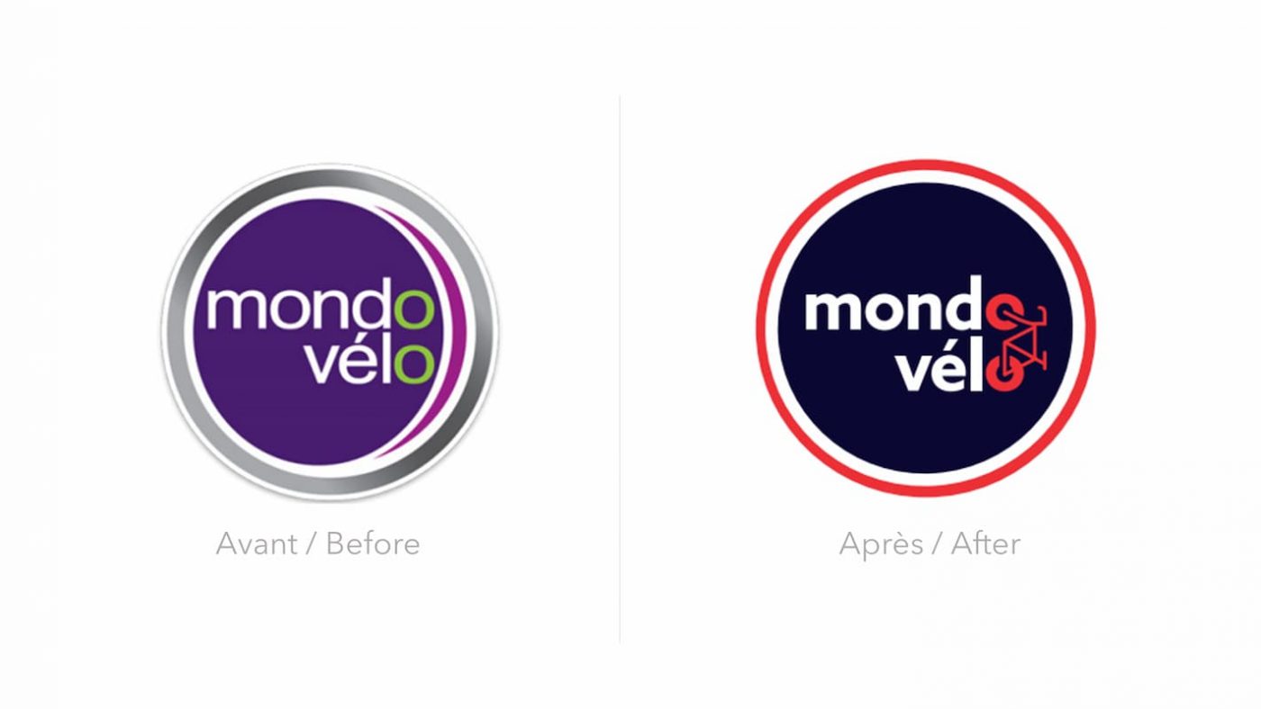
To re-dynamise the logotype in line with the in-depth service that the brand offers in its field, CBA has rethought Mondovélo’s colors:
- A deep blue tint as main color, symbol of reliability and trust: consistent with its expert role
- Combined with white and red colors, to showcase the brand’ national establishment and to offer to Mondovélo a new contrasting and modern colour palette.
Movement and emotion at the heart of the customer journey at Mondovélo
The agency has also redesigned the brand’s retail concept with the aim of developing the imaginary world and dramatising the space.
Therefore, CBA has worked on the movement and emotion by taking inspiration from cycling tracks specific to each enthusiast.
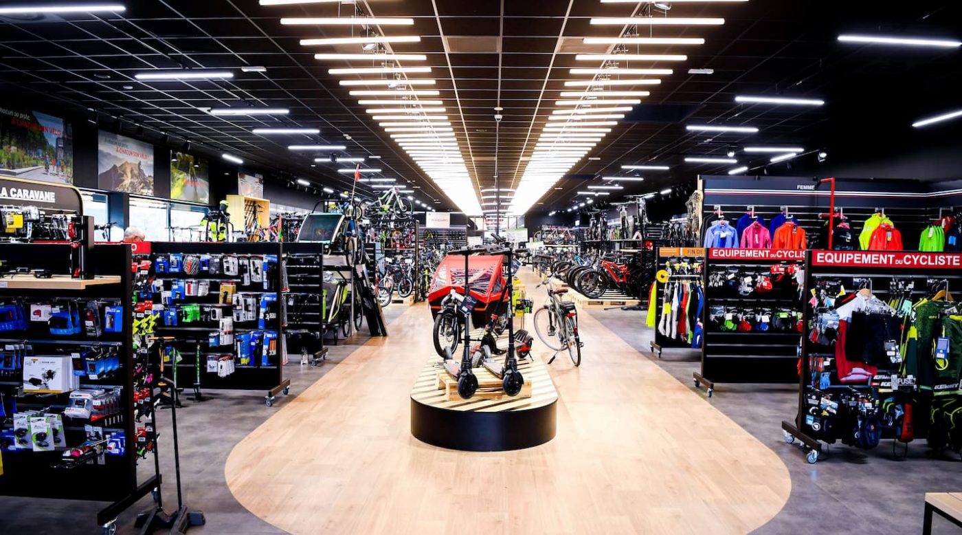
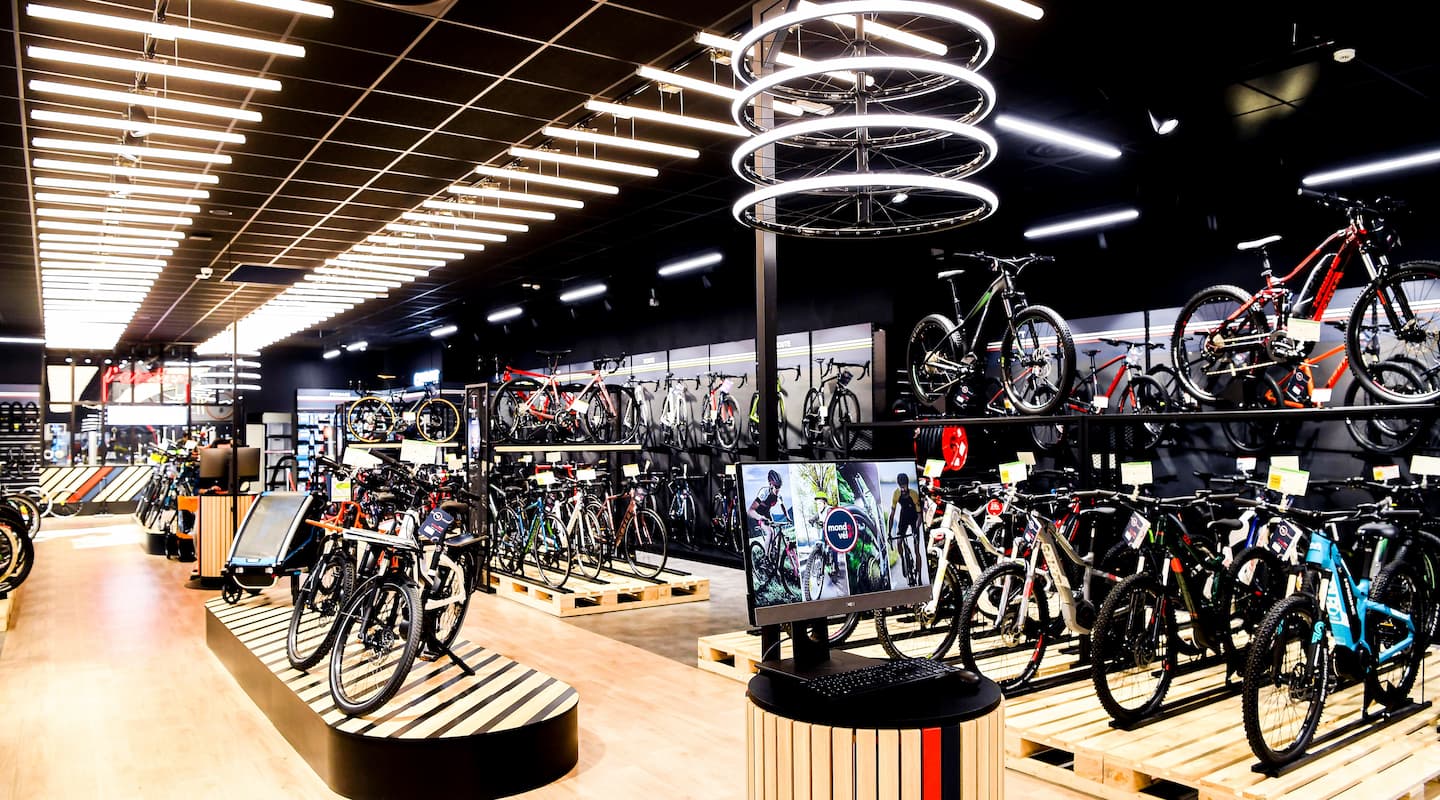
- In the middle of the stores, a track goes under the visitor’s feet and directs him/her towards the different departments and universes. Thus, each professional and amateur cyclist will be able to find his or her way to the cycle universe that corresponds to him or her.
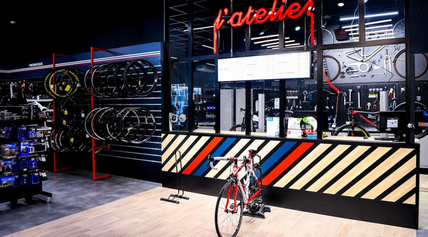
This track in the form of a velodrome sets the scene for the store and directs the visitor’s gaze, from the entrance, towards “The Atelier“. A workshop that offers a repair and maintenance service for bicycles, while promoting the exchange and sharing of knowledge between Mondovélo experts and cyclists around their common passion.
- The milestones, podiums located in the centre of the store, showcase the latest released bikes.
- Each department has been staged in order to be easily spotted thanks to the use of Billboards, visible from the entrance of the shop.
- In each department there is a Cyclobox, a horizontal or vertical box that can be used as a display for some of the shop’s flagship products.
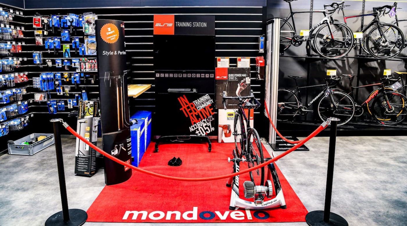
- The Club and Fits Corner, a special department designed to bring the customer more and more into the world of cycling, allows everyone to customize their dream bike to their measurements. The customer can try bikes offered by the store directly on home trainer equipment such as shoes. A department that also offers access to documentation giving the possibility of consulting the tracks and routes to be taken in the region.
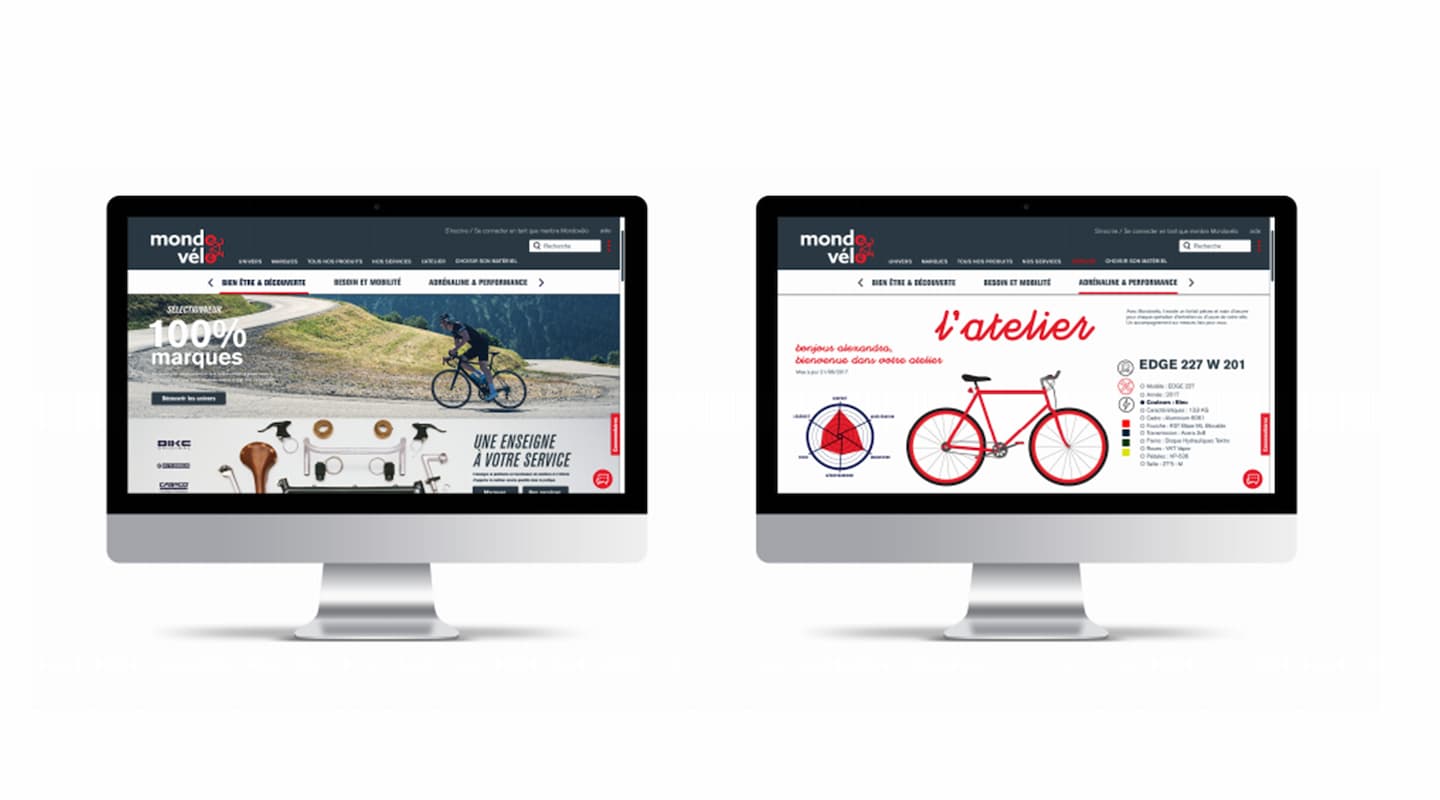
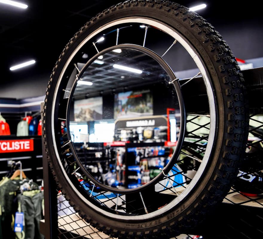
- Located on either side of the shop, digital consultation terminals staged by illuminated suspended wheels, give access to bike maintenance sheets, to the entire catalogue and to some customisation features offered by a few brands. This consultation terminal makes the tailored customer journey more interactive thanks to a modern and digital experience with the brand.
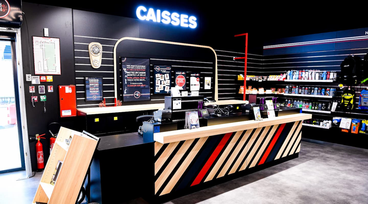
- The checkout area, the final point of the customer journey, is in line with the other hot spots in the shop. The back of the checkout takes the form of a caravan in a nod to the Tour de France caravan, and serves as a support for promotional or institutional posters.
The visual identity has been applied to all store’ signage, making it easier to identify each department. Thus, CBA has designed a clear customer journey by developing totemic elements that fit with the brand identity.
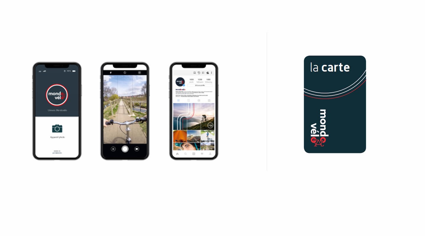
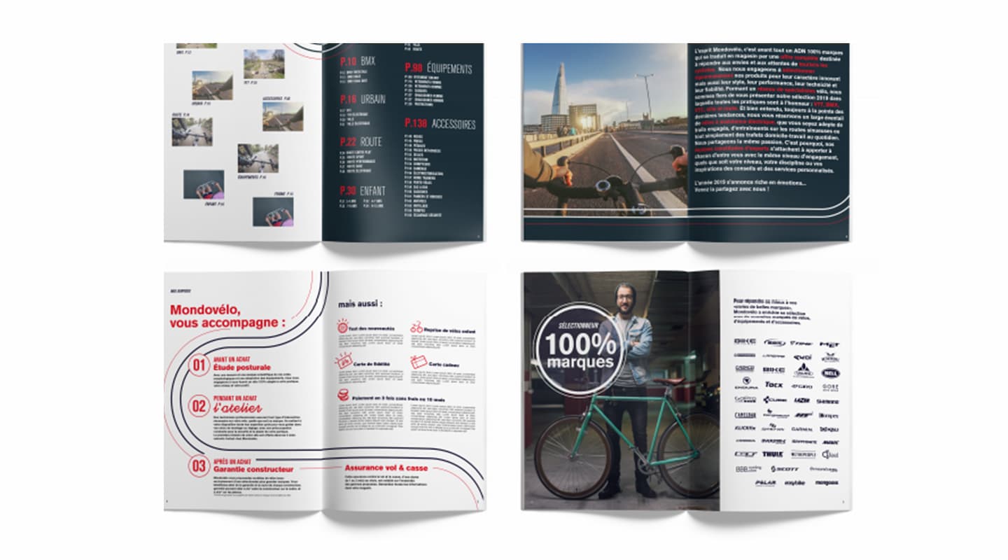
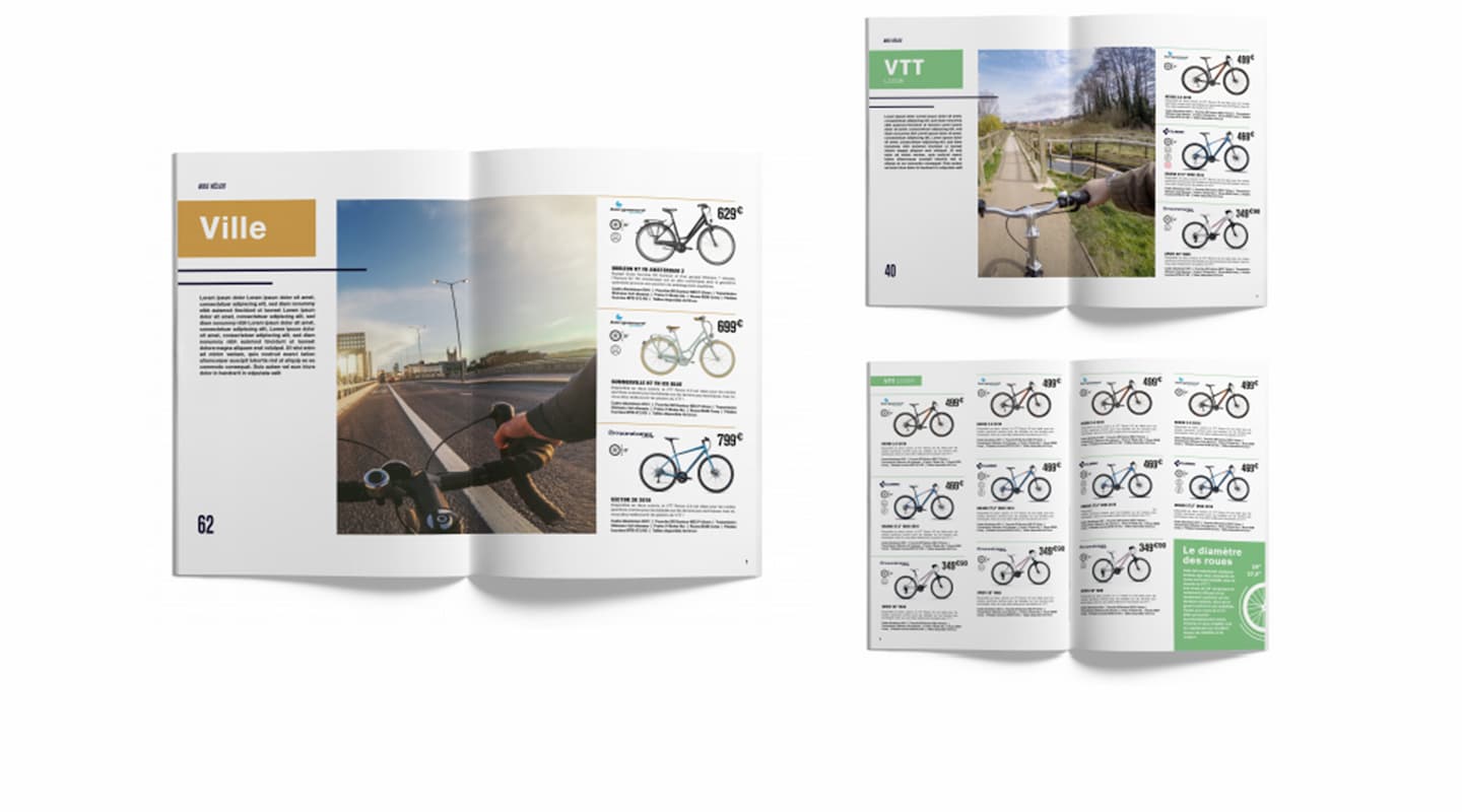
The agency also developed displays for the store, with a very specific iconography: photos taken on bikes by an on-board camera, in line with the visual objective of movement, to involve the client directly into the world of cycling. This graphic charter is associated with a transversal tone of voice and illustrations that animate the store and give a lexical field specific to Mondovélo.
CBA has created a radiant and dynamic installation that puts the enthusiast on track.
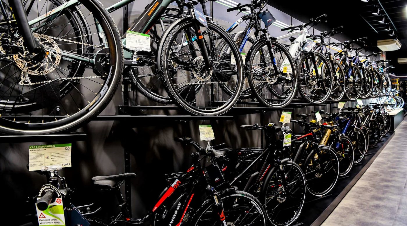
The communication principles on the labels of each of the products have been reworked in order to highlight the specificities of the bikes.

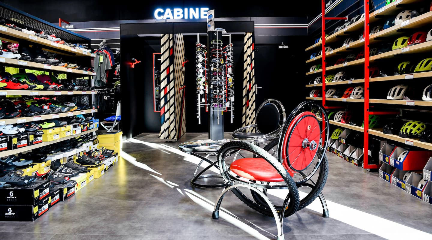
In addition, CBA has designed furniture made from the recovery of used bicycle equipment; hence enriching the world of cycling with original and unique details, while adopting a responsible approach with Upcycling: a great proof of Useful and Meaningful Design!
Finally, to continue the Mondovélo experience at home, the visual identity (the line concept, the universes of the different types of bikes…) has been declined on the shop’s catalogue, the loyalty card, the website and on the brand’s mobile application.
