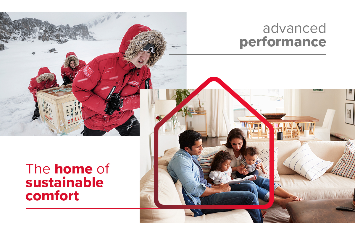
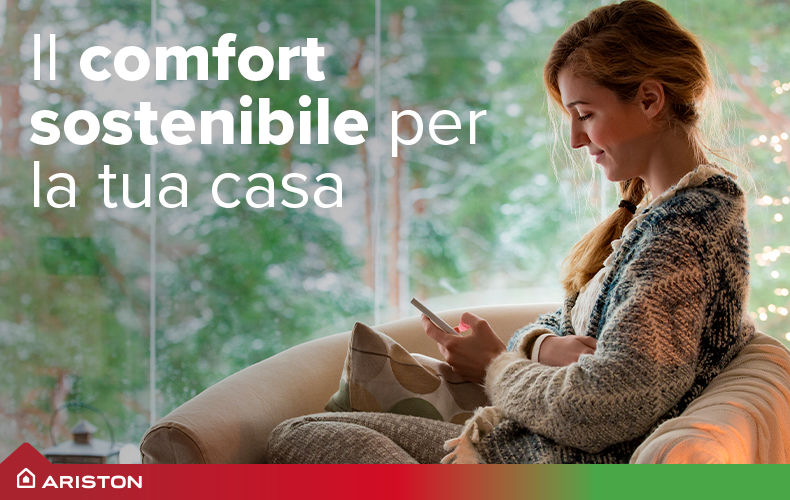
Home is where we feel safe in a welcoming and warm space. Ariston ensures this, thanks to technologically advanced solutions that make reliable home comfort accessible to all families.
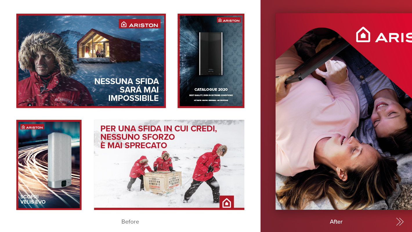
Once a static icon, the Ariston house now acts as the central visual element expressing the brand’s key messages. Moreover, the Ariston ideal house is also the connecting element for all the visual expressions on the various touchpoints.
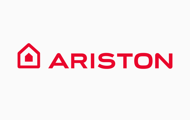
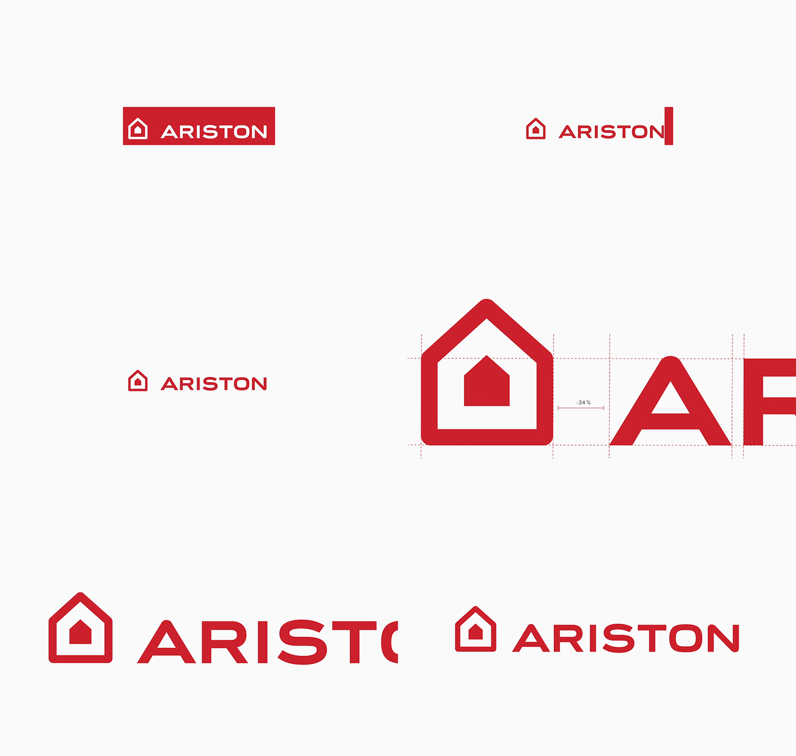
The logo’s icon is closer and better integrated with the logotype. The new design loses the frame enclosing the trademark: this allows a freer, more contemporary and impactful use, not least in terms of sizing.
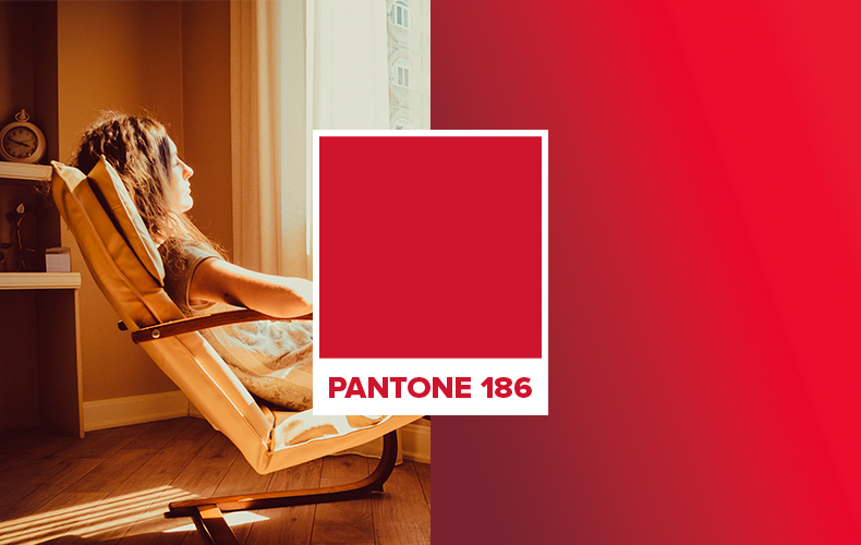
A slight but fundamental change in the colour choice towards a warmer red coupled with a light to dark gradient confers a more emotional look to the visual language.
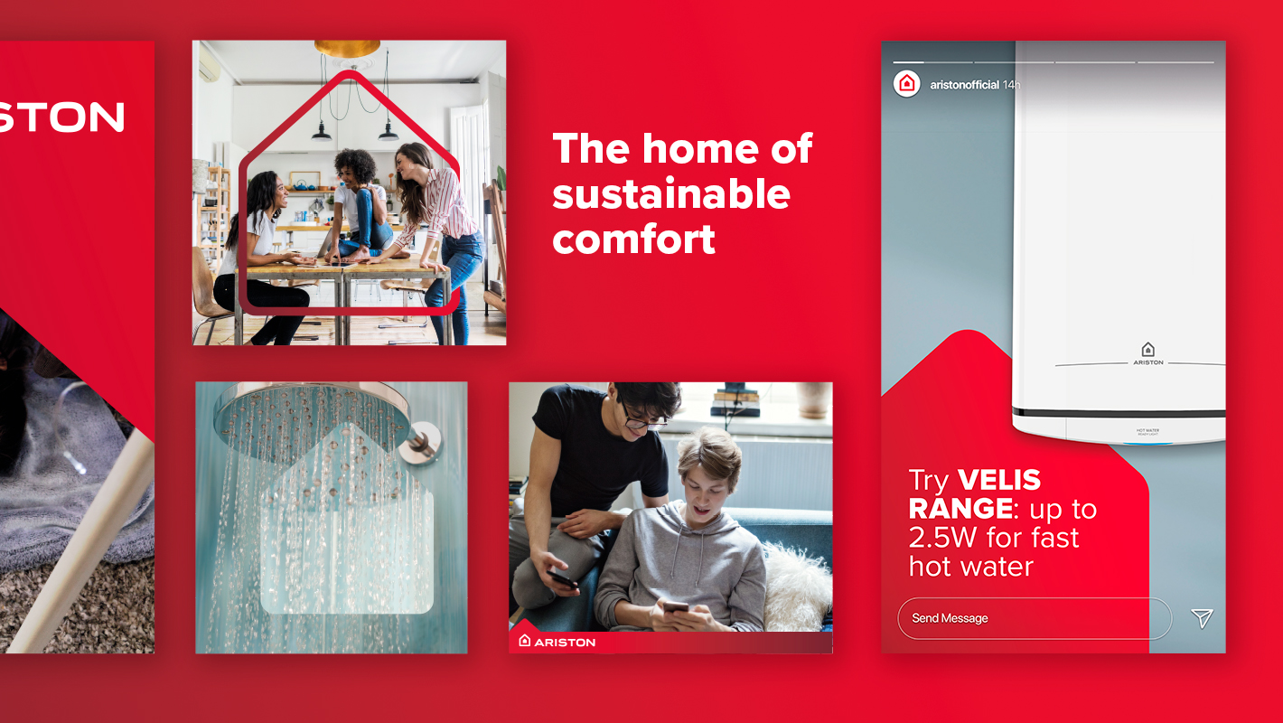
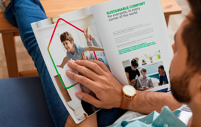
By making the house the central element, the identity maintains a solid coherence and appearance across the board. The symbol is versatile: it acts as a framing object, a lens focusing or a frame highlighting, as the situation requires.


The brand’s open outlook towards the future makes space for a more flexible and dynamic identity. The multiple identity adaptations are designed to meet the different communication needs of the many countries in which the company operates.
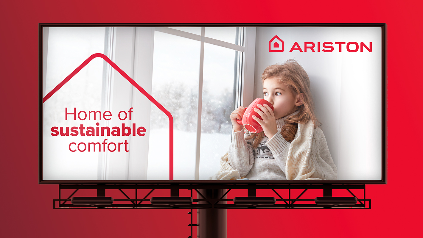
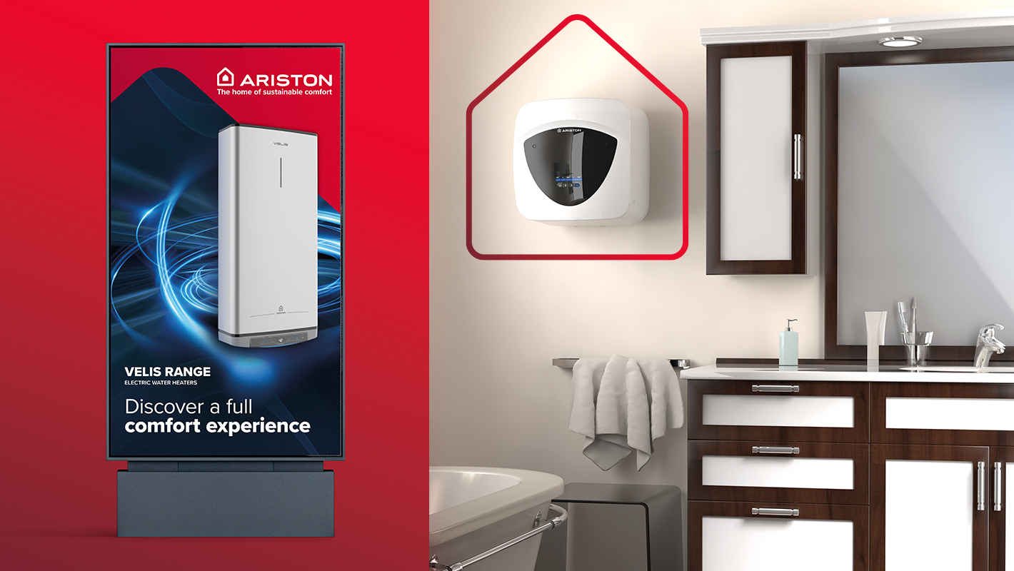
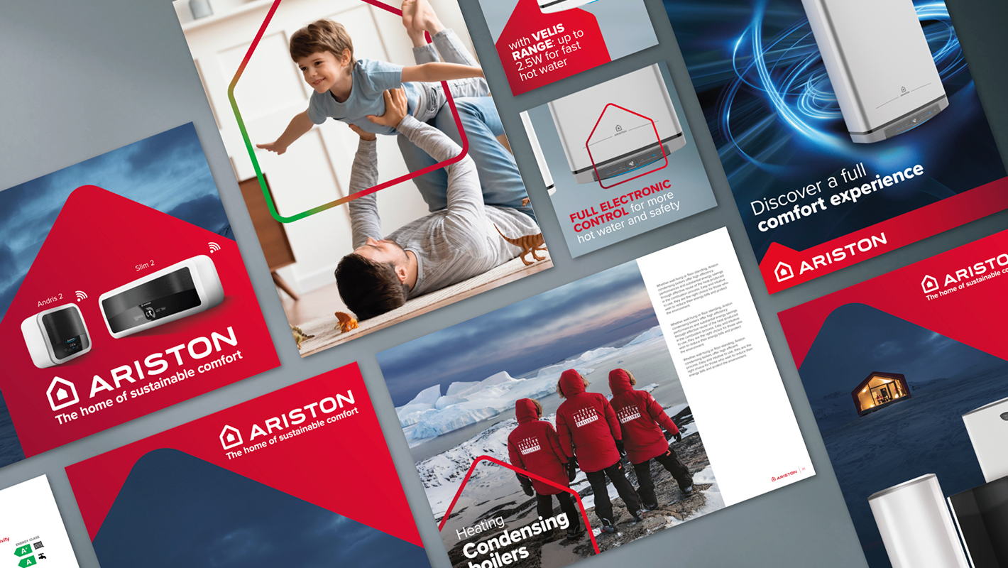
The language applies some variations to meet different communication needs without losing effectiveness, whether in physical or digital applications.
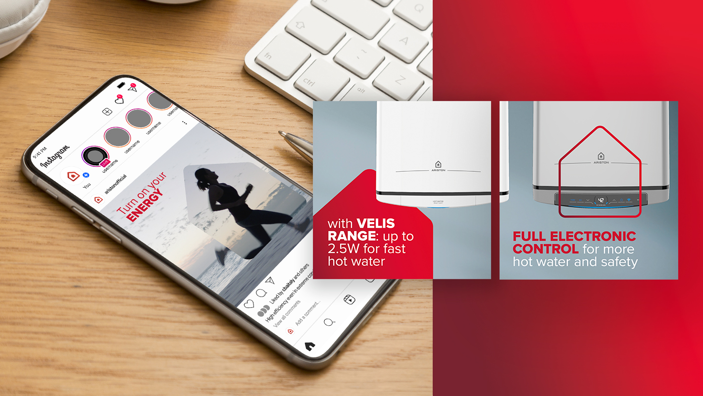
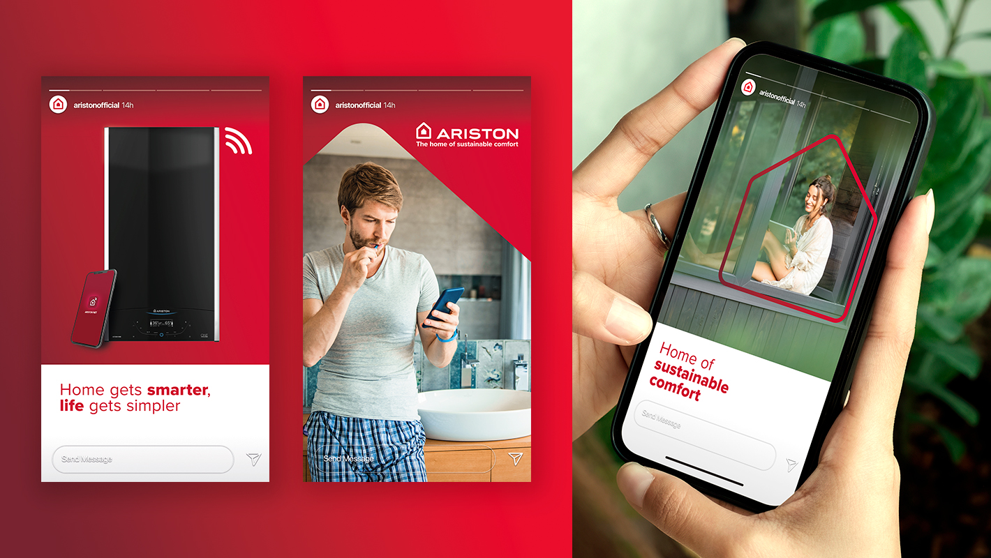
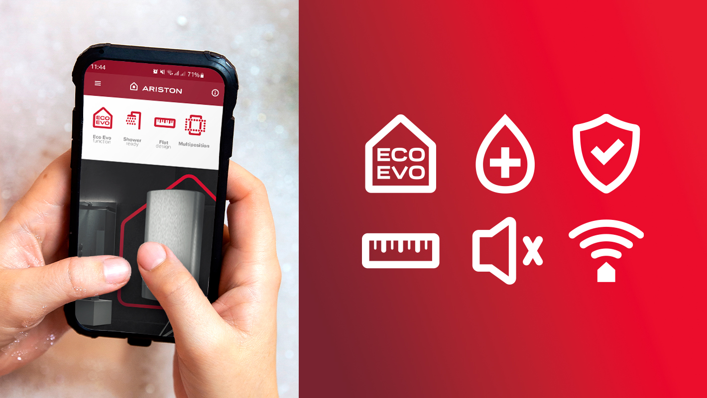
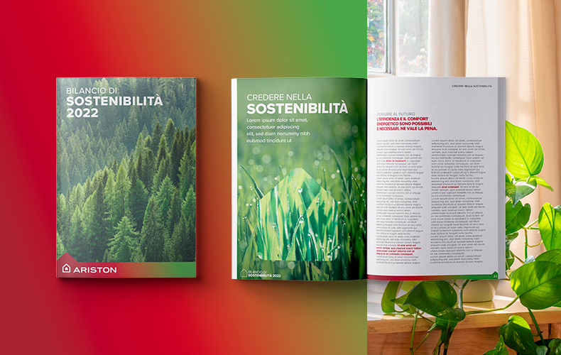
The company’s growing commitment to sustainability also finds a specific expression in the new visual language through the extension of the colour palette, including the colour green in the visual assets dedicated to the environment.
Ariston has been operating in the sector of indoor heating and domestic hot water for more than 90 years, today is one of the world leaders in thermic comfort.

