France
Paris
Switch to your local agency
Retour au menu
The history of inequality between men and women is as long as “the history of man” (sic!). Yet today, we are seeing significant changes and signs which seem to go beyond the symbolic mimosas of 8 March, both at the level of political movements and at the cultural and economic level, with the activism of the more committed brands. On the front of women’s civic engagement, recent years have seen the birth of various phenomena such as the #MeToo movement, which arose in the United States against the sexual harassment and assault of women, later followed by other movements such as “Non una di meno” [“Not One Woman Less”] in Italy, or viral events such as flashmobs protesting gender violence organised by Chilean collective Las Tesis, which has now spread around the world. (Las Tesis – video YouTube).
What is being created in parallel in the business world is a new sense of awareness and a new approach by brands in terms of gender and women’s needs, addressing the needs of those who do not have the time, desire or ability to take part in these new feminist movements but who identify with and support the cause.
As trend researchers, we have come across numerous examples of brands taking a new approach to gender issues.
They highlight the idea of women’s empowerment by coming into people’s daily lives with services and products designed for women and featuring messages and actions which promote their self-determination and which help to remove taboos around issues such as menstruation and menopause.
In the world of business and brands, we all remember the example set by Dove, a forerunner of the issue of body positivity with the “Dove Self-Esteem Project”, a campaign which even included workshops for schools on the acceptance of one’s own appearance. Many large corporations followed suit, and we can see two different levels of change which have taken place.
The first sees more well-established brands starting to address women in a different way, trying to somehow “make amends” for what happened in the past (sexist and stereotyped representations which limited women) with campaigns and individual initiatives; the second is more bold and innovative, and is championed by many newer brands who make women’s empowerment their very purpose, their raison d’être.
An example of the first approach from the field of music is the collaboration between companies such as Smirnoff and Spotify, which created the equality-themed “Playlist Equaliser” tool, ensuring that both male and female artists are represented in equal measure, contrary to what still happens in the music industry (amongst others), which is still largely dominated by men.
In the world of telecoms, Vodafone created a short film entitled “Raising Voices” which goes in the same direction by addressing the stereotypes and inequalities that determine the horizontal segmentation of the labour market, using the voices of child actors who wonder “why are all IT specialists men?” and “why are almost all superheroes men?”. Over the years, even several major brands have “learnt their lesson” by adopting the issue of empowerment, such as Nike with their “All Woman Project”, which collected the stories of New York’s female athletes: women of all shapes and sizes, all races and ethnicities, in the name of inclusiveness, their common trait being their “toughness” as women who are different but who have made it, celebrating their exceptionally unique and unmatched diversity (https://www.nike.com/us/en_us/e/cities/nyc/all-woman-project).
Then there are new brands which are created with a specifically female target market and an even more inclusive approach; often markedly feminist, they make empowerment their brand mission.
In sportswear, there are brands such as Outdoor Voices which perfectly represent the theme of inclusiveness, bringing their purpose to life: “We’re on a mission to get the world moving. Moving your body generates endorphins. Endorphins Make You Happy”. As such, they represent a world where sport is for everyone, male and female, and not just for athletes, distancing it from the traditional idea of sport being a solely performative and competitive arena. (https://www.outdoorvoices.com/).
A classic example of this in the underwear sector is the crisis that Victoria’s Secret, the biggest player on the US market, has been suffering in recent years. Its market share has dropped from 33% to 24% in 2 years, and it closed 52 of its shops in 2019. New players are popping up in its place: brands such as Lonely, which selects models with more curvy and realistic physiques than the picture-perfect “Angels” used by VS, making it a brand with a strong and genuine identity and an unusual photographic style featuring stretch marks, body hair and models who seem much more relatable and human than the top models favoured by VS. Victoria’s Secret’s problem lies in the underlying reasons for its foundation, namely the fact that in 1977, businessman Ray Raymond wanted to create “an underwear shop where men could go to buy something nice for their wives”. This model, which focused on the stereotyped aesthetic of the top model, aimed at meeting the needs of the husbands rather than the actual end users, is exactly what is being challenged nowadays. Agent Provocateur – a brand with an eloquent name – was also famous for its extremely provocative adverts, until it filed for bankruptcy, was acquired by Four Holdings, and is now rethinking its identity entirely: “Lingerie doesn’t have to be serious. It should be fun and playful and empowering” – this is the new approach from Agent Provocateur’s creative director.
In the same sector, brands whose unique selling point is their comfort and practicality for end users are starting to flourish. Thinx, for example, whose period underwear offers a range of female underwear designed especially for that time of the month, with an “absorption capacity equal to that of 4 tampons”. Their site not only showcases the product, but is filled with content about women’s health and speaks an empathetic language, aimed at normalising the topic of menstruation in the everyday life of women (and men).
The beauty sector, too, has examples such as Fenty Beauty by Rihanna, the make-up brand created by the singer in collaboration with the giant LVMH, whose entire identity lies in the idea that putting on make-up no longer means applying a uniform to standardise beauty, but rather a creative tool which can be used to express yourself, accessible to all and inclusive as it is designed for each and every skin tone and complexion.
AW LAB itself, in conjunction with CBA, has created the new retail brand “HERE”, a store just for women which is also a platform for events and workshops aimed at providing young women with the tools to learn, to be themselves outside of the pre-packaged models, and to fulfil their potential in the professional world, especially within the fashion system. What’s more, this is not the first time that AW LAB has organised initiatives like this one: last year in Milan, they organised the #WMNStogether project, where 6 talented ambassadors were invited to hold all-female talks, workshops and DJ sets to show young women once again that superheroes can also be female, that they can be whatever they want and that they can make their dreams come true. In this sense, AW LAB has closed the circle on both levels, moving from a single initiative to the creation of a fully-fledged brand like HERE, which is entirely dedicated to the personal development of young women.
Francesco Saviola, Strategic Designer at CBA
Even those who aren’t die-hard comic book lovers will be familiar with Gotham City, the imaginary city where the adventures of Batman are set. However, the artists at DC Comics didn’t start from nothing: Gotham City is the fantastical transposition of New York City. Even though it is not mentioned explicitly, the link between Batman’s hometown and the Big Apple is very close indeed.
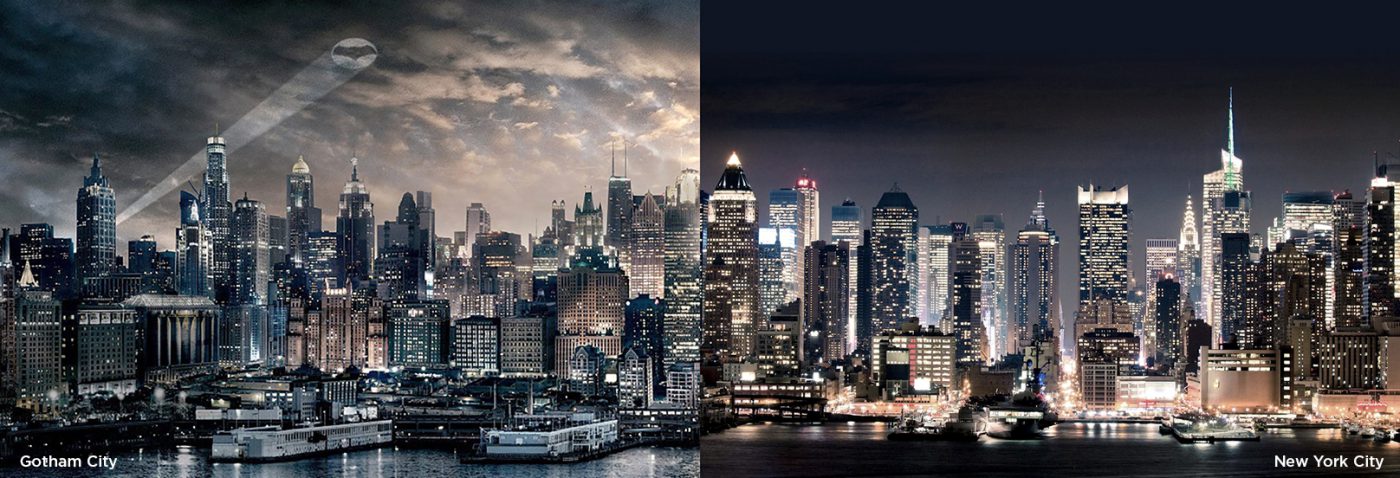
It may be for this reason that type designer Frere-Jones, Hoefler’s partner at the time, decided to name the typeface he designed Gotham after the comic book city. As with Batman, here too New York is a great source of inspiration.
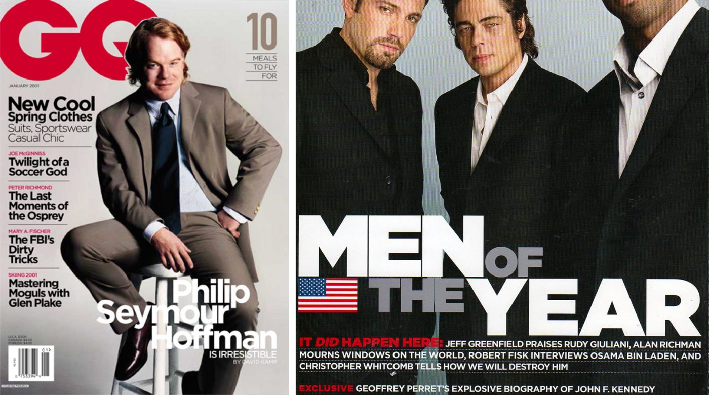
The font was born in 2000, commissioned by GQ, which wanted a linear font with a geometric structure. A “masculine, new and fresh” typeface capable of lending a certain authority and credibility to the articles they published.
In order to capture the essence of the city, Tobias Frere-Jones took thousands of photos all around New York, concentrating especially on the old signs from the mid-twentieth century. The type designer wanted to capture the rationalist spirit of those years, which can also be found in its architecture and urban planning.
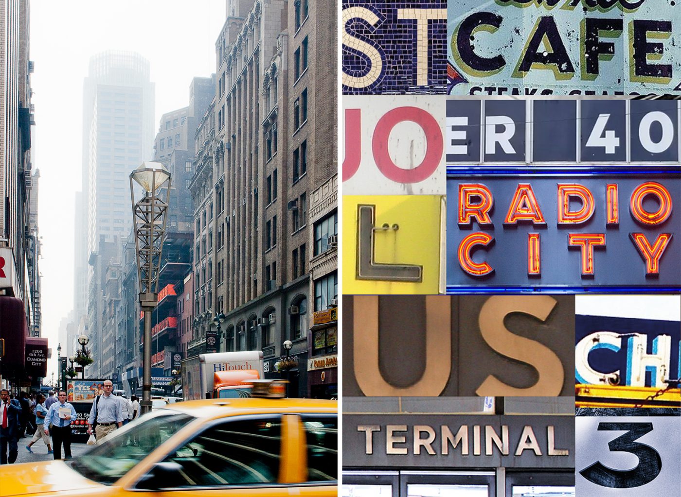
He was most strongly inspired by the sign at the Port Authority Bus Terminal on Eighth Avenue, whose simplicity was summarised thusly by Frere-Jones: “not the kind of letter a type designer would make. It’s the kind of letter an engineer would make. It was born outside the type design in some other world and has a very distinct flavor from that”.
The typeface that comes out of it fully embodies the minimalist philosophy by which it was inspired. In its 44 weight variations – now 66 – there is no room for frivolous or pointless elements. Gotham is a solid and functional typeface, yet accessible. The description on the Hoefler & Co website is quite clear: “From the lettering that inspired it, Gotham inherited an honest tone that’s assertive but never imposing, friendly but never folksy, confident but never aloof“.
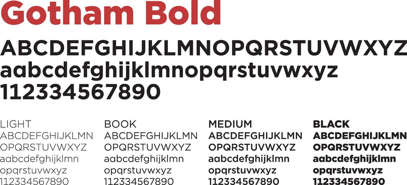
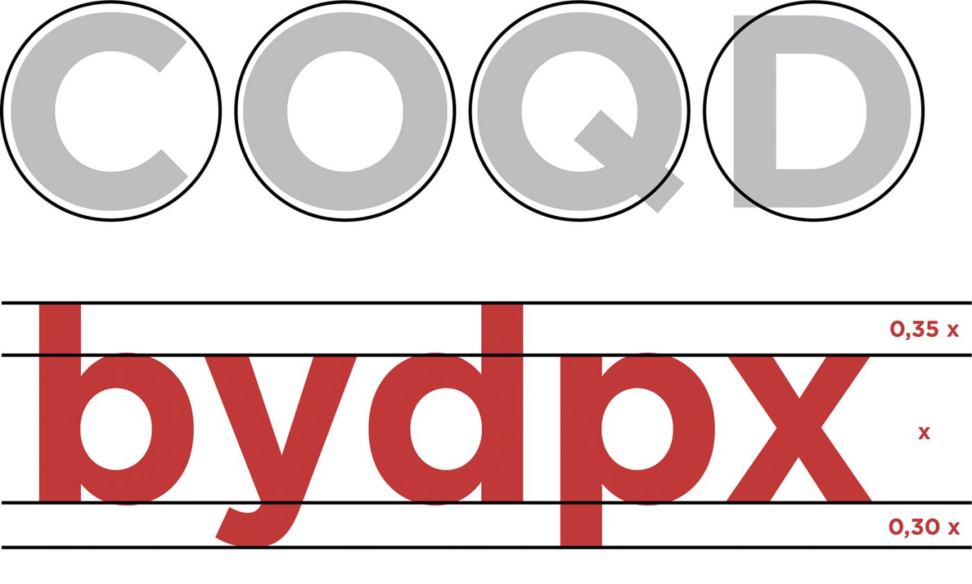
Its main characteristics include the circular shape of many of its letters and the fairly prominent height of the lowercase letters, with consequent quite small ascendants and descendants.
A few years after its publication, when the exclusive rights for GQ expire, it is used as the main character for the identities of the Freedom Tower and for the National September 11 Memorial & Museum, at the World Trade Center.

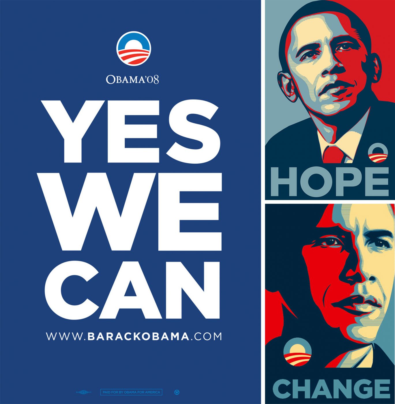
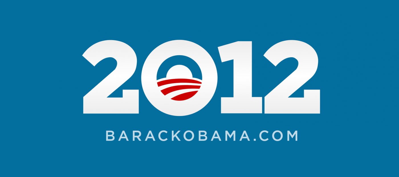
But it wasn’t until 2008 that it truly became famous: Barack Obama, as a candidate for the presidency of the United States, chose it as the official font for his campaign. “YES WE CAN”, “CHANGE”, “HOPE”: all clear, direct messages which found Gotham, with its simple and incisive look, to be the natural solution to represent them.
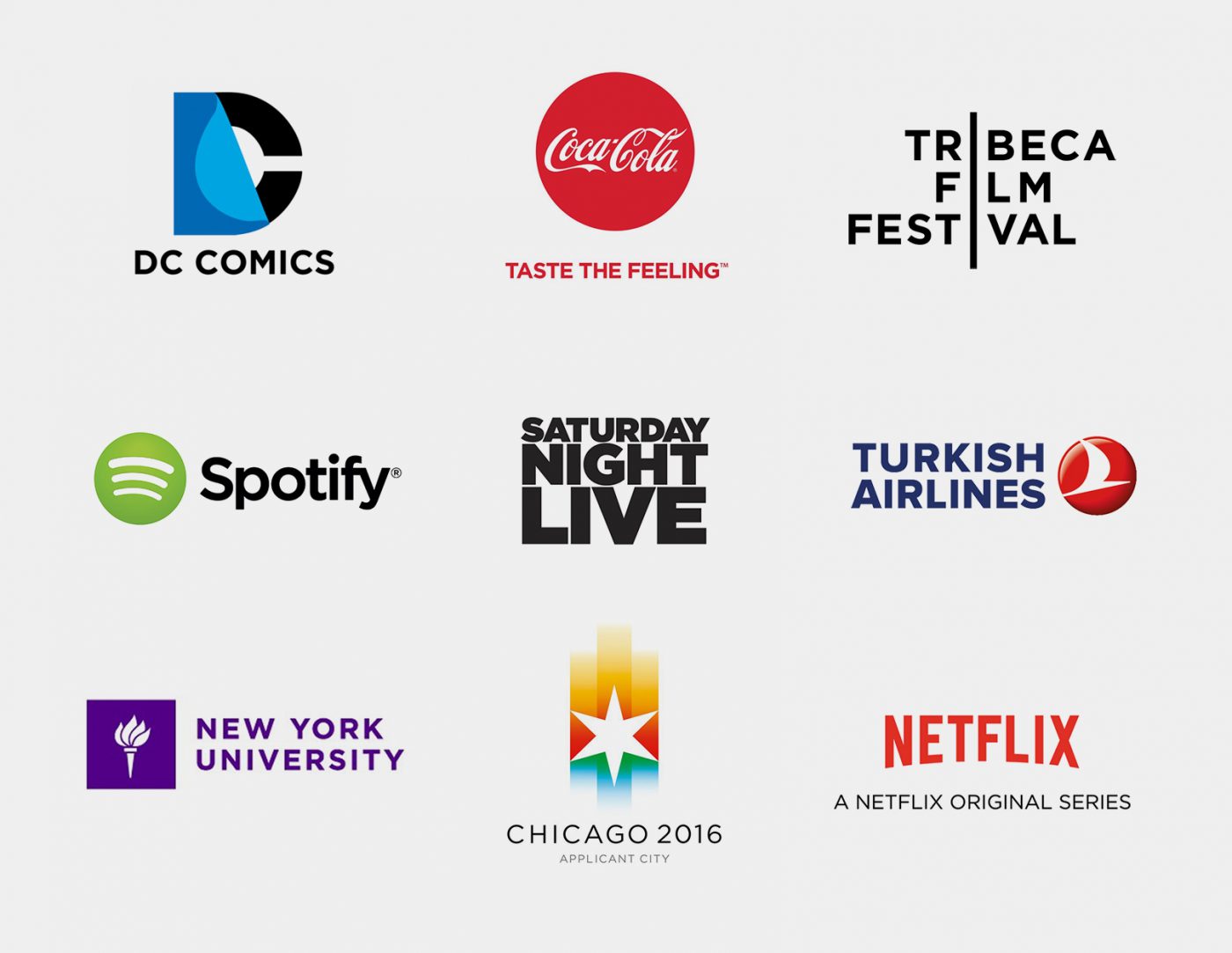
The rest is history. The “Obama typeface” became popular not only in the United States, but worldwide. It became the font of choice for Coca Cola, Netflix, Saturday Night Live, Turkish Airlines, DC Comics, Tribeca Film Festival to name but a few.
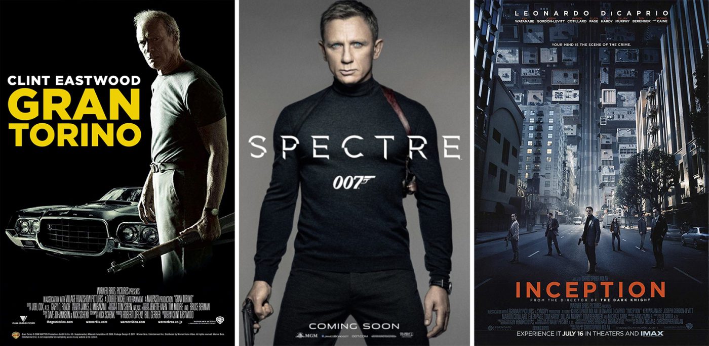
In the world of cinema, too, it gained a great deal of popularity, featuring on the posters for many blockbusters.
Obama himself, 4 years after his first campaign, decided to adopt Gotham as his font once again for the 2012 mid-term elections. However, this time he decided to add serifs to “his” font. Hoefler and Frere-Jones themselves commented on the request with a hint of irony:
“Can We Add Serifs to Gotham?
For the President of the United States?
Yes we can.“
Giuseppe Mascia, Creative Director at CBA
Privacy Overview