France
Paris
Switch to your local agency
Retour au menu
Today we are accustomed to asking questions and talking to various virtual assistants such as Siri, Alexa and Google Assistant. Each has its own tone of voice, personality and characteristics. At the dawn of artificial intelligence, this was not the case. The assistant’s “voice” was inextricably linked to the shape of its lettering. Microsoft became acutely aware of this in 1994, when it was working on a project to enhance the friendliness of the user interface of MS Bob, an alternative operating system in which the workspace took the form of a domestic lounge. Inevitably the system also comprised the perfect assistant, the faithful dog Rover.
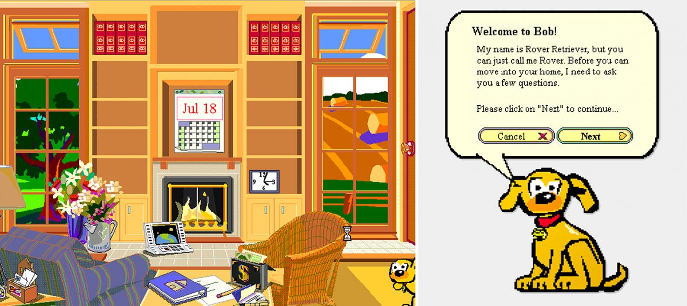
This is where the Comic Sans adventure began. In fact, the friendly dog “spoke” to the user, giving its suggestions using texts displayed in Times New Roman, a typeface that had been designed in 1932 for totally different purposes. Vincent Connare, a Type Designer at Microsoft who had previously worked at Agfa/Compugraphic, was struck by this typeface’s inability to express the desired approach. He had some copies of Watchmen and Batman on his desk. Connare immediately realised that the human touch of cartoon lettering could be more appropriate for an assistant with a friendly appeal such as that of the dog Rover. So he started working on Comic Sans, a typeface that would go down in history.
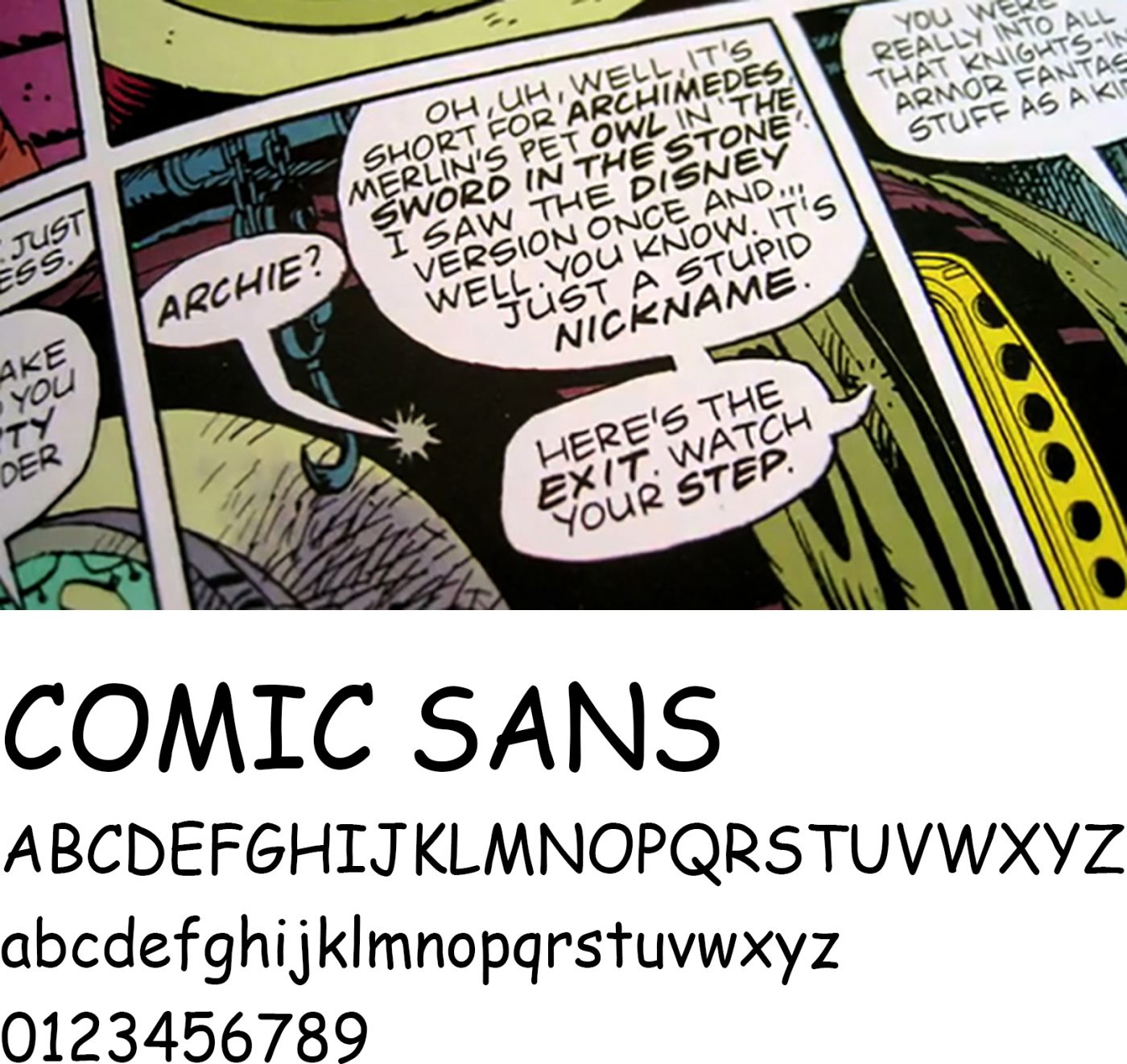
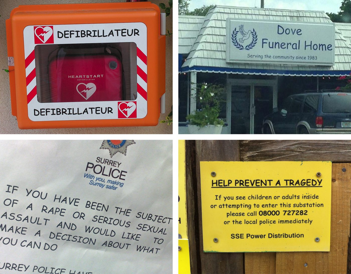
Unfortunately the typeface was not used for MS Bob, but it was included as one of the basic fonts of the Windows 95 operating system that was then being developed. Any person with a PC of that generation could use Comic Sans. It soon began to be used on a massive scale: for birthday party invitations, greeting cards, restaurant menus through to home-made posters. A large proportion of the sheets emerging from domestic printers were in Comic Sans. The typeface’s amusing, infantile and naïve appearance evoked a personal feel, something that other fonts, even though prestigious, were unable to express. It became the natural choice for people who didn’t want to take themselves too seriously. Unfortunately, it was used for many other things as well. Its use led to misuse, and this is where the problems started. Official documents, police cars, signs indicating danger of death, tombstones: all too often, Comic Sans began appearing in totally inappropriate situations, giving rise to involuntary humour which soon became loathing, above all in the world of designers.
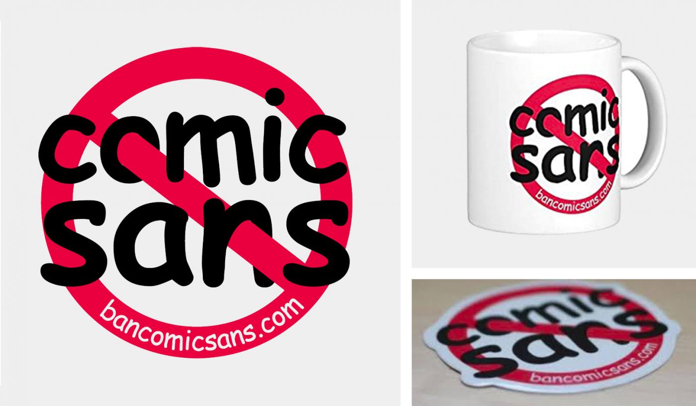
In the early 2000s, a movement against the typeface came into being, giving rise to the website bancomicsans.com (no longer active), on which you could buy T-shirts, caps and stickers that expressed the desire to ban the font. The site’s founders, Holly and David Combs, also published a sort of manifesto that explained their dissent:
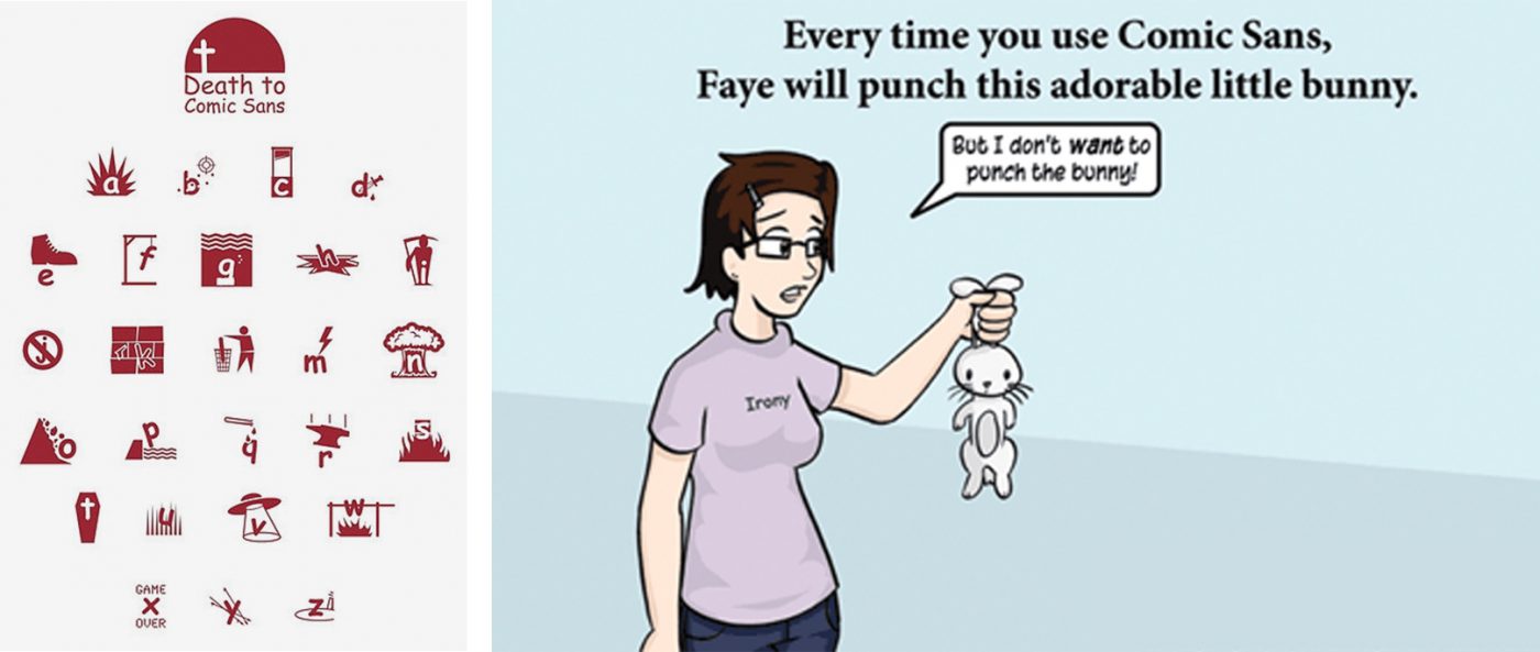
The typeface was also discussed by the Wall Street Journal, which in 2009 defined it as being so unpopular as to be retro-chic. Design Week even dedicated a cover to it, using it for the ironic message “The world’s favourite font!?”. Its inability to communicate plausibly is also treated by the ironic blog Comics Sans Project, in which famous identities are redesigned using the culpable typeface.

Over the years, inappropriate applications of the typeface have not ceased. For example, in 2012 it was used by CERN researchers at the press conference informing the world about the discovery of the Higgs Boson, and in 2014, some NBA stars wore a protest T-shirt with the text “I can’t breathe” in Comic Sans.

Despite the amount of criticism it has received, Comic Sans has an important point in its favour, the fact that it clearly showed that every typeface has its own personality, suitable for certain contexts and unsuitable for others. The reasons that led Connare to design it were wholly valid, and if only its use had been restricted to the areas initially contemplated, Comic Sans would have performed its role to perfection, without giving rise to so much debate. As Connare himself said in an interview, “If you love Comic Sans, you don’t know much about typography. If you hate it, you really don’t know much about typography either, and you should get another hobby”, underlining the fact that it is not the typeface itself that is right or wrong, but rather the way in which it is used.
Giuseppe Mascia, Visual Design Lead at CBA
Privacy Overview