France
Paris
Switch to your local agency
Retour au menu
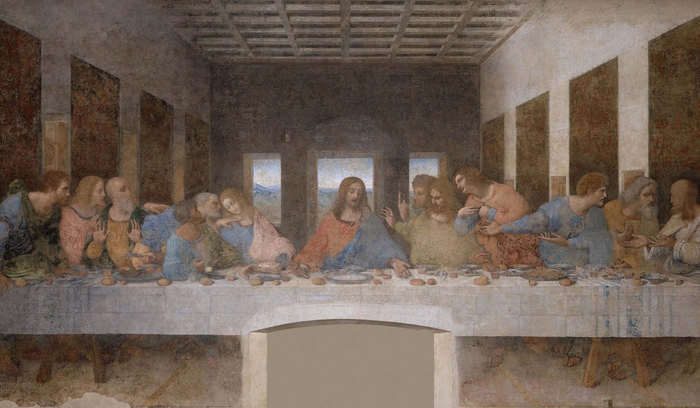
The Renaissance, an age of great artistic splendour. We are talking about the late 1400s. Christopher Columbus discovered a new unknown continent, and Leonardo Da Vinci painted the Last Supper in the period that he spent in Milan. In this context, Italy was one of the most important cultural centres of that age, and Venice in particular was the nerve centre for printing in the whole of Europe. In that climate, printing represented an emerging industry. Almost half a century after Gutenberg’s invention, printed paper had spread all over Europe. What was still missing was the aesthetic beauty of hand-drawn calligraphic lettering, and it was here that Bembo played its part.
Its history began at the publishing house operated by Aldo Manuzio, considered by many as the father of contemporary publishing. One of the history’s greatest punchcutters (today we would call him a type designer) worked at his printing shop: Francesco Griffo da Bologna. The most significant result that Griffo attained with his printed lettering was precisely that of having won the “war of beauty” against the scribes’ hand-written letters. And it was Bembo who reached the most superlative results in this task.
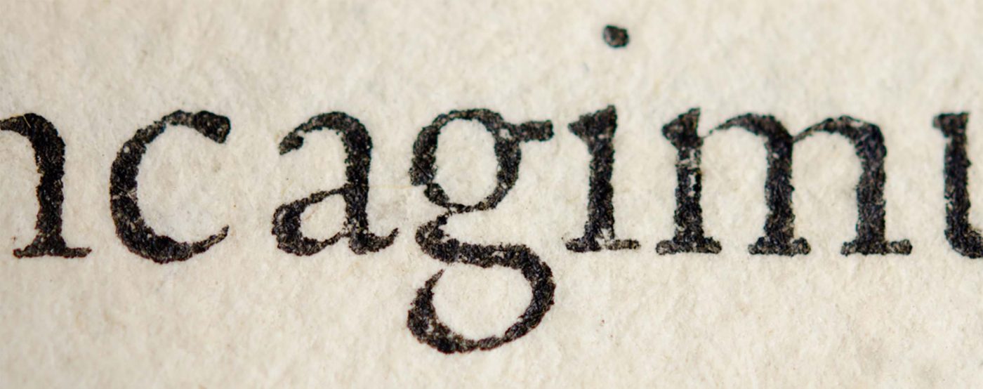
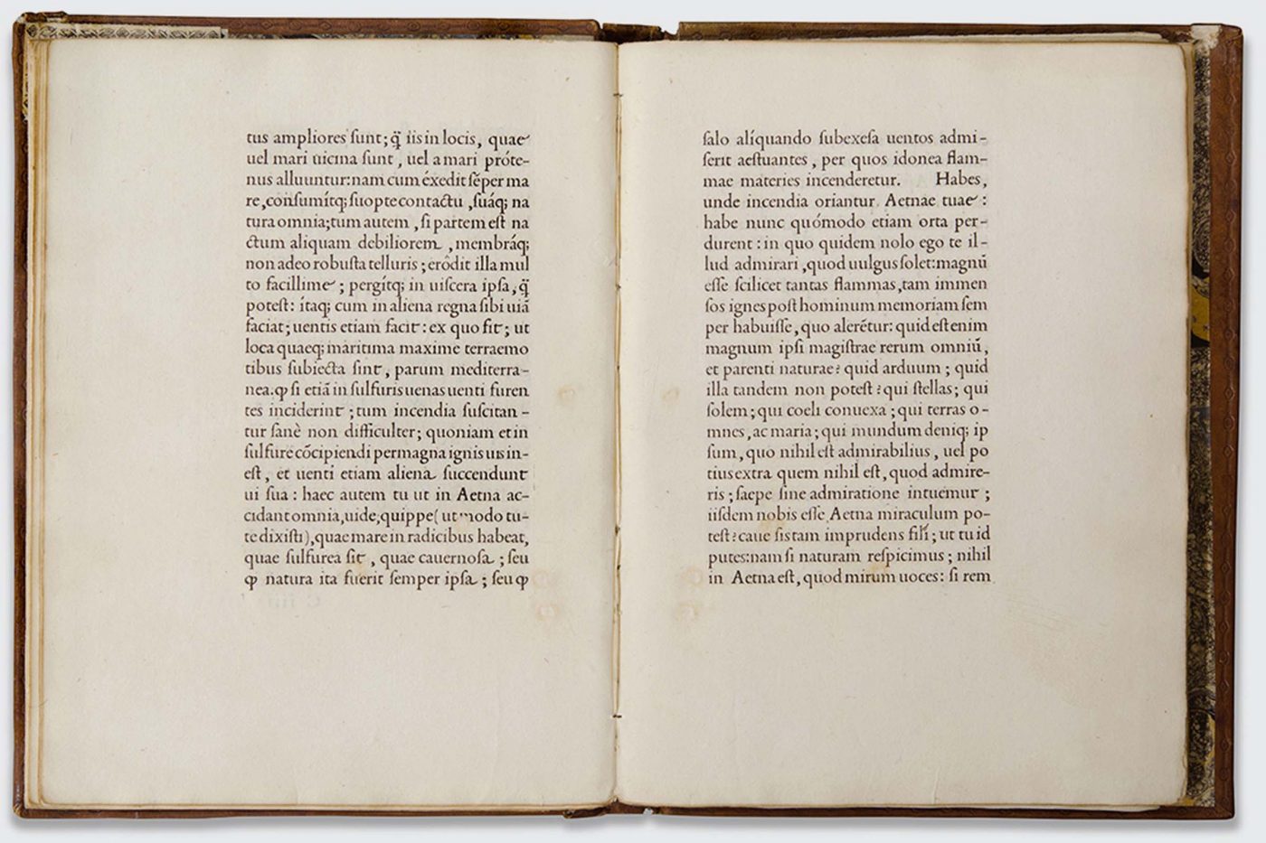
In 1495, Griffo cut a round roman typeface for the publication of De Aetna, a Latin essay written by humanist Pietro Bembo, after whom the face was named. Bembo lettering caused a sensation right from that publication, a clear demonstration of its stylistic evolution when compared to Jenson’s roman type, the rounded roman typeface that had been dominant in printing up until then.
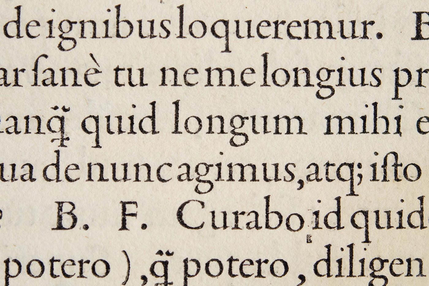
However it was the allegorical novel Hypnerotomachia Poliphili that brought Bembo to its greatest splendour. In this publication, Griffo improved the letters’ width/height ratio to bring it closer to the calligraphic characteristics of the masters working at that time. More specifically, Griffo also cut variants of the same letter – today we would call them alternate characters – in order to better mimic the lively appearance of hand-written lettering. The work was so elegant that experts consider it one of the most beautiful publications ever printed.
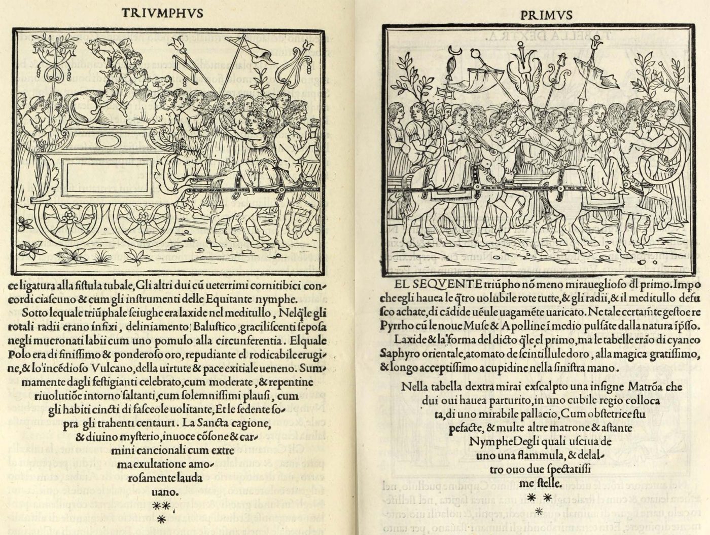
All this was absolutely revolutionary at that time, and it set the benchmark for typographical aesthetics during the following centuries. It is familiar knowledge that Claude Garamond, father of the like-named typeface, borrowed a great deal from Griffo’s punches when he created his Garamond, as Firmin Didot also observed: “Garamond […] just copied Francesco da Bologna’s type at different sizes; and it was he who received all the honour […]”.
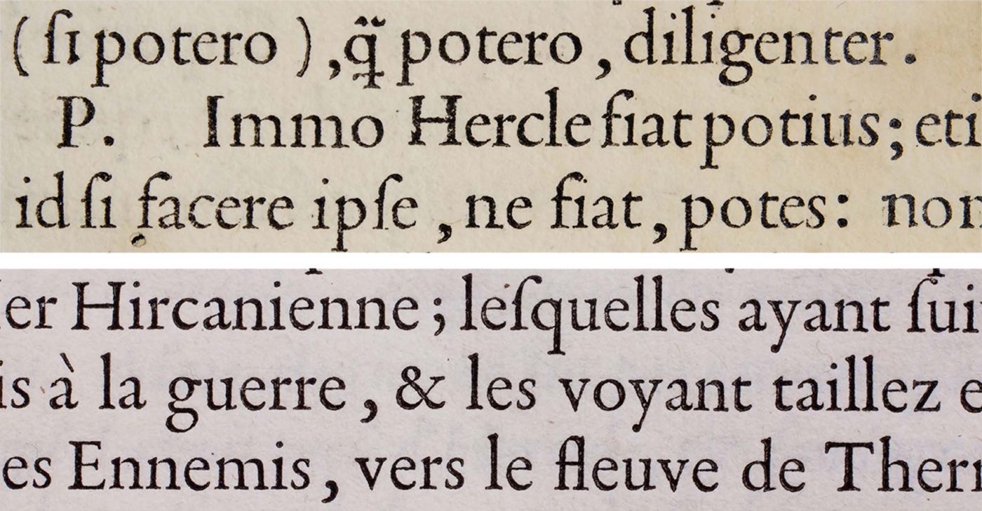
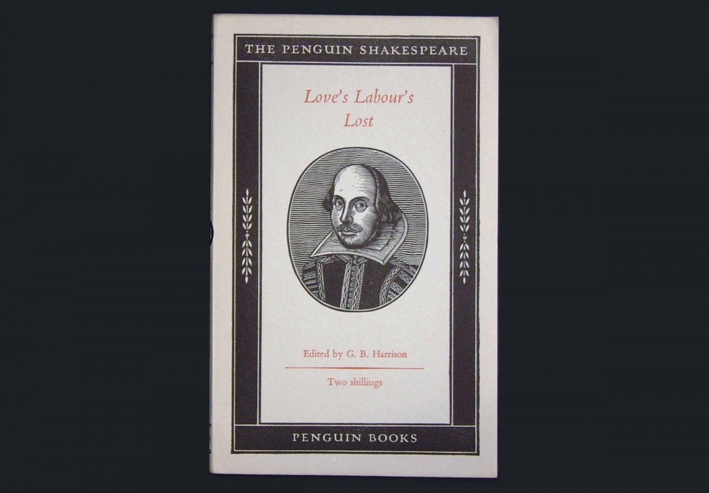
In 1929, Stanley Morison redesigned Bembo for Monotype, and from that moment on, a new period of splendour began for this typeface. One of the most iconic applications was that of the editorial design for Penguin books, by Jan Tschichold, famous for the pocket format, whom many say was inspired by the works created by Manutius and Griffo just over 400 years earlier. Tschichold used Bembo for the covers and body text of many volumes, above all for works by Shakespeare.
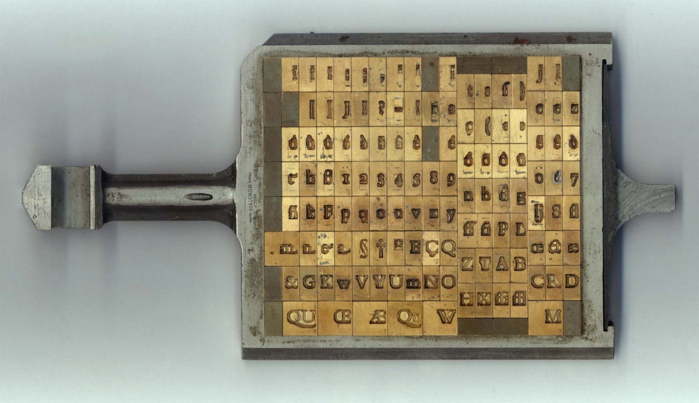
Over the course of the 20th century, Bembo became a typeface associated with culture: it was used by University Presses at the finest universities in the world such as Oxford, Cambridge and Yale, but also by London’s National Gallery.
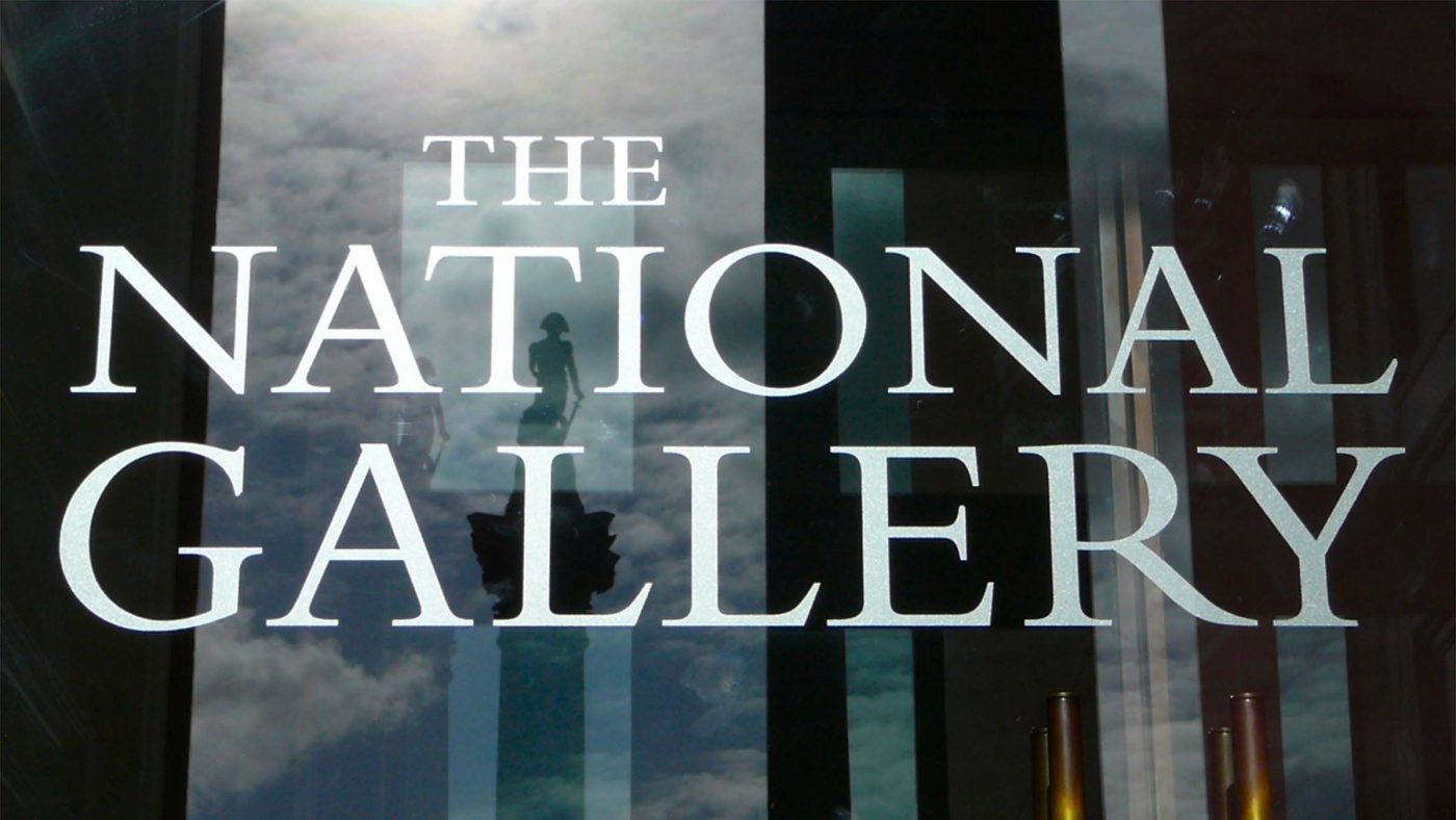
The typeface was so popular in the United Kingdom that it was also chosen for signage at Heathrow Airport, for which a bespoke version named BAA Sign (or BAA Bembo) was created.

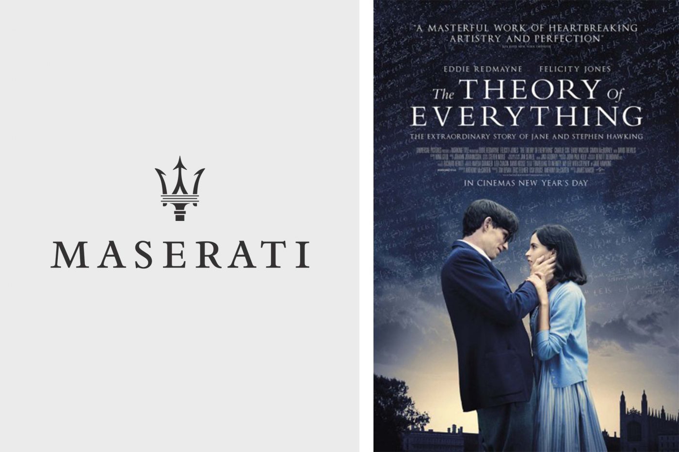
In Italy, luxury car manufacturer Maserati adopted Bembo’s timeless elegance, while in Hollywood, it was recently chosen for the poster of the award-winning film The Theory of Everything.
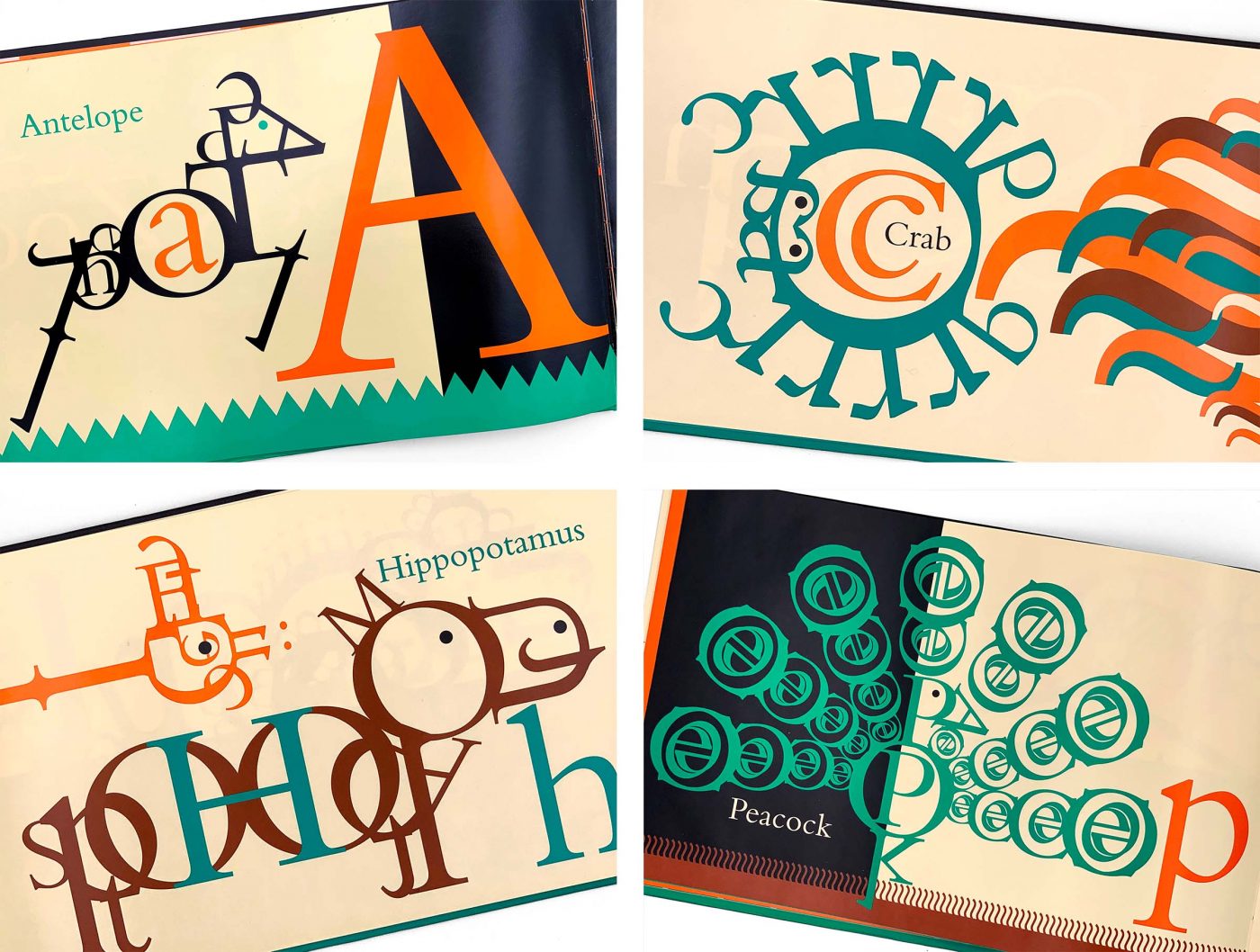
It would be an over-simplification to imagine that Bembo is used just for its elegance: one of its most interesting recent applications is that in the children’s book Bembo Zoo, in which Bembo is used to create illustrations of animals.
Though the typeface is very famous, the identity of its creator Francesco Griffo (for a long time referred to as Francesco da Bologna) has been rediscovered only in recent times, giving him the credit that he is due. The multidisciplinary project “Griffo – la Grande Festa delle Lettere” (Griffo – the Great Gala of Letters) was created precisely for this, with the ambition of disseminating his art. This unique personality, to quote Umberto Eco, “changed the history of publishing”.
Davide Molinari, Senior Visual Designer at CBA
Privacy Overview