France
Paris
Switch to your local agency
Retour au menu
It’s night, you’re driving home. Darkness fills the road ahead of you. You’re not from this area and you’re looking for a sign with a familiar indication. Finally, you find it. Your headlights are blinding the letters that become all the same and you can’t distinguish the information. You take the wrong road. You keep driving. It may seem like a classic thriller scene, but in reality, it’s a simple case of bad signage. Because in this case, the use of the correct typeface could have decreased the letters’ blurring effect due to the glare and you wouldn’t have taken the wrong road.
Signage is one of the fields where typography shows its most analytical and practical aspect, where the choice of the correct character is based on simple but extremely important principles. Firstly, it must have an excellent legibility of single letters, so linear sans typefaces of humanistic nature, such as Frutiger, are well suited for this use.
These typefaces have open counterforms, which prevent the letter from “closing” when looked at quickly or in poor lighting conditions. On the other hand, in a grotesque typeface like Helvetica, lowercase letters c – e – o, can appear the same under the above conditions, precisely due to the closed counterforms.
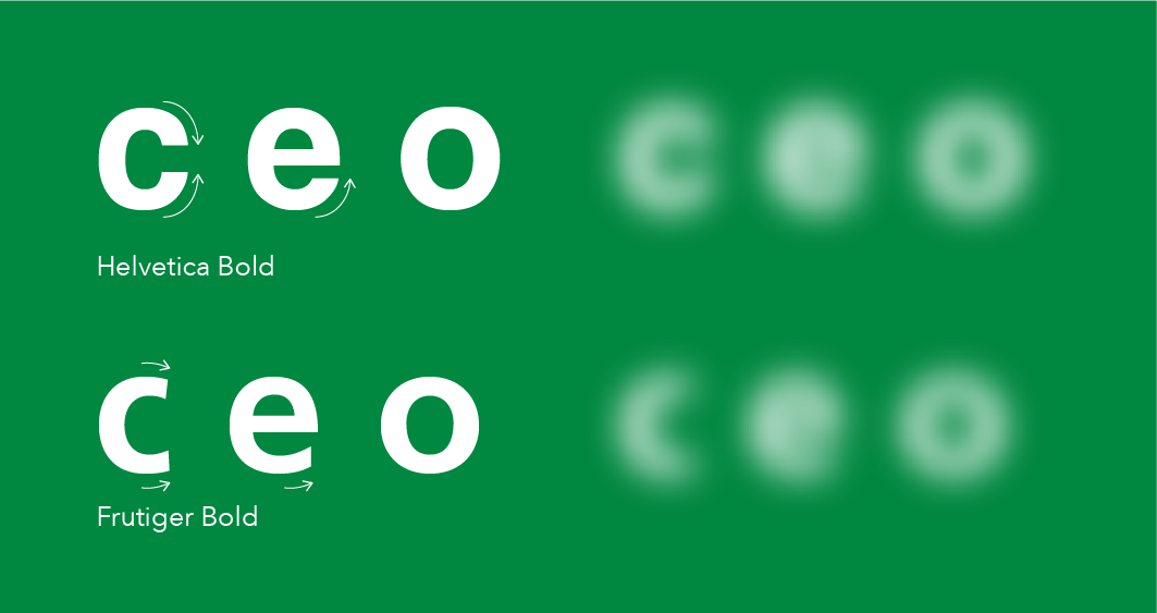
Legibility also goes through the specific forms of individual letters. In particular, the typefaces that are suitable for signage are those that are able to correctly distinguish all letters. Some typefaces like Futura, given their clean and geometric design, have some letters (and numbers) that look very similar, and in case of quick reading could be confused.
The readability of words and text composed with these characters is also essential. Fundamental concepts such as spacing between individual letters come into play, which ensures the legibility of the message at different angles and at speed.
Speed, a key concept when addressing a signage project. All these parameters are essential when the speed of the subject reading is at its maximum and therefore the reading time of the message is at its minimum. By reducing it, these rules can be less stringent and the choice of a typeface can be more open. Let’s therefore take a look at different examples of typefaces applied to signage projects, starting with those where the subject reads the message at maximum speed, then moving on to examples at medium speed, and finally with projects at minimum speed.
In this context, the best case to examine is certainly road signage, that is all the signs we find on roads and especially on highways. In this case, we are talking about typographical characters specially designed for this scenario, that is very high speeds and sometimes unfavorable reading conditions such as darkness and rain.
The classic example is that of American highway signs, where the famous green signs display the information set in Highway Gothic.
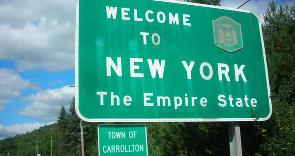
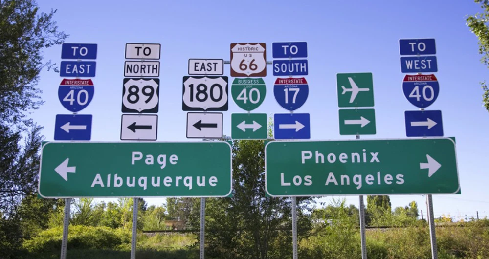
Designed by Ted Forbes for FHWA (Federal Highway Administration), Highway Gothic is a family of 6 fonts, named “A”, “B”, “C”, “D”, “E”, “F”, where “A” is the narrowest and “F” the widest. It can be noticed right away how in this case the previously mentioned rules are respected, especially regarding the generous spacing between one letter and another. However, this character has a rather sharp-edged nature of the letters, and the internal counterforms of the letters are very small (especially in the lowercase letters “a” and “e”), which compromises the individual legibility (legibility). For this reason, FHWA recently commissioned the design of a new character that would solve these issues.
Clearview is a linear typeface designed on a purely humanistic basis, with generous open counterforms, large lowercase letters compared to uppercase (x-height), soft curved strokes, and ample spacing between letters. It seems like the perfect typeface to replace the more angular predecessor, but something gets in the way in the process. For reasons that are not entirely clear, the replacement process is interrupted and now both typefaces appear on the American highway signs.
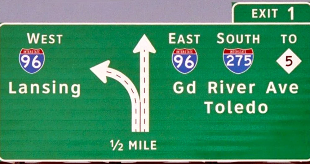
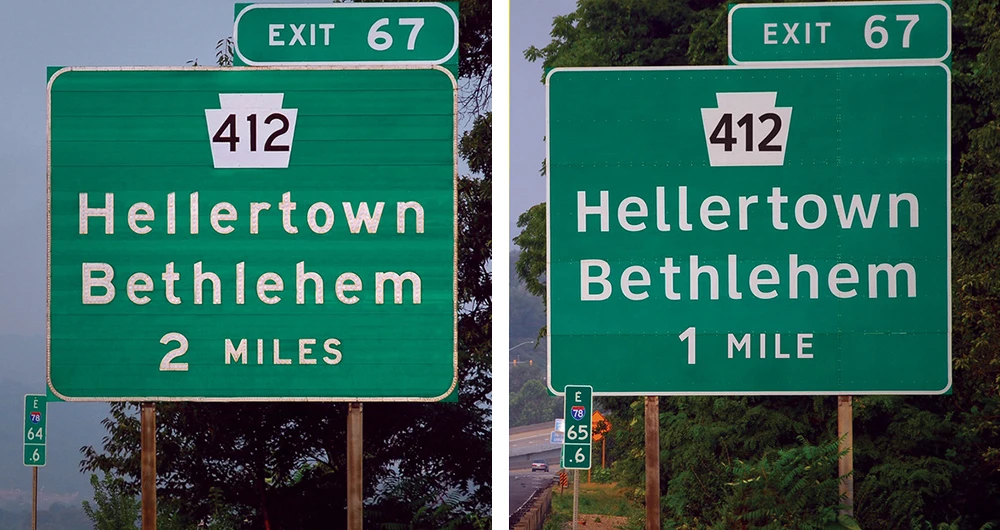
The visual recognisability of Highway Gothic is undeniable and for this reason it has also been a source of inspiration for type designers. Interstate, a typeface designed by Tobias Frere-Jones, is a reinterpretation of Highway Gothic. Its allure linked to speed prompted Lamborghini to choose it as their corporate typeface.

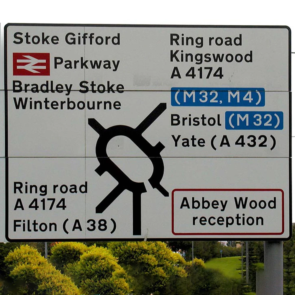
Returning to the initial topic, in old continent, the design line for the signage of highways is opened by the United Kingdom around the beginning of the 60s, with the introduction of the Transport typeface. Designed in two weights, Medium and Heavy, this typeface has generous counterforms and abundant spacing. This design of the letters, in addition to making the character very recognizable, also makes it readable in terms of legibility and readability. Variations of this typeface will be designed and used by other countries.
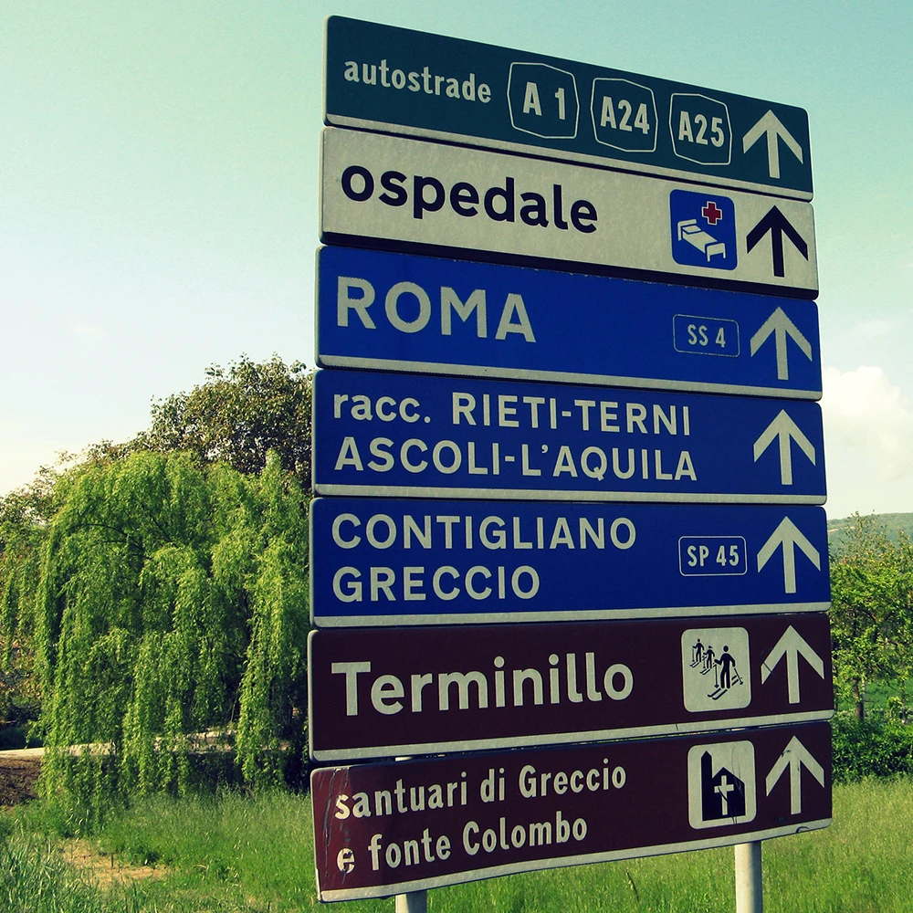
One of the countries using a variant of the Transport font is Italy, which has been creating a slightly bolder version of it for road and highway signs since the 1980s. The name of this typeface is Alfabeto Normale and it is used in combination with a secondary typeface, Alfabeto Stretto, specifically designed from the Normale to respond to the needs of writing longer and more complex information.
In Germany, on the other hand, the typeface for road signage is the famous DIN 1451, in the three widths Engschrift (condensed), Mittelschrift (normal) and Breitschrift (extended). It is classified as a “realistic” sans serif because its forms, while being essential and almost geometric, are absolutely legible and well distinguished. Not surprisingly, it is the typeface of the German Institute for Standardization (Deutsches Institut für Normung), from whose acronym the name DIN comes from.
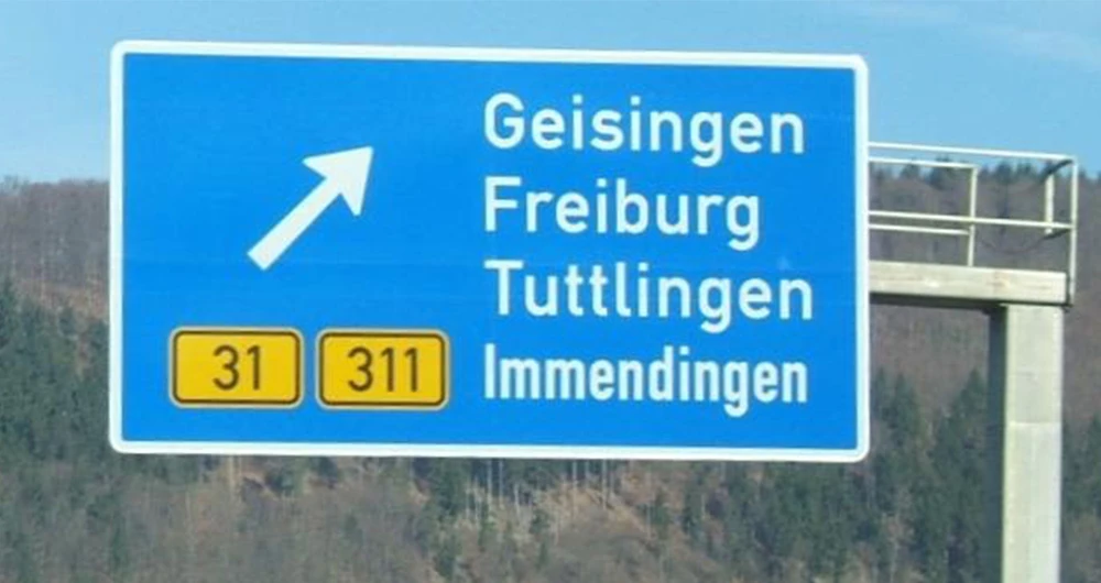
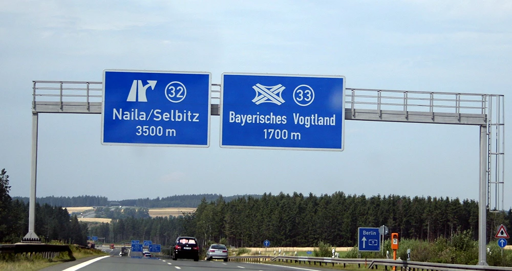
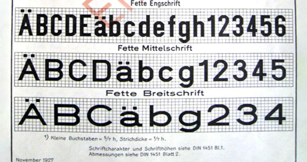
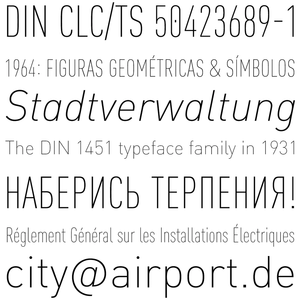
The clean and essential forms of this typeface have elevated it to a level of notoriety that its use has not been confined to road signage alone. It has been used for many different types of projects, especially thanks to the numerous restyling that has taken place over the years. The most famous is certainly FF DIN, from 1995, by Albert-Jan Pool. This typeface, in the following years, thanks also to many other type designers, has become a super family containing an infinity of variations, among which a rounded version, a slab, a stencil, up to the present day, with variable versions.
By decreasing the reading speed, it is possible to notice how the chosen typefaces differ. Since the extreme reading conditions of “maximum speed” are not present, many more typefaces can be used.
One of the areas that can be analysed in this context is subway’s signage projects. The most emblematic and famous case is probably the London Underground, where the typeface used is Johnston, named after its creator Edward Johnston, who designed it in 1916. From the point of view of letter design, Johnston can be classified as a humanist typeface. These recall the shapes and strokes of handwriting due to the open and easily legible counterforms. The capital letters take inspiration from those of the Roman Empire. In addition to being one of the first typefaces used specifically for signage, it is also one of the first corporate typefaces, or a typeface designed specifically for an institution and its visual identity.
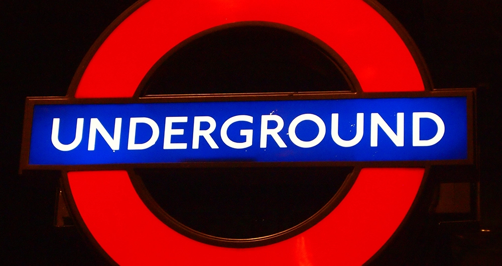
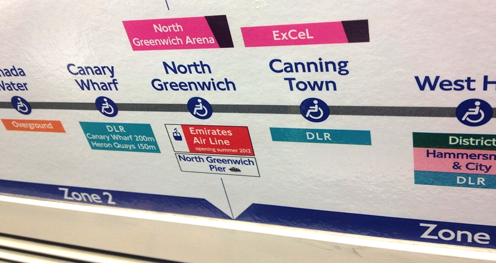
Even the famous Eric Gill, as Johnston’s student, participated in the design of this typeface. In fact, it is easy to see how working on this project inspired him when he designed his Gill Sans.
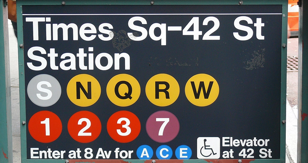
Flying overseas, it is possible to analyse another iconic case: the New York subway signage. A mid-1960s project that certainly made history, the work of a designer duo that in some way dictated the guidelines for this type of project. We are talking about Massimo Vignelli and Bob Noorda, who at that time formed the Unimark studio. For the New York subway signage the typeface used is Helvetica, and this is certainly one of its most famous uses. As mentioned earlier, the grotesque shape of the Helvetica letters (with counterforms that tend to close) is not the most suitable for a project of this kind. However, with good letter spacing, even Helvetica can be a suitable choice.
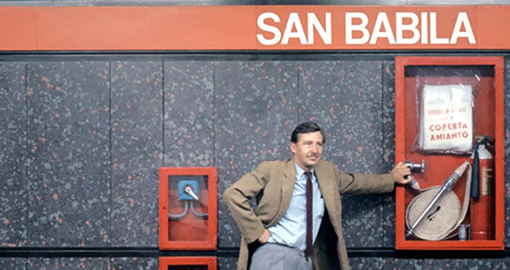
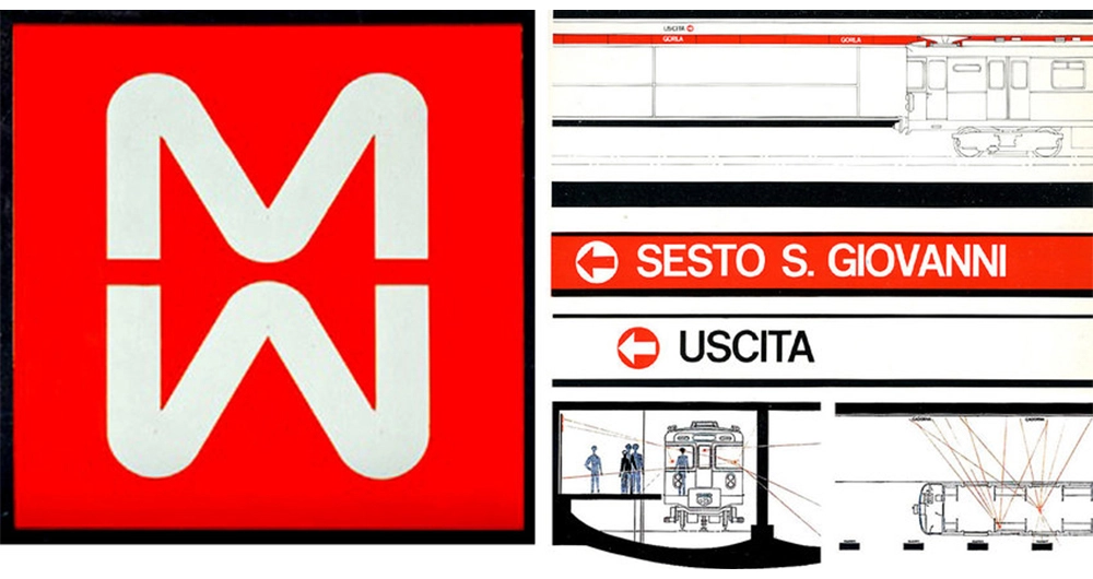
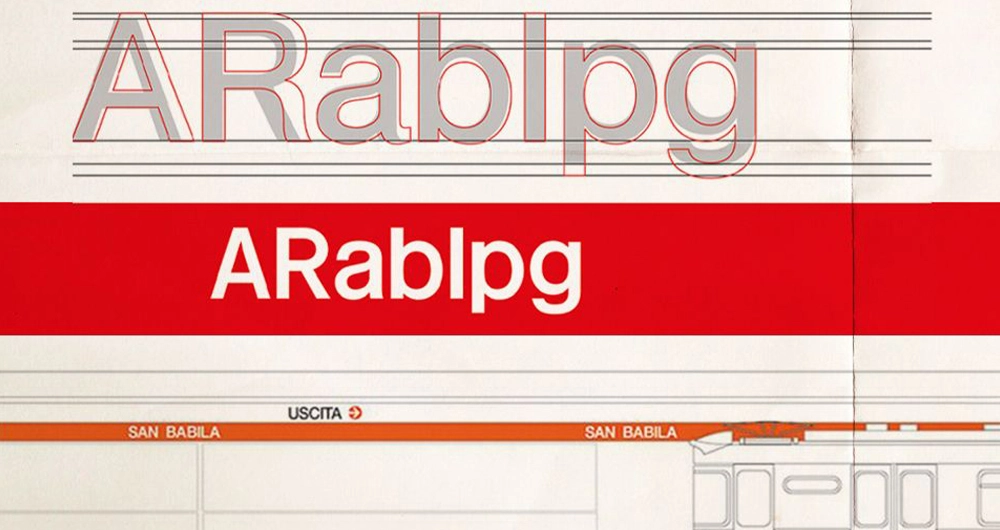
Returning to the old continent, in Italy, more precisely in Milan, the subway signage project is followed precisely by Bob Noorda. Also in this case, we are talking about an iconic project that earned the designer the prestigious Compasso d’Oro award. The spirit of the project is the same as the American one, namely the need to simplify a complex system by reducing the number of typographic variables. And also in this case, Helvetica took care of this simplification. More precisely, Noorda used his personal version of Helvetica, which he called by his name: Noorda. This modified version features lowercase letters with shortened ascenders and descenders and recalibrated letter spacing. This allowed for the best use of space in the famous horizontal coloured bands that show the names of Milan’s subway stations.
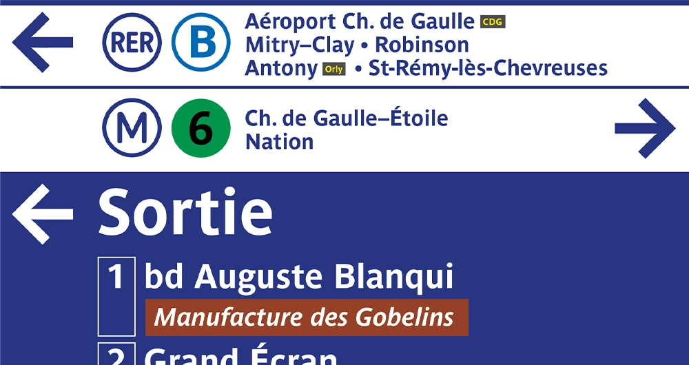
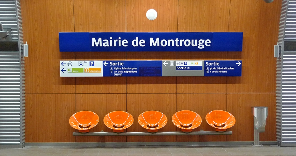
In this context, it is also worth mentioning the project for the Paris subway. Also in this case, a custom-designed typeface was created specifically for this use: Parisine. Designed by Jean François Porchez in 1996, this typeface takes into strong consideration the rules described above. It is indeed of humanistic origin, with open letter counterforms, a generous lowercase height compared to uppercase, and good spacing. In addition, the letters have a gentle curvature that pleasantly helps reading and makes it very recognisable. In the case of Parisine, we are talking about a very extensive family of characters, consisting of several weights and widths.
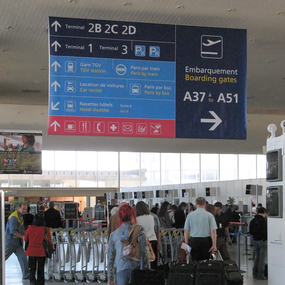
In the context of medium speed reading, it is worth mentioning airport signage projects where, some of the most important ones, use a specific typeface: Adrian Frutiger’s Frutiger. City airports such as Paris, New York, Amsterdam, and London all use Frutiger for their internal signage. It is no coincidence that Paris is mentioned first, as this typeface was originally commissioned for the signage project at Charles de Gaulle airport in Paris in 1968. Frutiger is also a humanist typeface, with open counters and easily distinguishable letters, and it has been incredibly successful, transcending the boundaries of airports to become one of the most widely used typefaces in the world today.
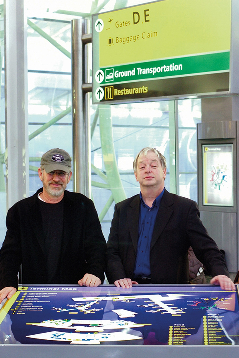
The signage project for JFK Airport in New York (again using Frutiger) also played a prominent role in the Steven Spielberg film “The Terminal”. The collaboration between the director and the designer in charge of the signage project, Paul Mijksenaar, was crucial for the film’s shooting.
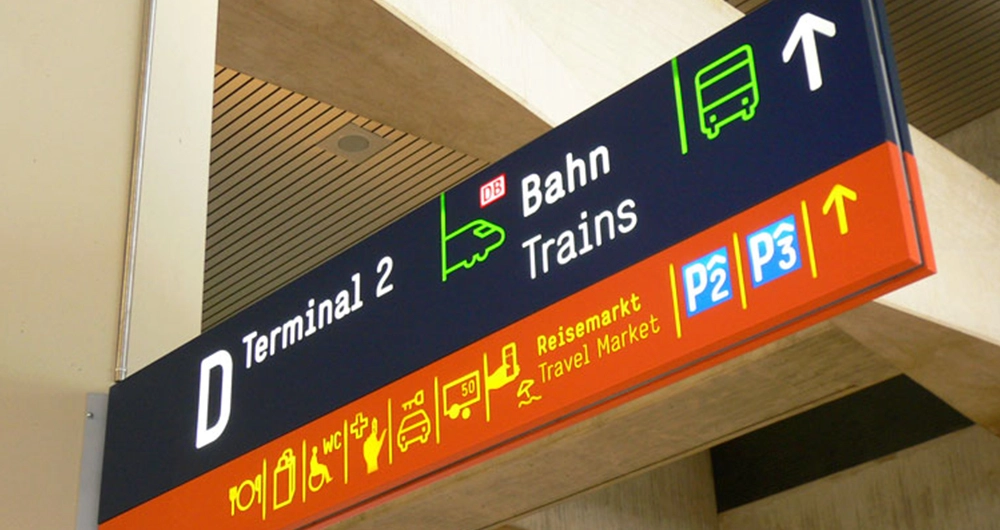
In this context, there are other interesting examples, such as the signage projects for Cologne-Bonn and Vienna airports, both designed by Ruedi Baur. The first case sees the use of a custom version of the Simple typeface (designed by the NORM studio), a geometric typeface that is very clean and rational, but with slightly rounded edges that make it human and friendly.
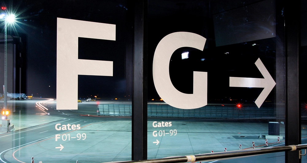
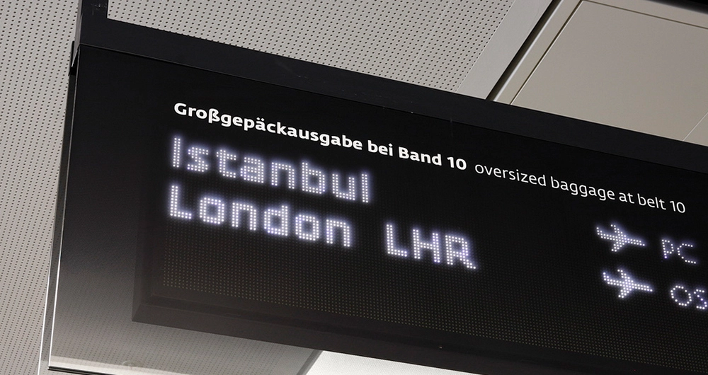
In the second case, the Vienna airport signage uses Fedra, one of the most extensive and complete super typeface families ever designed. In particular, the sans-serif version of Fedra is used in this project, including a “pixel” variant designed for messages displayed on LED screens that show flight information at various gates.
It’s time to slow down the reading speed. Let’s go for a minimum speed, which is a walking pace. In this context, signage projects feature more expressive characters, not just linear sans serif typefaces.
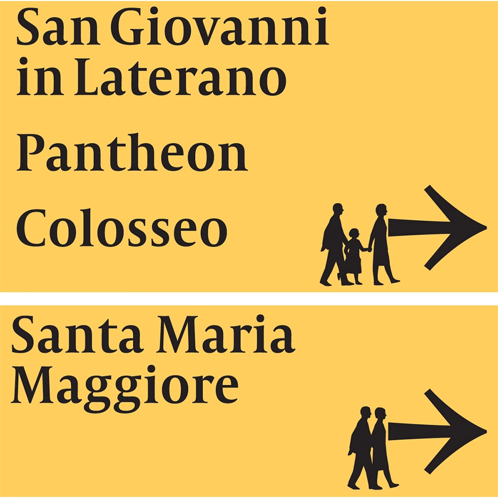
As a first example, we can mention the signage project for the Jubilee of 2000. In the streets of Rome, during the year of the celebration, a signage project was developed based on the use of a custom designed typeface. This is Capitolium, designed by Gerd Unger. Its uniqueness is immediately noticeable as a serif typeface, which is not often used in this context. However, it should be emphasised that Unger managed to create a typeface that is both elegant and very legible. It is worth noting that the serifs Unger designed are hinted at just enough to provide classic elegance in line with the project context. In addition, the contrast is not excessive, the lowercase height is very generous, and the letter spacing is more than adequate.
Staying in Italy, more precisely in Bologna, we observe the signage project of MAST (Manifattura di Arti, Sperimentazione e Tecnologia) designed by Tassinari/Vetta studio. Also in this case, a custom typeface was designed, the eponymous MAST designed by Jonathan Pierini, both for signage and for the identity itself. It is a very elegant and clean grotesque typeface, without visible contrast.
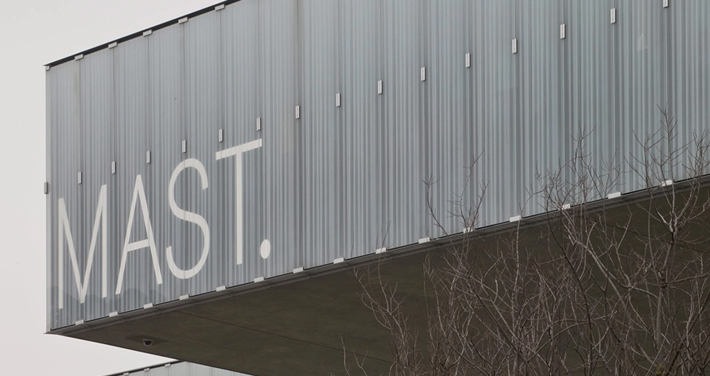
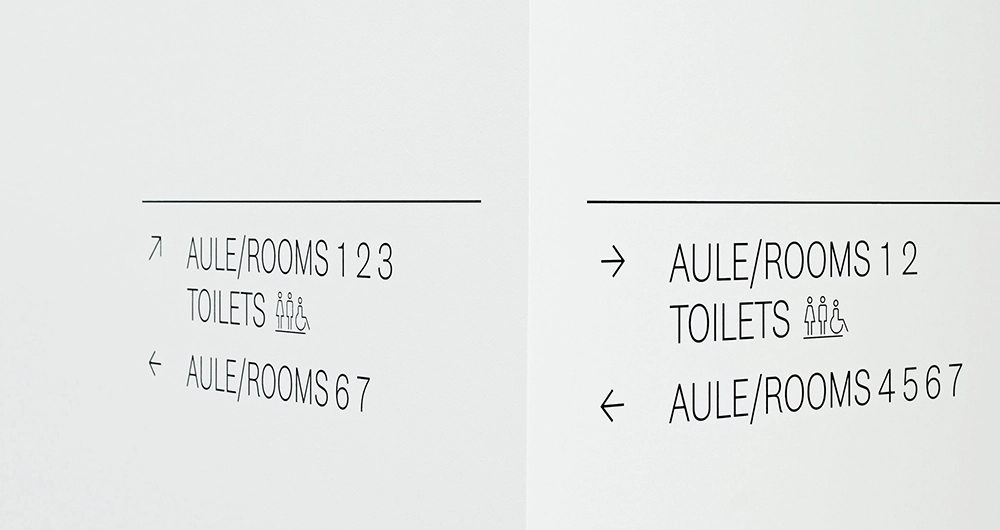
The real peculiarity of this typeface is in its display variations, which are characterised to identify the different activities present in the structure, creating real visual identities for each of them.
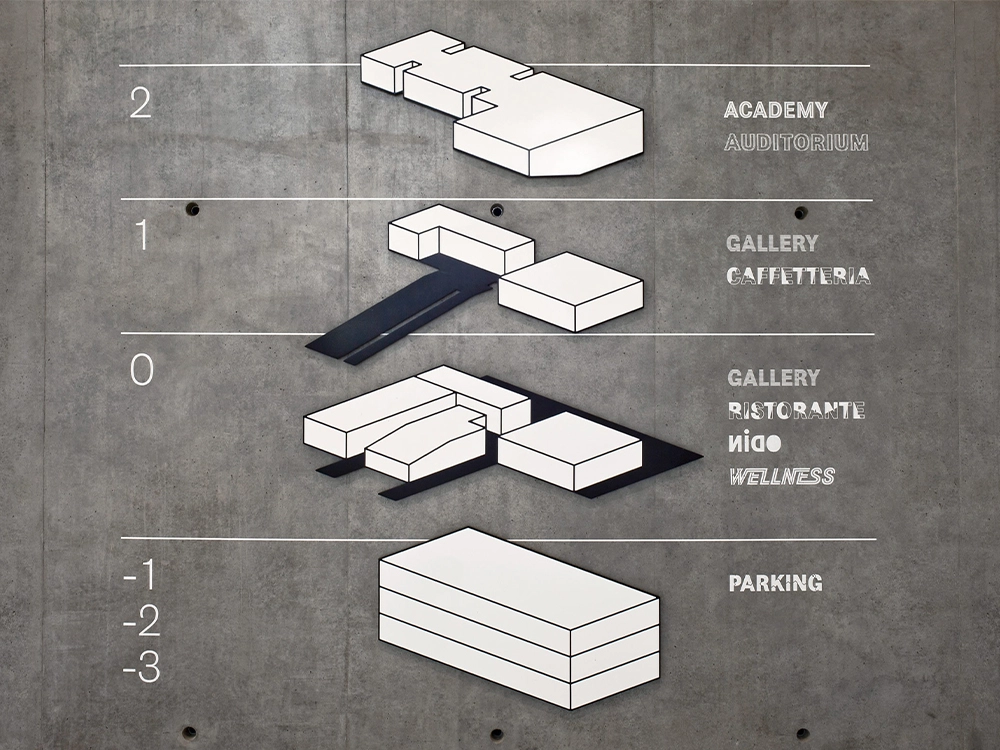
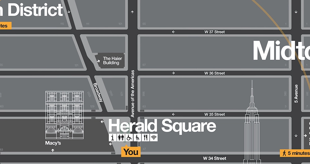
Let’s fly back across the ocean to New York to talk about another city signage project, one aimed at pedestrians. Not only does the subway need a navigation system, but so does the city itself, in its paths through the infinite streets that cross it. For the WalkNYC project, Pentagram studio (with the support of CityID and other studios) created an interesting system of maps showing everything that can be reached within a 5-minute walk, whose peculiarity is to be rotated in the reading direction of the person reading it, not according to the cardinal points. The visual focus is therefore shifted from an “aerial” position to a flat view, i.e., what stands in front of the person reading the map.
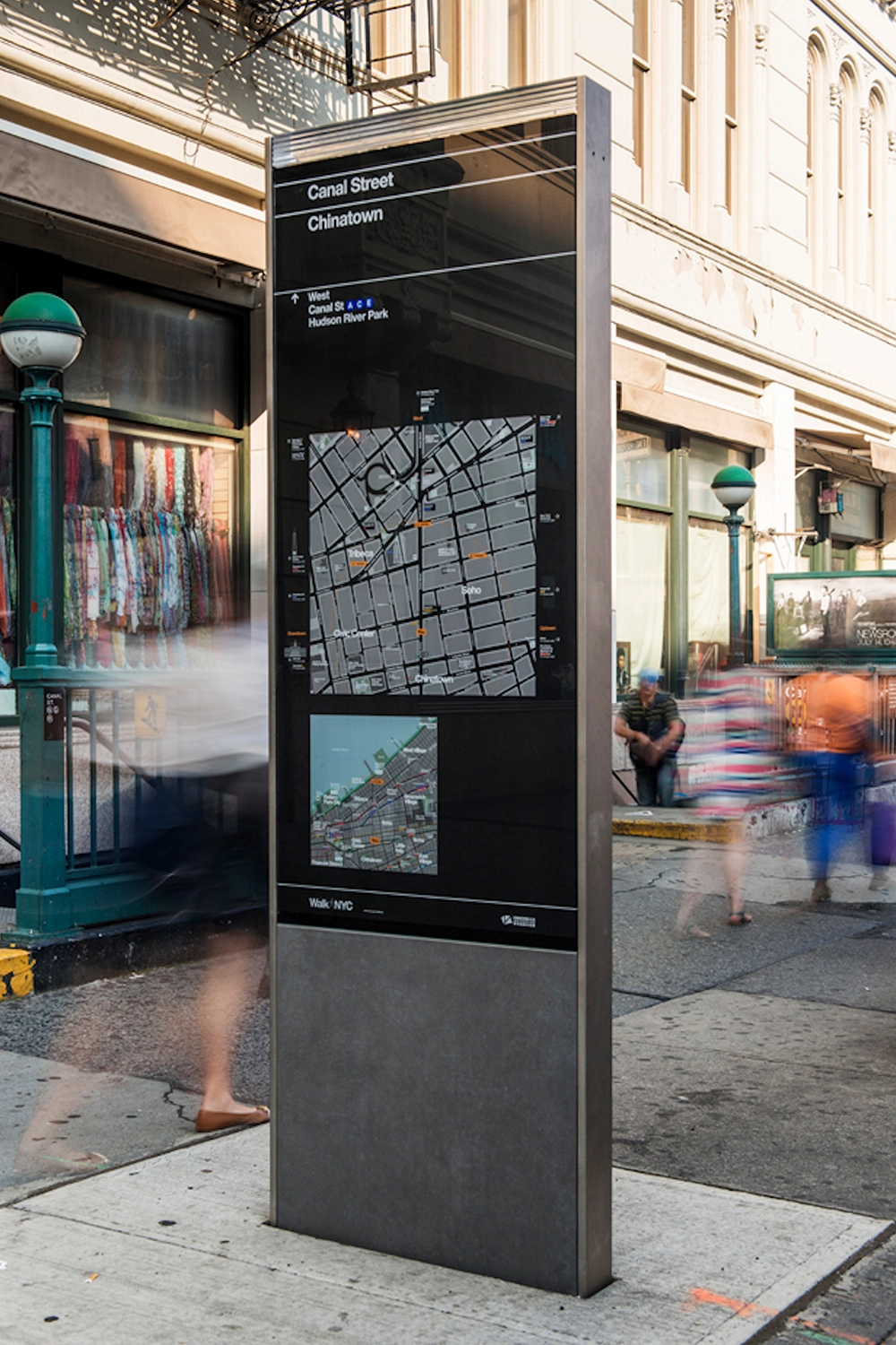
The Helvetica typeface was used again (this time in the Neue version, less rigid and better spaced than the original), redesigned in a variant called DOT (acronym for Department of Transportation), in which the dots in lowercase letters (like i) and punctuation marks are rounded. Along with the typeface, all icons were designed following the structure and curves of the typeface.
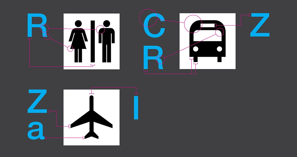
We have come to the end of this journey, traveling at different speeds and with different reading times and needs. What is clear from these examples is that signage is a very complex and deeply analytical field, where graphic design plays a fundamental role in organising information and where the ultimate goal is to indicate the right path, but also, why not, to tell something more. Always researching and using the right typeface, no matter what.
Davide Molinari, Senior Visual Designer
Privacy Overview