This story begins in the early 1930s, a complicated period full of contrasts. Great scientific achievements, such as the discovery of the neutron, are eclipsed by the approach of a new war that would change the world. These were also important years in the field of typography, with milestones such as Eric Gill’s Gill Sans, Stanley Morison’s Times New Roman and the protagonist of this story: Berthold Wolpe’s Albertus.
To understand the genesis of this typeface it is useful to frame its creator, Berthold Wolpe, one of the most influential designers of his time. Born in Germany, he became a pupil of Rudolph Koch (author of famous typefaces such as Kabel), with whom he cultivated his passion for letters and engraving. Forced to emigrate due to his Jewish origins, it was in London that Wolpe found his dimension as a graphic and type designer. In particular, it was the meeting with Stanley Morison of Monotype that santioned its consecration. Morison noticed Wolpe’s engravings and convinced him to turn them into a typeface for printing. The rest is history.
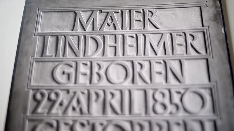
Albertus (from Albertus Magnus, German friar and philosopher) is a typeface with a strong personality, whose shapes, proportions and contrasts clearly derive from German engraving and rigor, but also manage to communicate a certain British style and allure. As Jonathan Pelham (Wolfe’s colleague for many years) recalls, Albertus managed to bring together different identities within itself: modern and vintage, rigidly formal but vaguely eccentric, folkloric but at the same time empirical.
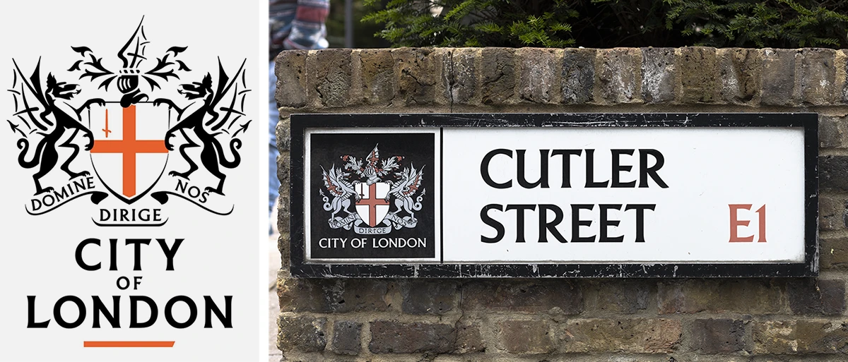
London itself fell in love with the unique characteristics of this typeface: Wolpe’s adopted homeland still uses it today in the coat of arms and road signs of the City and Lambeth district (where Wolpe lived until his death in 1989).
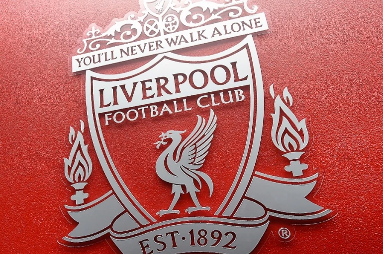
Staying on English soil, Albertus has also managed to bewitch the Liverpool football club, which uses a slightly modified version of the font for its crest and for the famous adage “You’ll Never Walk Alone“.
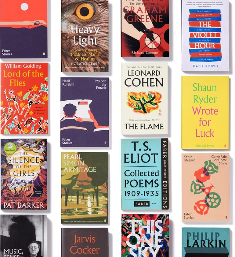
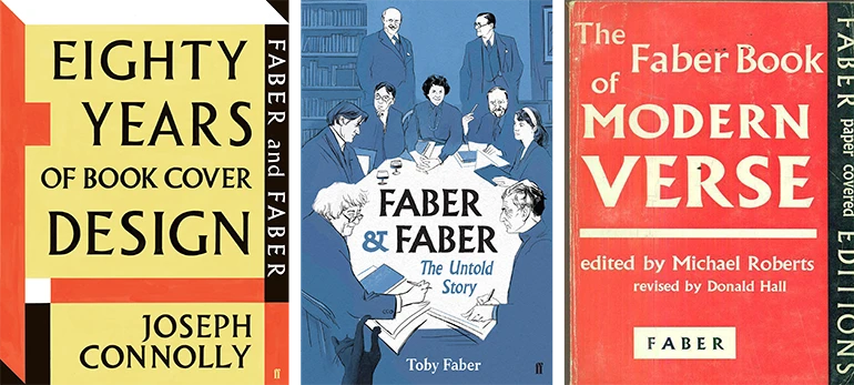
However, it is in the book covers of the Faber and Faber publishing house that Albertus found one of its most iconic manifestations. Wolpe had been collaborating with them for nearly 40 years, designing more than 1500 covers. Some of them are made with hand-made lettering, others with fonts such as Pegasus, Fanfare and Tempest (all designed by Wolpe himself), while many, many others are made with Albertus. This allowed the font to become a real British style manifesto, still recognizable today. Donna Payne, Faber’s current creative director, remembers that when she was hired, Albertus almost had its own “personal office” within the publishing house.
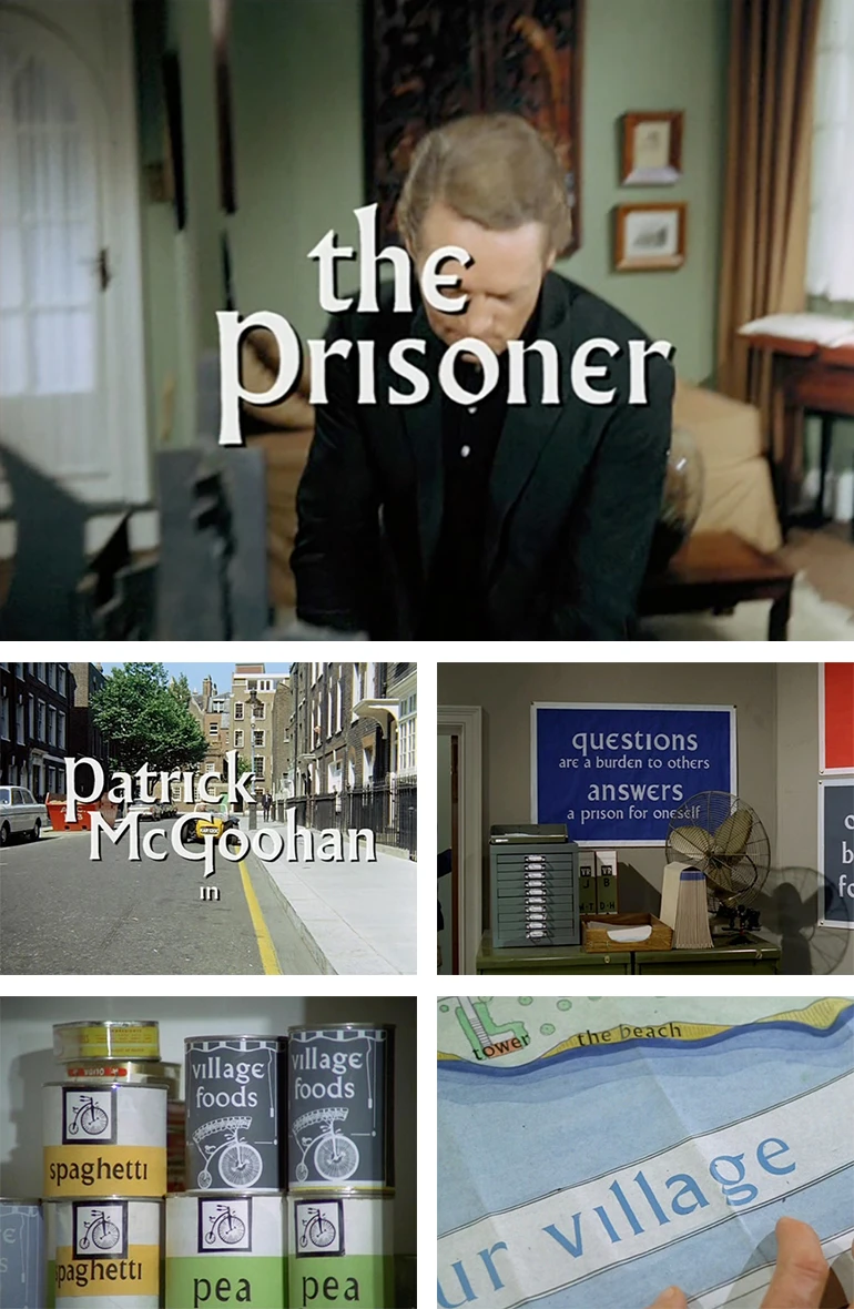
Even in television, the typeface became a cult icon. The political fiction series “The Prisoner” used a version of the Albertus not only for the titles, but also for the applications printed within the scenes, such as posters, signage and packaging.
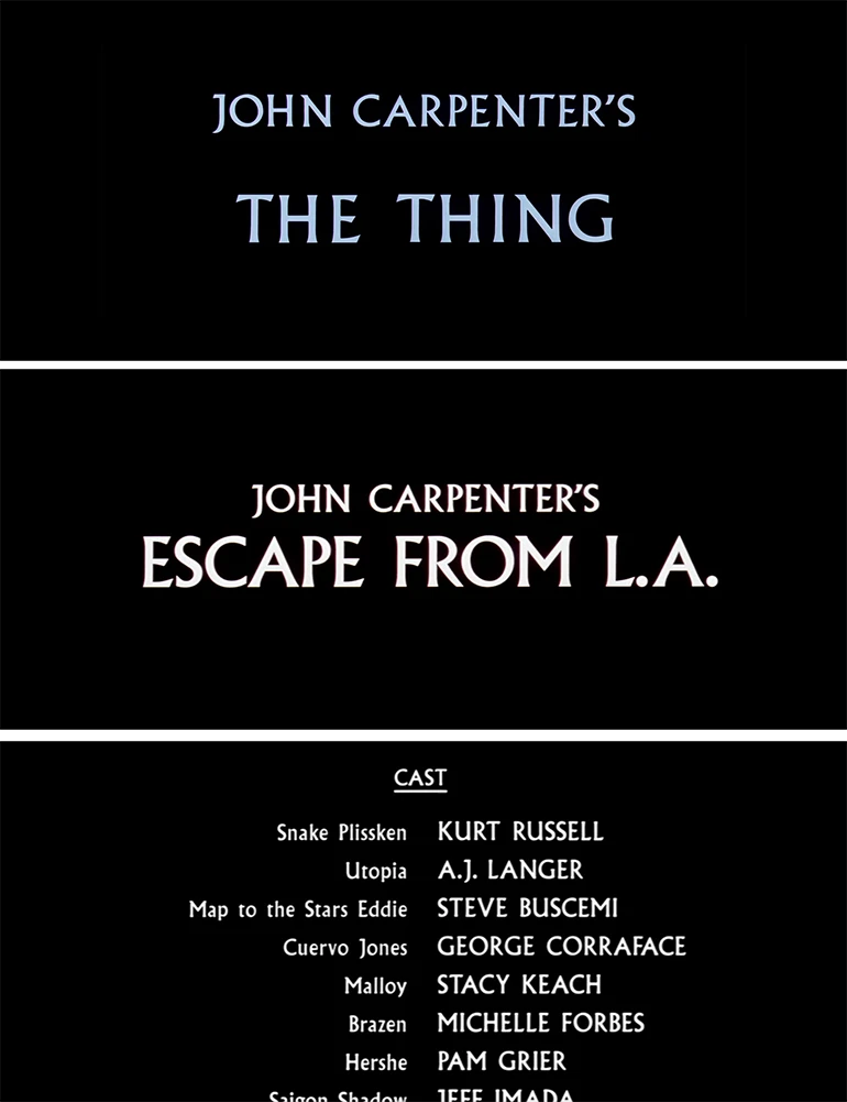
Among the film directors it was John Carpenter who fell in love with it, adopting Albertus as the typeface for the titles of iconic movies, such as “The Thing” and “Escape from L.A.”.
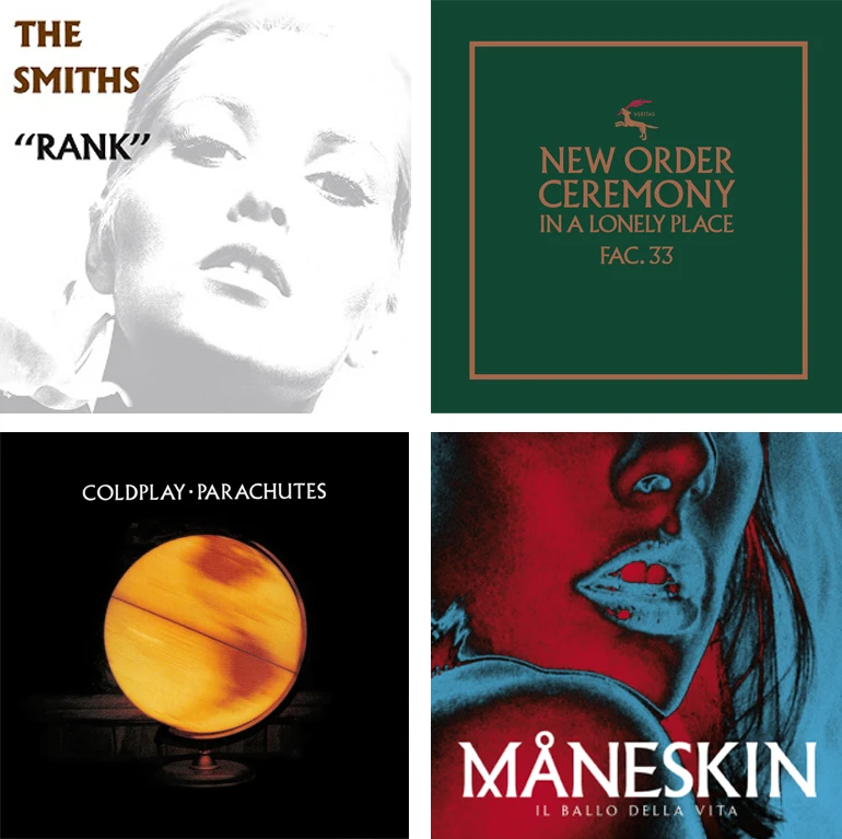
Albertus also left its mark in music, appearing on many album covers of famous bands such as Coldplay, New Order, The Smiths and, more recently, Måneskin, who used a custom version of the typeface.
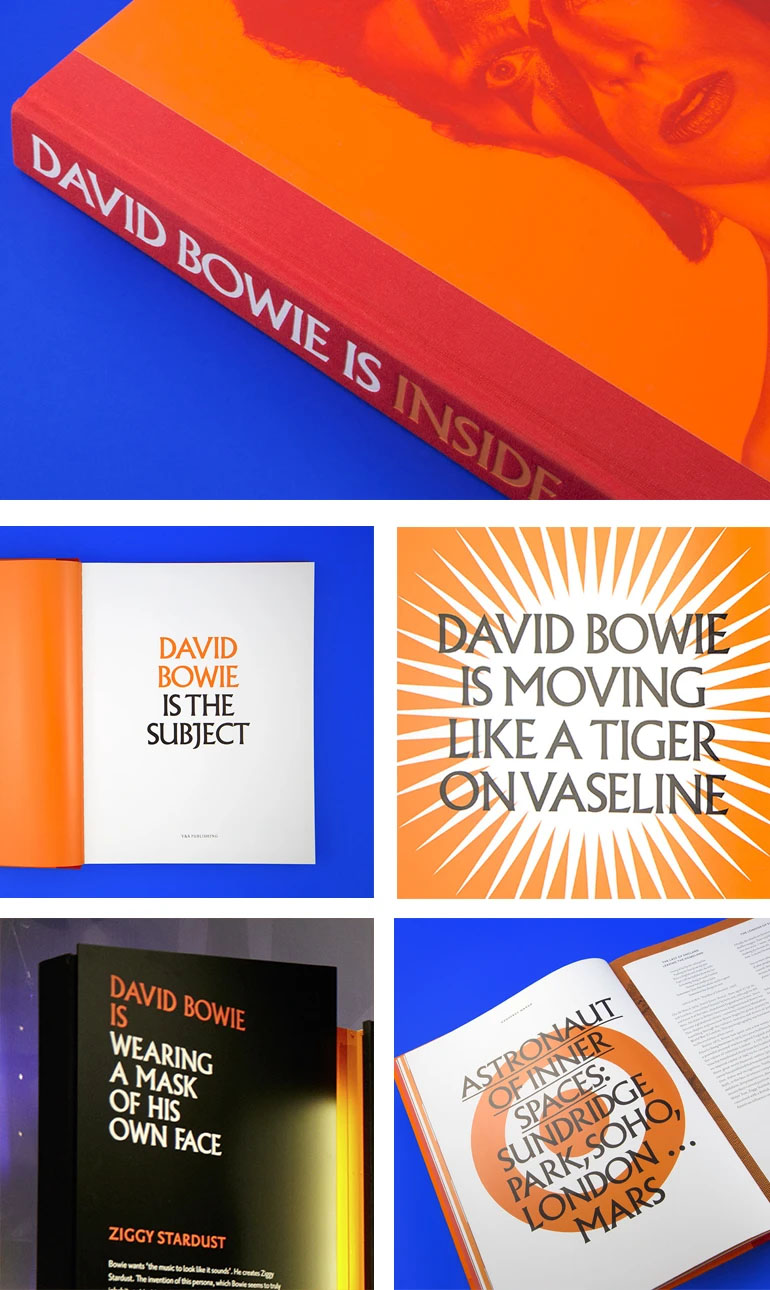
Remaining in the musical field, Albertus was used for the “Davide Bowie is” exhibition, designed by Jonathan Barnbrook and Jonathan Abbott for the V&A Museum. The choice was not accidental. Abbott points out how the nature of the font, between modern and traditional, sans and serif, puts it in a creative “slippery middle ground”, which perfectly represents Bowie, his art, his work and his cultural impact.
The dualisms that it manages to express and the different souls that are part of its nature elevate the Albertus to an iconic status, but at the same time within everyone’s reach.
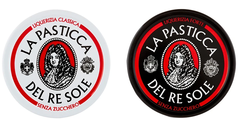
One example, in Italy, is the packaging of the popular licorice candy “Pasticche del Re Sole”, where the font stands out flanked by the effigy of Louis XIV.
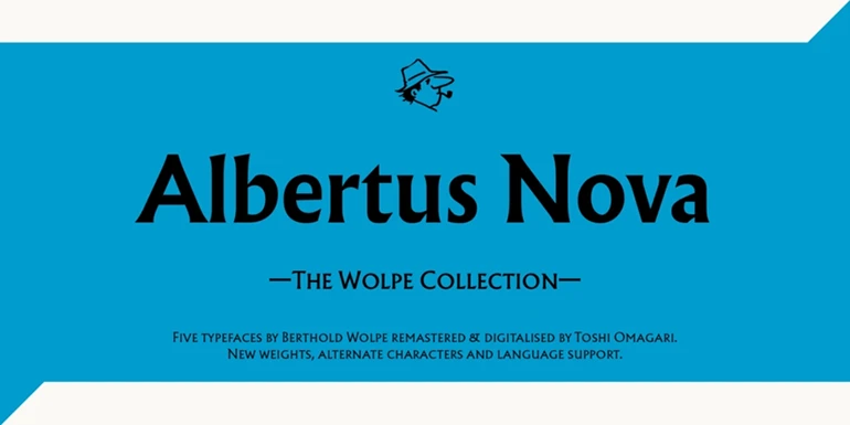
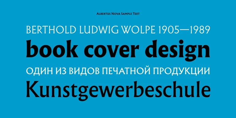
To celebrate this masterpiece and other Berthold Wolpe fonts, in 2017 type designer Toshi Omagari redesigned and digitized a series of Wolpe fonts for Monotype, including Albertus, which was reborn in a new guise, Albertus Nova, with a large set of weights and stylistic alternatives.
In particular, with regard to this new version of Albertus, it is worth noting the presence of several alternative letters, taken from the original engravings by Wolpe and the lowercase “e” present in the television series “The Prisoner”. An interesting easter egg that highlights Omagari’s sensitivity in taking into account not only the historical genesis of the character, but also the stylistic evolutions it has had over time.
It is not easy to find an answer as to why this font still works so well after all these years, always remaining iconic and relevant. A possible explanation is always provided by Jonathan Abbott: “When a typeface is in fashion for a short time, years later it can seem very old-fashioned. But since Albertus is a historical character, it somehow transcends trends, being neither inside nor outside. Perhaps this is a hint of its timeless aura.”
A valid argument, which finds further meaning in Wolpe’s own words: “Typography, after all, is just an explosive mixture of readability and common sense.”
Davide Molinari, Senior Visual Designer

