France
Paris
Switch to your local agency
Retour au menu
The relationship between the female world and the labour market has always been complex. Commonplaces and stereotypes have conditioned and still condition the access of women to numerous professions, especially in certain sectors considered the prerogative of men. Obstacles are often rooted in the culture and habits of many sections of the population. However, there are companies that strive every day to overcome them, trying to reduce the gender gap with concrete actions. This is done, in particular, by Gi Group, which we have joined in a collaboration that has included branding and communication, design and development.
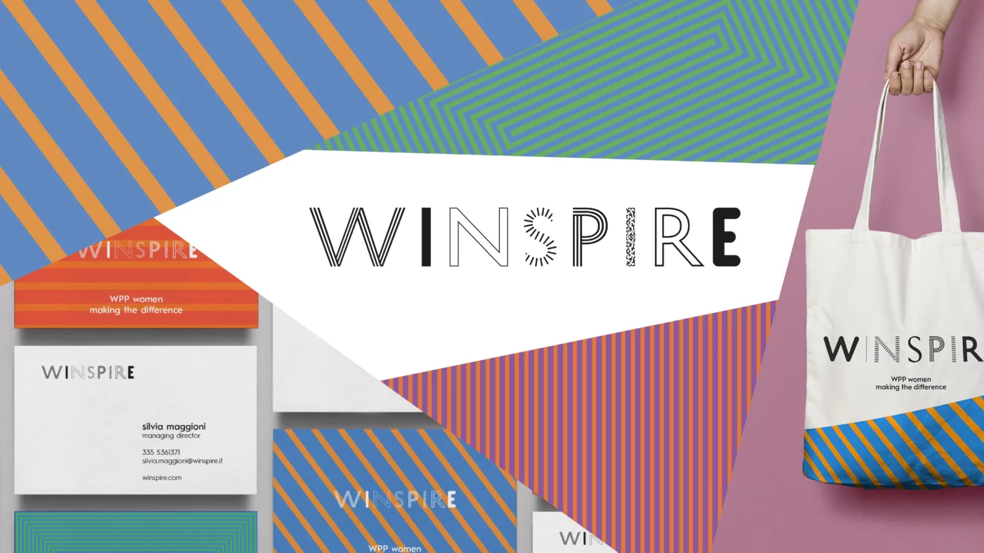
At CBA we had already dealt with this issue with Winspire, creating the brand of an internal WPP project aimed at enhancing the talent and uniqueness of all its employees.
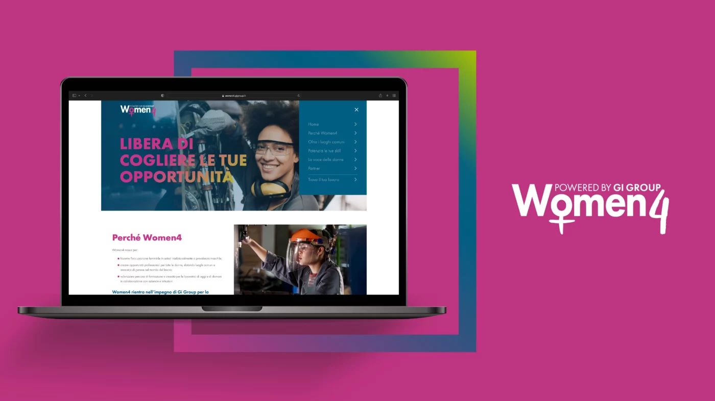
With Women4 we took a step forward, helping the first Italian multinational labor company to promote women’s employability in sectors such as logistics, transport, mechanics and ICT, while strengthening its positioning around the concept of Sustainable Work.
To be truly effective, Women4 needed to address, on the one hand, the target of candidates (the main beneficiaries of Gi Group’s commitment), and on the other hand, the most important public and private stakeholders (who play a decisive role in the evolution of the labour market).
We worked side by side with the Group, starting with the definition of the statement and the values of the project.

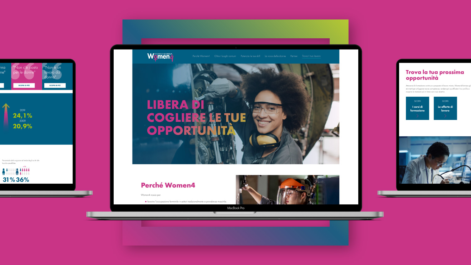
With a view to customer centricity, we then moved on to identifying the needs of female workers and professionals. Thanks to the research and data owned by Gi Group we defined concrete objectives, reflected in the structure and content of the website.
Authenticity and inclusiveness have guided every lexical and visual choice, balancing the Gi Group identity with a universally accessible language.
The symbol itself of Women4 represents this balance.
The empty square, used as a contour, serves to leave room for people, as Gi Group is positioned as a container that frames the life of the workers, who are the real protagonists of the project. To emphasize the will to meet the women’s needs, spontaneous brushes have been applied within the brand – including the famous symbol of Venus.
Going beyond clichés, we combined blue and yellow with fuchsia and white, applying this color palette to all communication touchpoints.
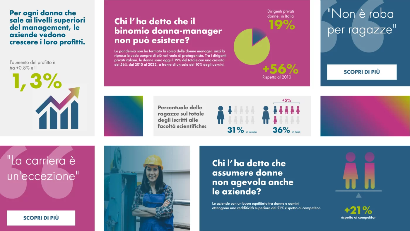
Beyond common places is also the name of a very important area of the website. Through data, infographics and statistics, false myths and stereotypes about the relationship between women and work are dispelled, providing useful information to candidates, companies and institutions.
The message conveyed is that the added value of a person does not depend on gender, but on personal skills and competences. And that, as a result, every woman can find the job that best suits her needs.
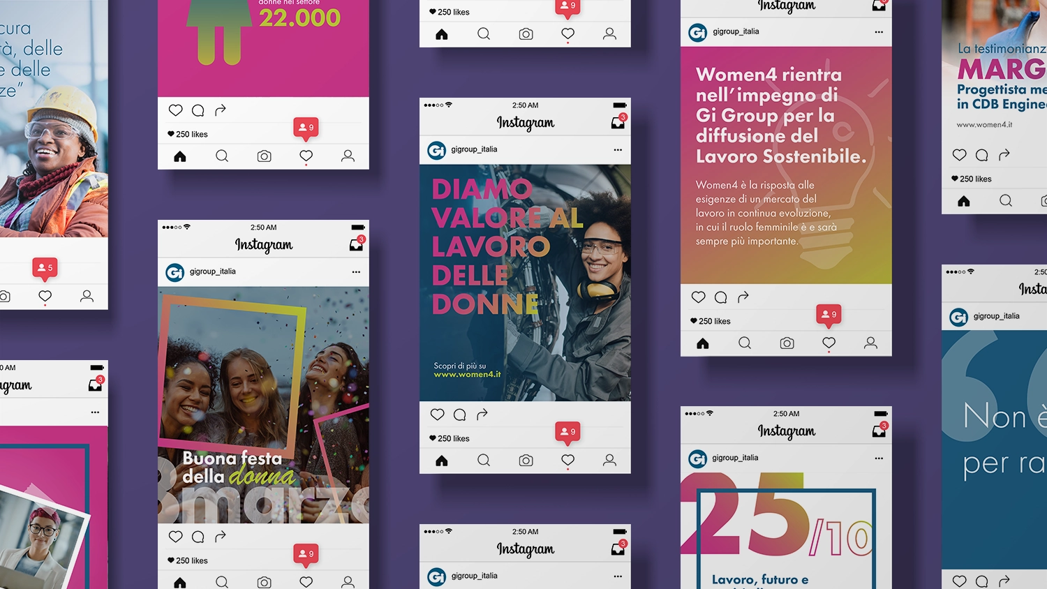
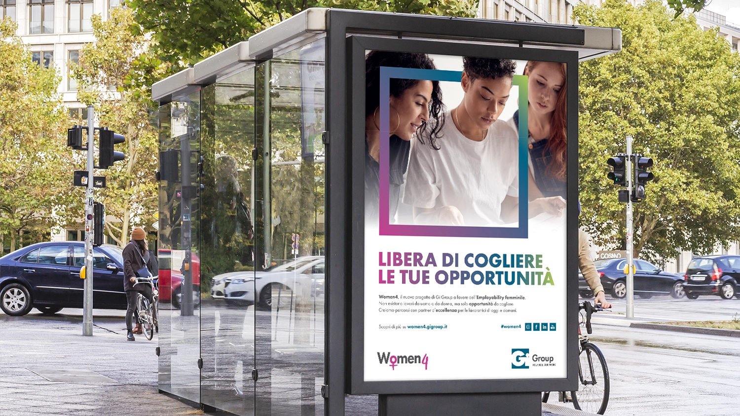
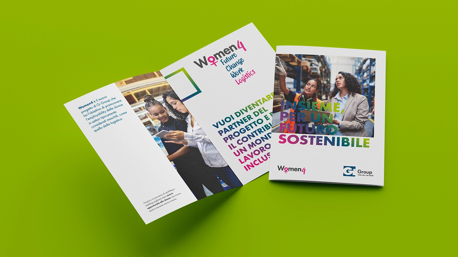
To make the knowledge of Women4 even stronger and more widespread, implemented the contents and values of the project on various on-line and off-line platforms, through a series of formats for social media, brochures, advertising, etc.
Visit the website of Women4
For CBA, talking about sustainability has always meant starting from the facts and working with brands to identify their concrete commitment. Acting as a brand activist is a serious matter because consumers have become increasingly aware and demand greater transparency.
So today, we are happy to tell you more about our journey with Fileni. A project focused on their Purpose, Vision and Mission, which has led the brand to be the first B Corp in the world in its sector.
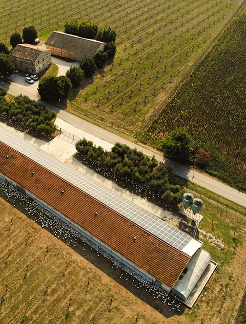
Thanks to the company’s firm belief in its choices in pursuing sustainable innovation for more than 20 years, we have reached this crucial goal. They have worked through tangible initiatives, taking all the steps necessary: organic farming, the production and purchase of electricity with a Guarantee of Origin, antibiotic-free breeding and a Sustainability Report covering the entire supply chain, with the final goal of Benefit Society certification.

Facts first, then. A brand must equip itself with a strategic plan for two fundamental reasons: to guide future choices coherently and to communicate (internally and externally) their long-term project. CBA enters here through a strategic project divided into five phases, involving the company board and the first line of Fileni management.
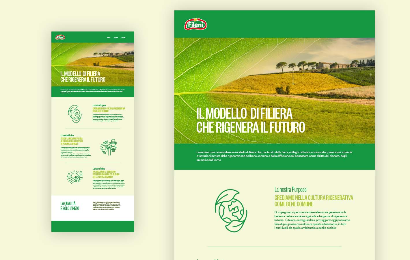
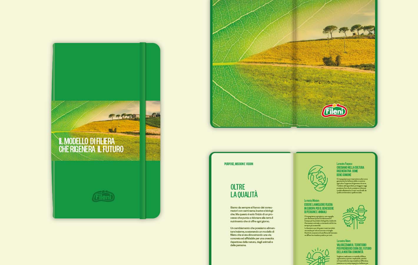
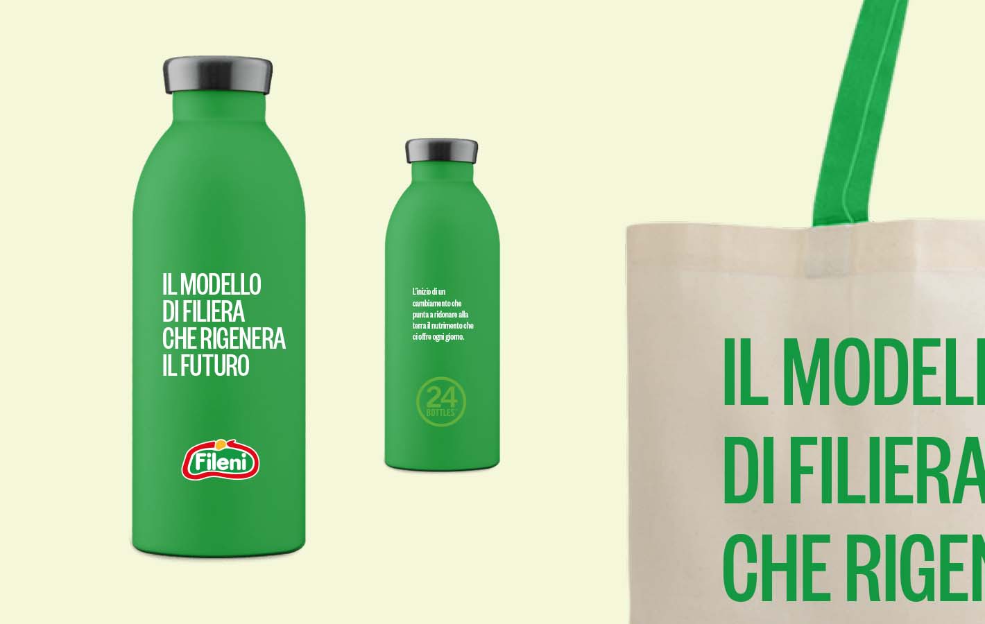
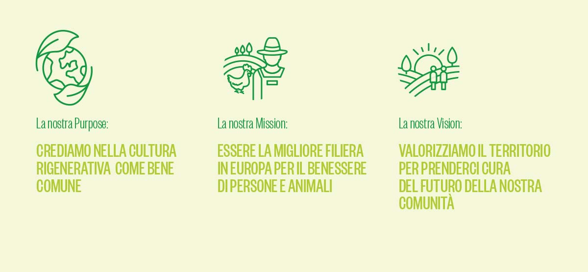
In this newly formulated Purpose, Fileni completely takes on and practices the concept of Regenerative Culture as a common good for all and the new generations in particular.
Today Fileni, with a well-grounded purpose shared by all employees and members of the supply chain, is the standard-bearer of an ethical approach to production and consumption. Their method gives life to a new business model, which enhances the territory sustainably and with profit.
In a world overflowing with boxes, cases and packs, what’s the role of packaging and how will it create a strong relationship between brands and customers?
While a crucial topic as reduction of packaging is (fortunately) already being well discussed and effective solutions are being developed in order to reduce its environmental impact, we decided to dig a little deeper, hoping to spark a reflection on what the future of packaging might look like, starting with the initial queries.
Think you know the answer? Spoiler: there is no single path. Still, one element seems to guide the evolution of packaging, and it’s the one that underlies every single relationship: interaction.
At CBA Italy we investigated what lies behind the packaging-customer interaction, and we came to realise that this relationship has continued evolving over the past years, going through 4 different levels. Let’s have a look at some real-life examples:
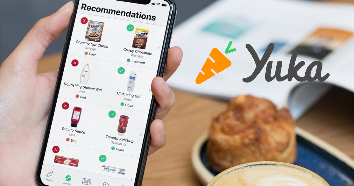
The Yuka app can decipher product labels. Through the scanning of the EAN code, the app analyzes the health impact of food products and cosmetics and gives the examined product a mark from E to A, following its nutri-score scale.
In this type of interaction, the packaging plays a passive role, waiting to get scanned. The interaction is merely functional since it doesn’t provide the user with any particular experience.
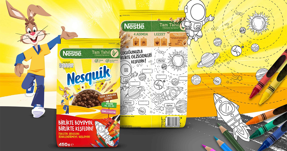
CBA Turkey partnered with Nesquik to create an interactive packaging design for their breakfast cereal. CBA created and developed a colouring area with 4 main themes: Planets, North Pole, Oceans and Our World.
This packaging allows the user to express him/herself while giving the box a second life. The interaction opens to a moment of entertainment and becomes the very first step in the relationship between the brand and its audience.
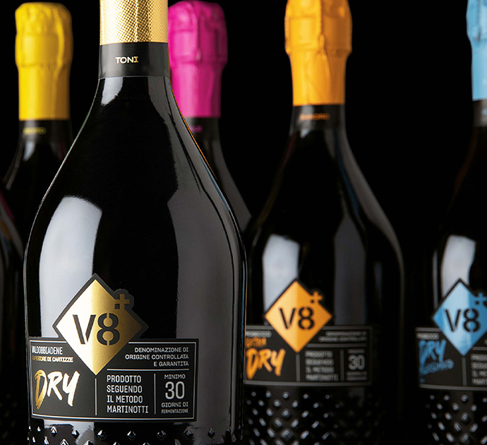
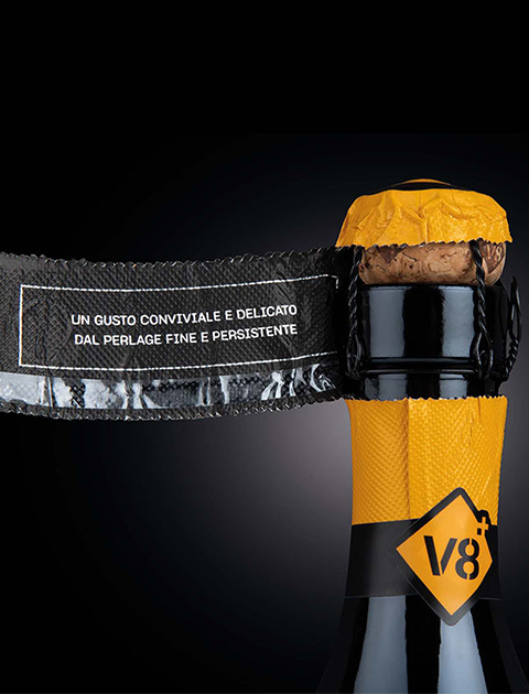
We created a project to re-launch a young Prosecco brand, revising all the brand’s graphic assets and uniting them into a consistent and unified story: the label clearly describes the wine’s characteristics, giving space to the production method; once opened, the capsule communicates the product features.
V8+’s bottles are designed to unveil the incredible story behind every product of their line: this interaction between the user and the product activates a strong bonding process between the audience and the brand while enhancing the product characteristics.
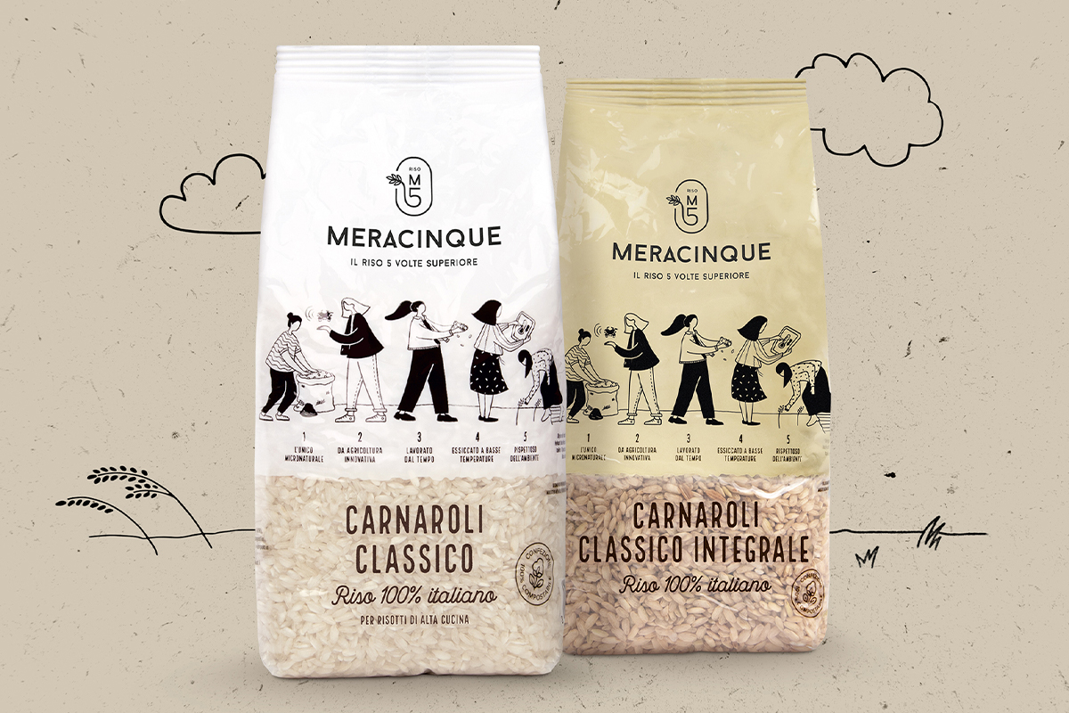
We designed the new identity of Meracinque rice, aiming at conveying the high quality of the product through an emotive and rational consumer-driven approach. The result was the creation of a new pack, where the five sisters tell their story and describe the product.
The story of the sisters and their project occupies a primary position in the pack. The pack was developed as a medium focusing on narration, taking the consumer on a journey to discover a one-of-a-kind story and an extraordinary brand.
As we set out to uncover the next level of interactive packaging, we began to wonder: are there more questions we need to address?
Short answer: yes, there’s always more to address.
Long answer: as far as packaging, we identified one more level of interaction, that we divided into two main themes. In our opinion, they will be pivotal in guiding its evolution: we are talking about inclusivity and continuity.
Kellogg’s – Rice Crispies Treats
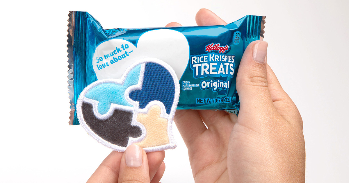
In our opinion, one of the best examples of inclusive packaging is represented by Kellogg’s Rice Crispies Love Notes. This product comes in two versions: one for autistic kids and one for kids with sight disabilities.
The one designed for kids with autism comes in a pack with four heart-shaped stickers to match the space on Rice Krispies Treats writable wrappers. The sensory stickers feature soft, smooth and bumpy textures designed for children with autism who may enjoy tactile experiences.
The one dedicated to kids with sight disabilities includes six heart-shaped stickers displaying love messages in the Braille alphabet so that kids can receive love notes from their parents even during their afternoon snack.
Mc Donald’s – Happy Goggles
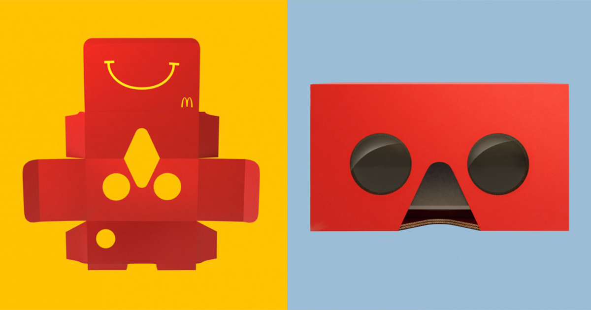
While designing the new packaging for its iconic Happy Meal, McDonald’s goal was to “ensure that the World’s most famous box will continue to be magical and relevant to families for another 30 years. Meet Happy Goggles – a unique VR viewer made from an ordinary Happy Meal box.”
McDonald’s was able to bring forth what we believe will be the future of packaging: a transformative box that enables a continuous interaction on both digital and physical levels, in order to enhance the brand experience.
In the end, we can conclude that interaction is the main element that brands are taking into account as they follow the natural evolution of packaging. How come?
The most relevant trends are showing us how the average customer is evolving, always expecting more in terms of experience and engagement from the brands they follow. In order to keep up with people’s needs, brands and packaging must continue to evolve, on the one hand by meeting the demands of their respective markets, and on the other by maintaining the ability to remain true to themselves and stand out from their competitors.
Now tell us, how do you think the packaging and its relation with the consumer will move forward in the next future?Looking forward to knowing your ideas, we at CBA Italy will keep exploring.
Giulio Vescovi, Strategic Designer at CBA Italy
Without doubt, 2020 was a year that overturned our lives, influencing our behaviour as consumers. In the retail sector, hard-hit by the pandemic, the online purchasing experience has shown the expansion of a decade in just a few months, with a 26% growth and a turnover of 22.7 billion euro in 2020 (source: B2C eCommerce Observatory, Politecnico di Milano – Milan Technical University). When consumers return to brick-and-mortar stores, they will have a new awareness that will increasingly narrow the separation between physical and digital space.
How are brands operating in this new scenario?
Over the course of the last twelve months, many companies, above all in the world of fashion, have ventured into new, hitherto unexplored, territories. Augmented reality, virtual stores and distance assistance are just some of the solutions that we have encountered and learnt how to manage.

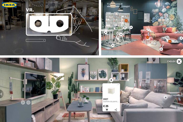
One of the first companies to take steps in this direction, with the objective of staying in direct contact with its consumers, is IKEA. After having abandoned its printed catalogue, the Swedish giant opened its first virtual store in which consumers can move along a route and make purchases with just a click, with the assistance of a virtual reality headset.
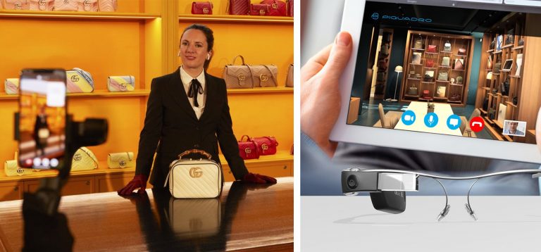
Hybrid approaches of this sort were also experimented by Gucci and Piquadro. Both of them offered its customers a virtual experience in which its sales assistants, wearing 3D glasses, take the place of consumers, providing a true distance personal shopping service.
These examples highlight the concern, particularly on the part of luxury brands, of generating value for an expression of e-commerce that is principally involved in products. Online purchasing leaves little opportunity for a brand to develop effective storytelling that can be perceived by the consumer. To avoid a sensation of dullness in the product range available, technology can provide an effective tool for disclosing the brand’s values, recreating the type of contact experience that usually occurs in the physical space.
With a view to involving customers in a new purchasing experience, virtual reality is the tool that comes closest to the physical situation. Immersive techniques are providing a new outlook on the use of content and engagement. For 2022, it has been estimated that about 2 billion people will utilise virtual reality at least once a month, with an estimated growth of 125 billion dollars over the next four years.
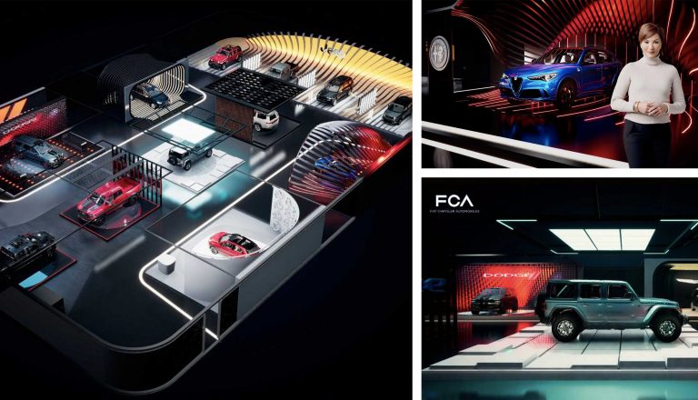
One of the latest examples was provided by FCA for the CES show in Las Vegas, the technology trade fair which this year took place in virtual format. The Italian-American group simulated a three-dimensional stand at which the visitor, accompanied by a virtual assistant, could interact with 3D models of vehicles, personalising colours and learning about the interior details.
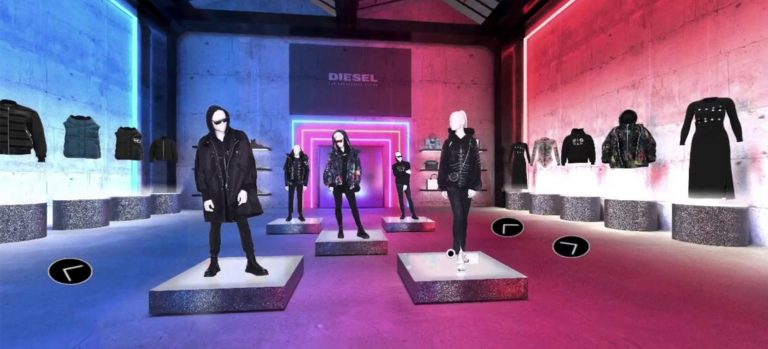
For the launch of the Spring/Summer 2021 collection, Diesel decided to replicate the event in the virtual world. The Hyperoom project gave its buyers the possibility of exploring the three-dimensional showroom, with guidance by sales staff provided by a live-chat platform.
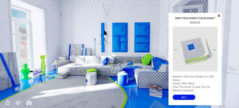
The most extreme and visionary example was offered by Harry Nuriev, Russian artist and founder of Crosby Studios, who launched Crosby Studios Homes, the first wholly online furnishing and lifestyle brand. Software from the world of gaming was used to display the collection, reconstructing an apartment entirely decorated with objects and items for the home. On the website, by means of a self-guided tour, customers can download 3D models of each article and order articles from the collection.
Companies’ investment into the online sector as opposed to stores, illustrated, for example, by Zara’s closure of over 1,200 points of sale, is leading to a new balance between physical and digital space. Even though some tools, such as augmented reality, are still only minimally accessible and exploited, the online experience will be a priority in the future. Stores will therefore have to evolve, offering an integrated experience in which to create more intense connections by rethinking purchasing processes.
However, the future will not involve exclusively the use of the latest technology to dazzle customers, but rather it will guarantee that the technological methods that are adopted meet consumer needs. Brick-and-mortar stores will become brands’ opportunity for creating a holistic experience in which to nurture the fidelity of its audience, going beyond solely the purchase of products. The design of omnichannel strategies capable of creating authentic relations with customers will be of key importance for long-term survival and for remaining relevant on the market.
The months spent researching to determine a meaningful brand essence that communicates who you really are and what your valuable proposal is, are wasted months if the brand platform embodying such outcomes is not consistently and coherently translated into the communication and behaviour of the company.
In short, working on the brand is pointless if you do not then coherently apply the brand identity to and in tandem with all the touchpoints, both inside and outside the company. One single logo is not enough, regardless of how attractive or effective it may be.
What does it mean in practice to coherently apply the brand identity? Above all it means understanding the brand positioning, its values and its tone of voice.
It also means being aware of its main touchpoints; points of contact between the brand and the user. The brand does not only exist in the product and in “regular” advertising, but lives (and continuously communicates) through a broad range of concrete variations.
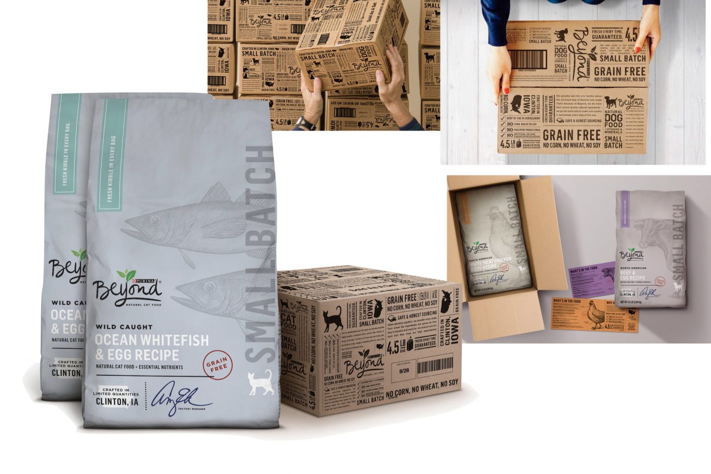
If we start from the most physical points of contact and then come to the less tangible ones, it is evident that there are different aspects to keep in mind when working on brand consistency. The role of packaging, for example, does not serve only to protect and transport a product, but can actually become a vehicle for messages relevant to the consumer, can make the experience of consuming a product more rewarding and enjoyable, and can give useful information on using it.
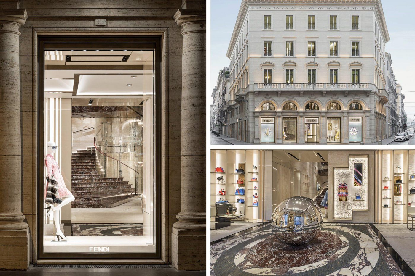
The physical stores also serve as important touchpoints and can build the experiential aspect of the brand. Palazzo Fendi, in Rome, is a flagship store that reflects the fashion house’s cultural heritage: “the history, art and beauty of Rome are part of Fendi’s DNA”. This elevated and certain message is delivered in a direct manner and is enriched not only by the collections and architecture of the palazzo, but by consistent experiences. The third floor of Palazzo Fendi has been transformed into the first Fendi hotel and the store is home to numerous unique installations, created by emerging artists.
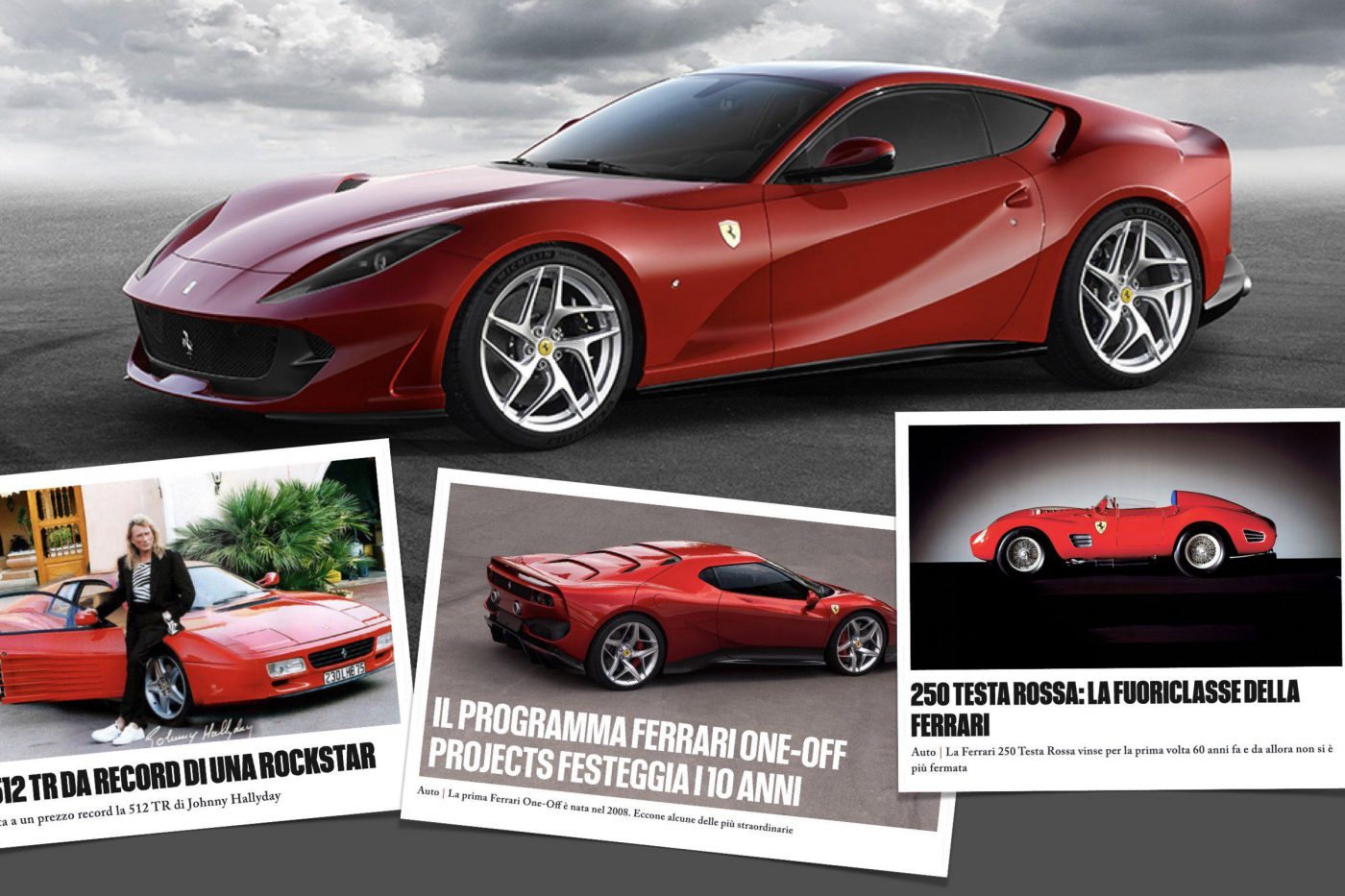
We will now move on to talk about consistency in less physical terms. That is, the declension of the brand identity on a linguistic level. The brand’s verbal identity sets out its thematic content, which the brand narrative and, above all, the tone of voice, revolve around. The latter must be consistent with its identity and relevant to its target audience, making use of all kinds of communication channels. The Official Ferrari Magazine is Ferrari’s communication channel that coherently expresses its “champion” identity. All of the articles in the home page begin with key terms that leave no room for doubting the excellence of what is before the reader: “The Ferrari 246 Dino Tasmania dominated the 1969 Tasman Cup race series”, “Record triumph: the V8 Ferrari is Engine of the Year 2018”, or “Ferraris reach record prices at auction”… and we could go on to read about heroic, podium and sensational cars.
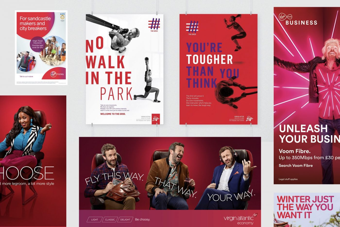
Virgin Group also insists on very different markets with sub-brands that have distinct visual identities, but maintains strong coherency at their base in terms of having a fresh, energetic and challenging tone of voice. Because of this Virgin is extremely recognisable.
To cultivate consistency between all the touchpoints in the brand identity, it is important to also focus on the company’s inner-workings: the presentation templates, the way of communicating, the register used with both clients and colleagues. Because the more you share and “live” a style, the easier it is to put it across to customers spontaneously.
It goes without saying that not everyone can have a store like Palazzo Fendi, but the concept remains the same. Even the simplest of exhibition stands can be designed to fully embody the brand essence and market positioning. As a matter of fact, there is no cost for coherency. At most it requires effort to truly understand who you are and enough rigour to declare your identity in every manifestation of the brand.
Massimiliano Frangi, Associate Creative Director at CBA
Close your eyes and think of a sporting brand.If you thought of Nike or Adidas, you are in the majority of the world’s population and this is by no means by chance. The sporting universe is characterised by dynamism, performance, results and improvement. A constant look towards the future and how the industry can evolve.
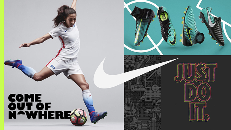

No-one would be likely to associate sport with the concepts of history, tradition, and a glorious past. But if we look at the world of football, particularly in Europe, where many of the teams are huge global brands, we discover a very homogeneous universe when it comes to the symbols of these teams, in the form of coats-of-arms and rich historic elements. A world in which renewal and improvement, at least from the point of view of visual identity, takes place with great caution, at times even being seen as something negative, as was the case with Everton in England.
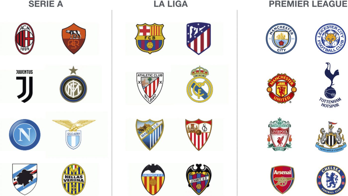
Taking our theory, which sees a misalignment of values between the brands of countless European football teams and the world of sport, as fact: what can design do in such a market? There are a couple of examples that in my opinion are worth examining in order to find a solution. The first is the re-branding of the Premier League, the second is the case of Juventus.
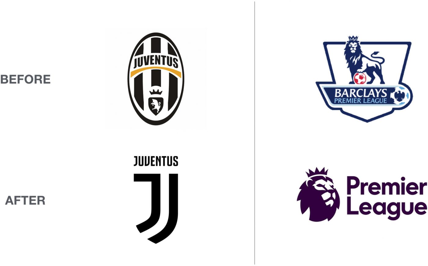
In both cases the two companies have undergone an extensive evolution of their historical and traditional past, presenting themselves to fans, spectators, sponsors and investors with an identity which looks to the future and to new challenges. First of all, with a radical change in brand, which abandons the traditional heraldic elements in favour of a more essential and contemporary version, embracing a highly modern brand identity with the use of colours and other graphical elements.
This move is the climax of a process which has seen the Premier League and Juventus as forerunners in the offering of a new brand experience made up of engagement programmes, thematic offers (restaurants, museums, shopping), and even playlists on Spotify: in other words, brands which go far beyond football and individual matches, brand experiences which are capable of also attracting people who are not so interested in football, shifting the focus from the football pitch to wider-ranging areas.

Without these premises it would be difficult to justify such bold changes in the football universe, and it would be difficult to imagine an alternative future in the panorama of football brands, even if, as a creative director and dedicated fan, I hope this is possible.
We recently enjoyed designing our new offices, focusing on our professional and personal needs in order to design an environment that is functional and cosy at the same time. In the workspace we spend the biggest part of our days, there we need to be focused, to share ideas, to comment and criticise our own work, we meet clients and partners, we find both relax and inspiration.

The workspace creates and defines the company culture. A rigid and formal space for sure won’t represent our way of doing business. “Designing Brands with Heart” means to put passion, empathy and openness in every design project. We have envisioned an open and transparent environment that will allow us to share ideas and inspirations.
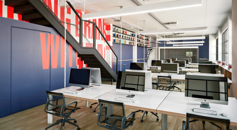
In Milan, via San Francesco d’Assisi, we found an oasis of calm and creativity where we can cultivate our passion for design. An old factory with big windows looking a courtyard populated from fashion and design related companies. A charming terrace is the entrance of our new office, it will be the heart of the space, where to arrange informal meetings, breakfasts or ‘aperitivo’.
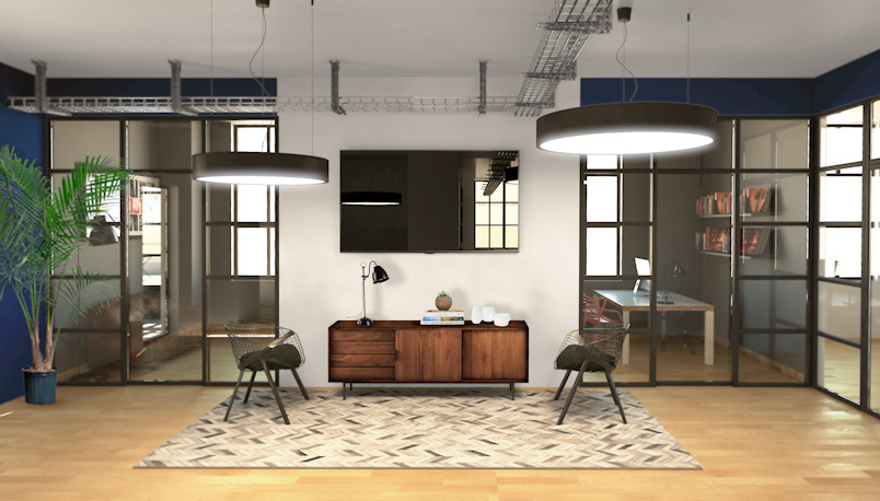
In any of our projects we put a lot of attention to details because, quoting the Eames, “the details are not the details, they make the product”. This is true in any design output, from product to identity, from environment to service.
It’s not usual to design something for ourselves, but we will love to live and work in a space conceived and designed just for us, starting from our values. In this way we will live them more and more, everyday.
The colours most used in heraldry are red, blue, black, green and purple. Yellow and white represent gold and silver, while the natural colours are used for fur and wood. When the real colours could not be used, they were represented in black and white with the method developed by the Jesuit Father Silvestro Pietrasanta; he attributed a distinctive graphic sign to each colour, varied with different densities of light and shade.
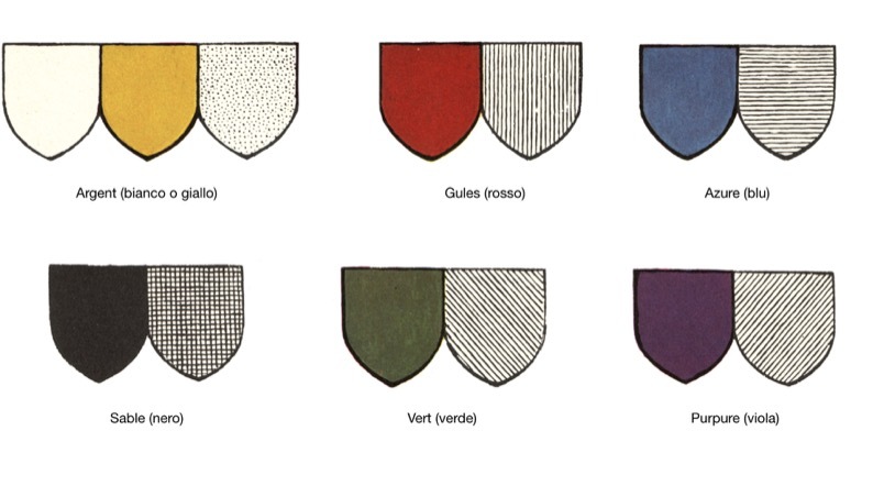
As in the past with heraldry, colouring also plays a determining role in branding as it identifies and enhances the social, cultural and marketing aspects by amalgamating the philosophical, psychological and sociological components of goods and services. Many business failures have been caused by an incorrect choice of colour, as the same message can be conveyed differently depending on the colour used. In fact, the meaning of a colour changes depending on the context and the way in which it is presented.
Designing colour combinations capable of inducing associations which cover a variety of services and products requires specific training: the same colour may lend itself to a series of associations with completely different results. We must not forget that the influence of the colour component in consumer choices is so deep that it is sometimes misused and becomes a mere persuasive tool, driven by trends set by the multinationals.
Colours can also be used in a misleading way to bypass our awareness, with the aim of promoting products that do not meet the expectations set by their image, driving us to make purchases that we will not be satisfied with.
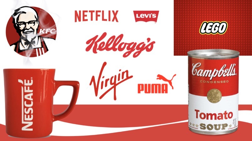
Many brands have chosen red as their iconic colour. In fact, to focus its wavelength, the focal point of our eye moves forwards, giving the illusion that red objects are closer. Red also affects our perception of time, causing it to feel slightly accelerated (the warm colours used for fast foods convey the idea of speed when eating meals). The combination of warm colours is used to communicate heat, power and energy; they transmit happiness and are therefore very widely used in the entertainment and leisure sector. In the food sector, the use of saturated reds tending towards orange characterises products with a strong or spicy taste.
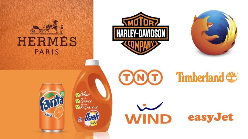
Orange is very widely used in the various fields of communication due to its visibility and ability to attract interest, encouraging the success of low-cost formulas and products.
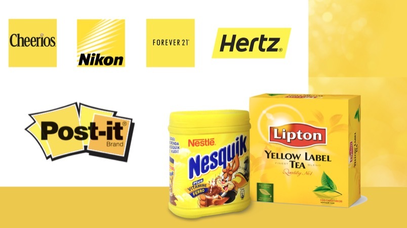
Yellow is the most cheerful colour in the colour wheel: it is the colour of the sun, of joy, of optimism, and is bold and original. Brands using yellow characterise widely distributed products and services that are therefore easily and immediately identified. When pure yellow is placed on a white background, however, the reverse effect is obtained and the information is no longer readable.
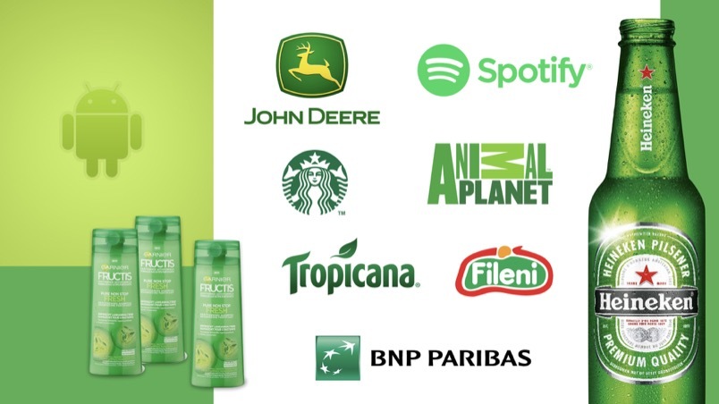
Green, mostly associated with nature, is a warm and relaxing colour which is widely used in many product categories. In general, it tends to be used to communicate security and sustainability in goods and services, and is therefore often found in graphics projects involving insurance, financial or legal companies. A balance between warm and cool tones, green is refreshing and thirst-quenching, making it very common in the food industry.
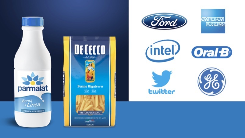
Blue is without a doubt the most preferred colour when you want to inspire maximum approval. Shades ranging from baby blue to dark blue are used, as evidenced by the brands belonging to the most important international representative organisations. Blue communicates reliability and security of products and services in all sectors. Although this colour is rarely found in actual food, when used in the food industry it is associated with freshness and is used to represent essential household products such as salt, sugar, pasta, milk and its derivatives.
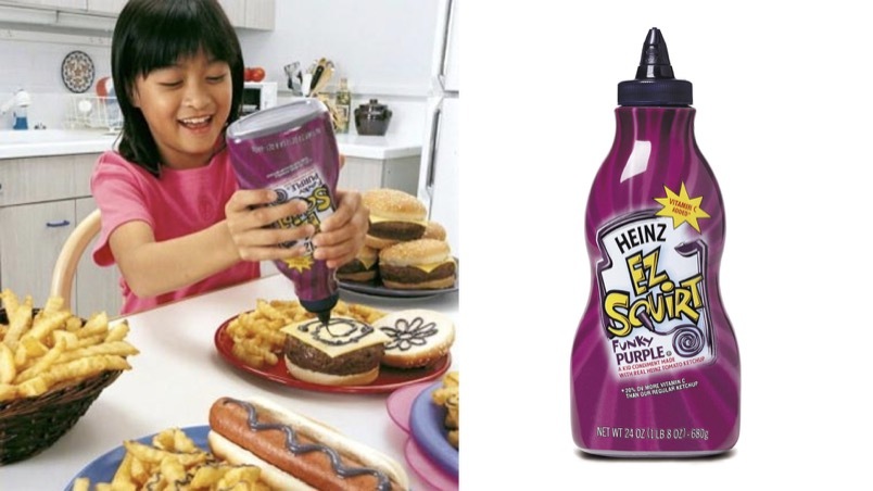
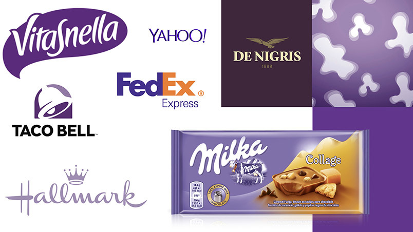
The purple colour range is among the least frequently used colours in brand design, especially since in the most saturated shades, it appears to be the least bright. The few brands that have chosen this shade, which has strong religious significance, have often managed to establish themselves on the market specifically because of the recognisability of this unusual colour. These shades are very often used in the packaging for intimate hygiene and female body care products.
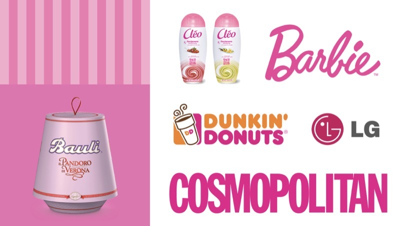
In the food industry, pink is largely associated with a sweet taste, while in almost all other sectors it remains linked to the feminine stereotype or is used as a decidedly unconventional colour.
The brown colour range is widely used in the traditional food industry due to its many synesthetic associations. The strong link with natural materials, such as wood and leather, makes the brown colour range very suitable to communicate the artisan quality of products.
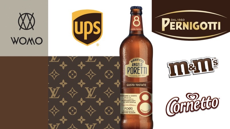
Over recent years, particularly in the technological sector, polychrome brands are emerging. A unique combination, it expresses diversity, great dynamism and openness to new things and to the future. Multicoloured brands identify the company’s aim to be impartial and suited to anyone, regardless of their sex, age, social class, and political ideas.
Vice President of IACC International, President of IACC Italy, Designer, Colour Consultant, Professor in the “theory of form and colour” at SPD (Scuola Politecnica di Design, Milan). From 1990 to 2006, he collaborated with the Atelier Mendini in Milan. From 2003 to 2013, he was Professor of Chromatology at the Accademia di Verona, the Nuova Accademia di Belle Arti (NABA), the Domus Academy and the Department of New Technologies at the Accademia di Brera in Milan.
Article originally published on the magazine PRINT n. 67.
The desire to feel increasingly entitled to occupy a more important position had led us graphic designers (a category to which I am always proud to belong) to define ourselves as visual designers, brand designers, brand consultants… however, our job remains deep rooted in craftsmanship. What therefore remains fundamental is the use of the hand as an advanced technical instrument which, through its complex movements, is capable of transforming an idea into a sign.
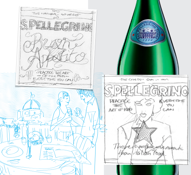
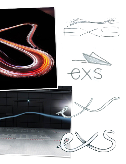
For the designer, the hand is the first fundamental interface for the expression of ideas and intuitions which are then ‘recorded’ on a sheet with pencils or digitally via a graphic tablet. The hand is the most sophisticated of instruments, the first that we use in synthesising ideas.
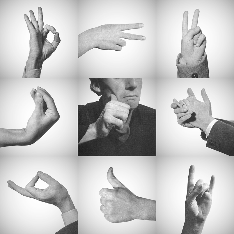
Even before they translate concepts into marks, our hands help us to reinforce thought and cognitive elaboration through gesticulation. In expressing ideas, concepts and strategies, we cannot but use our hands. The use of gesture activates neurotransmitters which are fundamental for memory. It is no coincidence that we Italians have developed, along with our great capacity for rhetoric, a repertoire of characterising gestures (almost a brand for us), which the designer Bruno Munari had brought together in his famous Supplement to the Italian dictionary.
Gianfranco
Dialogue means meeting
To create a constructive relationship between the agency and the client, the fundamental factor is openness to welcoming other people. From my experience, I’ve learnt that the most successful projects are those based on open and sincere interpersonal relationships. The people involved in the project must be willing to make this dialogue lively and constructive.
Dialogue means listening
To ensure that dialogue can bring a result, one must keep an open mind, let go of any prejudices and know how to listen. Putting yourself in a position to listen means to be on the same page as your interlocutor, creating empathy, and making the other party’s needs your own. By listening attentively, you can discern the real needs that lie at the heart of every request.
Dialogue means changing your mind
After a first meeting one often goes away with an immediate first impression of the client, the brand and the problem. Just as often, the client already has a clear idea of the kind of response they’re expecting. The continued dialogue that comes out of the dynamic of the project gives us the opportunity to change our minds and arrive at unexpected solutions that arise from the use of lateral thinking, from another point of view.
Gianfranco
Privacy Overview