France
Paris
Switch to your local agency
Retour au menu
To be original means being able to follow that road, going against convention and sometimes breaking a few rules. That is how to obtain something unusual, unpredictable, captivating and probably very memorable.
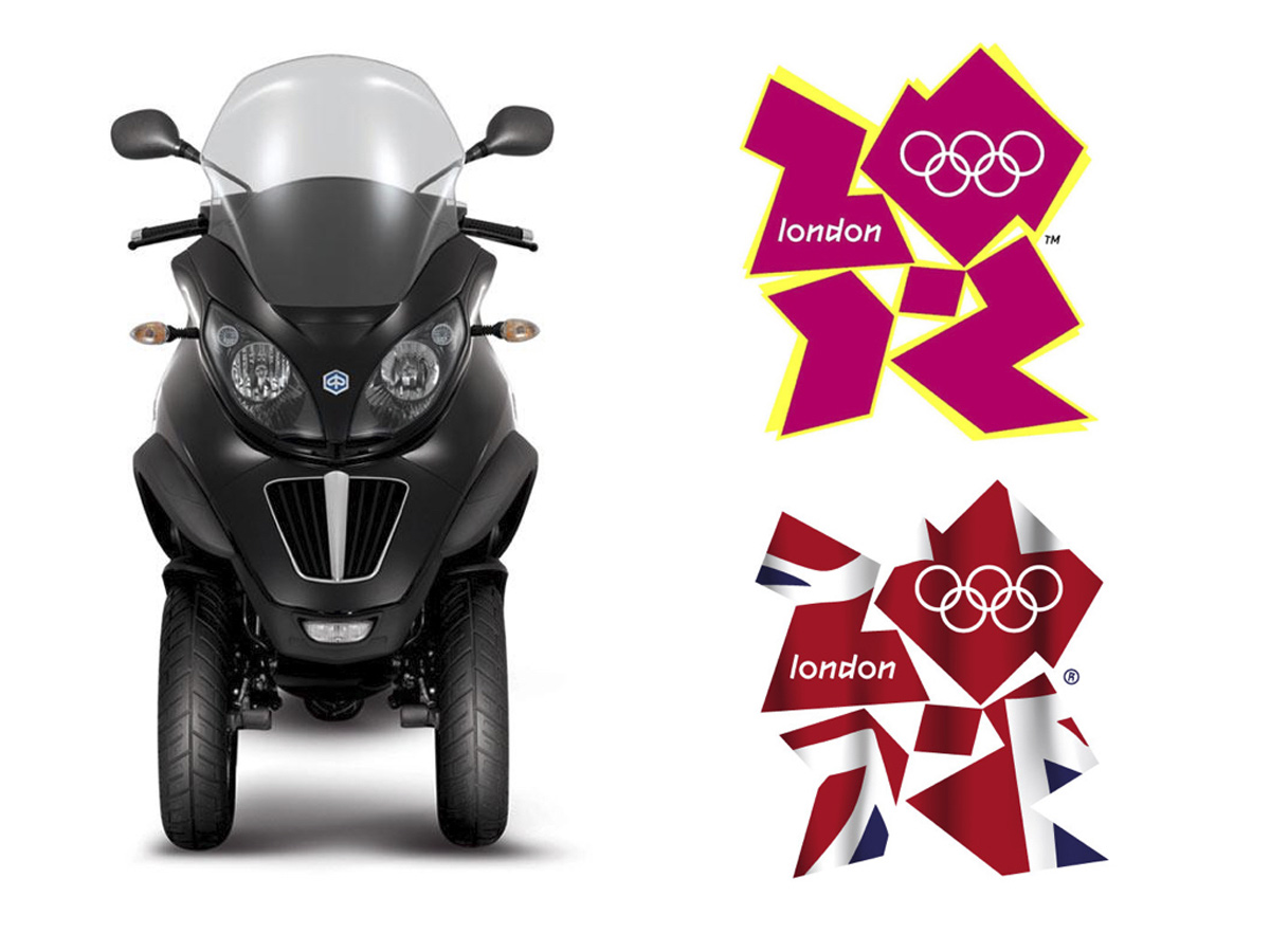
Perhaps it is an idea that really stands out from the crowd, such as the MP3, the three-wheeled scooter launched by Piaggio a few years ago which certainly looked very weird but opened a new category in the market. An equally explosive case of branding was the London 2012 Olympics identity, was so powerful and unique that nobody will forget it(does anybody remember the Peking 2008 Olympic logo?).

It may be the stylistic codes that stand out, as was the case for the Dyson hoover which looked like spaceships from the future, or the Citroen Cactus which definitely broke a few car design conventions.
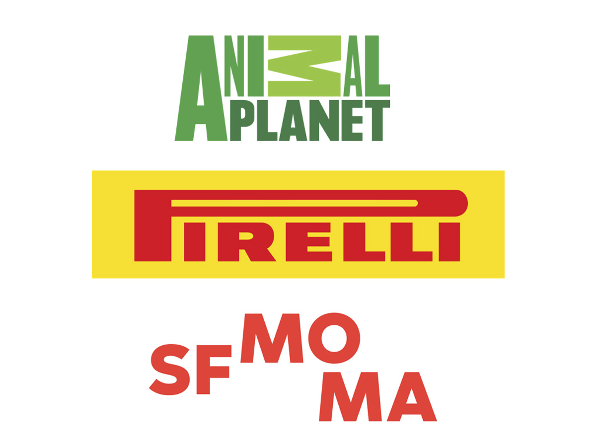
Originality is also conveyed in details which, with some small intervention, can create something quite unusual and bursting with personality. Whether it is an upside down letter, deformed initial or wonky alignment, the result can be unforgettable if executed correctly.
Giacomo Cesana
Creative Director
According to data from the FAO, 1.3 billion tonnes of food are wasted globally a year. That is approximately a third of the total food produced for human consumption. In Europe, the figures stand at 180 kg of food waste per capita per year (108 in Italy).
The European Parliament has adopted a sustainable food resolution and manifesto that will oblige countries to halve edible waste by 2020.
Our shopping baskets contain the wrong items and too many of them. We fill our fridges but do not even know how to store food correctly.
Food waste is gradually starting to be monitored, but only on a domestic level. Four out of five consumers no longer throw out items that are past their expiry date without first taking a closer look and trying them to see if the recommendation to dispose of them by a certain date is valid or not.
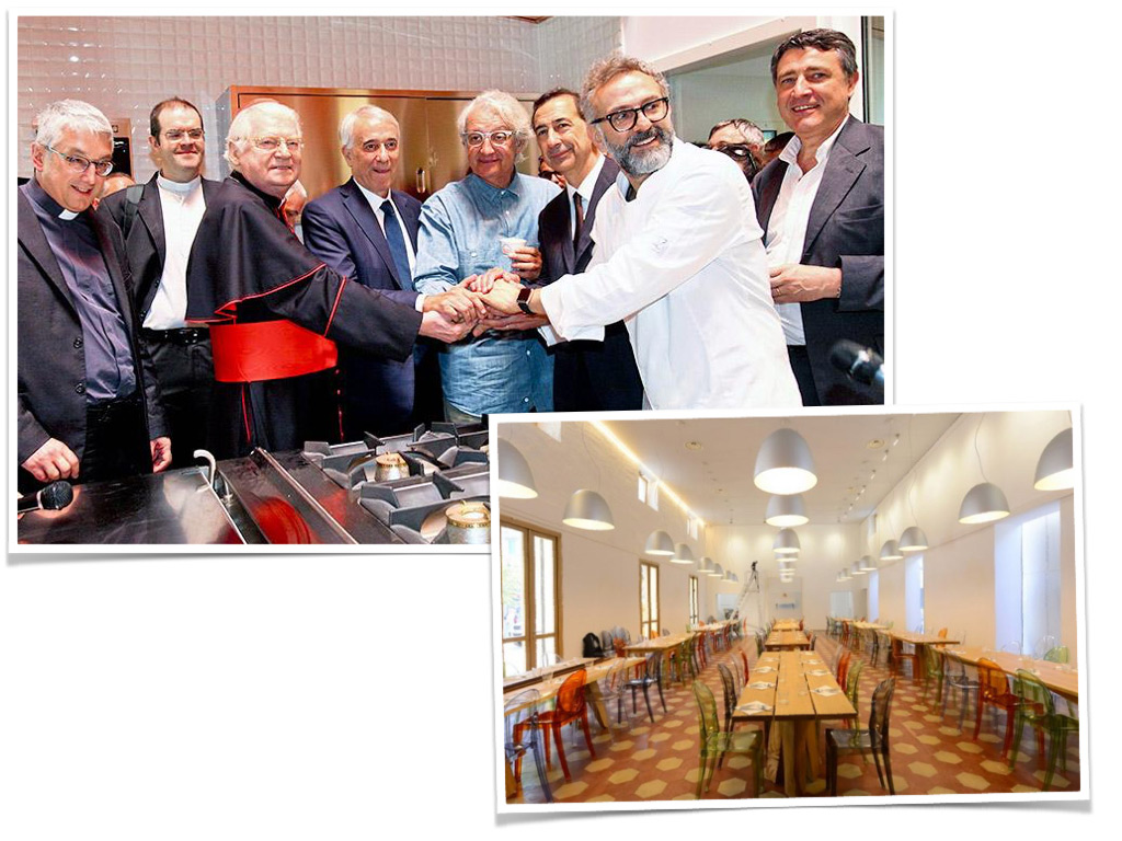
The Refettorio Ambrosiano (Ambrosian Refectory) has been set up in the former Teatro Greco building in the neighbourhood of the same name on the outskirts of Milan. It is a soup kitchen with room for 96 diners where a team of 40 chefs led by Massimo Bottura cook with food recycled from EXPO 2015.
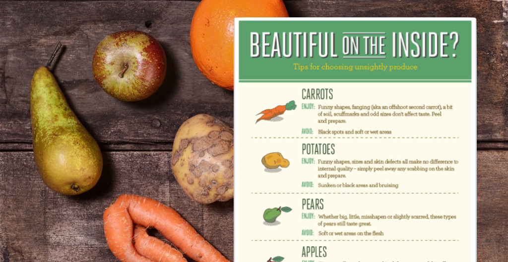
ASDA has launched a campaign to sell ‘misshapen’ fruit and veg through its network of supermarkets; these are products that would formerly have been thrown away. The initiative is called Beautiful on the Inside and aims to raise greater awareness about food waste among UK consumers.
A lot of food is wasted before it even reaches our supermarket shelves. Research by Think.Eat.Save has shown that over 40% of fruit and veg produced in Kenya (such as green beans grown for export) is destroyed simply because it does not meet the strict cosmetic standards required by European distribution.
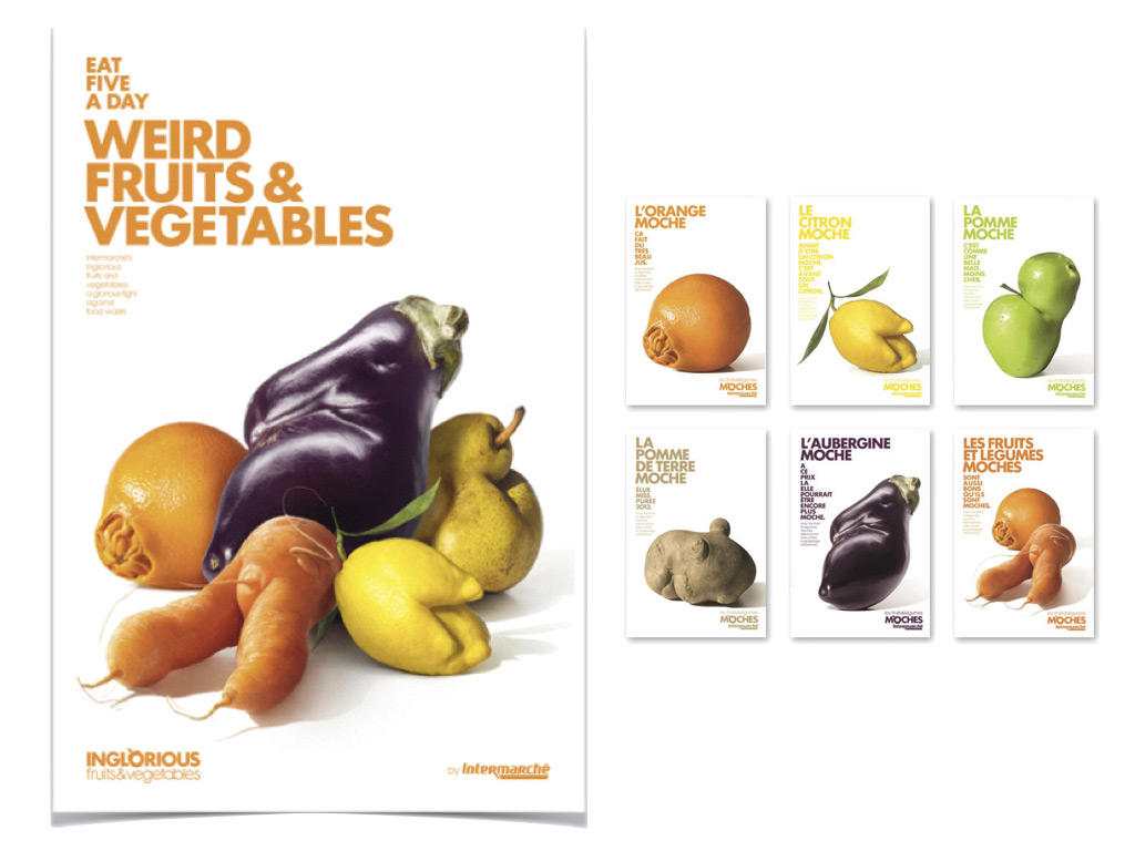
In France, Intermarché has launched a similar initiative throughout its 1,800 sale points. ‘Inglorious Fruits & Vegetables’ celebrates the grotesque and ridiculous shapes of fruit and vegetables shot by famous photographer Patrice de Villiers. The campaign explains that this fruit is still good for us and is just as tasty as the ‘normal’ version, but costs 30% less. A total of 1.2 tonnes of ‘inglorious’ fruit and veg were sold in each store during the first two days of the campaign.
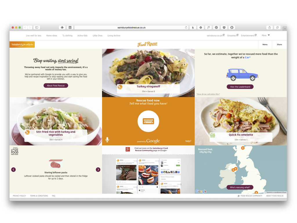
Sainsbury’s has launched a website to help consumers use up leftover food by sharing recipes. Consumers can insert a detailed list of the ingredients they have available and receive recipe suggestions in response. The website also calculates how much food has been saved, both in weight and monetary value.
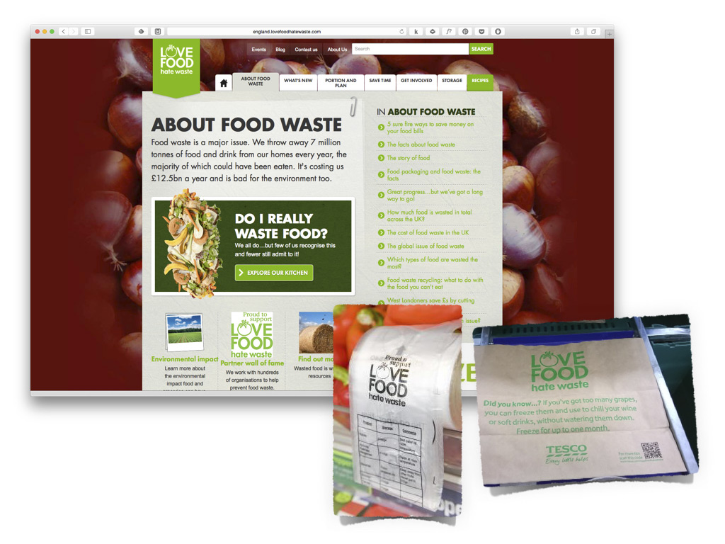
Love Food Hate Waste is an initiative launched by WRAP (Waste & Resources Action Programme), a British government-funded charity. It collaborates with various retailers in the United Kingdom. It is interesting to see how Tesco and The Cooperative (fifth largest UK retailer) have included storage advice from the LFHW website on their fruit and veg packaging.
Gianfranco Siano
CEO, Partner
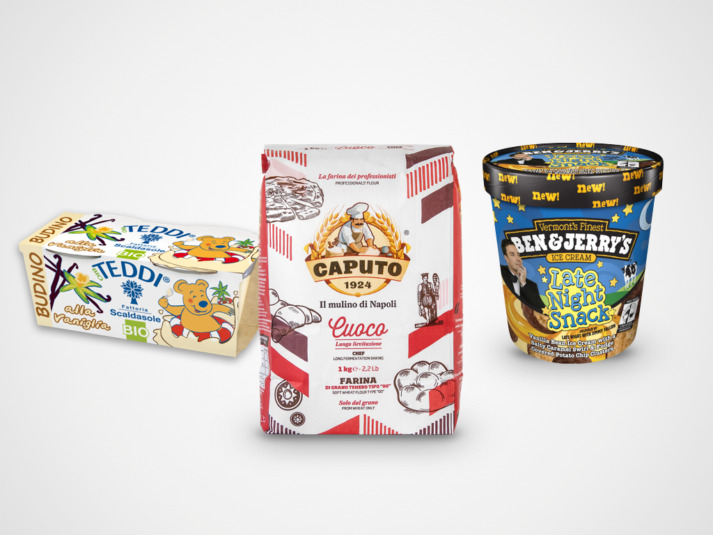
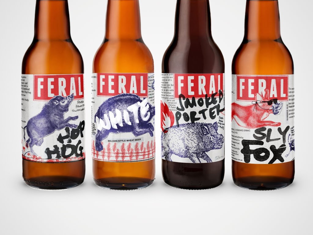
One of the rules we always apply when planning any kind of communication tool – whether a manifesto, product packaging or a magazine – is that the information has to be clear, legible and stick to a certain order. This rule applies to each individual element: logos, text and images. This creates a reading order that begins with the main elements and continues through to those of secondary importance. But like all rules, there are exceptions: products with a disorganised appearance where the different elements seem to have been arranged at random and confusion seems to prevail over order. You might think that this kind of approach is only suited to niche or avant-garde products or markets – craft beers perhaps or ultra-contemporary fashion brands – but you’ll find such examples in your local shops too.
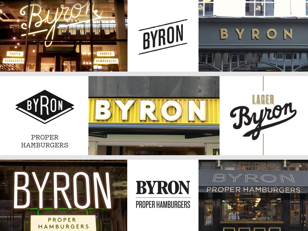
Moving into the retail world, the case of English hamburger chain Byron is worthy of note. It was created with an entirely random approach to visual identity: each of its first 35 restaurants had a different logo and completely different communication tools and materials. The only constant was the name and the hamburger. Launched in 2007, Byron grew with this random identity and was sold in 2013 for £100 million. Not bad for a brand ‘without a real logo’.
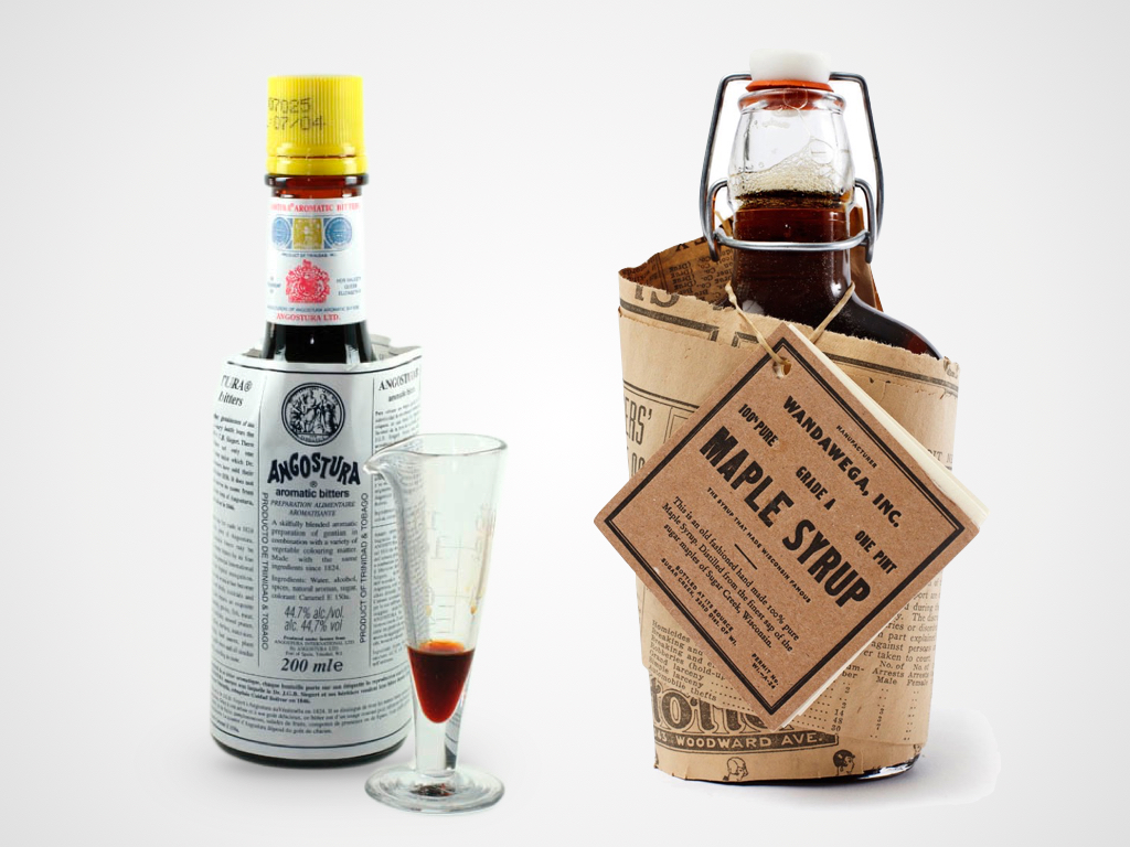
Have you ever found yourself saying “oh don’t take any notice of my clothes, I just threw on the first thing that came to hand”? I certainly have and that’s the impression I have every time I open a bottle of Angostura bitters, where the label is clearly the wrong size for the bottle. But this defect has become the most memorable element of its identity.
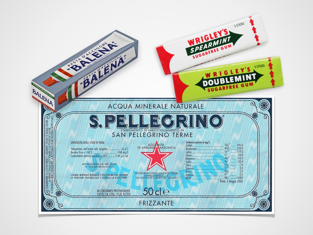
Then there are a host of brands whose identity has never changed – overcoming trends and generations to become highly iconic. The fascination I feel when confronted with this sort of brand is not only due to the historic value of their visual expression but also because often I am bearing witness to a genuine and naïve approach to marketing. In fact, if somebody asked me what I thought of a label where the logotype was repeated twice and in two different forms no less, where the legal information was on the front and overlapped the
logotype and where the entire composition was barely legible, I would reply that it were ridiculous. Without realising of course that they were describing the San Pellegrino label. And what would I say if somebody told me they wanted to use the four sides of a pack to reproduce exactly the product inside? I would say they were missing an opportunity, without reflecting that this strange approach might be an opportunity to become iconic, as happened for Balena pasta to an extent. And when I think of Wrigley’s, a company that has 35% of the global chewing gum market and whose products are definitely iconic, where the ‘spearmint’ flavour is represented by a spear and the ‘doublemint’ flavour by two arrows, I can only conclude that being naïve can be of great value.
Giacomo Cesana
Creative Director
Consequently, after years of distribution solely via the Pharmacy channel, the ‘free’ range has now invaded the shelves of large-scale retail channels and become mainstream. It is no longer a specialist range: even companies are investing in the segment by launching private brand lines.
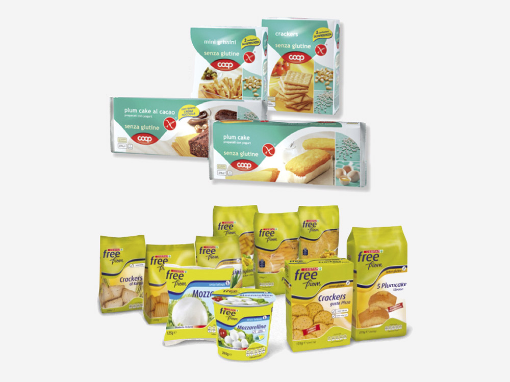
The first challenge faced by these products is to transform the fundamental motives behind choosing a ‘free’ range into positive aspects. This necessity is actually an opportunity and it starts with the name: the adverb ‘without’ has now made way for the positive concept of ‘free’. ‘Free from’ has become the universal code for this category.
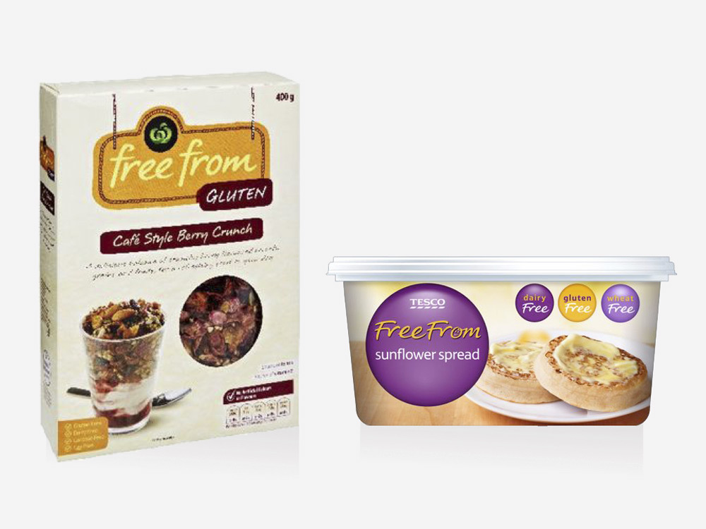
Apart from the name, the visual language tends to be more cheerful and colourful, reinforcing the product as a healthy alternative to the standard item.
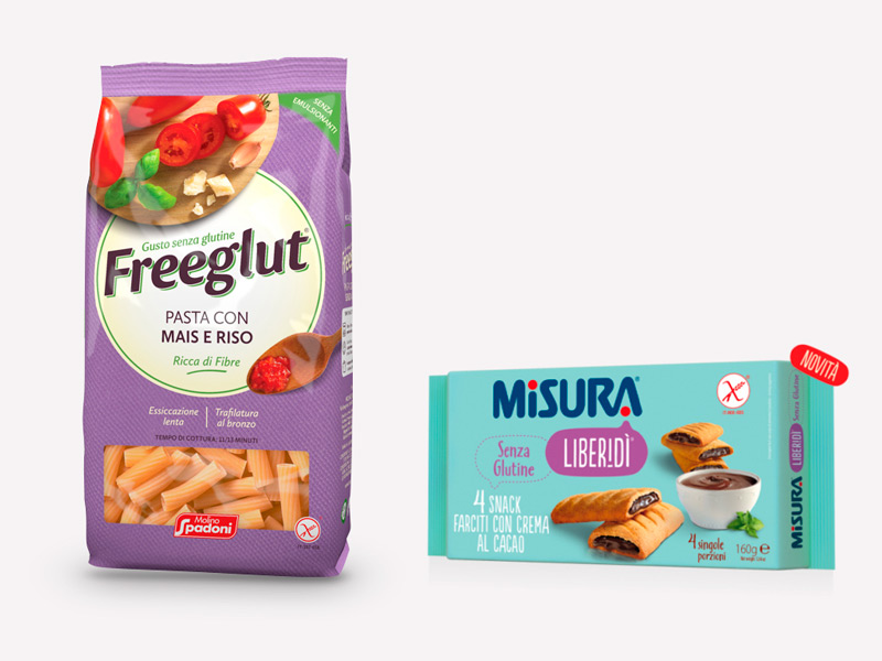
The second obstacle is taste: if something has been removed, the product cannot be as delicious. Manufacturing technology has now reached such levels that it can match the standard offer in terms of organoleptic quality. The visual language tends therefore to communicate maximum flavour in order to balance out the healthy guarantee with the appetising nature of the product.
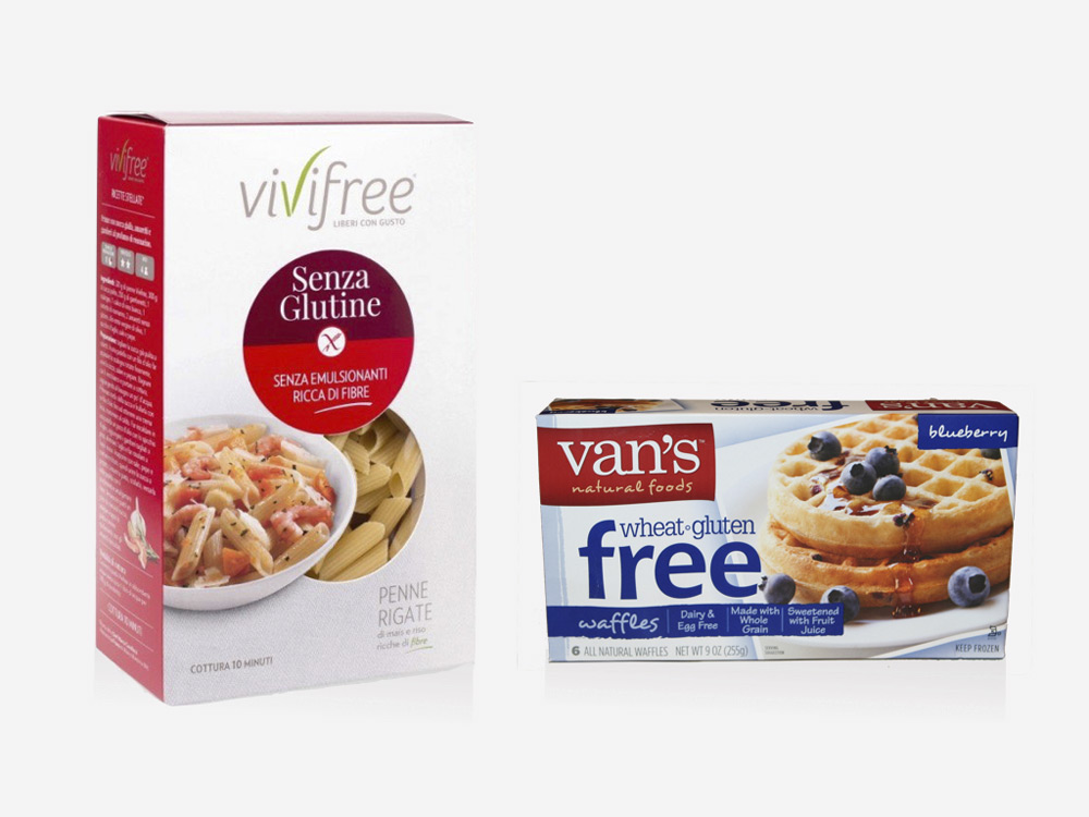
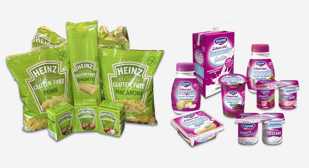
One of the characteristics of products for controlled diets is the extension of the promise to diverse categories on the market. In these cases, the pack system remains unchanged over the shelves and dominates over category logic.
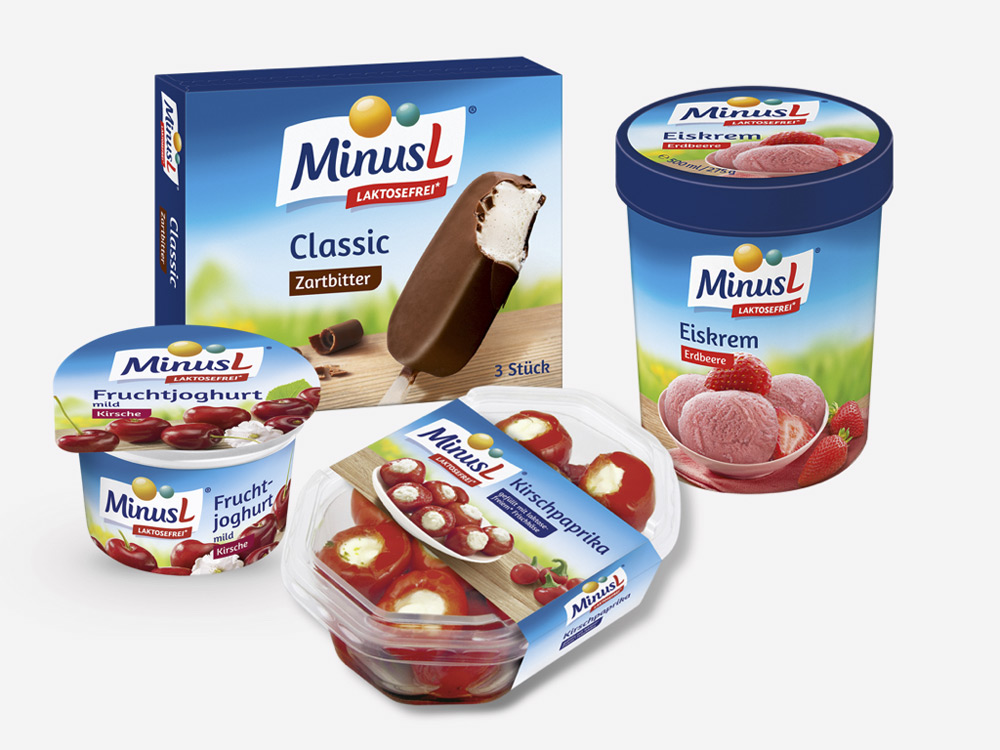
Since the promise is first and foremost the solution to a dietary problem, the colour may be incoherent with the codes of the single categories covered by the range. The colour is the key that helps the range to emerge and be recognisable on the shelves when placed alongside the standard offer or on separate shelving.
Cristiano Mauri
Direttore Clienti
What is the ideal frame? It is the question that arises who wants to buy a bike. It was started testing on bicycle frames in the 80s and after 2000 have experienced a huge spread carbon fiber and titanium, as materials for construction. But when Lino Messori started working, with his father, the frames were made of steel. That’s it. u0022Once you cycled and it was enough. Now there is the need of titanium, carbon, light alloys … a bicycle more and more light, more and more complicated.u0022 A life, his, dedicated to the work that was also his passion. He always worked, even in recent years. Hammering, still making some little thing, but as a hobby not for money, he is keen to point.
We feel his heart while he tells his life. His bicycles are most perfect, almost all red because they were created by hand by a real Ferrari lover. It was his color, red. And the frames were all chrome plated, because the goal was to provide the customer with a frame that lasts for a long time. He built 150 bikes in his career, all special: the pump inserted into the frame, with the small wheel in front and big behind, forks, all u0022weird stuffu0022, created by him.
Those who knew Lino, said of him: u0022everything he did in life was just ordinary.u0022 Like the day he made up the holed frame, because there was no one in the store. He wanted to prove to be able to do the bikes. And since then, they all went to see his bikes.
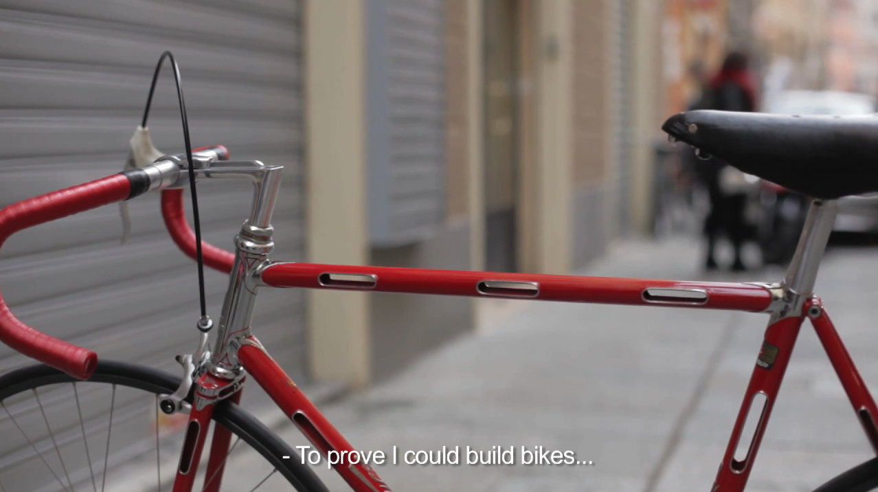
Discover the story of Lino Messori and his work Made with Heart.
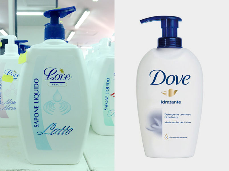
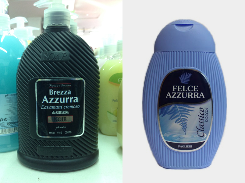
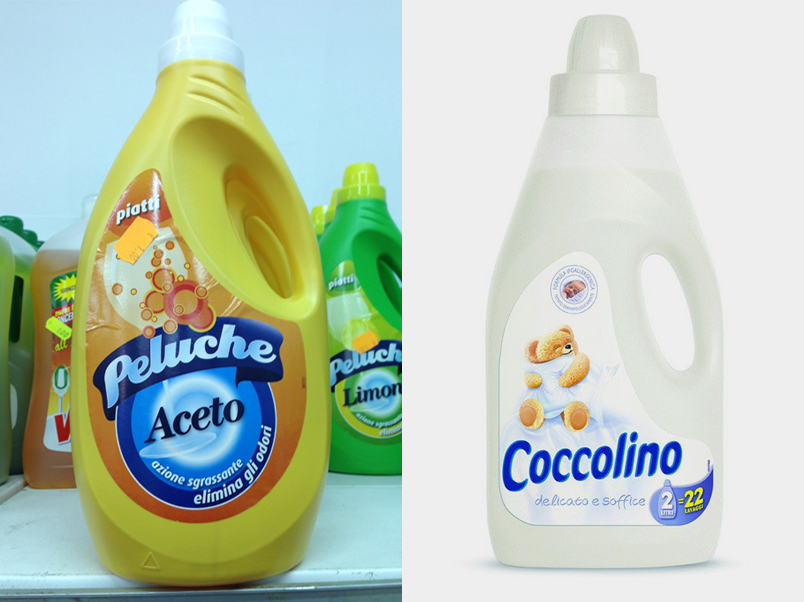
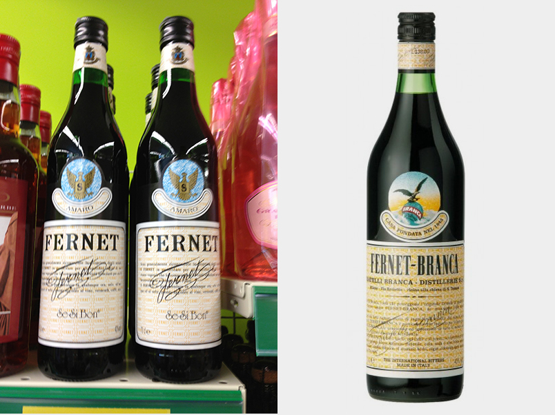
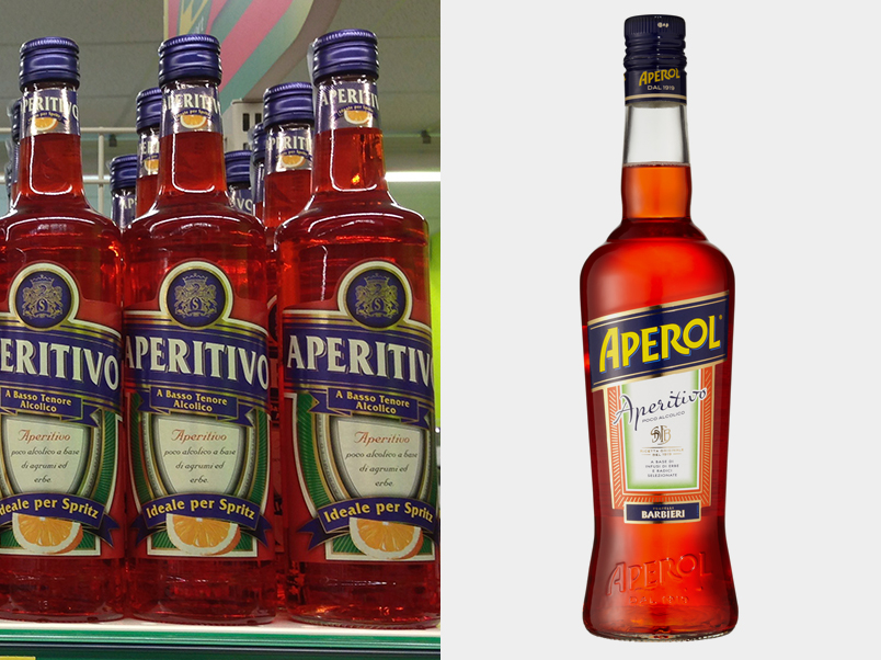
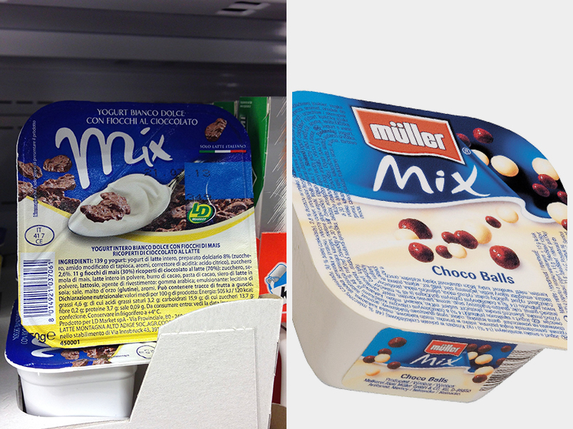
Over the years, we have become used to seeing Shanzai pieces in the worlds of fashion, clothing and technology – with IVKE products instead of NIKE or the Polystation instead of the PlayStation.
It has for some years been common practice to imitate the traits of reference Brand Leaders in the Fast Moving sector, and especially where Private Labels were concerned, but now we are witnessing the birth of many products that could to all effects be labelled Shanzai.
If they weren’t produced and sold in Italy…
Gianfranco Siano, CEO – Partner
Twenty-five years have passed but words have lost none of their importance and his reaction is as relevant as ever. It is, in fact, increasingly difficult to read an article or watch a TV programme that doesn’t contain any foreign terms, the odd Anglicism or mangled versions of other foreign languages. Just imagine what would happen if Michele Apicella had to attend a briefing meeting with the project manager of a branding agency and a company marketing manager. And just imagine the insults I’ve have got for even writing that sentence.
The concepts of Branding and marketing were invented by the Anglo-Saxons, so it makes sense that much of the terminology used in these two fields is English. Their names have even been adopted without any translation into our language. In fact, the very idea of translating marketing with ‘strategia dei mercati’ or branding with ‘progettazione della marca’ is not only weird but downright reductive.
There’s no need to get up in arms about this but perhaps Michele Apicella – and he wouldn’t be alone – would object if he heard that a new brand stretching project had passed the briefing phase following extensive brainstorming, a series of refinements and debriefing and subsequently a test in which a panel of consumers validated marketing’s big idea which will now be presented with at a cascade meeting in order to bring everyone up to speed on the outputs and deadline. You need a dictionary to work out the lingo to begin with, but then you just get used to it.
However, we must bear in mind that languages evolve, sometimes due to contamination, and that neologisms are constantly being invented all over the world. Without forgetting of course, that speaking more than one language correctly and contemporarily, handling different lines of thought and using the wealth of two vocabularies is without a doubt a sign of maturity and intelligence. Many other common terms in the Italian language have been adopted from other languages and nobody finds it weird. Sport, computer, toast, autobus, brioche: what would we call them in Italian? Mind you, neologisms and foreign languages are one thing, but Itanglese is quite another. To return to Mario Apicella, just imagine his reaction upon hearing the verbs endorsare (from the English to endorse, the Italian word is supportare), strecciare (from to stretch, estendere), scrinare (to screen, selezionare), draivare (to drive, guidare), mecciare (to match, abbinare) or ciallengiare (to challenge, sfidare). Or adocchizzato adjectives (invented ad hoc) such as gastronomizzato (prepared using gastronomical techniques), editato (edited) or impattante (having an impact). I’ve heard them all, many a time, and I just smile.
While Italian may not have coined the terms for marketing and branding, it is the fourth most studied language in the world and has a sufficiently large vocabulary for us to find the right alternative to many abused foreign terms. Without wishing to appear nostalgic and conservative, and certainly without being insulted by anyone, I am still conscious that “words can be like X-rays; if used properly, they go through anything”. And with a closing quotation from Aldous Huxley’s Brave New World, I can claim to be a cultured writer.
Giacomo Cesana, Creative Director
Kevin: that was the perfect name. Short, sharp and assertive: a guarantee of charisma and distinction. At least that is howCarlo Verdone convinced Claudia Gerini to pick her future son’s name in famous Italian movie Viaggi di Nozze. To citeanother milestone movie in Italian cinema, in Mitici (Colpo Gobbo a Milano), Ricky Memphis triedto reassure Claudio Amendola about letting a very young Monica Bellucci intotheir newly formed criminal gang with this simple comment: I’ll say just onething, her name’s Deborah, with an H…
If a name represents the destiny of its bearer in popular culture, in branding the name often determines the destiny ofthe person who chooses it. The wrong name can compromise the potential successof a product or service, meaning all investment in its development and launchhas been in vain. And, just like destiny, it can be hard to change a name. Thatis why naming is increasingly being recognised as one of the most relevantdisciplines in the world of branding.
It is certainly not an exact science: there is no one creative process that works better than another, no formula tocalculate the economic return of an effective name. But there are factors thatan expert can assess: pronounceability, memorability and the absence ofnegative connotations for the target consumer to name but a few. It is well known that in 1922, Luisa Spagnoli, inspired co-founder of Perugina, decided to name her new pralines ‘Cazzotti’(Punches); it was Giovanni Buitoni who convinced her that the name ‘Baci’(Kisses) was perhaps more appropriate. And returning once more to Deborah, thesuccess of the cosmetics brand started in the Sixties shows that the name wasspot on for the category and target it was aimed at, despite the H.
Naming can be the fruit of pure creative intuition but, more often than not, a good name comes with technique and experience. When a fruit producer from the south of Italy asked CBA to redevelop the identity of their product, the first thing needed was a new name. The former name was chosen intuitively but was not suitable for the international market. The creative process began with the entrepreneur’s passionate account of his land and roots. This was all theinspiration we needed to identify the different semantic areas of our research:grapes, the Mediterranean and the joy of fruit. All areas synonymous withItalian values and relevant for the international market yet still credible forItalians. Each area was then investigated from a lexical perspective, producinghundreds of roots and phonemes that were then combined into words. The idea wasto find a sound that captured the simple, sweet nature of the fruit beingoffered to the consumer, just as Nature intended it.

One of the main problems when naming is legal availability. This is really a matter for legal experts but an initial clearance search is essential to ensure that the client doesn’t fall in love with a name that cannot actually be used. With 3 million brand names already registered and 54,600 more requested in 2014 alone (almost 150 a day!), the Italian Brand Registry is the archenemy of all namers. Many of our names fell at this first hurdle.
After our names were filtered according to availability, only 21 survived. Almost all of them were made-up names with no connection to terms of any real meaning. In the end, our decision was mostly motivated by simplicity: Nuva. English-speaking consumers would immediately pick up on the reference to the term ‘new’ and appreciate the Italian sound of the name; and Italian consumers would have no problems remembering such a clear and straightforward name, which just added a single letter to the name of the fruit. The market reaction was very positive and solved the problems that had been encountered by the previous name.Every name has its place but the problems are always the same: distinctiveness, comprehensibility, commercial use, etc. Names that pass these tests are definitely potential candidates but that alone is not enough to determine their success. Context, channel, product quality, coherent communication and other ingredients are just as decisive. The right name cannot solve everything. But the wrong name certainly doesn’t help.
Cristiano Mauri, Client Director

Between the introduction in 2012 of detergent pods and the end of 2013, 17,000 children under the age of six have ingested or inhaled the detergent contained within the pods, or sprayed it in their eyes.
Single-dose detergents pods are packaged with attractive lines, soft textures, small size and flashy colors, just like the toys or sweets. It is this packaging and their small size that have attracted hundreds of children and this is what inspired us to develop some packaging solutions to keep children out of contact with the capsules, starting with 3 simple concepts.

Children will not eat pods in the shape of broccoli.

Large pods connected in tear-off sheets would be more difficult to handle and ingest.


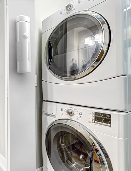
A single-dose dispenser would keep the product out of the sight and reach of children.

Several American Associations for the protection of children have invited the detergent pods manufacturers to review the design of their products, believing that the root of this problem lies in the appearance of the products.
We hope this challenge will stimulate dialogue and the search for solutions, because we believe that common sense, greater attention and concious packaging design, can help to reduce the number of home accidents involving children.
What do you think about this? Join the conversation by expressing your thoughts on Twitter, Google+ or Linkedin via the hashtag #SafePods.
The value of consistency might be interpreted as the supremacy of identity over anonymity. Consistency in one’swriting, one’s actions and representations of oneself is a way of affirming,reiterating and showing a precise identity. Far removed from the concept ofmonotony, consistency shows personality and rectitude, in other words, the abilityto act consistently at all times.
Over the course of the years, consistent representation of brand image has given rise to the concept of corporate Identity and the brand guideline as an instrument that summarises therules surrounding the construction of communication tools for any determinedbrand. Today we are witnessing the birth of new ways to affirm identity, withoutbeing ‘identical’.
It is interesting to examine the architecture of a brand such as Virgin which, while competing on variousmarkets with brands that adopt different visual identities, manages to maintainan essential consistency with the fundamental values of the mother brand and atone of voice that carries the energy of a challenge.
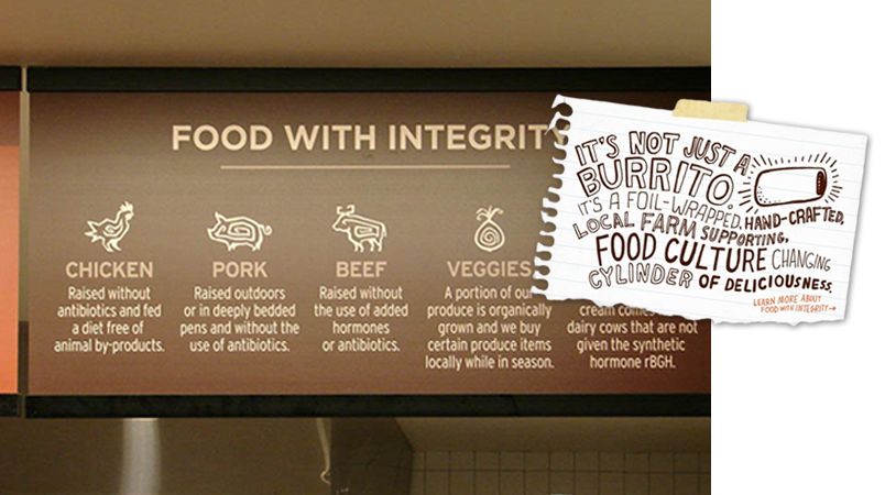
A brand’s consistency also applies to its behaviour in relation to the promises made by the brand. The consequentialchoices have an impact on the offer as well as on the selection of suppliersand partners, Chipotle, fast food brand established in 1993, has taken on themission of producing food with moral integrity, always seeking the bestingredients that are produced with respect for animals, the environment andgrowers.
Consistency then completes the bouquet of six values that, in Calvino’s opinion, are fundamental to the millenniumwe live in. We have tried to verify how these values and the implicationsderiving from them can be applied to the Brands that surround us.
In conclusion we feel able to claim that the most successful brands, which we encounter every day, all possess someor many of the following qualities:
‣ #1 Lightness, which sanctions the supremacy ofthe intangible over the material, which reigned in the last century;
‣ #2 Quickness, which affirms the value of intuitionover slower methodologies;
‣ #3 Exactitude in attention to detail as opposed tovague superficiality;
‣ #4 Visibility, which celebrates the imaginationover direct experience;
‣ #5 Multiplicity, which values curiosity overconformity;
‣ #6 Coherence, maintaining one’s identity withoutmonotony.
Privacy Overview