France
Paris
Switch to your local agency
Retour au menu
To introduce the value of multiplicity, Calvino quotes Emilio Gadda, who sees the world as a“system of systems” in which each individual system conditions the others andis conditioned by them in turn.
For Musil,knowledge is awareness of the irreconcilability of two polar opposites:precision and chaos. Multiple points of view and interconnected systems lie inthe tension between these two poles. It is quite incredible how Calvino wasagain able to so clearly foresee our contemporary age in this idea.
Brands, whichare the bearers of values and vehicles of the ‘sense’ of our culture, becomemore or less open systems that exist and adapt in relation to the other systemsthey are connected to, such as fashion and design for example. In this sense, we might claim that the value ofmultiplicity validates the primacy of curiosity, the ability to navigate andexplore the complex systems in the constant tension between precision andchaos.
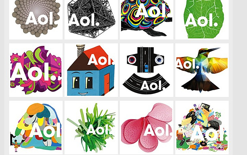
Many brands choose not to be represented by a single symbol, but through a multiplicity of signs that express every nuance of the brand and can reach different audiences in different contexts. AOL’s mission is to inform, entertain and connect the world through a multitude of extraordinary experiences.
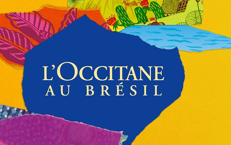
Anotherinteresting case is that of L’Occitane en Provence, which chose to expand intonew markets by localising their production and the entire brand experience. Inthis particular case, the whole brand is transformed and becomes L’Occitane auBrésil.
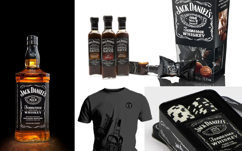
The ability of individual ‘systems’ to condition other systems is proven by Jack Daniel’s, which hasextended its brand territory to contaminate different categories with thepromise of a unique taste and well-defined lifestyle
Taking inspiration from Dante’s Divine Comedy, Calvino explores the mechanism of imagination, or rather the ability to create images in our minds that have almost ‘fallen from the sky’. Visibility is a value that must be preserved in this new millennium as we risk losing the capacity to imagine, to create images behind closed eyes.
The supremacy of the image over the word is a characteristic of our times. The image is rapid and concise, but above all inclusive, because it transcends geographic, linguistic and even cultural boundaries. The image speaks to everybody.
It is probably for precisely these reasons that we have witnessed the birth of Brands who have built their success on this ‘torrent of images’. Cases such as Instagram and Pinterest are a definite demonstration of how forward-looking Calvino was: lightness, quickness and visibility are the founding values of these Brands.
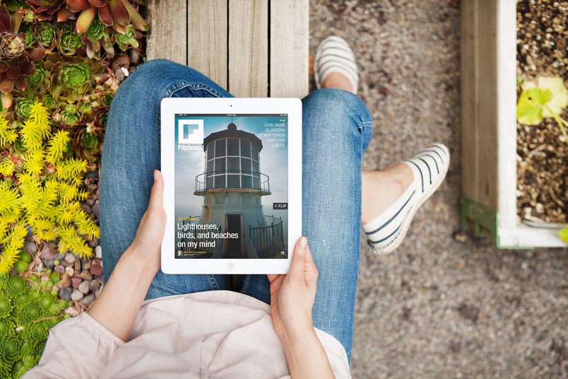
Even in the realm of information, which has been the chosen territory of the written word since its birth, is increasingly asserting itself with the use of an image-based approach to news. Within this context, we have seen the birth of successful brands such as Flipboard, which transforms the ‘torrent of news’ into a ‘torrent of images’.
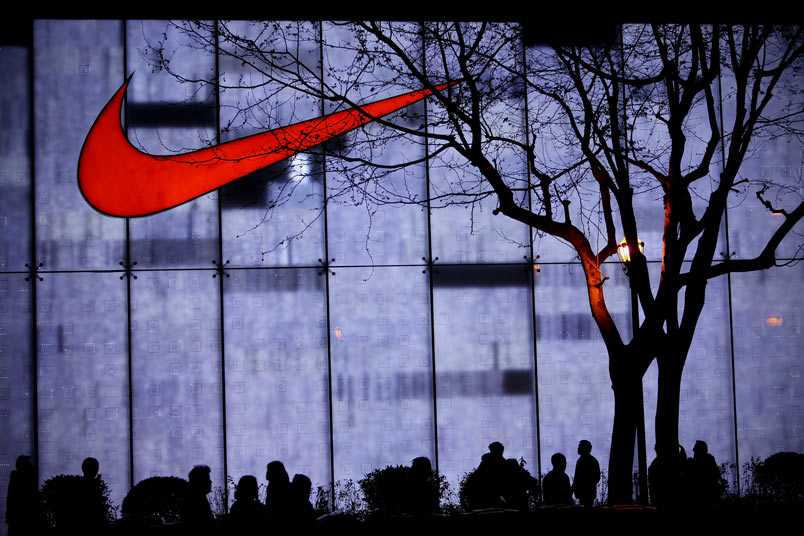
The brand Nike has demonstrated how a symbol, an image, can be a vehicle for the communication of a brand’s values in every corner of the world, making it unnecessary to adopt local traditions and otherwise localise the brand.
The ancient Egyptian symbol for exactitude was the image of a feather placed on the balance scale used for the weighing of souls. The name of the feather was Maat and its hieroglyph also represented a unit of measure, the 33 cm of a standard brick, and the fundamental note of the flute. We can define exactitude as the antithesis of the vagueness of approximate language.
Many years before the explosion of the Internet, Calvino brought the crucial problem that faces us today into sharp focus: information overload and the infinite multiplication of irrelevant images, which create deaf-ending background noise and make the search for meaning in every element of human communication quite urgent.
Born in the late Seventies, the brand created by Milton Glaser for New York City used the pictogram of the heart in a vivid, innovative logo. The clarity of the sign and its message make it one of the best-known and most-imitated brands in the world today.

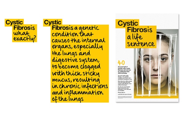
The non-profit association Cystic Fibrosis Trust chose to use brief, incisive messages as its logo, which explain what the illness is, what afflicted people have to face and what the association’s goals are.
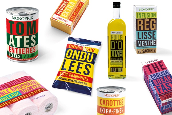
Monoprix, French emblem of large-scale retail, created the image of its products by reducing them to an exact description. The final look and feel, which is very colourful and pop, balances out the minimalist communication style.
Being design objects, pieces of furniture, fashion clothing or food, the beauty of these products is almost a signature of being Italian – the taste for life that we instill in everything we do.
It is difficult to define beauty or the common features that band products and handcrafted objects together, almost like an innate element of DNA, but what is certain, is our ability to always give something unique into what we do. During the inauguration of Eataly in Roma, Oscar Farinetti emphasizes the importance of the aesthetic side of products, of their beauty, part of the DNA of every projects.
Infact, the shopping experience in Eataly has a strong ‘aesthetic’, that goes far beyond the need to buy food, and although excellent, it is also about the desire to be part of a certain life style.
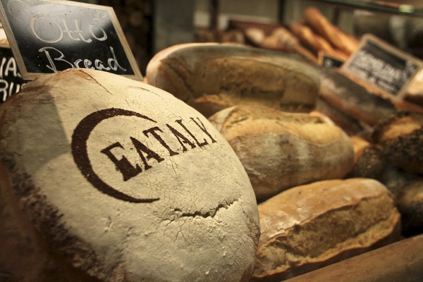
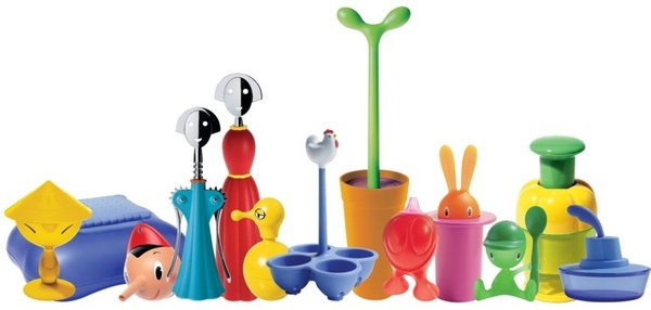
We italians are used to exporting beauty – we have done it over the centuries through all kinds of expressions. In the 60s, it helped us to educate the public through designing things for everyday use. For example, Alessi distinguished itself with a simple ironic style for kitchen utilities.
Still in the 60s, our ‘poor but beautiful’ cinema had an increased reputation around the world, with Italy becoming known for a country where hedonism and the continuous pursuit of pleasure is present, to which many people aspire.

However, in order to describe the “Italian Way of Life” outside of Italy, we must go beyond the stereotypes of Dolce Vita and begin to build a contemporary image to show the very best of our capabilities. That said, if we continue to talk about the past, there is the possibility of Italy being perceived as a “Country Museum”.
By carefully looking at the reality, we can find new ways of relating to our history and cultural baggage that “we drag everywhere”. One way to experience the history and the tradition, we can not just stop at the mere evocation with past, but grasp the deeper lesson and build innovation.
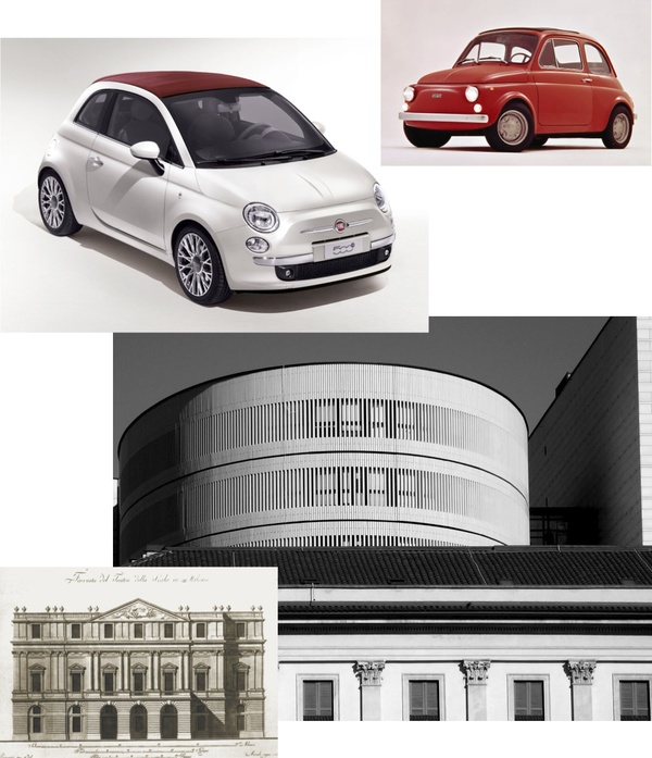
To retell the story and originality of Italian excellence, it is necessary to emerge the core values of being Italian, and to differentiate every single brand. Simply inserting the Italian flag is not enough.
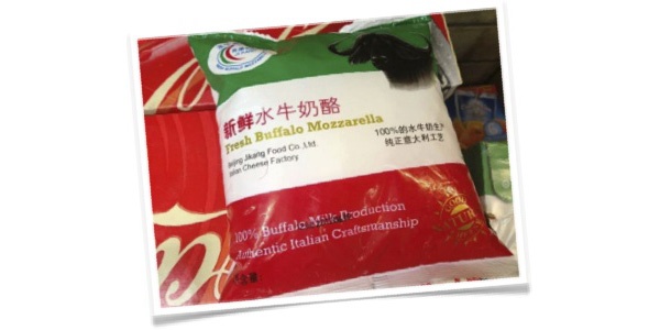
At CBA, we always get excited, even if we are required to represent the origins of an Italian product. We always find a different angle that allows us to tell a story. To export “la Dolce Vita” means to give away a piece of our aesthetic experience, without taking anything for granted.
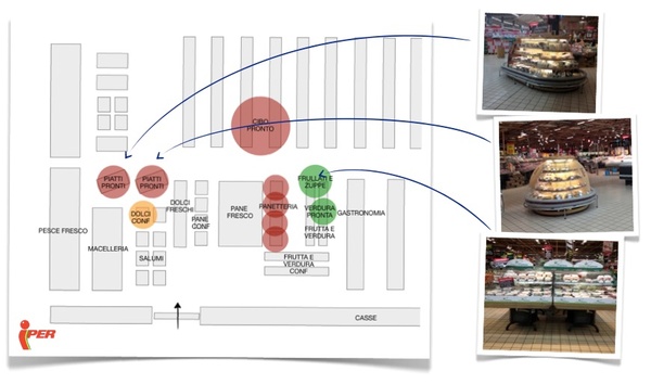
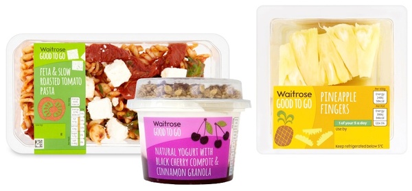
If this is true in numerical terms, with data that indicates a substantial growth of the category with 86% of the purchase managers who have bought prepared dishes in the second part of 2012, Italian retail distribution has however moved towards this offer in an almost undifferentiated manner, not meeting the needs of a target in rapid evolution and in the search of solutions that are always new, both in terms of taste and service.
Looking at the Italian consumer in fact, the drivers for the purchase of ready meals are definitely linked to specific factors such as variety and taste, but especially in eating habits and in the socio-demographic evolution of the Italian consumer, where there is the start of emergence of new needs and habits. We are thus faced with a fragmented target, which now expresses different needs compared to when the category was born.
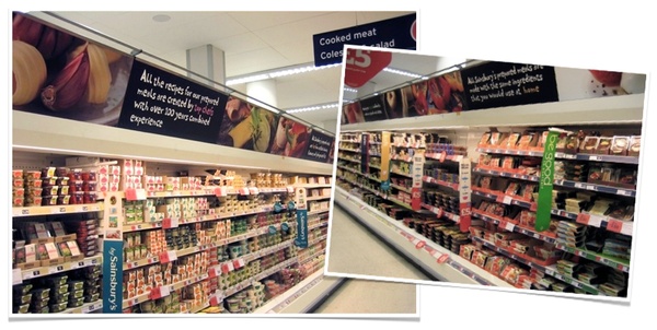
As is known, the UK has always been the country of the Private Label, and it is in fact overseas that for quite some time it has been understood that the future of retail and commercial brands resides mainly in the kitchen. The English market for ready-to-eat dishes is absolutely the most advanced one, indeed, reflecting the eating habits of the typical English consumer. The outcome of this is a sales space that is almost exclusively dedicated to ready meals and a breadth of the assortment that is truly immense. The communication has as its centre the concepts of quality and the genuine nature of the products offered, besides supporting the consumer in the navigation at the shelf.
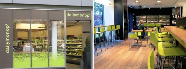
Even France emerges as one of the most mature markets in the ready meals offer. Time is in fact more and more valuable, and to be able to shop for groceries with speed, or a bite to eat on the run is an increasingly common request of the consumer, that’s how the Monoprix group launched in September 2003 the concept Dailymonop’. Inspired by the universe of the convenience store, it proposes a wider offering than traditional snack foods, and the possibility of consuming it in the store.
The German Rewe Group, one of the main world actors of the large retail distribution, has recently inaugurated its new food service concept in Cologne. Open next to a Rewe supermarket but accessible from a separate entrance, MADE by Rewe has a surface area of about 200 square metres. The assortment of the new format includes both ready-to-eat dishes and ones that are prepared on the spot and, depending on the time of day, with a menu that varies from pizza, pasta, soups, salads, sandwiches and snacks, desserts and drinks. The new concept allows the German consumers to bring home their food or to consume it in the restaurant area.
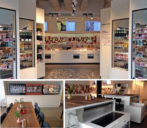
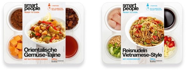
But the most interesting novelty is represented by the line of products called ‘Smart People’, composed of ready-to-cook dishes that include all of the necessary ingredients for their preparation, in addition to the relevant recipes.
During the twentieth century, quickness was a vector of progress, from futurism to automobiles, from transoceanic transport to the first man on the moon. Calvino however, referred to quickness of thought defined in antithesis to “methodically rigorous thinking, which proceeds slowly and with caution”.In this sense, quickness is not only to do with the ability to think critically, but rather intuition or, as we would say nowadays, lateral thought.
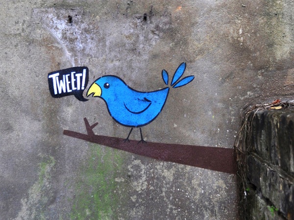
The ability to think critically and quickness are the two fundamental characteristics of Twitter, a Brand that has demonstrated its ability to be relevant to the latest generations, especially overseas. Twitter is a Brand/Service that is so quick it can spread the most superficial gossip as if it were crucial information and mobilise uprisings during the Arab Spring.
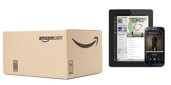
Quickness is the vital promise of some Brands: Amazon has built its success on being able to source anything you need in a short time; even Spotify, for example, gives you access to “all the music possible” in an instant.
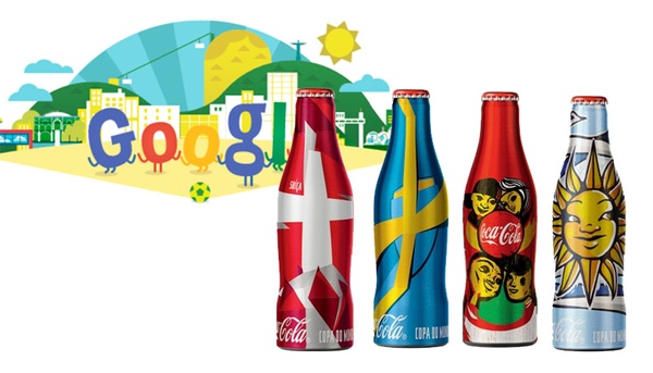
Google has taught us how important it is for a Brand to be able to react quickly, to mutate quickly depending on the context. In this sense, the Google Doodle or special editions product packs represent this “swift manner of speech” that each brand has to broach with an up-to-date approach.
Let’s finish off with the story told by Calvino at the end of his lesson:
The first of the six ‘American Lessons’ was dedicated to lightness. Starting with a classical reference, Calvino recalled how the only hero that could behead the Medusa was Perseus, thanks to his winged sandals. So lightness is defined as the opposite of heaviness. Following the heavy millennium of the industrial revolution, steam and steel, came the light age of information, communication and bits.
In the transition between millenniums, we have witnessed the decline of
heavy brands in favour of their lighter competitors. One example is how Microsoft lost a lot of power to Apple, which has always adopted a simple approach to technology. From experience, we think this is a success of lightness.
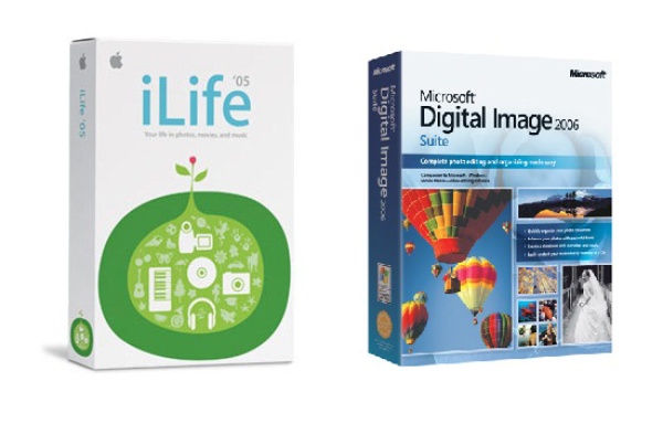
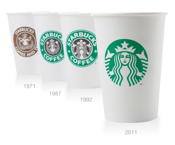
Visual language, the way many Brands express themselves, has also become lighter in recent years. The lightness of language is achieved through subtraction, which does not entail sacrifice, but rather means focus, synthesis and ultimately greater stature.
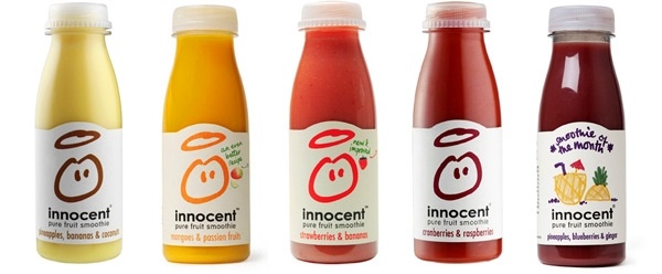
The tone of voice used by Brands can also become lighter, almost as if it were a direct response to the weight of living as suggested by Calvino. We have seen the birth and development of brands that are able to handle very important themes, such as sustainability and the future of our planet, with lightness.
These are just a few possible examples, we invite you to reflect on these ideas with us and follow us over the next few months in our discovery of the values that might inspire us in the next millennium.
Privacy Overview