France
Paris
Switch to your local agency
Retour au menu
We have been discussing how brands should behave in the digital switch. We are now moving on to talk about the other main aspect involving the increase in online shopping: the retail world, commercialising brand products, that is the “box” leading our purchase choices.
Until today, offline retail has played a key role in defining the customer’s purchase experience, especially in its first stages: awareness, testing, search and selection of the product. Today these phases are happening on digital platforms. How can we re-think them related to the purchase behaviours we assume? How can we make them attractive, different from a simple search engine or customised advice? How can we imagine the future digital shelf, able to catch the customer’s attention and to respond effectively to different needs?
An answer to these questions emerges from the results of qualitative research we conducted interviewing a selected sample of people from Paris, Milan and San Francisco, investigating their purchase habits: by doing so, we found 5 purchase behaviours that characterise us as customers, depending on our shopping habits and on the item purchased. We have therefore imagined a possible digital solution for each purchase behaviour that can make every customer’s journey relevant to every need.

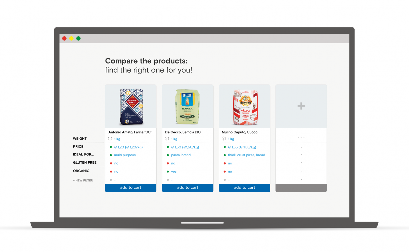
It’s the typical behaviour of consumers that meticulously read every information label on every product they handle, comparing features, to understand which product best fits their specific needs. The amount of time and money are not drivers for the choice, instead it is specific information and the possibility to compare many products in a simple way. In this case a “product comparator” on the e-commerce platform is the ideal tool for this kind of consumer, to be applied to specific products suitable for comparisons (i.e. not salt or sugar).

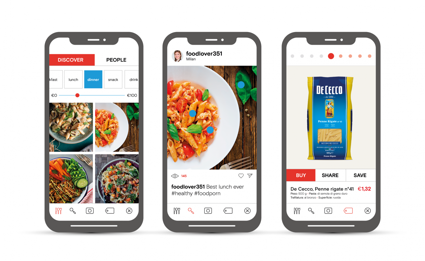
It’s the purchase behaviour of people who are enchanted by aesthetically appealing and innovative products, with shapes, visuals and design that deserve to be posted on Instagram. There is no loyalty to brands, but a continuous search and experimentation of new products that from time to time seem attractive to the customer’s eyes, generating compulsive purchases. An e-commerce platform that is relevant for this purchase behaviour should have a dedicated section that really concentrates on the visual content that could surprise and satisfy the aesthetic search. This can be developed by accurately selecting the best products available in store. These pictures should be taken in detail, mainly about objects in their actual context of use, thus capturing customer’s attention much more than the small standardised images, on a white background, which are typical of e-commerce catalogues. 21 Buttons is an example, in the fashion field, of how products can be visualised in a catchy way and how influencers and models can also be involved in this kind of product presentation.

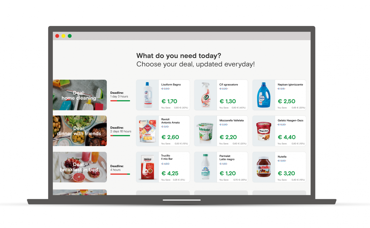
It’s a purchase behaviour clearly related to the price as a fundamental driver of every purchase. It’s not about the cheapest price but about the deal you are getting. We are talking here about the real pleasure experienced by those who know they have bought something at a lower price than what is perceived as the “true value”. So why not equip the e-commerce platforms with a configurator that collects the purchase data, and through a path of choice guided by simple questions, proposes to the user the best in-store deals available? This system could be based on a choice linked to the consumption opportunities rather than on the concept of the shopping list: do you have to make dinner for four people, with fish, on a shoestring budget? The system is able to offer you a basket of suitable products at a super-affordable price. The Nordstrom Gifting app, for example, helps users to find beautiful and surprising gifts at the best price, conversing with a chatbot that uses artificial intelligence.
The key decision driver is the time, or rather the small amount of time, that you want to dedicate to grocery shopping. How can you minimise the time and energy spent on an activity that is considered boring or even unnerving? If the price does not matter, the brand does not count and the product details are not relevant. The ideal solution for a platform that wants to meet this need is to provide a shortcut to purchase by totally removing the selection phase, providing a grocery subscription. Through an initial profiling of the user basing on important information, a connection with their calendar and a machine learning approach, the platform is able to model products and frequency, with no involvement on the user’s side. Consumers will be able to easily provide feedback and suggestions, when and if they decide to. There is a similar example in the travel world: it is Anywhr, which provides a complete tour operator service, upon subscription, taking away any kind of thought related to the organisation of a trip. You provide the dates, Anywhr decides the destination and organises accommodation, transfers and visits. Clearly, for these solutions to be successful, the initial profiling phase is crucial where the user declare his tastes and preferences, intolerances or general restrictions, so that the system can provide a fast and simple service, which is truly satisfying for the user.
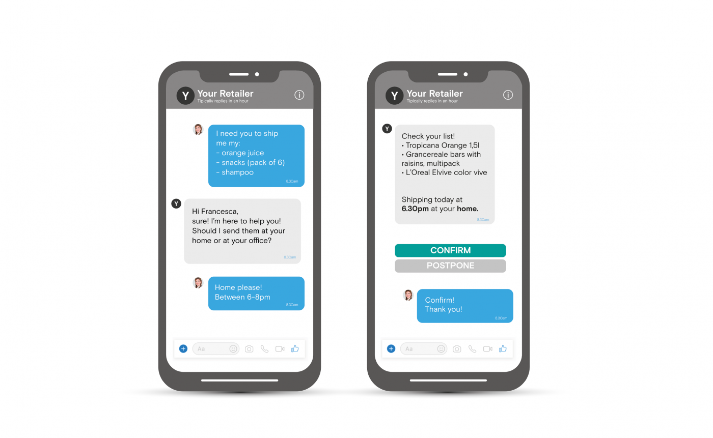
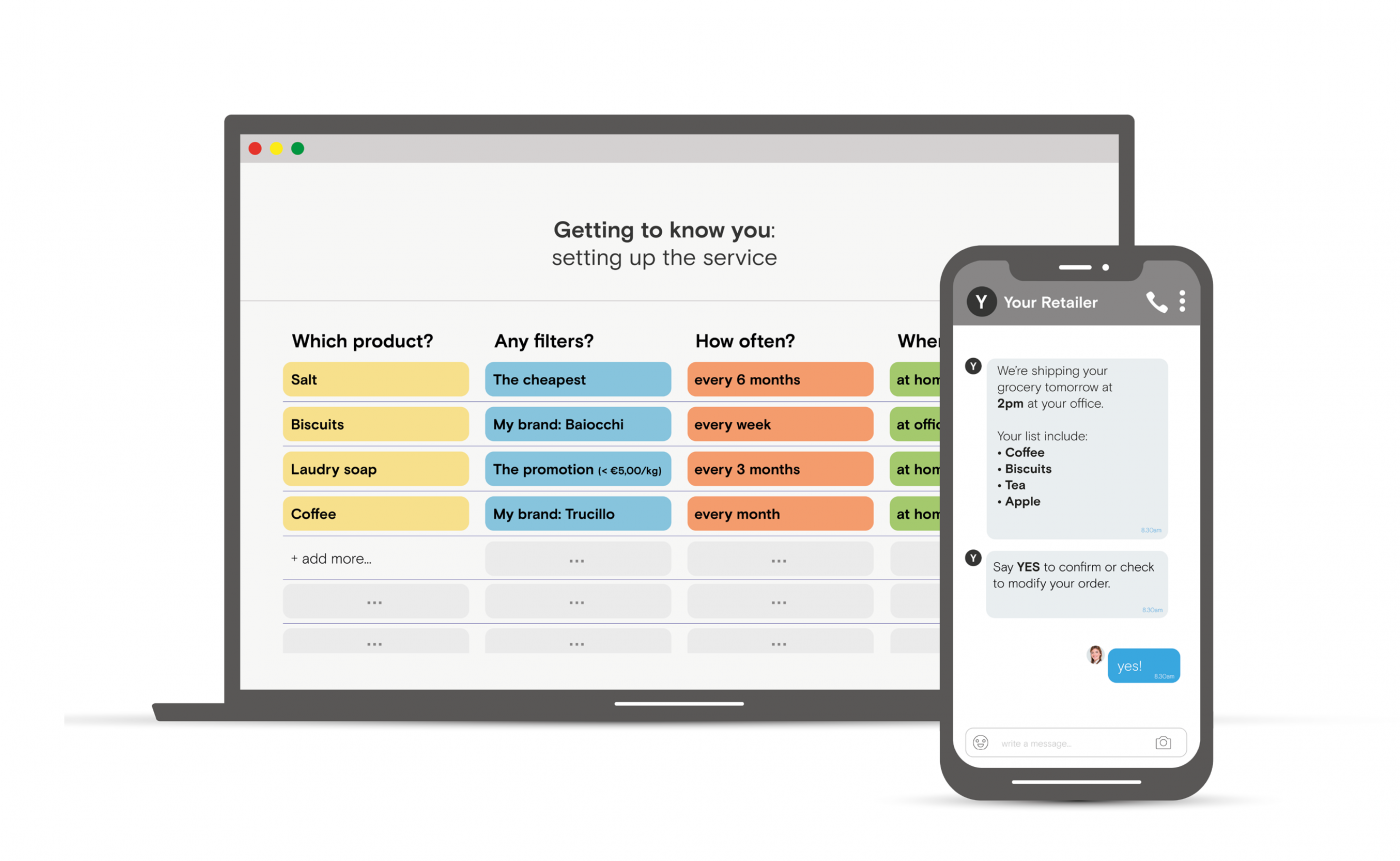
It’s the purchase behaviour that focuses on the brands, the ones to which we are attached. It’s a kind of purchase that finds in the brand a certainty, a reliability and also a certain dose of affection for everyday products. To be relevant in a scenario where the choice of the product has already been taken by definition (the choice of the brand is already done), it may be interesting to reduce the effort and the timing of re-purchase of the desired product to the minimum. For example, online shopping platforms could develop a service based on an initial profiling process in which the users indicate their favourite brands. Once this is done, all the shoppers have to do is to upload a shopping list, or send it by WhatsApp, and the platform will take care of shopping for them, making them skip the search phase and optimising consumer’s time. Also, with its Dash button, Amazon has devised a system to make reordering your favourite brands extremely easy.
Online grocery shopping in growing 3 times faster than offline (Food Marketing Institute and Nielsen “Digital shoppers”). Online supermarkets sales on digital platforms are predicted to capture 20% of total sales by 2015, reaching $100 billion in US (Kantar Worldpanel’s latest report u0022The Future of E-commerce in FMCG, November 2017).
The reason why? Faster and cheaper delivery, online exclusive deals, easier returns and 24/7 availability. Even if many people still prefer the hands-on approach of shopping in a store, high street outlets are starting to suffer as more and more people chose the comfort of online shopping rather than bothering to leave the house.
The leading actor of the offline shelves is undoubtedly the pack, one of the first touchpoint with whom we get in contact with the brand. When we switch channel and we find ourselves surfing on digital shelves, what is its role? How does it change?
The colors of packs, their fonts and call to action, pounce upon us from offline shelves redirecting our attention and our choices. On the other hand, when we’re on the online shelf, the pack often loses completely its function and it becomes a search engine support, a slideshow that over and over portrays the product with little effect on the user. If offline I can touch, see and read the pack, online I just can “recognize” it (from far away).
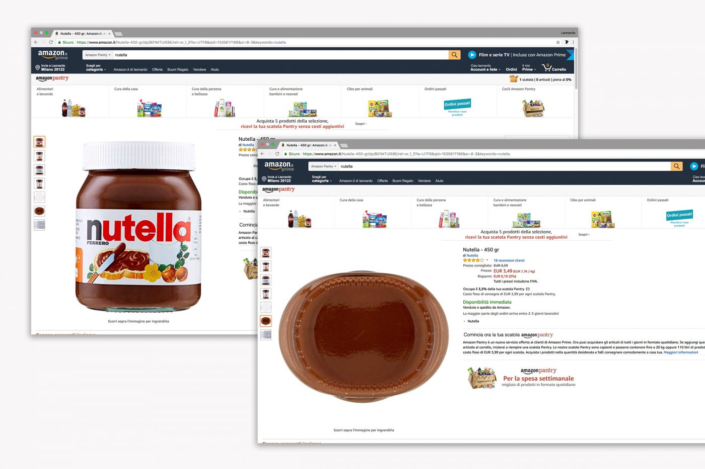
To deeply understand how the role of packaging changes online and how does it influence customer experience and purchasing choice, we went out in the field and talked with consumers. We did this in order to understand their purchasing behaviors and then we identified opportunity areas for brands and retailers as well as actions aimed at strengthening the relationship with their consumers online.
Offline, the packaging has always been crucial in the first stages of customer journey, where it orientates the products search, and in final stages, when we use the product and we store it in the larder. Differently from grocery offline shopping on the e-commerce platforms we can’t rely any more on packaging to attract and inform the customer on our products. On the other side, the central stages of customer journey – the using and the conservation of the product – are the first and unique phases in which online customer comes in contact with the packaging.
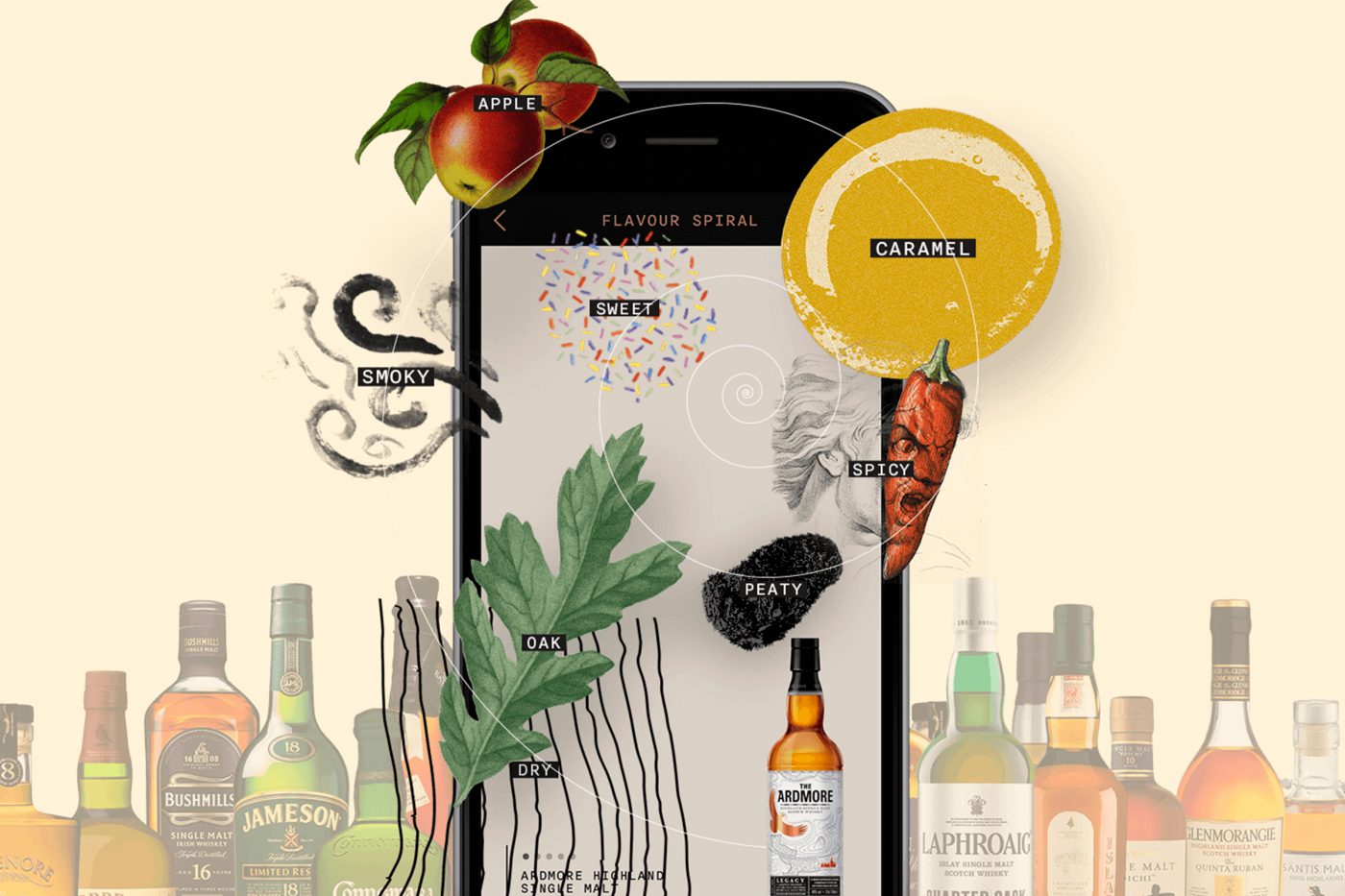
Goal number one of all the brands today is to be visible, easily recognizable on the platform and to be chosen among all the other products. Working on a strategy based on the creation of a series of emotional visual assets, varying from pictures to videos, to better visualize and understand the product. This will help the consumer’s navigation on the platform towards your product. This is what FLAVIAR proposes, alcoholic drinks brand, that presents users with visual depictions of the flavors associated with particular alcoholic drinks.
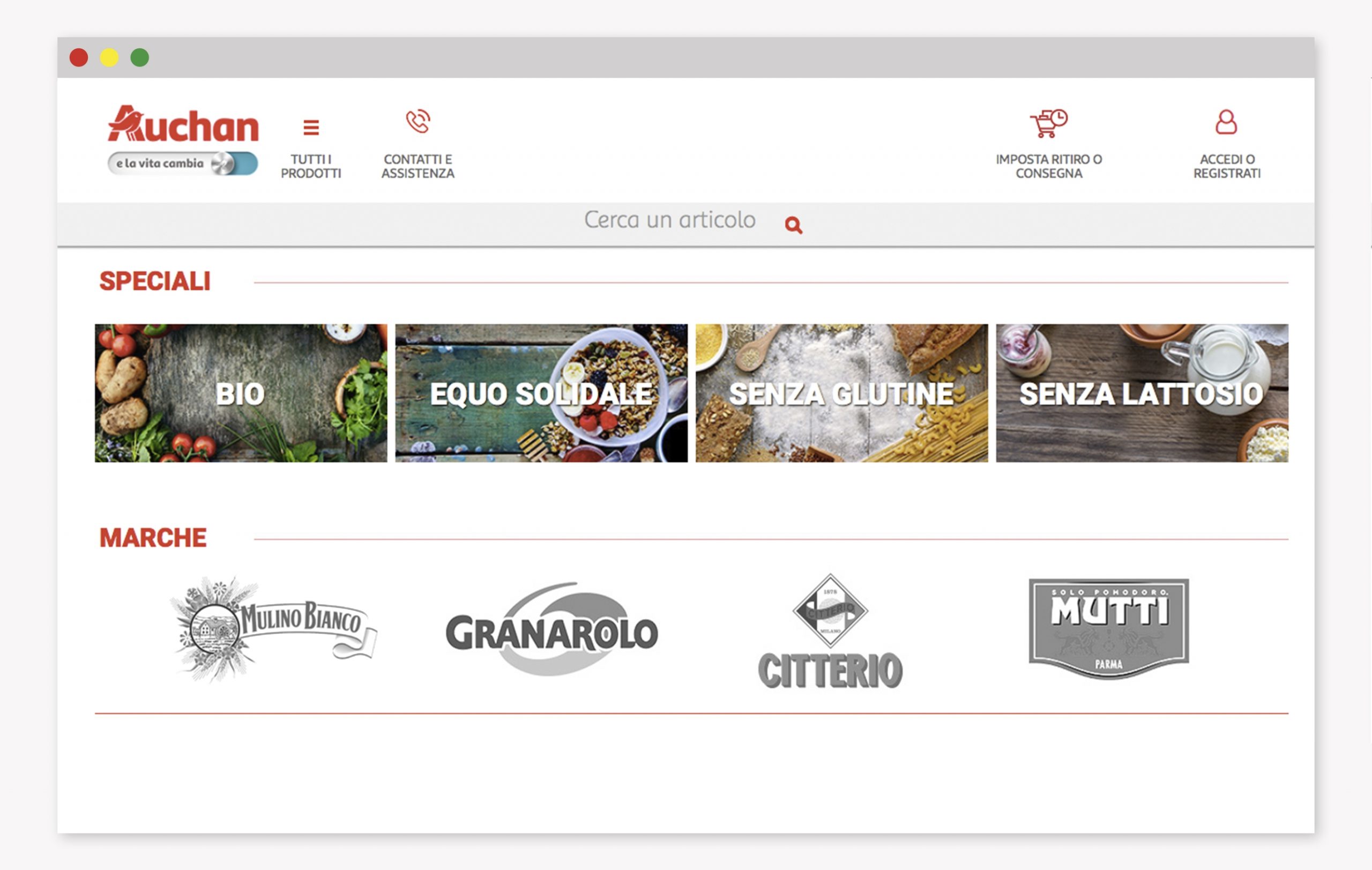
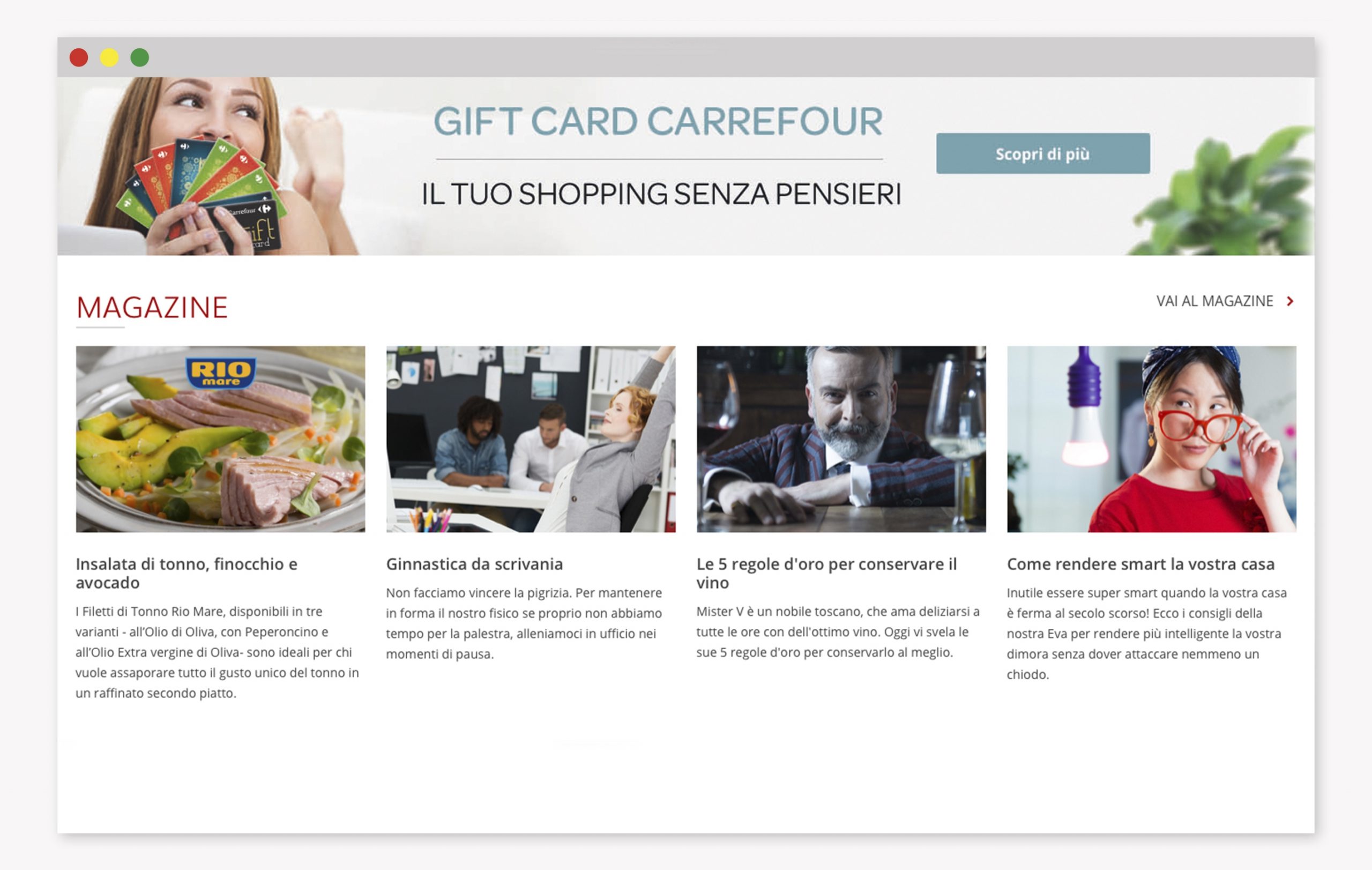
Collaborate to improve the experience on the retailer platform, in order to make your brand more visible than the others. When purchasing, online platforms are the ones taking the lead over products and packaging. There are several brands that, with specific agreements, get higher visibility on supermarkets’ online platforms. For instance, on Auchan’s e-commerce there are brands like Mulino Bianco, Granarolo, Citterio and Mutti that stand out on the homepage. Or on Carrefour website home there is a “magazine” section where brands like Rio Mare explain how to prepare the best tuna salads.
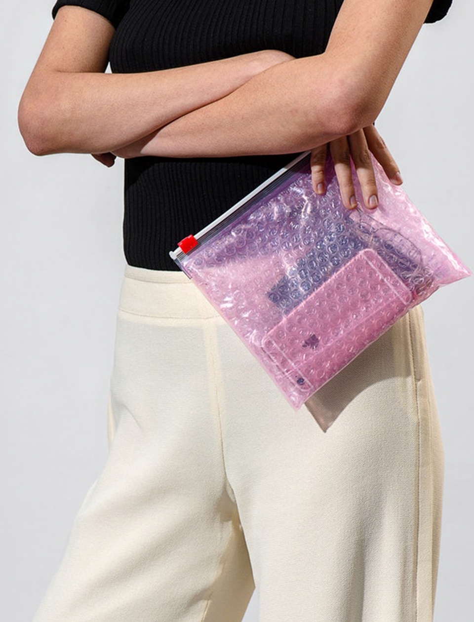
Delivery, unboxing, usage and storage are phases that are not considered enough when designing a pack. Working on the role that packaging can fulfill in these late stages of the customer’s journey can be a key differentiator to strengthen the relationship with your consumers. GLOSSIER‘s packaging is like a ziplock bag with pink bubble wrap inside, and it became a must in every woman’s handbag. It become such a hit that on the website that they even started selling the empty pack by itself.

What does constructing a brand identity mean? Form a personality for the brand through a visual and iconographic language, effective communication, or even the design of every single touchpoint: these are all elements which determine the perception and reputation of the brand from the point of view of its public. A perception which is not only rational but also profoundly emotive and instinctive, on which the approval and the consequent success of the brand depends.
The visual image is, however, not the only answer.
How can I get my brand onto the market? How can I reach my consumers? Through which channels and actions? Through what forms is the brand perceived by its consumers? How can we reach the heads (and hearts) of users? The go-to-market strategy is the answer. Answering these questions means planning a strategy aimed at constructing a relationship with our clients. According to the combination of factors chosen for implementation, brand perception by users varies considerably and, consequently, the brand identity is also affected.
Brand identity is therefore not (only) the result of its visual image but also of the combination of all channels and actions which are carried out by the brand in order to construct a relationship with its clients.
The various combinations create differing brand perceptions and, consequently, this significantly influences the brand identity.
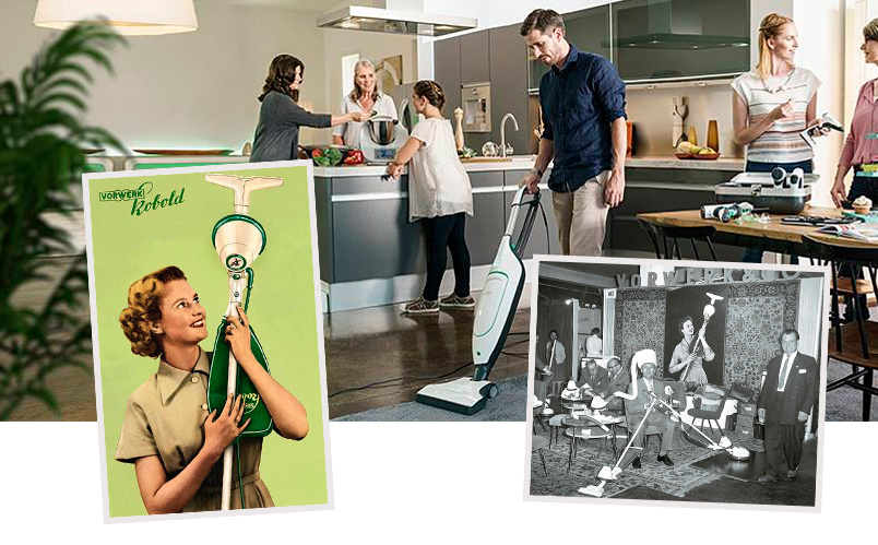
Vorwerk Folletto
The German company entered the Italian market as far back as 1938 with a new sales technique, the door-to-door model, a technique which is still in widespread use for a number of product types. The main value that the brand wanted to project to the consumer was (and is) loyalty. The brand uses the strength of the relationship economy, based on authentic human relationships, which generate a positive feeling of trust in consumers, in order to position and differentiate its products on the competitive scene. The product that it sells costs more than those of its competitors, and it is often difficult to understand all its functions or use all of its modes. A demonstration at home, accompanied step by step by interaction with the sales representative, is fundamental in order to convince and impress the target. Consequentially, this generates a bond of trust with the seller and the brand it represents.
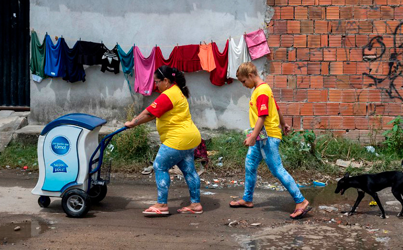
Nestlé Brasile
The same door-to-door sales strategy is applied by the multinational company Nestlé in the main Brazilian cities, which uses a network of micro-distributors and individual sales representatives who, with a cart, manage to reach the most inaccessible areas of the city. By using this strategy, the brand has managed to provide employment for a large number of women from the poorest areas, and to sell its products in difficult-to-reach or completely inaccessible areas. Furthermore, by selling food at low prices, the brand has been well-received by the population, creating a feeling of trust and reciprocal support. A brand which is “close” to you, not only via that which it communicates, but also in the way it reaches you wherever you are.
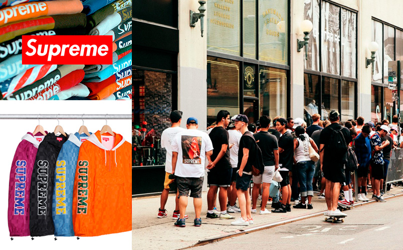
Supreme
One of the currently most fashionable and talked-about strategies is that of the “drop”. Supreme applies this sales model by releasing new products every Thursday morning in its online store and its five physical stores world-wide. This strategy has generated an unprecedented level of physical and virtual traffic, approximately 1 billion views in one drop in 2016, increasing the traffic on its website by 16,800% and creating queues in front of the stores days before. This strategy, accompanied by a communication campaign which transmits the same values of exclusivity, has permitted the brand to achieve this elite, inaccessible and extremely fascinating image.
The experience of the three case studies shows how the go-to-market strategy, the choice of channels used to reach one’s clients, the method of interaction with them, the frequency of the relationship and the key actions carried out by the brand, are an integral part of the very identity of the brand. Being a loyal brand comes through the human and profound relationship with those who sell the product (in the case of Folletto); brands which respond to daily needs are those which reach you wherever you are (Nestlé); and lastly, being exclusive is not only a question of gold and sequins, but of intelligent sales strategies (Supreme).
The way I contact and address my clients is the very heart of my brand identity.
Irene Serafica
Strategic Design Lead
When it took its first steps 20 years ago, Italian craft beer mainly had to compete with wine. In an initial attempt to compete directly, it borrowed methods and visual codes: a 75cl bottle size, visuals inspired by the rural soul of the winemaking world, and price positioning and consumption occasions which all belonged to wine.
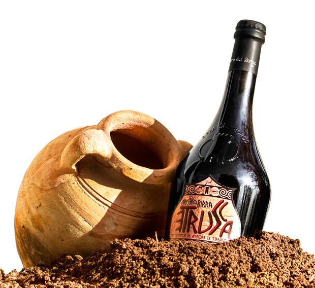
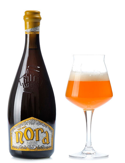
Only in the last five years we have seen a marked change in direction: the craft sector has distanced itself from traditional, artisanal positioning to move towards a more contemporary craft territory. Gradually, it started speaking the languages of the brewing industry, from the use of 33cl bottles to greater immediacy in communication, from the simplification of its packaging to the attempt to position itself as more of an everyday product.
Even beer styles and therefore product ranges followed the same shift. Initially, Italian craft beer was associated with a product that was often complex and rich, whereas nowadays it has expanded to include more simple and accessible styles, such as lagers – previously relegated to industrial production only – or styles influenced by contemporary trends, such as American IPAs
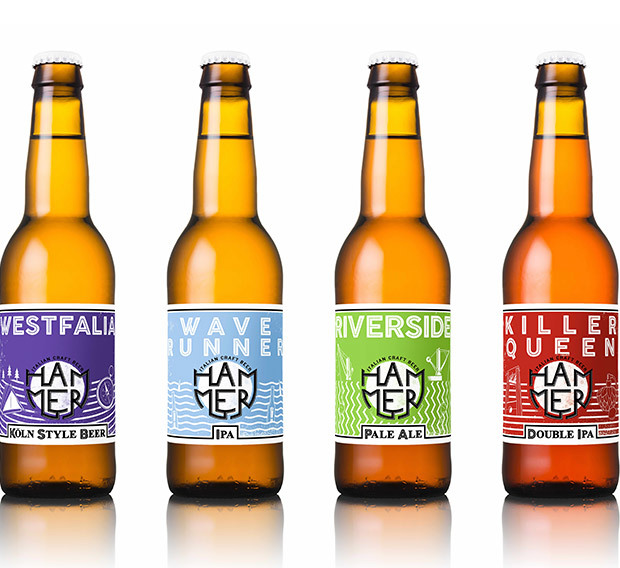
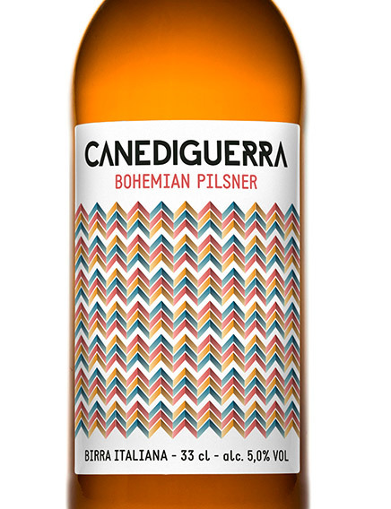
The normalisation of craft beer is destined to continue. From all fronts, an ever-growing number of products and brands will seize the middle ground between artisanal and industrial: we will see more and more craft-like industrial beers and more and more breweries with an industrial setup.
This middle ground will grow, eventually becoming the norm to the detriment of small artisan producers and the slight erosion of the industrial beer market.
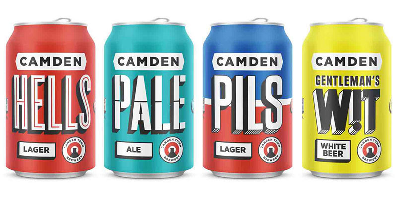
An excellent example of this transition in the UK market is Camden Town Brewery. A microbrewery that was born, like so many in London, under a railway arch, with a small site and only a handful of staff who, however, have shown themselves to be strongly consumer-oriented from the outset. The creation of a taproom where they could sell their products and bring the brand experience to life, a visual identity that is based on a simplicity and directness that are instantly attention-grabbing, a flagship product that very courageously redefines the everyday lager and an entrepreneurial mindset that led them to launch a successful equity crowdfunding campaign and finally sell the business to AB Inbev.
In the coming years, the real growth will come from those who will be able to make craft beer, namely beer that average consumers would define neither industrial nor artisanal, more accessible not only in terms of distribution and price but also in terms of communication and visual languages.
With a background in Carlsberg’s Italian and Danish marketing and innovation teams, she made her way to London, where after three years as a brand strategist at Kantar Added Value she founded ByVolume, a creative agency specialising in food and drink. Her product knowledge stems from an expertise that can only come from true passion: she regularly judge at beer competitions around the world including Birra dell’Anno (Beer of the Year) in Italy, the International Beer Challenge in the UK, and the World Beer Cup in the USA.
Probably you have also heard that Milan’s seafood is the freshest you can get in Italy and that the Seafood Market is its home. For individuals, it opens the door on Saturday mornings from 9:30 am, but to breathe the authentic air of the market, you must be there before 4 am. And maybe, you should be guided by an exceptional Virgil as Enrico Buonocore, creator and manager of the restaurant Langosteria 10.
The fish market in Milan is a paradise for restaurateurs, among the most modern in Europe and the most important market for fish products in Italy for quality, range and freshness. Each year 25 thousand tons of fish pass through here: wild or farmed, smoked, frozen.
If you want to be sure to have the best raw material, you can not miss the appointment. Enrico certainly doesn’t miss it: he personally selects tuna and prawns, shrimp, oysters and lobsters for his restaurant. In short, all the best that the sea can offer.
He seems to be home, he moves with familiarity among the fish crates, demonstrating the quality of fishes and telling the different ways of cooking them. Enrico knows all the people and all the fish in the fish market. The breadth of the offer and the infinite varieties, the different characteristics and origins, respect for the raw material, different cooking techniques, come from a wealth of experience, made of perseverance and determination.
The passion for cooking, born when he was a child and matured and refined over the years, combined with the dedication with which manages the company, led to its success. Because it works, only if it is run with heart. A passion that shines through his words as he explains how to recognize fresh fish or how to match the wine to his dishes, so real we can almost smell it.
Are you curious to know more? Discover the story Made with Heart of Enrico and his passion for fish, in the video by Il Sole 24 Ore.
Zinc is a bar. But it is not only a bar, is a place to discover new cocktails, starting from the quality of the ingredients, possibly homemade. The alchemist is Enrico Contro, aka Frog. That tells us that the bar is named because of the bar, which is made from zinc, used in the Twenties and Thirties. In France they used to say “Let’s got to the zinc” to mean “Let’s go to a bar”. Zinc is also the element of the periodic table that recurs in the image of the local.
Frog likes the concept of laboratory, where all the bartender may propose their own ideas: he surrounded himself with professional people with different points of view, with a creative twist and passion for work and study. Just as happens in the agency: the right proposal, the most surprising, can get from an experienced designer as from a junior designer.
Frog speaks about simplicity, cocktails with a simple structure but no less interesting, that do not require complex mix of flavors that you can hardly identify. Exactly as in branding: a strong idea is simple, does not require large explanations because it can be told in a couple of words.
Inspirations are everywhere, it needs a lot of research: one example, Dale DeGroff who worked at the Rainbow club in New York, a pioneer in the art of cocktail that towards the end of the 80s. He experienced a gourmet approach to recreate the great classic cocktails. And it has begun to make ingredients himself: in this way each bar has its own line. Just like Frog with Zinc.
Talking about his Master, Oscar Quagliarini – u0022bad boy of Italian mixingu0022 – says: u0022He (Frog) got me started in the study, the attention on the customer, the execution of the drink, the use of quality products and fresh fruit squeeze, the passion for this work.u0022
Modernbarmen and bartenders have lost empathy with their customers: knowing how to listen, understand the mood and with a little luck you can even cheerthem up.
According to you, what is Frog’s favorite cocktail?
Discover his story Made with Heart.
u0022The idea of bringing to life Pastificio dei Campi was born in 2007, when the market of pasta was not yet so orientated towards innovation. Certainly beginning to develop itself is what we can define as the macro-trend of the bio product and of premium foods… but to think that pasta, the most popular and economical of Italian products, was able to become something exclusive, to sample and to appreciate as if it were a fine wine, that was a risk.u0022
Di Martino begins to tell its story, highlighting at the start that the idea of building a sustainable business around a premium pasta would not have been an easy enterprise.
u0022My family has always produced pasta, in one of the territories that have become renowned in the world thanks to pasta: Gragnano. And it is from here that I wanted to start to pursue my ambition: producing pasta of very high quality. The first step was that of asking myself and my collaborators a simple question: how can I, how can we do our work better?u0022.
u0022Farmers, millers, and pasta makers that work for my business have, like me, pasta in their DNA. They have known Gragnano and its fields for generations, as well as knowing pasta better than anyone. The recent ascent of the international markets and the necessity of producing on a large scale, have however removed the present technologies of production from the antique production methods, standardising the typology of the offer. My intention was in fact that of recovering this knowledge and making it become a niche market, finding the right balance between knowledge and innovation, between quality and modernity.u0022
u0022It is necessary that each actor of the production line, taking off from simple executer of a technical production plan, becomes a protagonist, transferring his or her entire know-how in every package of pasta. The territory, the harvesting, the storage, the preparation of the dough, the procedure, the drying, the packaging are all factors that play on a fine balance and we are all seeking to optimise each passage, although realising that this is going to bring about an inevitable increase in production costs.u0022
u0022Obviously we knew that to make these costs sustainable it would be indispensable to position ourselves and to communicate in a certain manner. We have therefore used the same approach we had used in the past: How can I enhance the design of my product? How can I communicate its quality? How can I create a truly involving brand experience?u0022
u0022To market the pasta a package had been designed in the shape of a cardboard cube, with windows in plastic that allow the immediate recognition of the pasta’s shape. The cube is very functional during transportation and conservation of the pasta, because it protects it from humidity and can be stored anywhere. At the same time, it is possible to close it once the desired amount has been dosed out, without having the package break and its contents get scattered. Furthermore, in the creation of the ideal package, we started by the needs of the chef, who stores pasta in drawers; in this context the cube with the visible product from above was the most rational and convenient solution.u0022
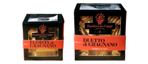
u0022The cube is also an excellent means of communication. Its faces not only are used to communicate who are the actors of the production process, but also to allow the consumers to visit the place of origin of the product itself, by means of a system of traceability. Entering the site of Pastificio dei Campi and inserting the product code, it is in fact possible to know the field in which the grain purchased was grown, the moment of its planting, the day in which it was harvested, the silo in which it was conserved for the entire period leading to the milling. And still further, the mill in which the miller ground that grain so that it would become bran of durum wheat, the day in which was delivered to Pastificio dei Campi and the day in which the bran became pasta, thanks to the work of the pasta maker, and the day in which the pasta was loaded into the packages by the packer.u0022
The entire life of a package of Pasta dei Campi is thus traced and the protagonists of this story finally have a face and a precise place. But will there be a happy ending?
u0022Pasta dei Campi today is sold in selected gastronomy shops and in the most prestigious Italian and foreign food markets. In Italy it is sold at the Rinascente of Milan, at the gastronomy shop Roscioli in Rome, at the Enoteca Di Leva of Gragnano. Outside national boundaries it is available at the Bon Marché in Paris, at Harvey Nichols in London, from Mmmmh in Brussels, from Isetan in Tokyo or from Pusateri’s in Toronto. Some chefs of the highest level have chosen it for their own restaurants: Gennaro Esposito of the Torre del Saracino, Andrea Berton of the Trussardi alla Scala, Libera Iovine of the Melograno of Ischia, Alessandro Boglione of the Castello di Grinzane and still others.u0022
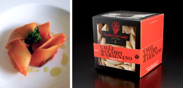
Giuseppe Di Martino showed us that to have a vision and to pursue it with tenacity are the necessary premises for success. The rest was accomplished by the ability of telling an interesting story and the attention given to the needs of the consumer in planning the product Pack.
And so that it is a happy ending, with the hope of soon hearing other stories like this one, whose protagonist, why not, could be one of these students. We’ll be waiting to see, but in the meanwhile we thank Giuseppe for this extremely interesting lesson.
Privacy Overview