In the second half of the 15th century, with the development of moveable-type printing, Venice became one of the most important centres for typography art. One only has to think of the exquisite work of Francesco Griffo for Bembo, a typeface studied at the end of the 1400s for “de Aetna” by Pietro Bembo, from which it takes its name.
There was however a character that was to be associated with the timeless elegance of Italian printing, the Bodoni, created a few centuries later in Parma. Again in this case, the name of the typeface was associated with a surname, that of Giambattista Bodoni, a native of Cuneo who lived in Parma. Bodoni was born in 1740 to a family of typographers, and after years of training in Saluzzo and Rome, he moved to Parma, where he became director of the Royal Typography.
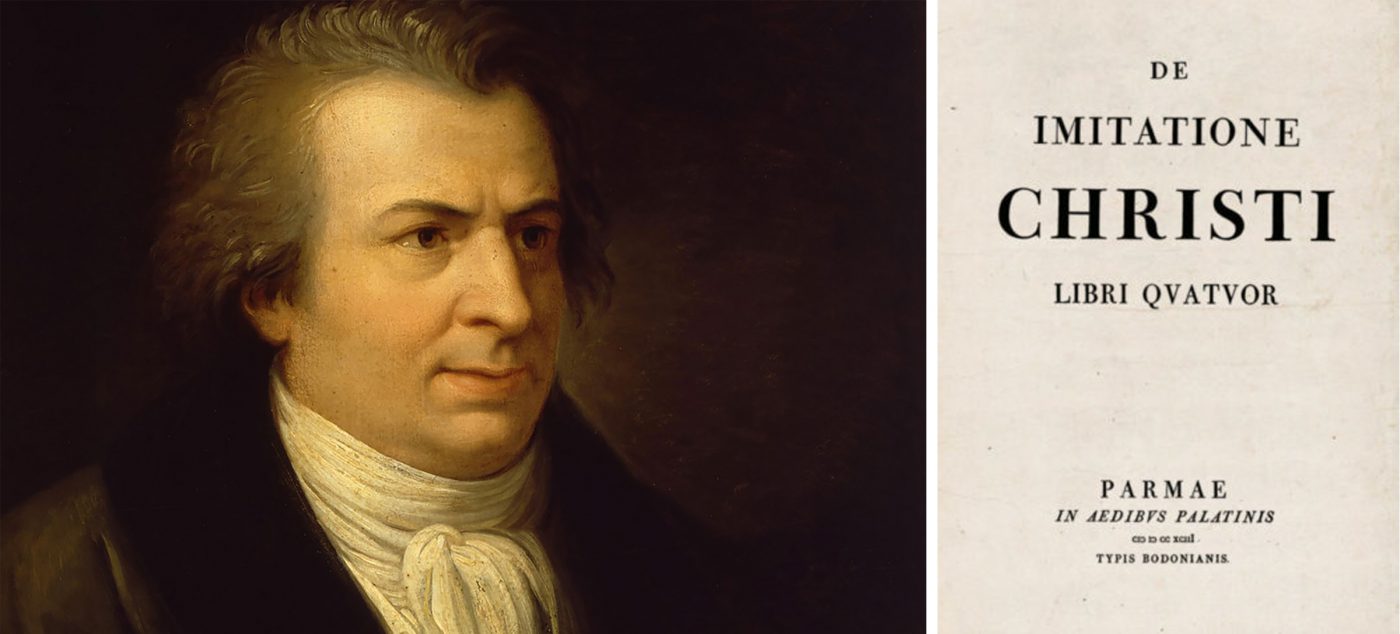
His artistic sensitivity, combined with his considerable technical ability, drove him to experiment with new forms of character, drawing inspiration from France.
Taking his cue from the work of Pierre-Simon Fournier, later taken up by Firmin Didot, Giambattista Bodoni created his typeface in 1798. Its main characteristics lay in the extreme contrast in the very fine serifs and in the perpendicular nature of the same in respect to the vertical lines.
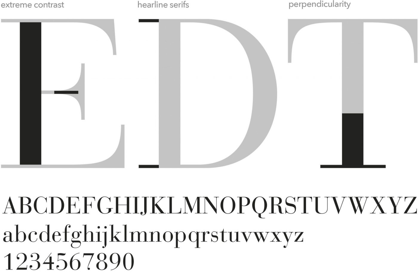
These characteristics were made possible also thanks to progress in printing techniques and improved quality paper, which allowed for very fine lines to be used without the risk of them disappearing.
Bodoni rapidly became the new standard for typographical elegance, to the extent that almost every print workshop had its own version of Bodoni, although none of them ever reached the level of elegance of the original.
Due to the modernity that it introduced, the new font was identified as “modern serif”, a definition still used today to indicate typefaces of a Bodonian nature such as Didot, in contrast to “classic” or “Venetian” serifs such as Bembo, and “transitional serifs” such as Baskerville.
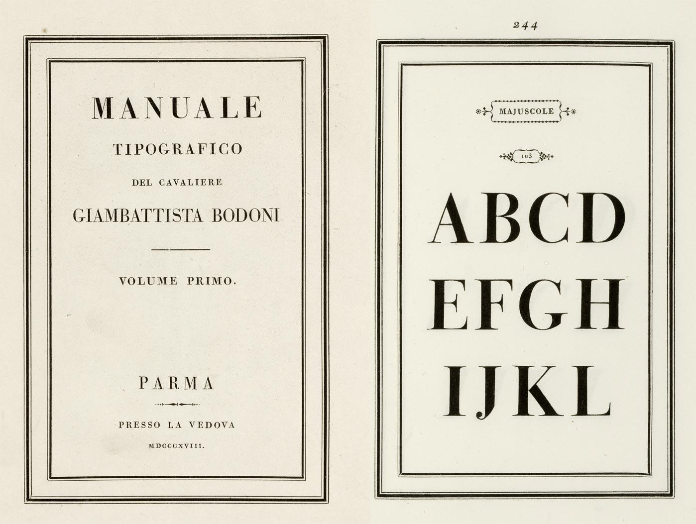
The principles on which the character were founded were illustrated by Bodoni himself in his “Manual of Typography”:
regularity, all the letters must be constructed on a common base which defines them;clarity, the letters must be highly legible;good taste, the letters must fulfil their task without excessive affectations;beauty, the letters must be created with all the care and attention necessary without limits of time (it is no coincidence that Bodoni was to spend his entire life perfecting his typeface).
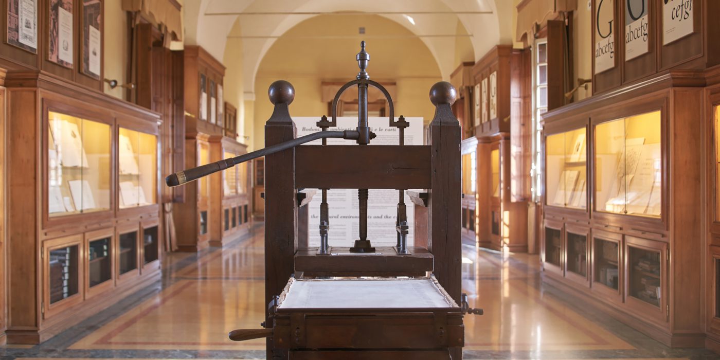
Thanks to his art, the Piedmont-born typographer rendered Parma the world capital of printing at the end of the 1700s. His ties to the city were so strong that in 1963, on the occasion of the 150th anniversary of his death, the Bodoni Museum, the oldest printing museum in Italy, was inaugurated.
In its more than two hundred years of history, the Bodoni font has been subject to various interpretations by the main type-foundries. Among the most significant are those by the American Type Founders (1907), by Bauer (1926), and by the International Type Corporation (1994), which, while inspired by the original design, have stylistic characteristics that render them clearly distinguishable.
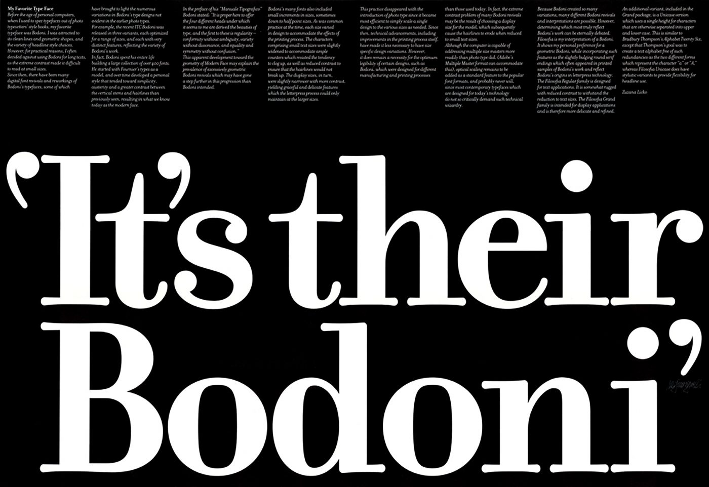
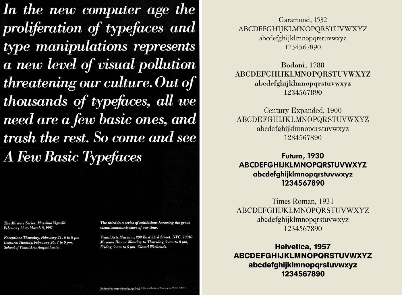
Even the famous designer Massimo Vignelli, a great admirer of Bodoni, made his version of the font in 1989 in collaboration with Tom Carnase, called Our Bodoni. However, in 1991 Vignelli, convinced that the enormous proliferation of digital fonts created nothing more than visual confusion, organised an exhibition of his work, demonstrating that all projects can be handled with just a few standard typefaces. It goes without saying that together with Helvetica, Futura, and just a few other well-known fonts, Vignelli featured Bodoni in his list.
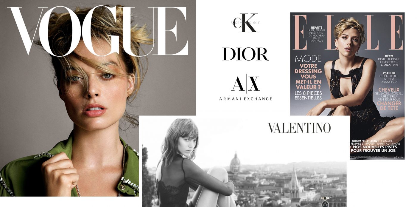
The many uses of Bodoni, or its closest derivations, include the identities of Valentino, Vogue, Armani, Dior, Calvin Klein and Elle.
But it is not only the fashion world that makes use of Bodoni. The typeface is also particularly popular in the music industry, from Bruce Springsteen to Nirvana, right up to Lady Gaga.

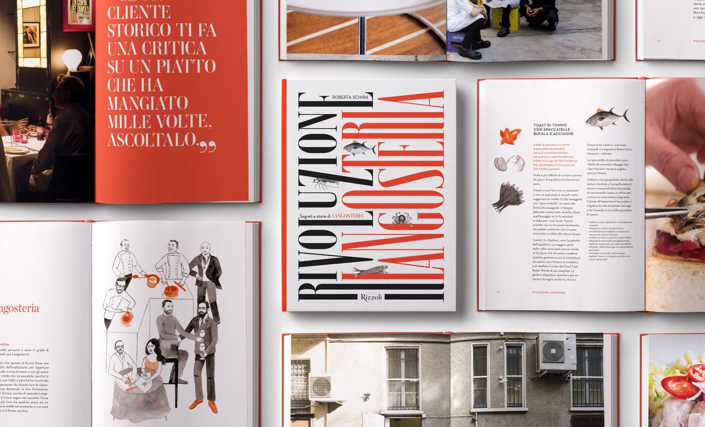
The Bodoni style was also the protagonist for the re-branding of the Langosteria restaurants and bistros, studied by Cba. Beginning with the need to express a higher level of premiumness in line with the new positioning of the brand, a Bodonian-style font was used as the standard character. As well as being used in the composition of the logotype, the character has become an integral part of the new visual language of the brand, conferring it with stature and elegance.
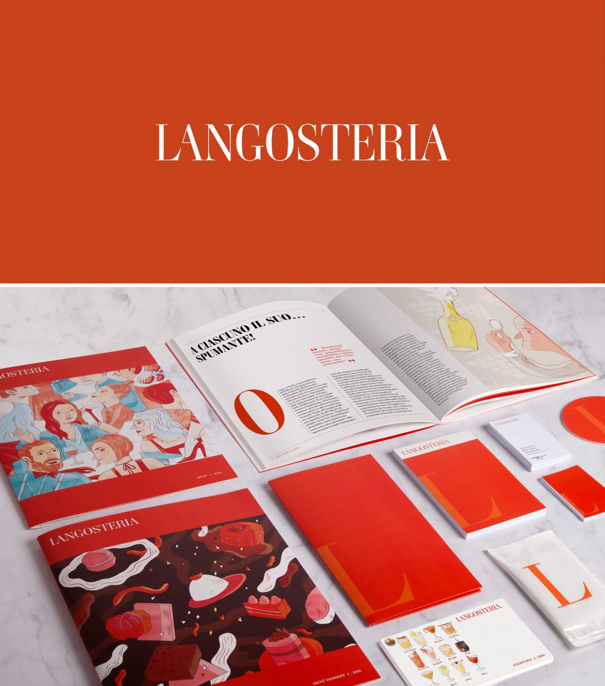
Even the Type Directors Club has recognised the prestigious use of the font, awarding the editorial project “Rivoluzione Langosteria” the ambitious certificate of excellence in typography.
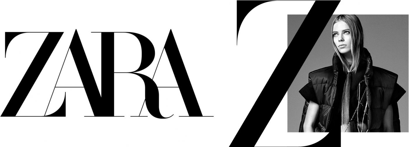
The latest uses of Bodoni also include that for the identity of Zara. In 2019 the famous Spanish fashion house made use of Bodoni to lend new prestige to its more than 2,000 shops located in 93 countries around the world, demonstrating that the font is still a very topical choice, despite its more than 200 years of history.
Giuseppe Mascia, Visual Design Lead at CBA

