Throughout the 1920s and ‘30s, a new aesthetic model established itself across the whole of Europe, linked with rationalism and functionalism. It involved disciplines ranging from architecture to painting, from sculpture to graphic design. The entire art scene adopted this new mindset, which took the name of the Modern Movement. At its heart is the idea that each project should primarily aim for maximum utility. That which is functional is beautiful. All the European avant-garde movements were united in promoting this new philosophy: Le Corbusier in France, the De Stijl movement in Holland, the Bauhaus in Germany.
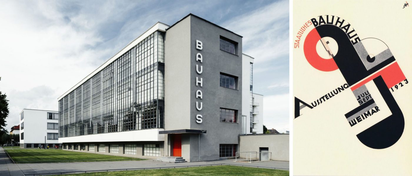
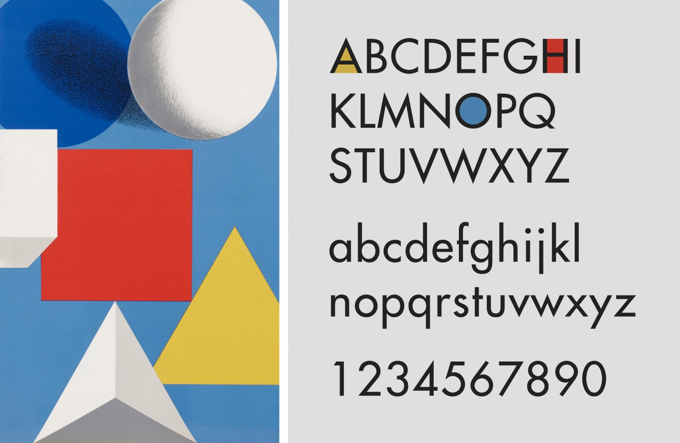
Typography could not ignore this revolution. It was precisely in Germany that an advertising graphics and typography teacher from the Frankfurt school of art, Paul Renner, created one of the most important typefaces in the history of modern typography: the Futura. Bauhaus’ influence on this font is clear. There are no frills or stylistic affectations. Everything about it is based on geometric principles.
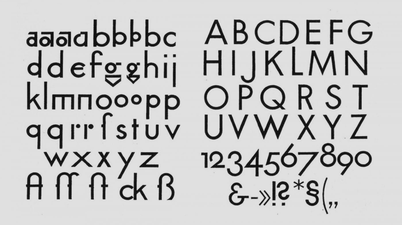
The first version of it was born out of a redesign that Paul Renner conducted on one of his pupils’ projects at the Graphische Berufschule. The letters, especially the lowercase ones, were so rigid it was almost difficult to read them. Between 1924 and 1926 Renner worked on the typeface with great skill, conducting a series of optical corrections that resulted in a more balanced font, without overturning the rationalist principle that it started from. Now, the whole alphabet still derives from pure geometric shapes, but without any problems of legibility. The shape caters to the function, just like with the new diktat.
Some of the main characteristics are the circle shaped “O” and “Q”, the triangle based “A”, “V”, “W” and “M” and the rectangular “H”. The lowercase letters have rather long descenders and ascenders, which necessitate a relatively generous line spacing.
In 1927 “the type of today and tomorrow” was marketed by the Bauer Type foundry and straight away received huge appreciation. In the years to follow, countless versions of weights and different styles were developed, making Futura an extremely versatile font.
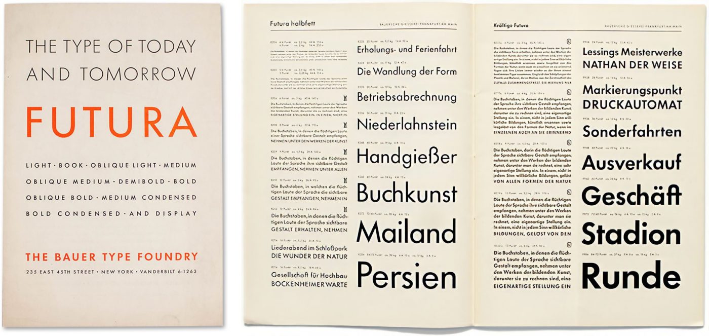
In 1933, the same Renner presented it to the Triennale di Milano, drumming up huge success also in Italy. Futura quickly became the font that perfectly embodied the avant-garde spirit of the 1930s, but its real popularity would kick off in the following decades.
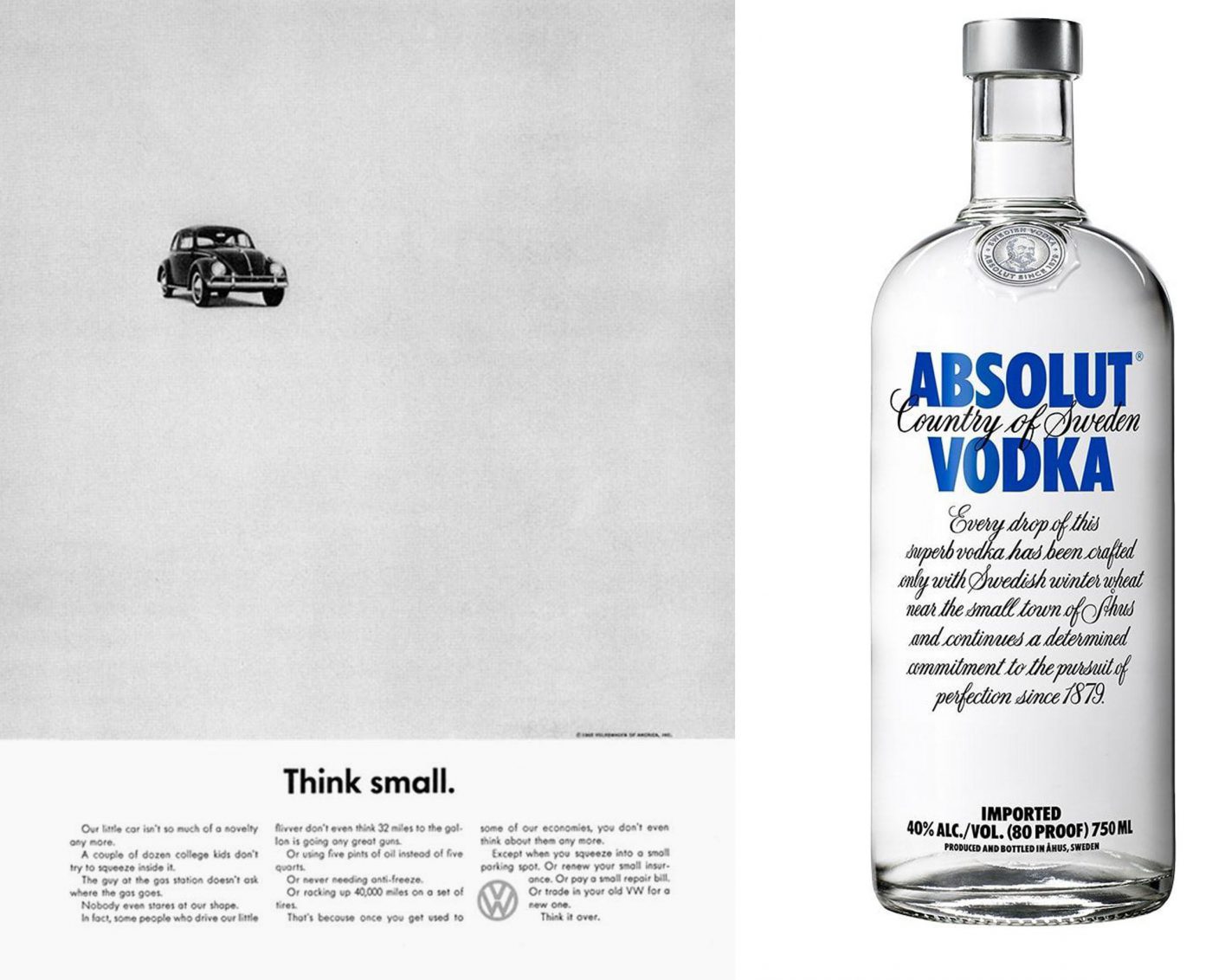
From the second half of the twentieth century it was being used practically everywhere, from Volkswagen advertising campaigns to famous trademark brands such as Absolute Vodka and Swiss Air.
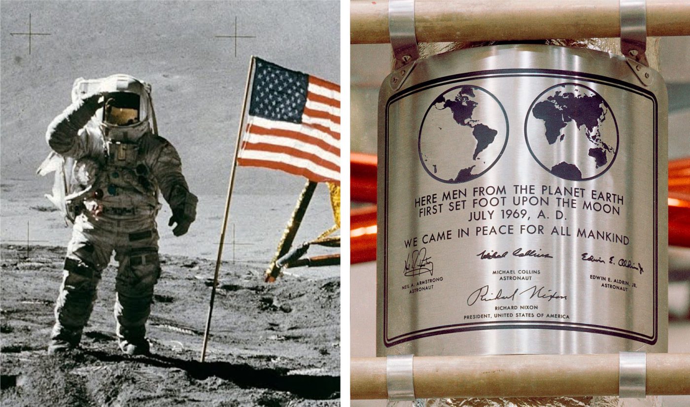
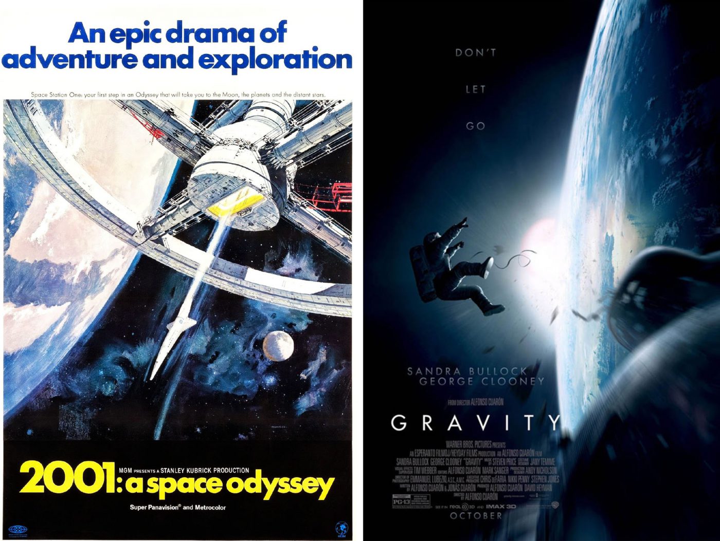
In 1968 it was used on the poster of one of the most famous science fiction films of all time: “2001: A Space Odyssey”. The following year, this fantasy became fact. Futura crossed our planet’s borders and became the fully-fledged font of the future: it was chosen for the plaque that the Apollo 11 astronauts would leave on the moon.Nomen omen (the name is a sign), as the Latin goes.
Unlike other famous typefaces, Futura has never declined in popularity. From cinema to fashion, transport to politics, it has always been in constant use, guaranteeing an elegant and timeless style.
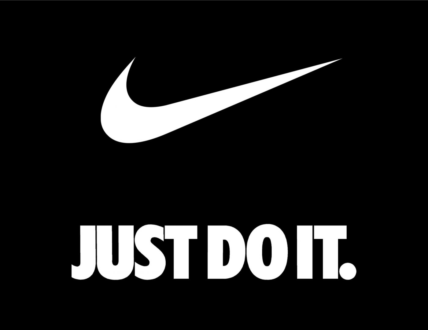
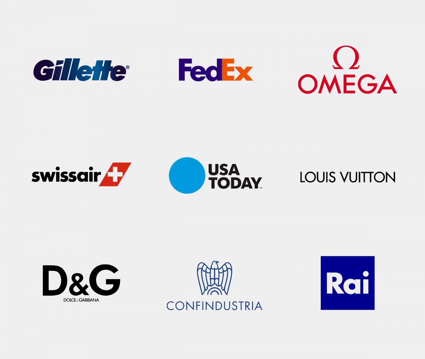
Nike, Fedex, Louis Vuitton, Gillette and Usa today all make use of Futura, whilst in Italy Confindustria, Rai, Dolce&Gabbana and Gi Group, to name just a few of the most famous cases, have used it as their font of choice.

Recently, the top division of the Spanish football team, “la Liga”, has also chosen Futura to modernise their wordmark, proving that there is no field in which this typeface doesn’t hit the mark.
We can say with some certainty that in the history of typography, the only font to be more popular than Futura is Helvetica, but then again, we’re only talking about planet Earth.
Giuseppe Mascia, Creative Director at CBA

