Even those who aren’t die-hard comic book lovers will be familiar with Gotham City, the imaginary city where the adventures of Batman are set. However, the artists at DC Comics didn’t start from nothing: Gotham City is the fantastical transposition of New York City. Even though it is not mentioned explicitly, the link between Batman’s hometown and the Big Apple is very close indeed.
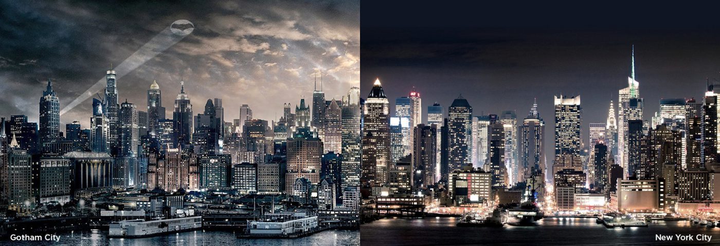
It may be for this reason that type designer Frere-Jones, Hoefler’s partner at the time, decided to name the typeface he designed Gotham after the comic book city. As with Batman, here too New York is a great source of inspiration.
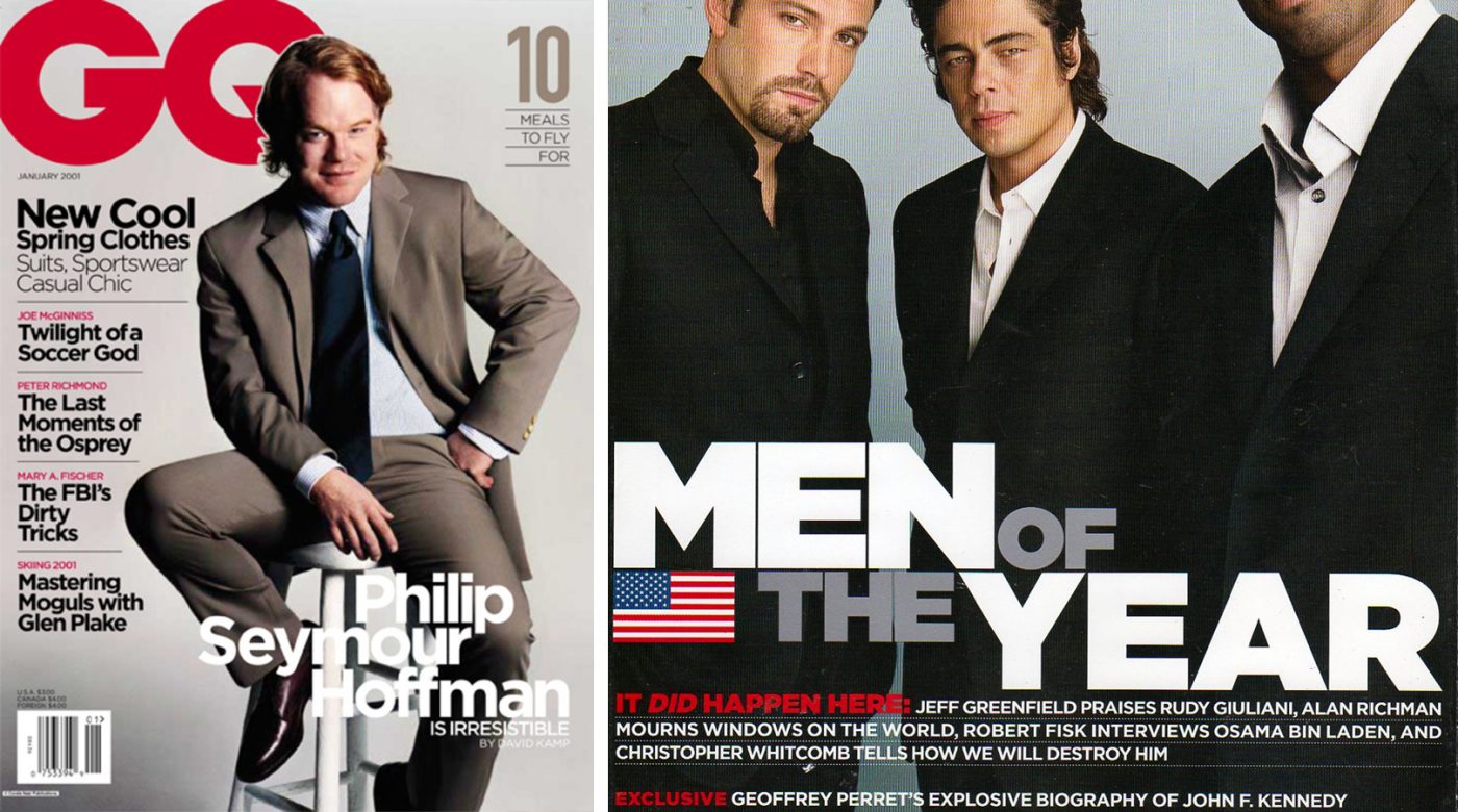
The font was born in 2000, commissioned by GQ, which wanted a linear font with a geometric structure. A “masculine, new and fresh” typeface capable of lending a certain authority and credibility to the articles they published.
In order to capture the essence of the city, Tobias Frere-Jones took thousands of photos all around New York, concentrating especially on the old signs from the mid-twentieth century. The type designer wanted to capture the rationalist spirit of those years, which can also be found in its architecture and urban planning.
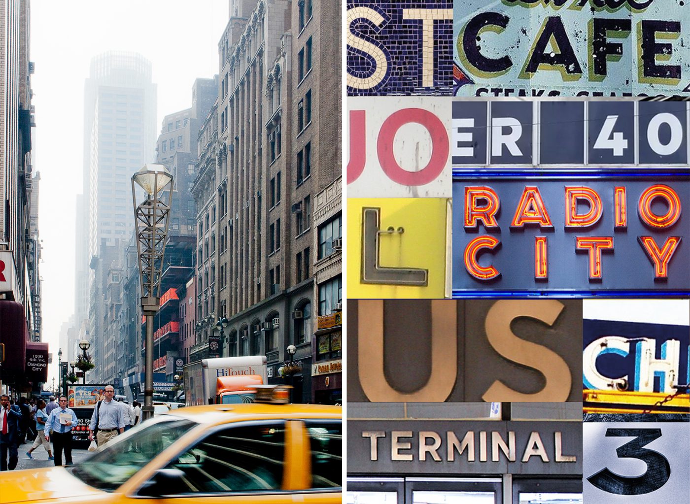
He was most strongly inspired by the sign at the Port Authority Bus Terminal on Eighth Avenue, whose simplicity was summarised thusly by Frere-Jones: “not the kind of letter a type designer would make. It’s the kind of letter an engineer would make. It was born outside the type design in some other world and has a very distinct flavor from that”.
The typeface that comes out of it fully embodies the minimalist philosophy by which it was inspired. In its 44 weight variations – now 66 – there is no room for frivolous or pointless elements. Gotham is a solid and functional typeface, yet accessible. The description on the Hoefler & Co website is quite clear: “From the lettering that inspired it, Gotham inherited an honest tone that’s assertive but never imposing, friendly but never folksy, confident but never aloof“.
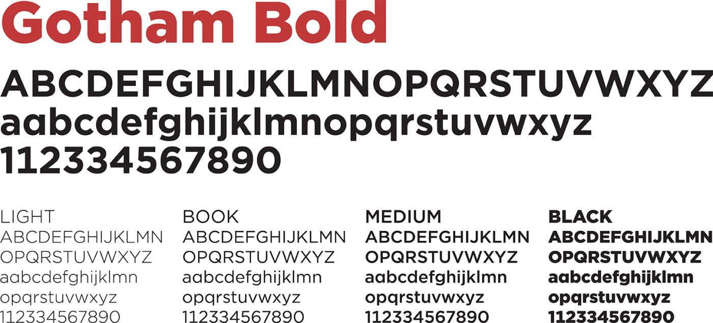
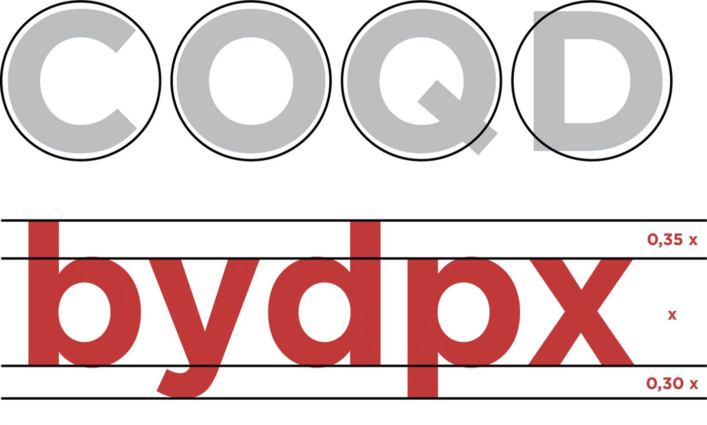
Its main characteristics include the circular shape of many of its letters and the fairly prominent height of the lowercase letters, with consequent quite small ascendants and descendants.
A few years after its publication, when the exclusive rights for GQ expire, it is used as the main character for the identities of the Freedom Tower and for the National September 11 Memorial & Museum, at the World Trade Center.

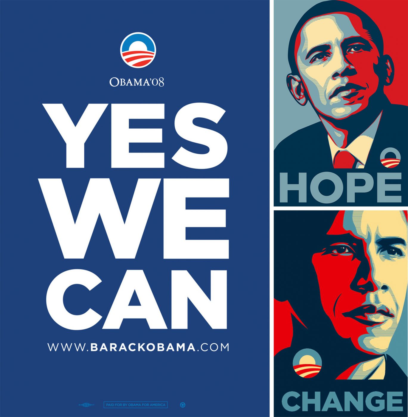
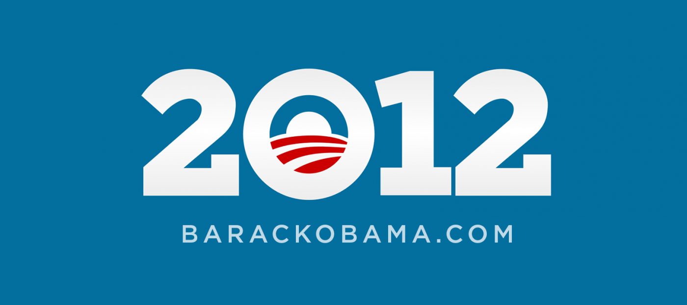
But it wasn’t until 2008 that it truly became famous: Barack Obama, as a candidate for the presidency of the United States, chose it as the official font for his campaign. “YES WE CAN”, “CHANGE”, “HOPE”: all clear, direct messages which found Gotham, with its simple and incisive look, to be the natural solution to represent them.
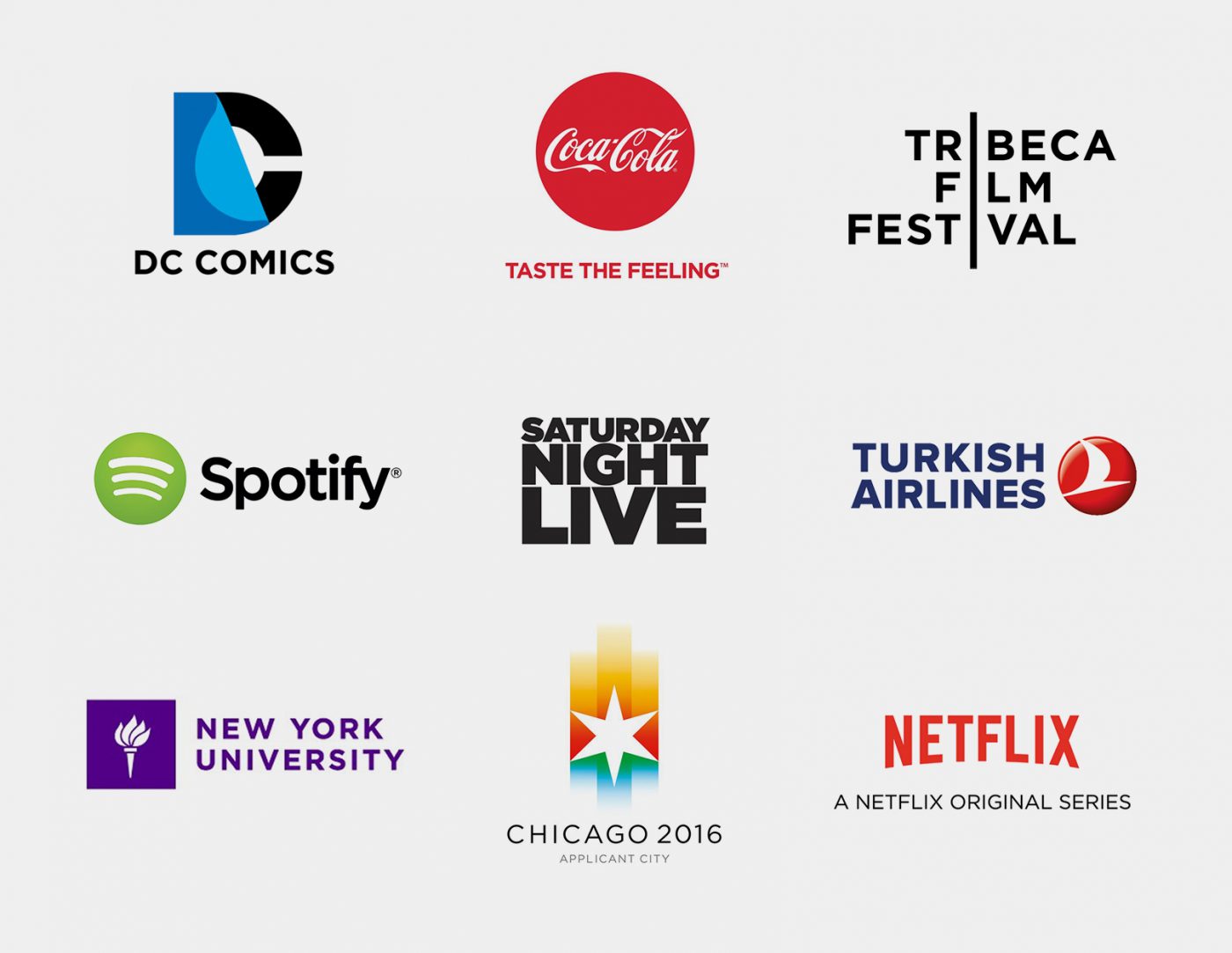
The rest is history. The “Obama typeface” became popular not only in the United States, but worldwide. It became the font of choice for Coca Cola, Netflix, Saturday Night Live, Turkish Airlines, DC Comics, Tribeca Film Festival to name but a few.
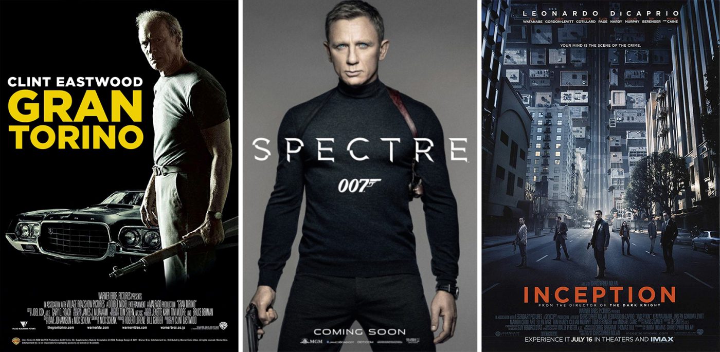
In the world of cinema, too, it gained a great deal of popularity, featuring on the posters for many blockbusters.
Obama himself, 4 years after his first campaign, decided to adopt Gotham as his font once again for the 2012 mid-term elections. However, this time he decided to add serifs to “his” font. Hoefler and Frere-Jones themselves commented on the request with a hint of irony:
“Can We Add Serifs to Gotham?
For the President of the United States?
Yes we can.“
Giuseppe Mascia, Creative Director at CBA

