“The tastiest panino in the world comes from a tiny little place”
These words, written by Lina Sotis, author and journalist for the Corriere della Sera newspaper, sum up the essence of De Santis. Established in 1968 in Milan, in the midst of cultural fervour, the historical and timeless nature of the location, characterised by wood panelling, textured plastering and exposed wiring, has always clashed with the excellent quality of the range of panini on offer, made with top-quality ingredients, and with the “singular” experience to be had in the eatery.
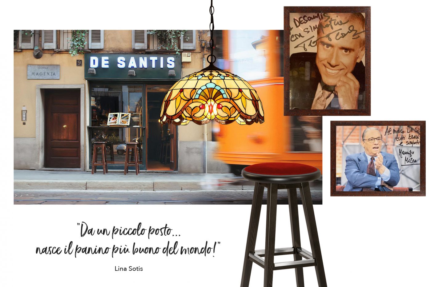
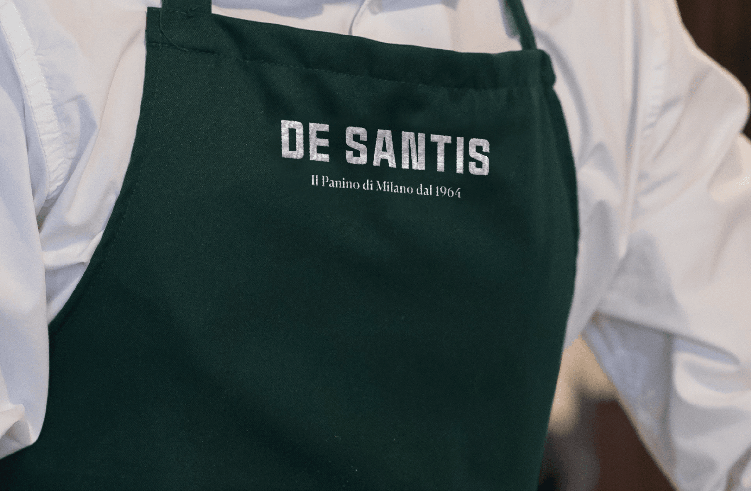
Starting from an ambitious entrepreneurial idea, the goal was from the very beginning to transform the iconicity of the first restaurant in Corso Magenta into a replicable retail format. The new tagline “Il panino di Milano dal 1968” (The sandwich of Milan since 1968) tells the link with the city of Milan and the excellence of the gastronomic offer, declined both in the visual language and in the interior design project. The new De Santis becomes an elegant and informal place, expression of a Milanese way of doing things creating an authentic relationship between brand and consumer.
. . .
The logo before and after
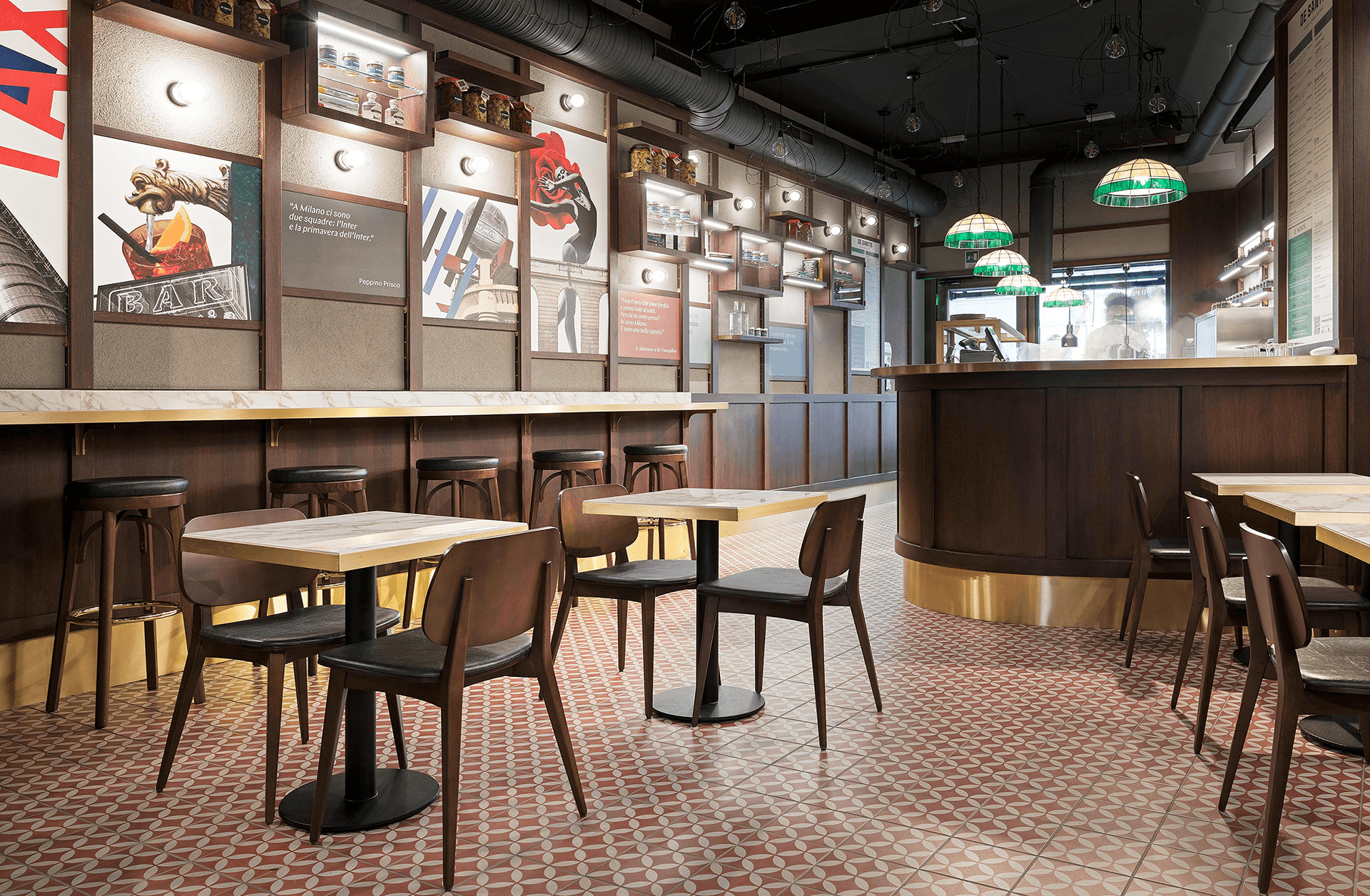
The new venue in Via Cesare Battisti, the first of a series of upcoming launches, with its long and narrow layout and the counter behind the entrance, recreates the experience of the original bar, where customers watched their favourite panino being prepared.
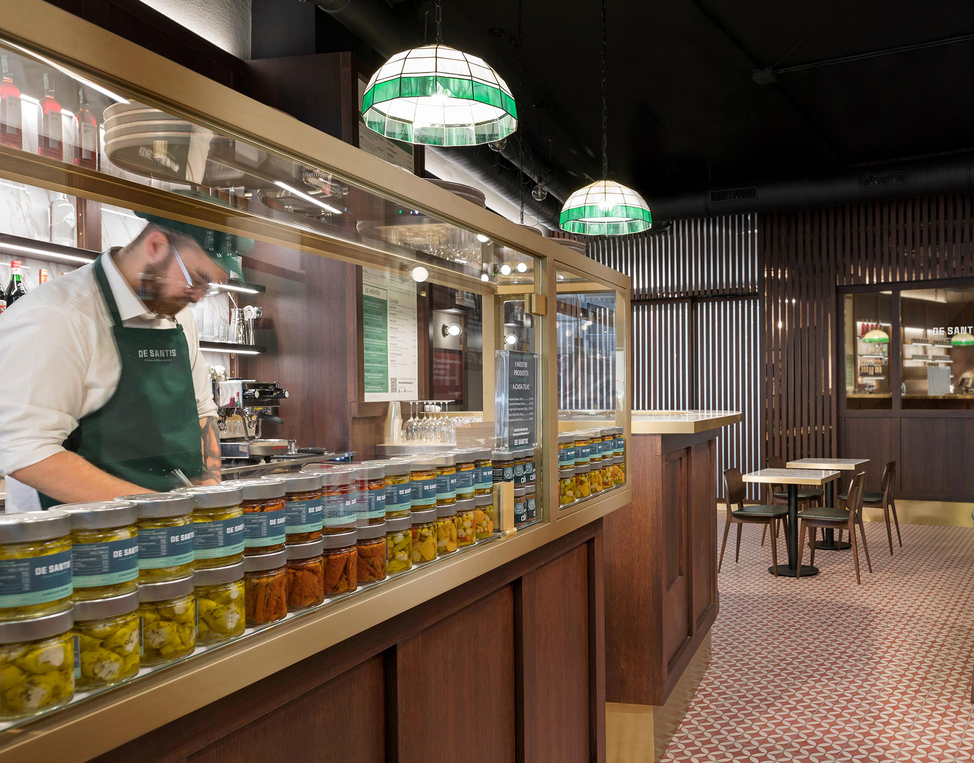
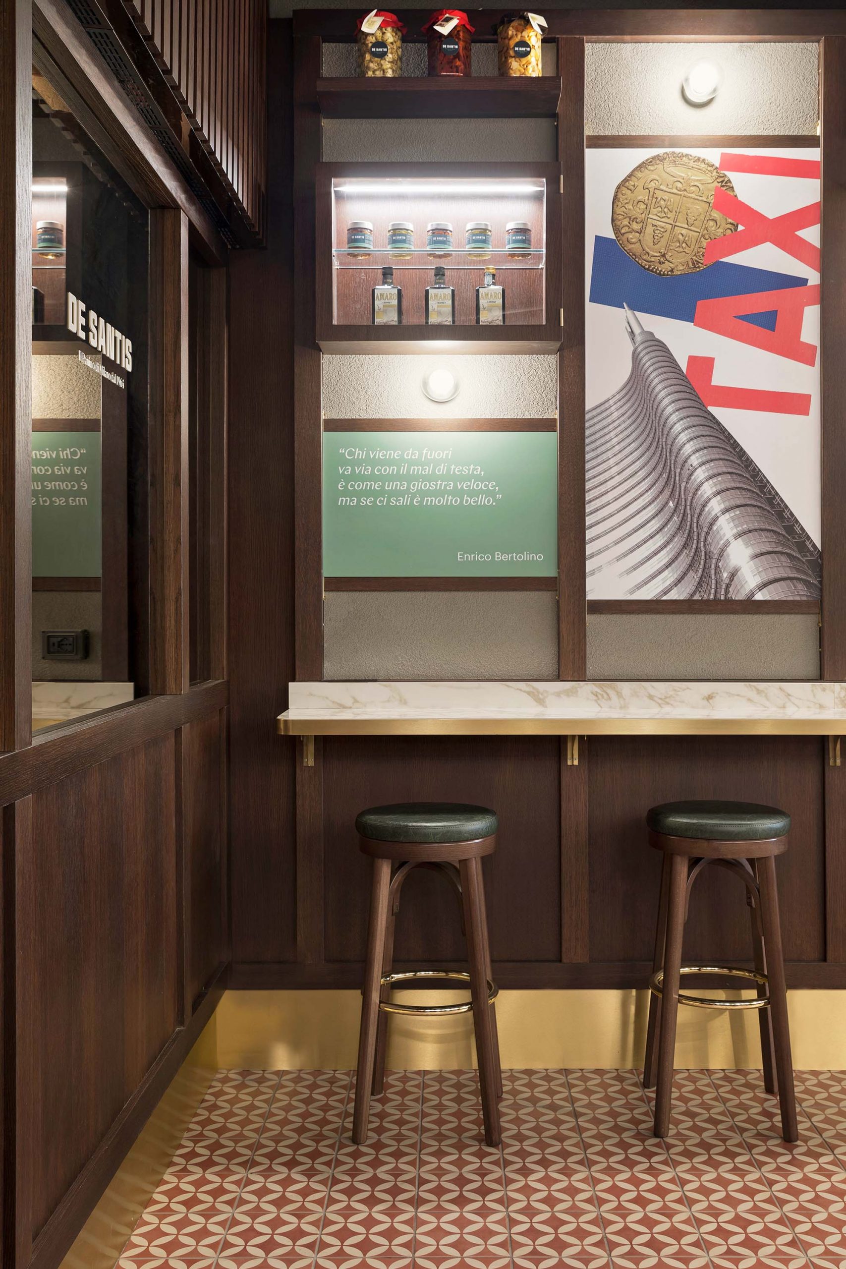

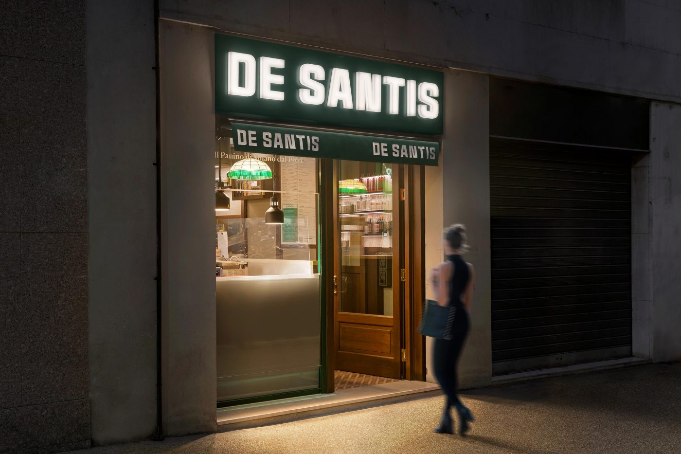
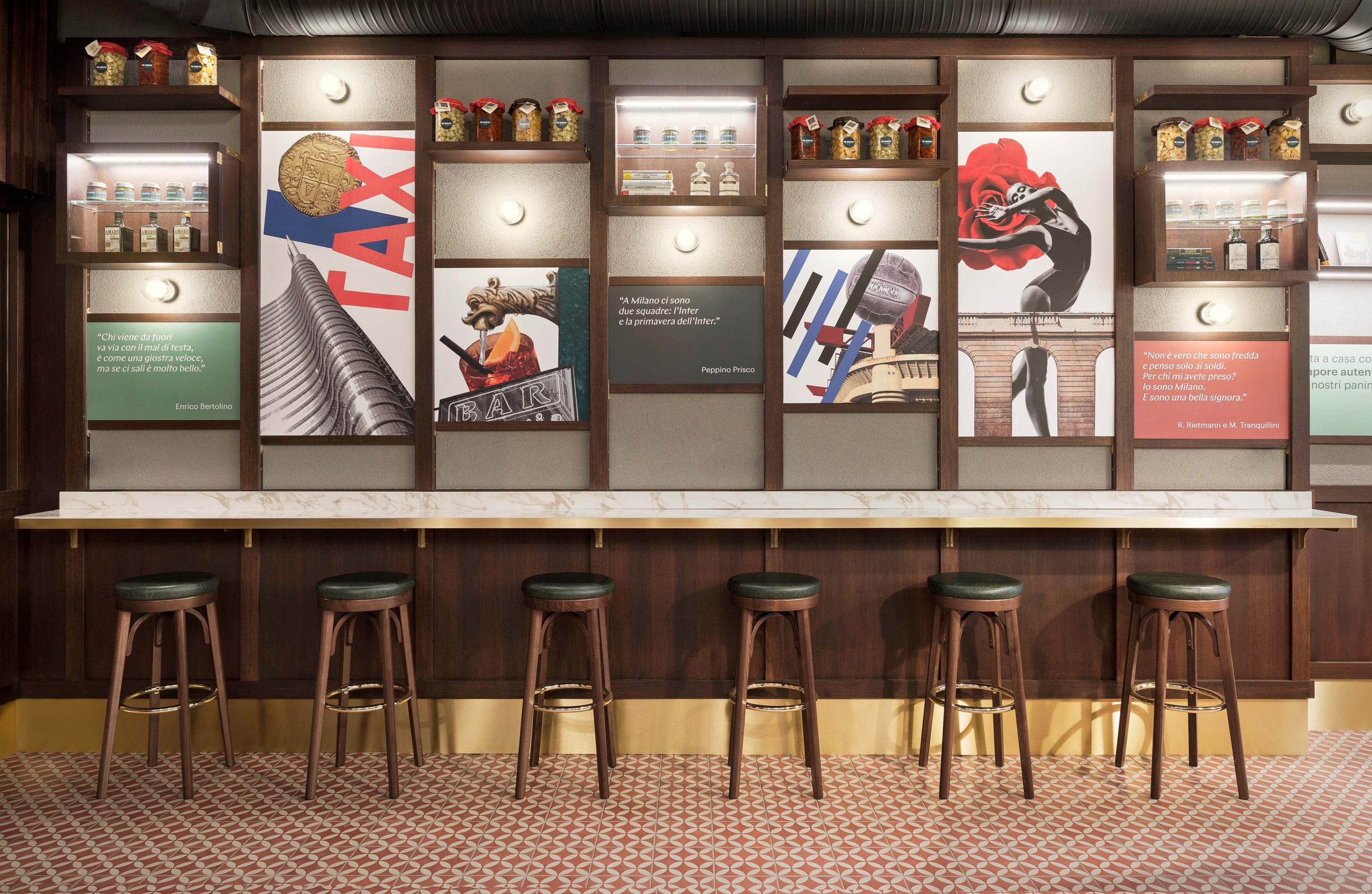
In order to create a replicable format that recreates the unique De Santis atmosphere, the most iconic elements of the original location have been reread in a contemporary key, while at the same time maintaining a marked classical element.
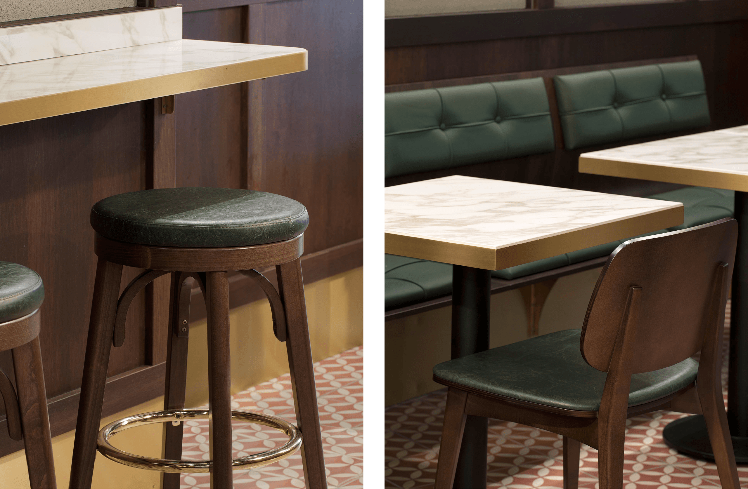
- The food preparation counter, true star of the establishment, as it was in Corso Magenta, is made entirely out of wood and enriched with details in brass and a white marble countertop.
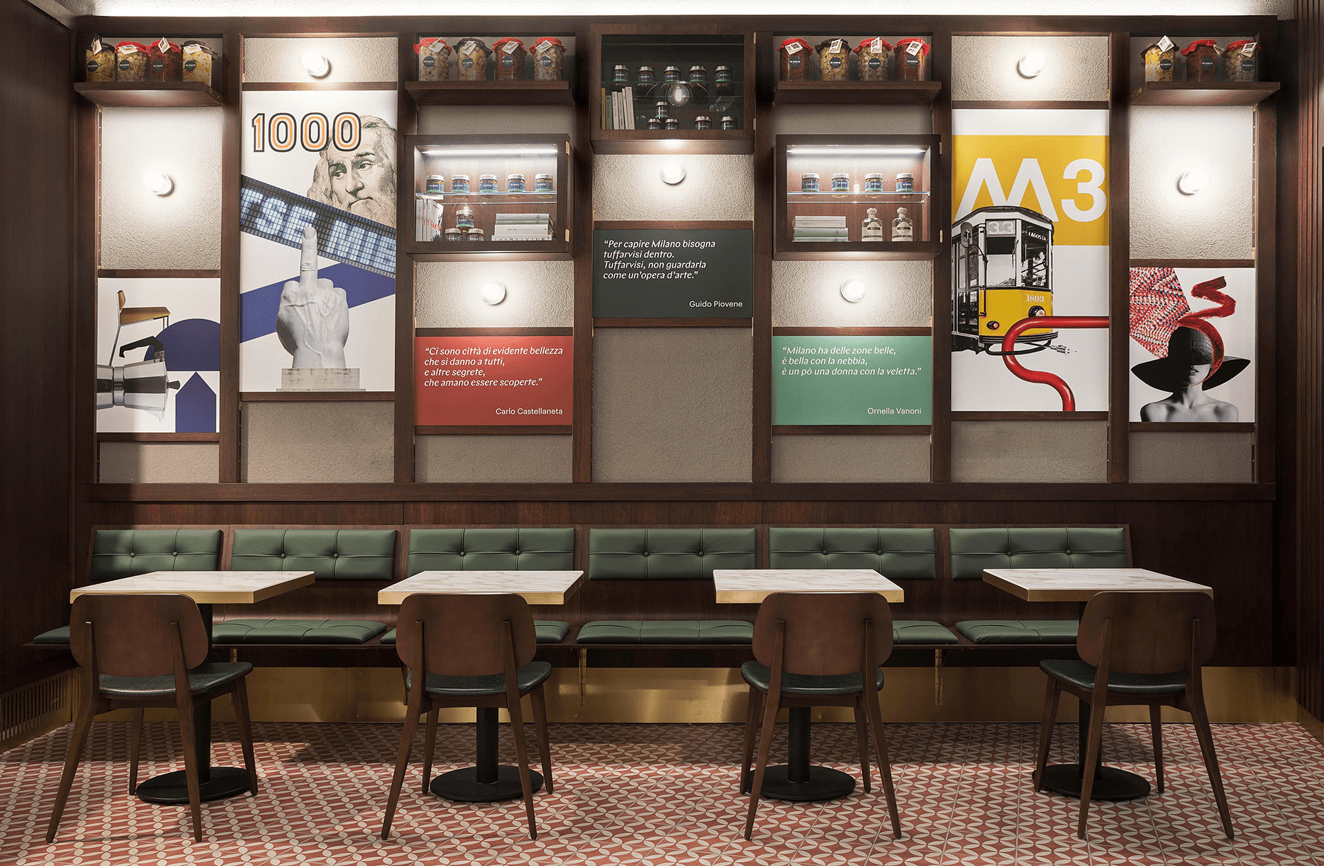
- The wood panelling has been designed to be a flexible and dynamic element; a series of wooden brackets support a sequence of shelves, displays, light fittings and posters that express the De Santis identity.
- The perimeter bench in wood and green leather is a reference to the seating in the original Milanese trams, elegantly re-interpreted.
- The light fittings in Tiffany glass, made by a Milanese artisan, have been re-interpreted in a contemporary key, with the use of coloured glass.
- The floor, with its geometric pattern, reflects classic Milanese cement tiles and adds a touch of colour.
The posters, designed as collages, reflect the past and the present, creating powerful visual contrasts that bridge the two eras. They express situations, places and people, blending elements and recomposing them in an unexpected manner. These are accompanied by Milanese proverbs that bring irony and levity to a classic setting.
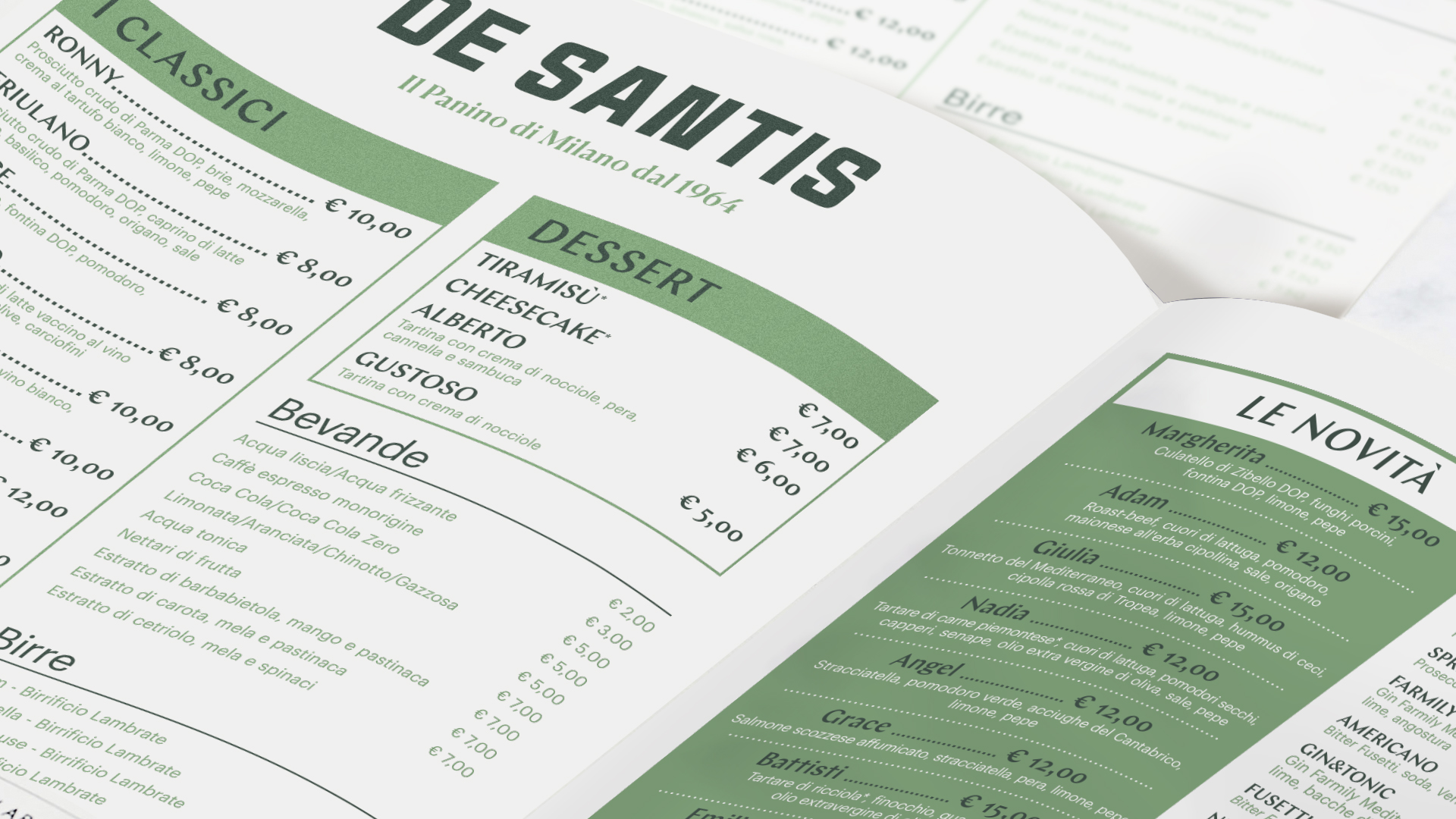
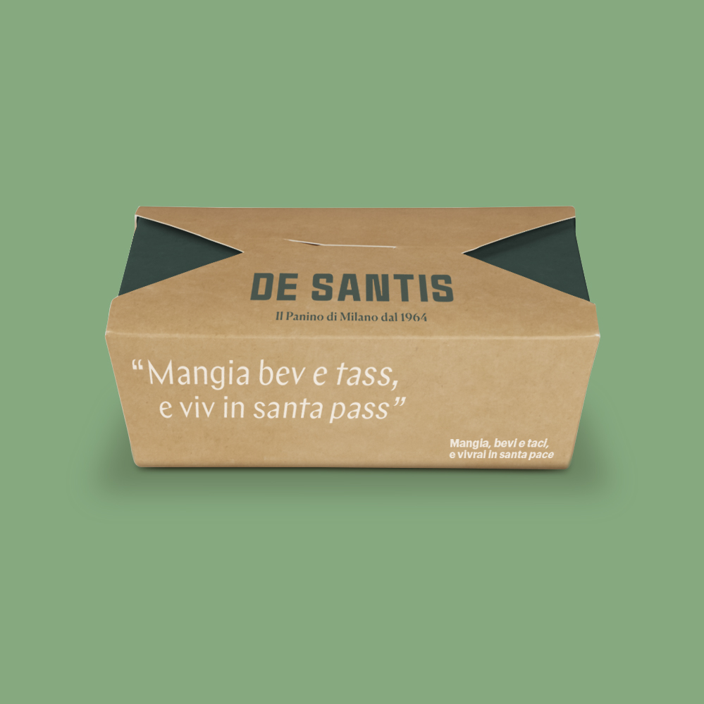
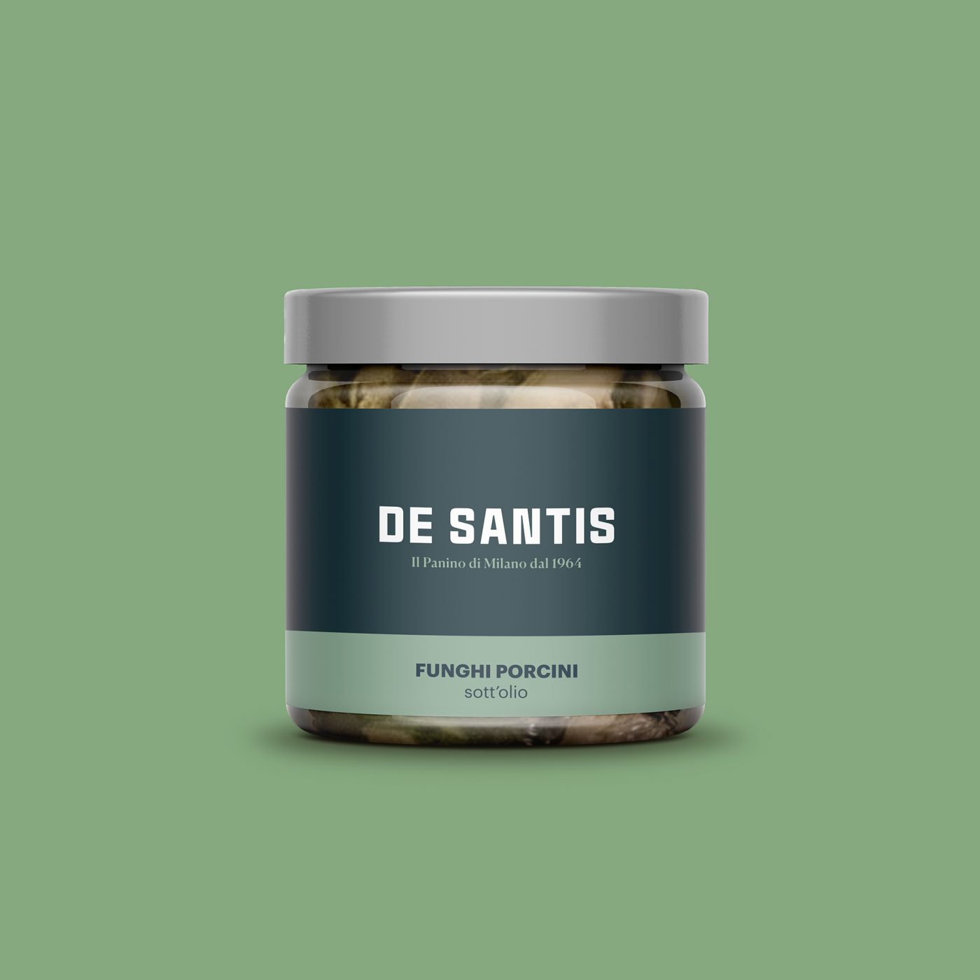
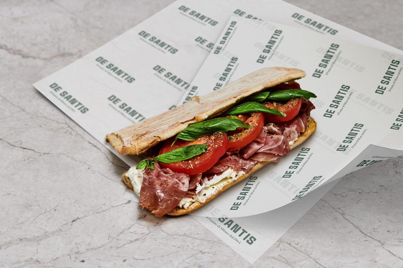
The new De Santis language, coherent with its history, has been enriched in terms of lexicon and colour palette, in order to adapt to all the materials. The delivery packaging, the menu, the food wrapping paper and the new De Santis branded products all express the attention to detail that characterises the panini.
