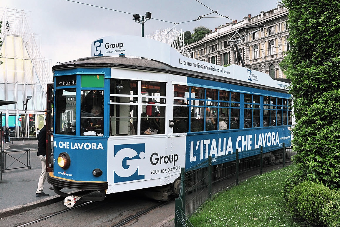
Gi Group is the top Italian multinational employment agency and is one of the main companies around the world offering services connected to this sector.
Active in all fields connected to the development of the job market, from temporary and permanent staffing to training, from executive searches to outplacement, the group operates in over 30 countries in Europe, America and Asia.
Given its position, Gi Group interacts with millions of people on a daily basis and is involved in such complex situations that, if handled correctly, a company brand identity might really add value to an organization.
The project
In order to position itself as an important player within the market, the company felt the need to evolve its brand language, which had developed strategically over the years and consequently was unable to communicate coherently and authoritatively with its interlocutors.

The Gi Group logo is a blue square. This shape and colour are the basic ingredients that we used to create the brand’s new visual language. The square symbolises stability and materiality; it is a symmetrical and reassuring shape which Pythagorean theorists have identified as the symbol of justice. Blue is the colour of the sky, the sea and infinite space. It is the colour of calm, of tranquillity and equilibrium.
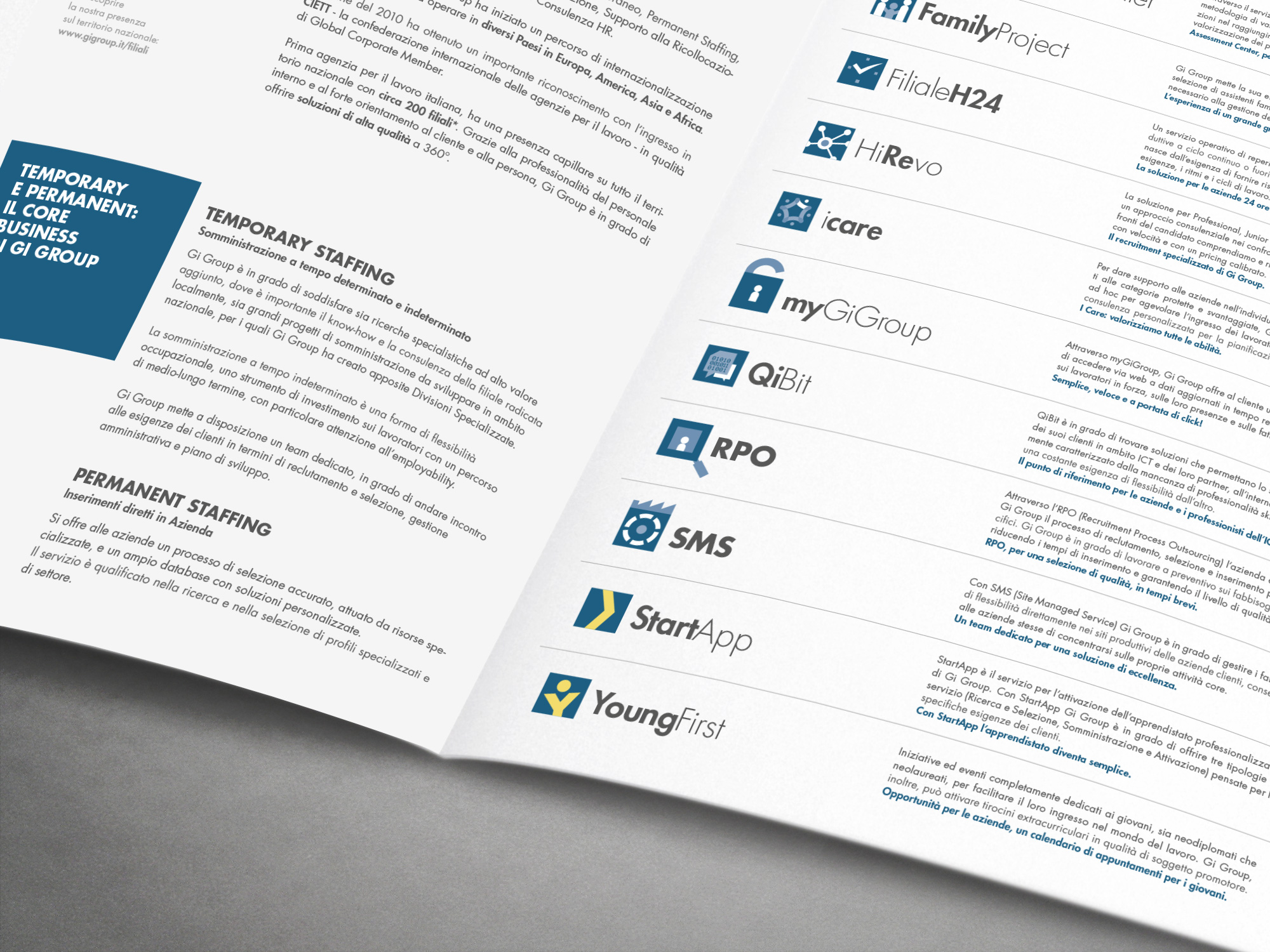
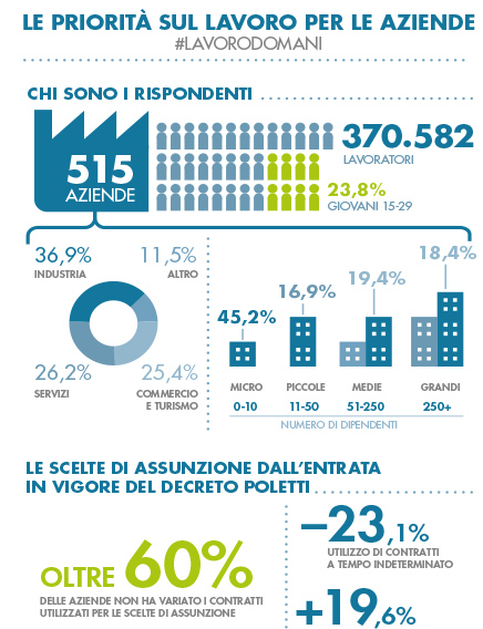
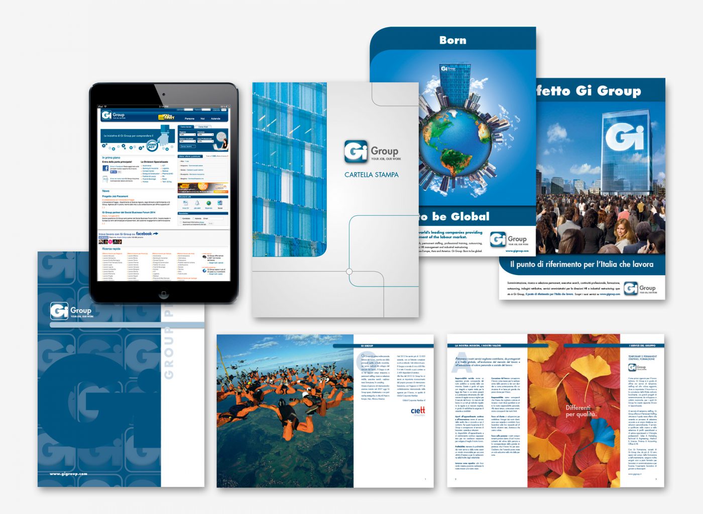
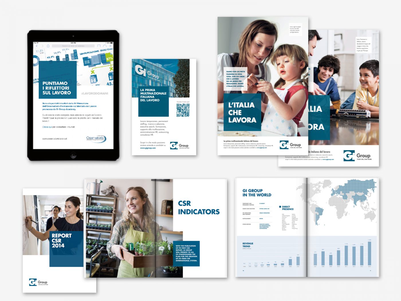
We created a new visual language by starting from the logo and moving on to the chromatic identity, illustrative and informative style, photography and typography.
The goal was to create a simple yet distinctive language that would have an impact. A flexible language so as to be memorable and easy to adapt to all communication requirements.
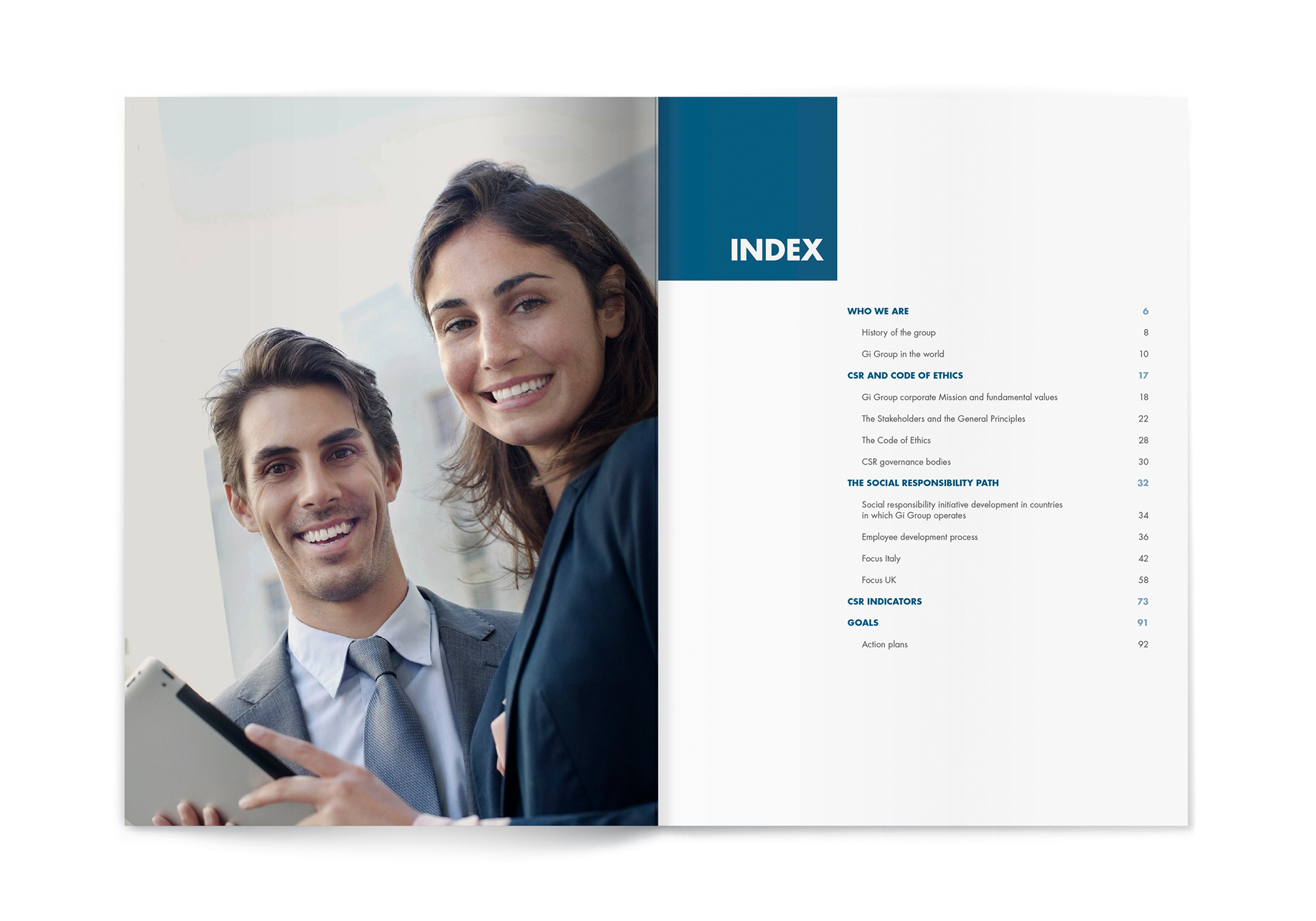
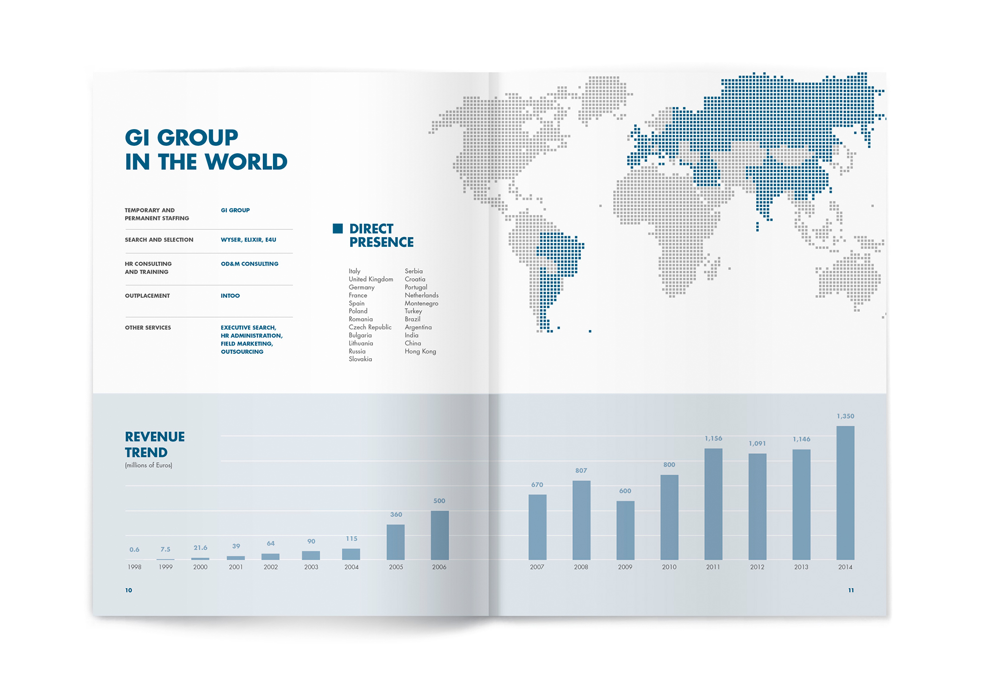
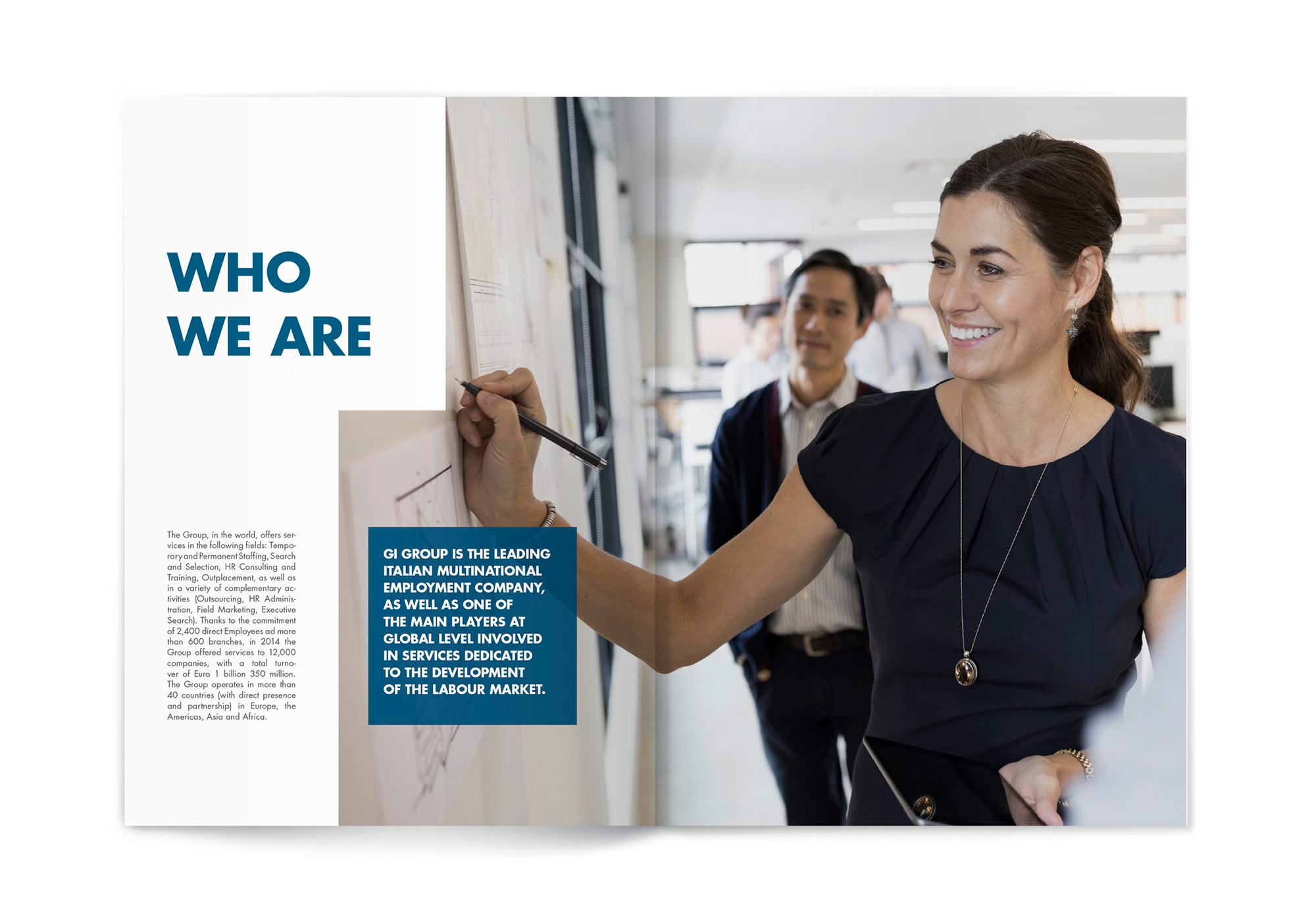
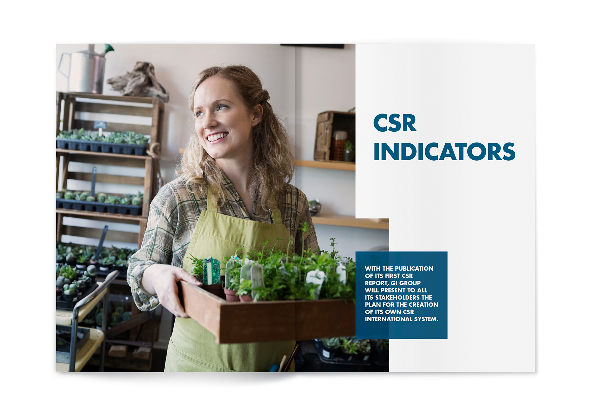
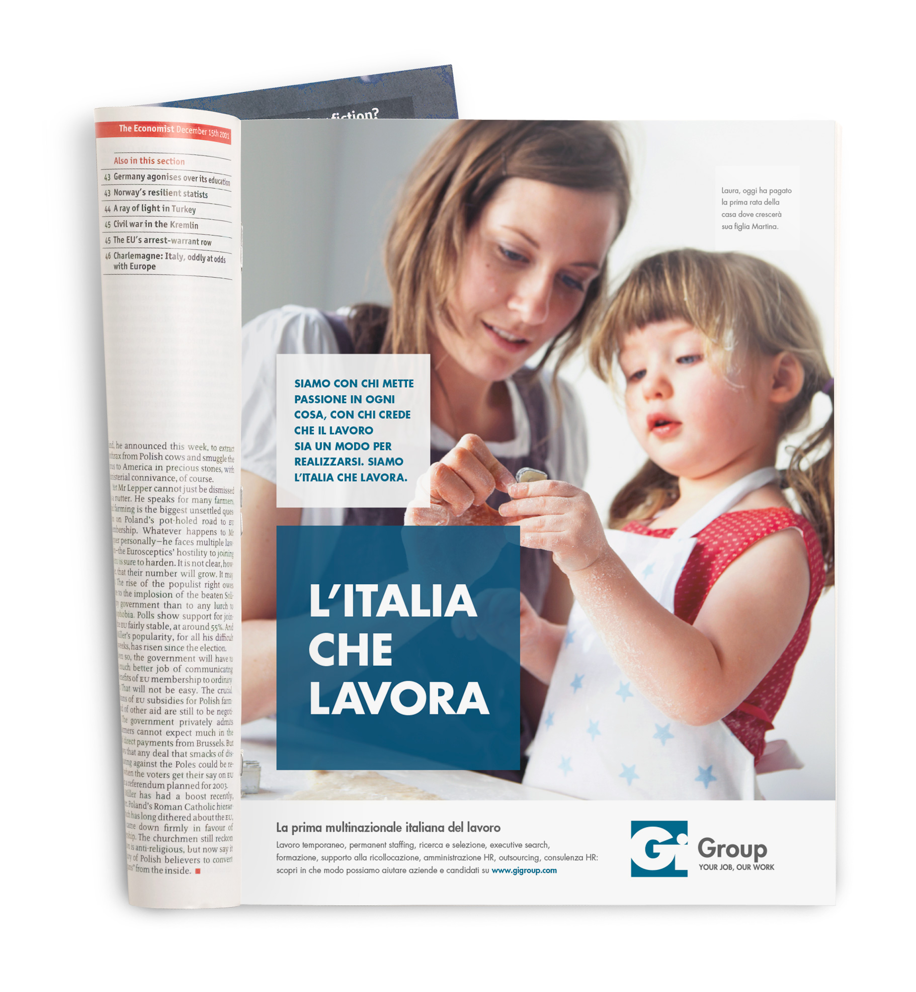
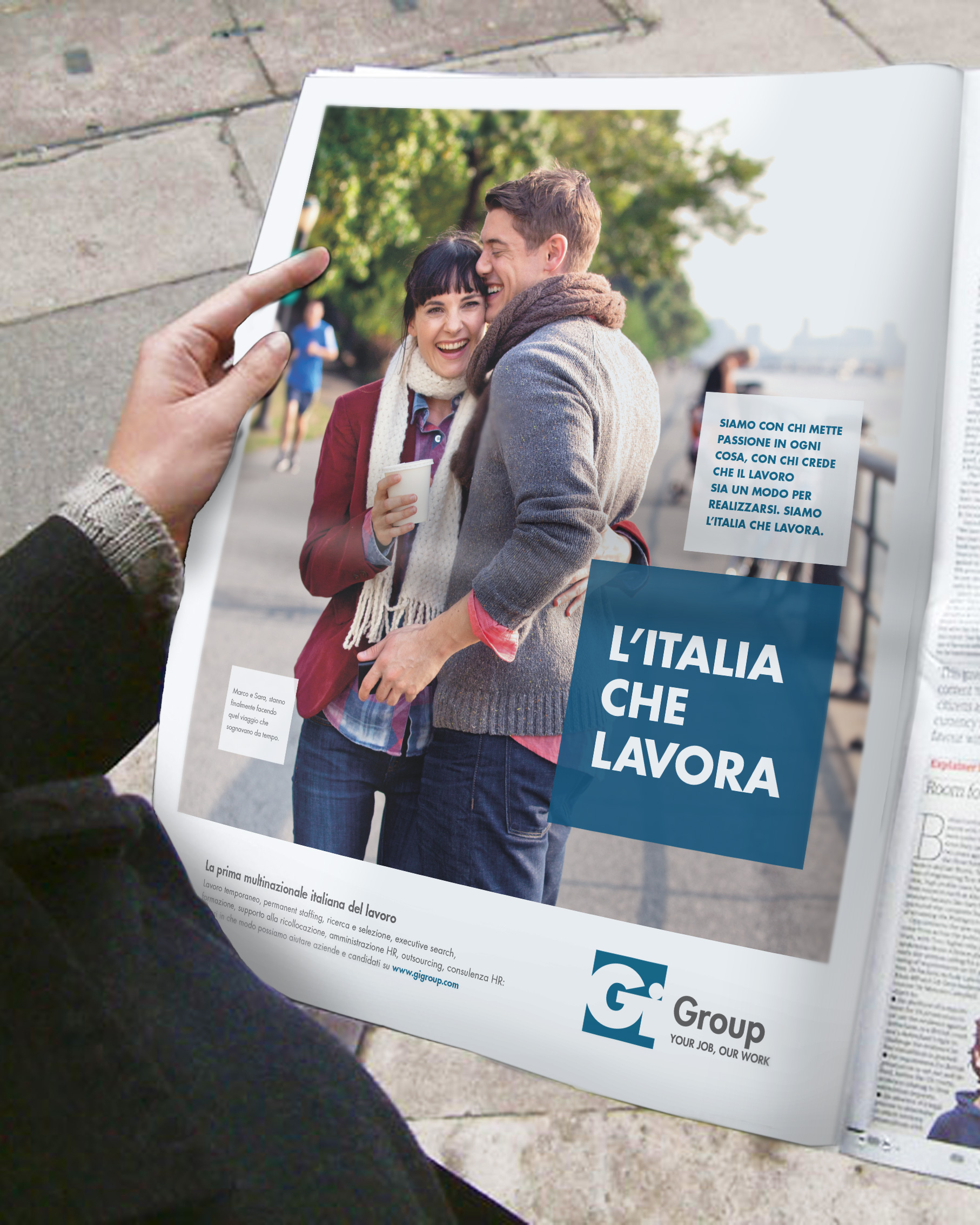
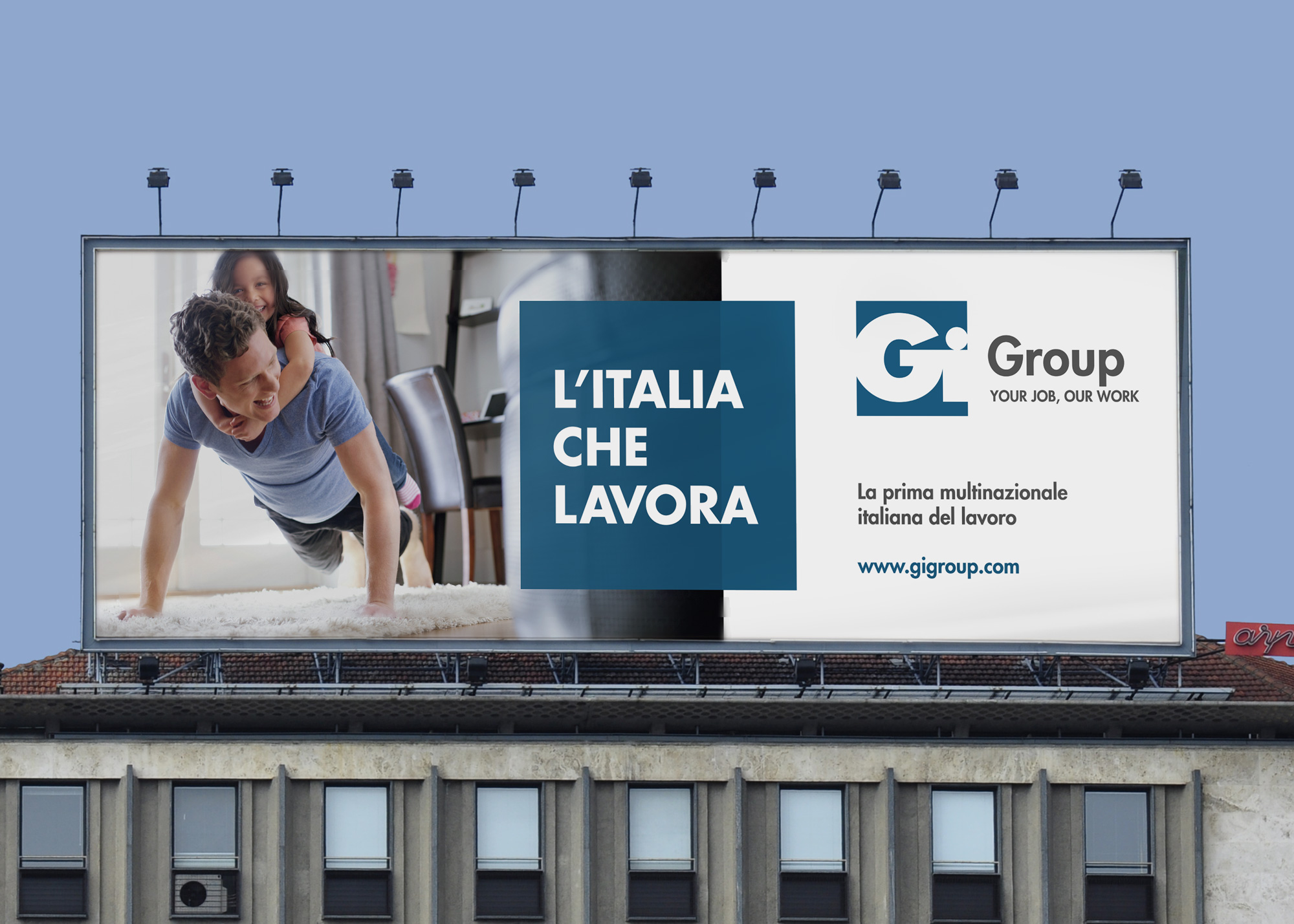
In order to reiterate the Gi Group mission more clearly and simply and create an emotional relationship with its interlocutors, we placed the focus on photography, bringing people to the centre of the message and defining an involving photography style that shows the subjects during spontaneous moments in their life and work, capturing the moment where their gaze meets the camera.
Branches
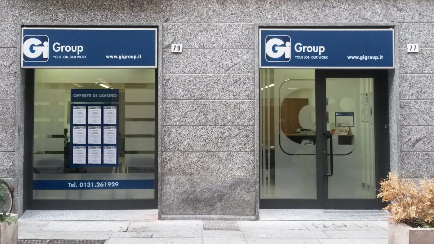
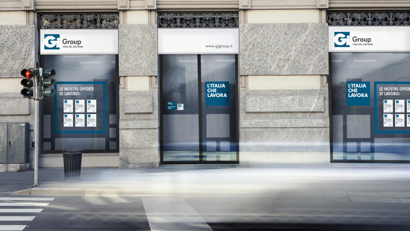
The intervention on the facades of the branches moved in the same direction, simplifying the existing content and increasing the recognisability of Gi Group. The signs were designed to guarantee visibility both during the day and night and to be adaptable to any size and situation. The windows became a communicative space where publicity messages and job offers stand side by side in a modular grid that guarantees visibility of the space within, making the branches seem more transparent and welcoming but maintaining a certain discretion for those inside.
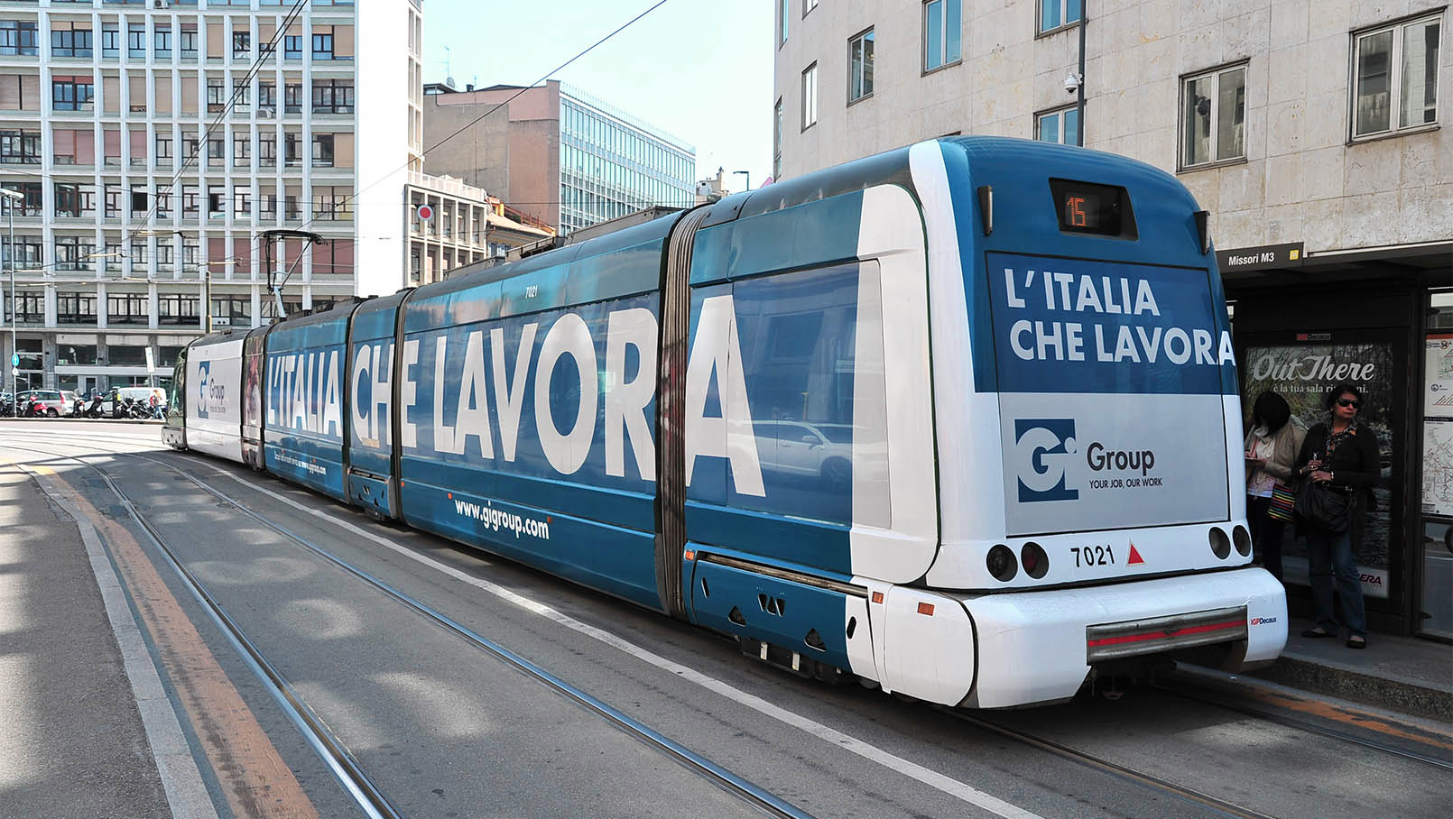
Advertising campaign
