A brand new Brand dedicated to men's personal care and grooming.
The market of personal care products dedicated to men has seen rapid growth in the last few years, both regarding the quality of the products offered and the quantity of the players who have decided to focus on this segment. Structuring one’s own positioning and communication strategy in an effective manner has therefore become indispensable in order to be successful, especially when one is starting from scratch.
It is with this attitude that CBA is accompanying Percassi in the Womo project: a newborn Brand for grooming and personal care, dedicated to men, speaking in the language of men.
The true challenge: to bring essentialness and concreteness to the centre of the masculine identity
The personal care needs of men are inevitably connected to their lifestyles: free time, sport, travel, work. Simplicity and concreteness therefore become fundamental catchwords to be able to speak in an effective manner to all those men who love to feel good and at ease, maintaining an approach that is concrete and elegant.
Starting from the brand, passing through the definition of the brand’s language, until reaching the packaging of the products and the communication, the new Brand was therefore developed with the aim of restoring the masculine identity to its cardinal values: pragmatism and essentialness, with the right balance between tradition and innovation.
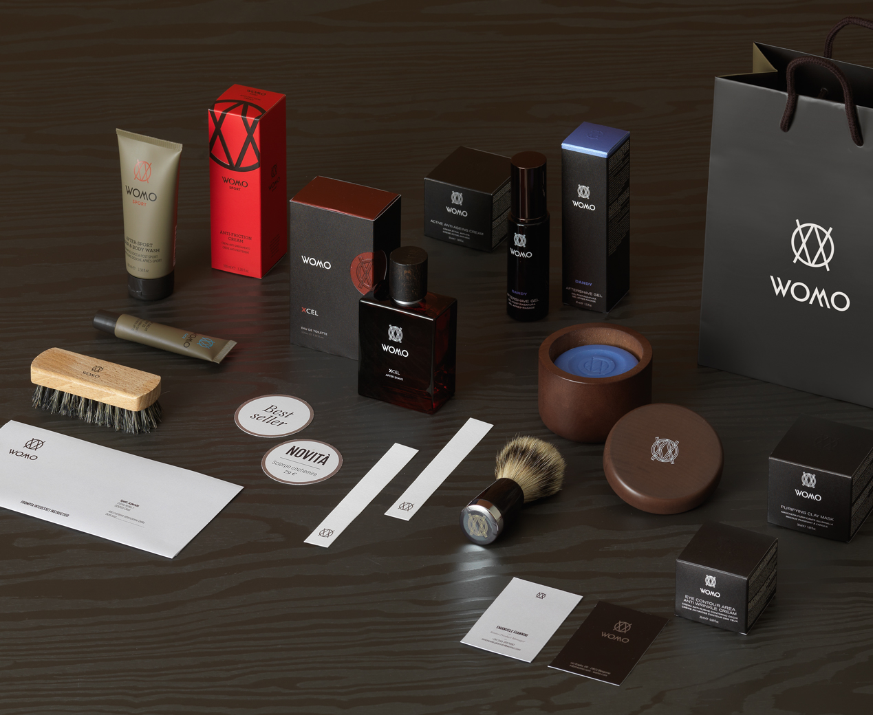
How to: an immediate naming and a design of substance..
The name Womo comes from the assonance with the word u0022manu0022 in Italian, to suggest from the start and in a clear way the target to which the Brand is directed. A concise and elegant name, clean and easy to pronounce in different languages, able to immediately transmit masculinity and functionality at the same time.
The brand also joins the simplicity of an almost symmetrical logotype and the elegance of a monogram constituted of the union of the union of the letters u0022Wu0022, u0022Ou0022 and u0022Mu0022, aiming everything at recognisability and immediacy.
... extended over a vast range of products
The numerous families of products share a similar essential quality in their image, while each of them affirms its own identity. The language of the brand in fact is used in different ways for the daily products, those for sport and the more prestigious ones, communicating, thanks to the colour, finishes and materials as well as the typography, the different characteristics of each product.
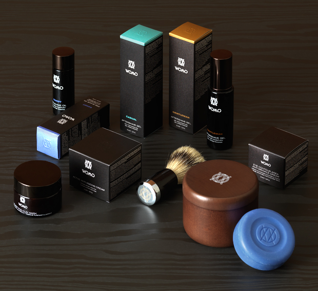
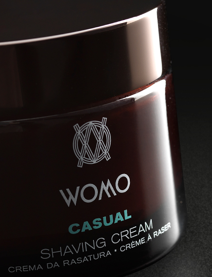
u0022Signatureu0022 is the line product targeted to a most elegant man, looking for a traditional and modern solution. The official colour of the brand, dark brown, becomes the colour of the line on the product pack and is enhanced by colorful accents in shades of purple, brown and light blue allowing the differentiation between different fragrances.
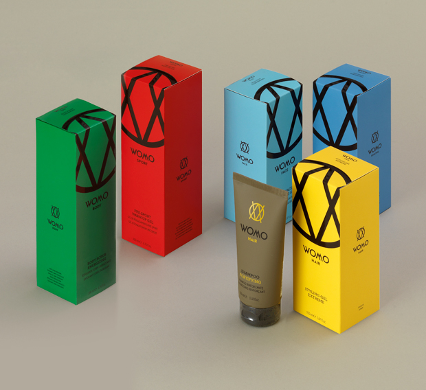
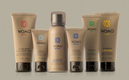
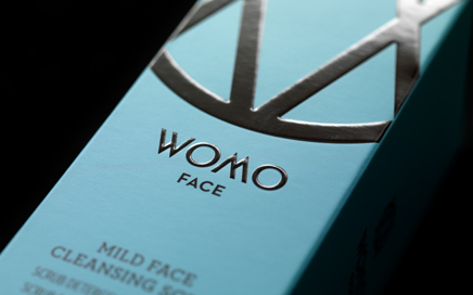
The u0022performanceu0022 line, for a dynamic man, leverage on bright colors to differentiate the intended use, for example: face, body, hair, while keeping a simple and sophisticated image at the same time.
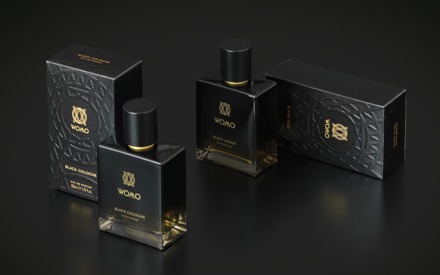
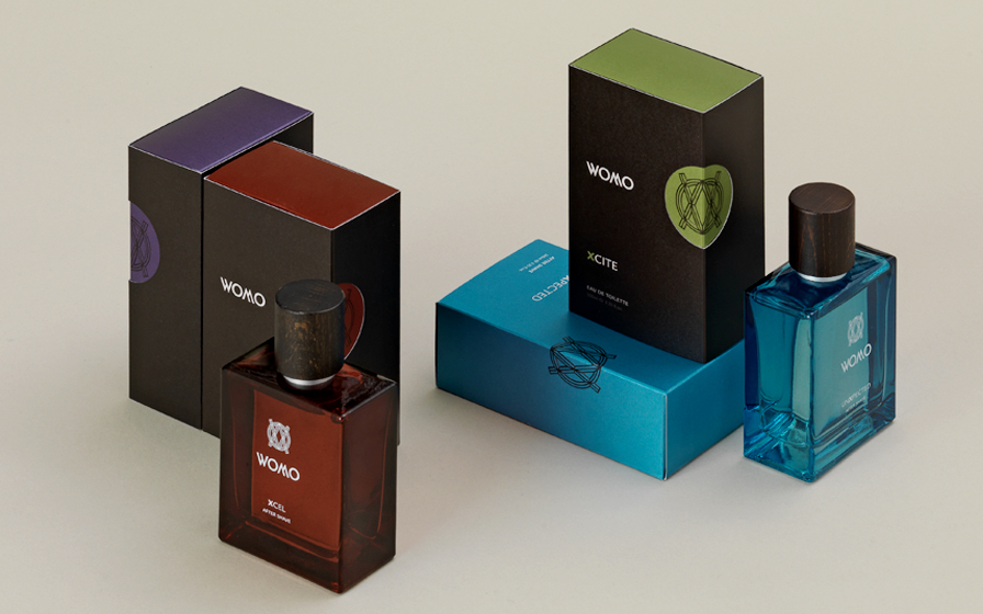
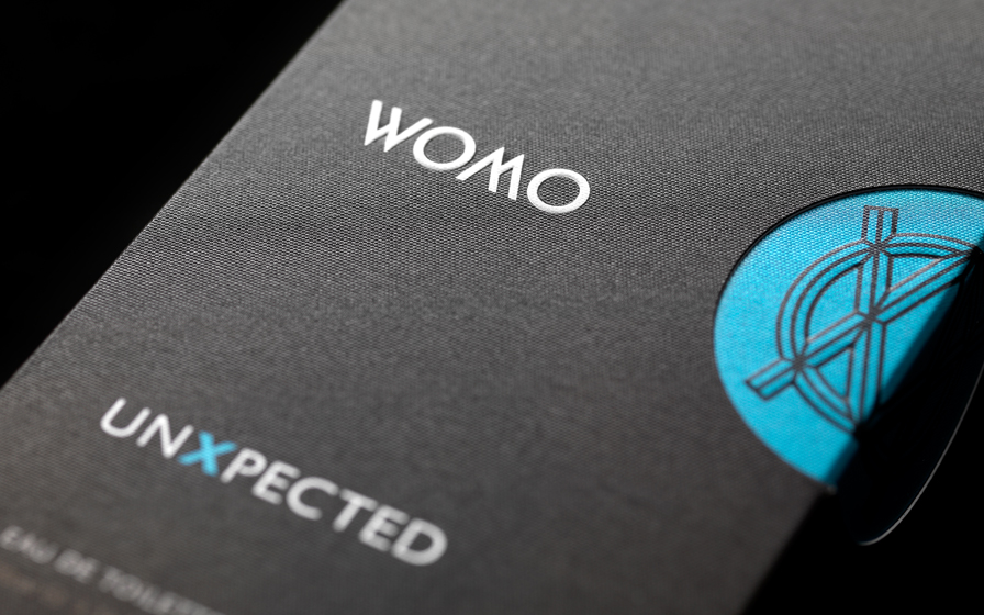
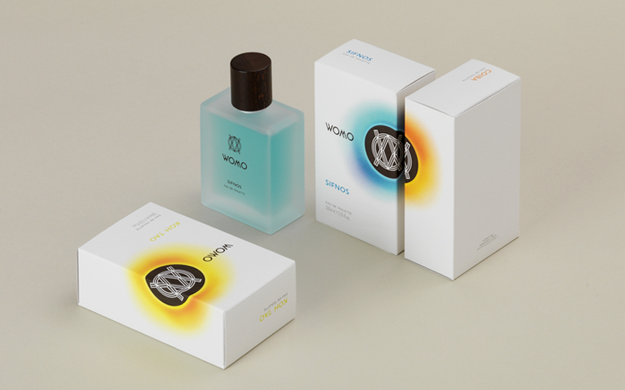
The fragrances and aftershave of the u0022Exclusiveu0022 collection recover the look and feel of traditional men’s fragrances but revisit them with a modern touch thanks to the colors that characterize the primary and secondary pack. The collection of summer fragrances u0022Travel diariesu0022 comes up with a bright and colorful look, to convey the feeling of a journey through remote islands. The collection of eau de parfum u0022Black Collectionu0022 is inspired by the black and communicates strong emotions of passion and elegance. From the shape of the monogram was created a relief decoration that adorns the pack and forges its personality.
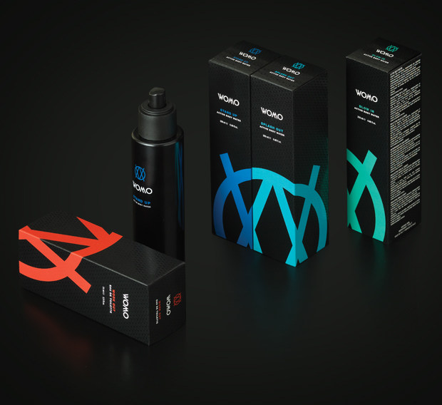
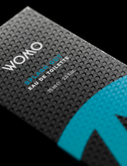
The 12 sport fragrances, 6 waters and 6 toilet waters, seize the features of the youth and sports world thanks to a pack wharein the “cut” and coloured monogram lives on a coal-black background, which gives the line a young and aggressive image at the same time.
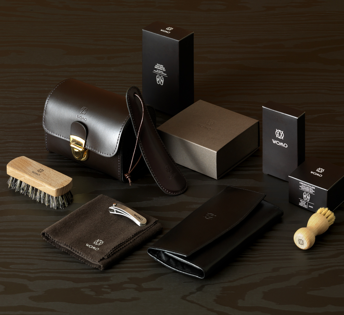
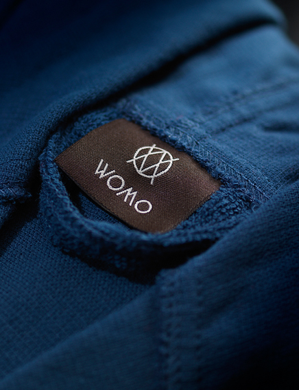
All the numerous non cosmetic products, ranging from underwear to shoe care, share a simple and essential identity.

