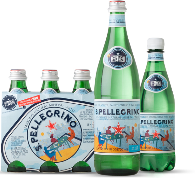
S. Pellegrino is not only one of the top brands of sparkling water in the world: it is an icon of the italian lifestyle. The label design with the red star in the middle is an old fashioned and untouchable asset that never changes. Nevertheless, the Brand is way far from being perceived as dusty or in decay.
A schedule of special editions in different Countries contribute to keep its reputation high and cool. The purpose of the brief is to create a special edition for the US market in order to support the launch of the new global ADV “Practice the art of fine food every time you can”.
A special edition of an iconic product has to be recognizable and original at the same time. The idea must be in line with the brand personality and the design must be eye catching and innovative. Given this assumption, the key objective was to tell the spirit of S. Pellegrino and the italian attitude of tasting fine food wherever you are, whatever you’re doing.
It is understood that some Brand’s equities are untouchable (i.e. the logo, the light blue and the star) whereas the design should create a certain disruption from the standard label.


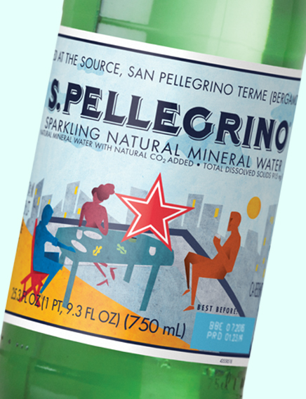
According with the S. Pellegrino personality, elegant and hedonist, we have created an aspirational scene showing an informal dinner with three people on a rooftop, dining and relaxing around the table in a warm evening.
The meaning is that you don’t need anything else but an italian touch to practice the art of fine food with spontaneity wherever you are. We looked for a “New Yorker” mood, worldly but not exclusive, through rough style and flat colors.


