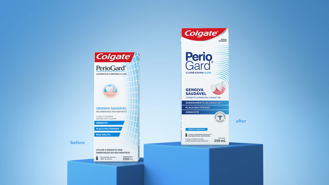
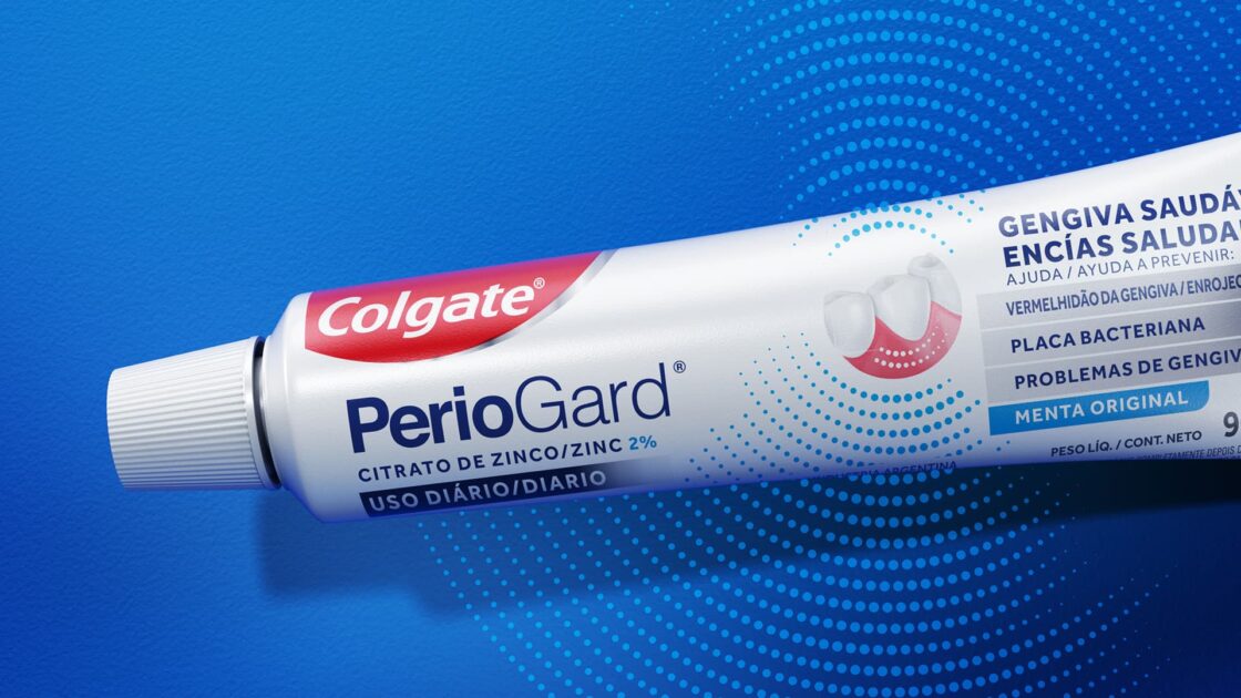
In our new partnership with Colgate, this time we have developed a project regarding their traditional and recognized line of Gard clinical products – PerioGard and OrthoGard. The main challenge, in addition to creating a more contemporary visual concept, was to differentiate between the products indicated for treatment and those for daily use, emphasizing their functionalities and benefits.

Modernizing without losing brand legacy
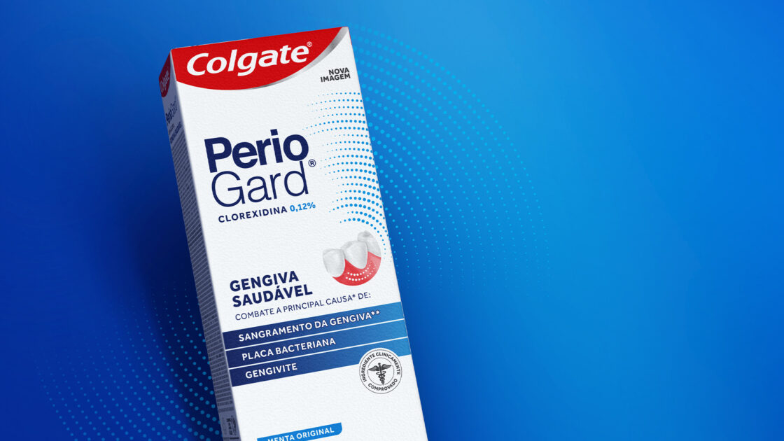
To update its visual identity, the net – a characteristic asset of the brand that refers to protection – was redesigned and gained prominence. The new design, now dotted, conveys movement and higher performance, alluding to a more intense action of the product formula.

To highlight the different varieties of the line and create a hierarchy of information that facilitates the user’s life, the packaging has gained new color codes, emphasizing the recommendation of benefits. Different typologies were applied to the Perio and Ortho prefixes, as well as to the amount of active ingredient present in the product.
The new visual identity and graphic concept were developed in a co-creation work with the Colgate design and marketing teams and applied in all SKUs of the PerioGard and OrthoGard lines, in the Brazilian and Latin American markets.


