France
Paris
Switch to your local agency
Retour au menu
Although enjoying a strong market share in the country chocolate market, Nestlé Peru had not yet entered the premium segment, which has been growing in importance and relevance over the years. So, the company decided to ask its consumers which of their portfolio brands would better fit the premium category, and D’Onofrio was the answer – a centenary brand loved by Peruvians.
Besides understanding which brand would better fit the new segment, a yet more important question has arisen: what does it mean being premium, after all?
For Peruvians, sophistication comes from origin. They take pride in their ancestral roots and the popular culture is their most precious asset.
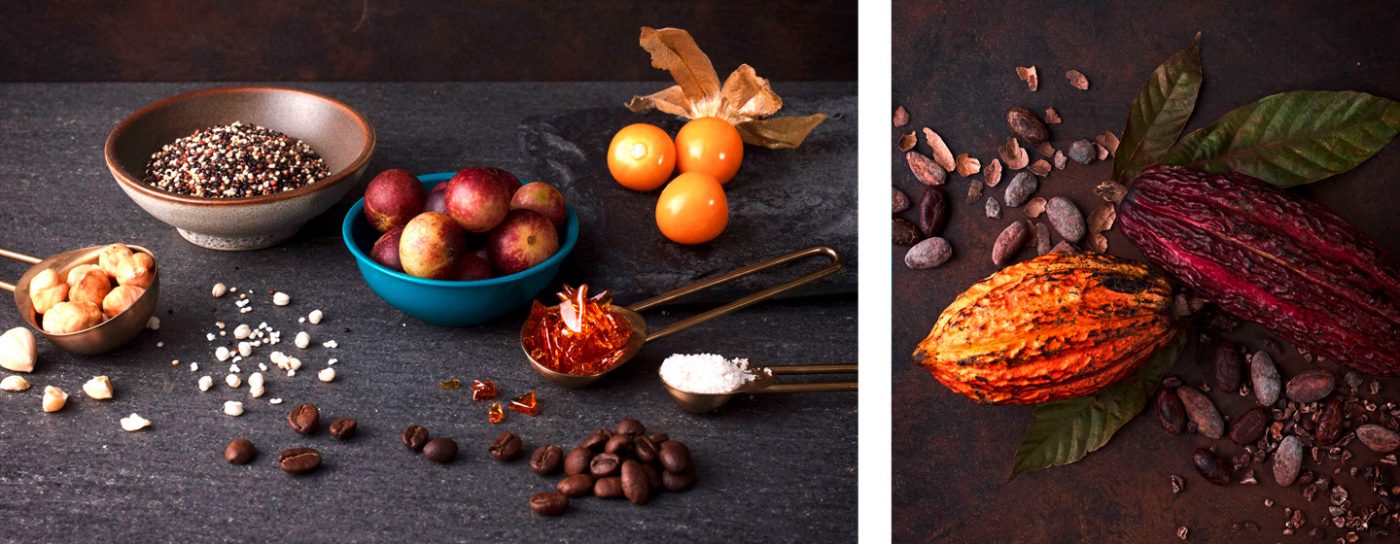
Therefore, our first move was to explore the country traditions. Together with a team from Nestlé we traveled around Peru to get a close look at their fairs, villages, and cities, taking a deep dive into the local culture and costumes. Then, we went to the Peruvian Amazon rainforest. We visited small and medium-scale cocoa farms where farmers, together with their families, produce the best and purest cocoa paste in the country. We have learned that it takes 3 to 5 years to complete the cultivation cycle, from sowing to the first harvest.
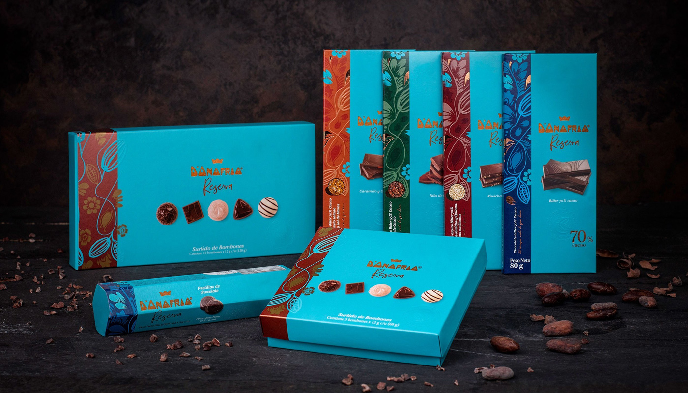
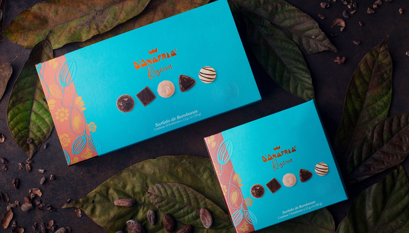
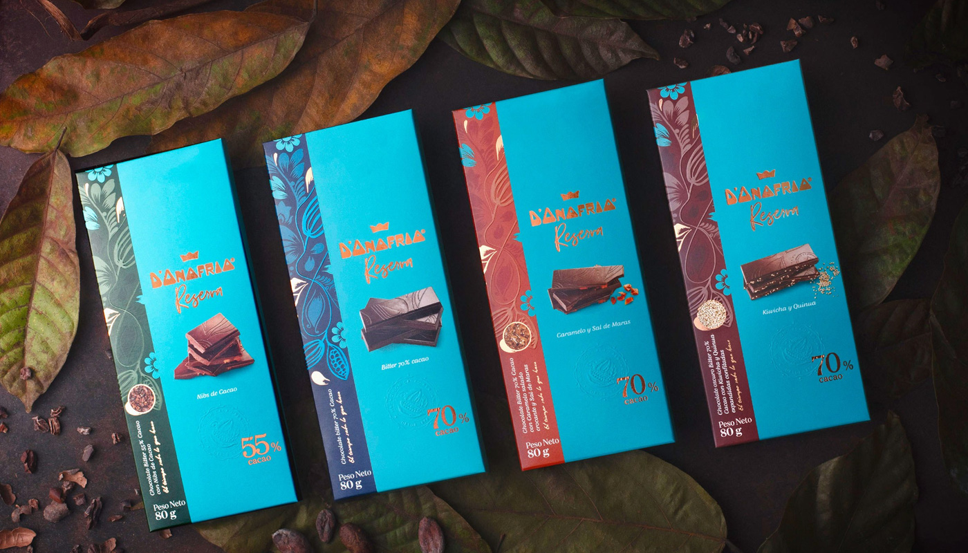
Inspired by the living contact with the local culture and tradition, we moved to the next step – the creation of the new chocolate brand concept. We studied D’Onofrio Masterbrand’s strategic documents, such as the essence, consumer profile, market surveys and the existing brand portfolio, that already has premium Panettones. Based on the living experience and adding the strategic analysis, we developed the creative concept for the whole line. Inspired by the abundance of the rainforest, we have created an illustration that represents the cocoa in its environment. The colors chosen were also inspired by nature, with earthy pastel tones. The copper tone contrasts with the other colors highlighting the quality and care of the new premium line.
We have presented visual codes for the parent brand, such as typography, colors, patterns, textures, and hierarchy of elements, besides the naming strategy. These cross elements are the foundation for the graphic system of the new brand, named D’Onofrio Reserva.
To complete the brand rationale, we felt the urge to add an important element: the cocoa origin history. This emotional element, essential to lend credibility to the new line and build a connection with people, is in the inside of the packaging. Following the creative concept El tiempo sabe lo que hace (time knows best), stories are told, enhancing the cultivation, the harvest, and the selection of the best beans. It is a product that cherishes the making of chocolate, the time and dedication behind its production. A line of chocolates that values authentic recipes and the respect for the origin, producers, and ingredients, as do the Peruvians.
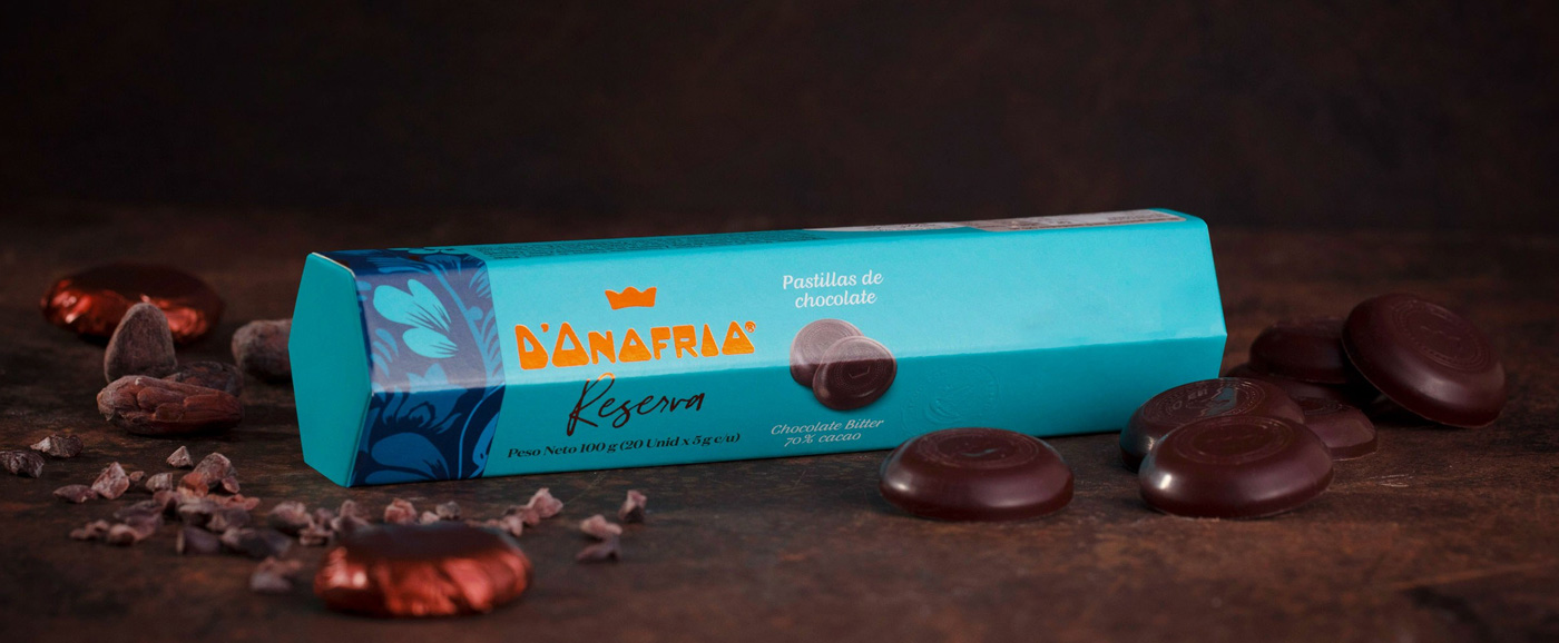
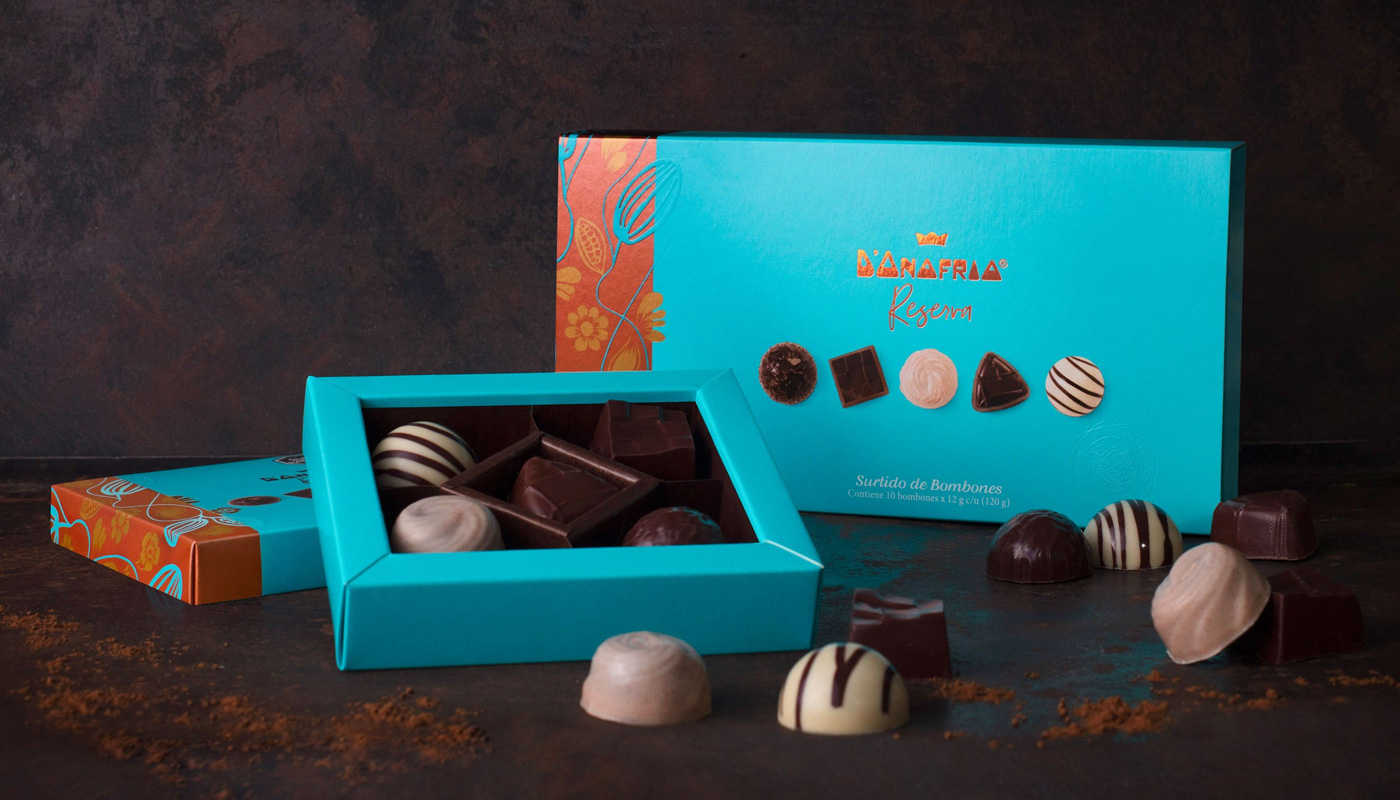
D’Onofrio Reserva line has 70% cocoa bars, bonbons and pralines, all wrapped in vibrant colors and traditions of the Peruvian culture.
Braskem’s renewably sourced polyethylene – a result of the combination of innovation, technology and sustainable development – was conceived to promote a better impact to the environment.
In line with the company’s commitment to Circular Economy, the I’m green™ bio-based plastic resin, produced from a renewable raw-material – sugar cane –, is now considered a business opportunity, due to the product’s contribution in reducing carbon footprint.
To start the brand repositioning, our team’s first move was to explore. We studied the category in-depth, analyzed the brand history up to the present moment and – a particularly important step – we interviewed several of the brand stakeholders – from Braskem’s employees, clients, to recycling companies.
During this phase of study, we dived deep into the company’s portfolio of circular economy related products with renewable and recycled source solutions, and a point got very clear: why not join these resins in a single portfolio, combining the quality of their deliveries?
This idea stood as a key point in the next phase of the project when we in fact started to build the brand’s new strategic positioning. Based on the fact that I’m green™ is already a recognized brand in the market, acknowledged by the partners that promote this chain, moreover presenting an innovative feature, why not take advantage of its own brand to expand the scope, making it represent Braskem’s portfolio of products with a Circular Economy approach?
With the survey inputs at hand, the next step of the project was to answer the question: Ok, but how are we going to make it happen? What is the best way to enlarge the portfolio and how should we handle each solution? To solve the challenge, we held a Sprint Lab workshop. For two days, we and Braskem’s team of professionals from all over the world have worked collaboratively, developing together the new portfolio architecture, with an expanded brand identity and new visual routes to be explored.
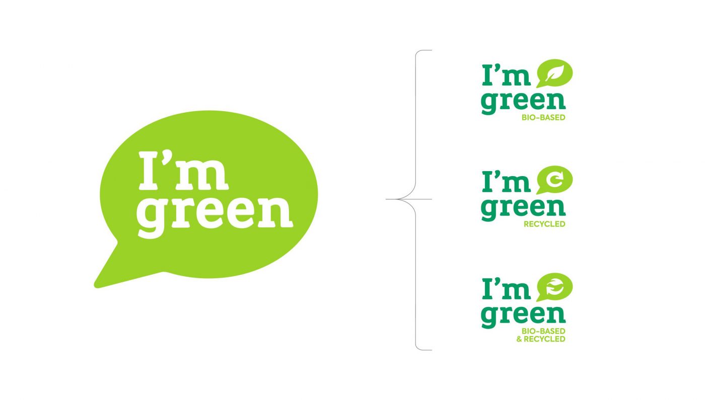
To highlight the strong points of the existing products from renewable and recyclable sources and their similar values, aligned with the Circular Economy, we have started by defining the purpose, personality, and essence of Braskem’s set of offers. At this point, our strategy and design teams worked closely together. For all to understand how to deal with the brands as a whole, we have created visual prototypes to make possible changes – as well as their impact – tangible. These prototypes were then presented in a survey conducted with clients and partners, to capture their feelings about the new organization of the brand’s portfolio, where I’m green™ featured as a Masterbrand and, under it, stood the products from bio-based and recycled sources.
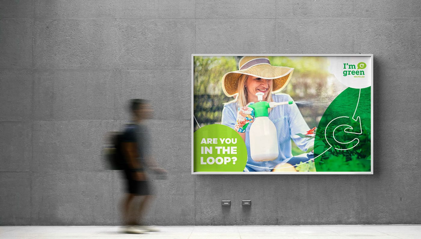
In order to add force to I’m green™’s identity, a verbal language was established based on the new strategic settings. Purpose and essence were the foundation for the definition of the key messages and the brand’s tone of voice. The Masterbrand visual identity was updated, and products sub-brands were created to work together with the existing visual concept. Moreover, the look & feel was developed to design a more modern and updated portfolio. The verbal and visual work has culminated with the creation of the products’ Brand Guidelines and the Brand Book for I’m green™ Masterbrand.
The official launch of the new Masterbrand and the products sub-brands was announced at the end of 2019, at K Trade Fair, an important fair for the plastic and rubber industry that takes place in Dusseldorf, Germany. So, with a renewed look and purpose, I’m green™ was reintroduced to the global Market, leveraging Braskem’s presence with sustainable solutions and reinforcing the company’s commitment to Circular Economy.
Note: the content of this text refers to CBA B+G case created for I’m green™.

Privacy Overview