Discover the collaboration between CPW and CBA
/ CONTEXT
Cheerios, a strong player in the cereal category for many decades and present in more than 60 markets is a love brand and is renowned for its delicious and nutritious cereals for the whole family.
/ CHALLENGE
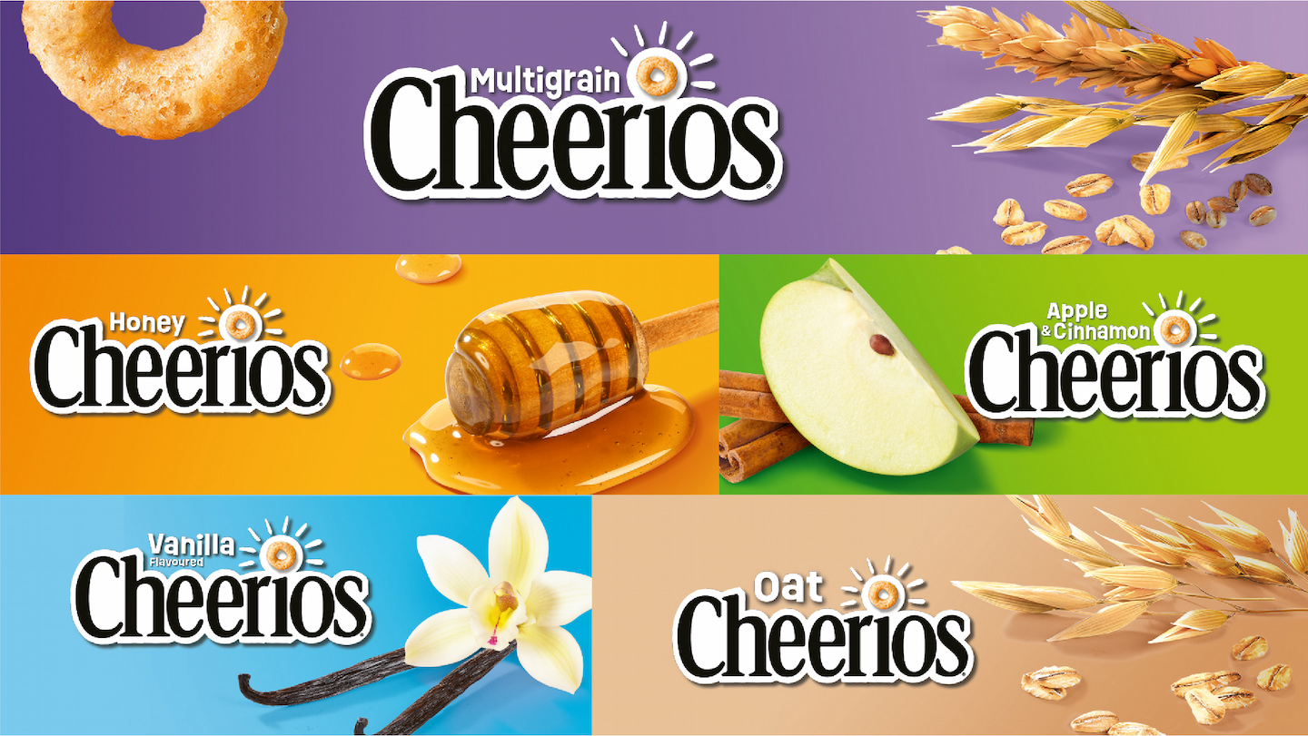
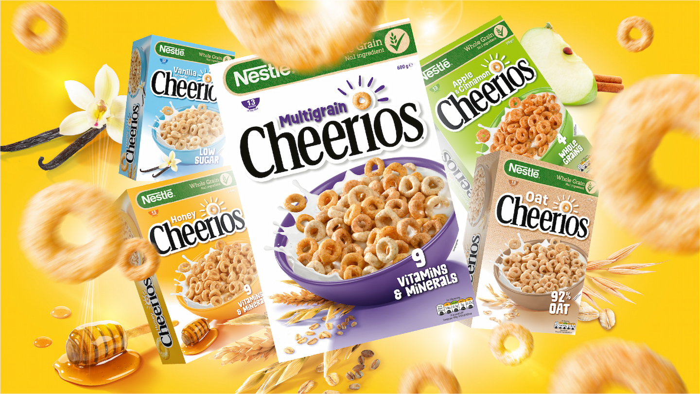
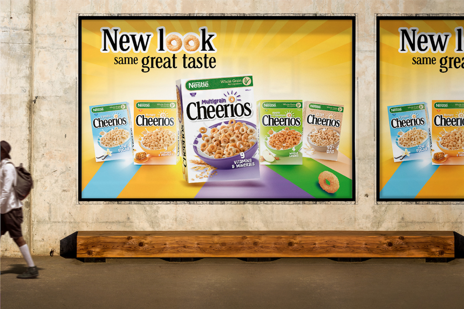
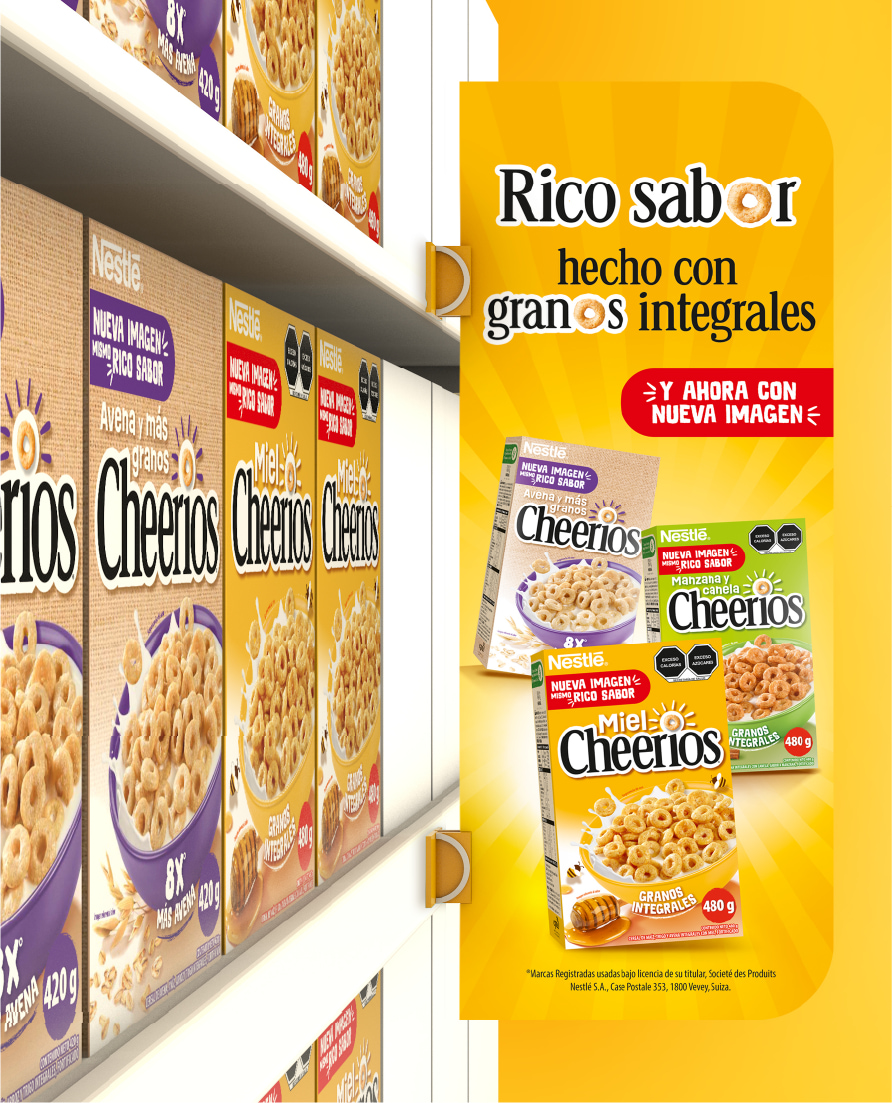
However, it needed a stronger point of difference and a distinctive and ownable visual identity to attract a wider audience and stand out from the crowd. In addition, within the portfolio, there was a lack of clear differentiation between the different flavours and product sub-ranges to ease shopper navigation on shelf and trigger purchase.
/ SOLUTION
Cheerios embarked on a journey to reposition the brand on a global* scale. CBA’s mission was to bring to life the new brand positioning, leveraging cheerfulness, taste and nutritional benefits.
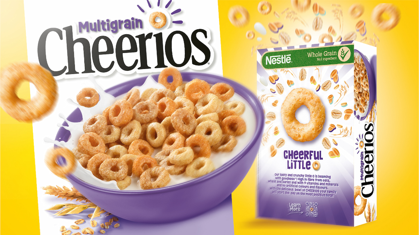
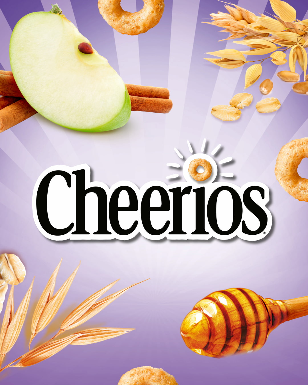
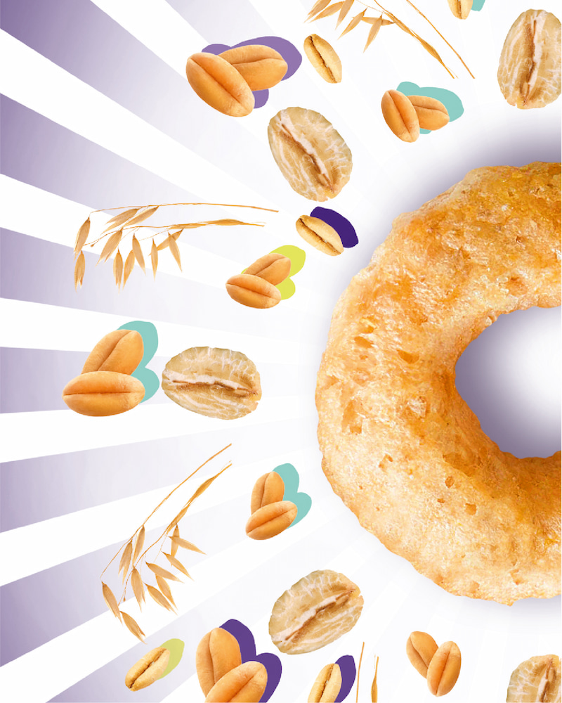
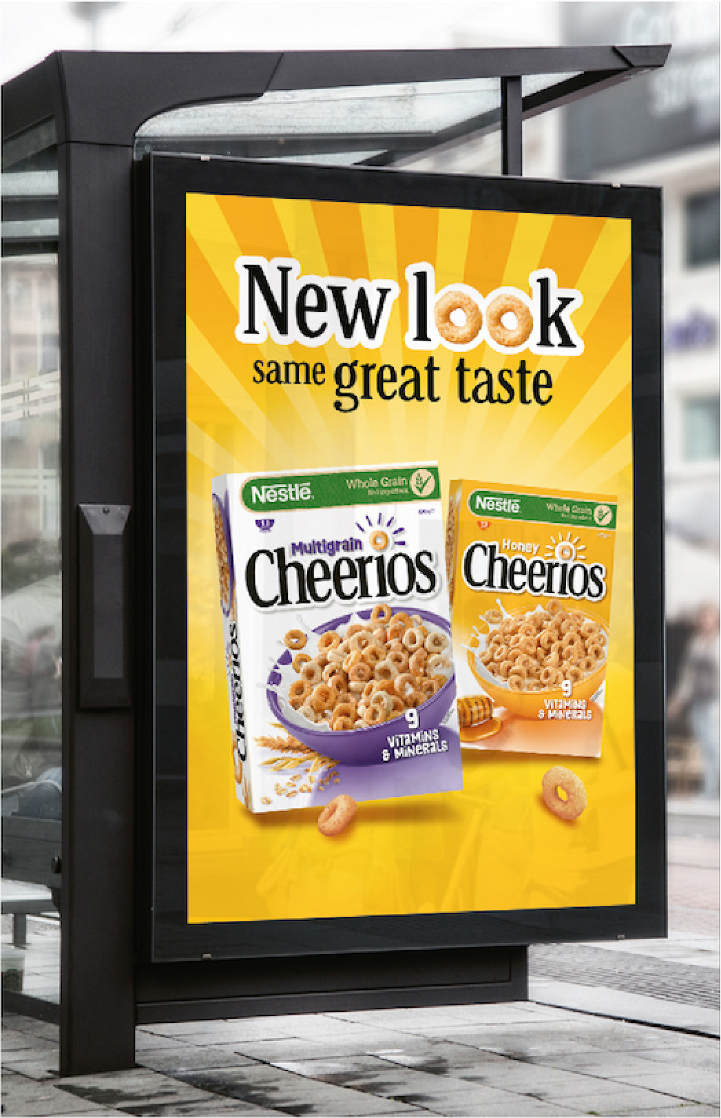
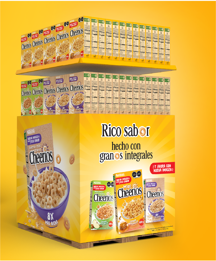
The agency’s vision was to transform Cheerios into a modern and dynamic brand that conveys positive energy and goodness. CBA opted for a design that is both bold, modern and uncluttered, leveraging strong assets that will strenghten the Cheerios brand. Placing the product and its benefits at the center, the famous ‘little O’ of Cheerios has been reinterpreted with meaning, vitality, personality and an indulgent touch.
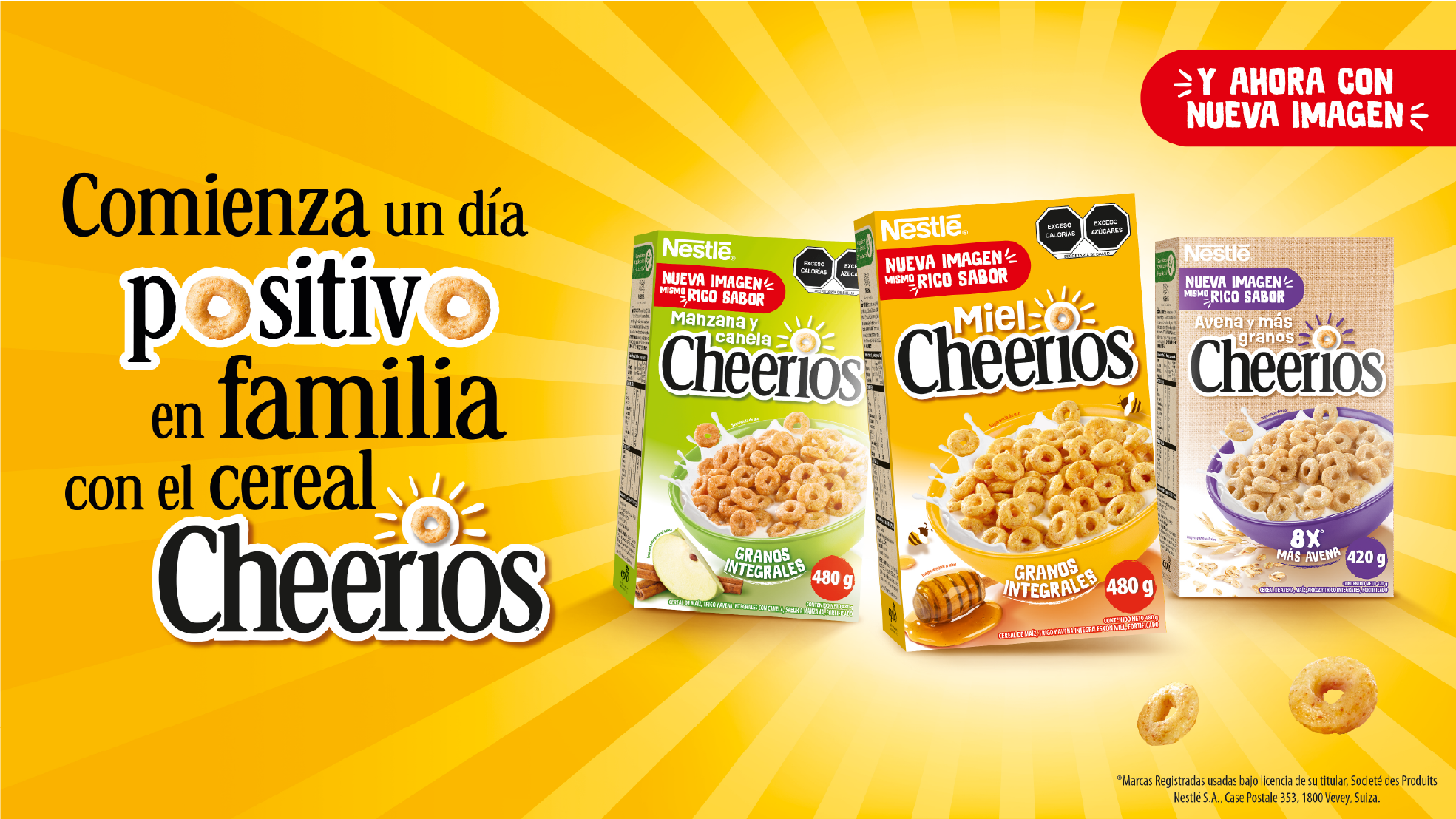
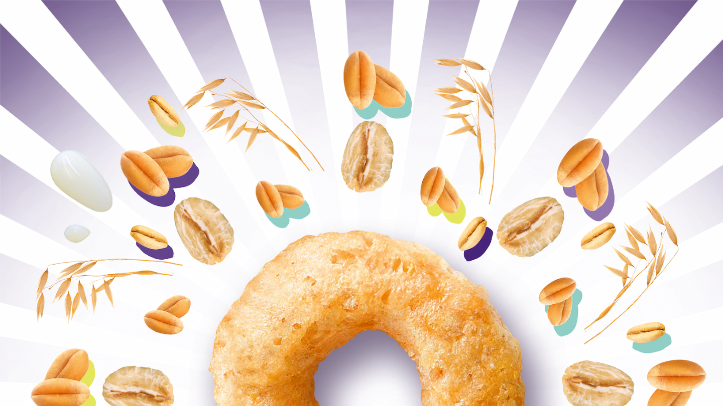
The ‘beaming effect’ spreads positive energy, highlights the brand’s purpose and personality. Like the positive benefits of real sun rays, it invokes warmth, well-being and a healthy body and mind.
The design system allows flexibility to welcome many flavours and sub-ranges.
*Except for the U.S. market
