France
Paris
Switch to your local agency
Retour au menu
Since the launch of BBVA‘s new image on April 24th of 2019, there have been many comments about it. By default, criticism. And the fact is, in general, we are more about destroying than building. The day this changes, we’ll move forward by leaps and bounds.
But what is the main difference between the revolt surrounding the change of Zara’s logo and the change of BBVA’s identity?
While Zara is a brand that touches our skin and connects directly with us, BBVA represents a further, even colder place, whose main purpose is to keep our capital safe. And is that what inspires us?

The purpose of branding is mainly to iconize the story we want to tell efficiently. A story that connects with who we are addressing. A story that matters to those who we are going to tell it to. So, before falling back into the like/not like, let’s think: why have they done it? What do they want to convey with this change? What do they want to tell people today, that they weren’t telling them yesterday? Then we will be able to assess how and if the aesthetic interpretation and the creative territory chosen is aligned with what attracts their current and potential customers.
According to their official statement, the need for change comes because ‘‘In a world where digitalization and globalization are already a reality, customer experience is the most important factor for the success of any company.” Well, here we find two key leads:

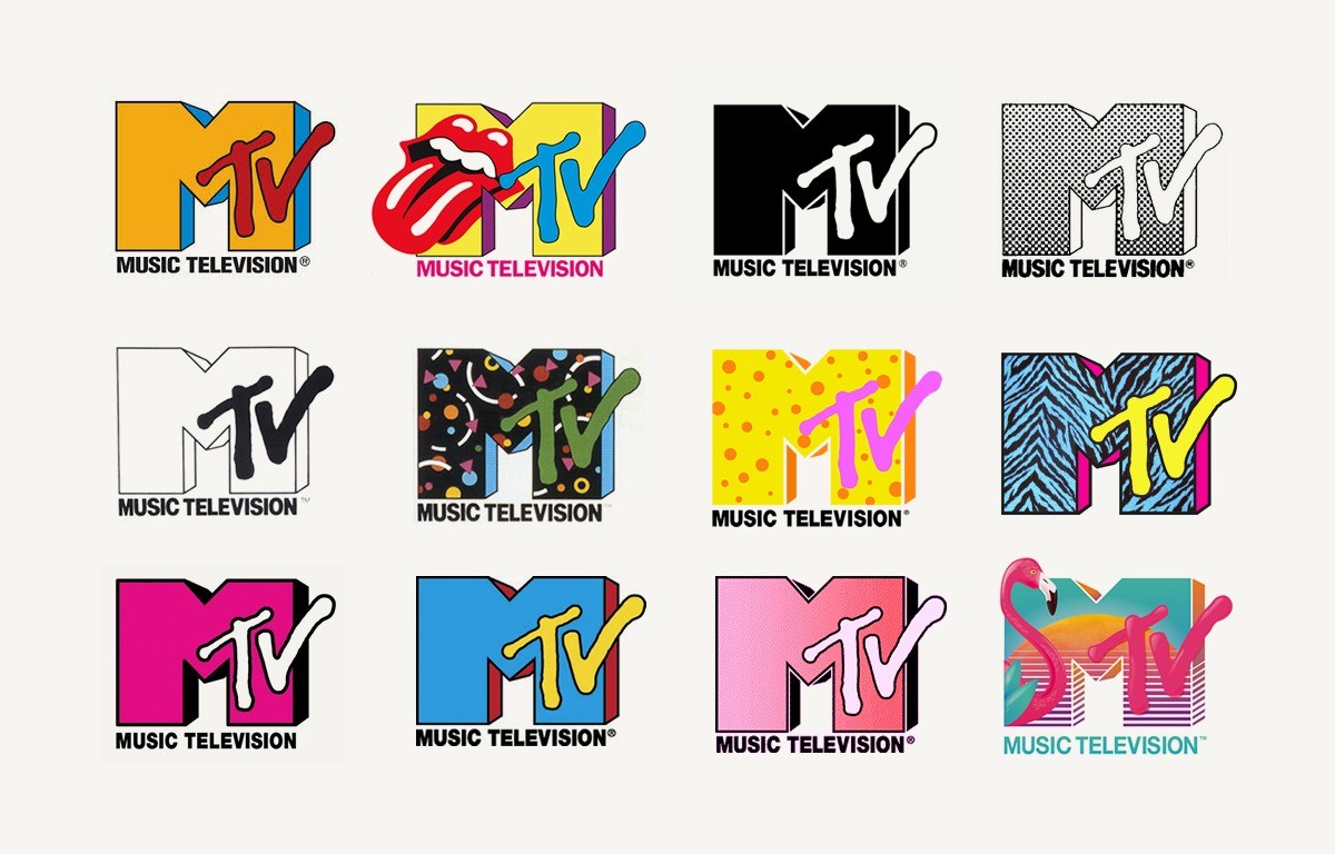
All this, from simplicity and iconicity. Two fundamental ingredients in visual communication to give visibility and recognition to a brand. In this case, capitalizing on the tagline ”Create opportunities”, allows to develop a chameleonic aesthetic language as an invitation to discovery and creativity. A proposal that seeks to stimulate and inspire, and thus connect with younger audiences. An exercise that other brands have carried out throughout their history, and that is sustained, mainly, thanks to the construction of a simple but consistent icon.

And the fact is that the versatility of a brand can only be built through iconicity. That is why it is essential to find a symbol that clearly represents what we want to tell.

In the case of BBVA, one of the major changes has been to build on the ”A” as an icon of the brand. ”A” as an open door to creativity and future ideas. ”Au” as a symbol of growth and solidity. The summit. A necessary exercise to be able to have an appropriable speech (with A) that revolves around what matters to people: that their money will always be safe. Because, after all, design is empathy.
Article published on MarketingNews
Privacy Overview