France
Paris
Switch to your local agency
Retour au menu
Ávoris Corporación Empresarial has entrusted CBA Design with the redesign of one of its most iconic brands, CATAI, as part of its transformation process. A strategic branding project that highlights the value of the brand’s journey based on imagination, innovation and distinction.
CATAI began its journey in 1981 by the hand of its founder Matilde Torres, who chose this name for her passion for the empires of Asia and the art they held. Her pioneering vision and more than 40 years of experience have positioned the brand as unique and inimitable. A story of success and leadership that embarks on a new journey: the launch of its new visual identity.
A project meant to reinforce CATAI’s value proposition, gaining in consistency and establishing its own territory of expression. A solid narrative and visual identity, with a new graphic and semantic ecosystem that builds on the brand’s strategic pillars and activates them consistently.
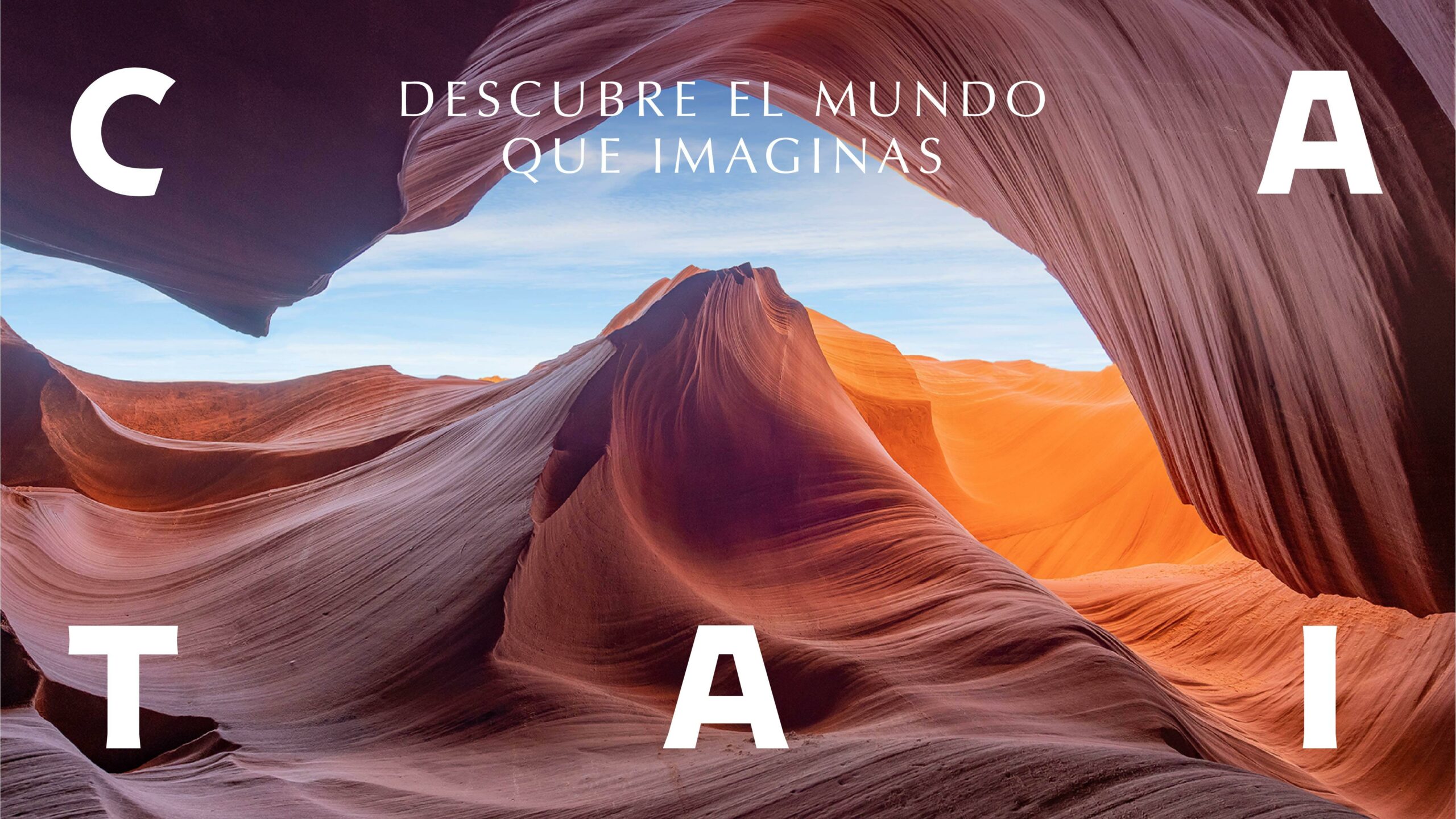
“Descubre el mundo que imaginas” – Discover the world you imagine – is the core message to drive the new strategic platform. A fundamental concept in the definition of the brand image, which is reflected in all aspects of the design. This new language is articulated from the creation of a strong logotype, creating a global identity system.


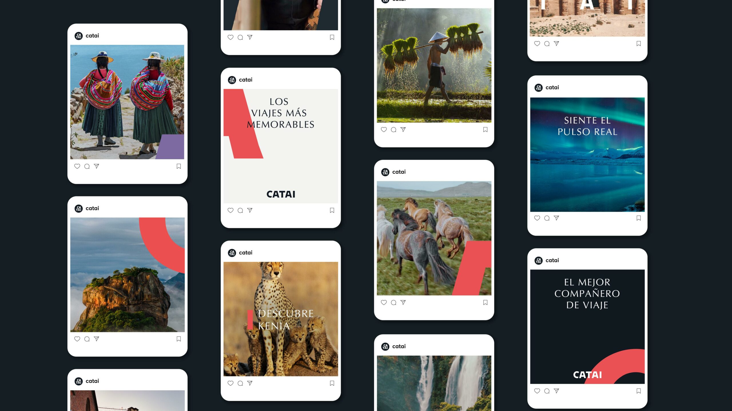
CATAI’s complementary codes, typographic and iconographic styles, colour palette and photographic proposal acquire greater prominence and expand dynamically throughout all the touch points between CATAI and its travellers.
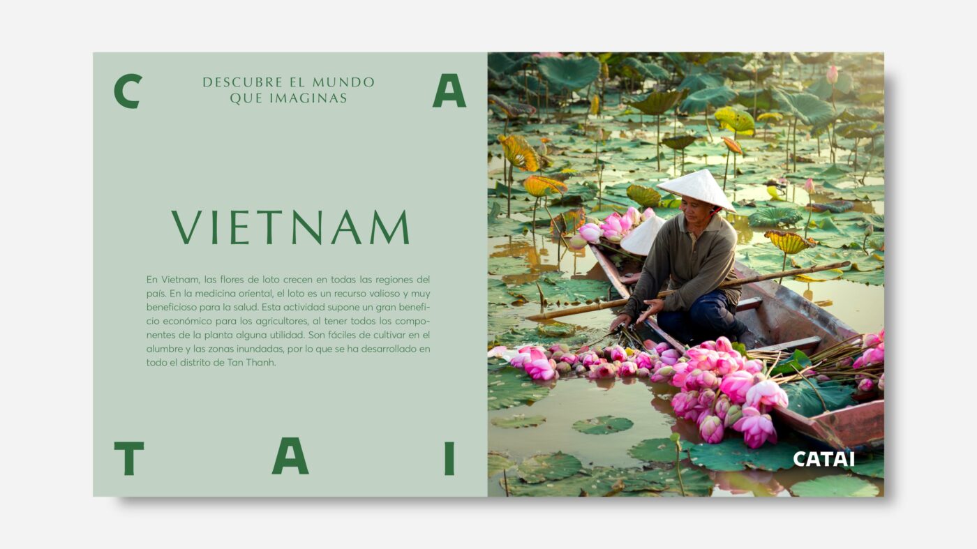
A typographic style whose serif and simple shapes take us to a more premium and elegant world. Along with the ornaments built from the logotype, we give the brand a unique personality and recognition, both through the typographic gestures and the editorial style.
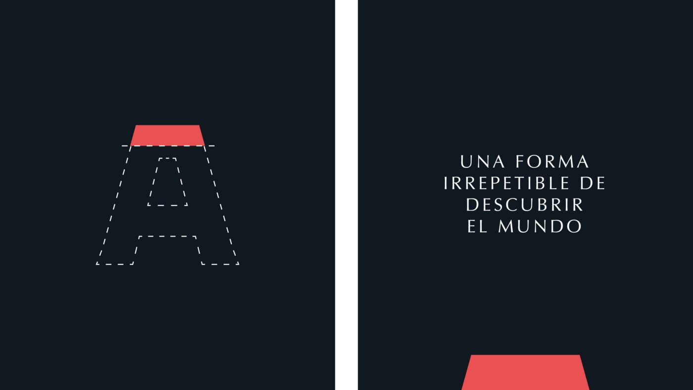
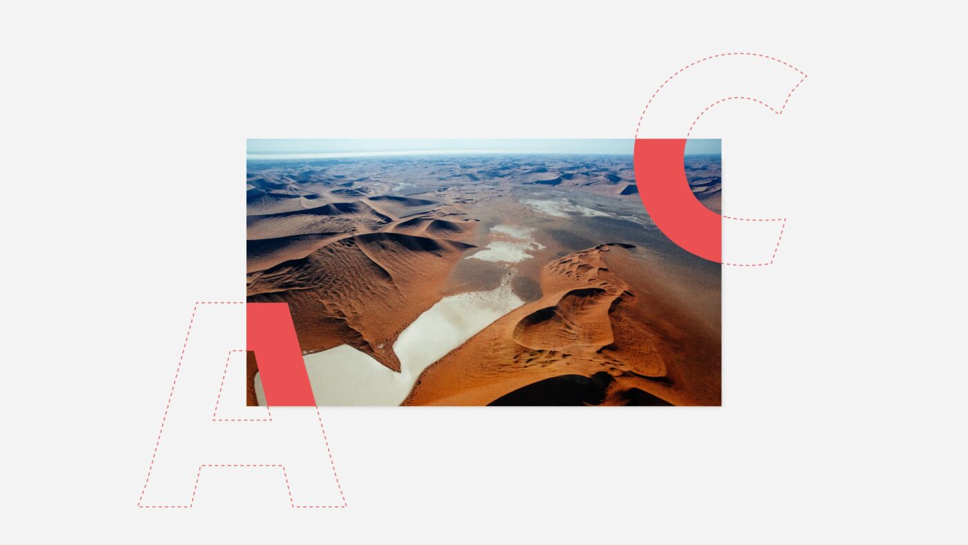

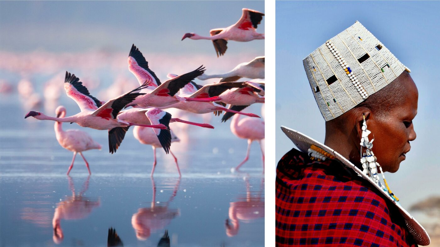
Part of this strategy involves a collaboration with the documentary photography specialists The Raw Society, in order to capture exclusive images from the authentic CATAI gaze. The result is an immersive imagery that allows a genuine connection with each destination.


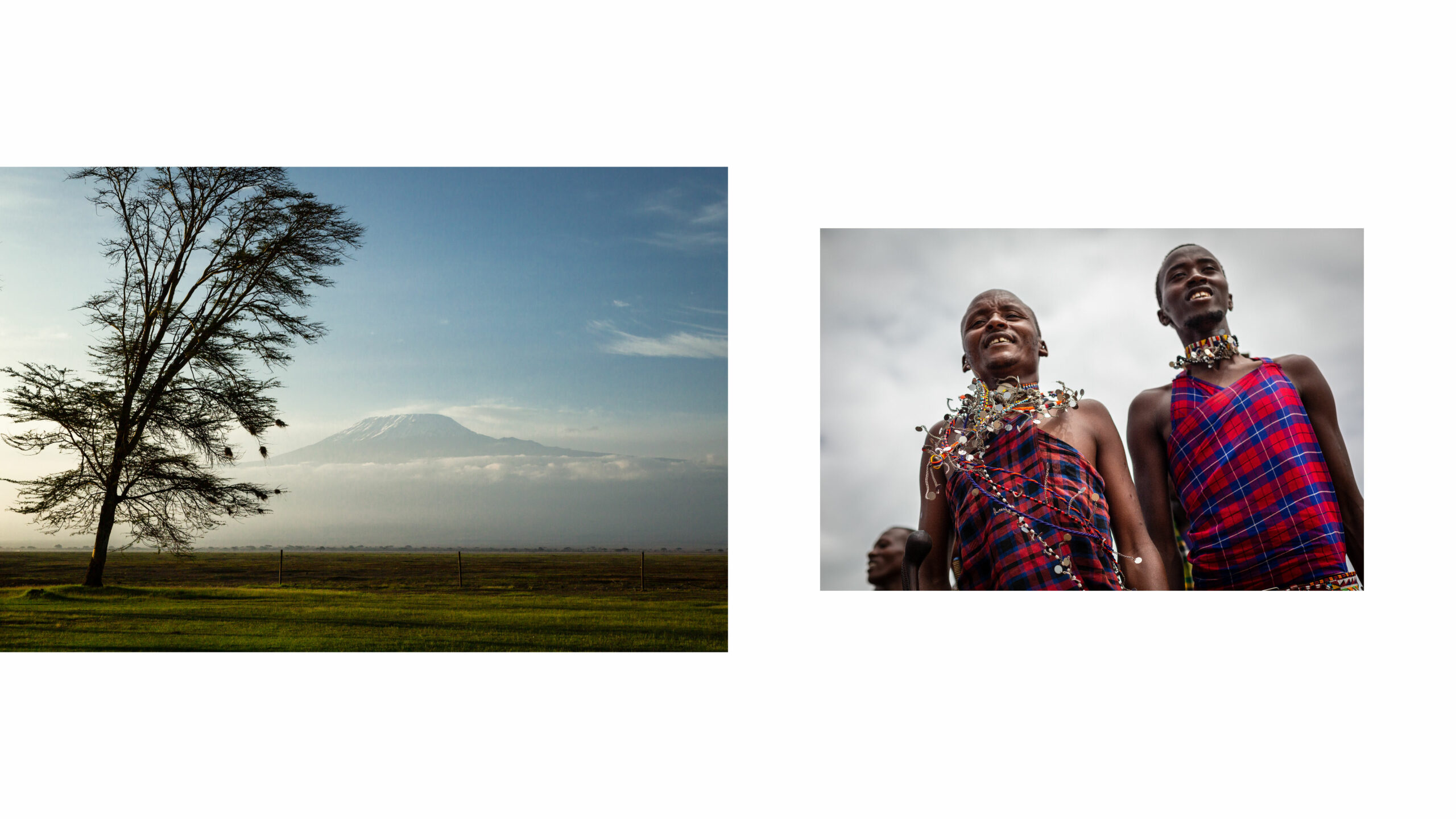
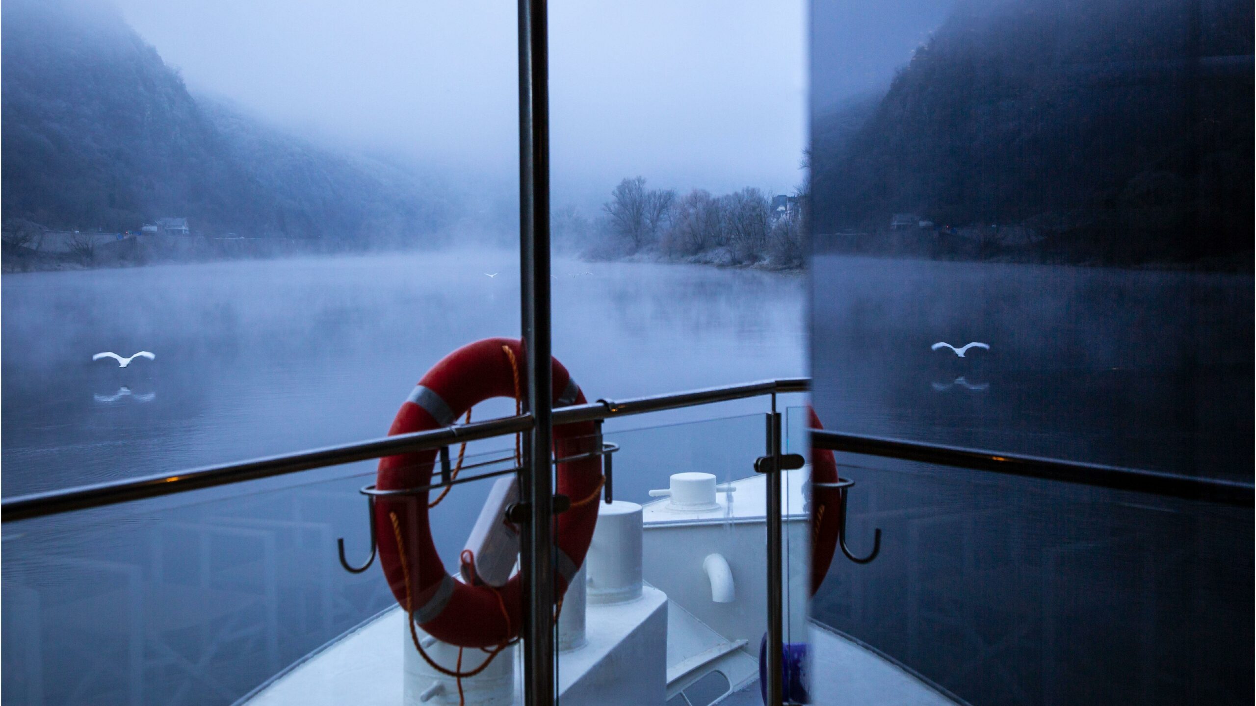

The entire visual imagery of the brand, both in digital and editorial style, is built under the concept of the CATAI gaze. An authentic, passionate and committed vision that allows us to observe the world from unique perspectives.
Images with natural and balanced colours, where the clarity and contrast between lights and shadows convey a sense of reality and connection with the destination.

In order to transmit CATAI’s wide experience and expertise, we have extended the chromatic palette by clustering the different destinations into different colours according to geographical areas. By doing so, we achieve a chromatic harmony between the different elements and provide flexibility and versatility to the brand, in a consistent way.
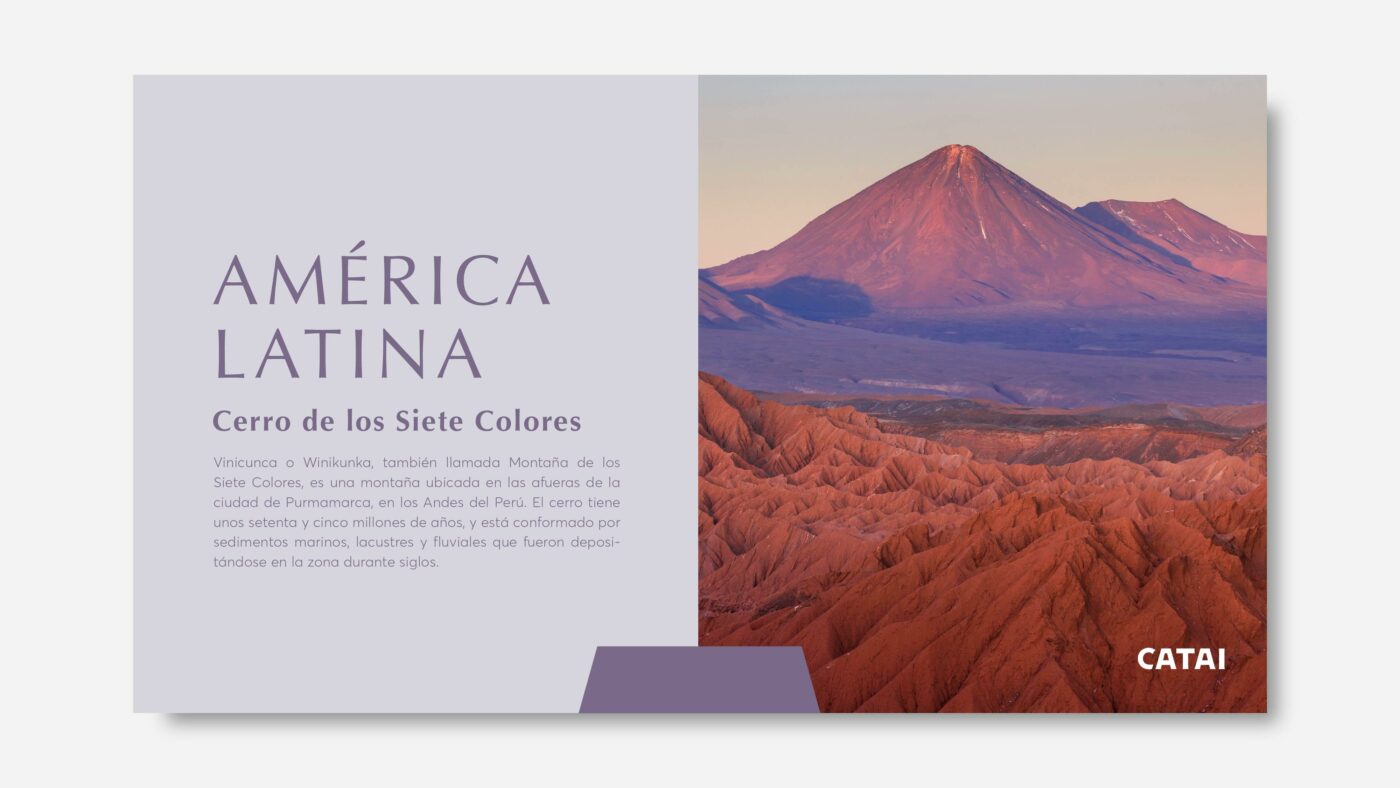
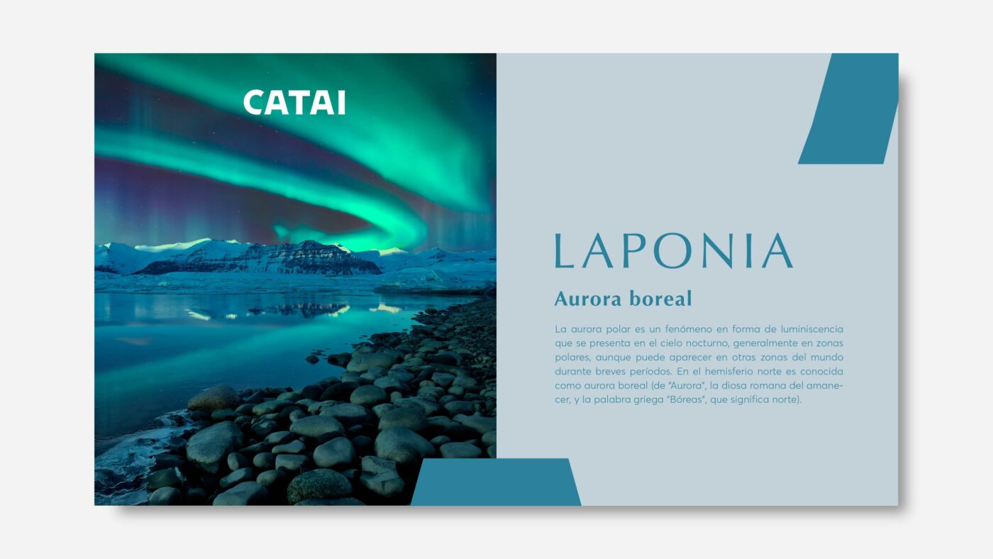
A new identity for CATAI that enhances the legacy of a pioneering woman in the industry, its founder. A project that has allowed us to build a relevant brand image with a highly emotional tone, adding new meanings to the word design and its relationship with people.
With this redesign, CATAI positions itself as the best travel companion. A vision that pays tribute to its roots and highlights everything that makes it a committed and innovative brand.
Privacy Overview