France
Paris
Switch to your local agency
Retour au menu
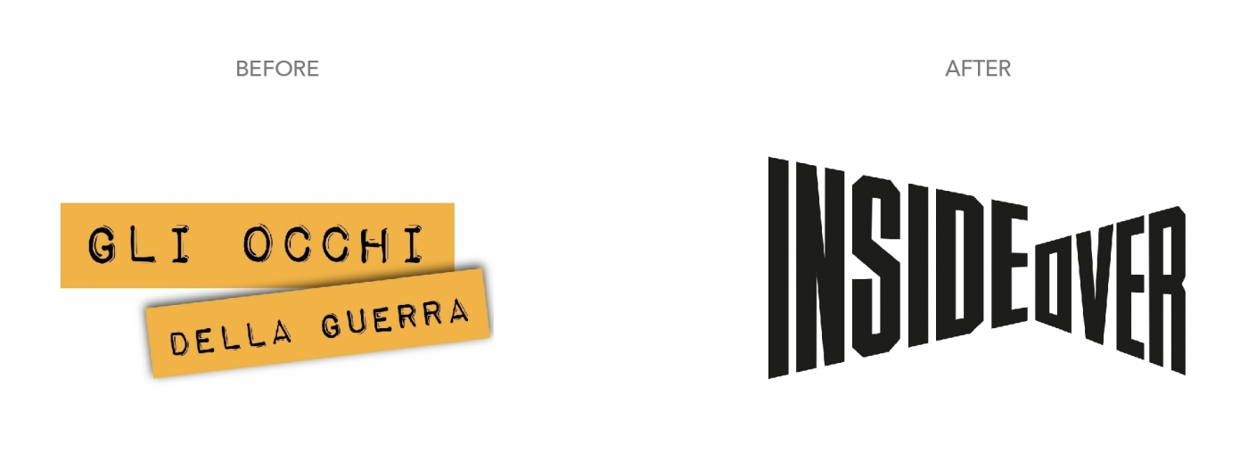
This is the mission with which Inside Over project was created. An initiative launched for the first time 5 years ago, under the name of Gli Occhi Della Guerra (“The Eyes of War”), as an online platform that collects high-quality reports from all over the world. A unique and fascinating project, which we have supported and developed together with the rebranding.
Throughout these five years, dozens of reporters have produced more than 200 reports all over the world and Gli Occhi Della Guerra won numerous international awards: many for the quality of the stories told, others, including the Inma Global Award for Innovative Journalism in 2016 in London, for the idea and method of involving readers, and finally the prestigious Biagio Agnes International Journalism Award for the “new frontiers of journalism”.
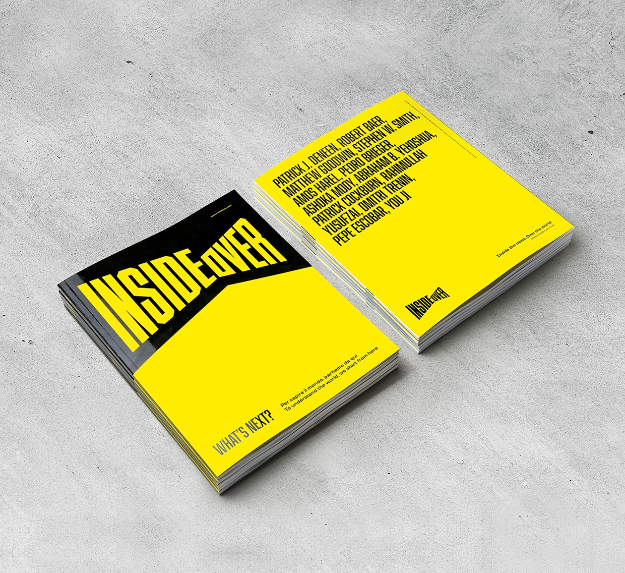
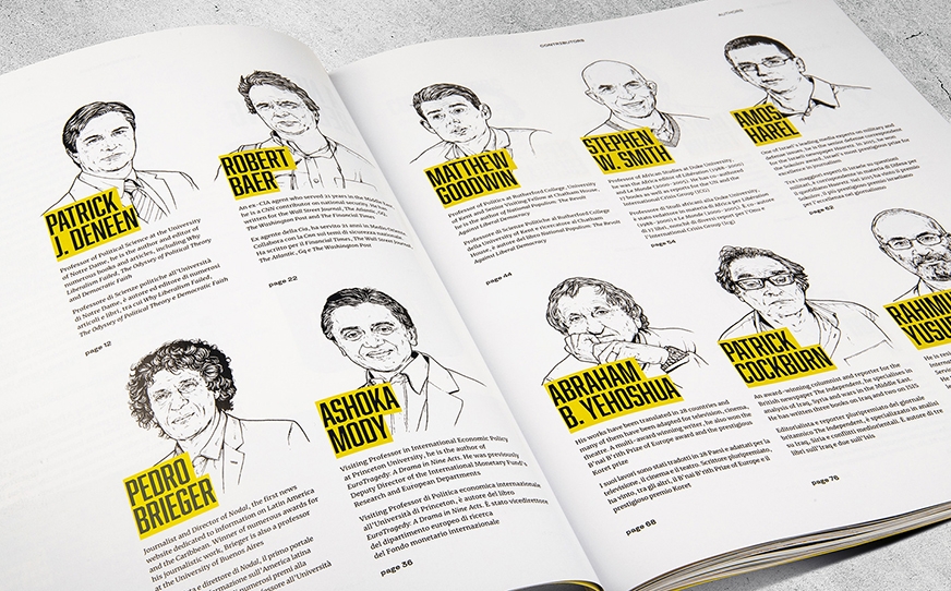
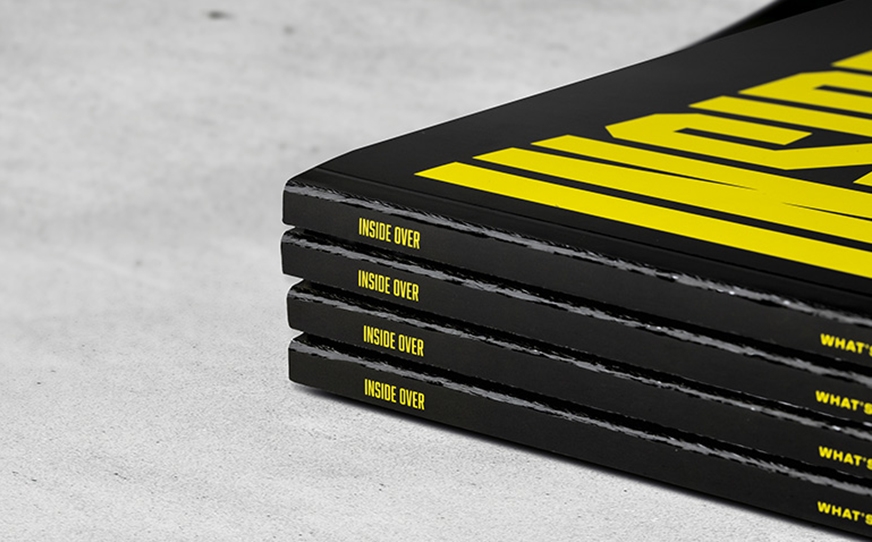
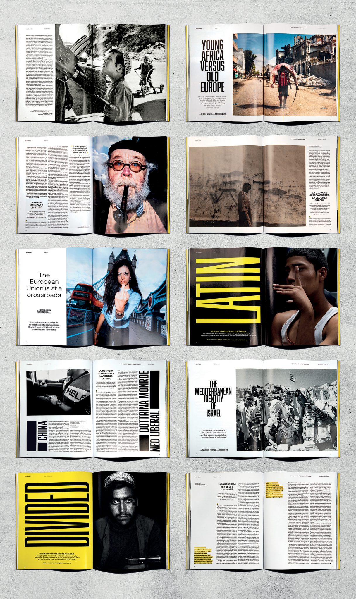
For the launch of the new brand, we also designed a special edition magazine, where thirteen authors (among them journalists, writers, analysts and international university professors) answered to a simple yet complex question: Where is the world going? The magazine, which has been distributed in all Italian newsstands, is the first calling card for this new journalistic project, which seeks new readers and passionate supporters. Like us.
Its radical transformation in order to establish itself as an international journalistic presence has involved the creation of a new name, able to describe the uniqueness of the publication, which deals not only with issues related to war but also presents itself as a source of authority outside the Italian audience. Hence the name Inside Over. Two words that create a contrast and a tension, as if they were trying to push in two opposite directions.
The first aims to enter into reality, through in-depth content and reports from all over the world. It aims to go deep, INSIDE. The second pushes towards a work of analysis, towards the need to look at scenarios from up high, to fully understand and contextualize the facts in the global chessboard, without falling into “easy” judgements, OVER. A way to describe reality that therefore highlights the contrasts, the tensions between the near and far, the inside and the outside, the local and the global.
This same concept was then transported into the brand design: a strong, recognizable typographic sign that highlights the tension between the word INSIDE – going deep, discovering, entering – and OVER – expanding the look, the analyzing, the elevation.

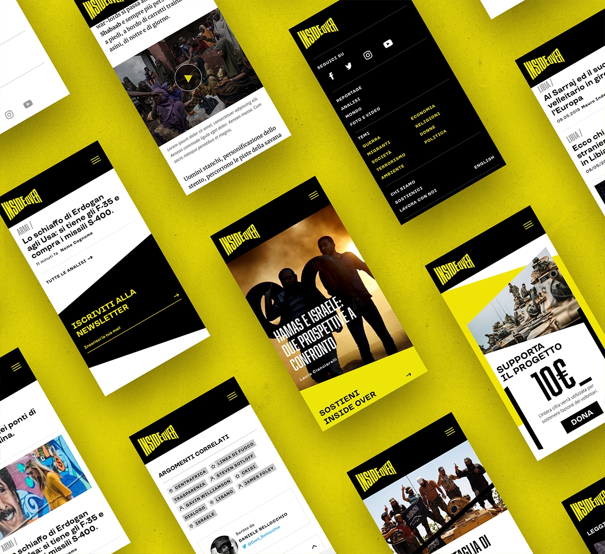
In this case, for example, we have designed the interface of the new website (www.insideover.com), where great attention has been paid to differentiating the various types of content, giving them the correct hierarchy: most featured are the reports and video stories, then the detailed profiles and finally, as a corollary, the news.
It was little more than a dream to start over in the years of the deep publishing crisis, to do ‘‘journalism in real time’’ and ‘’on the front line’’. It was little more than a dream to do it starting from the web, which, let me tell you, is often foolishly branded as the breeding ground for superficial information or, worse still, for fake news. It was little more than a dream to try to revive great journalism, starting from the most important resource of each newspaper, the reader, which we first involved through crowdfunding.
Privacy Overview