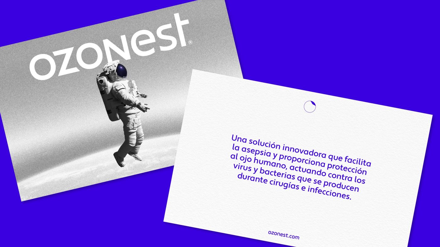
Ozonest is a groundbreaking solution that facilitates asepsis and provides protection on the human eye thanks to its formula based on the O3 molecule, better known as ozone. An innovative treatment that acts against viruses and bacteria occurring during optical surgeries and infections.
It is also the very first brand in the Spanish market to use this sky-high formula, for which we have created a unique graphic imagery from scratch, introducing new codes in the universe of ophthalmology through a fascinating perspective that takes us to the moon.
/ storytelling
The first keystone has been to create a storytelling that connects with both professionals and patients, establishing a consistent and differentiating narrative that drives an effective dialogue between them and the brand:
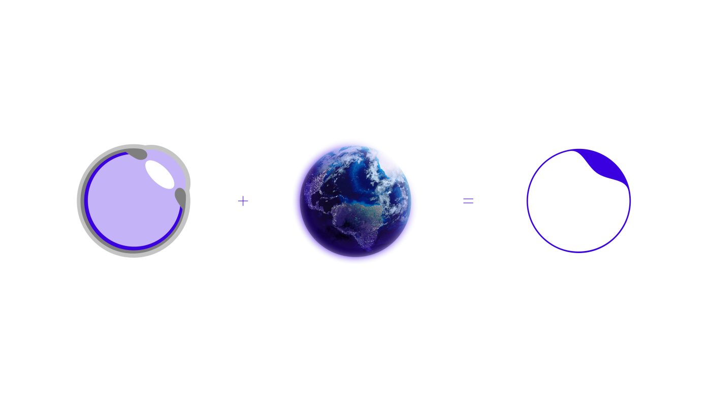
The globe is protected by the upper layers of the atmosphere, where we find stratospheric ozone, the most active form of oxygen. Its purpose is to articulate an invisible membrane to protect the Earth’s surface. In the same way, Ozonest, the ophthalmic solution of tomorrow, will soothe, restore and protect the health of the patient’s eyeball after infection or surgery. A proposal with superior tolerability, which has been developed thanks to the revolutionary LipozonEye® formula. An innovative and effective treatment to build a harmonious eye microcosmos, where cleanliness, gentleness and comfort reside.
/ BRAND
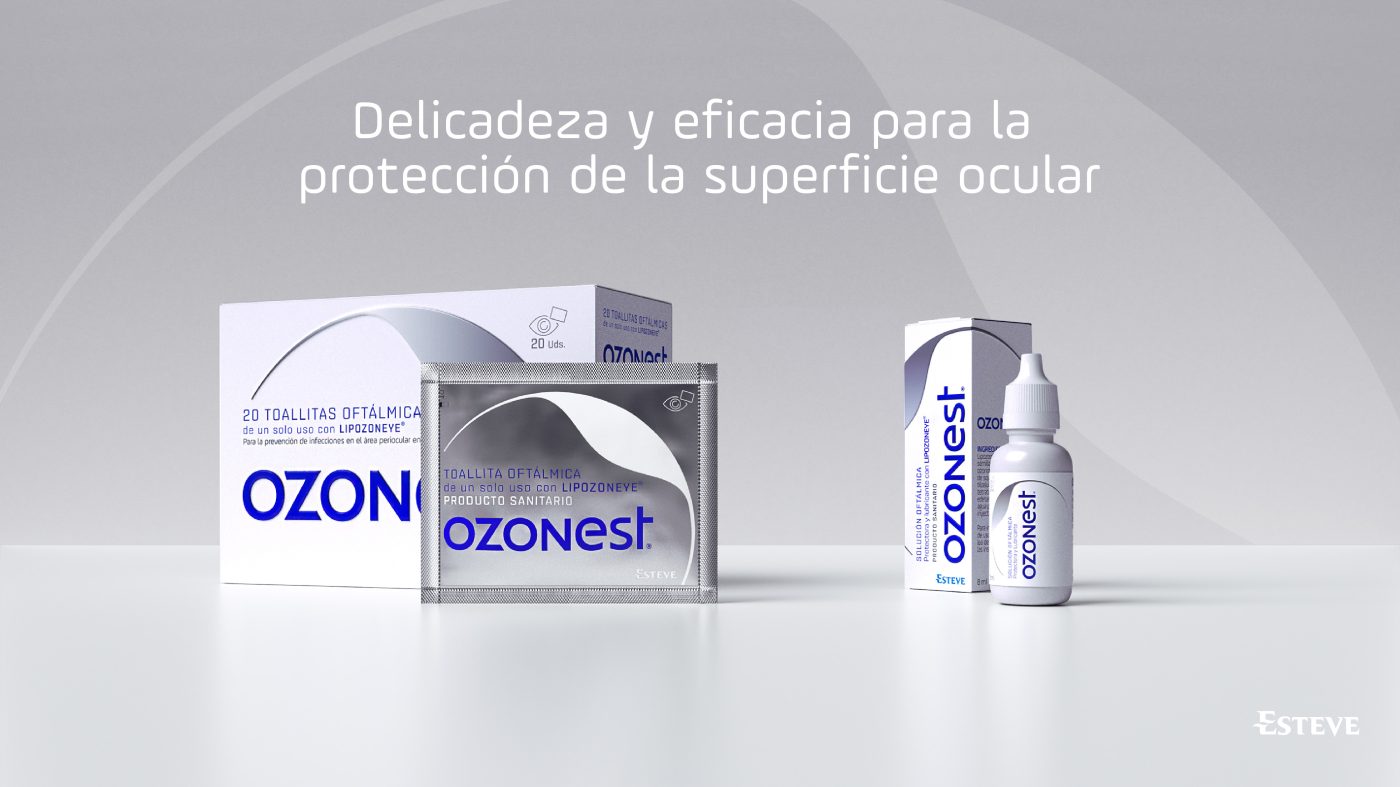
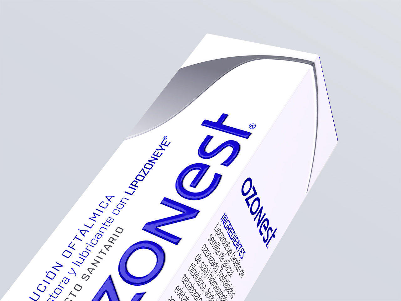
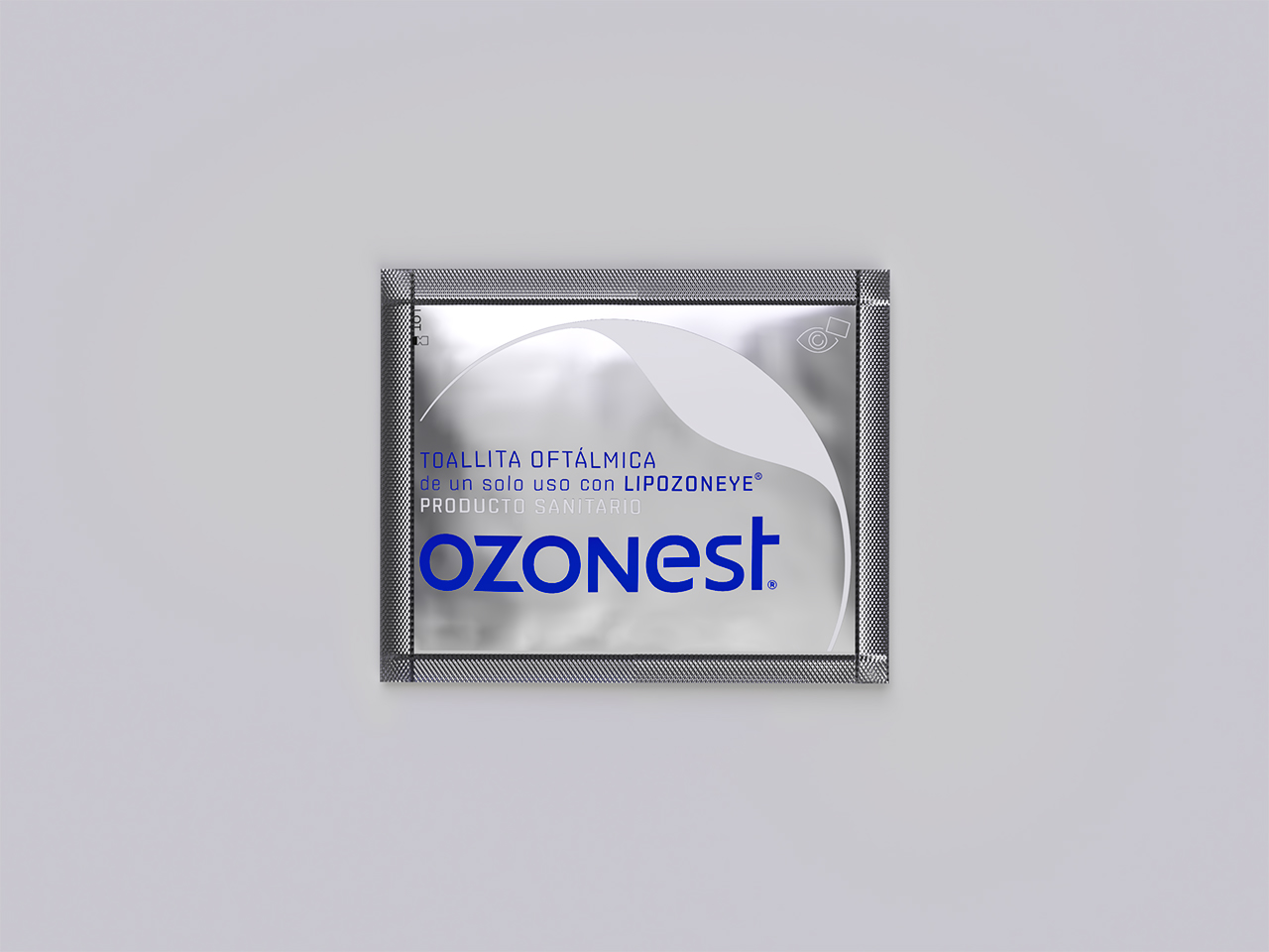
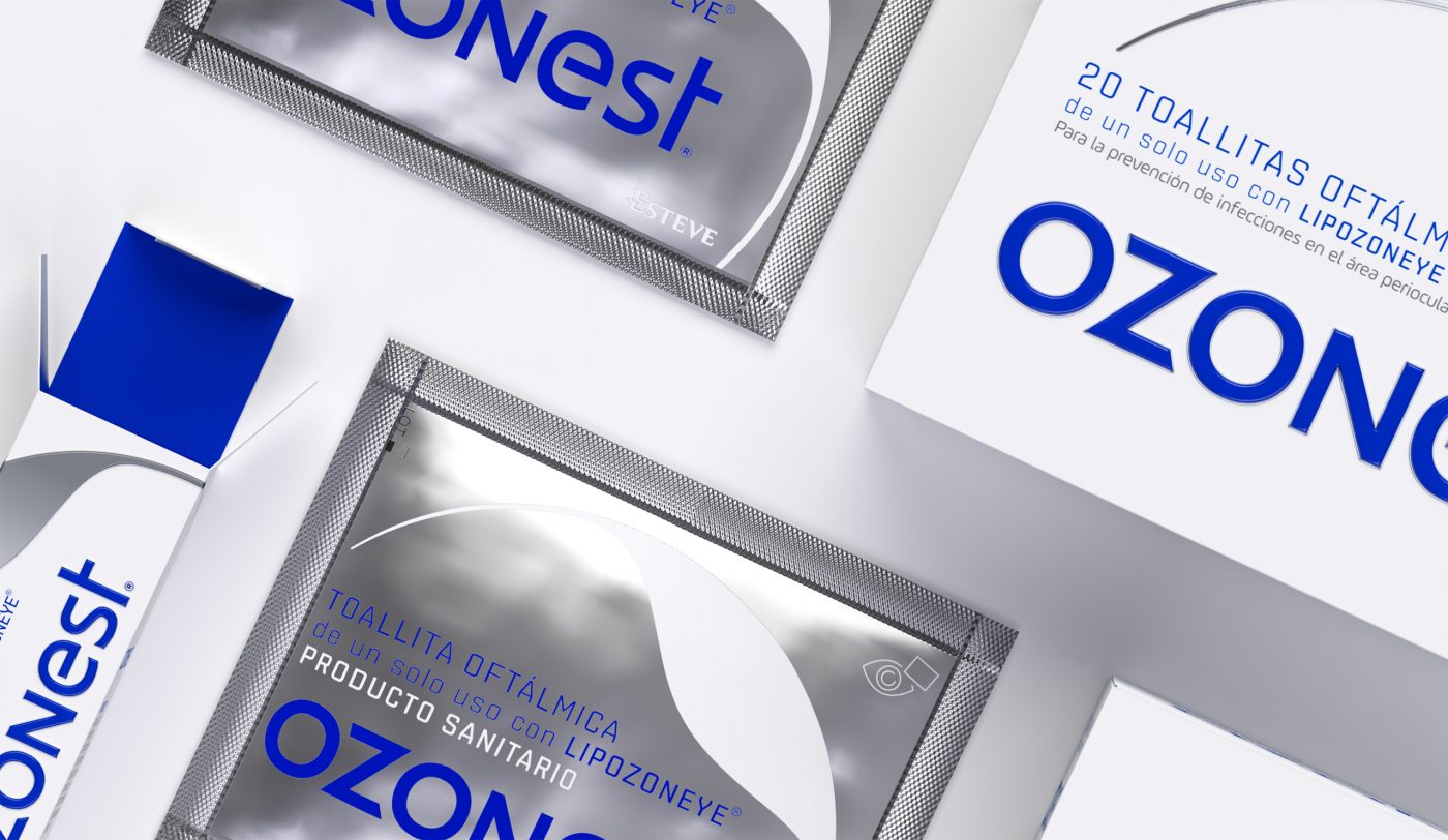
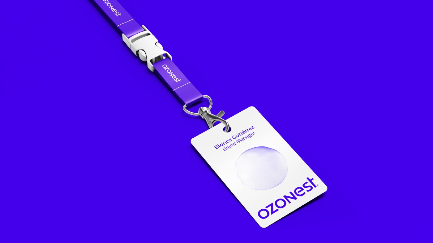
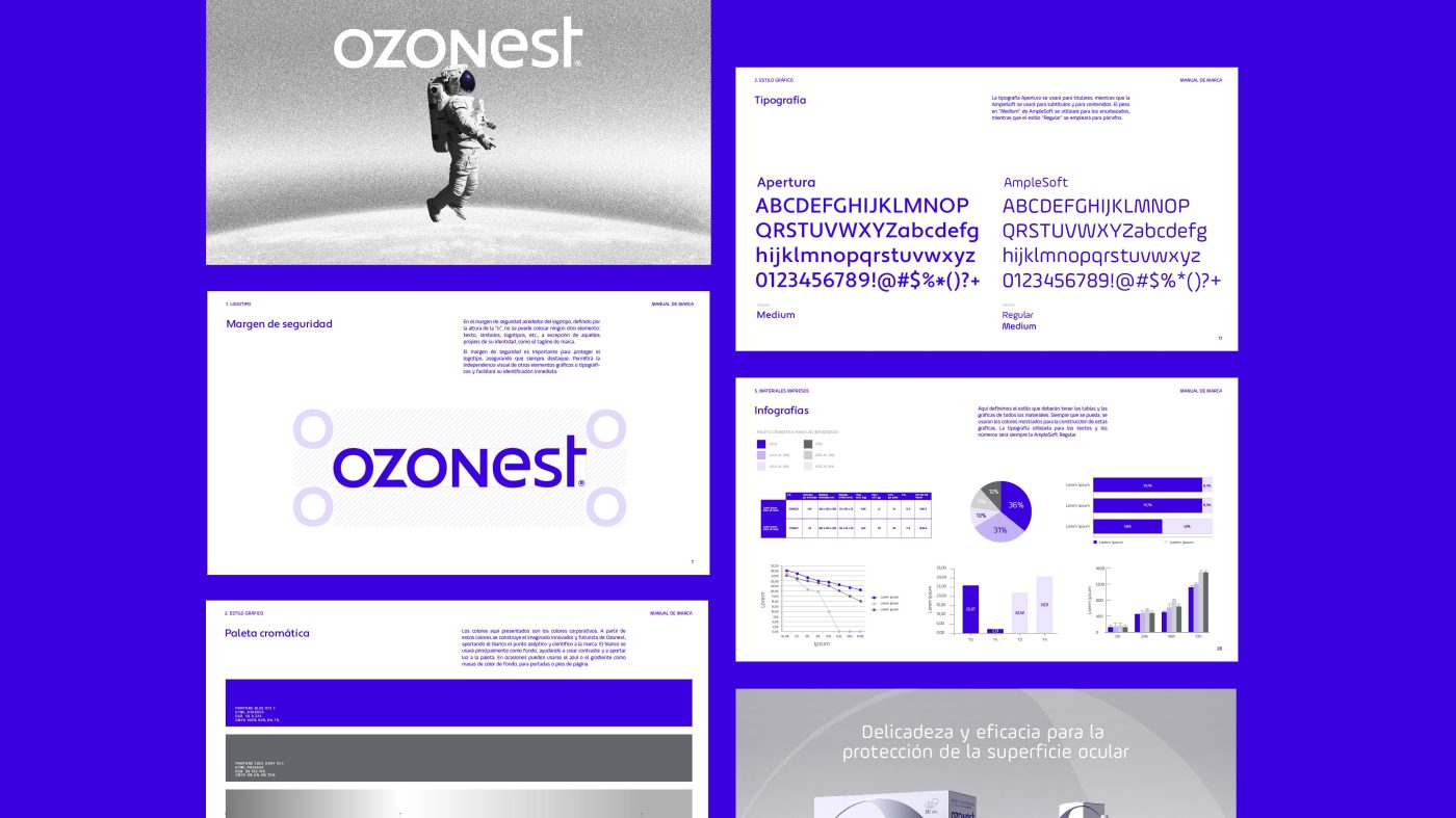
To convey this storytelling from a visual perspective, we have created an ownable and relevant identity that captures the essence of ozone innovation in an eye-care solution, consistently applied on its various touchpoints and packaging line.
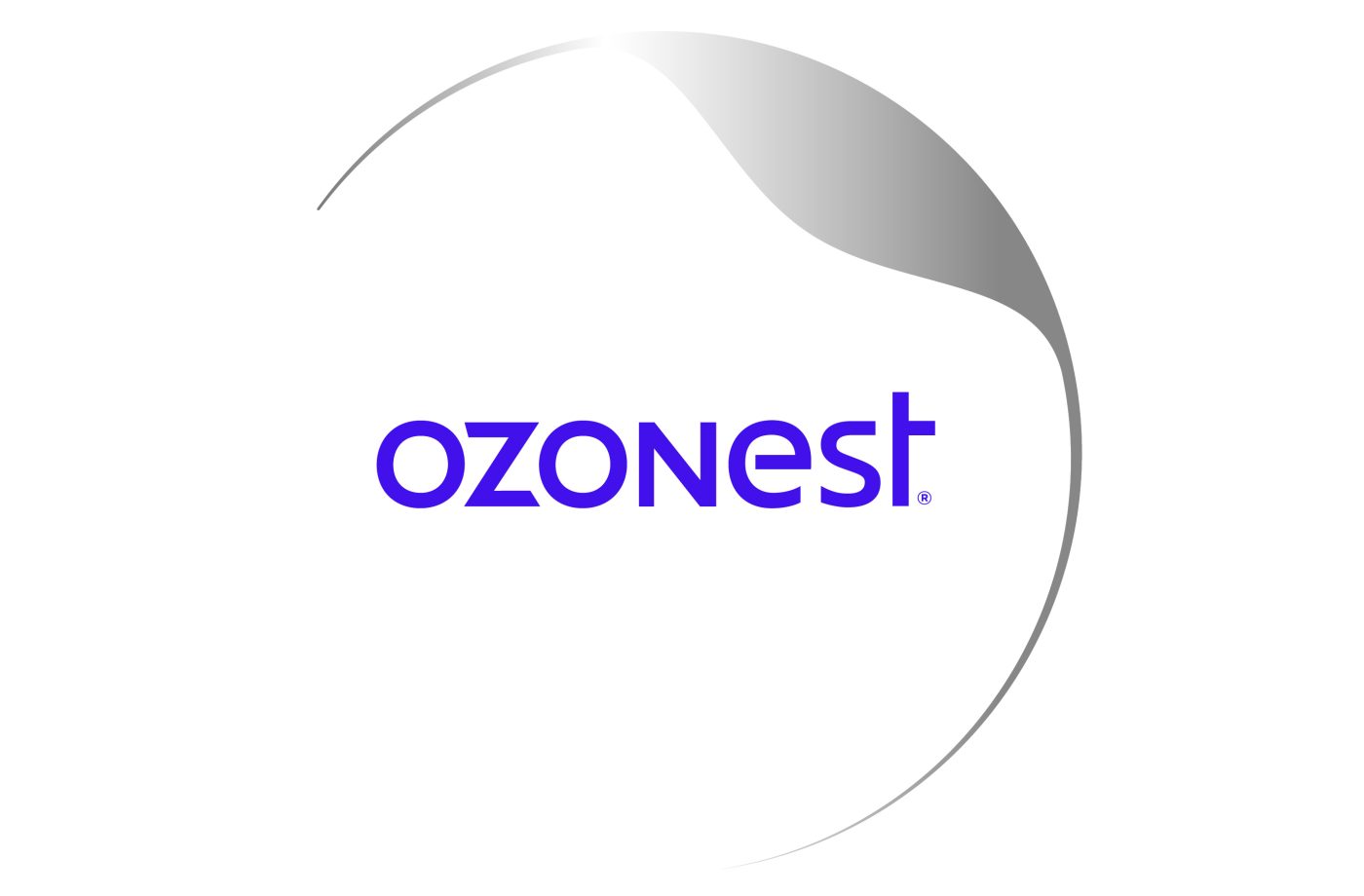
A logotype that gravitates on the brand’s personality: innovative, futuristic, scientific and aseptic, built from a NASA inspired typography, which combines an electric blue with open shapes and encompasses the idea of pioneering and technological feat.
The visual narrative is accompanied by a recognizable iconography inspired by the ophthalmology field. Clear white expresses purity and cleanness, cold metallic resources represent strength and asepsis, both becoming the signature of the brand.
The visual elements represent protection and simultaneously the supreme delicacy of the human eye, bringing Ozonest and its brand purpose to life.
/ RESULT
A new brand that embodies the uniqueness of this cutting-edge and high quality ophthalmic solution.
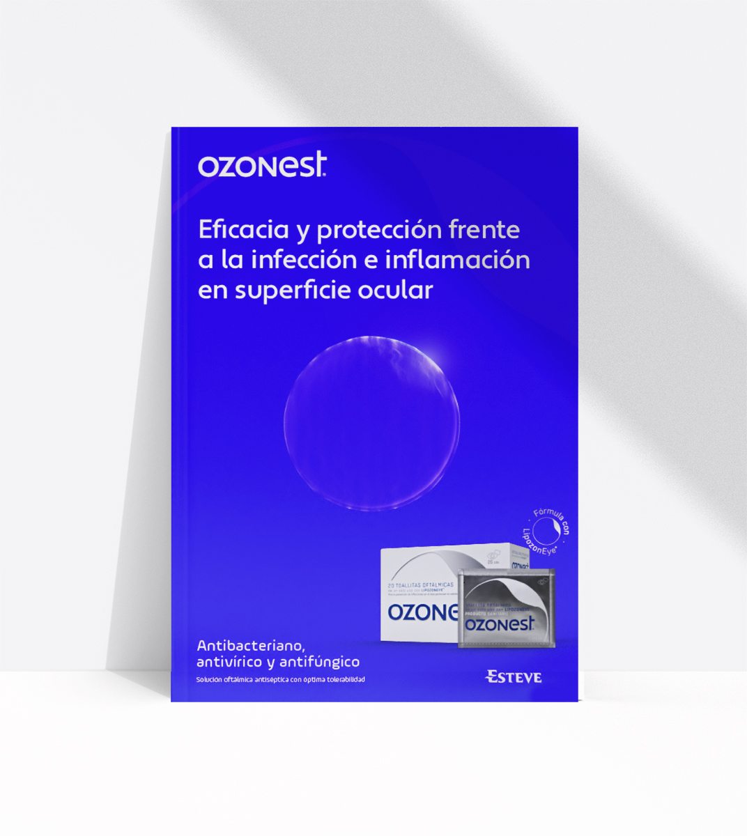
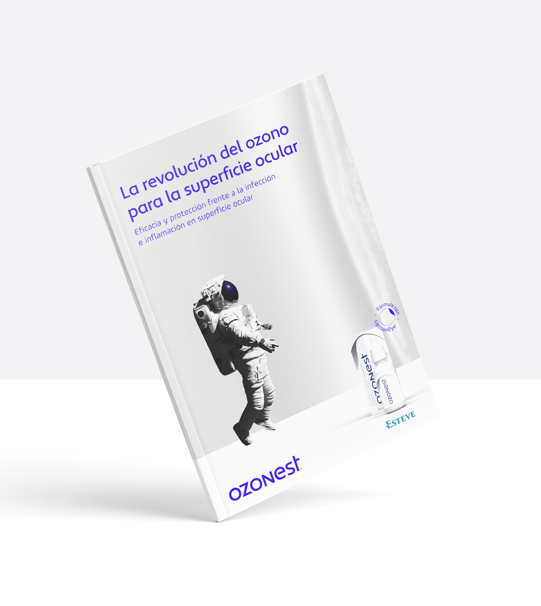
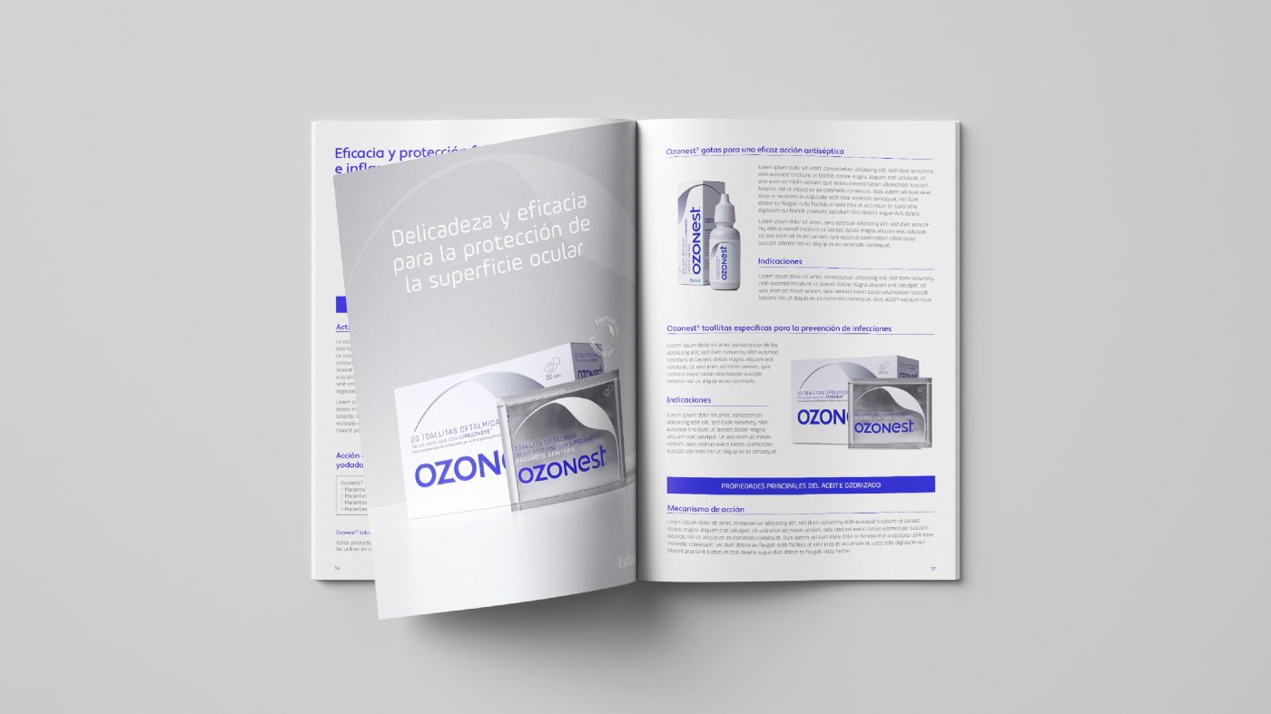
Specific editorial materials have been created for each, with different key visuals, to help understand the qualities and the benefits of the product, representing the essence of the brand and the storytelling created. On one hand, we find a rational, efficient, technical and rigorous tone to connect with scientists, doctors, and pharmacists. And on the other hand, a much more emotional and reassuring speech for patients to feel confident and safe when using the product, considering the eye is such a complex, fragile and delicate organ.
A unique and solid brand identity, able to represent Ozonest as a breakthrough in the pharmaceutical sector.
We use cookies on our website to give you the most relevant experience by remembering your preferences and repeat visits. By clicking “Accept”, you consent to the use of ALL the cookies.
This website uses cookies to improve your experience while you navigate through the website. Out of these, the cookies that are categorized as necessary are stored on your browser as they are essential for the working of basic functionalities of the website. We also use third-party cookies that help us analyze and understand how you use this website. These cookies will be stored in your browser only with your consent. You also have the option to opt-out of these cookies. But opting out of some of these cookies may affect your browsing experience.