France
Paris
Switch to your local agency
Retour au menu
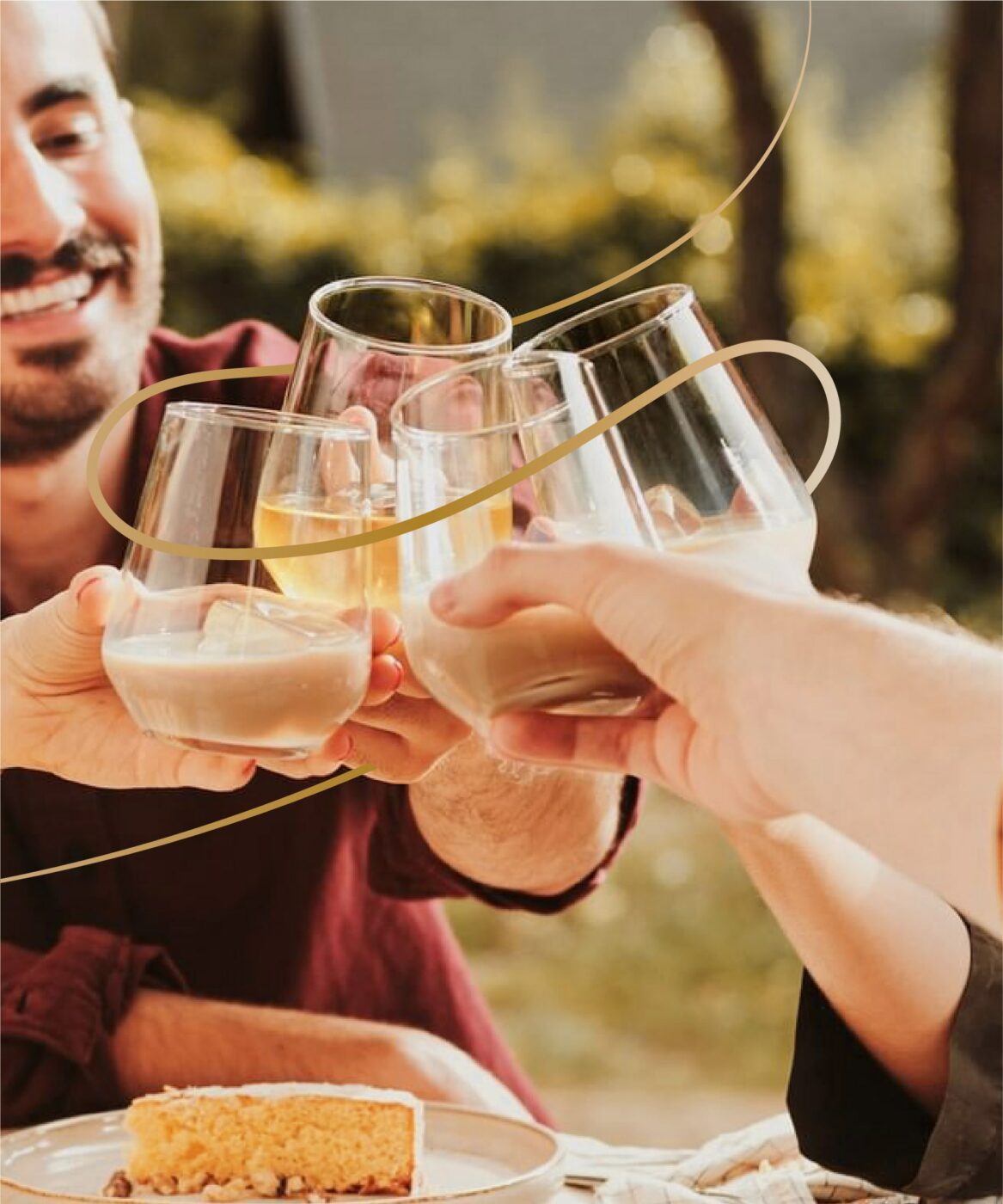
Following the relaunch of its new image in 2021, with a sleeker and more sustainable bottle, as well as a new logo that emphasises craftsmanship, the need arose to build new codes for Ruavieja. The leading liqueur brand required its own language to endorse its positioning as the true icon of the sobremesa: a magical social moment in Spain where, after a meal, the best conversations take place and we cherish our time with our loved ones. Our challenge has been to rethink the brand’s visual identity system to reflect its essence, bringing out its roots and highlighting the importance of bonds in a younger and more dynamic way.

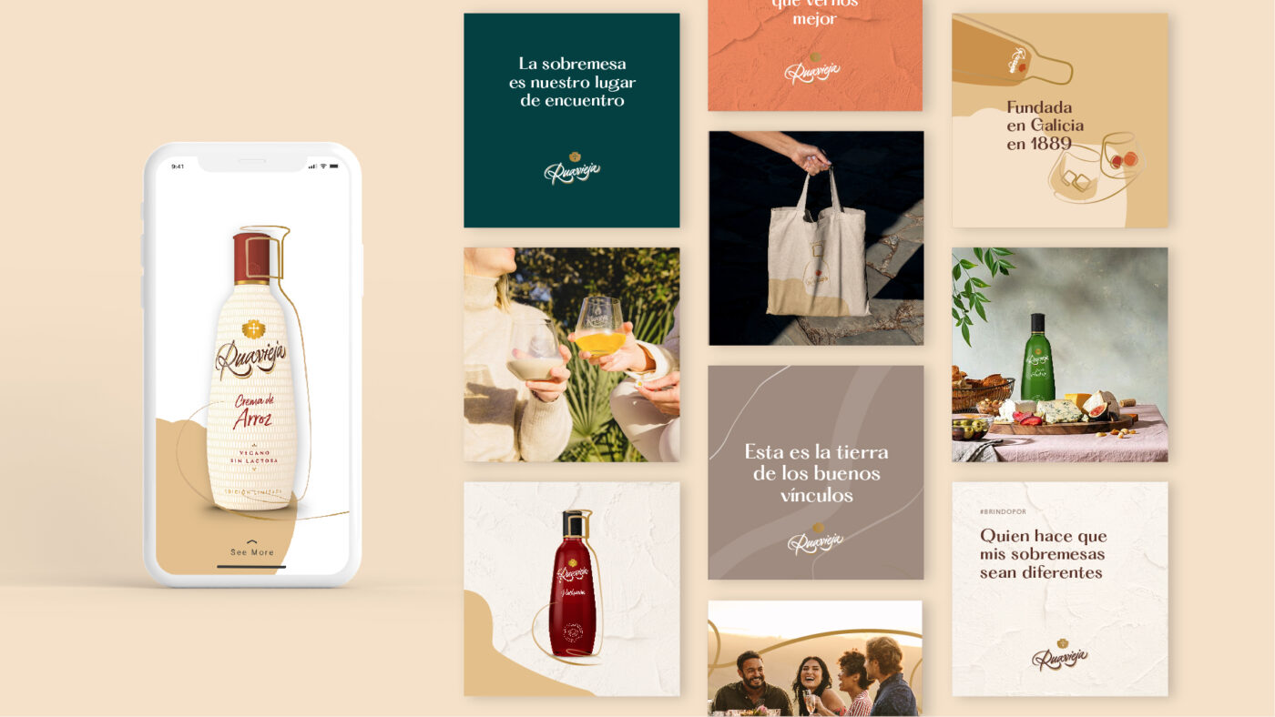
From its brand purpose, we enhanced its value proposition and reinforced its positioning by designing an imaginary that speaks to us of connections from the heart. To this end, we resorted to the human and calligraphic features in the logotype and packaging to expand the language and create this thread that leads us to the encounters and the things that unite us.
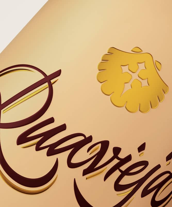
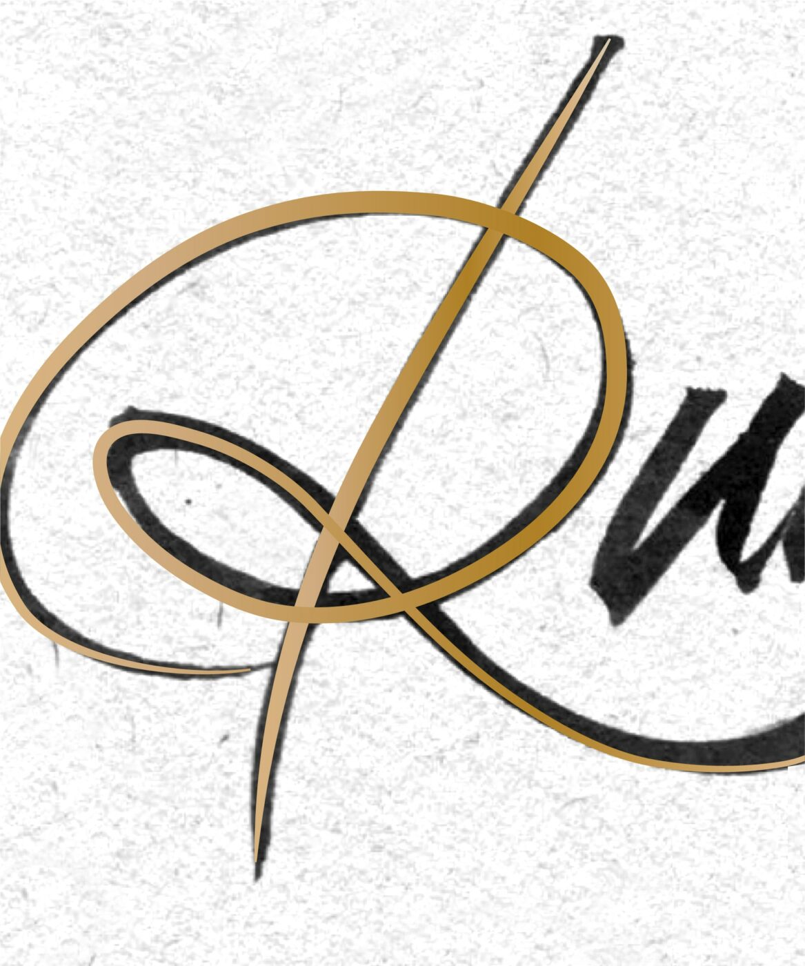
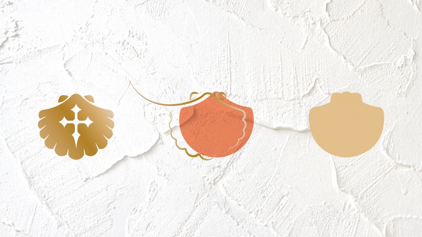
From there, we identified the brand’s signifier: the pilgrim’s shell. An icon which already lives on the pack and generates a direct link to the Galician origin, allowing us to unlock its potential by introducing a visual system that releases it in a creative way.
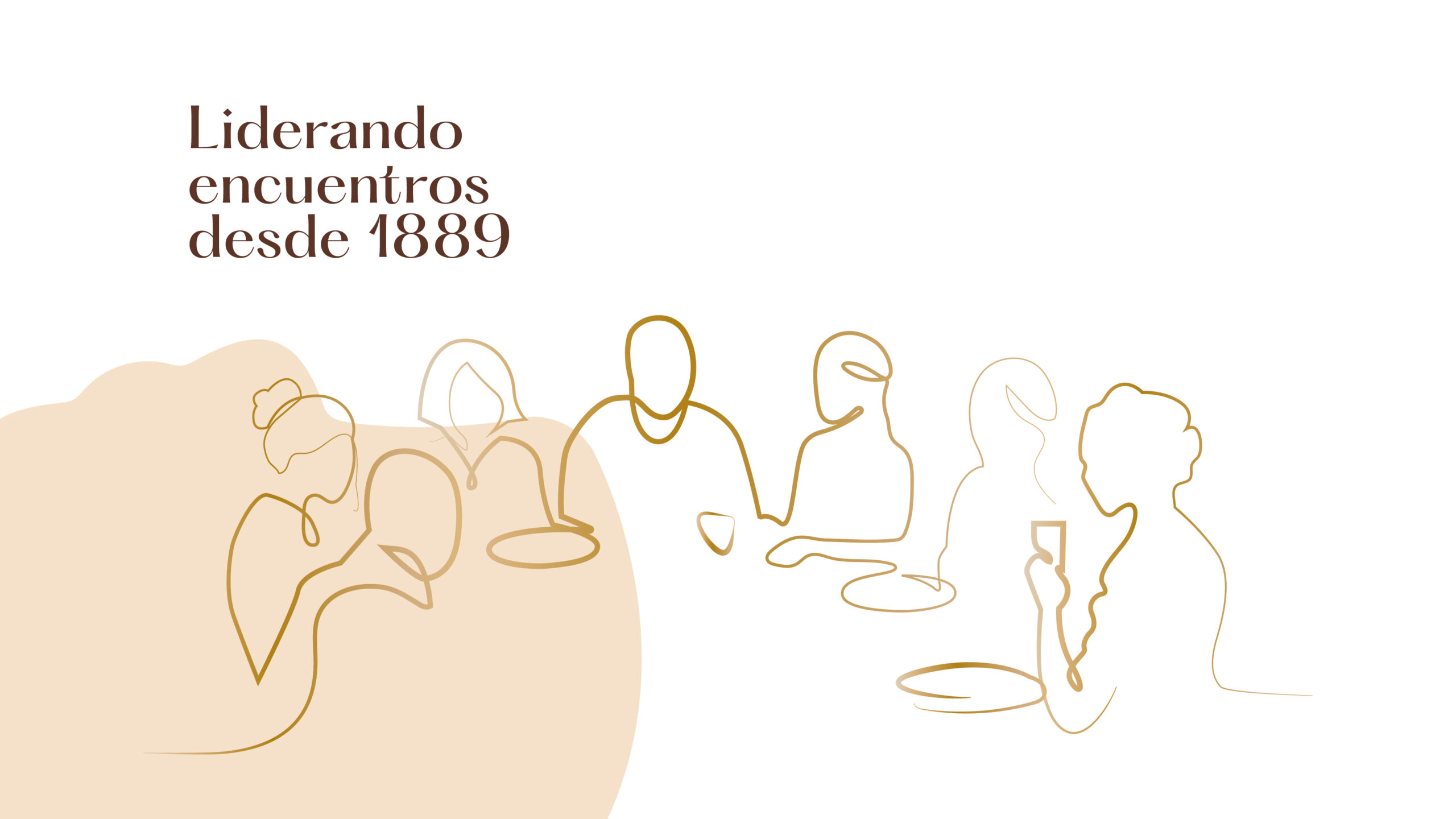
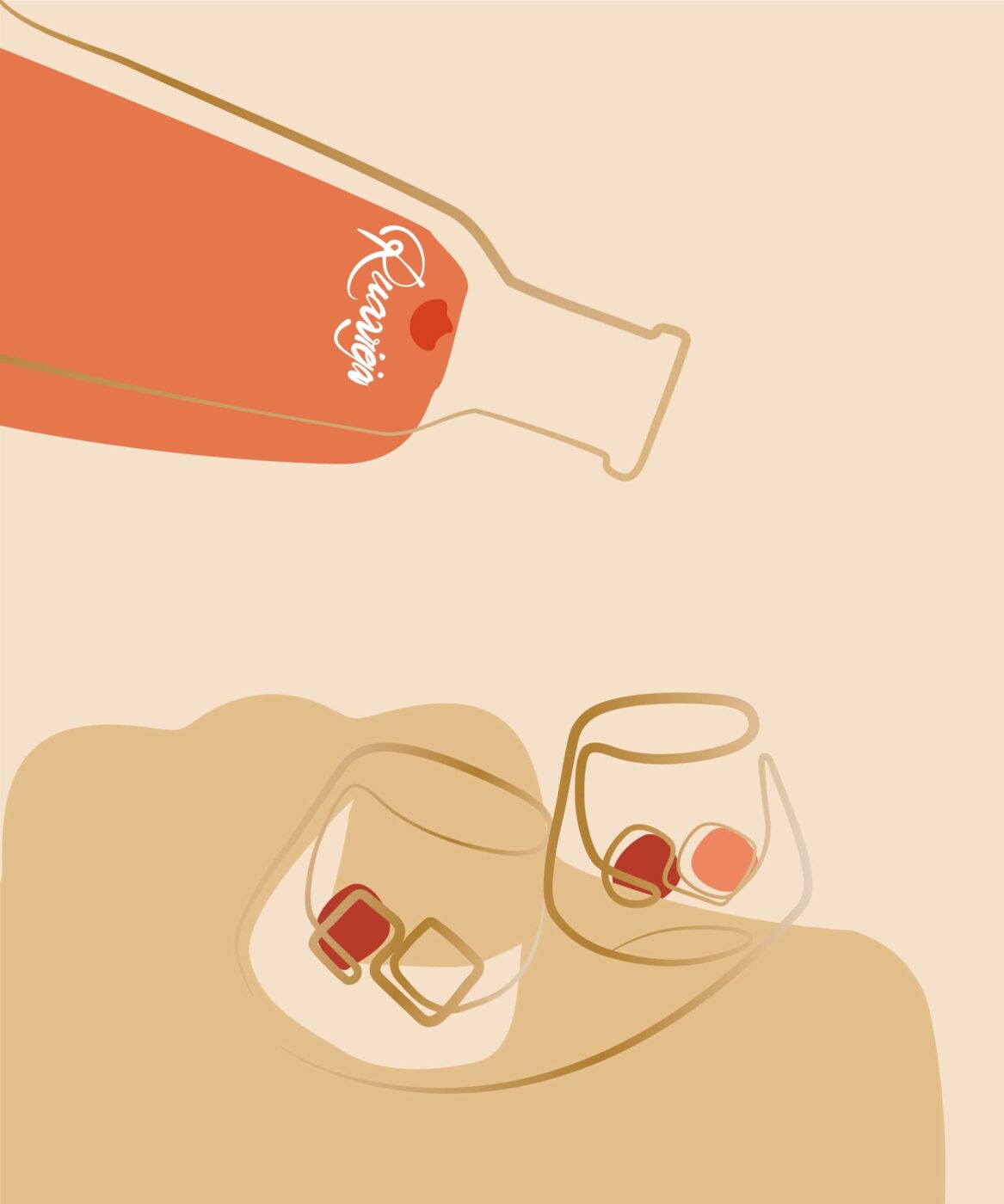
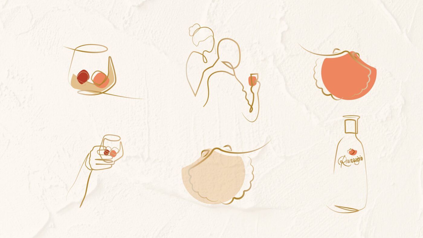
The illustrations, created by hand, bring dynamism and versatility to the brand, giving it a new range of expression. At the same time, they support and value the concept of meaningful bonds and sharing moments with loved ones. The nature of these illustrations is represented through everyday scenes related to the sobremesa, the perfect occasion to get together with Ruavieja by our side.
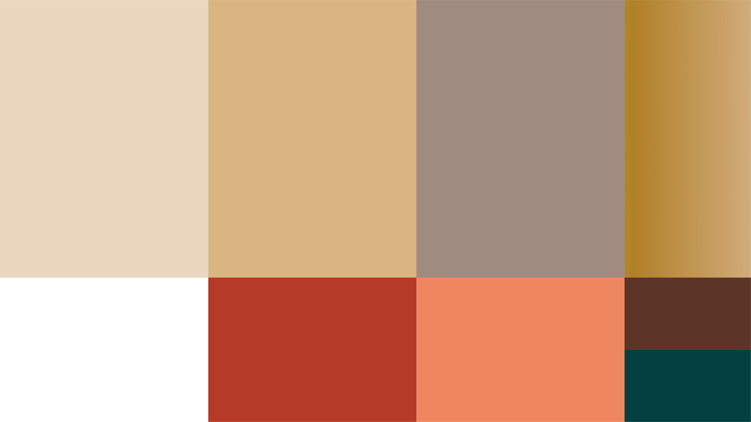
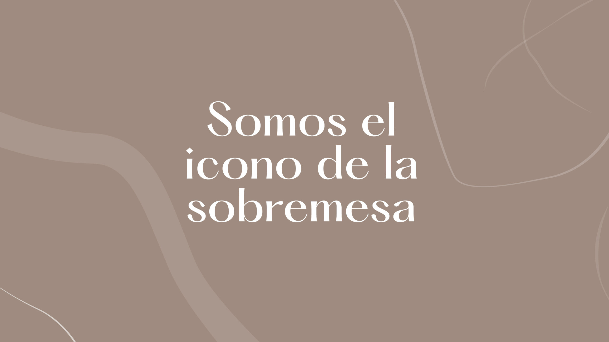
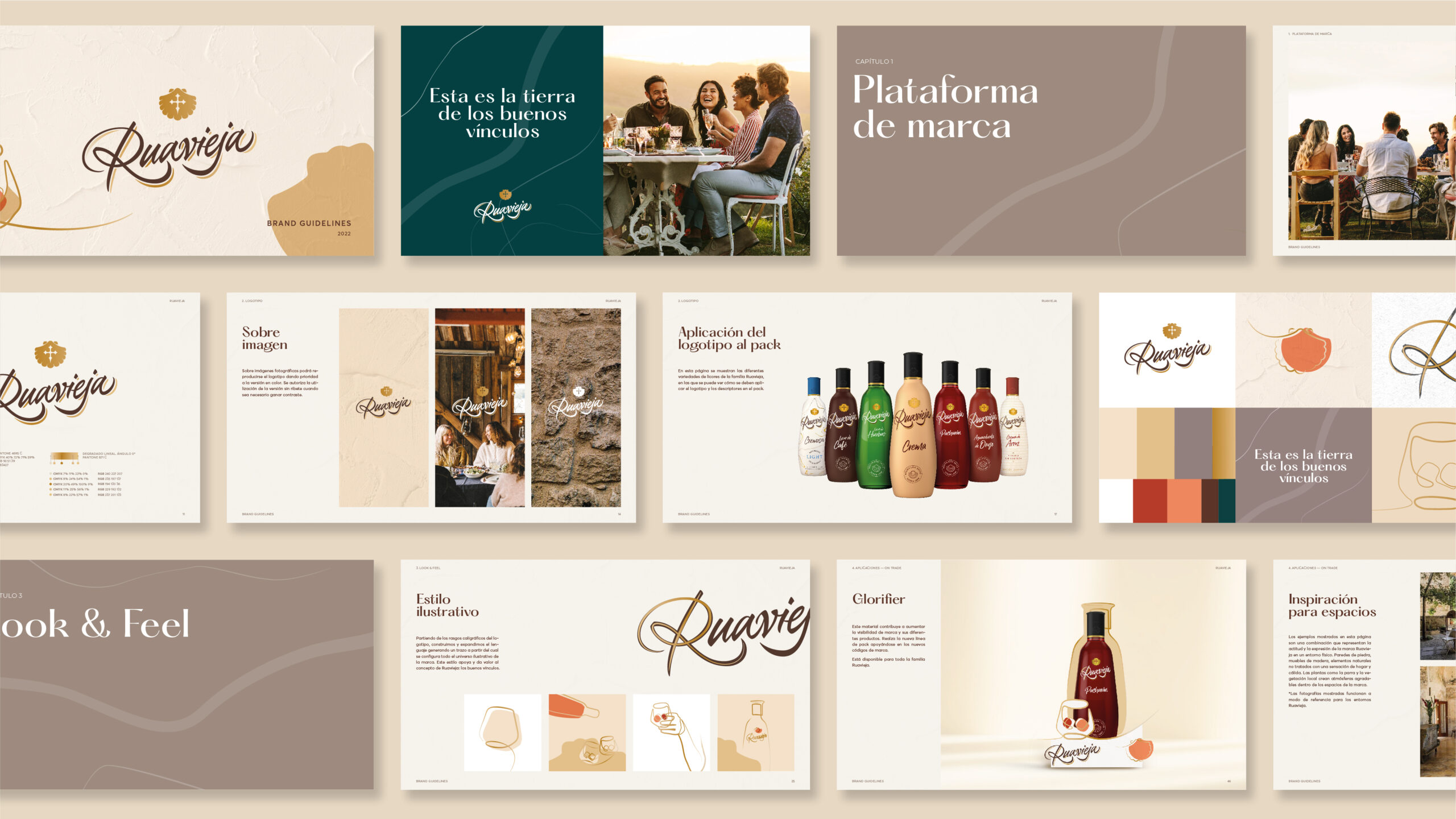
This new chromatic universe is configured through the use of warm tones that remind us of the earth, creating a homely feeling. A color palette that represents Ruavieja, conveying freshness, contrast and consistency. The gold takes on a key role as a connecting thread, a ribbon that adds a distinctive touch to the brand.
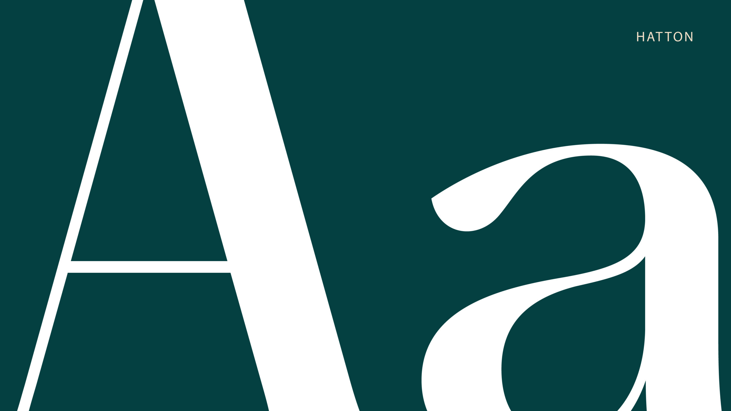
The typographic style is also elegantly reinterpreted, opting for the Hatton family as the main typeface. A proposal that represents the artisan nature of Ruavieja and its legacy, from a modern point of view.
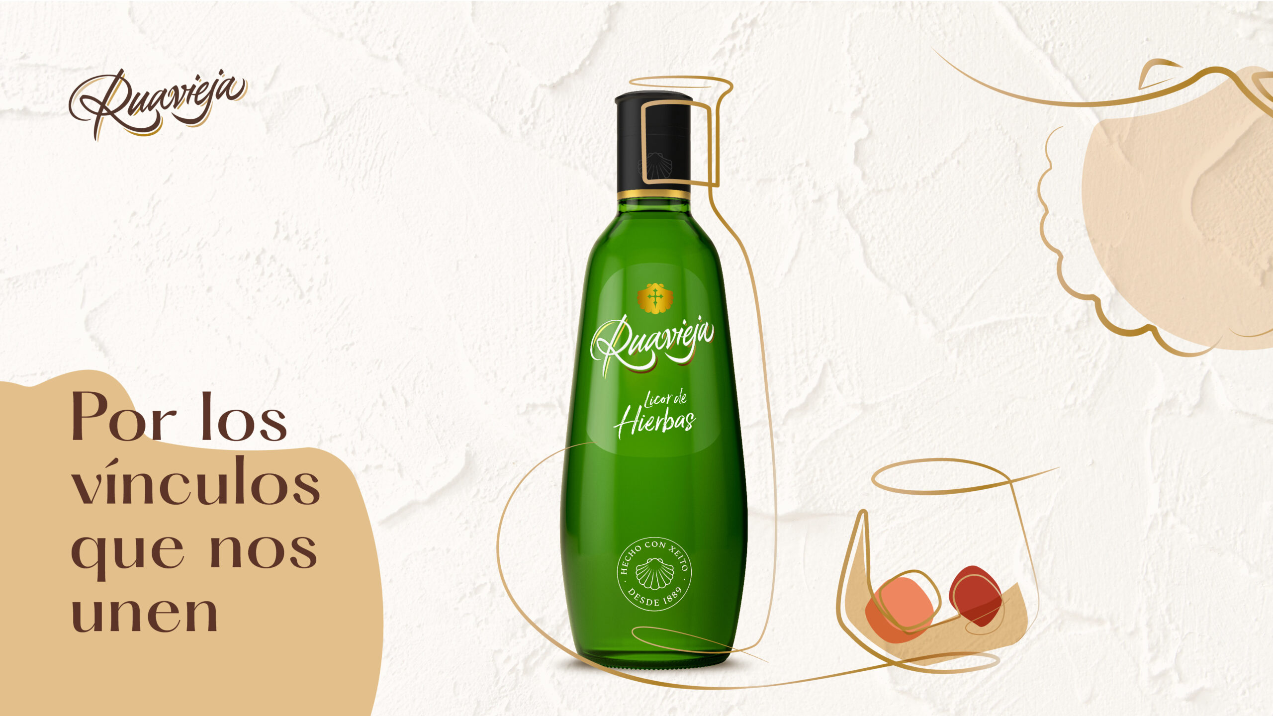
The combination of these visual identity elements, along with the photographic style, backgrounds and textures, allows the application to different formats in a simple and transversal way. By doing so, we achieve a flexible and versatile brand language that works in both on-trade and off-trade materials.
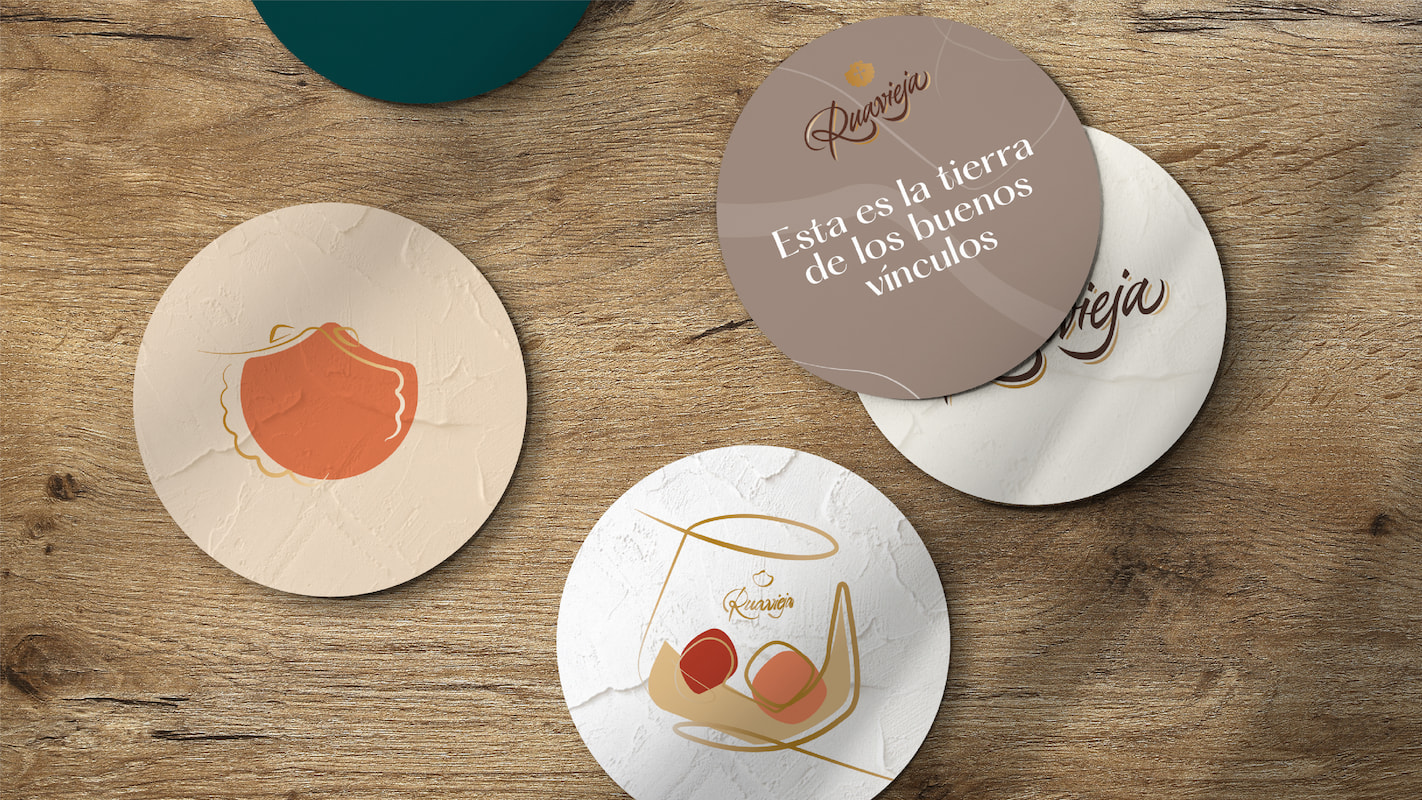
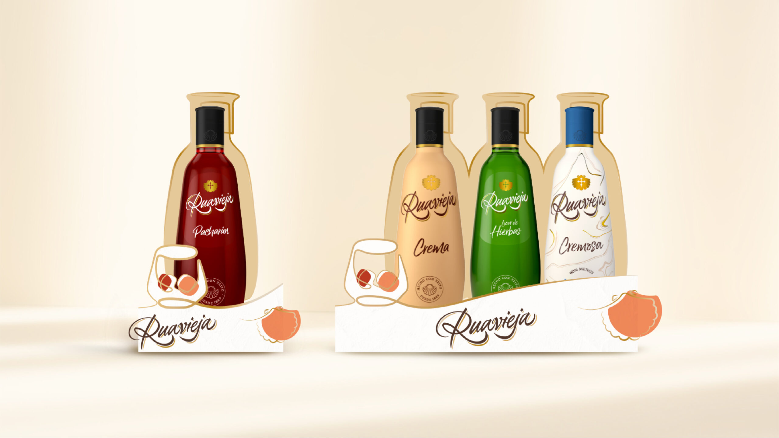
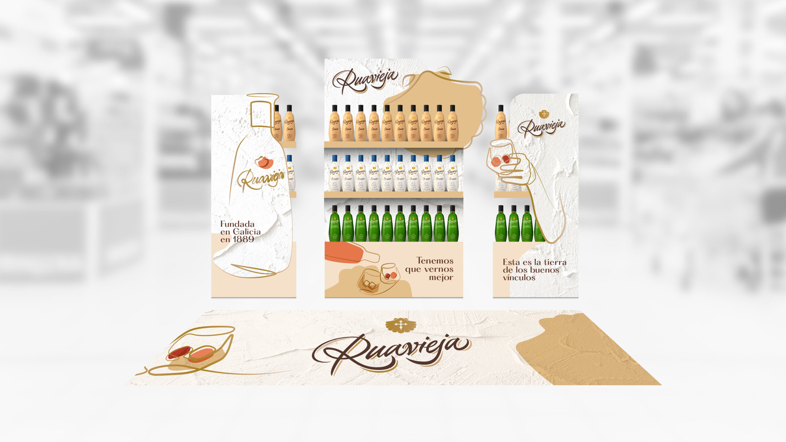
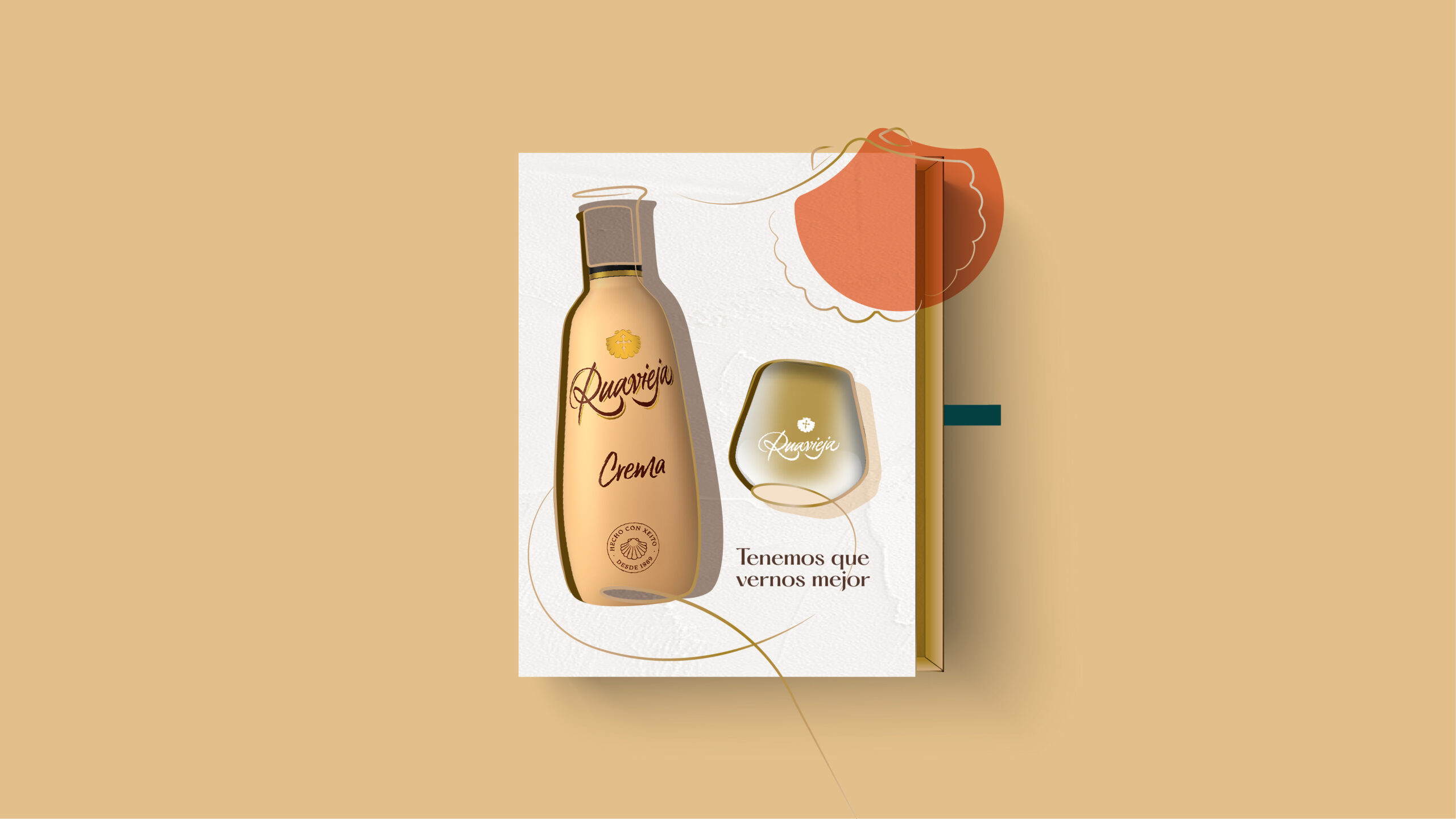
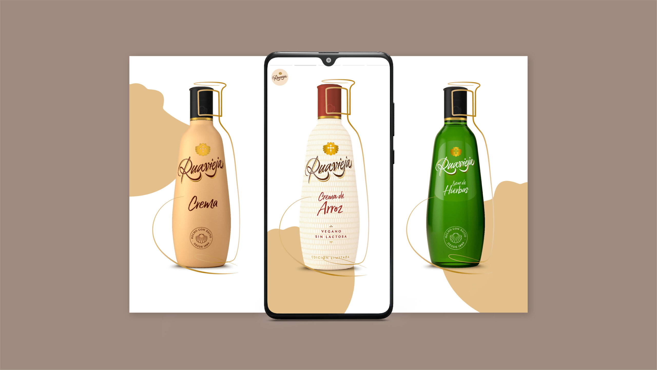
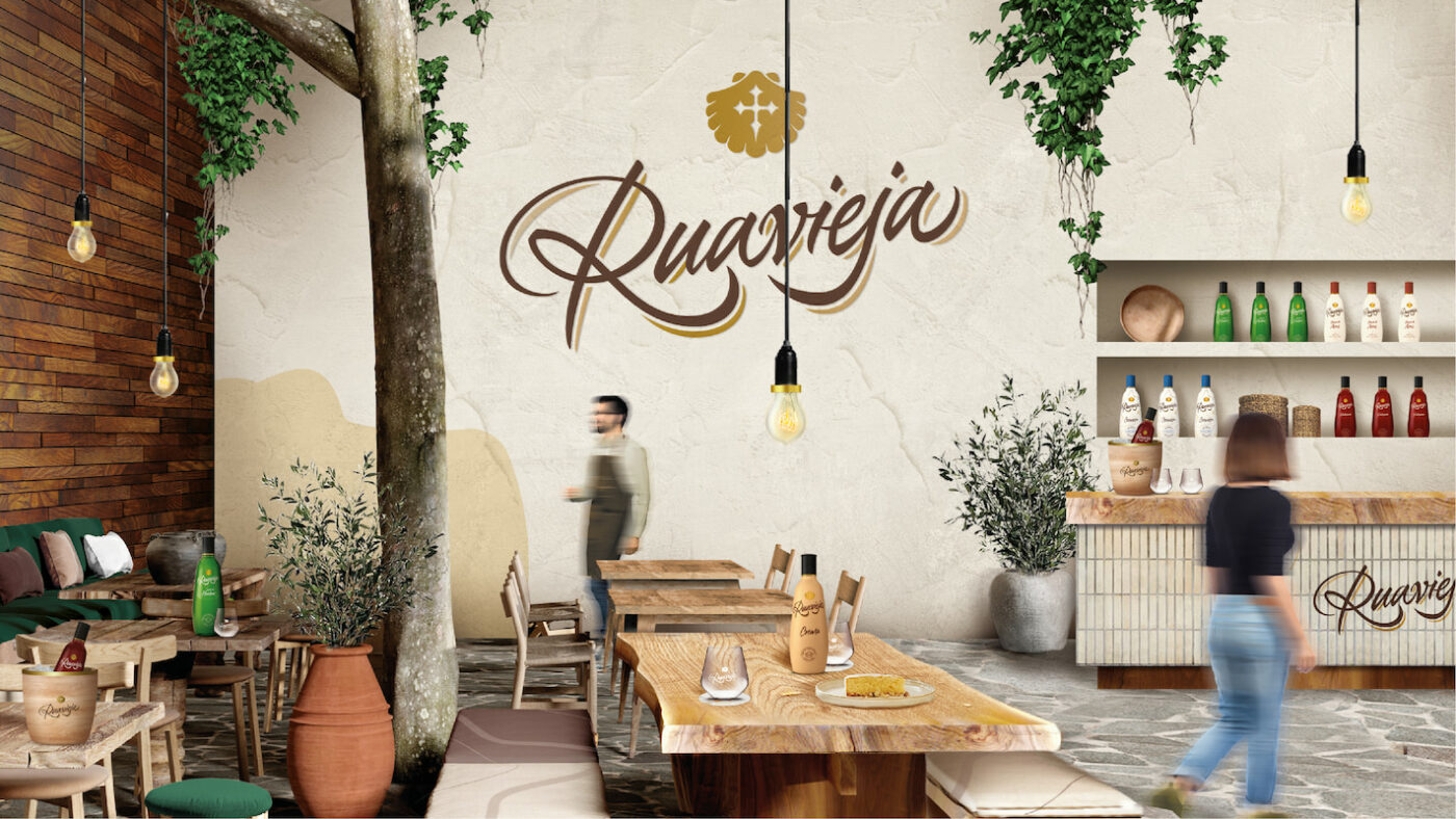
When designing the Ruavieja space, we thought of it as a place to be lived in, to form bonds that make us feel at home. The presence of natural elements such as stone, ceramics and wood establish a warm and friendly atmosphere. The combination of these elements inspired by a traditional environment, appeal to the authenticity and know-how of Ruavieja in a fresh and stylish way.

Overall, a new visual expression for Ruavieja that reinforces the importance of meaningful bonds, that invites us to enjoy life and to appreciate every second. It encourages us to get together with our loved ones, raise a toast to focus on what really matters and to cherish these precious moments as they deserve.
Privacy Overview