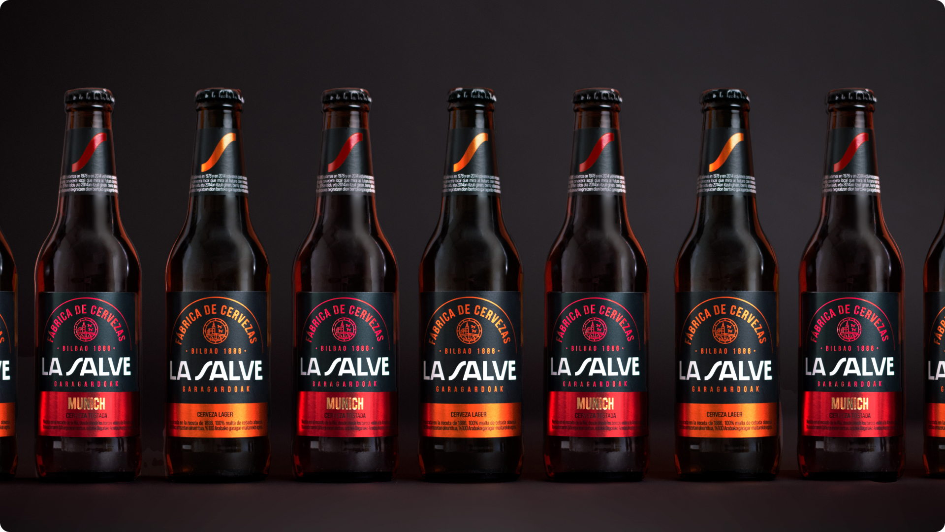
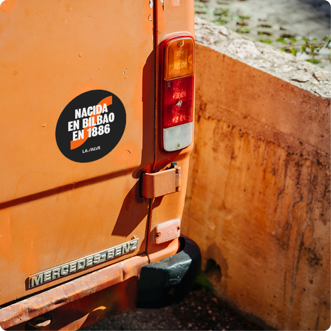
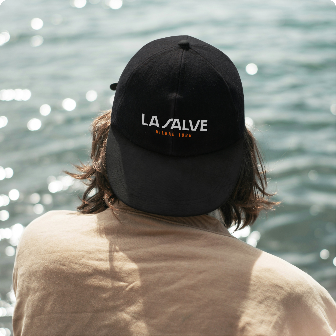
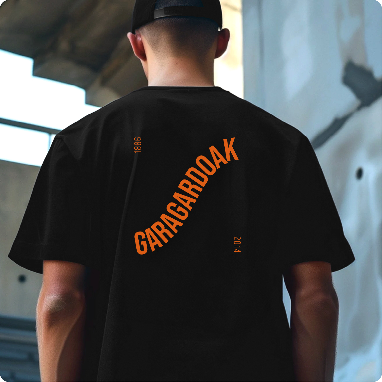
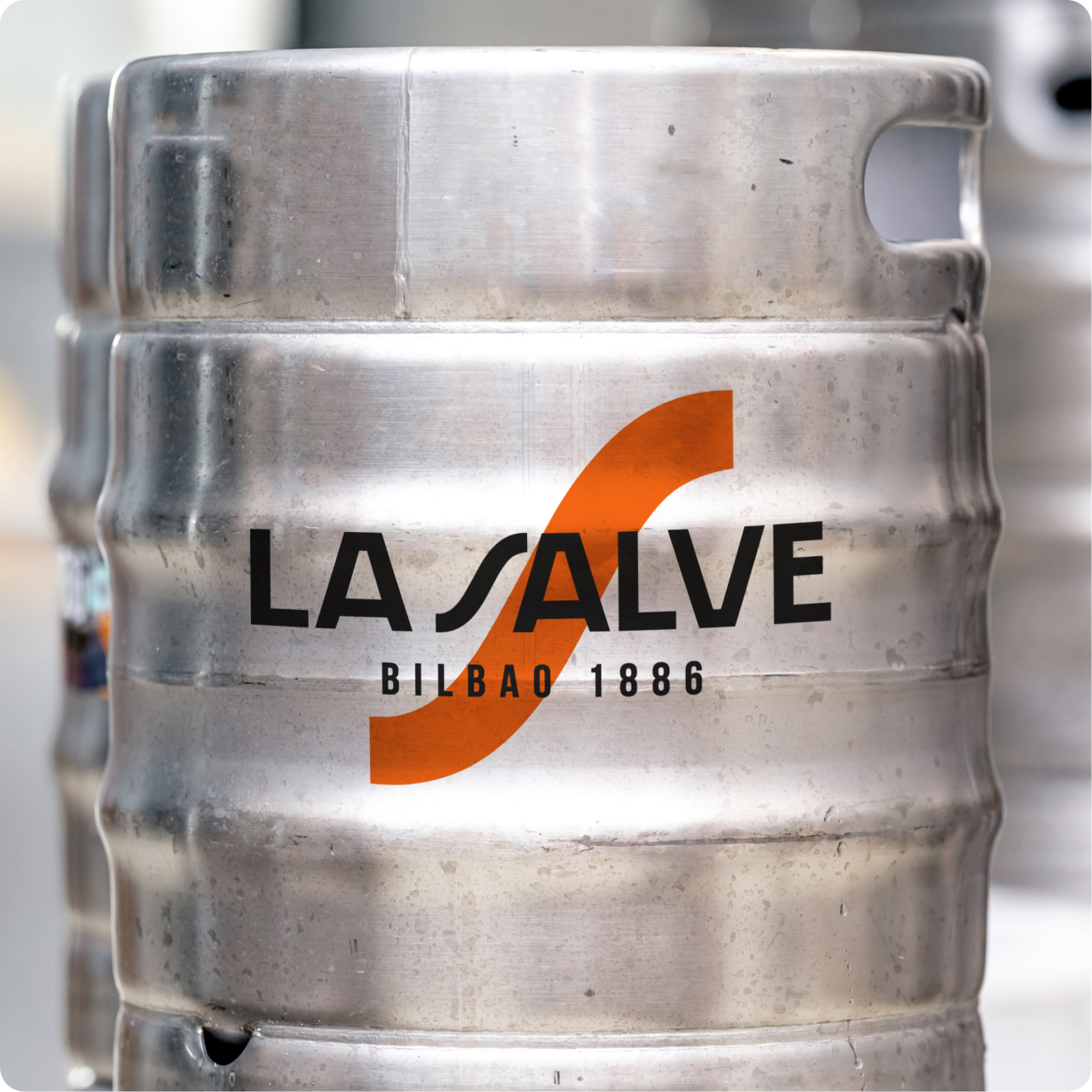
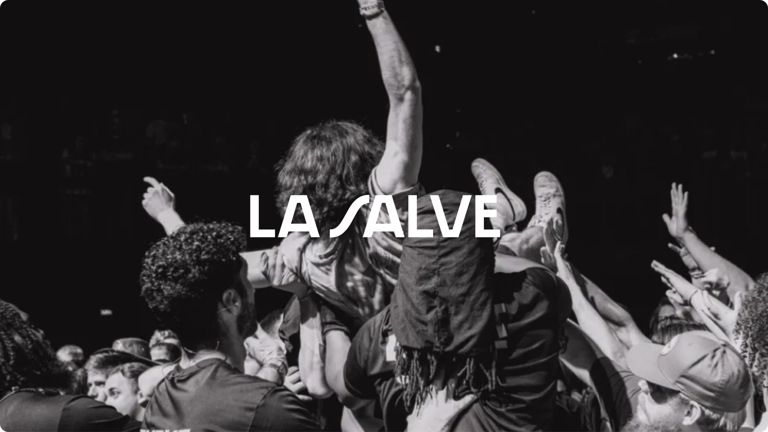
La Salve, Bilbao’s iconic brewery and part of Mahou San Miguel, continues its evolution with a renewed visual identity system. Honoring its deep local roots and collective spirit, the brand is reimagined through a contemporary lens, one that bridges tradition, community, and innovation to reflect its growing role in the national beer scene.
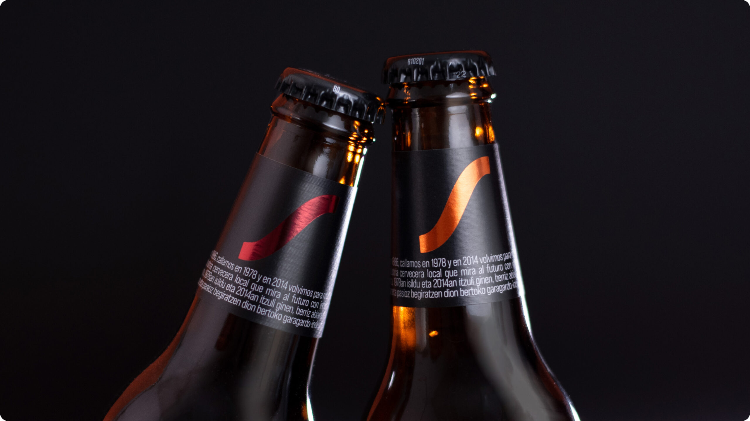
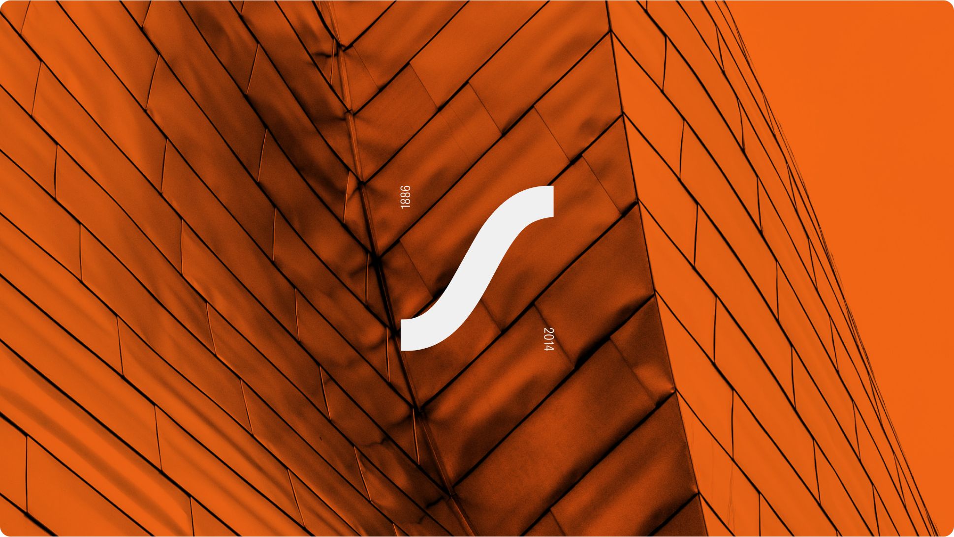
The identity builds from the brand’s most iconic asset, the “S” of the logotype. Transformed into a dynamic symbol that threads together people, values, and stories, this visual anchor serves as the foundation for a bold, flexible system that captures the essence of La Salve.
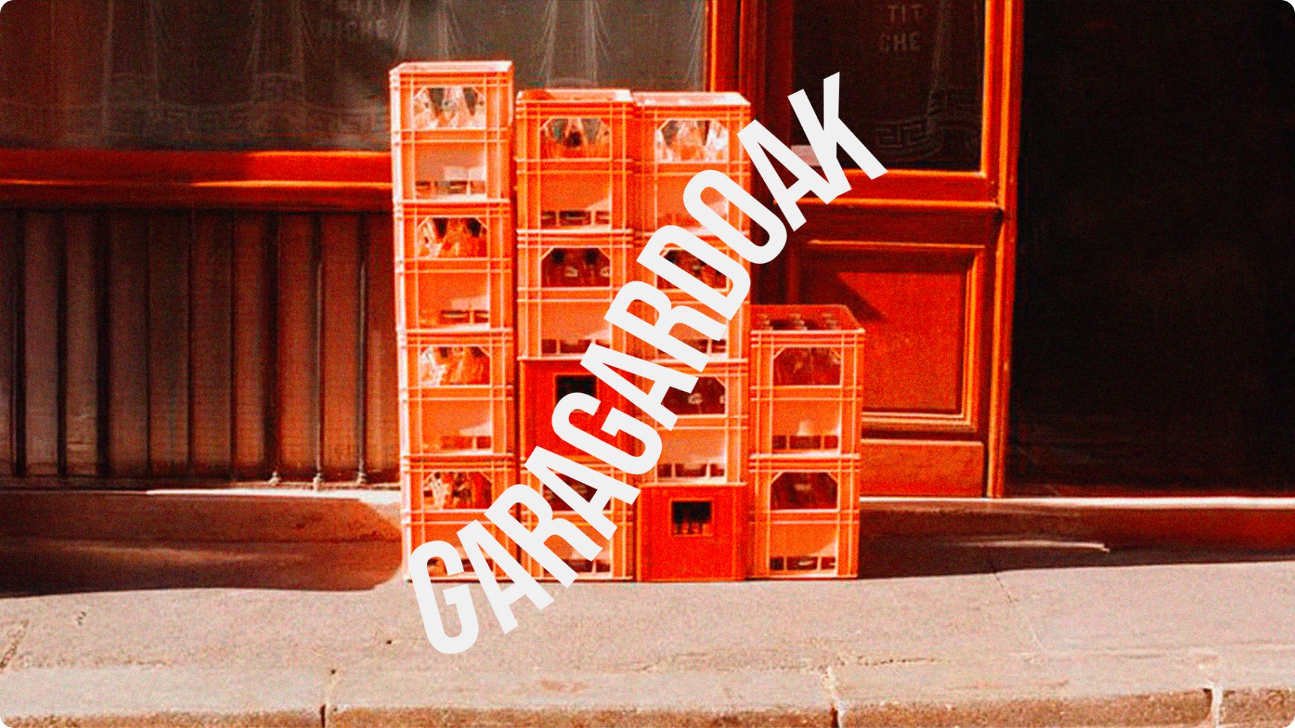
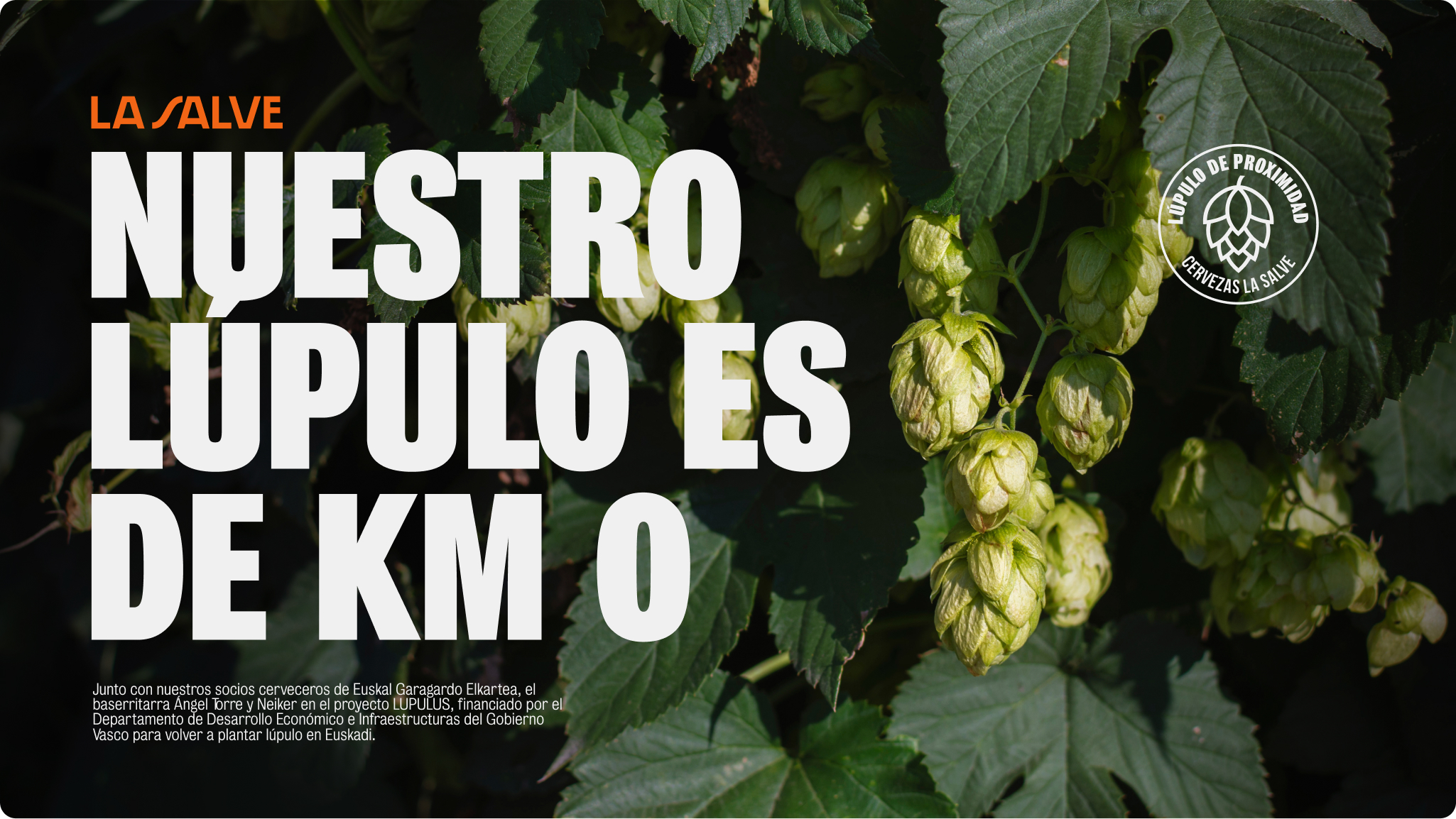
Authentic, inclusive, and deeply connected to Bilbao. The use of orange, inspired by the city’s industrial heritage, fire, iron, and energy, contrasts with sophisticated black tones to convey quality and character.
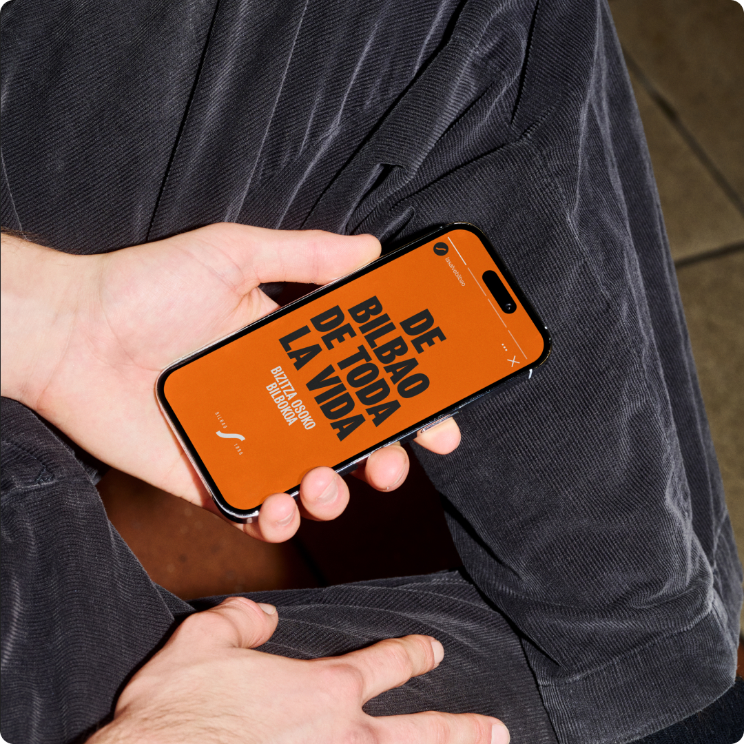
From the visual identity system and curated art direction to motion, packaging, and digital expression, every element was crafted to amplify La Salve’s commitment to sustainability, local sourcing, and social progress. The result is a distinctive and meaningful brand that celebrates connections, and La Salve as a proud reflection of its people and origin.
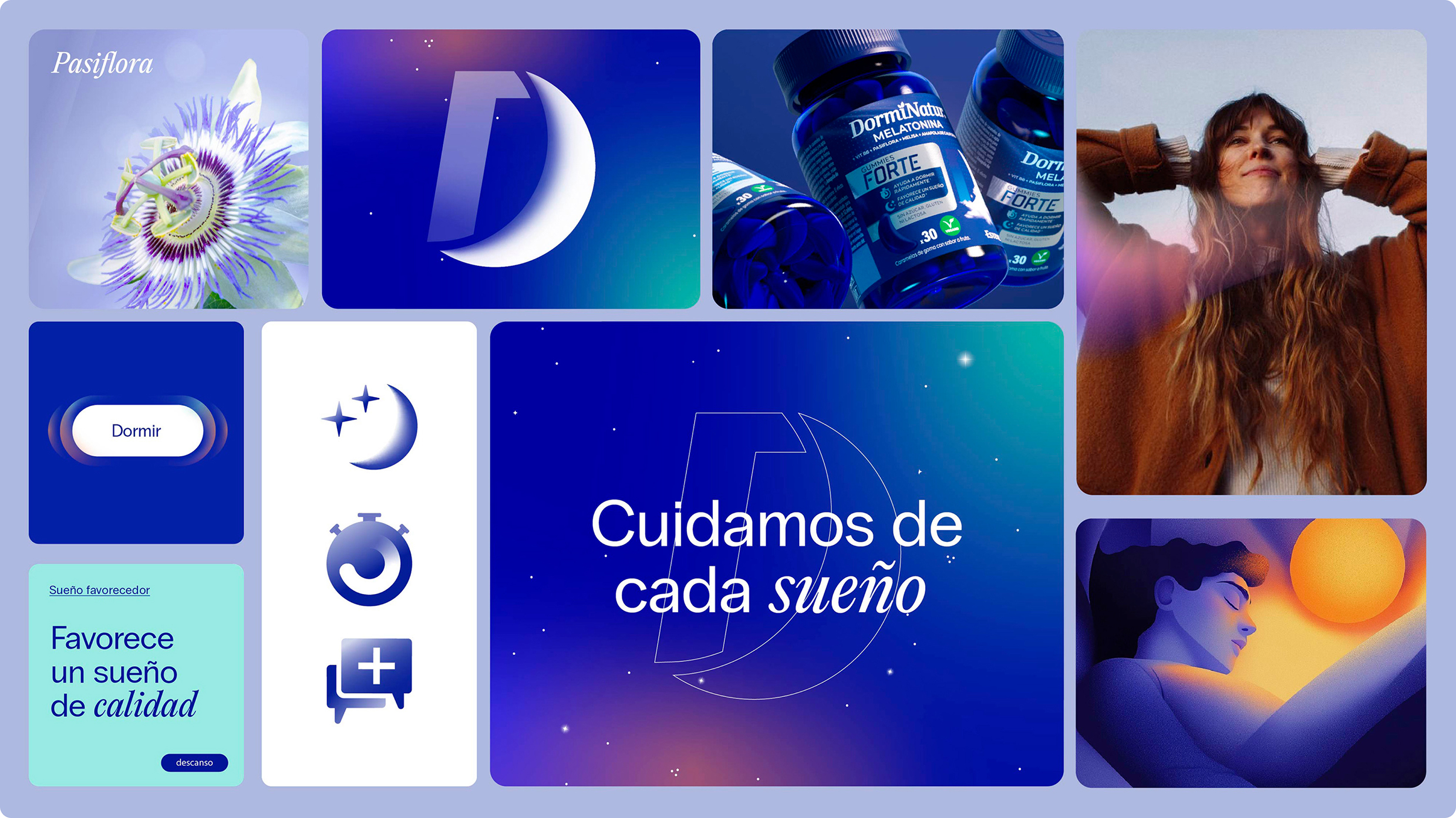
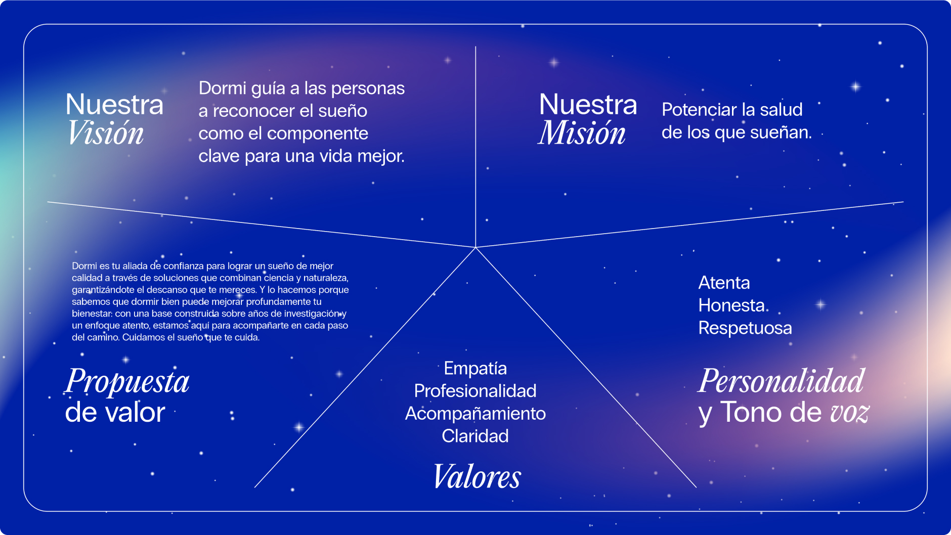
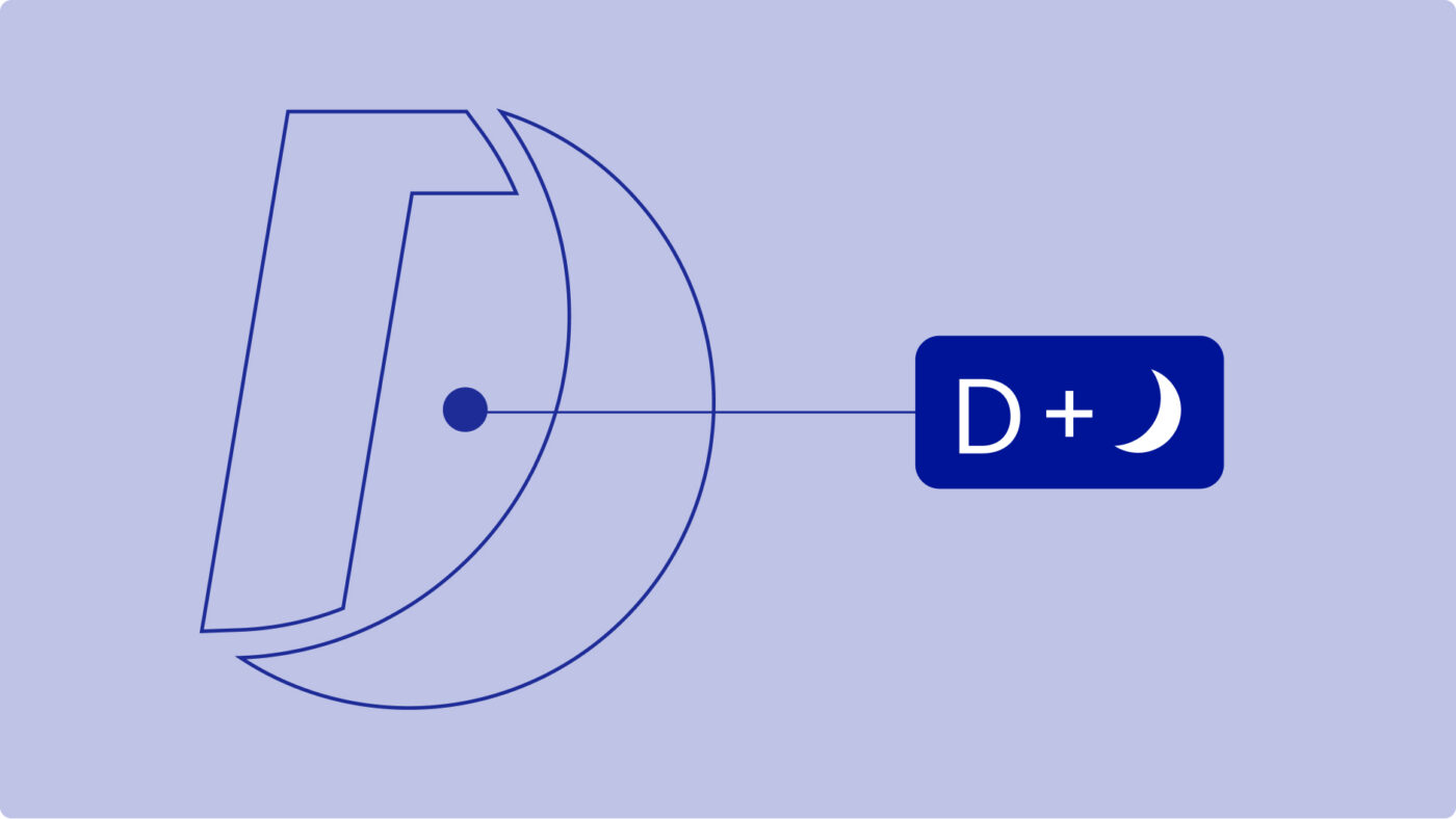
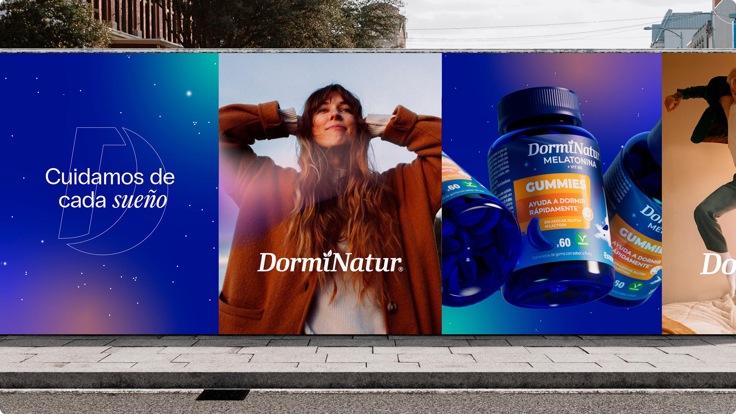
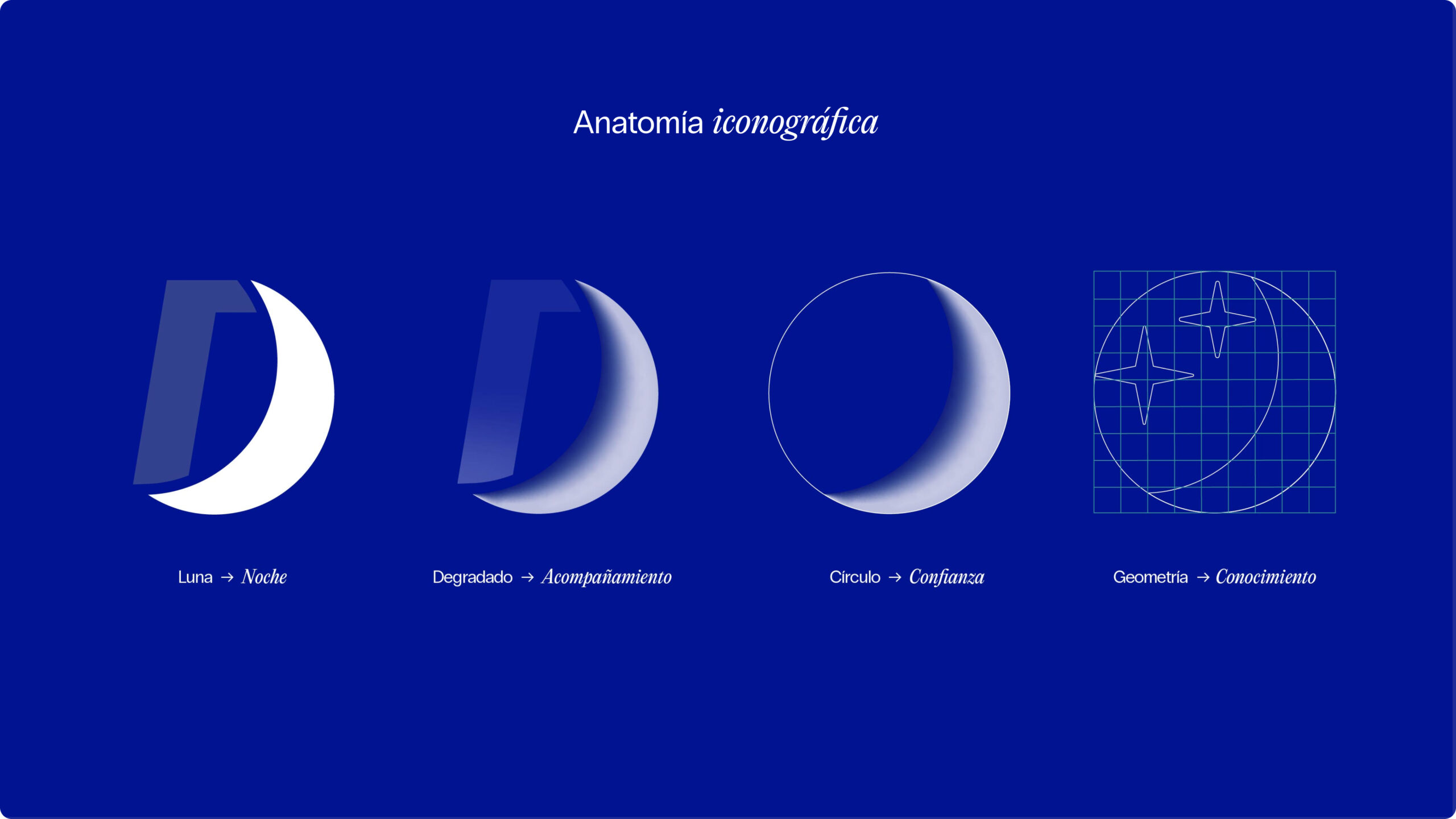
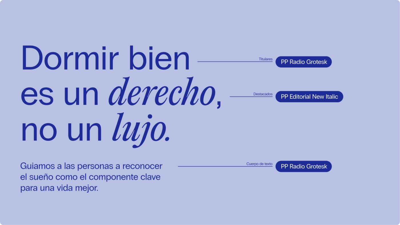
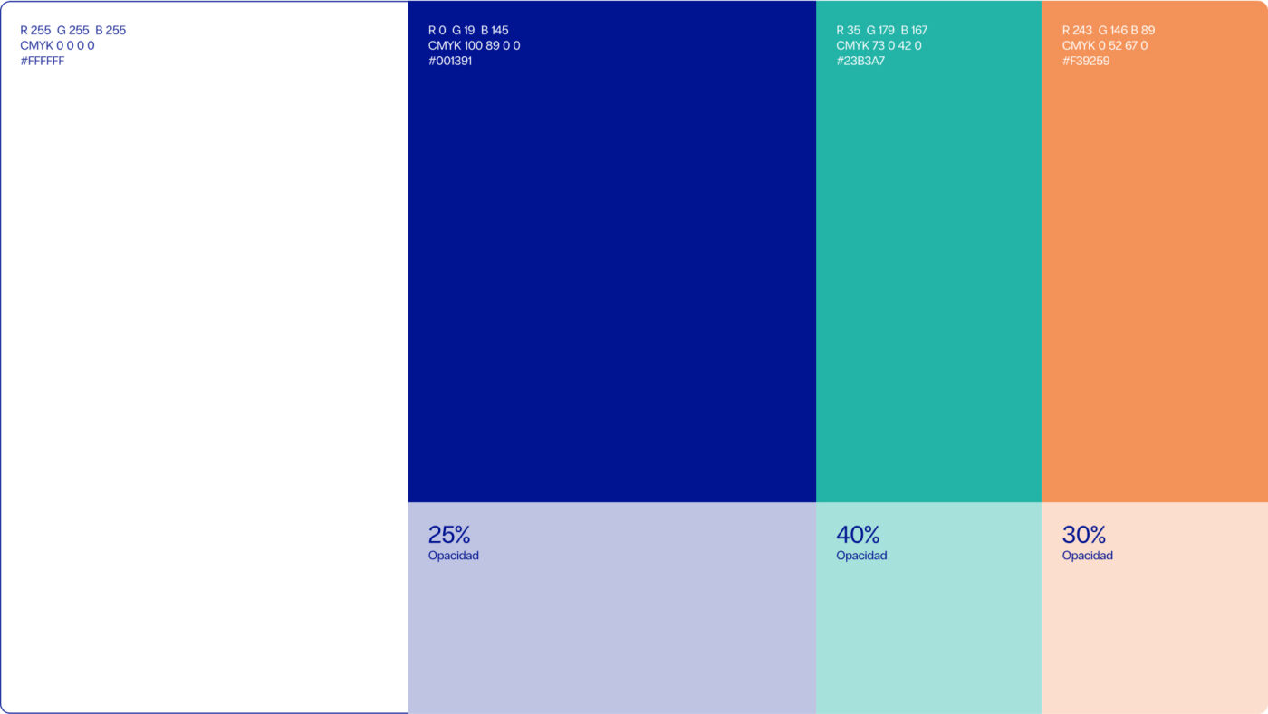
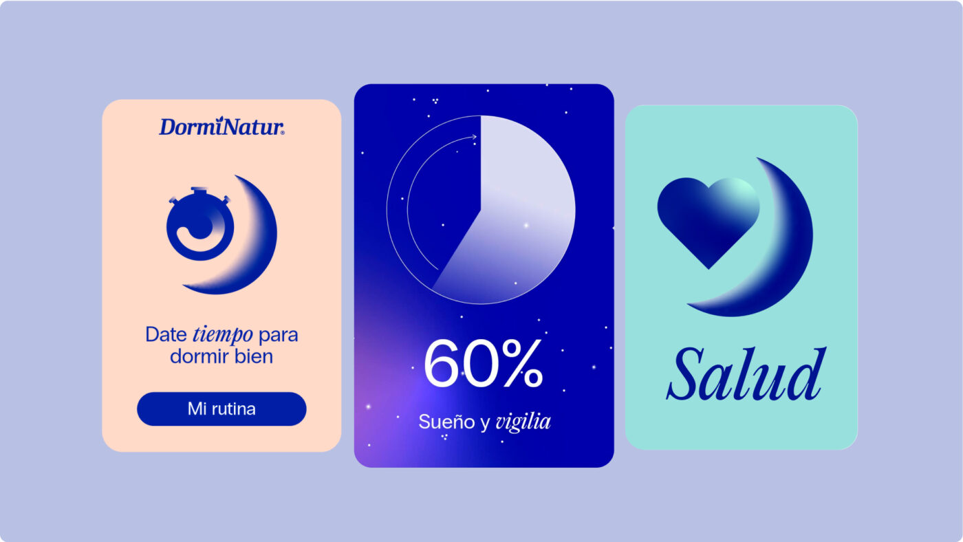
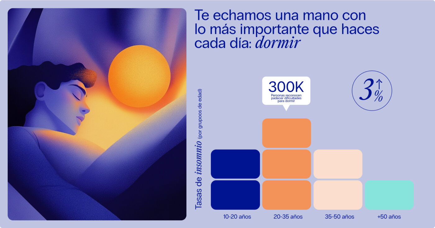
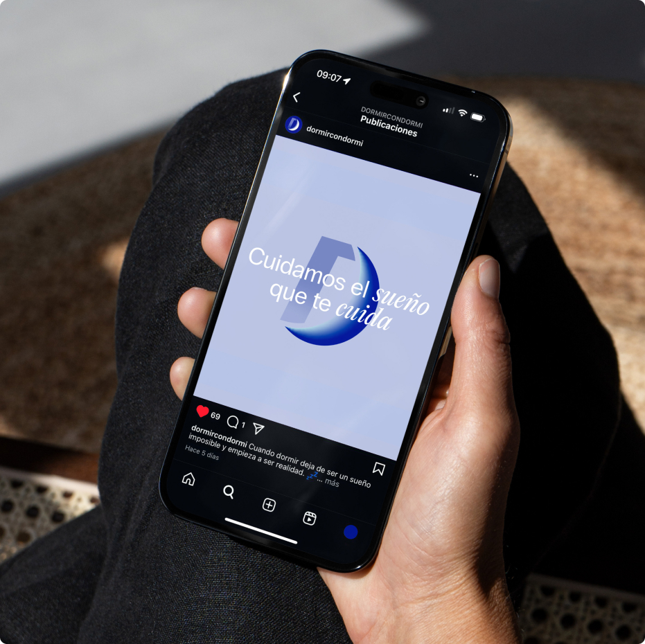
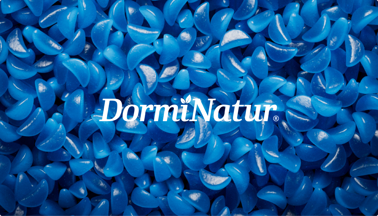
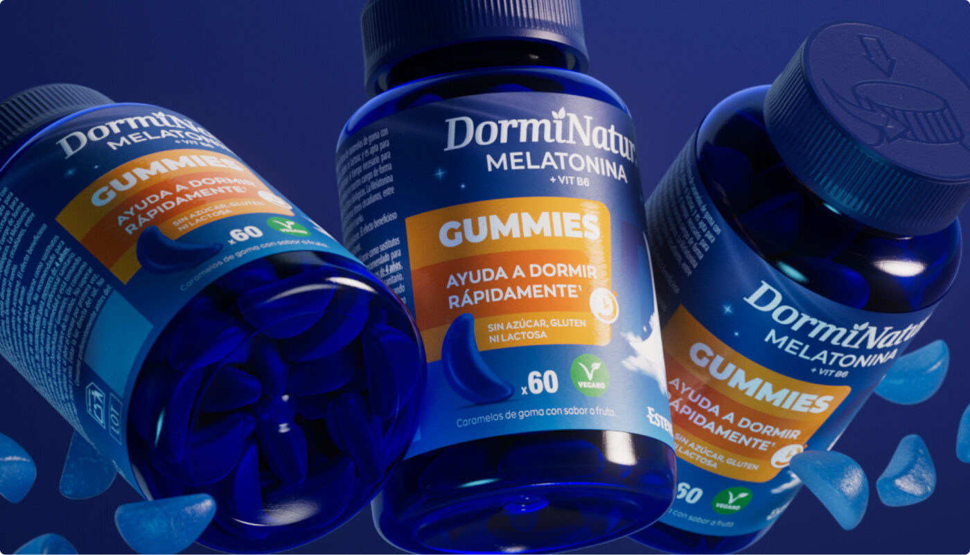
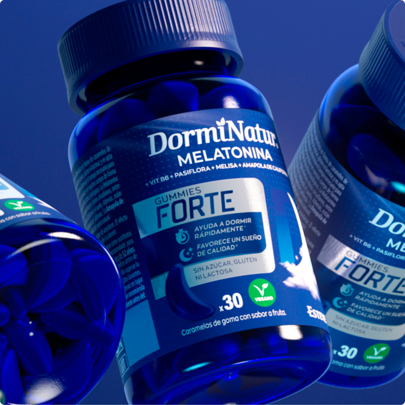
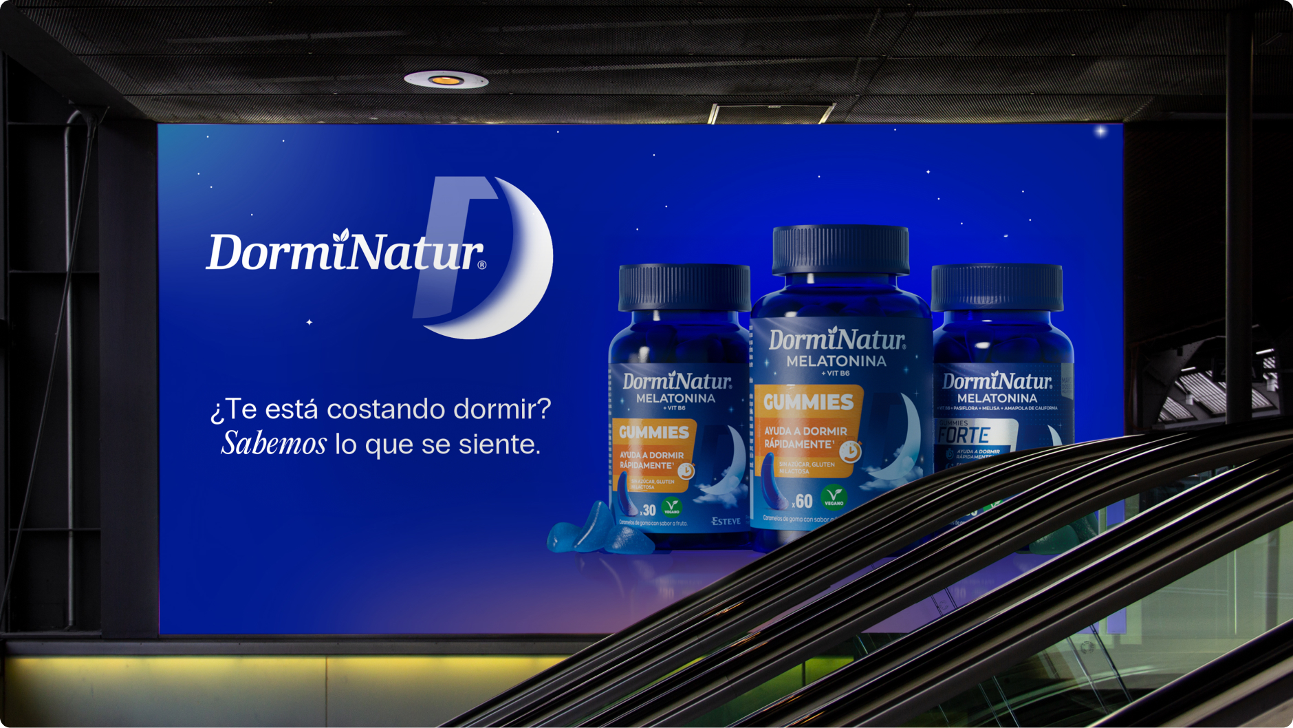
Esteve, one of Spain’s leading pharmaceutical laboratories, takes a step forward in the sleep category with the creation of a new brand ecosystem. With Dormidina and DormiNatur as iconic brands, this strategic branding project redefines its visual identity, combining coherence and flexibility to stand out in an increasingly competitive market. Under a solid and attractive narrative, a brand platform and value proposition have been defined to reinforce Esteve’s leadership in the sleep category.
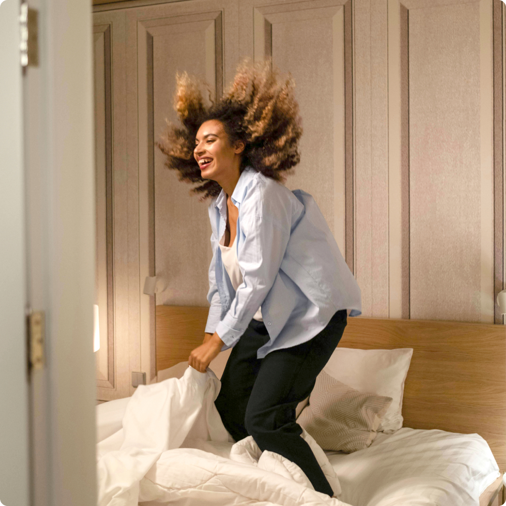
From packaging design to digital presence, retail and social media, this transformation drives emotional connection with consumers while strengthening Esteve’s commitment to health and well-being. An evolution that consolidates the company as a reference in the sleep sector.
With this long-term project, CBA Design and Esteve continue their 7-year partnership, advancing pharmaceutical branding. A clear example of how strategy, design, and innovation can create memorable brands that resonate with today’s society’s needs and expectations.
/ Context
A fresh new visual identity for an iconic festival and a timeless brand.
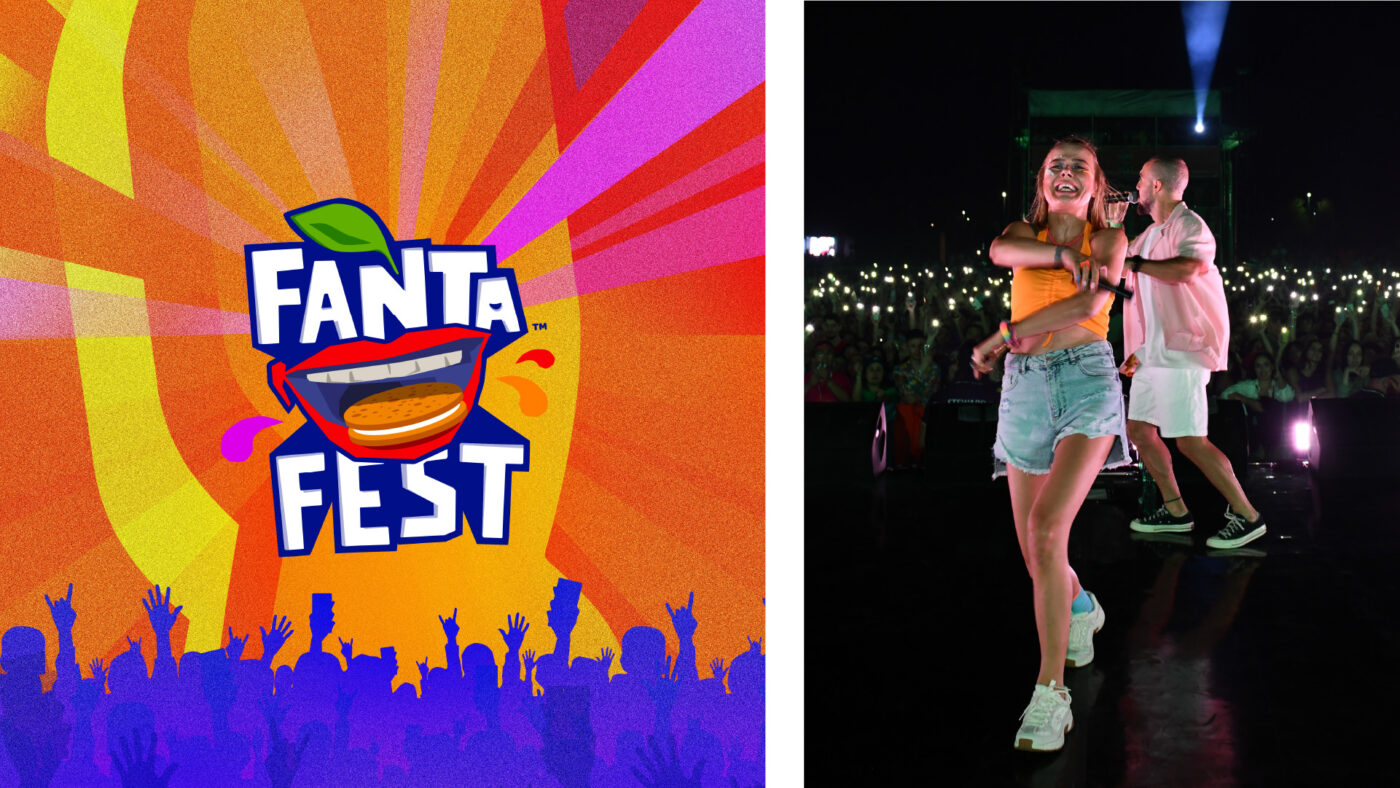
Fanta Fest is a music festival held in Turkey and is considered one of the most popular and beloved festivals in the country. Taking place during the summer, this is an event young people make sure not to miss out.
Over the years, a variety of experiences have grown within the festival, which now has become much more than a set of concerts. To ensure the on-going evolution of its value proposition, a new visual system was needed to allow it to expand consistently by keeping the essence of the brand alive. Thus, for its 2023 edition Fanta needed a flexible but consistent global identity language that is adaptable over time and across all types of media.
/ CREATIVE CONCEPT
Fanta Fest is all about painting the grey in our lives and enjoying every second to the fullest.
Because life is about new sensations, fun vibrations and unleashing creativity. Even more so during the summer, when we let our worries go and bring in all the positive energy of the sun, the music and our friends.
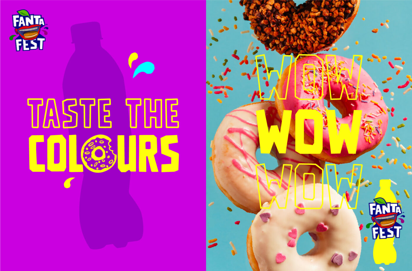
The design had to showcase this mood through an iconic concept that represented the festival’s visual universe and generated a genuine connection with its young audience. To do so, we explored the idea of ‘Flavour Explosion’. An invitation through the immense depths of colours and flavours. Fantasy, tastiness, intensity and vibrancy. We expanded the storytelling of fun and excitement, so we could taste colours, and see flavours.
/ VISUAL IDENTITY
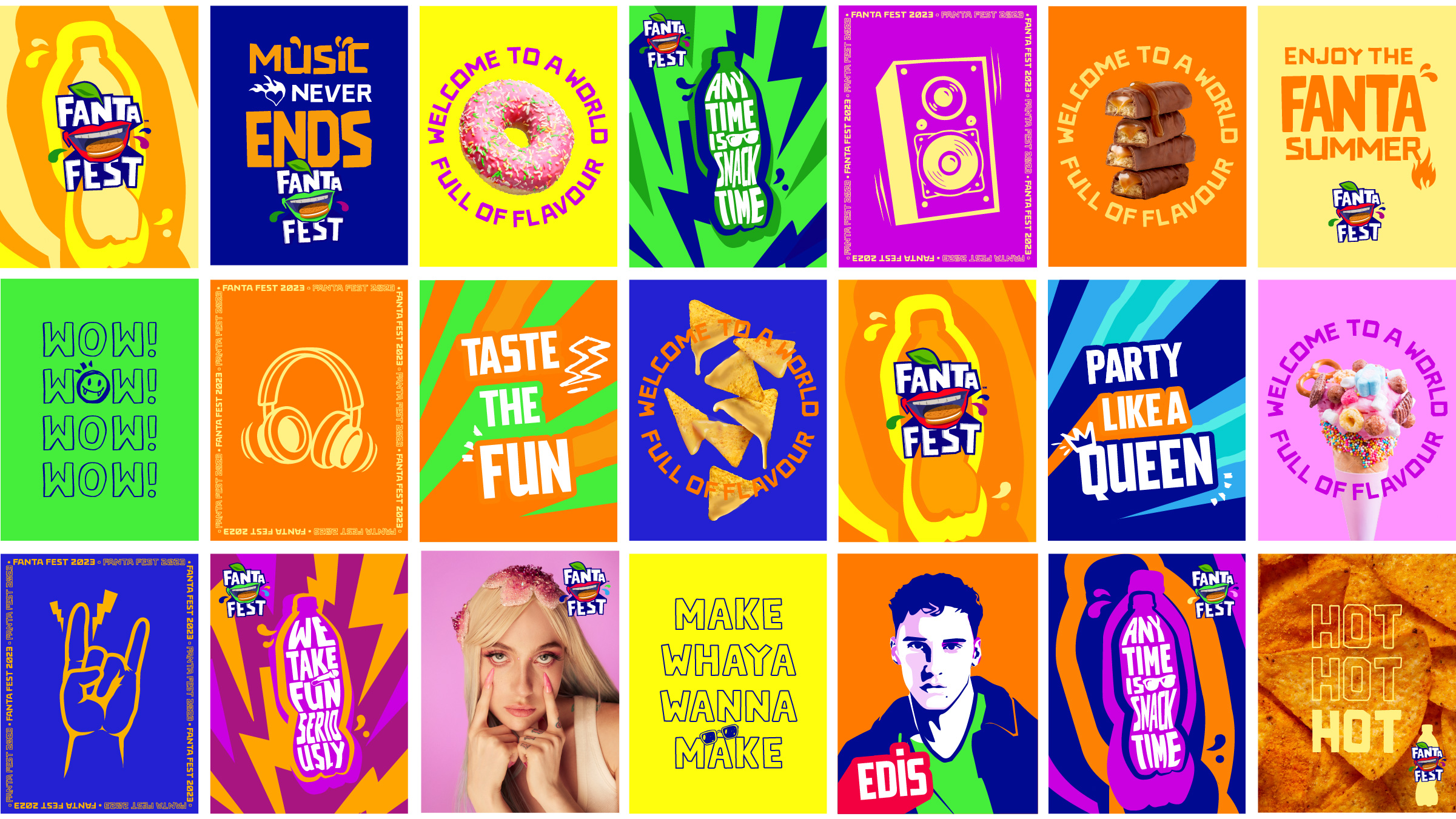
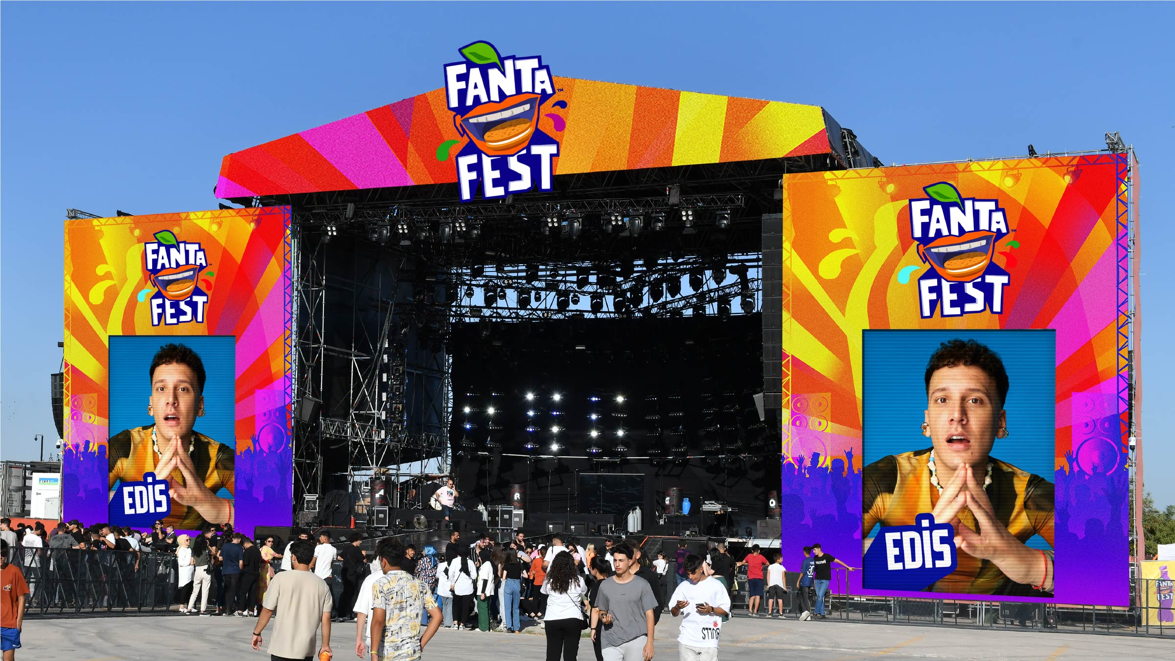
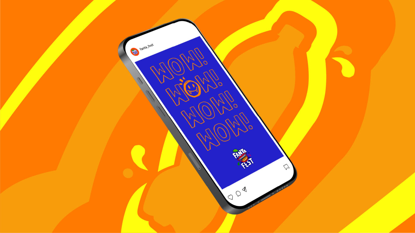
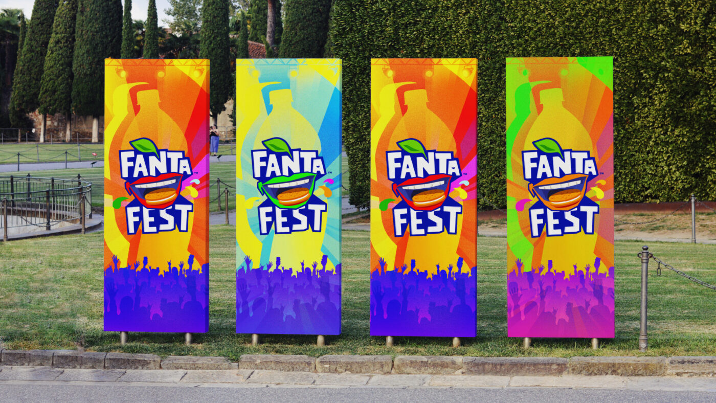
From the creative concept set as a starting point, we built on the new graphic, chromatic, typographic, iconographic, photographic and illustrative codes, always maintaining coherence with the essence of the Fanta brand. This complementary visual language gains prominence and expands dynamically through a diversity of key touchpoints: from the stage to the social media attitude, packaging or point of sale materials, among others.
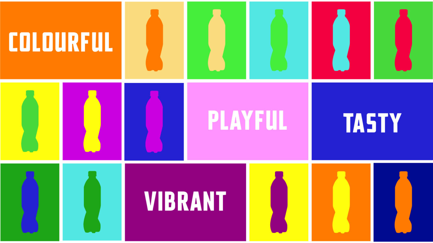
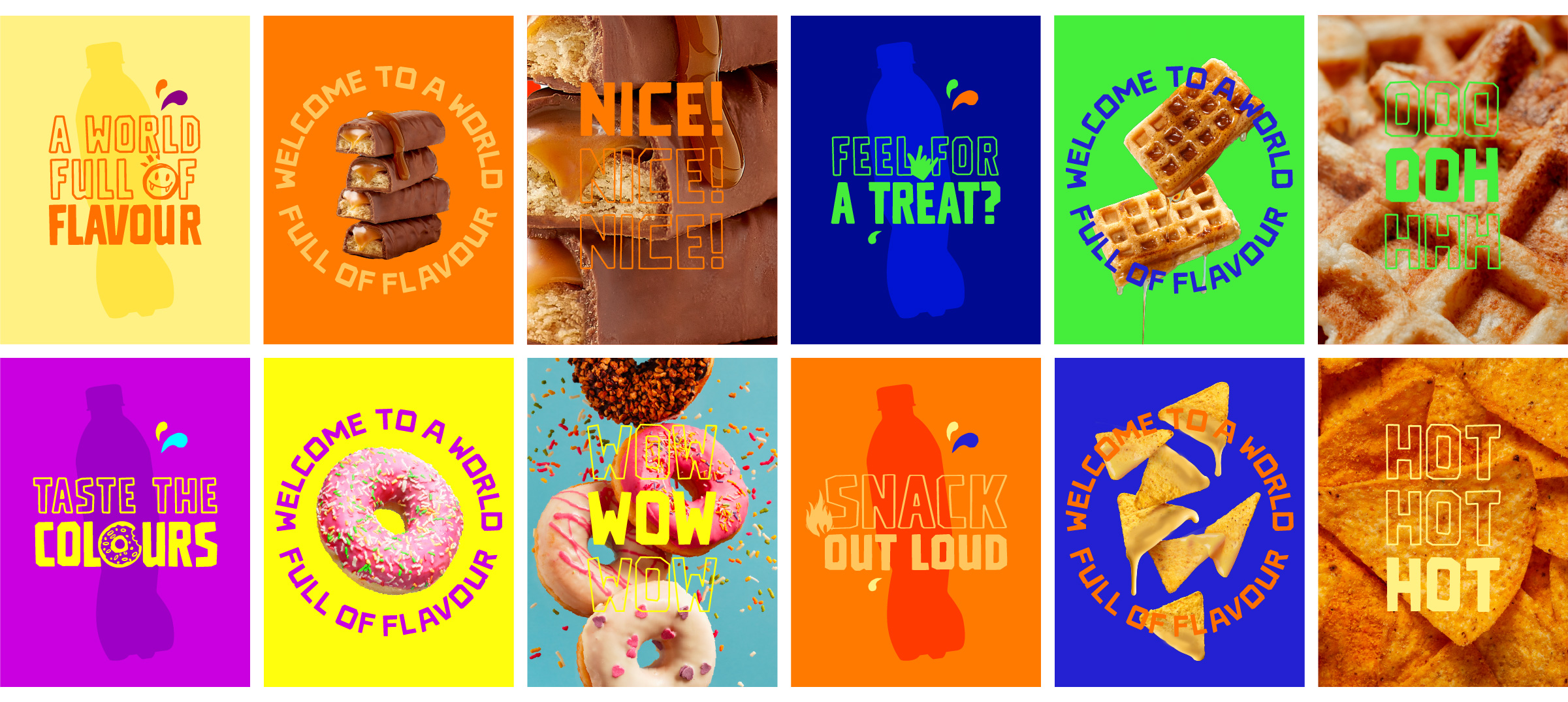
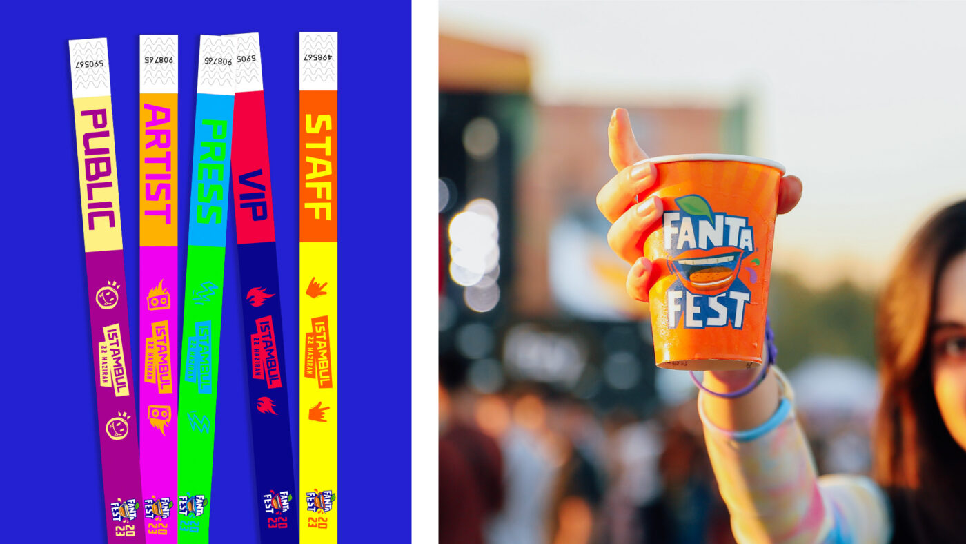
Elements such as the logotype, designed for the previous edition, the bottle-shaped icon or the primary colour palette ensure Fanta’s recognition through all visual ecosystems.
Additionally, we endowed the festival with a unique personality through a flexible secondary palette of bright colours that express the youthful sensation.
This results in an overall modular visual system that is easily adaptable to multiple touch points and that can be developed and activated continuously to meet emerging needs and communication goals.
The coexistence of the different graphic resources also projects a divers and empathic image towards the Fanta Fest target and its main interests.
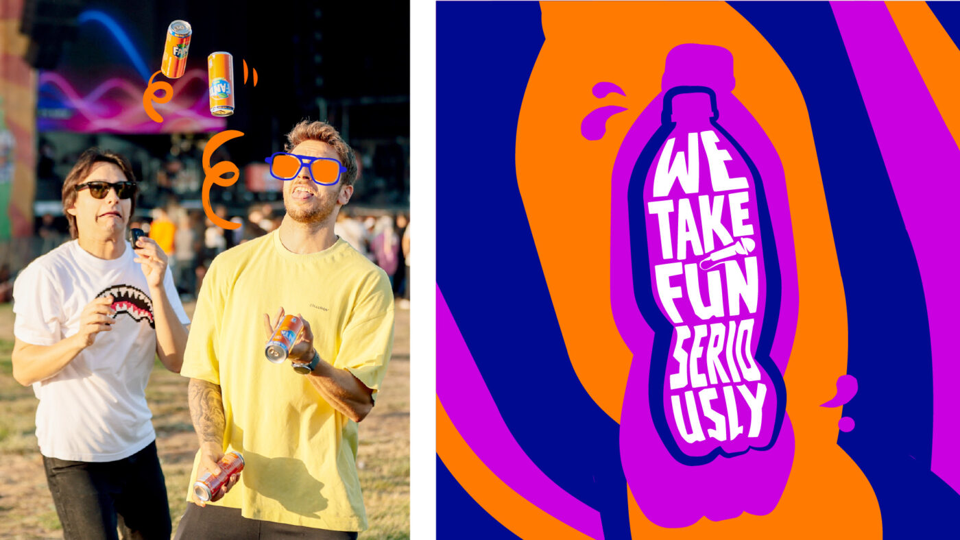
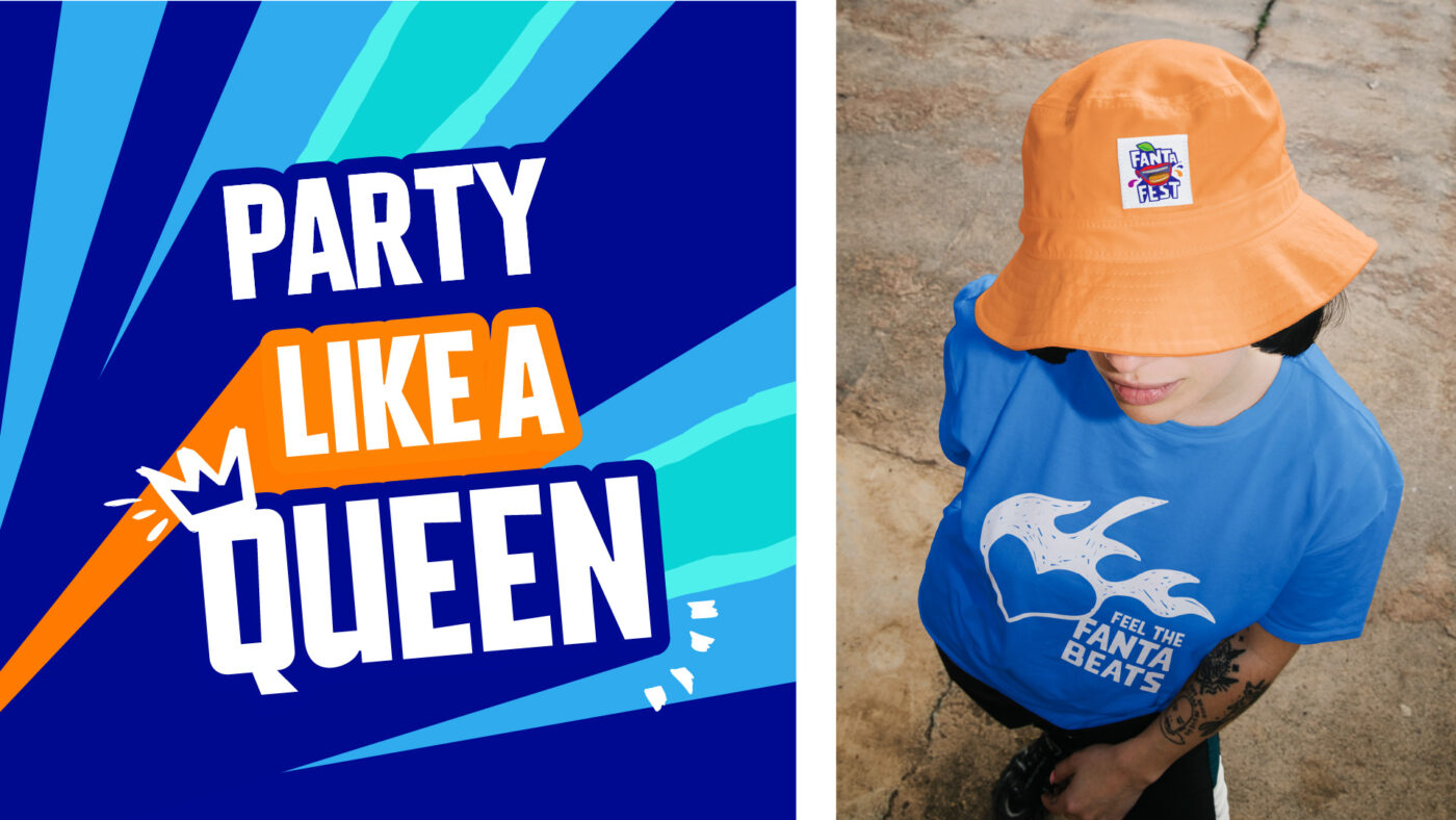
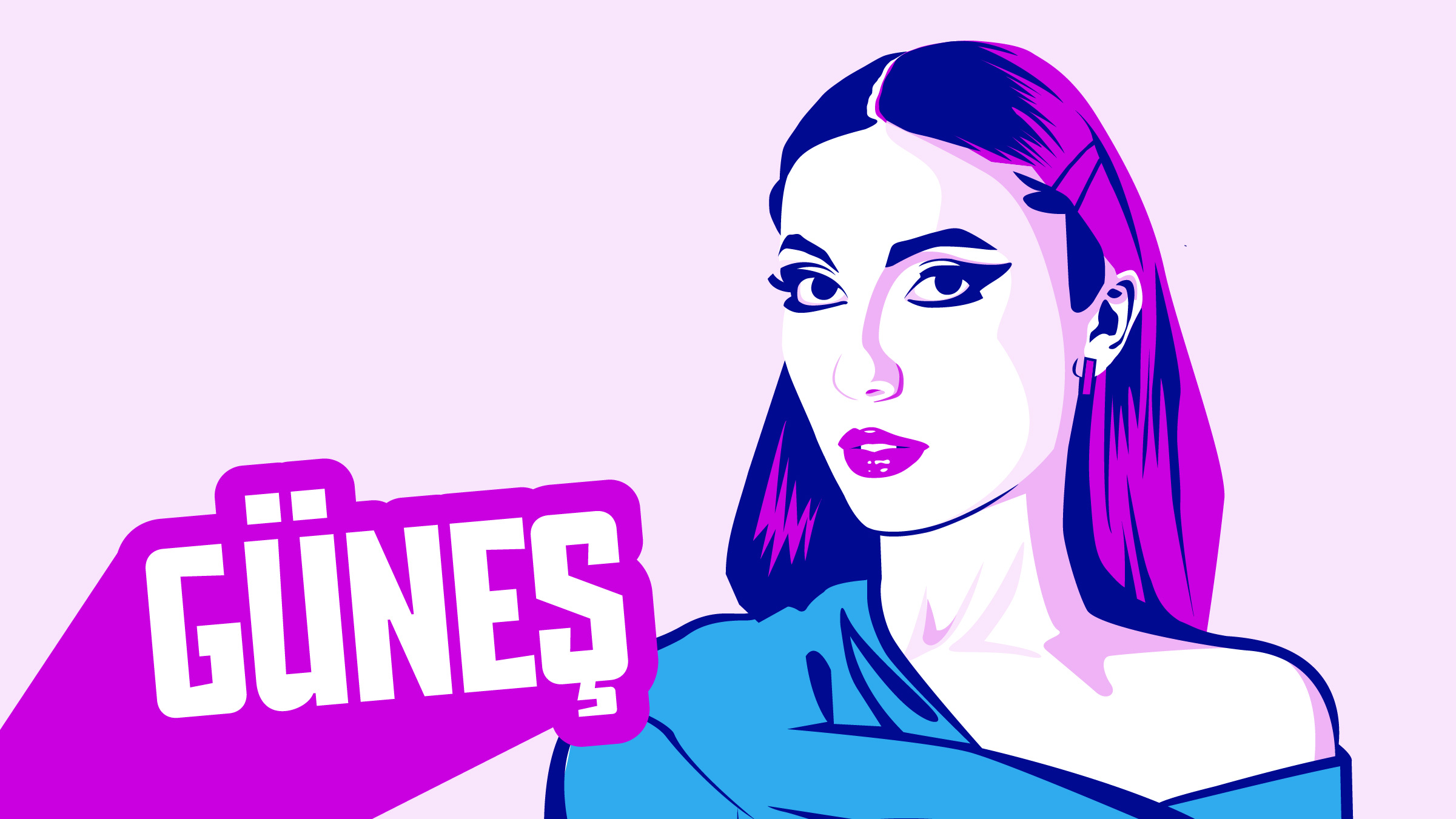
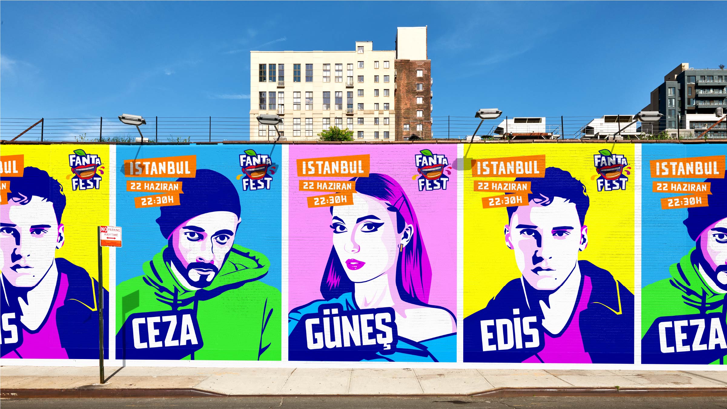
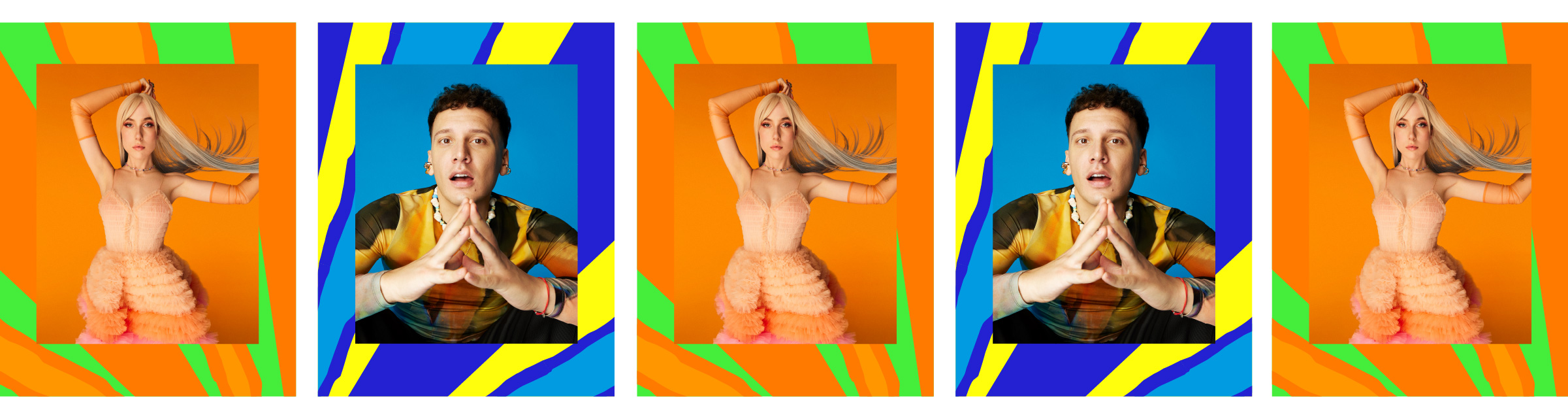
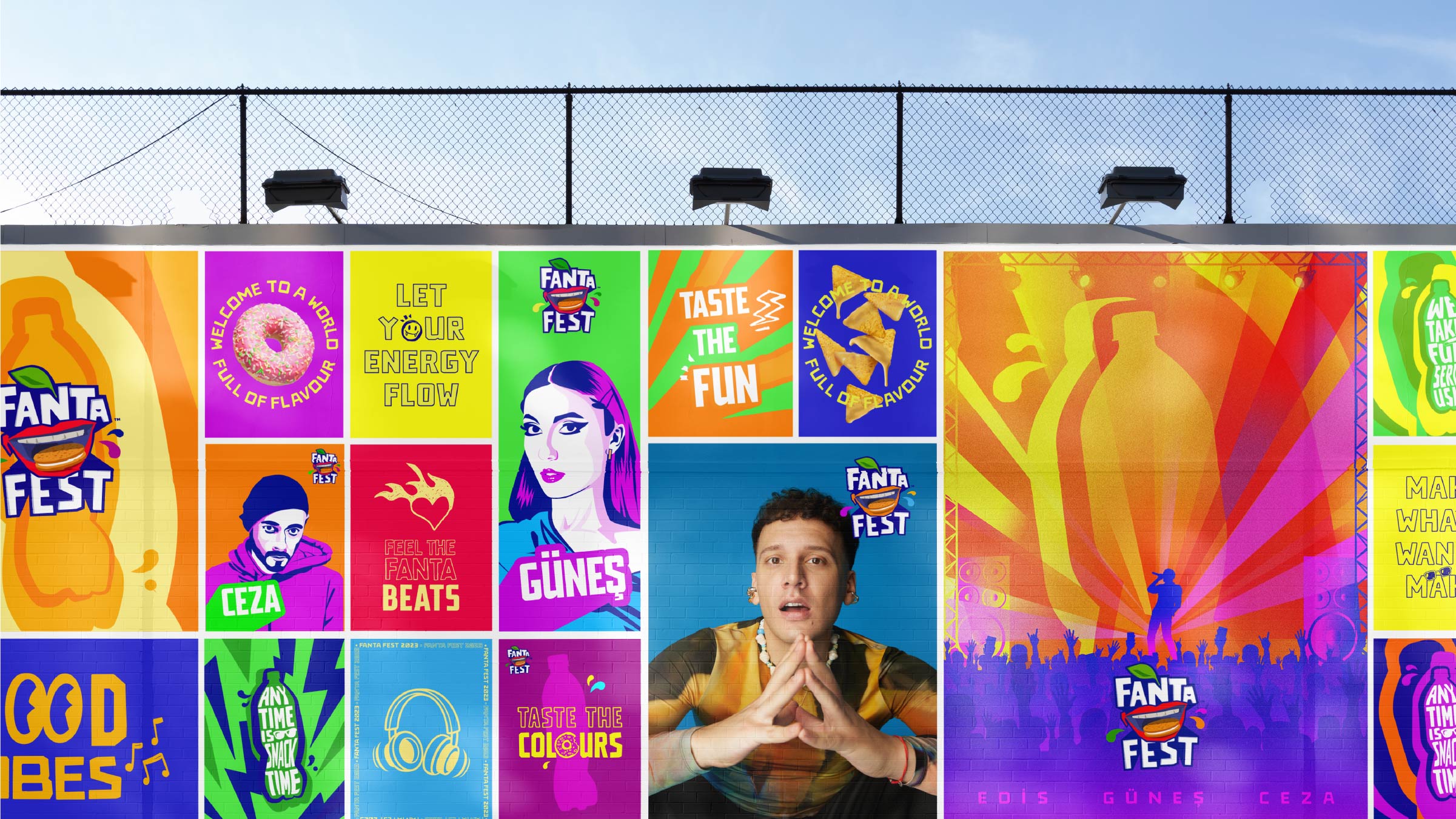
Original artist illustrations have been designed to create unique and impactful celebrity posters. With a timeless style built on flat colours, consistent with Fanta’s visual identity, versatility is achieved through chromatic variations in the artist’s strokes and clothing, which can alter depending on the environment in which the posters are placed.
/ ART DIRECTION
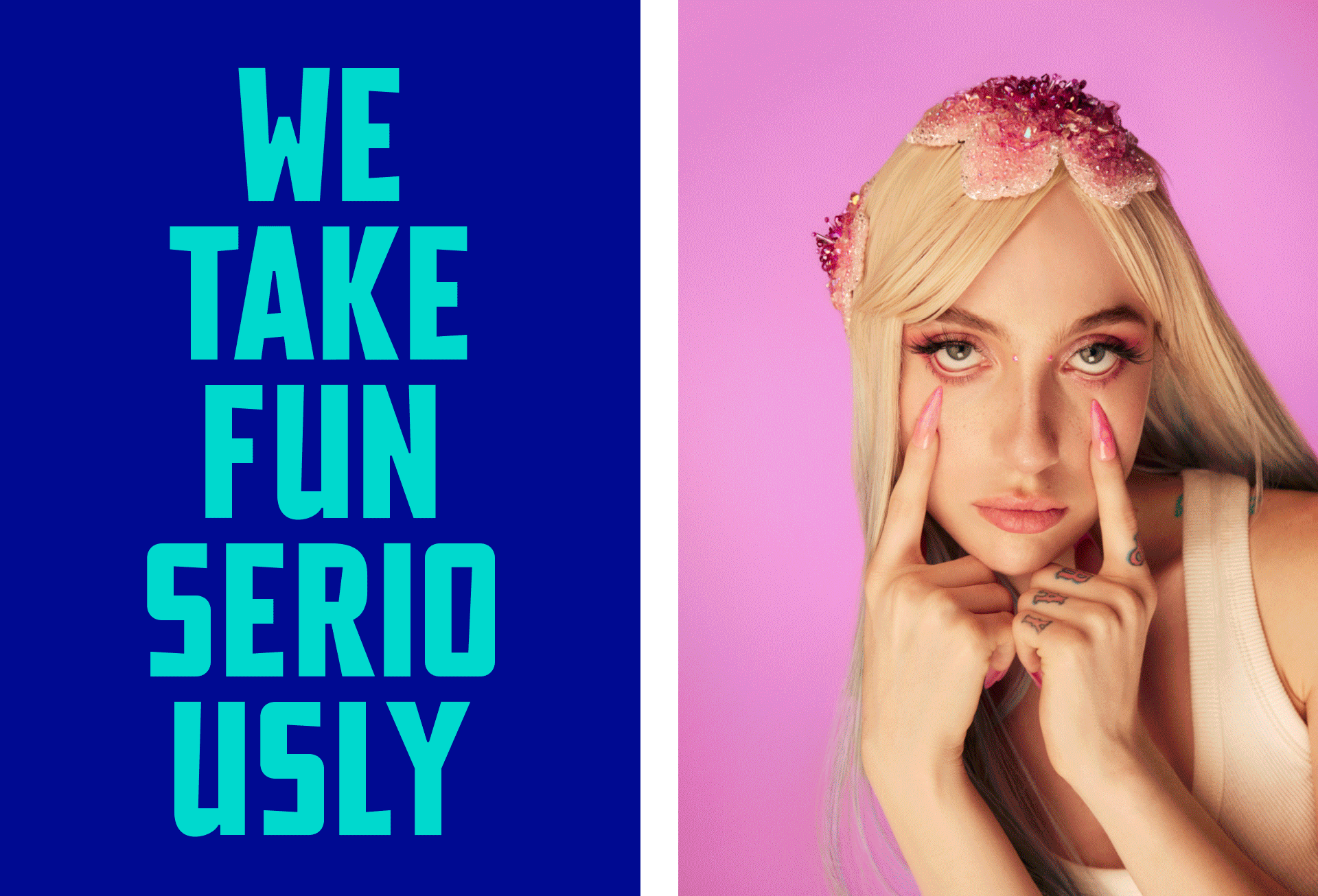
The art direction of the celebrity photoshoot and the whole visual imagery of the festival, both in digital and editorial styles, are consistent with the main creative concept: fun, colourful, and diverse, and portrayed in a natural and dynamic way.
From lifestyle photographs of people enjoying every second of the experience to the fullest, to snacking posters that, combined with a fun copy, showcase the tastiness of the products available at the festival.
This vibrant and eye-catching visual ecosystem comes to live through its diverse applications, from social media to festival materials.
/ RESULT
A solid yet flexible new visual identity system that allows Fanta Fest 2023 to express itself in a playful and vibrant way across all types of media. An iconic and timeless identity that evokes the youthful and joyous essence of the festival.
We use cookies on our website to give you the most relevant experience by remembering your preferences and repeat visits. By clicking “Accept”, you consent to the use of ALL the cookies.
This website uses cookies to improve your experience while you navigate through the website. Out of these, the cookies that are categorized as necessary are stored on your browser as they are essential for the working of basic functionalities of the website. We also use third-party cookies that help us analyze and understand how you use this website. These cookies will be stored in your browser only with your consent. You also have the option to opt-out of these cookies. But opting out of some of these cookies may affect your browsing experience.