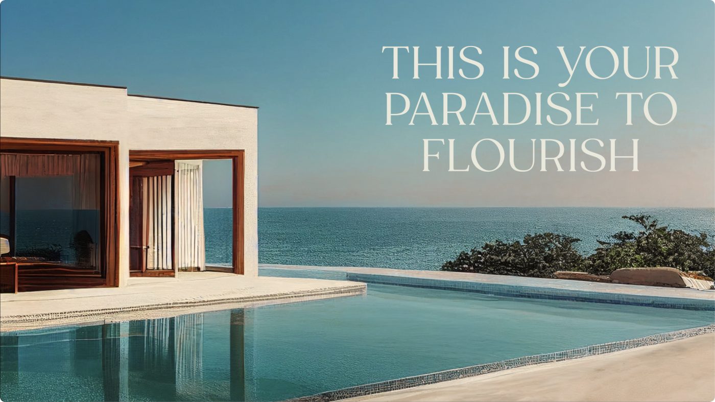
A Mediterranean sanctuary along the Albanian Riviera
Located in Albania’s breathtaking coastline, Green Coast is a hidden gem attracting growing interest from investors and tourists alike. To stay relevant and competitive in the market, the brand identified the need to evolve. To do so, Green Coast turned to CBA to take on the challenge of revitalizing their visual identity, enhancing their storytelling and boost their content strategy.
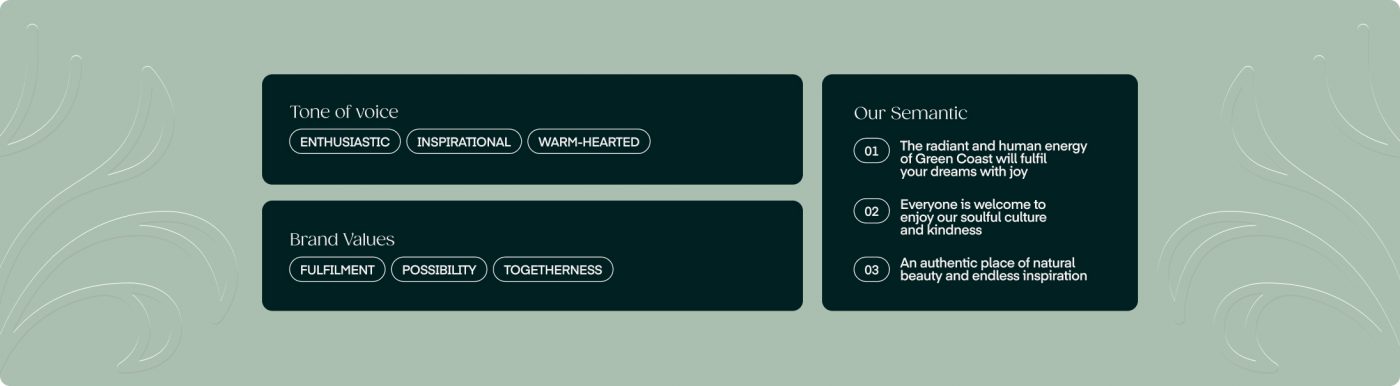
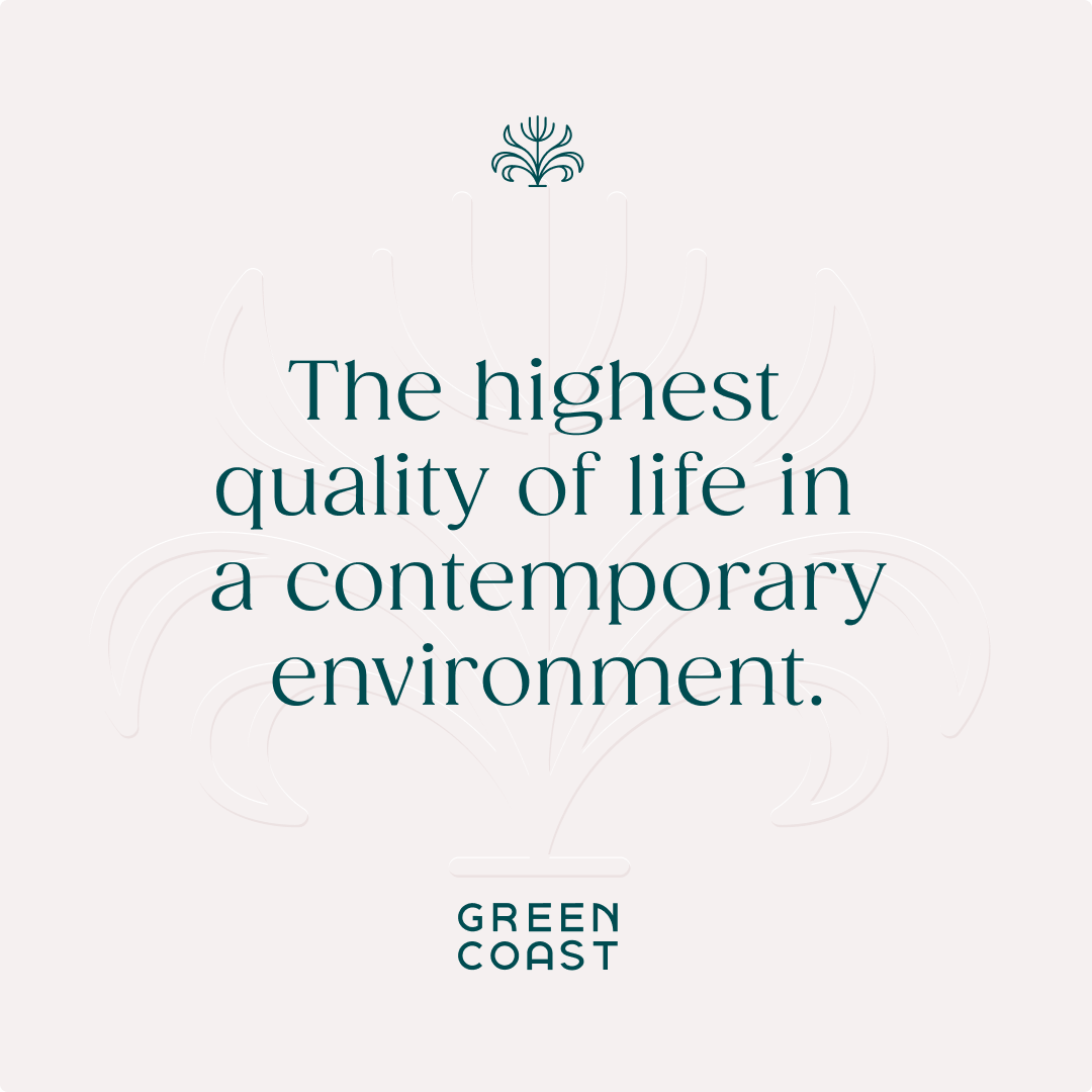
Our collaboration was rooted in the understanding that Green Coast’s success goes beyond property development. It encapsulates a vision of harmonious living, where residents and visitors can fully immerse themselves in the natural beauty of their surroundings and in a place that fosters a sense of community and endless opportunities.
We crafted Green Coast’s visual identity carefully balancing tradition and modernity, creating every element with a sense of sophistication, warmth, and authenticity.
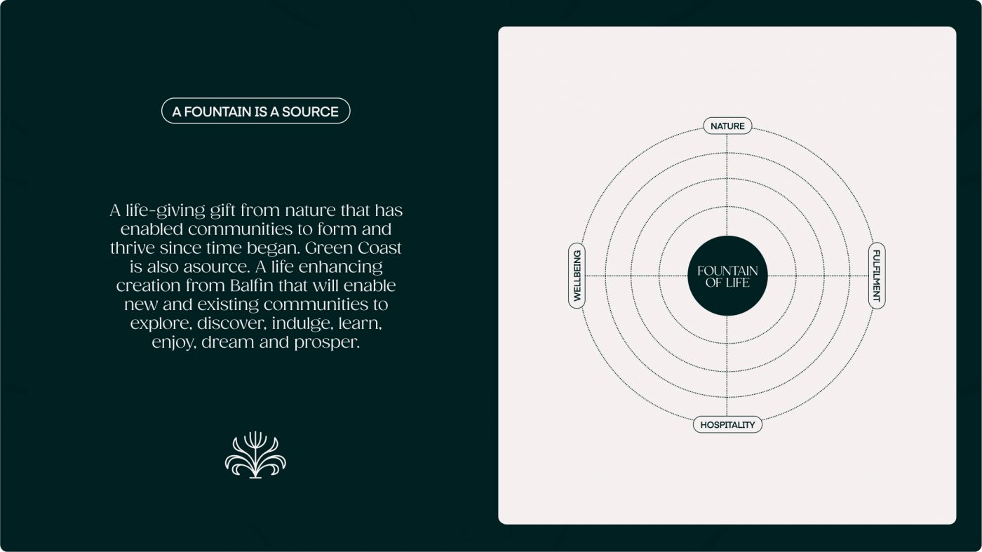
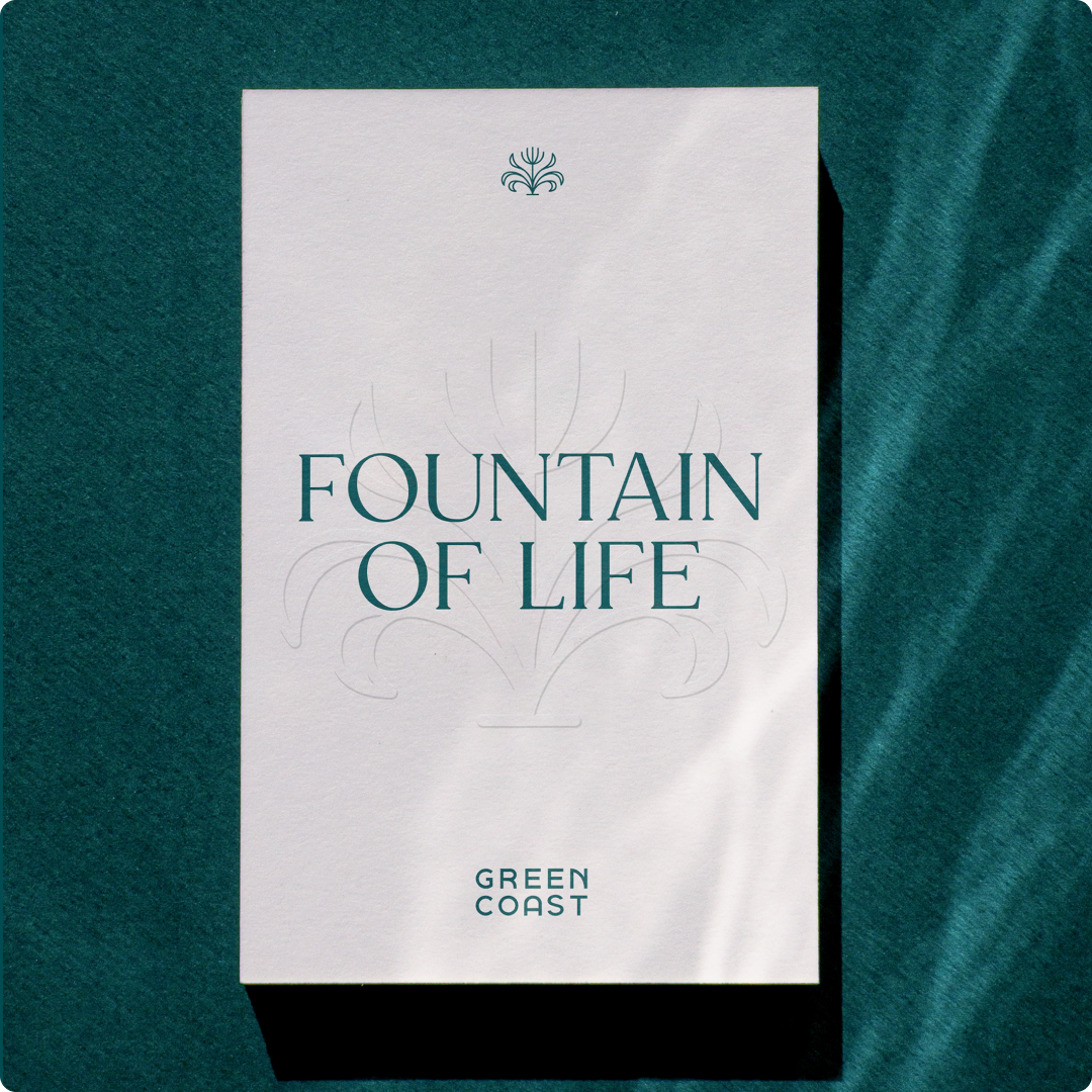
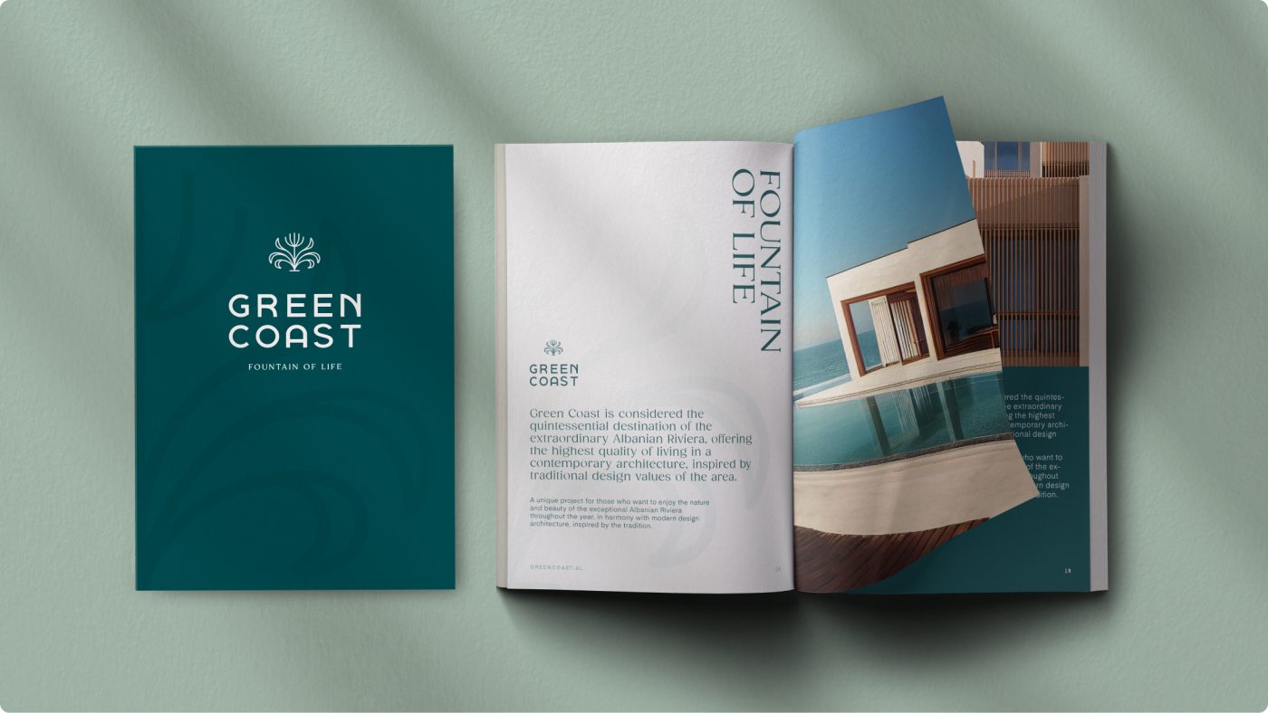
To represent the vitality and abundance that define Green Coast, we created the concept ‘Fountain of Life’: a place full of life and endless opportunities.
This concept also inspired the logo design capturing the essence of Green Coast in a single, memorable mark that represents sophistication and refinement, embodying commitment to excellence and brand heritage.
Our goal was to generate a true connection between Green Coast and its target audiences, by designing a meaningful and unique brand
around its heritage and future, able to build a timeless relationship with people.
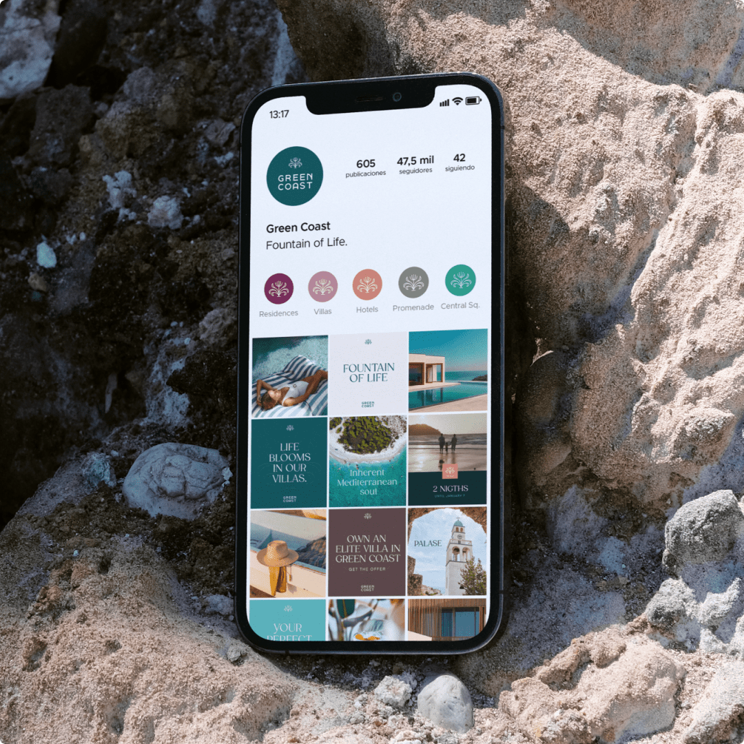
From the selected creative concept, we have built a consistent storytelling for Green Coast, able to express its personality and establish a genuine connection with people.
Overall, the new image is a clear expression of the optimistic and relaxed spirit that Green Coast represents and offers.
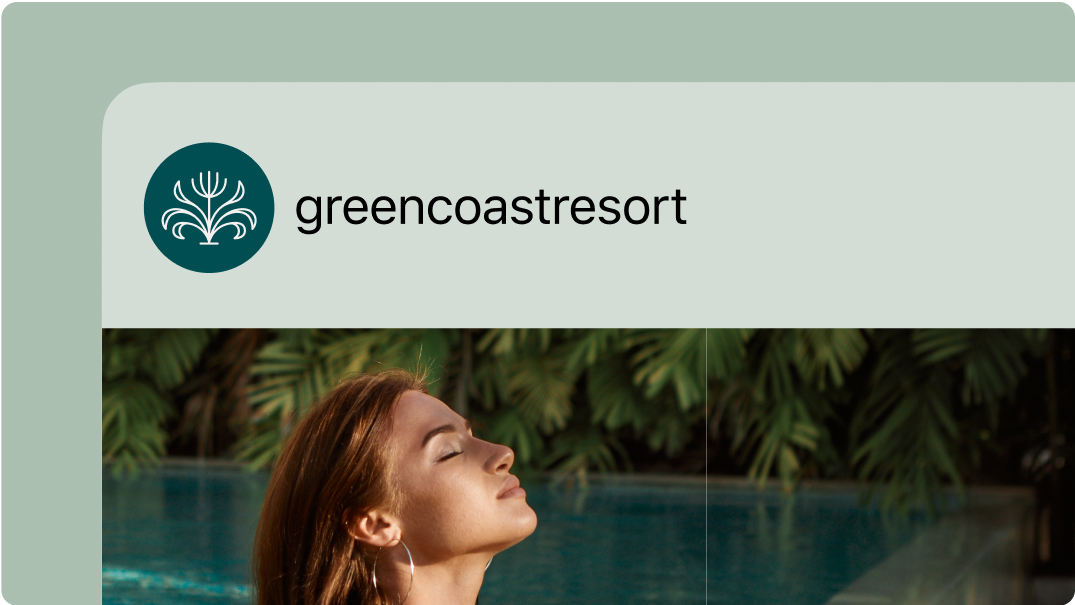
Vibrant and inviting photographs also capture the essence of the iconic Mediterranean lifestyle, and convey the serene atmosphere of the place and the beauty of the landscapes.
/ RESULT
Through the implementation of a cohesive brand strategy and the creation of a captivating visual language, Green Coast has elevated into more than just a real estate venture, it is a lifestyle destination synonymous with fulfillment, togetherness, and boundless opportunity.
/ context
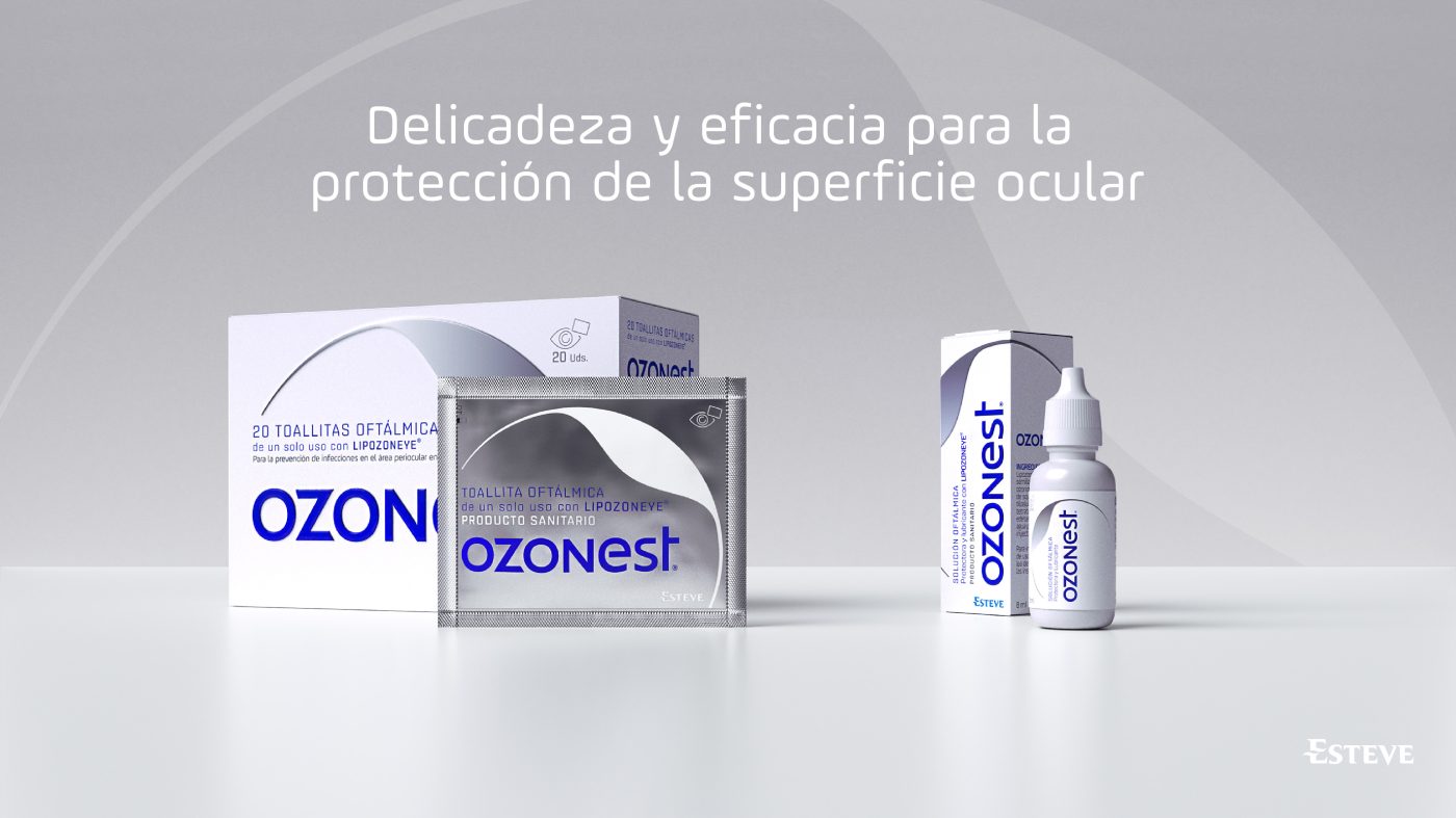
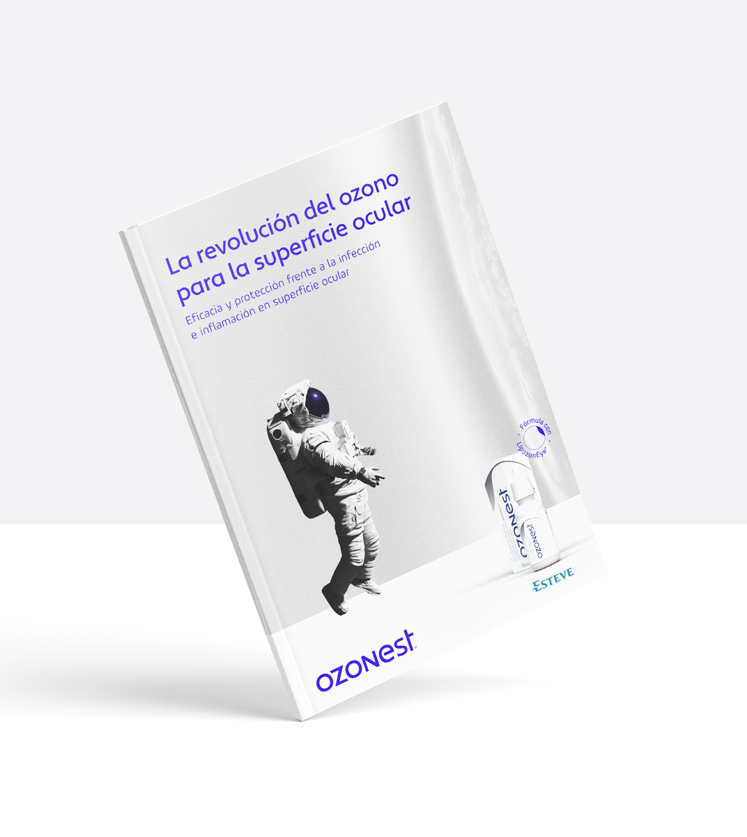
A pioneer solution based on the ozone.
Ozonest is a groundbreaking solution that facilitates asepsis and provides protection on the human eye thanks to its formula based on the O3 molecule, better known as ozone. An innovative treatment that acts against viruses and bacteria occurring during optical surgeries and infections.
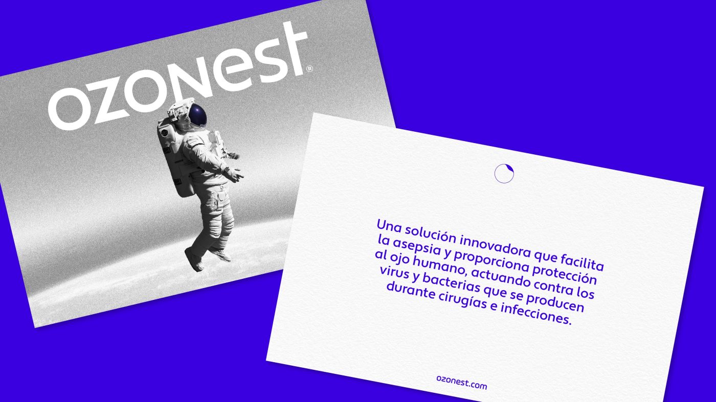
It is also the very first brand in the Spanish market to use this sky-high formula, for which we have created a unique graphic imagery from scratch, introducing new codes in the universe of ophthalmology through a fascinating perspective that takes us to the moon.
/ storytelling
The first keystone has been to create a storytelling that connects with both professionals and patients, establishing a consistent and differentiating narrative that drives an effective dialogue between them and the brand:
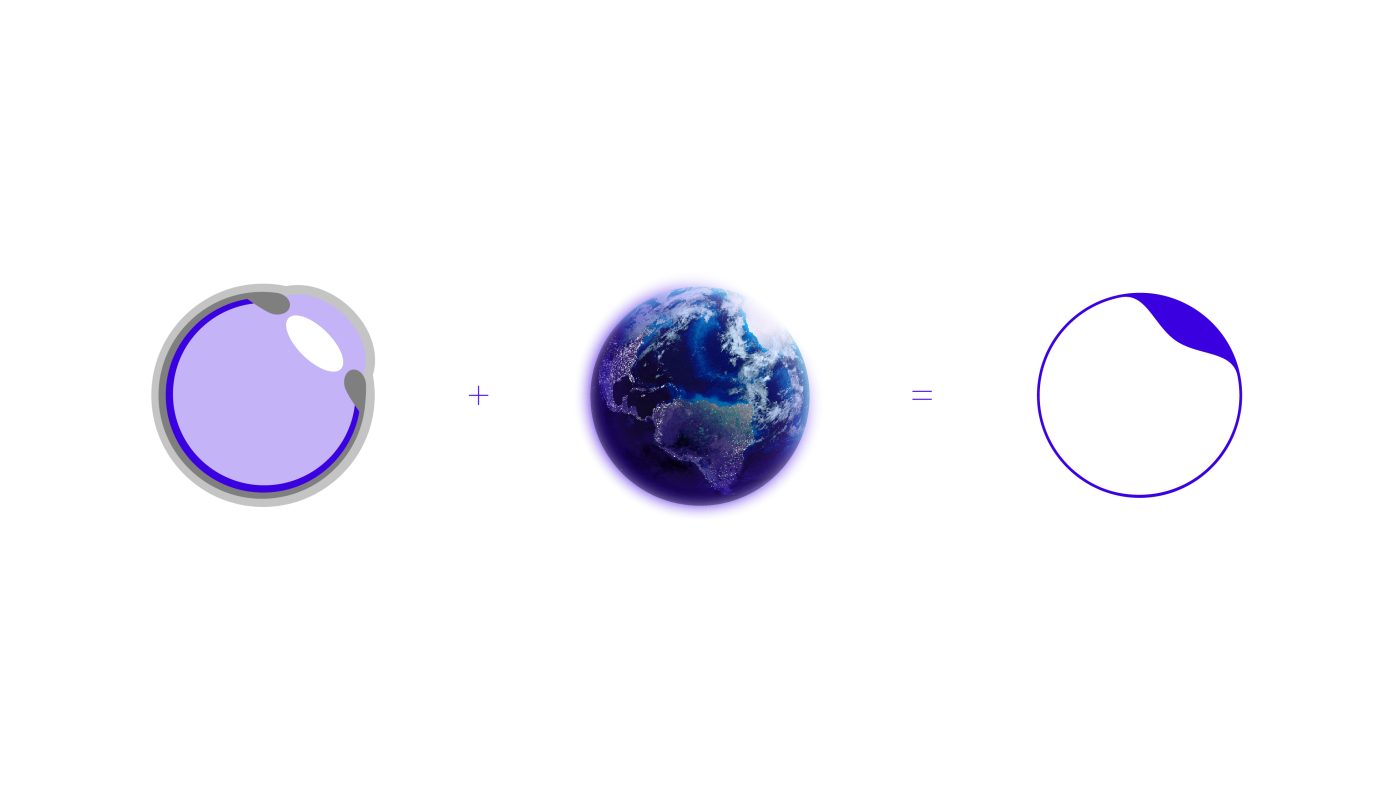
The globe is protected by the upper layers of the atmosphere, where we find stratospheric ozone, the most active form of oxygen. Its purpose is to articulate an invisible membrane to protect the Earth’s surface. In the same way, Ozonest, the ophthalmic solution of tomorrow, will soothe, restore and protect the health of the patient’s eyeball after infection or surgery. A proposal with superior tolerability, which has been developed thanks to the revolutionary LipozonEye® formula. An innovative and effective treatment to build a harmonious eye microcosmos, where cleanliness, gentleness and comfort reside.
/ BRAND
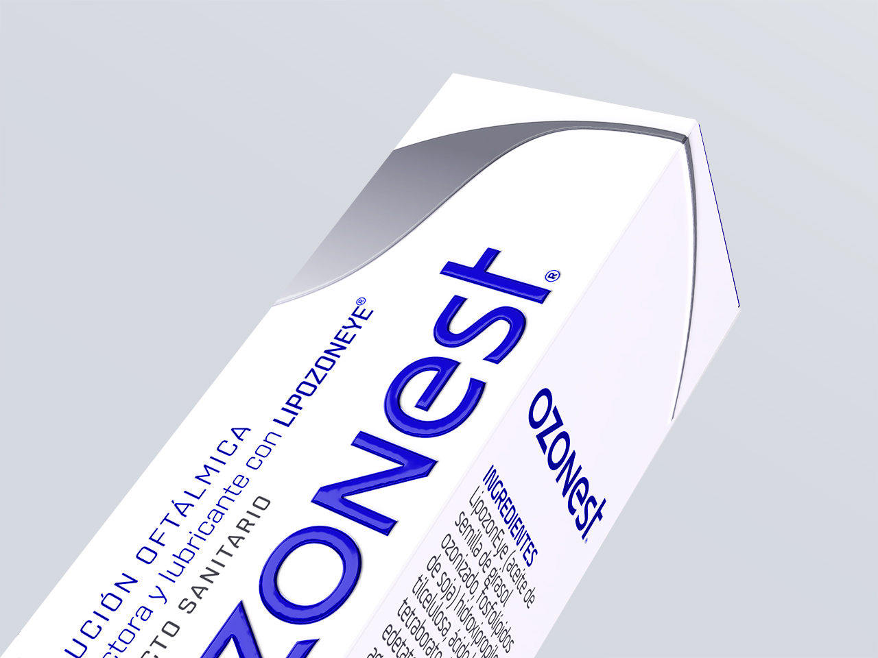
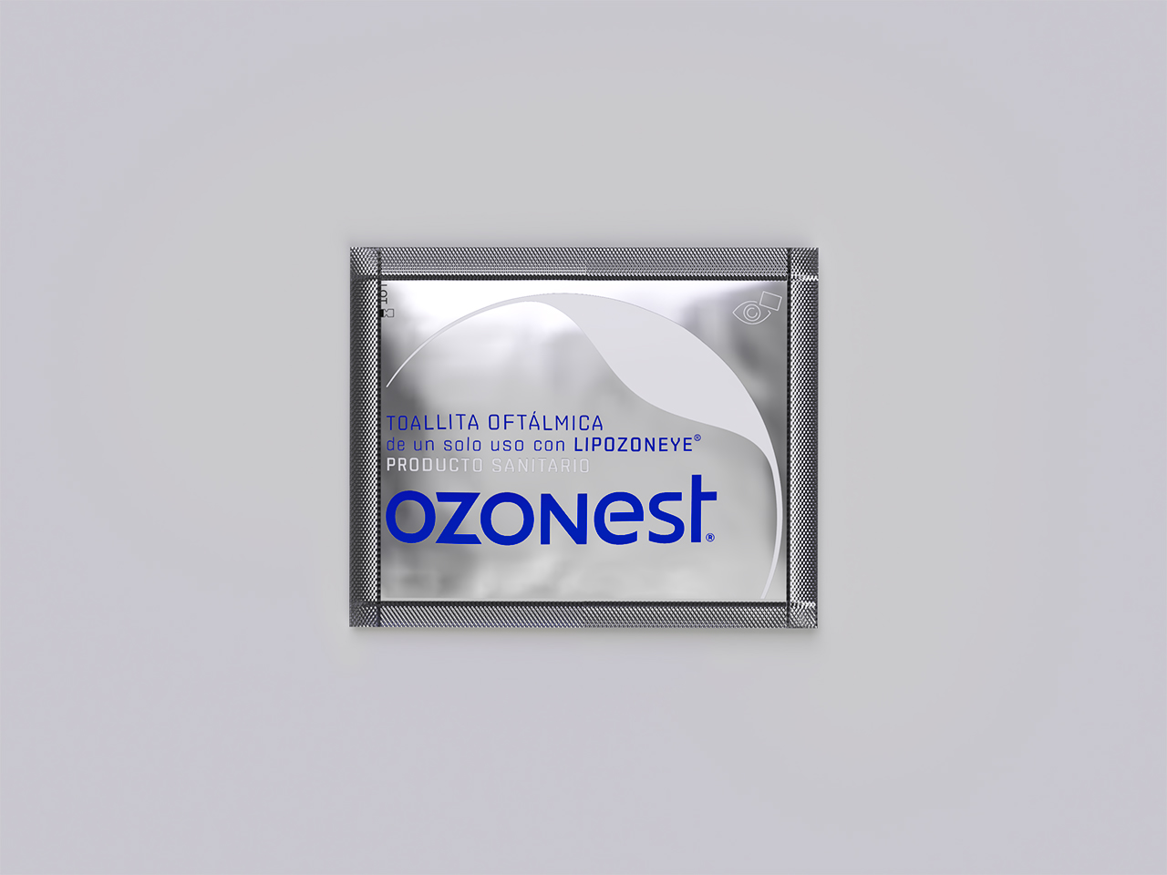
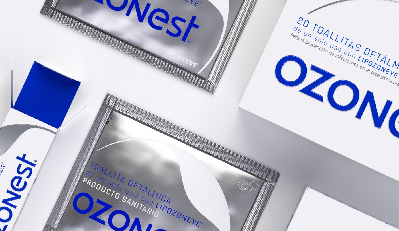
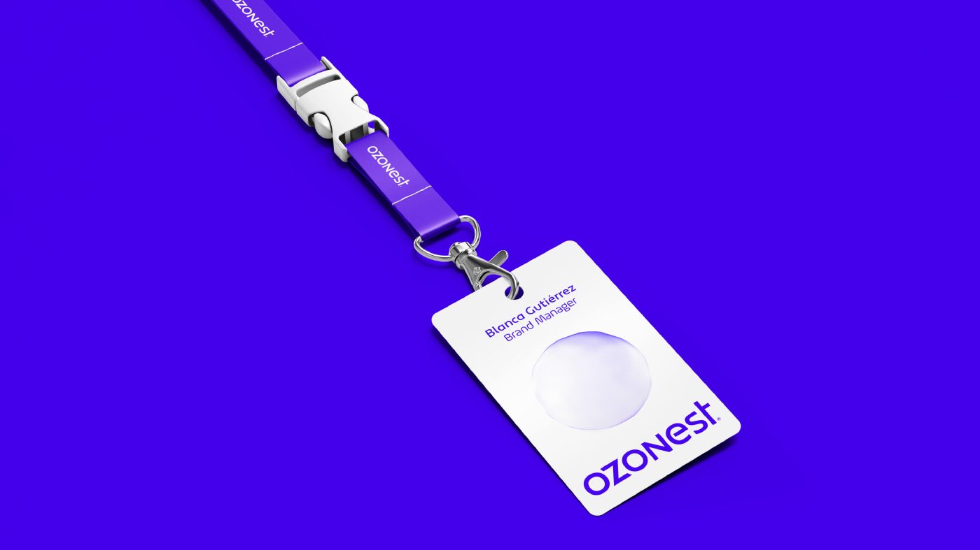
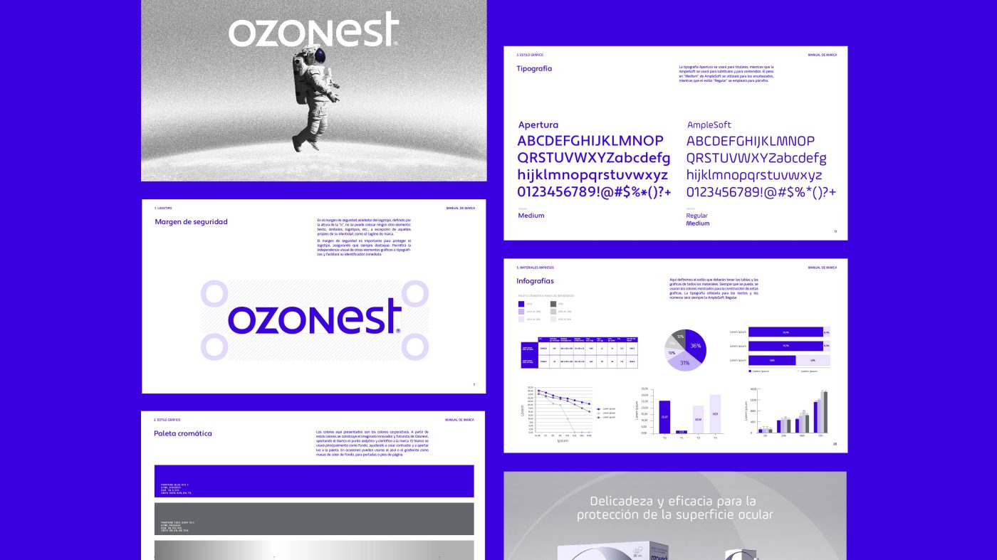
To convey this storytelling from a visual perspective, we have created an ownable and relevant identity that captures the essence of ozone innovation in an eye-care solution, consistently applied on its various touchpoints and packaging line.
A logotype that gravitates on the brand’s personality: innovative, futuristic, scientific and aseptic, built from a NASA inspired typography, which combines an electric blue with open shapes and encompasses the idea of pioneering and technological feat.
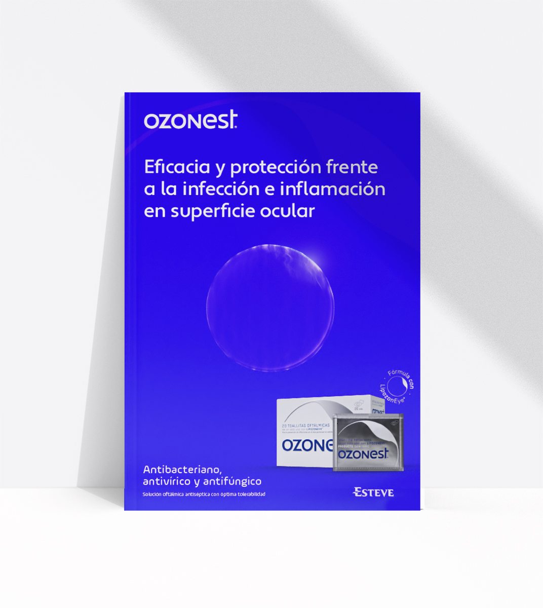
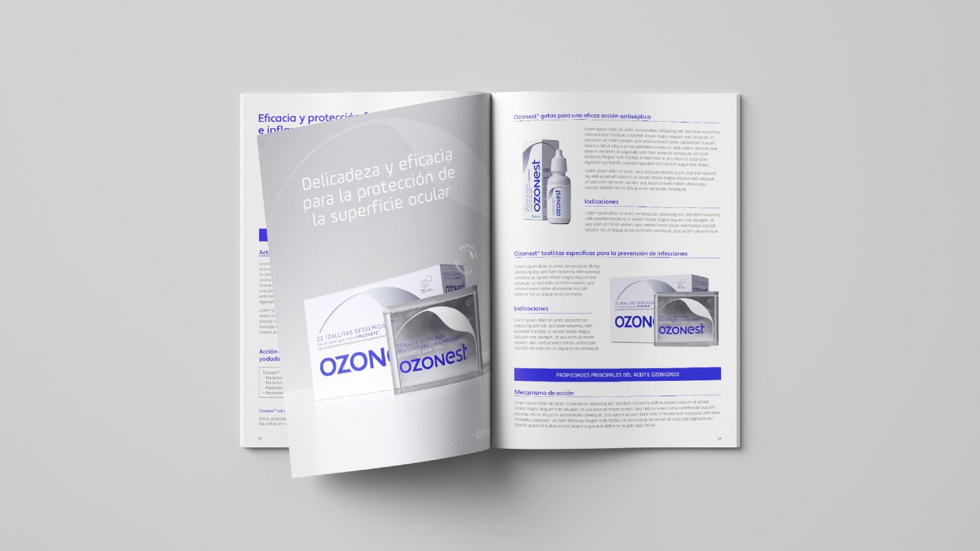
The visual narrative is accompanied by a recognizable iconography inspired by the ophthalmology field. Clear white expresses purity and cleanness, cold metallic resources represent strength and asepsis, both becoming the signature of the brand.
The visual elements represent protection and simultaneously the supreme delicacy of the human eye, bringing Ozonest and its brand purpose to life.
/ RESULT
A new brand that embodies the uniqueness of this cutting-edge and high quality ophthalmic solution.
Specific editorial materials have been created for each, with different key visuals, to help understand the qualities and the benefits of the product, representing the essence of the brand and the storytelling created. On one hand, we find a rational, efficient, technical and rigorous tone to connect with scientists, doctors, and pharmacists. And on the other hand, a much more emotional and reassuring speech for patients to feel confident and safe when using the product, considering the eye is such a complex, fragile and delicate organ.
A unique and solid brand identity, able to represent Ozonest as a breakthrough in the pharmaceutical sector.
/ Context
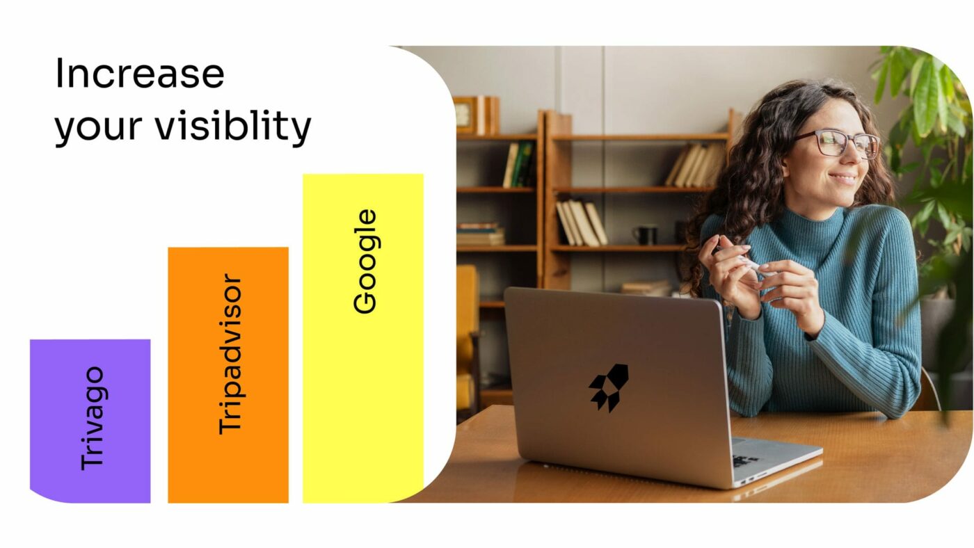
A custom software that increases visibility and sales, saving time and money.
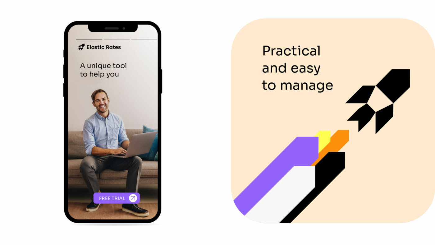
Elastic Rates is a unique tool that helps travel agencies and hoteliers to easily optimize and manage their products. The ultimate innovative and technological solution to regain control of travel inventories in an efficient and simple way.
An opportunity to accompany Elastic Rates in the process of renewing its image, building its strategic brand platform and designing a solid visual identity system in order to enhance its visibility and sales power.
The strategic process has been key to build the new brand identity. We defined fundamental aspects such as its values and personality, and established a distinctive positioning in a saturated competitive environment, focused on helping its clients, efficiency and personalization.
/ VISUAL IDENTITY
This new identity gives the brand its own expression and connects it in a meaningful way with its main target audience: travel agencies and hoteliers.
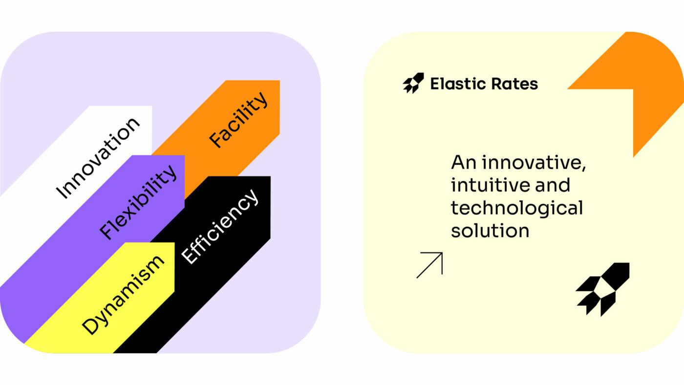
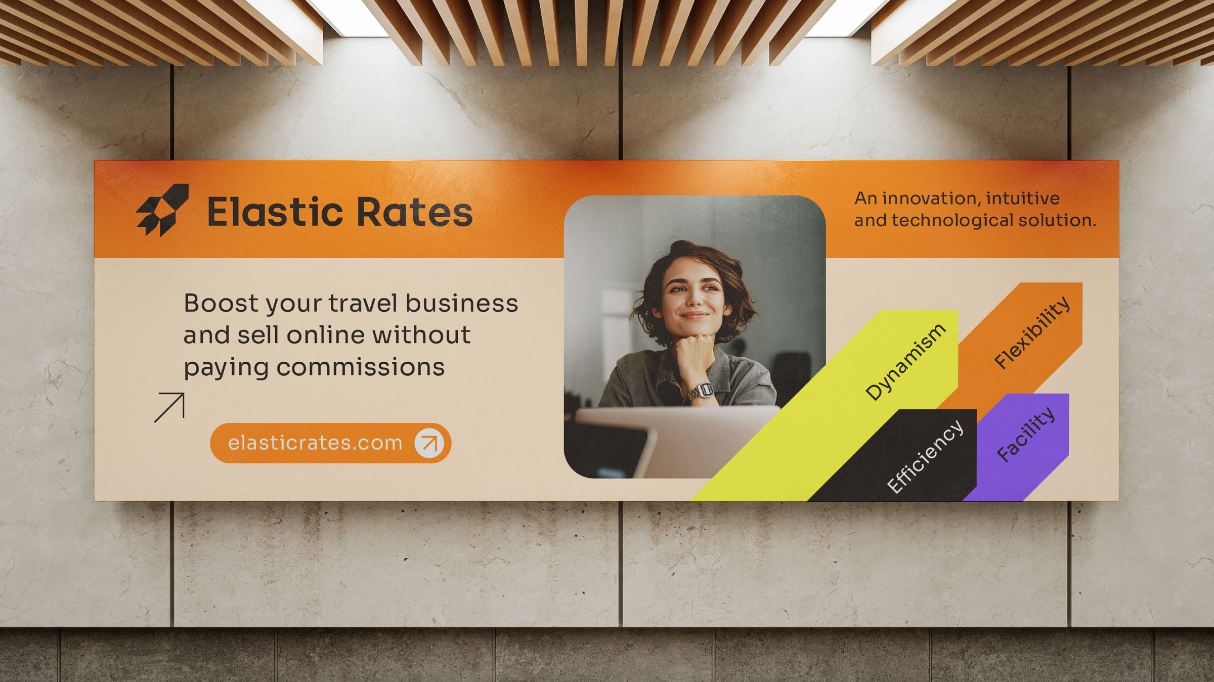
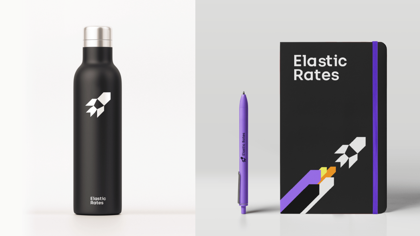
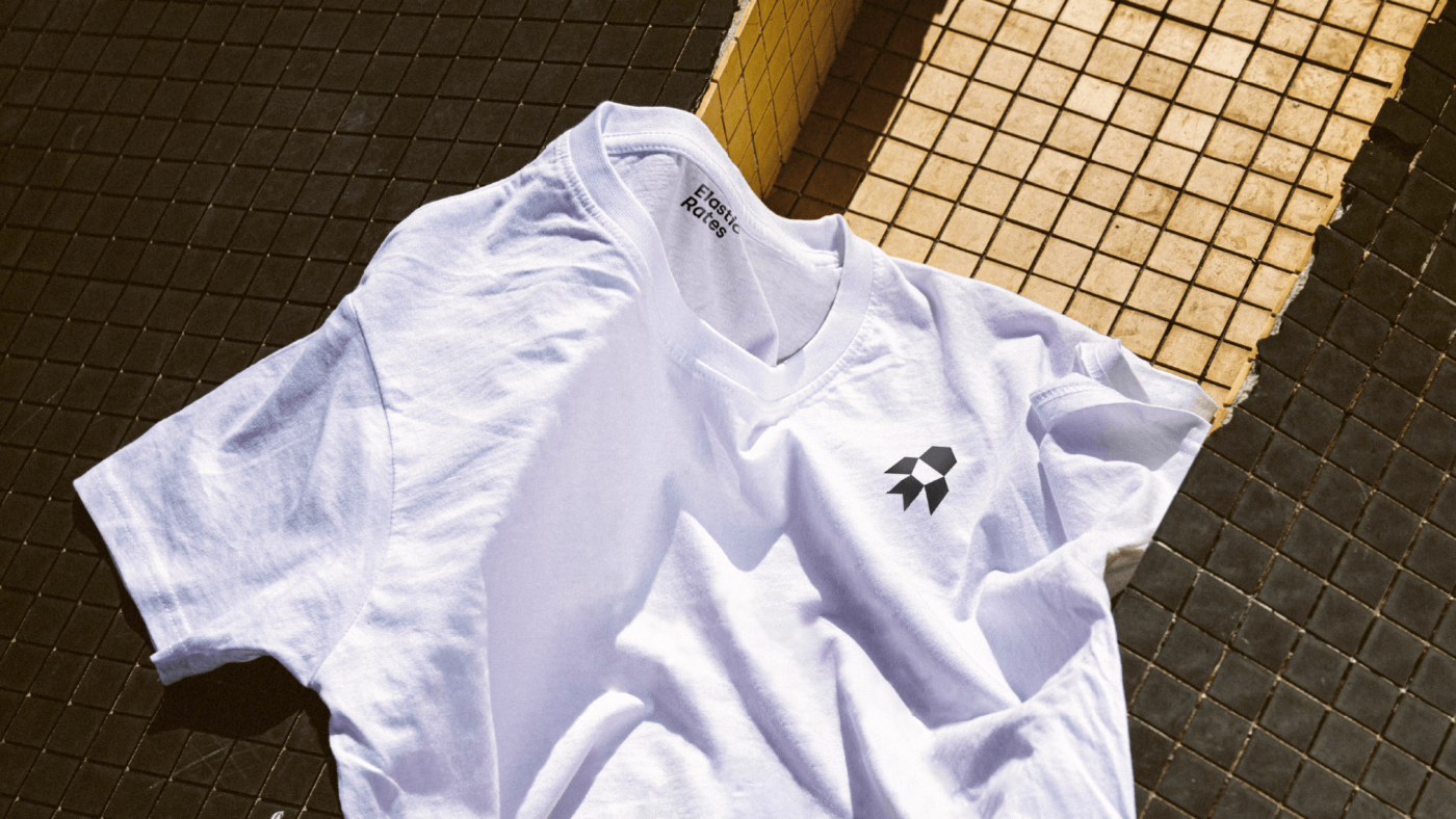
An image that builds on the rocket as a symbol of impulse, innovation and progress, becoming the icon of Elastic Rates.
Its angles give us a sense of take-off and launch, creating a spatial environment that enhances the technological aspect of the brand and propels us forward through collaboration. An innovative icon as a key element of the brand that reinforces its purpose and facilitates its recognition in any context.
The trails given off by this rocket become a prominent graphic element of the brand’s language. Formed with the corporate colors, they represent the flexibility, dynamism and impulse that define Elastic Rates. The iconography is built with digital resources and in accordance with the virtual context of the brand, inviting user interaction.
The visual ecosystem expands through different media and environments, beyond the tool itself. The website presents an intuitive, clean and clear image, with content that connects directly with the user from a close and human approach. On mobile devices, the graphics are created to communicate the benefits of the tool and the help it offers to its clients.
/ RESULT
A recognizable and appropriable visual identity for Elastic Rates that effectively reflects its value proposition, highlighting its advanced technology to support its customers on a daily basis.
We use cookies on our website to give you the most relevant experience by remembering your preferences and repeat visits. By clicking “Accept”, you consent to the use of ALL the cookies.
This website uses cookies to improve your experience while you navigate through the website. Out of these, the cookies that are categorized as necessary are stored on your browser as they are essential for the working of basic functionalities of the website. We also use third-party cookies that help us analyze and understand how you use this website. These cookies will be stored in your browser only with your consent. You also have the option to opt-out of these cookies. But opting out of some of these cookies may affect your browsing experience.