When someone asks us, “How are you?” we often respond with “I'm fine,” almost on autopilot. But behind that “I'm fine” lie complex emotions, racing thoughts, and days that are more difficult than others.
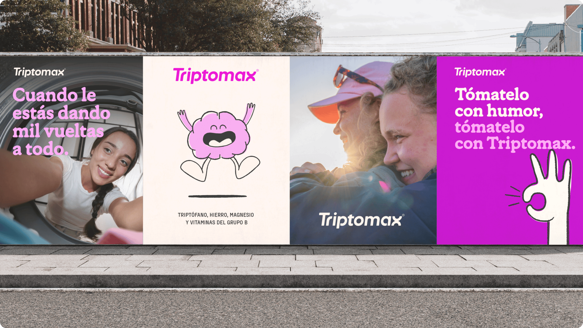
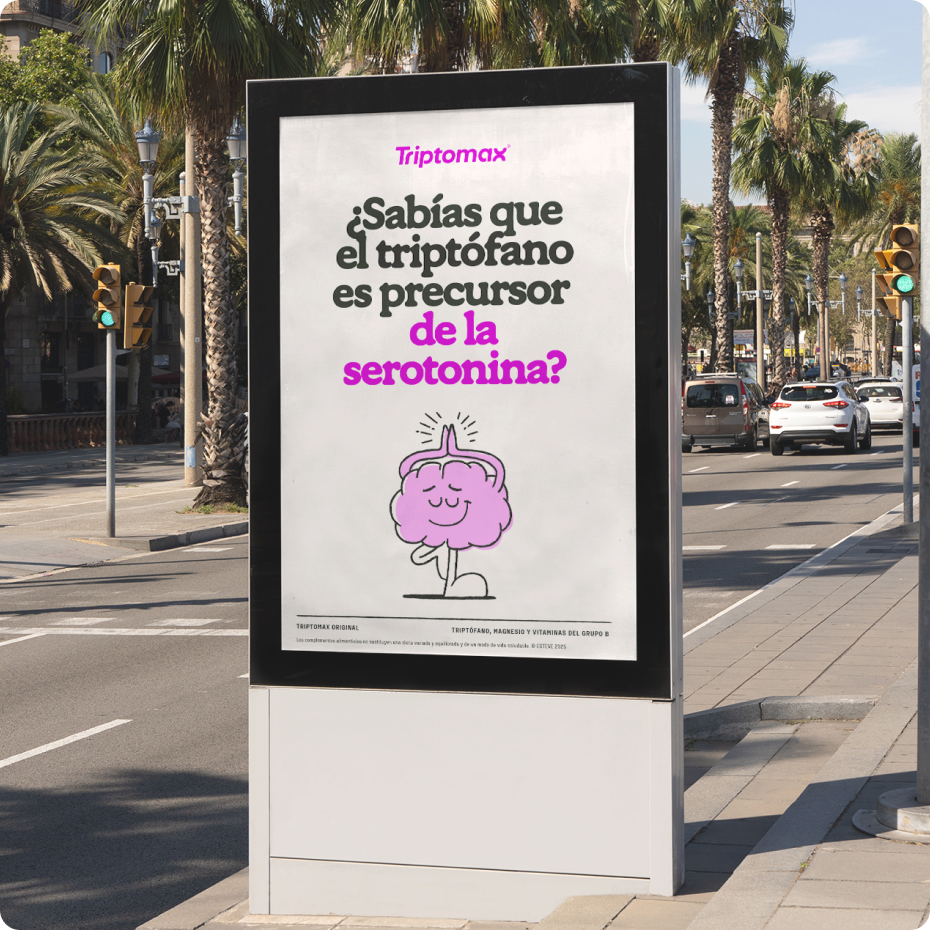
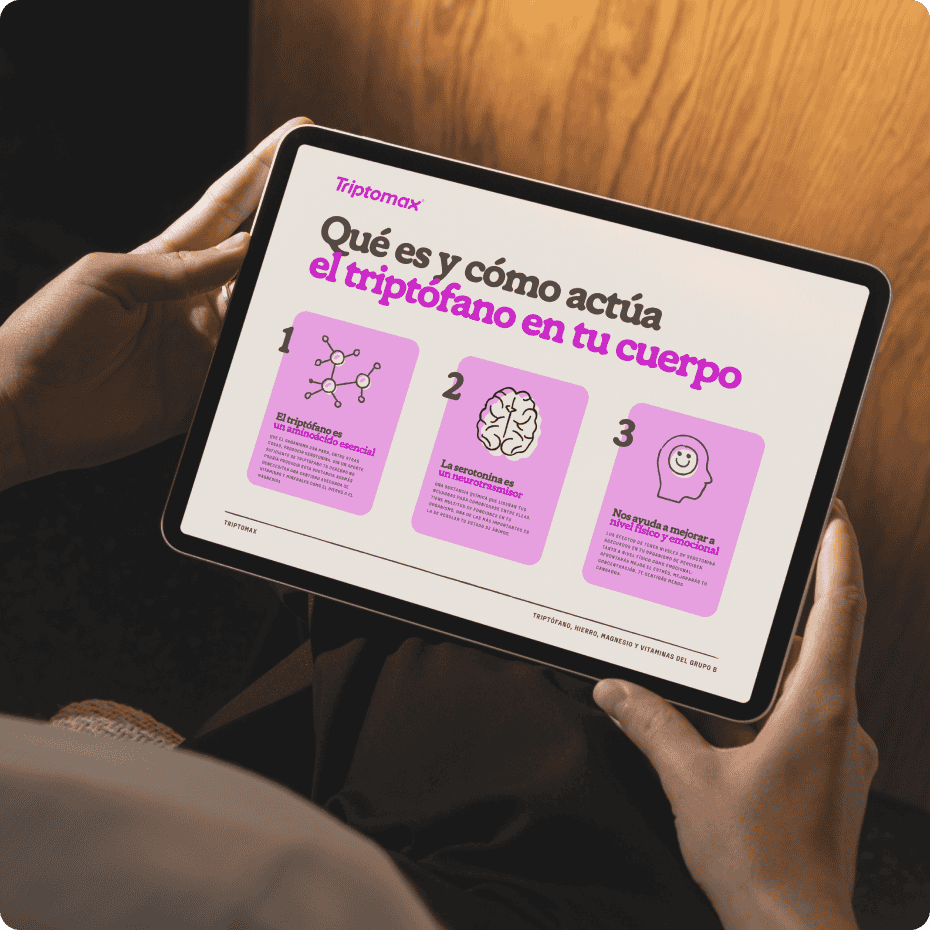
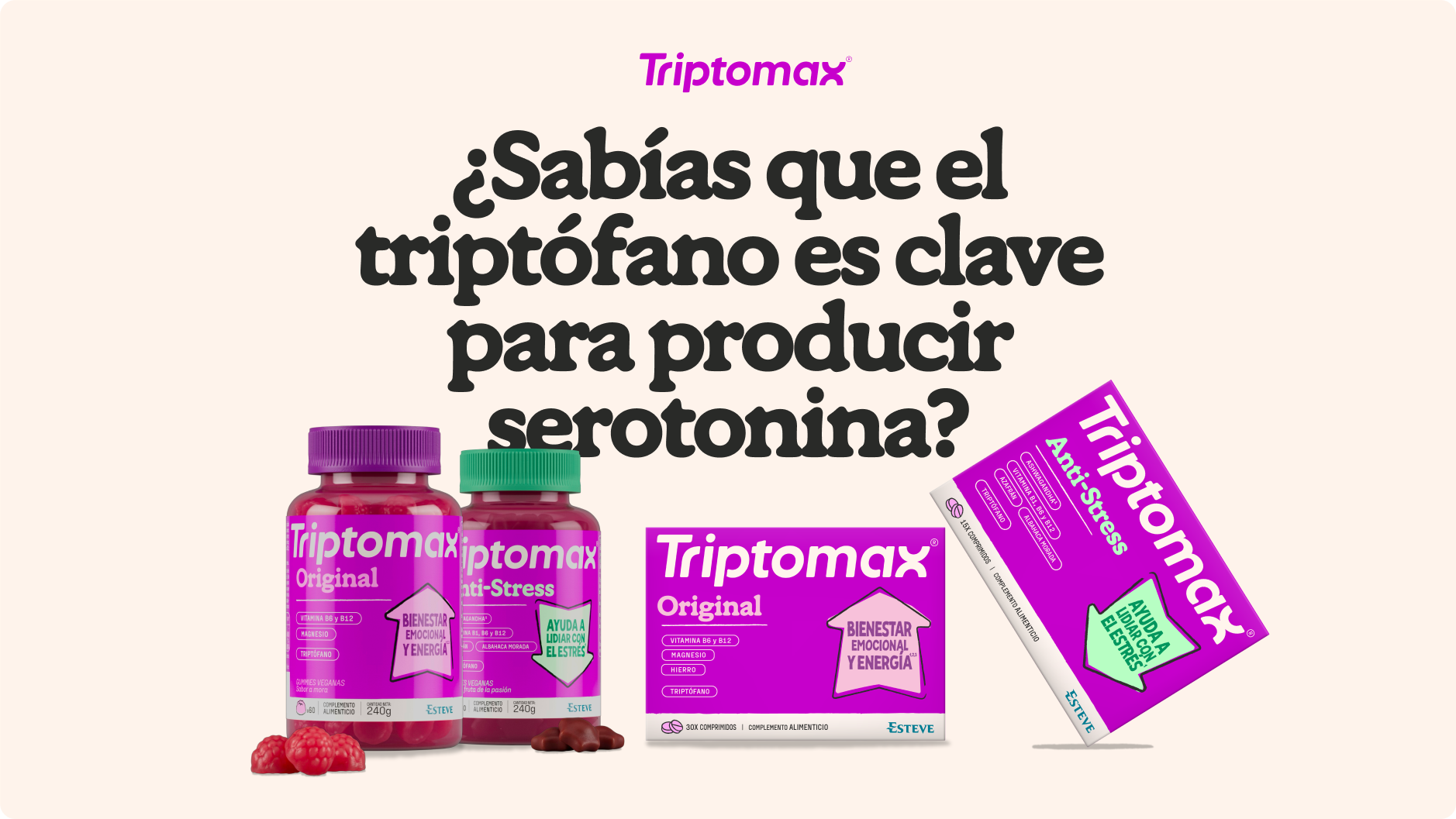
ESTEVE entrusted us with completely revamping Triptomax, its brand of natural supplements based on tryptophan, an essential amino acid that promotes emotional well-being and serotonin production. The challenge was to create an identity that broke with the scientific and cold codes of the sector and spoke about emotions in an authentic, approachable way, and, why not, with humor.
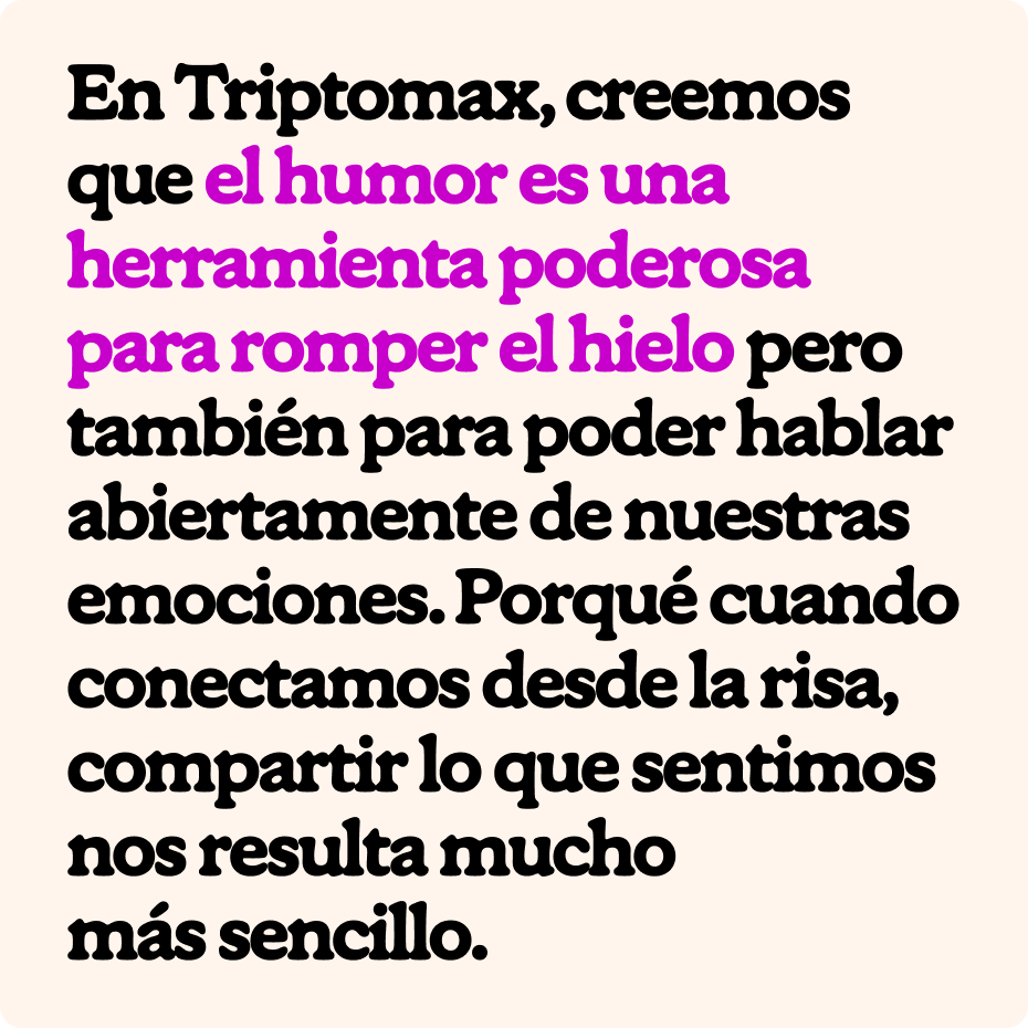
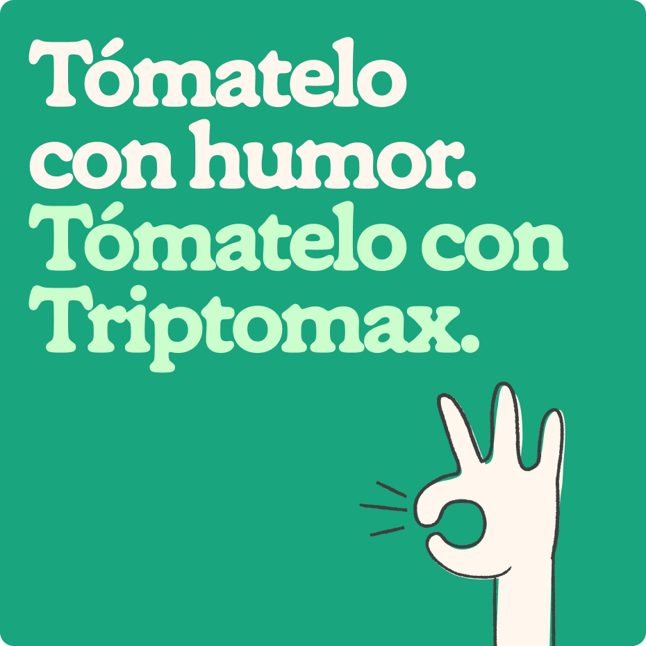
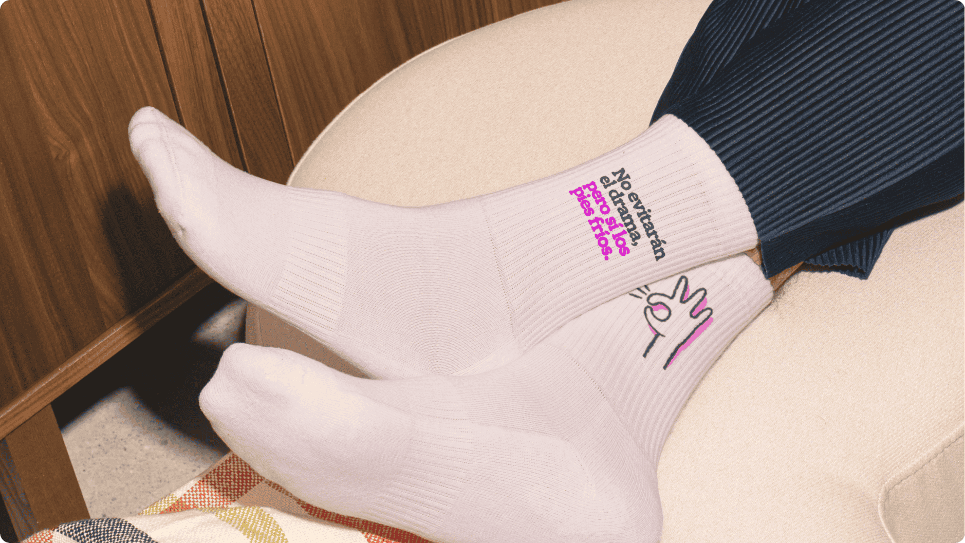
The strategy: to speak as we speak. We created an identity based on how we relate to our emotions today: sharing memes, putting things into perspective with humor, empathizing, knowing that we are not alone and that not everything is positive or negative. Because we are all our emotions, even those we sometimes don’t understand. That’s why we built a narrative that normalizes talking about complex issues such as mental health in a simpler and more relatable way.
The visual heart is Max, an illustrated brain that personifies our emotional world as it is: anxiety, stress, but also calm. Max appears in different moods and is the protagonist who guides communication, accompanied by an identity system that includes the revamped logo, a vibrant palette inherited from the brand’s iconic magenta, and a graphic universe designed to connect across networks, digital, and point of sale.
The result is a brand that dares to speak differently, normalizing conversations about emotional health and combining natural solutions with a deeply human narrative. Because sometimes, what we need is to be able to say that we are not always fine. And that it’s okay not to be.
/ Context
A story of success, leadership and innovation.
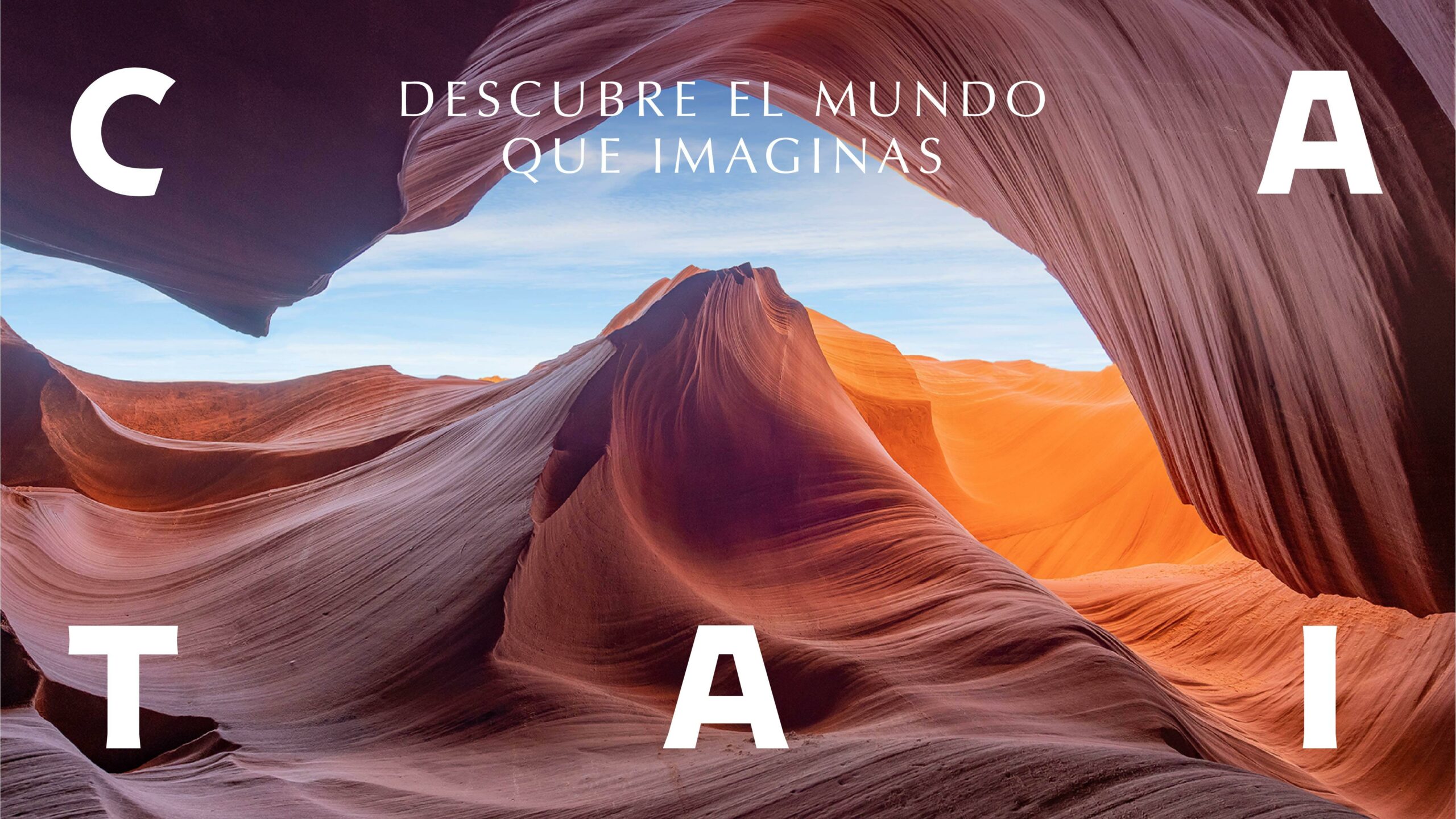
Ávoris Corporación Empresarial has entrusted CBA Design with the redesign of one of its most iconic brands, CATAI, as part of its transformation process. A strategic branding project that highlights the value of the brand’s journey based on imagination, innovation and distinction.
CATAI began its journey in 1981 by the hand of its founder Matilde Torres, who chose this name for her passion for the empires of Asia and the art they held. Her pioneering vision and more than 40 years of experience have positioned the brand as unique and inimitable. A story of success and leadership that embarks on a new journey: the launch of its new visual identity.
A true tribute to the dedication, in body and soul, to travel, discovery and curiosity.
A project meant to reinforce CATAI’s value proposition, gaining in consistency and establishing its own territory of expression. A solid narrative and visual identity, with a new graphic and semantic ecosystem that builds on the brand’s strategic pillars and activates them consistently.
/ VISUAL IDENTITY
“Descubre el mundo que imaginas” – Discover the world you imagine – is the core message to drive the new strategic platform. A fundamental concept in the definition of the brand image, which is reflected in all aspects of the design. This new language is articulated from the creation of a strong logotype, creating a global identity system.
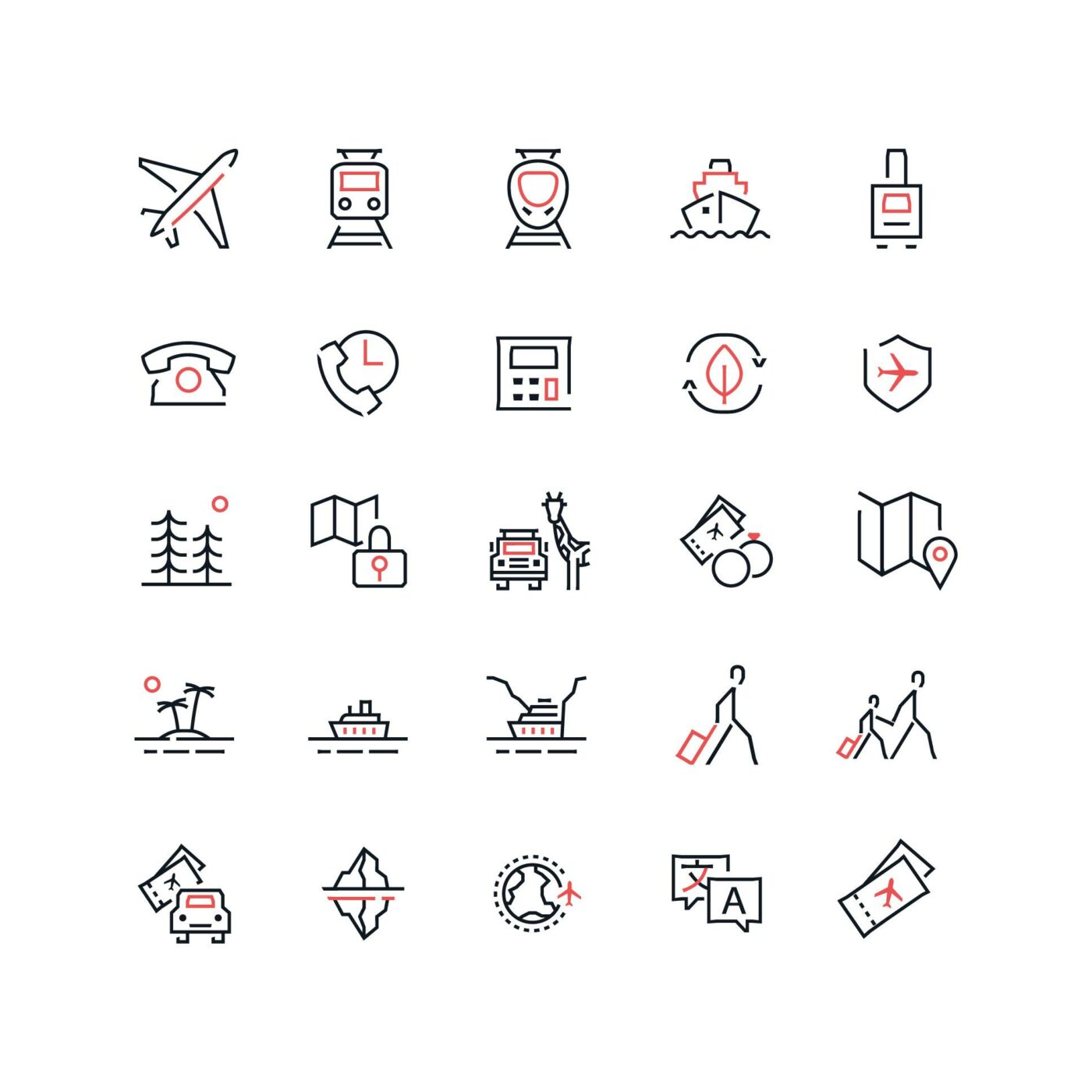
CATAI’s complementary codes, typographic and iconographic styles, colour palette and photographic proposal acquire greater prominence and expand dynamically throughout all the touch points between CATAI and its travellers.
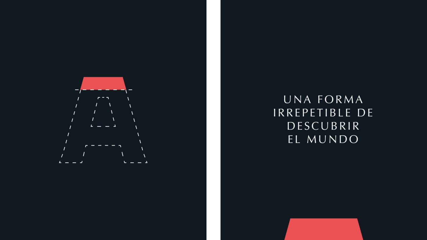
A typographic style whose serif and simple shapes take us to a more premium and elegant world. Along with the ornaments built from the logotype, we give the brand a unique personality and recognition, both through the typographic gestures and the editorial style.
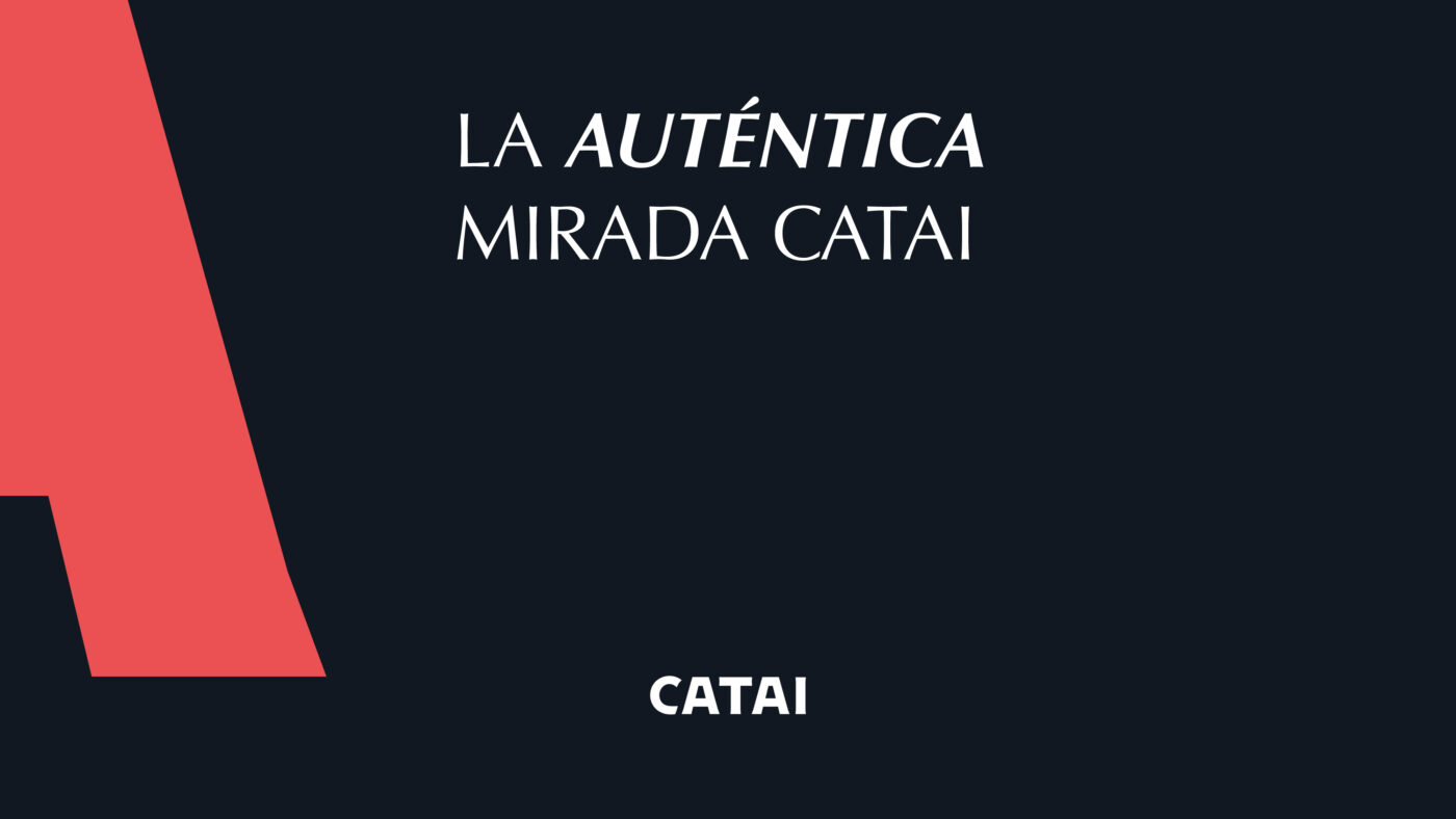
/ A UNIQUE GAZE
A collaboration that enhances and highlights the brand's photographic style as its core strategic focus in visual communication.
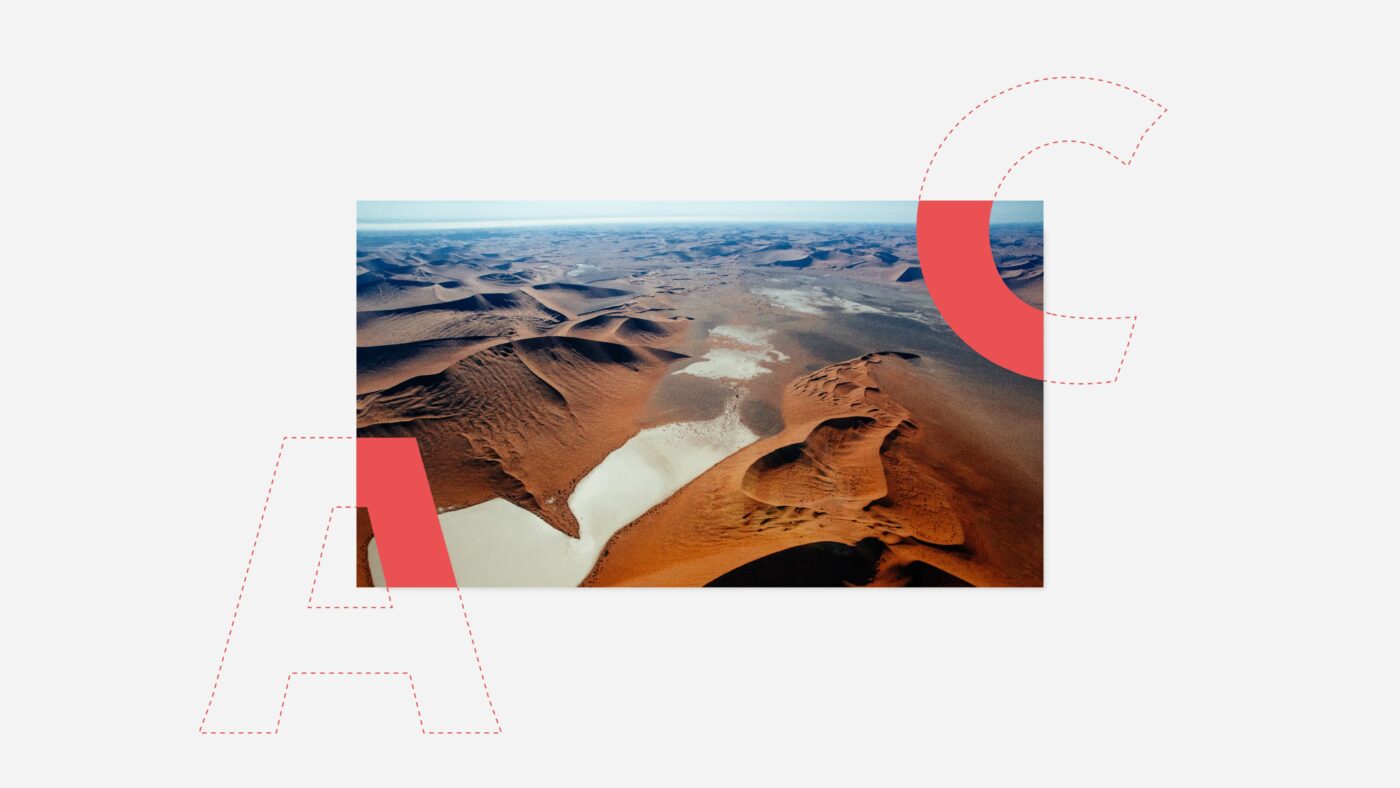
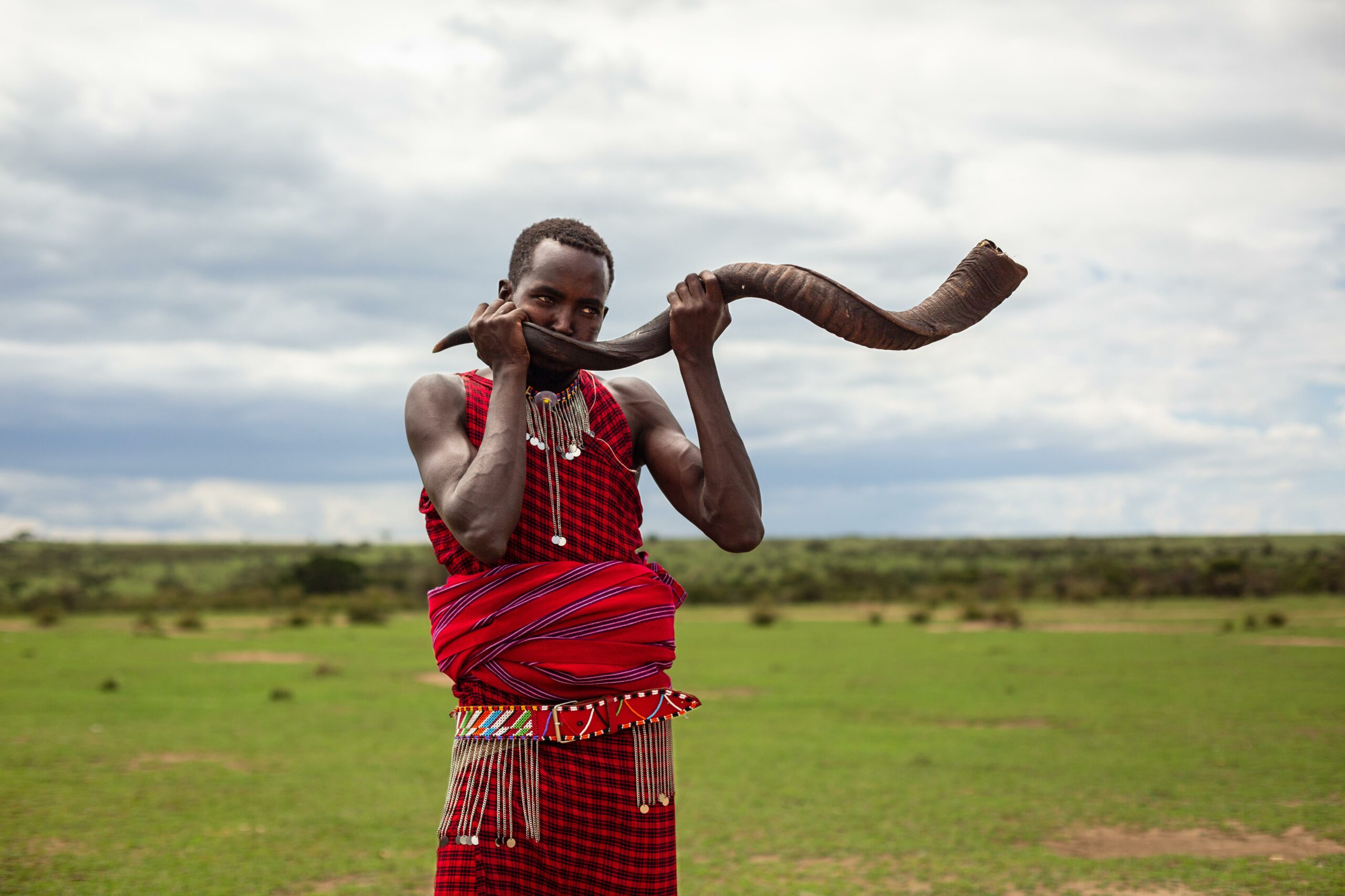
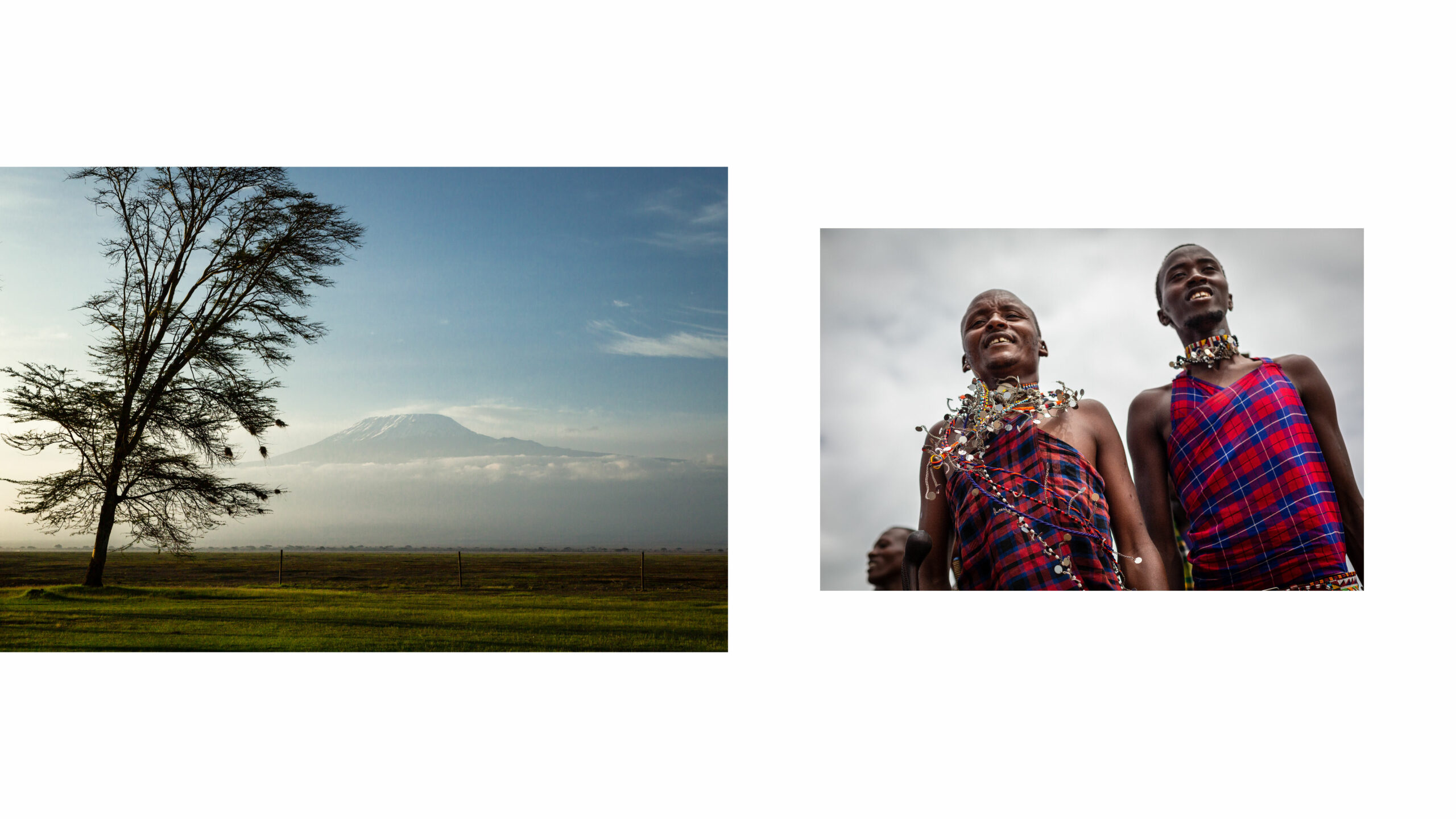
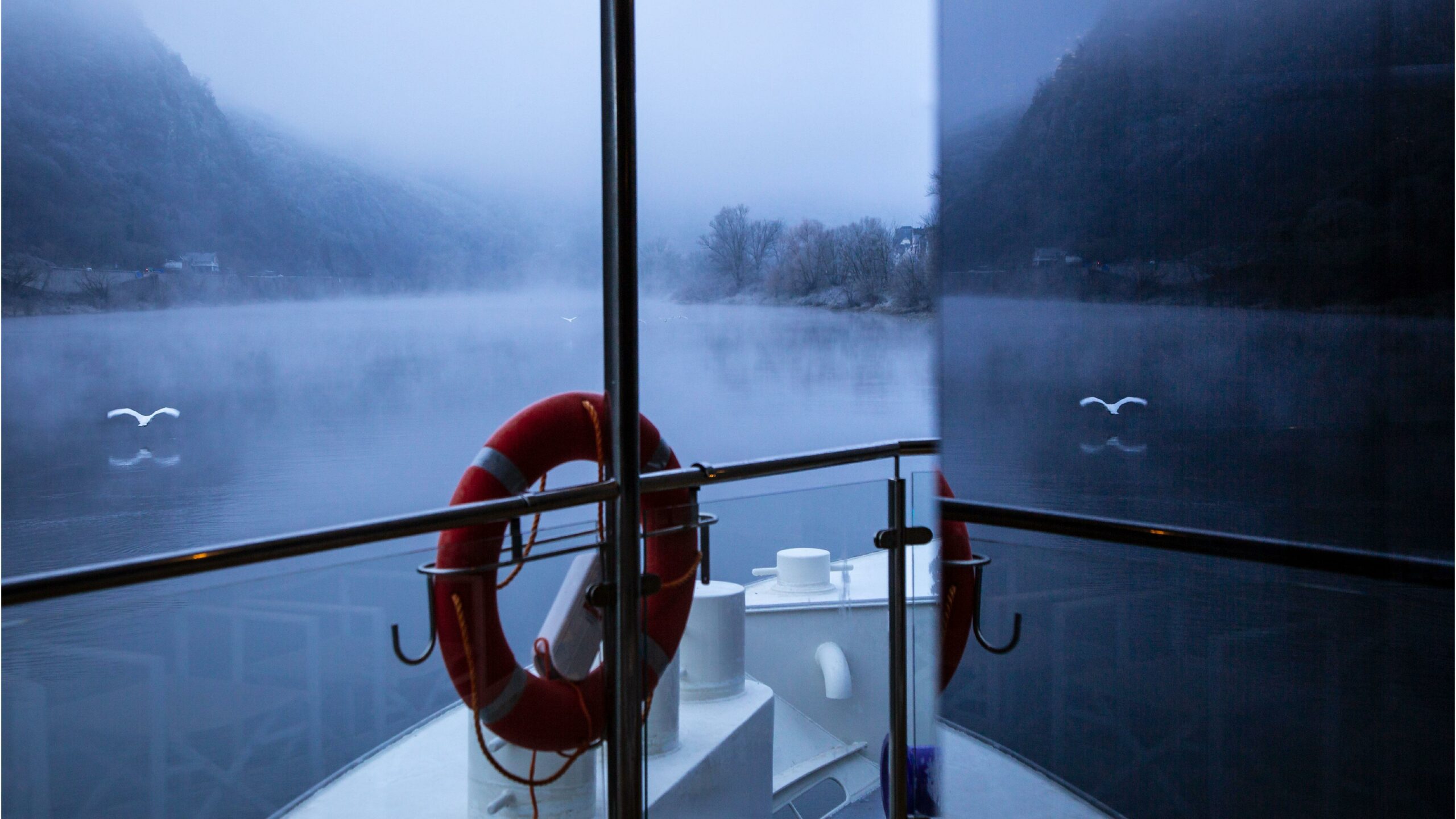
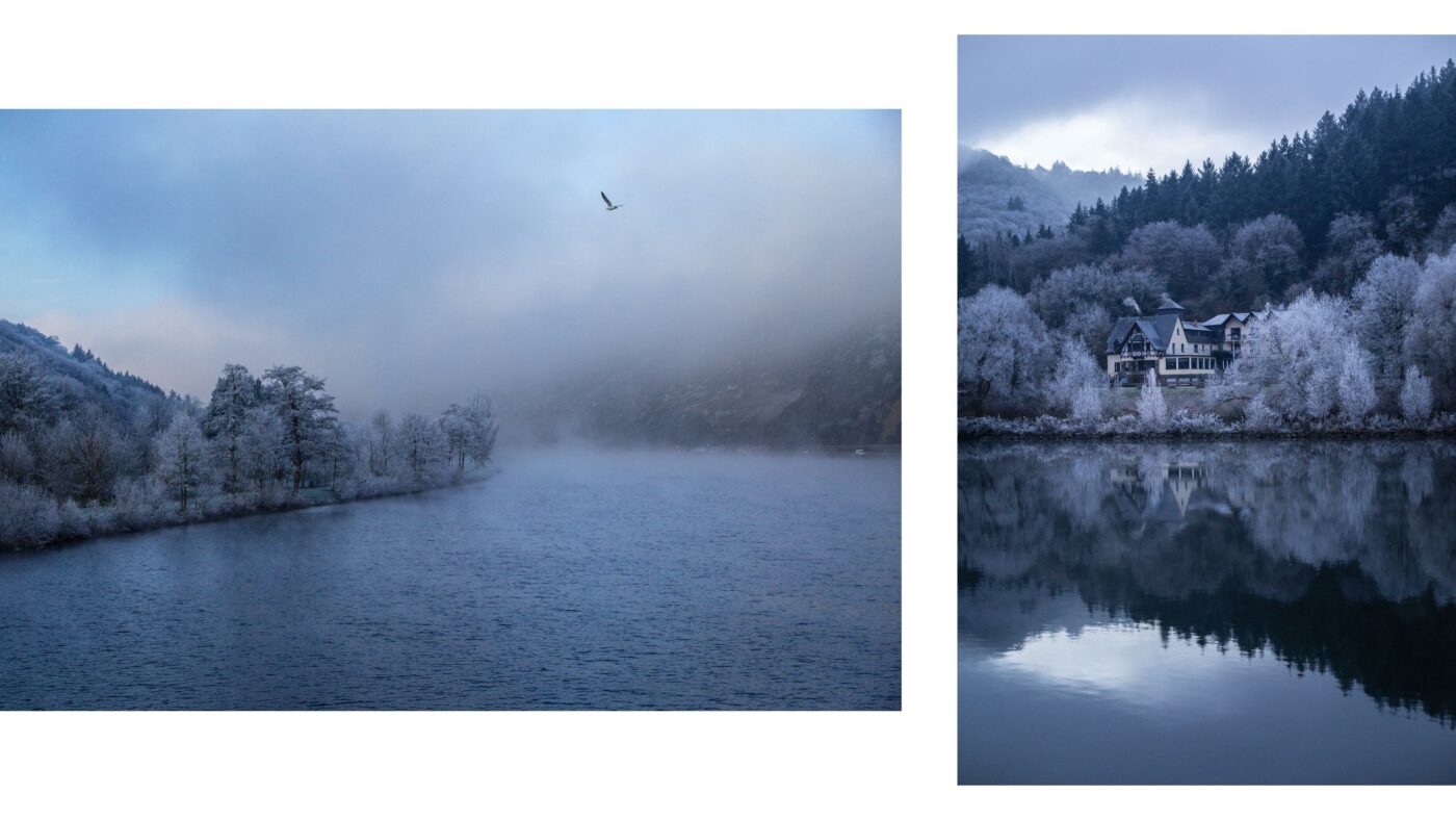
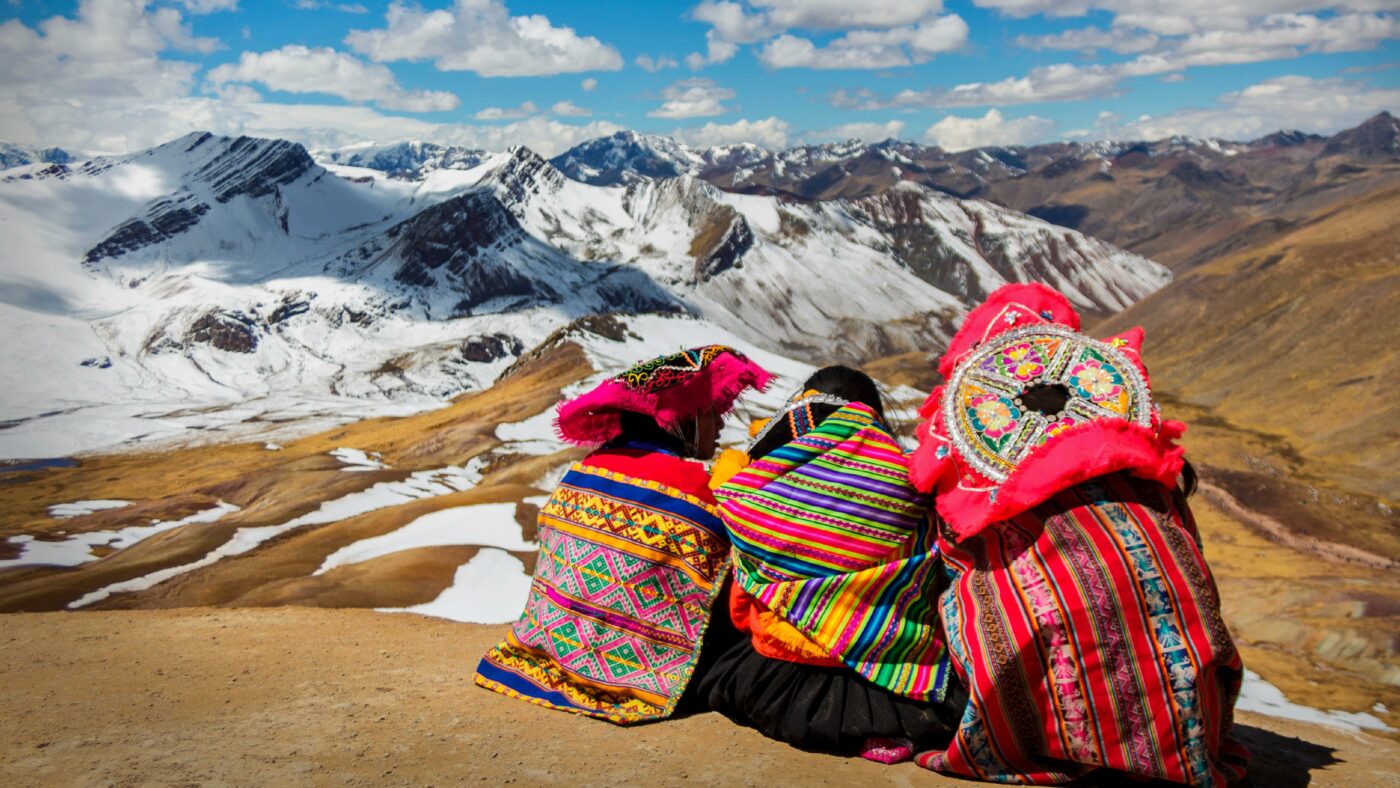
Part of this strategy involves a collaboration with the documentary photography specialists The Raw Society, in order to capture exclusive images from the authentic CATAI gaze. The result is an immersive imagery that allows a genuine connection with each destination.
/ ART DIRECTION
Images that tell stories.
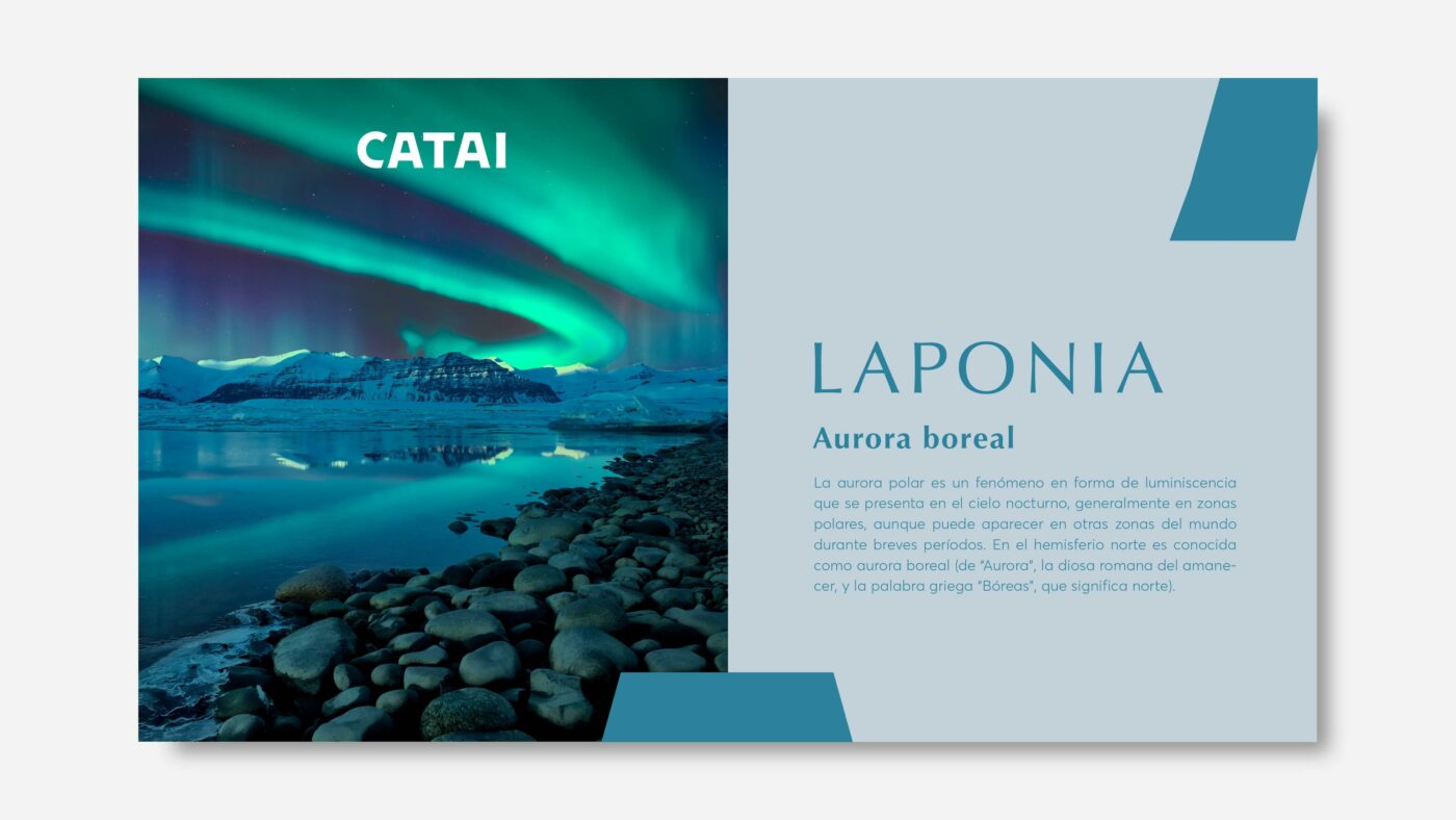
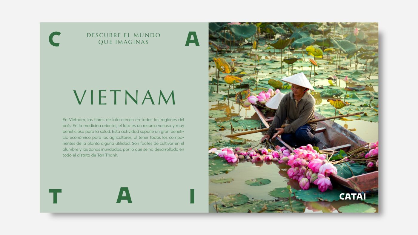
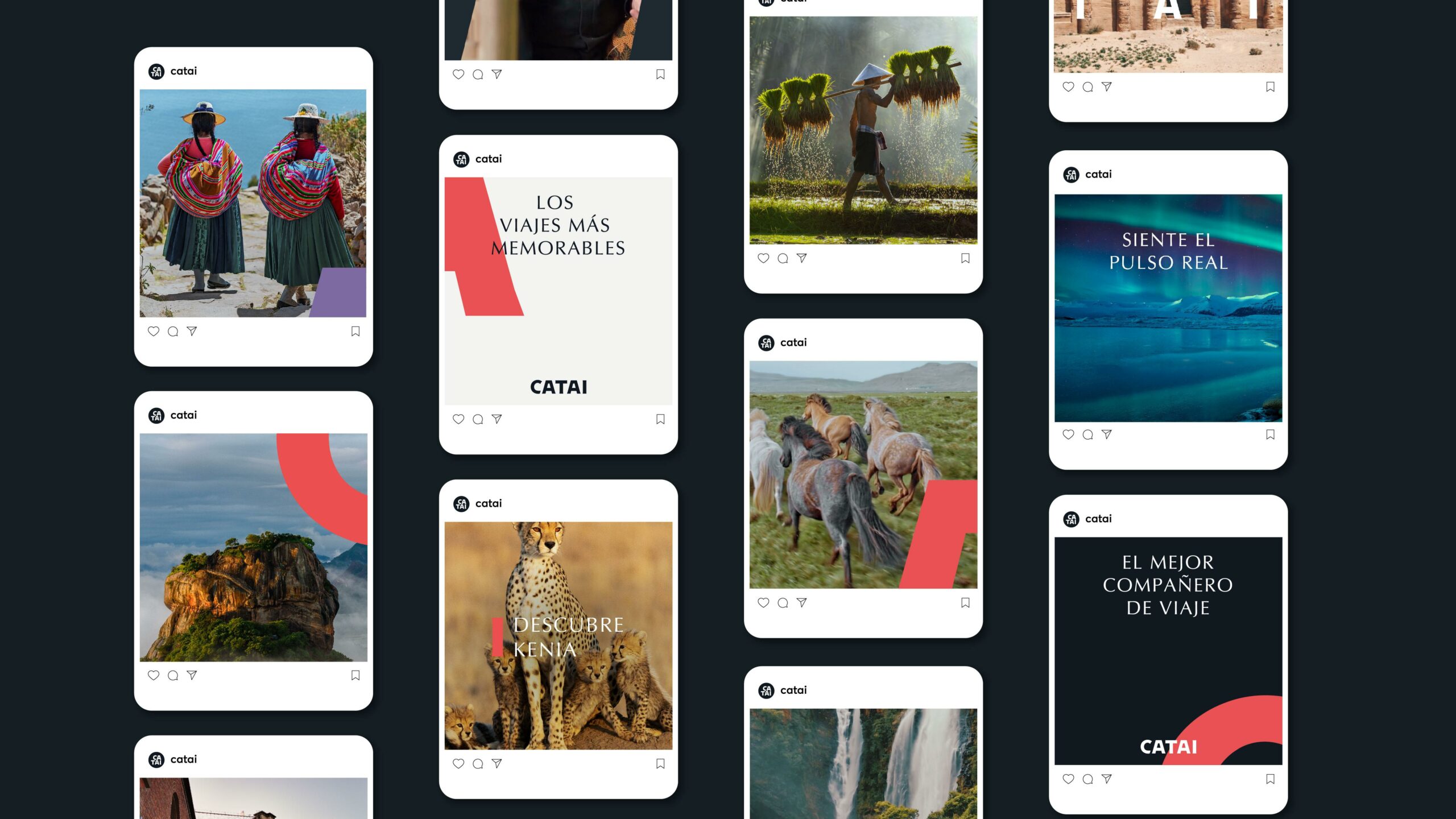
The entire visual imagery of the brand, both in digital and editorial style, is built under the concept of the CATAI gaze. An authentic, passionate and committed vision that allows us to observe the world from unique perspectives.
Images with natural and balanced colours, where the clarity and contrast between lights and shadows convey a sense of reality and connection with the destination.
The best travel companion.
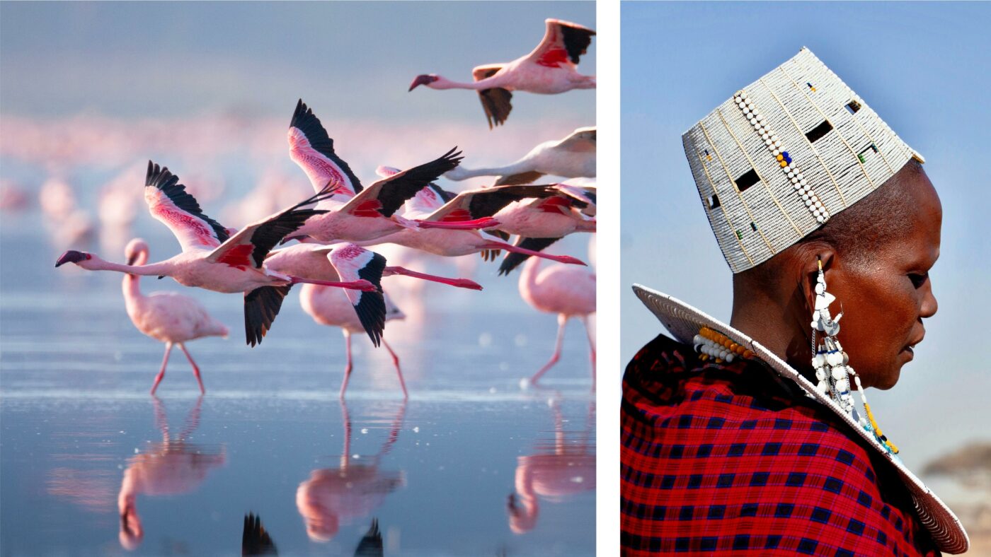
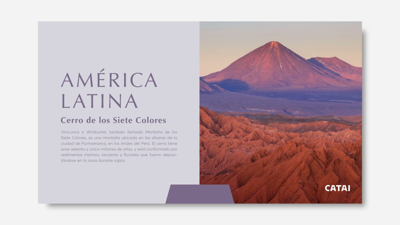
In order to transmit CATAI’s wide experience and expertise, we have extended the chromatic palette by clustering the different destinations into different colours according to geographical areas. By doing so, we achieve a chromatic harmony between the different elements and provide flexibility and versatility to the brand, in a consistent way.
In the digital environment, both on social media and on the website, the brand takes on a life of its own thanks to its powerful visual imagery and graphic language.
A new identity for CATAI that enhances the legacy of a pioneering woman in the industry, its founder. A project that has allowed us to build a relevant brand image with a highly emotional tone, adding new meanings to the word design and its relationship with people.
With this redesign, CATAI positions itself as the best travel companion. A vision that pays tribute to its roots and highlights everything that makes it a committed and innovative brand.
/ Context
Vacations without worries at everyone's reach.
Travelplan is an established tour operator with more than 30 years of experience in the travel industry, accompanying its clients closely on each of their trips. However, the brand lacked a solid strategic platform and its own distinctive personality.
Therefore, Travelplan has entrusted CBA Design to carry out a strategic branding work, enrich its brand narrative in a consistent way and relaunch the brand with a renewed image that reinforces its value proposition.
/ STRATEGY
The new positioning becomes the core of the new visual identity system.
The project takes off with a deep strategic work with the aim of repositioning Travelplan as the leisure expert that helps you enjoy your vacation without complications, offering a wide variety of options within the reach of any pocket. A comfortable option so that traveling is synonymous of enjoying with your family and friends.
We have worked on the creation of a brand platform, defining its positioning, personality and values. A strategic proposal where inclusion and accessibility take center stage in the story. Travelplan believes that travel should be within everyone’s reach, putting enjoyment and peace of mind at the center of all decisions. A close, open and dynamic brand
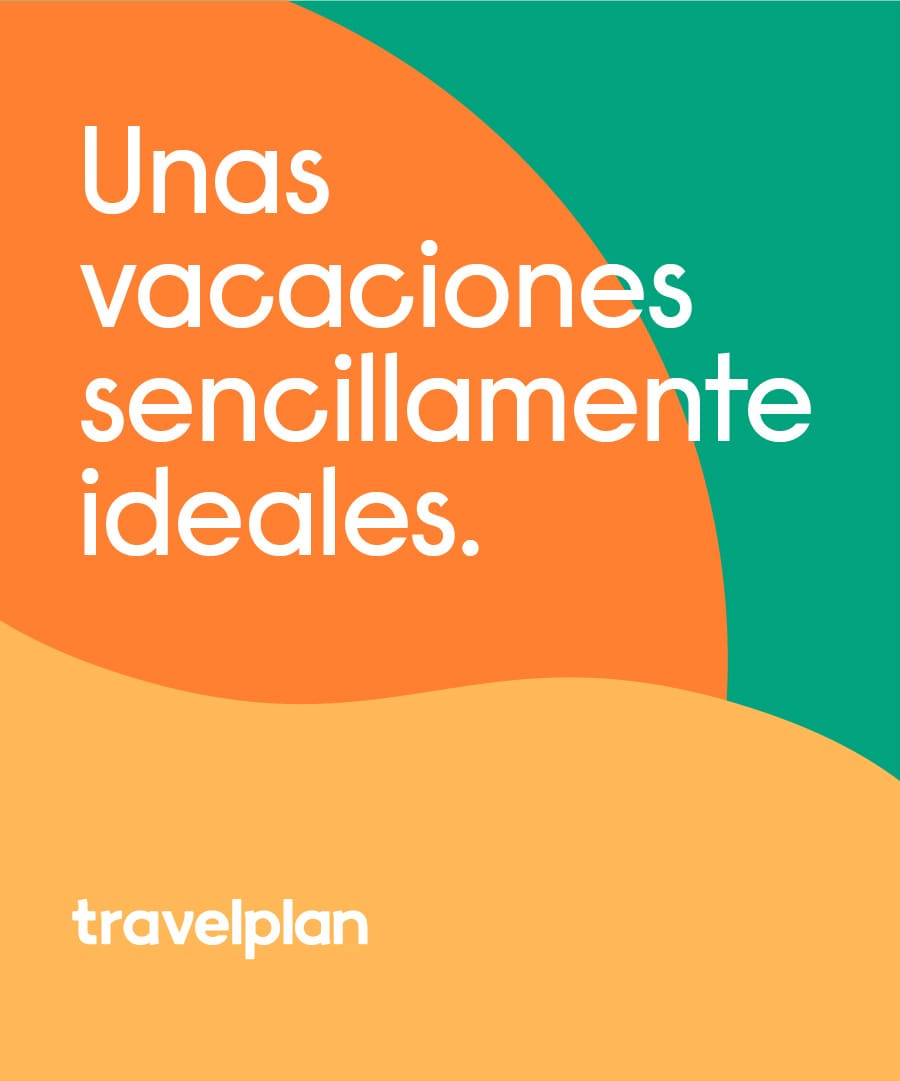
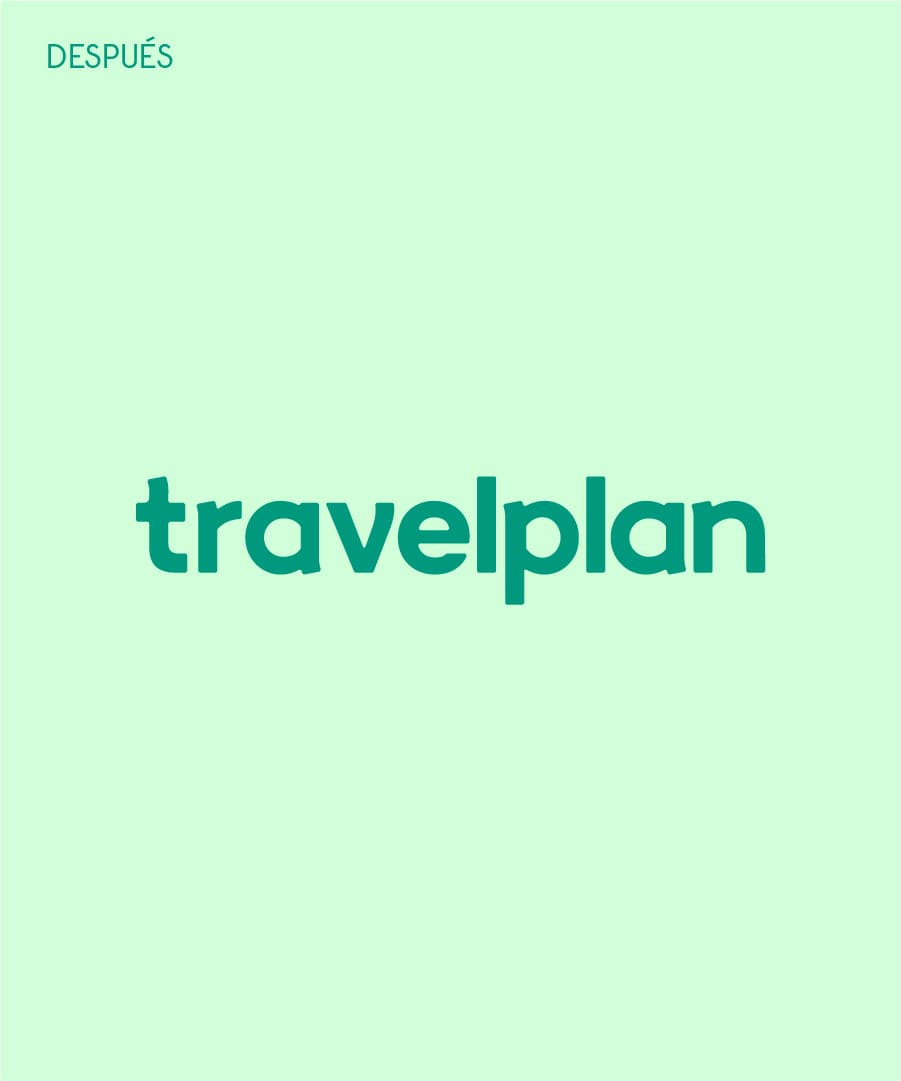
The strategic repositioning is expressed, first of all, through the brand’s most representative element, its logo. It demonstrates the trust and closeness that Travelplan offers by opting for a friendlier construction, working with rounded and organic shapes, and evolving from red to green. A design decision that moves the brand to a more contemporary and modern space.
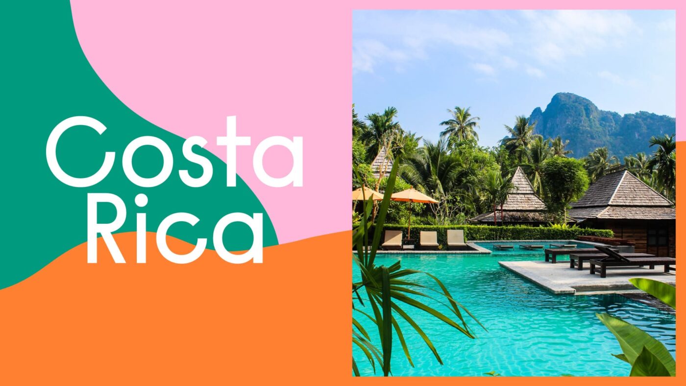
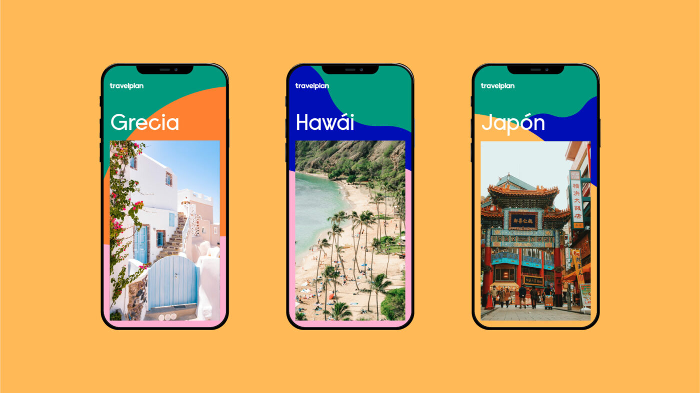
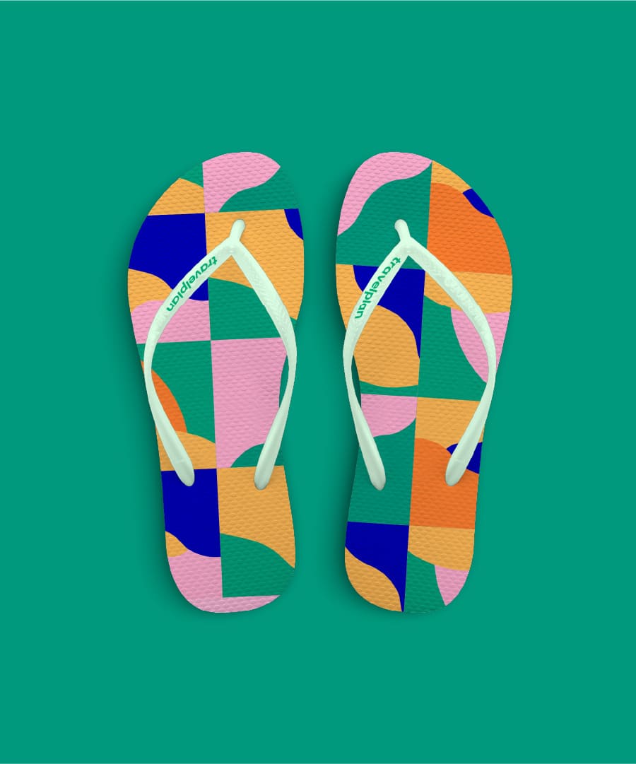
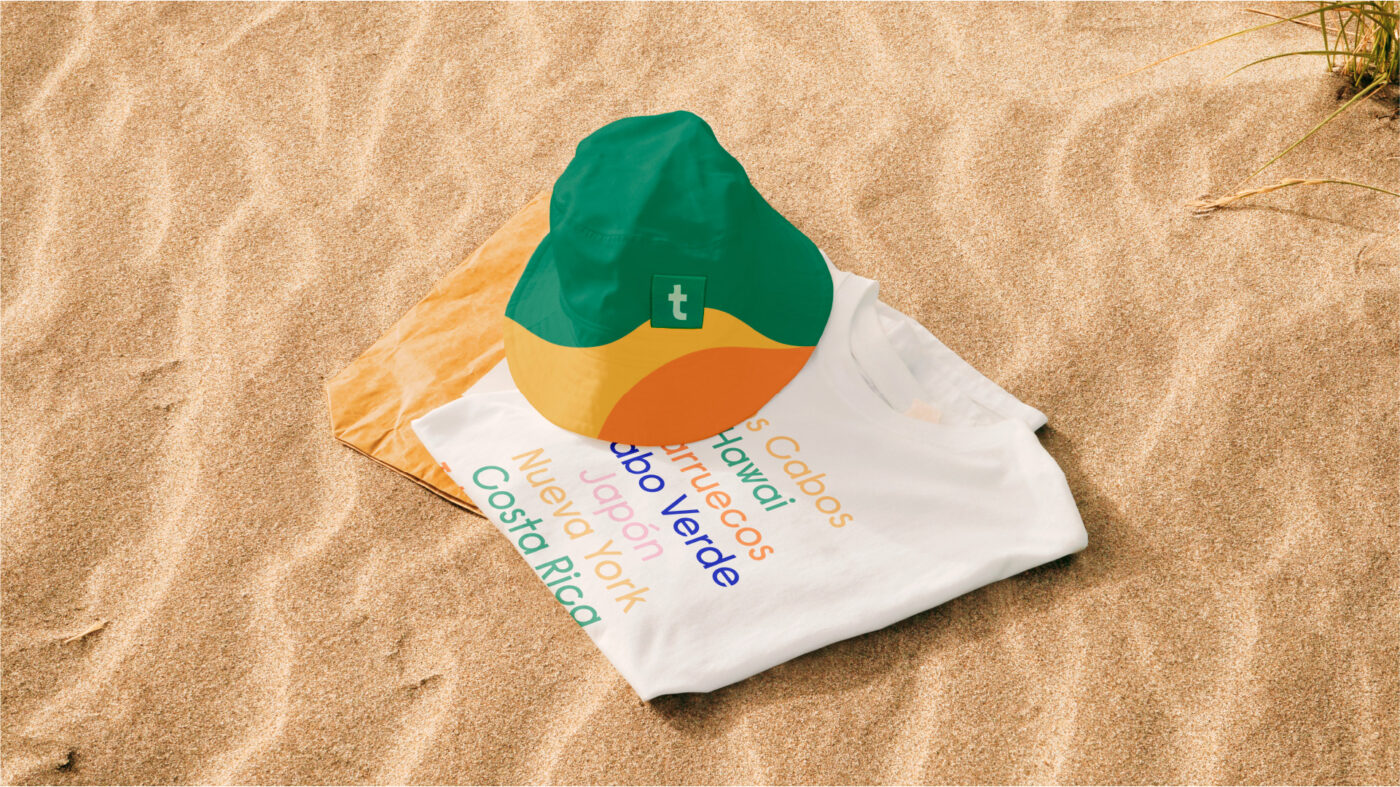
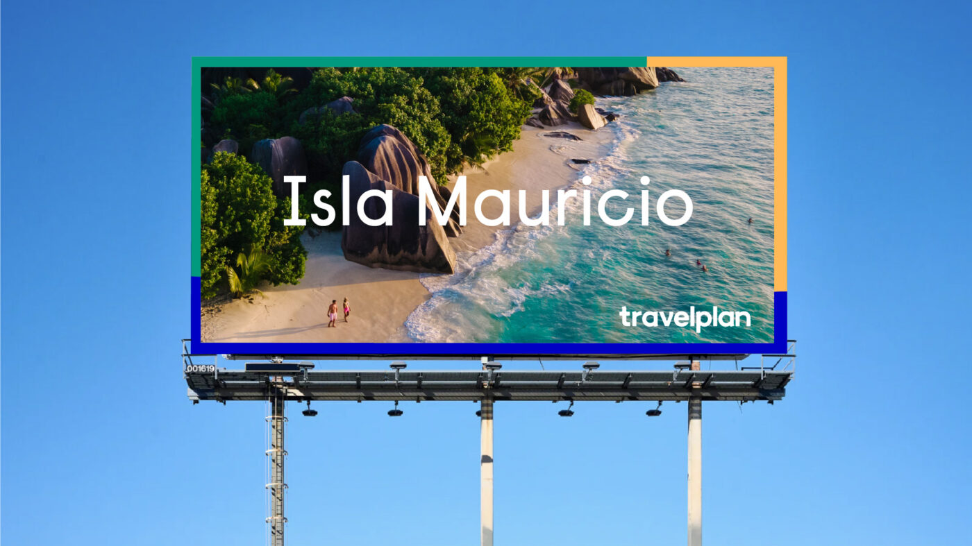
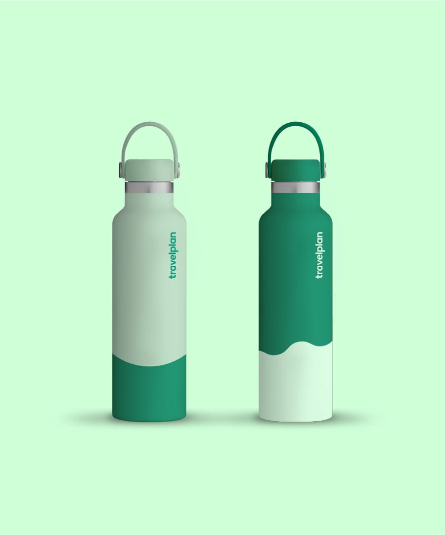
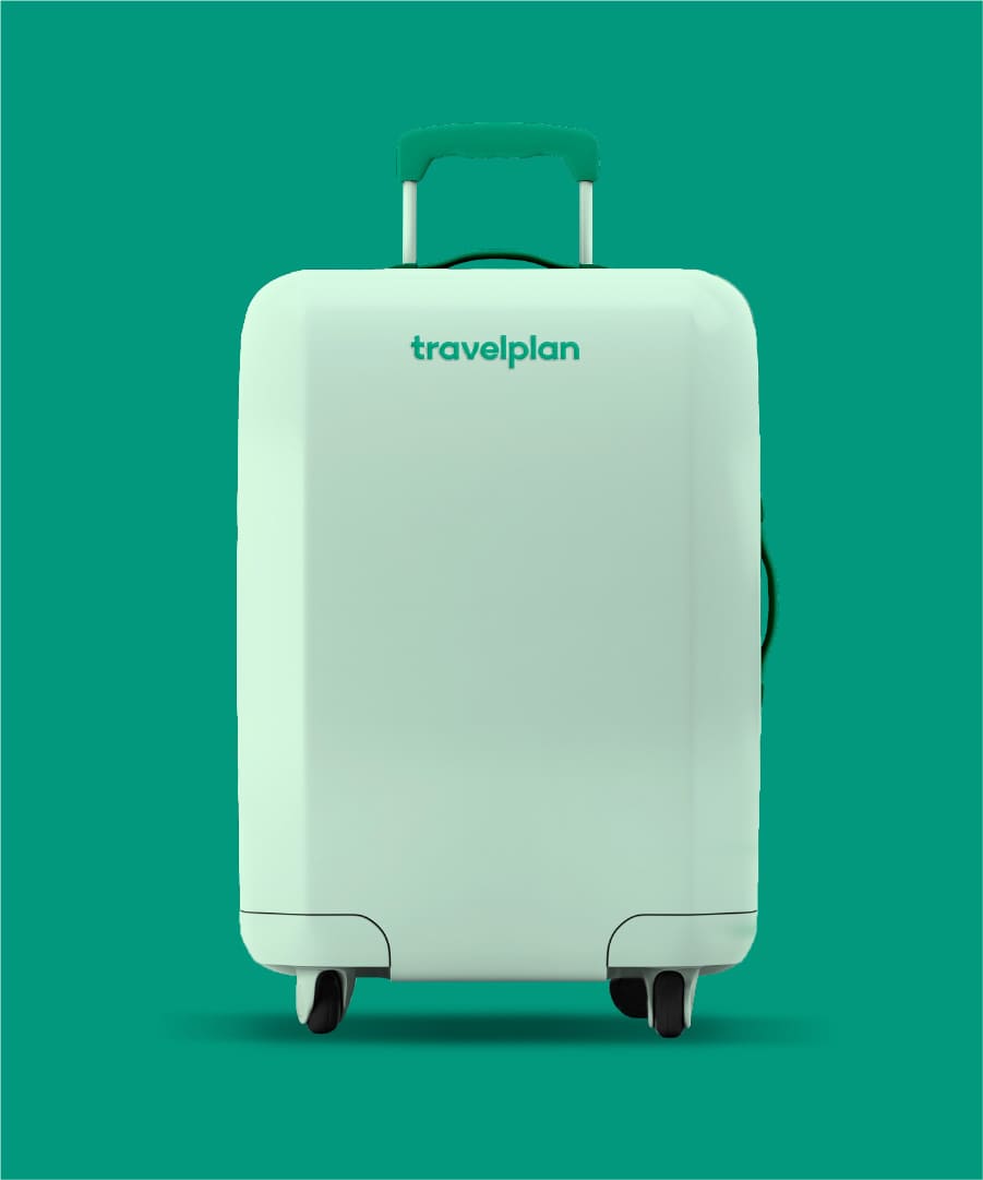
/ VISUAL IDENTITY
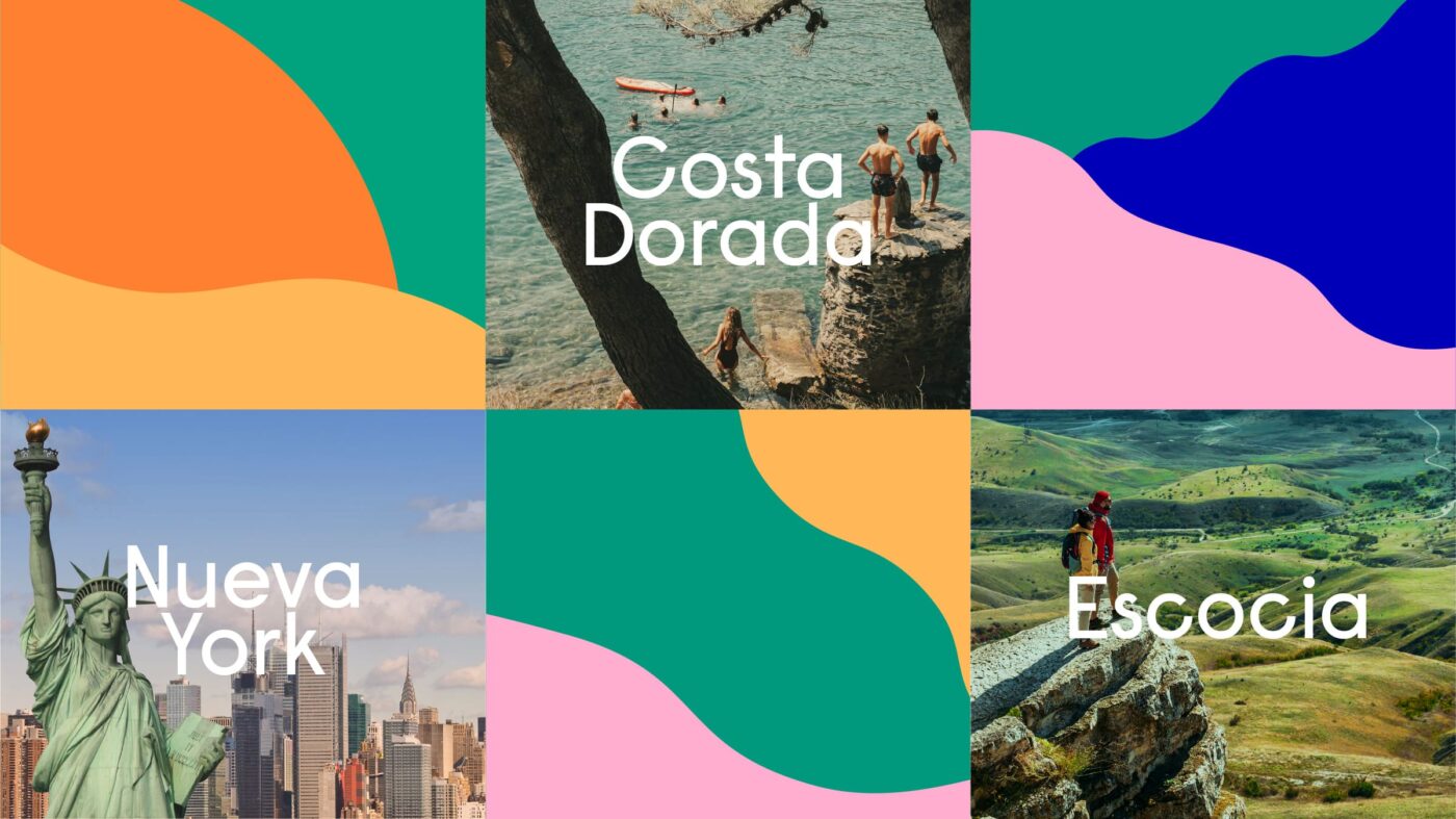
A proposal that seeks to reflect the versatility of the brand and highlight its infinite range of possibilities.
From the construction of the new logo, and in line with the strategic platform, a flexible and dynamic visual identity system was developed.
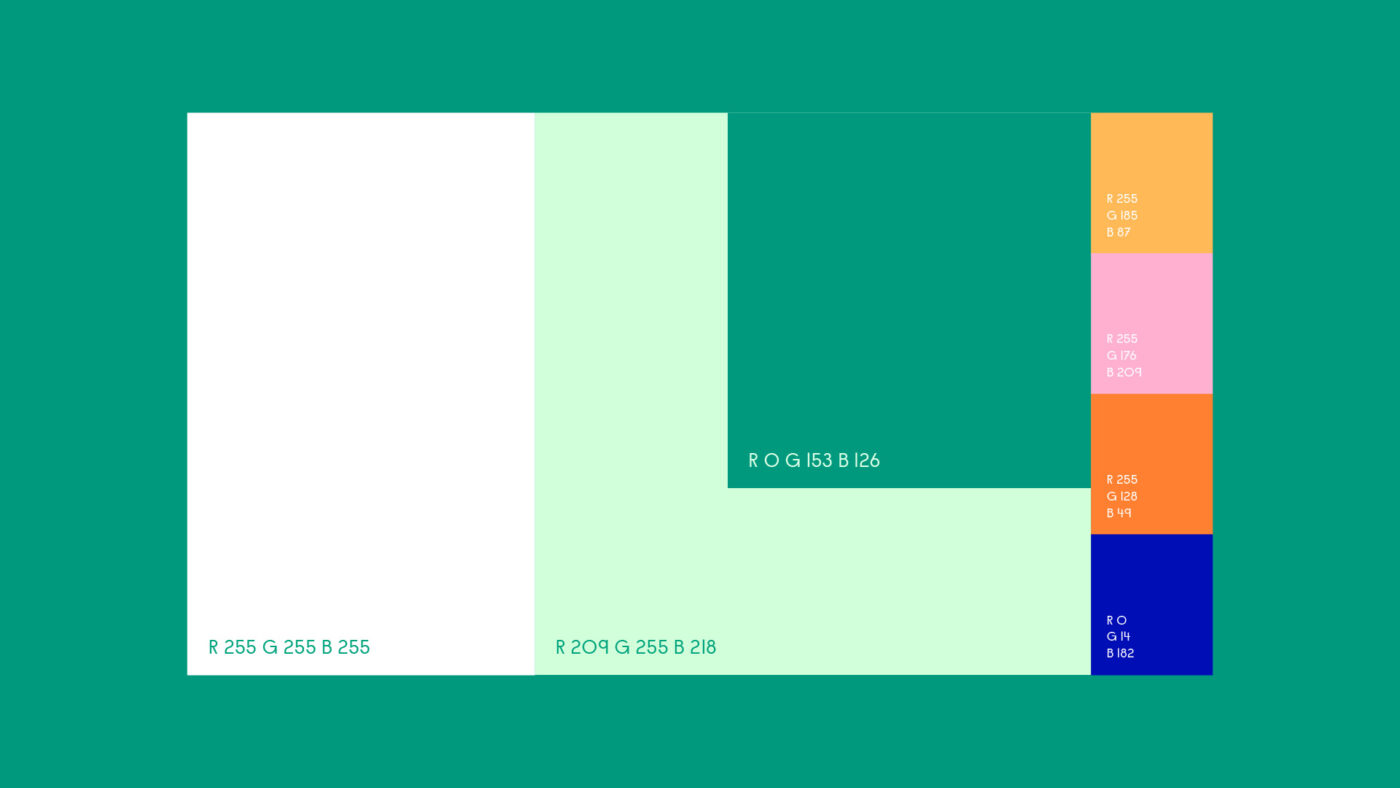
A new language where typographic, chromatic and iconographic resources take us to that moment of enjoyment and vitality.
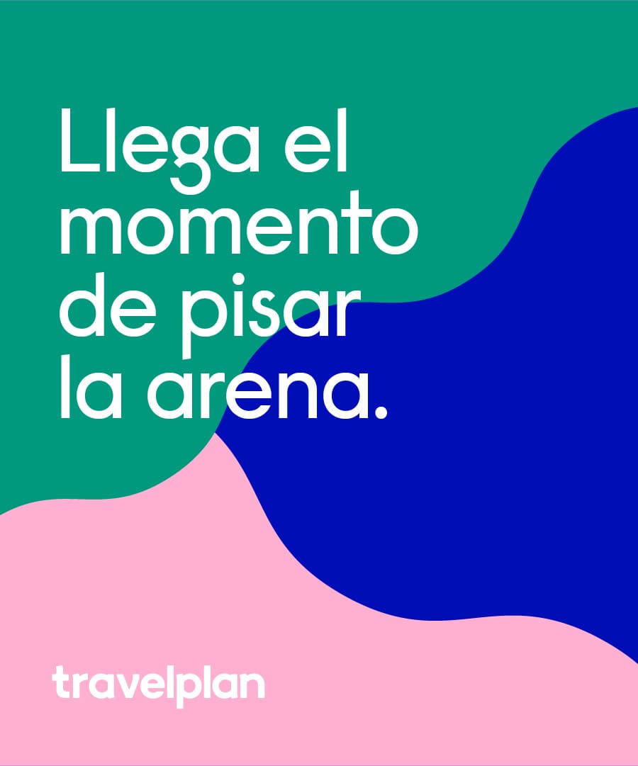
A renewed brand that celebrates the vitality and joy of a simply ideal vacation.
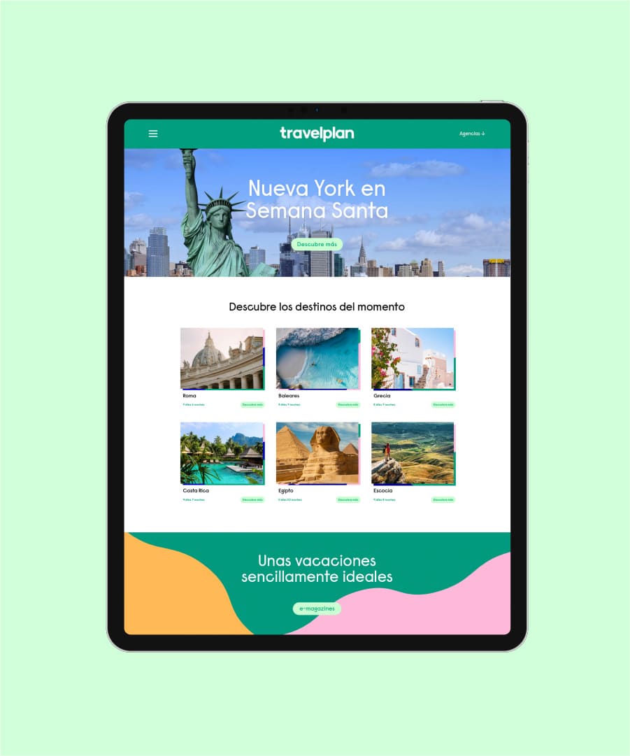
An identity system that expands consistently in its editorial and digital application, giving the brand the space it needs to develop its new narrative.
Overall, the new image is a clear expression of the optimistic and relaxed holiday spirit that Travelplan represents and offers.
We use cookies on our website to give you the most relevant experience by remembering your preferences and repeat visits. By clicking “Accept”, you consent to the use of ALL the cookies.
This website uses cookies to improve your experience while you navigate through the website. Out of these, the cookies that are categorized as necessary are stored on your browser as they are essential for the working of basic functionalities of the website. We also use third-party cookies that help us analyze and understand how you use this website. These cookies will be stored in your browser only with your consent. You also have the option to opt-out of these cookies. But opting out of some of these cookies may affect your browsing experience.