Ten years have gone by from when Kevin Systrom, co-founder of Instagram, published the first photo on his digital platform. The world was entering a new era, the age of smartphones, influencers and memes. The epoch of streaming, the internet of things, and the sharing economy.
These great developments have changed not only everyday habits, they have also affected culture, the visual arts and design. Typography has not been a mere onlooker in this evolution. The 2010s were years of important revolutions in typeface design, playing an increasingly pivotal role in graphic design due to a new and more mature awareness of typography.
Return to rigor
In the early years of the new decade, there was a renewed interest in uncluttered geometries, a trend that had appeared a few years earlier with the spread of linear typefaces such as Gotham, and that propelled typefaces such as Akkurat and Circular to popularity towards the mid-decade.
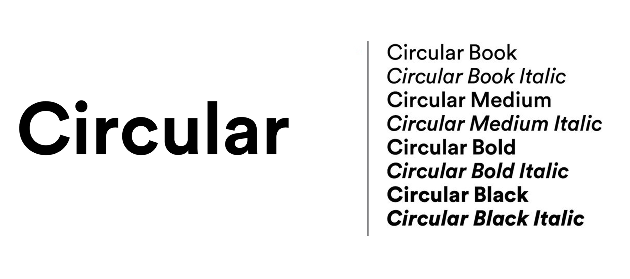
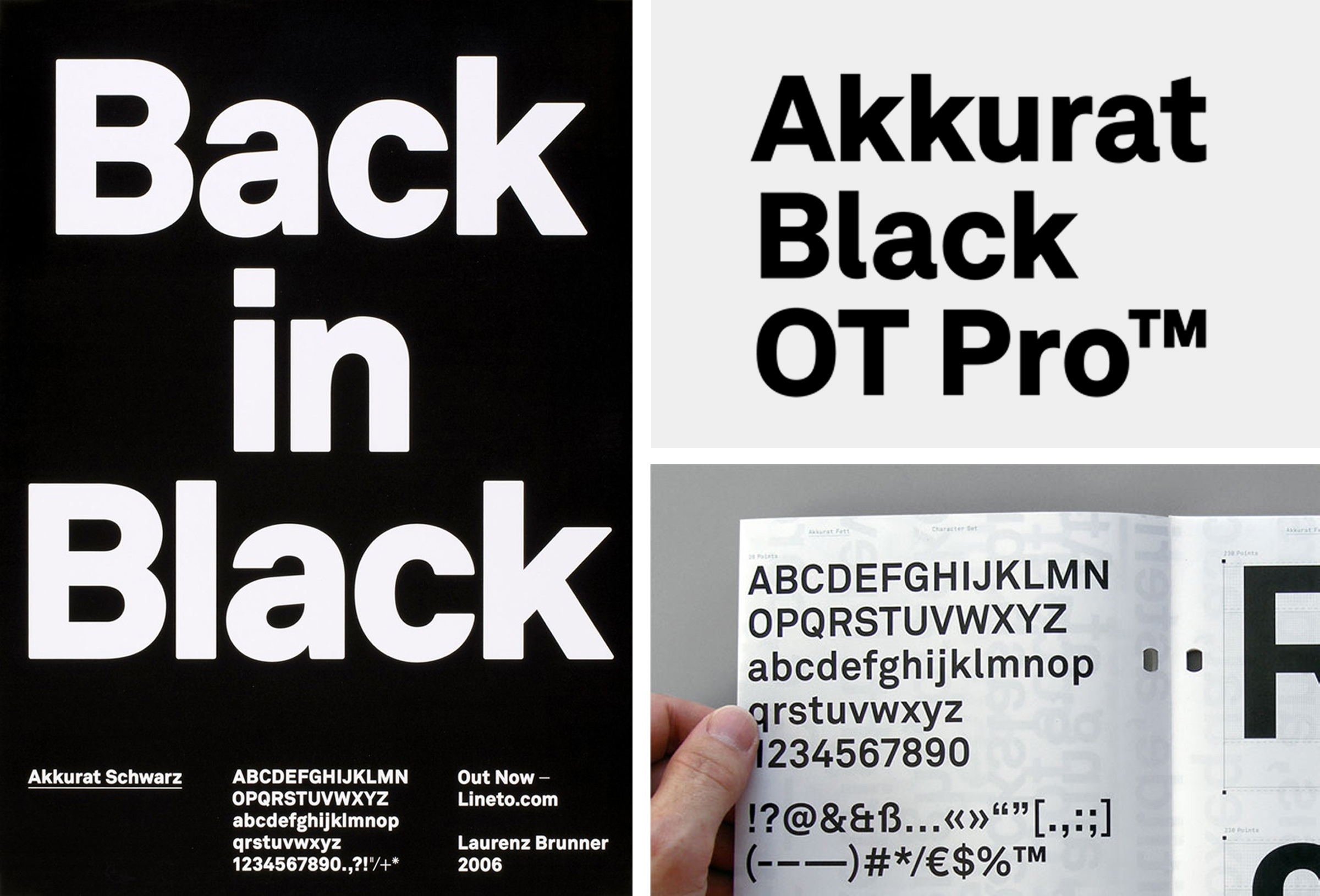
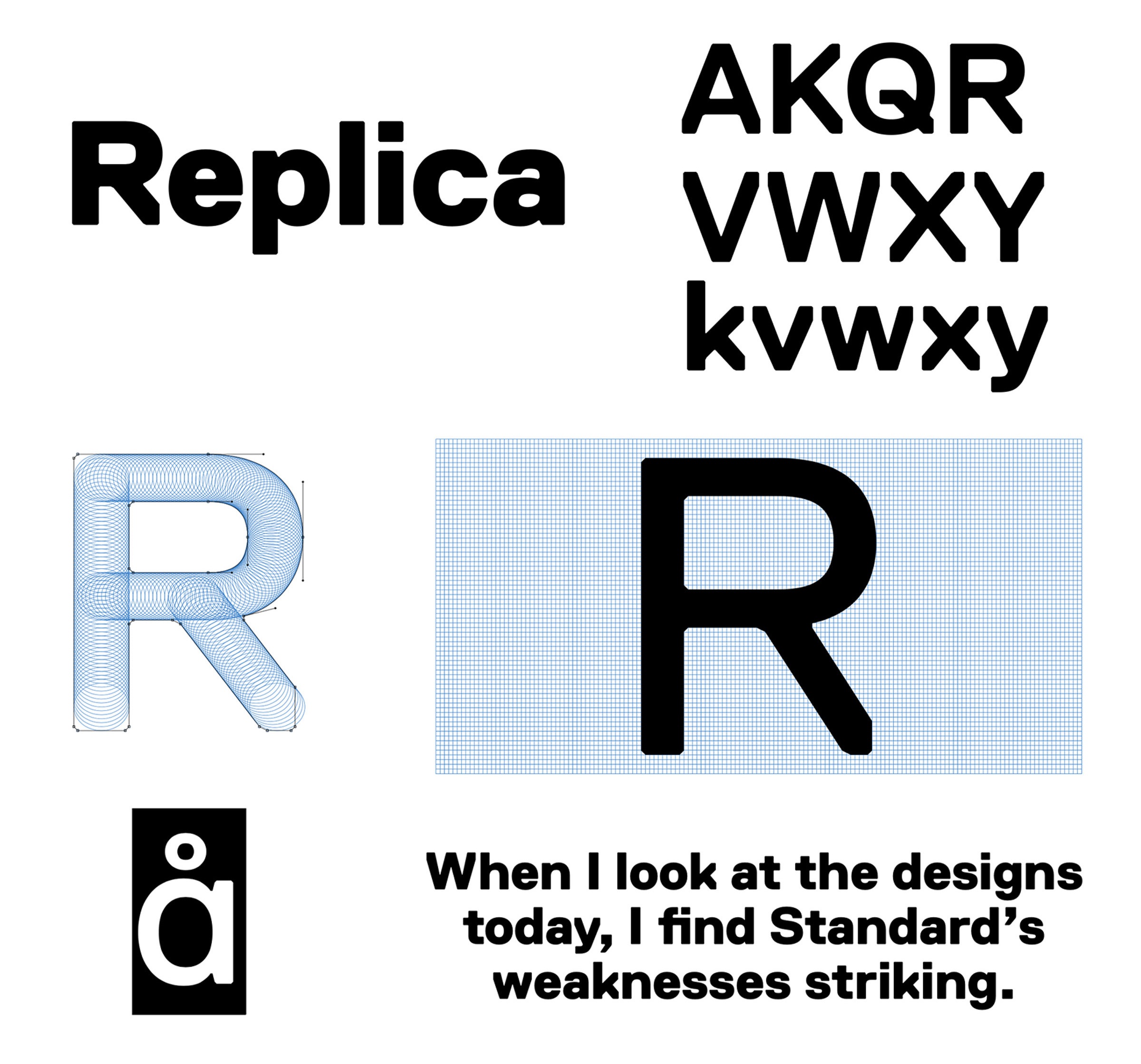
Alongside technological innovations, an elemental, minimalist style of typography developed, linked to digital aesthetics, which replaced all elements of traditional ornamentation, considered as superfluous or even problematic.
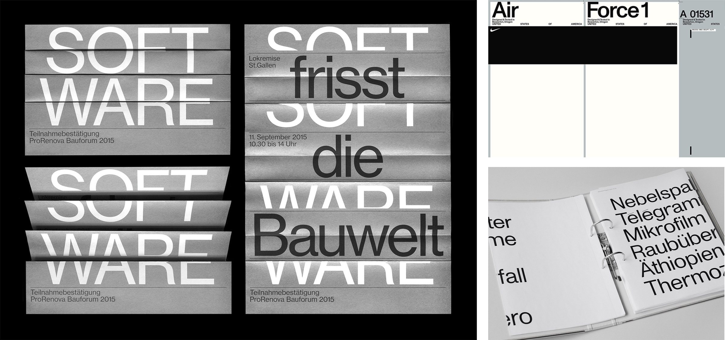
One of the most important reasons for this return to minimalism was the need for greater legibility, fundamental in a world in which most content is accessed through the screens of smartphones or even smaller devices. This was keenly felt by Apple, to the point that, specially for the Apple Watch, the company launched “San Francisco”, a typeface that successively became standard for all products by the Cupertino-based company.
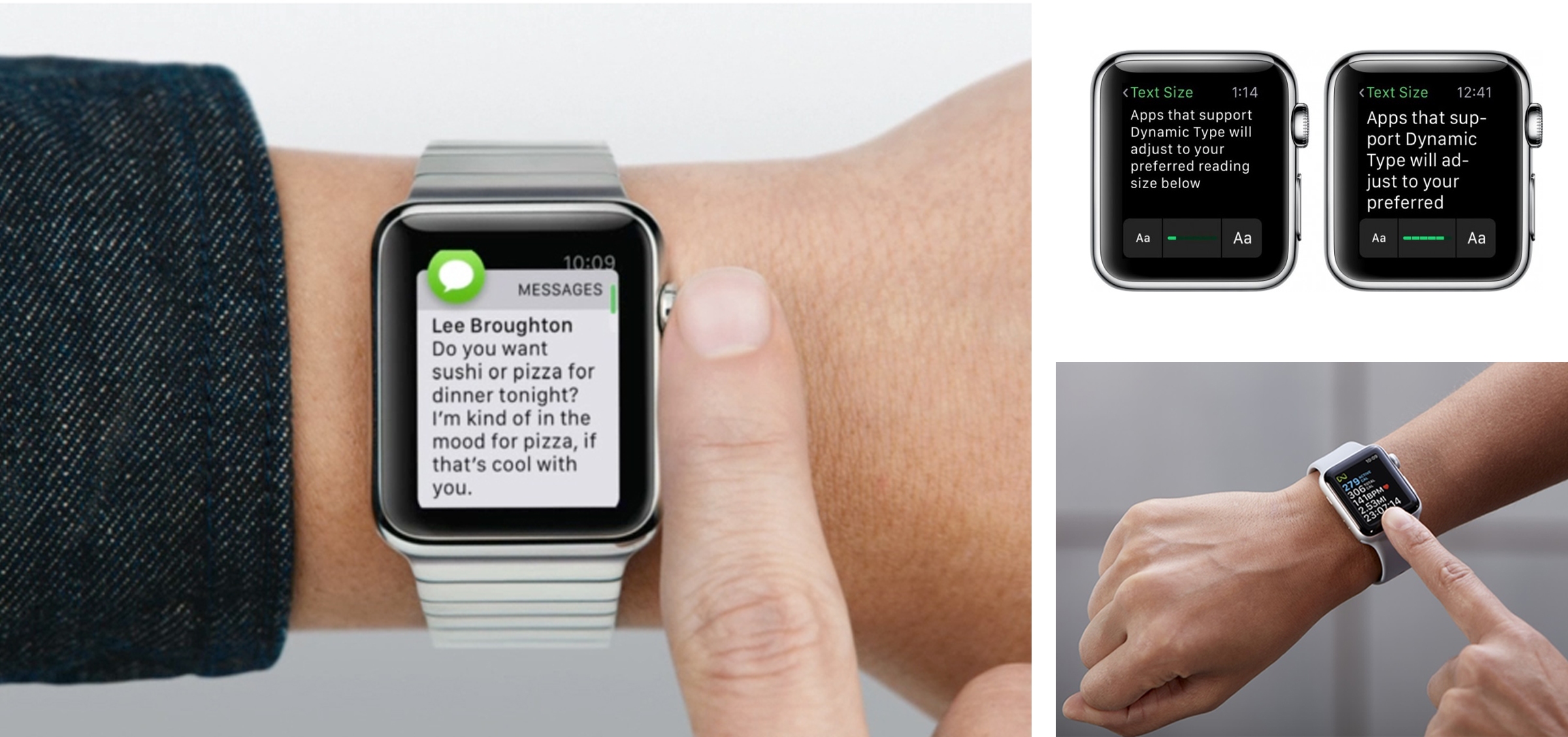
This trend towards minimalism has also been clearly visible in the world of branding, above all within the largest digital corporations, but in other companies as well.
It was in fact the decade of historic rebranding operations for important names such as Google, which abandoned the historic serif character of its logotype in 2015, adopting instead a geometric, linear font, “Product Sans”. The same approach was adopted by Facebook, Spotify, Airbnb, Motorola and Lenovo, and later by Dropbox, Mastercard, Pandora, Pinterest and Uber. This quest for simplicity reached its peak of popularity towards the middle of the 2010s.


Towards the end of the decade, the phenomenon spread to important fashion brands, which gradually adopted more neutral and geometric versions of their historic logos, with varying degrees of approval on the part of the public.
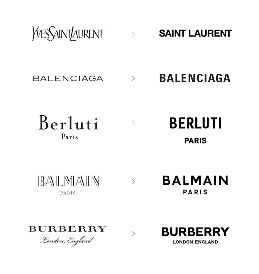
The experimental phase
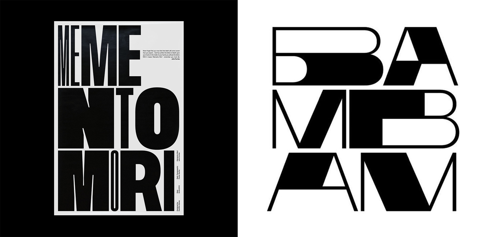
At the same time, from the mid-2010s, there was a powerful interest in more experimental forms of typeface. This trend was made possible by the introduction of user-friendly software such as “Glyphs”, which enabled increasing numbers of designers to enter the world of type design, and fuelled an increase of typography’s popularity on social media. Good examples include viral projects such as “36 Days of Type” which over the course of 6 years collected over 670,000 participants.
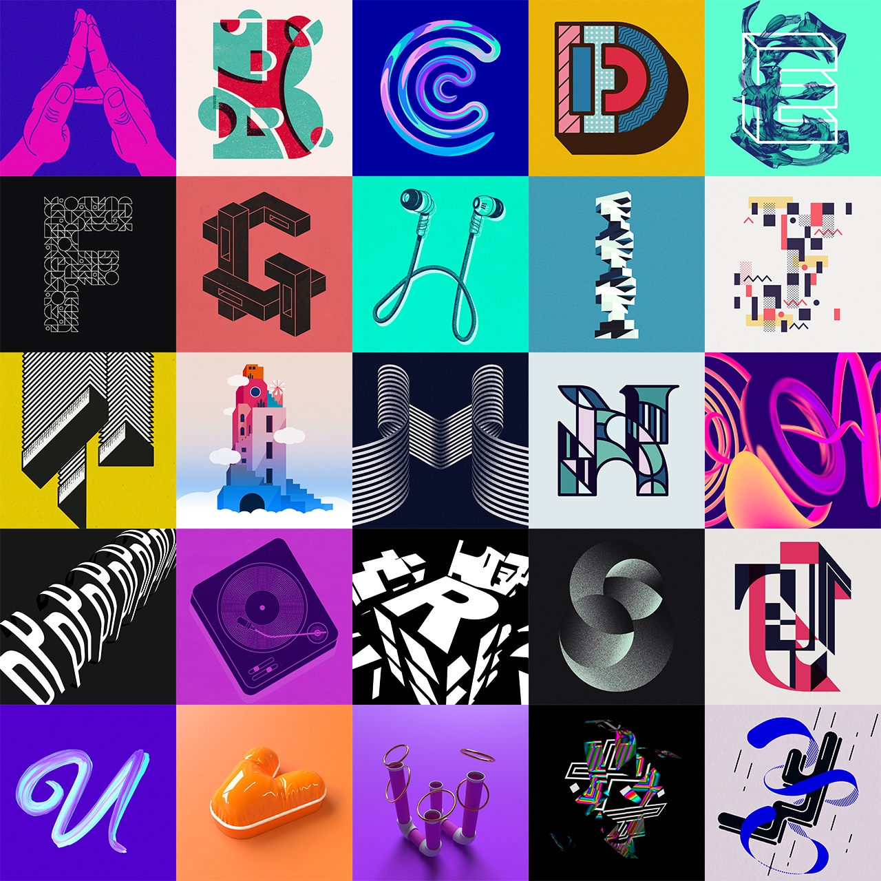
The possibility of accessing tools that were previously reserved to just a few people induced a sort of revolution that went beyond the pure Nevill Brody-style provocation of the 1990s. Typographical experimentation became more mature, acquiring a full awareness of its identity as a true form of expression.
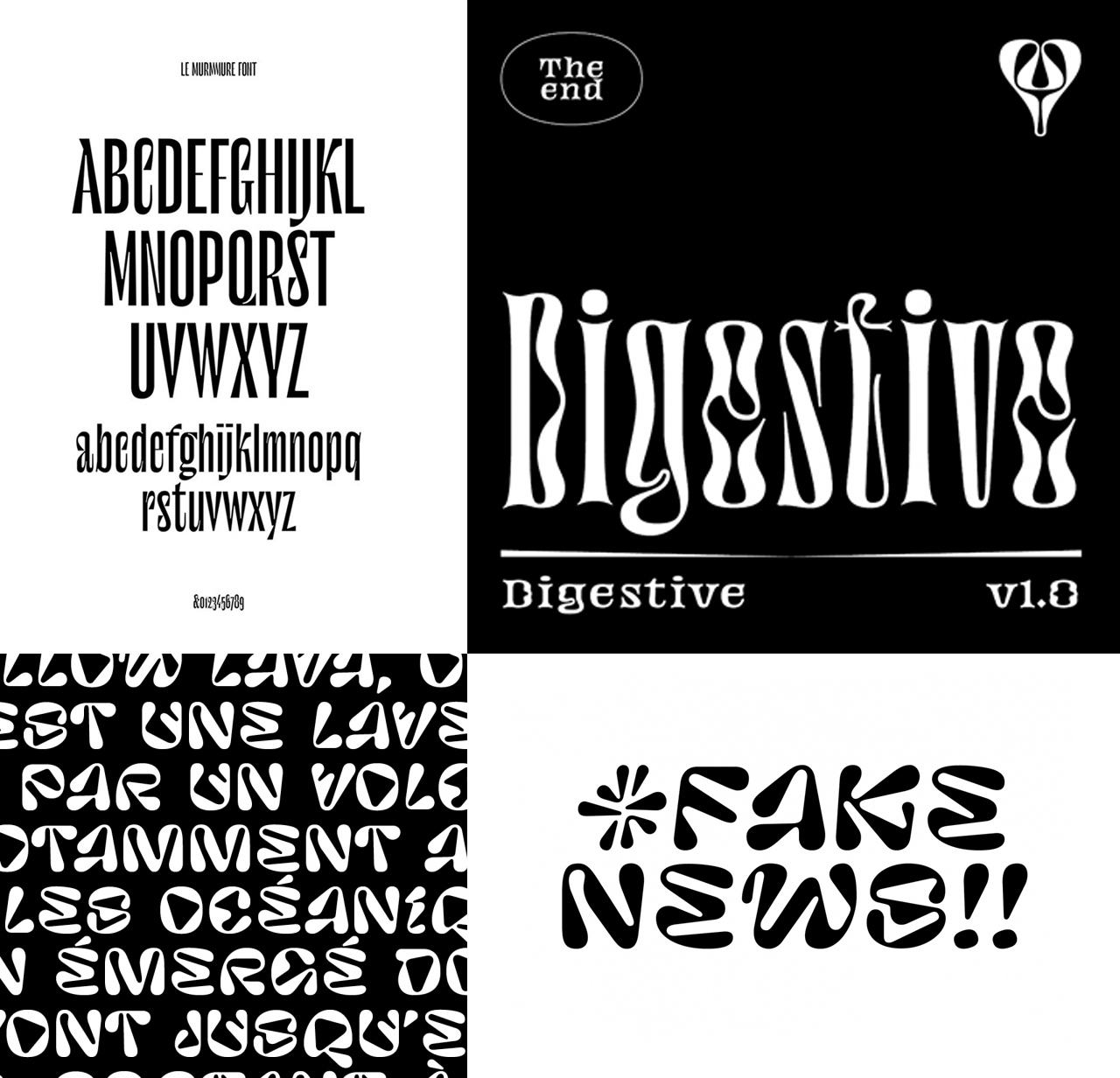
Mirko Borsche became one of the most important exponents of this point of view. He succeeded in bringing this trend to a mainstream level, working with important fashion and sportswear brands.
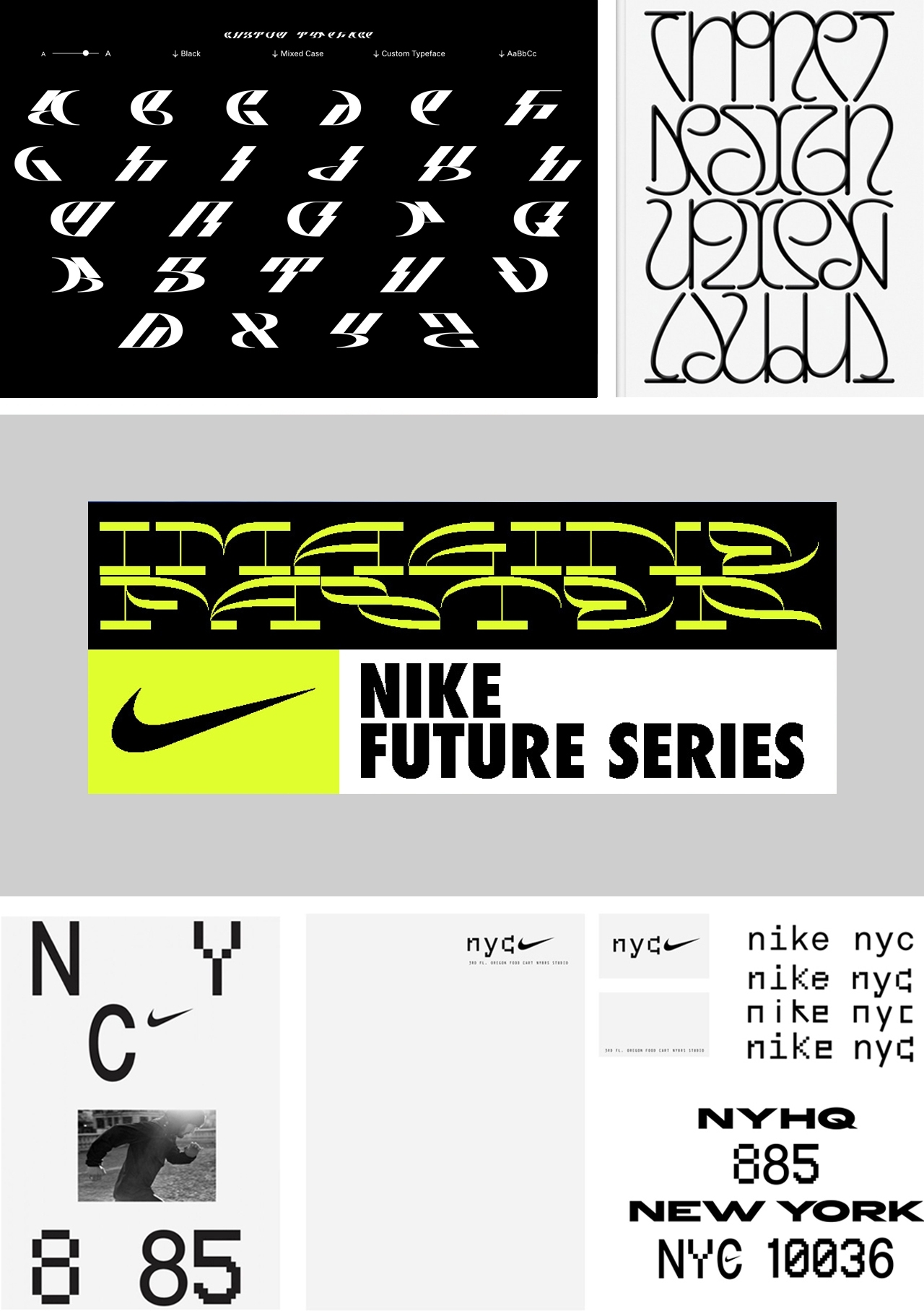
The academic world has always made powerful contributions in terms of experimentation. Without doubt, one of the most significant examples is Ecal, the Swiss institute based in Lausanne, which in recent years has often anticipated and launched new trends in the world of typography.
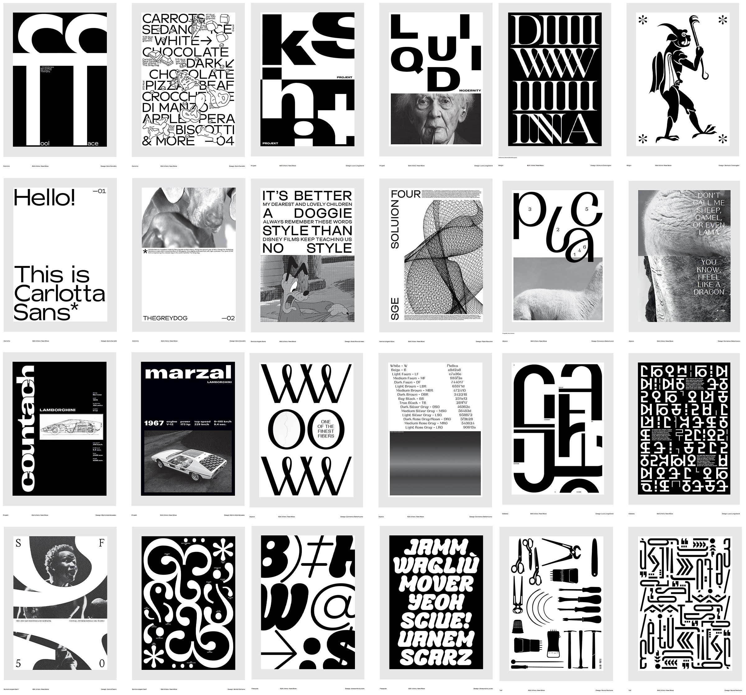
In Italy, the height of excellence in this regard is Isia in Urbino. This college has always dedicated a lot of attention to its students’ typographical research and experimentation, and it has embraced this new wave of creativity in initiatives that include the New Wave project.
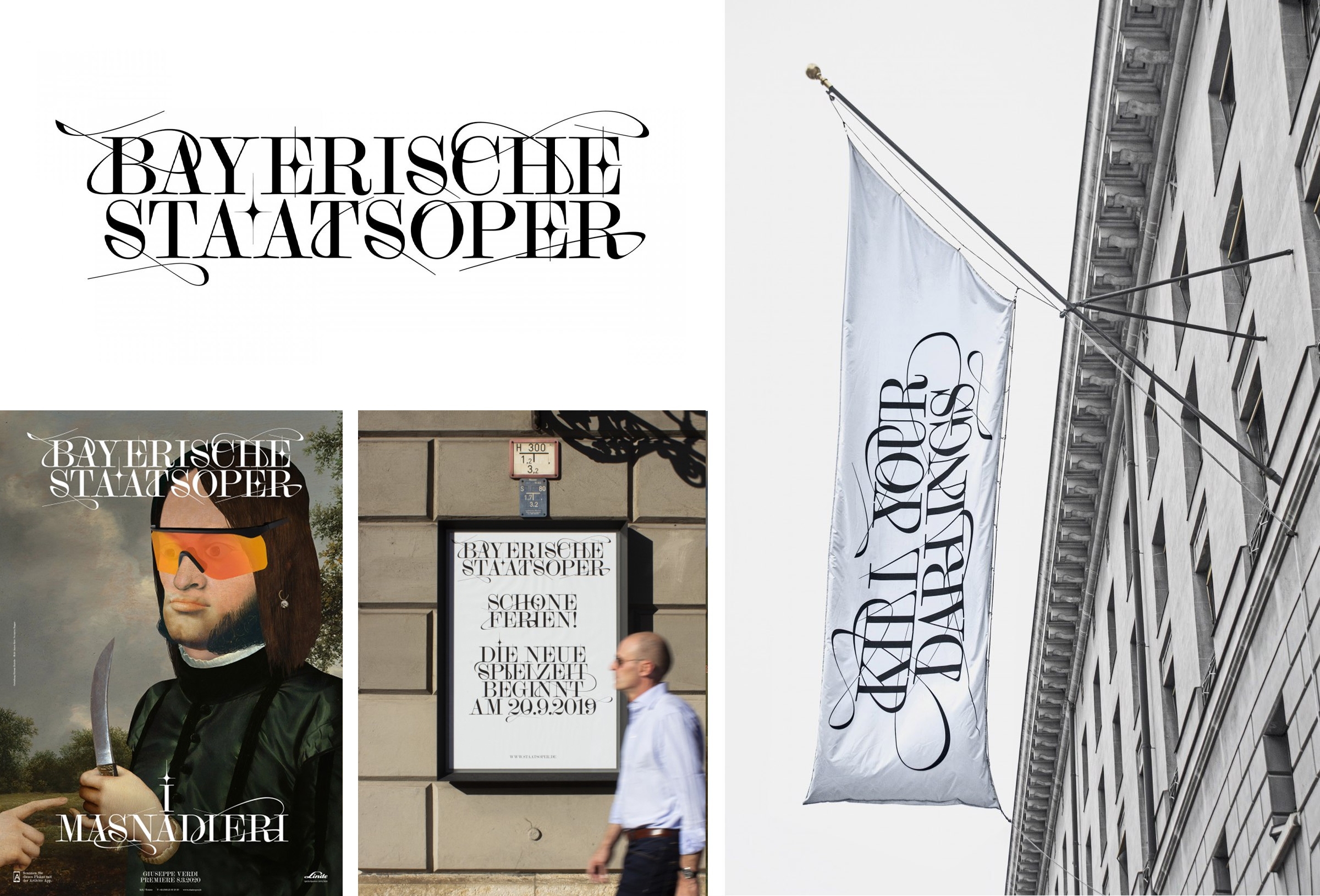
Typographical experimentation has also included the redesign of historic, classic typefaces. It is no coincidence that the last decade saw an increase in popularity of the Didone family, typefaces of French inspiration that emerged in the 18th century, and that were given new interpretations compliant with the needs of new technology.
Technology and new opportunities
With the development of technology, the 2010s saw the introduction of another important opportunity: the possibility of displaying every typeface correctly on the web platform, made possible by the introduction of the WOFF (Web Open Font Format) in 2010. Before then, the choices of typefaces available for a web page were limited to a handful of “system” fonts, which made it almost impossible to communicate your own identity online through typography.
It was normal practice to include an alternative “web safe” font that was as close as possible to the same typeface used for printing, but due to the limited number of options available, the result was not always acceptable.
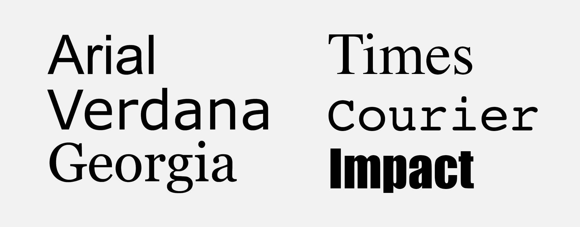
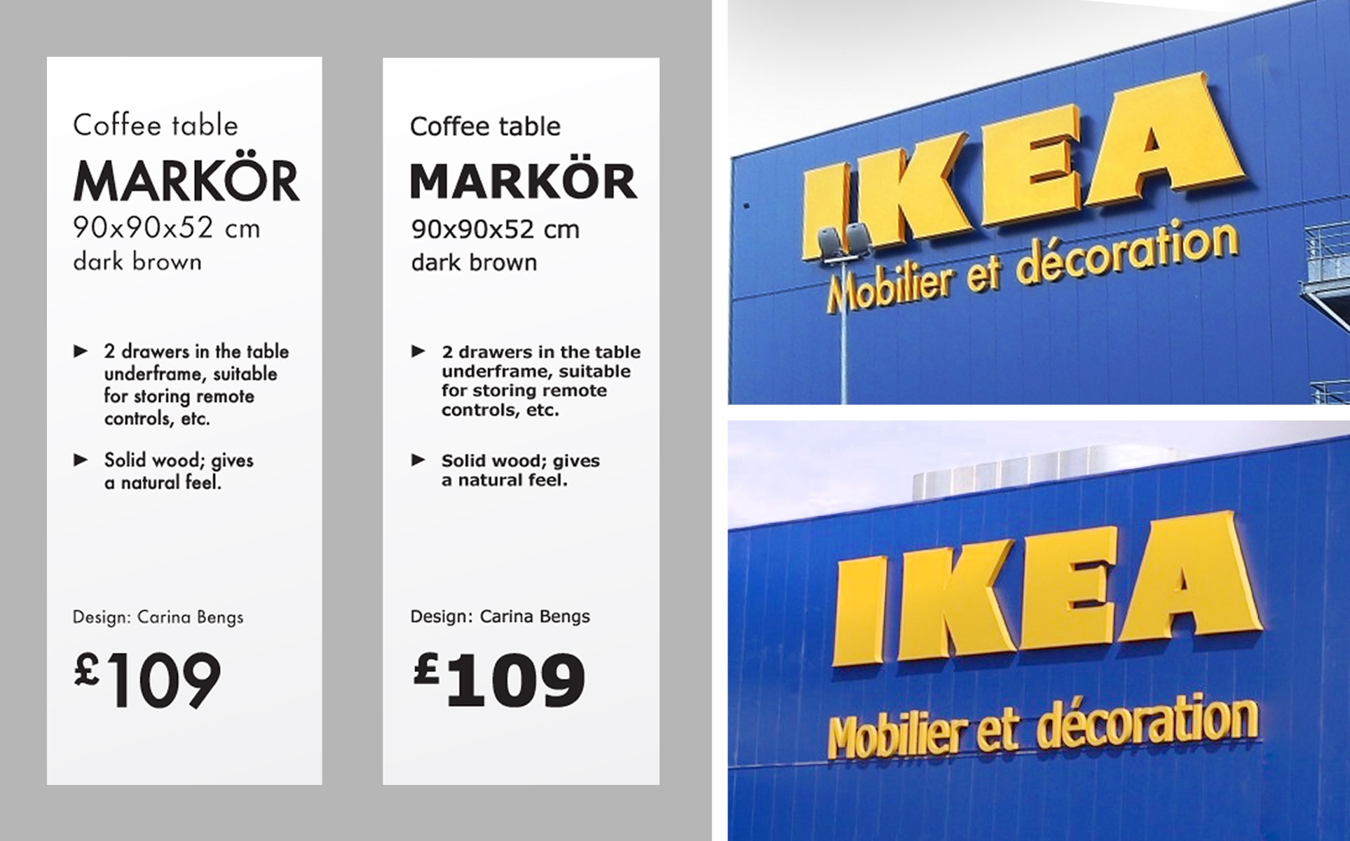
It was precisely for this reason that in 2009 the Swedish company IKEA decided to abandon Futura, after having used it for 50 years, and adopted Verdana, one of the few “web safe” typefaces of the day, in order to attain a greater degree of coherence between online and offline communications.
Ironically, just one year later, developments in technology would have made it possible to use Futura online as well as in print, which would have enabled the company to save the large capital investments that had been made for the transition to the new typeface.
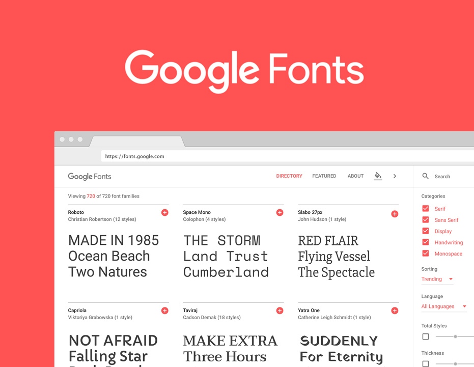
Another factor in the move towards typographical democratisation was a pivotal innovation introduced by Google. In 2010 it launched its “Google Fonts” service, giving its users the chance to work with a wide range of professional typefaces, totally free of charge. The typefaces are web- friendly, and superbly designed right down to the smallest details. They represent a valuable resource, for web designers and many other web users. Two of the most popular typefaces on the platform are Roboto and Open Sans.
Adobe has worked in the same way, introducing the “Adobe Typekit” service in 2011, for all Creative Cloud users, providing access to an extensive typeface library included as part of the subscription.
Over the years, these services have become very popular, giving a new meaning to the definition of “free font”. Originally this expression referred to amateur typefaces, with a limited range of font weights and often with a restricted number of glyphs; today on the other hand, the definition can be applicable to some very interesting typefaces, accessible to everyone without any compromise.
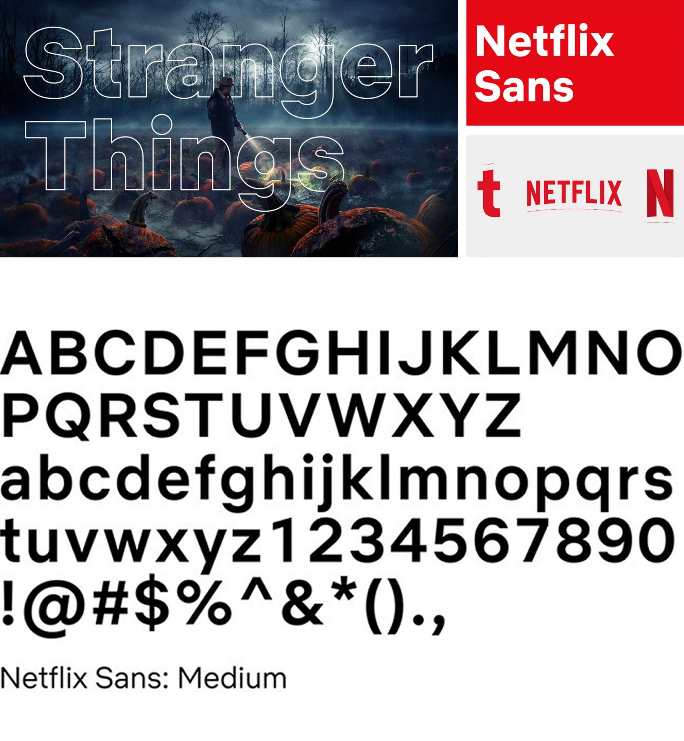
This typographical democratisation has, however, increased the need for distinctive typefaces, something that, in addition to a growing visual awareness amongst the population at large and not just professionals working in this field, has induced an increasing number of companies to have their own proprietary typefaces, so-called “Custom Fonts”. In addition to giving the company an original visual identity and adding prestige, this decision can also have important economic benefits.
An emblematic example is that of Netflix, which saved millions of dollars in copyright fees by designing its own typeface. Or that of “Cereal”, Airbnb’s custom typeface created by Dalton Maag in 2018.
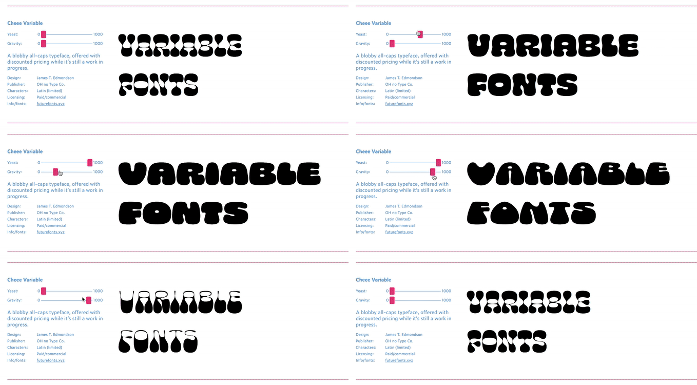
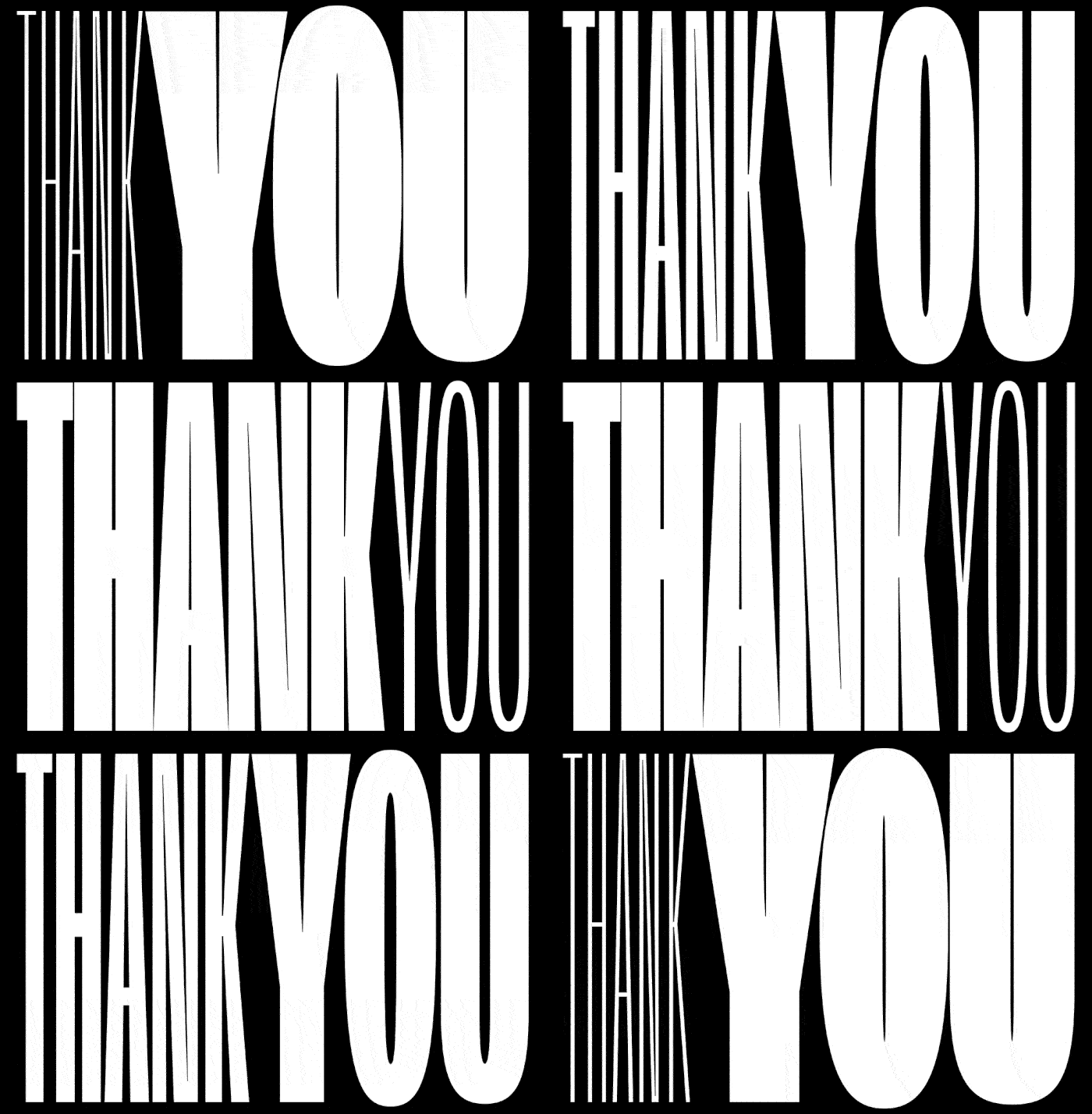
Returning to the subject of technology, there is another important event that characterised the 2010s, changing the rules in the world of typography: the introduction of Variable Fonts in 2016.
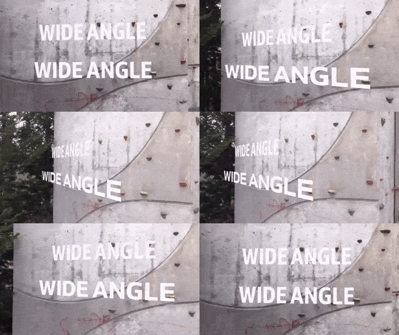
This new technology has expanded the possibilities of Open Type, in the sense of a single font file that includes innumerable variations in weights and shape which become “variable”, i.e. they can be modified directly within the programme. So, instead of large typeface families, there is a single file that includes all the possible variants, with every version respecting the fundamental characteristics and identity.
Yet to reach widespread acceptance, this technology provides maximum font flexibility, and at the same time, maximum efficiency in terms of light weight, an important factor for the web.
And so, an intense decade has come to an end, a decade in which technology, above all web technology, has played a central role in the epochal changes that have made quality typefaces an increasingly appreciated and pivotal element.
It is likely that over the course of the next few years, an increasing focus on customer-centric design, together with the development of new technology, will mark a turning-point in the interaction between users and typography, further improving user experience with respect to its functionality.
One thing that is certain is that at the start of another decade, a concept that has accompanied us in previous years is still valid: “Type matters!” is true today more than ever before.
Emilio La Mura, Visual Designer at CBA
