France
Paris
Switch to your local agency
Back to menu
Welcome to
Following the user-centric approach that has always distinguished us, we have taken up some of the topics covered in our Food-Z research. The article frames 5 restaurant trends associated with as many moments of consumption, focusing on a world in constant evolution in which brand identity plays an increasingly crucial role.
1. CHOOSING THE RESTAURANT
Accessible cool: eating experiences that are cool, yet accessible.
There are three main drivers that lead 2021 consumers to choose a particular restaurant: perceived quality, the restaurant’s image, and affinity with the consumer’s identity.
The union of the first two drivers leads us to identify the first trend: Accessible cool. This is a type of format that is accessible to the majority of people but is seen by users as a fairly luxurious experience, thanks to significant attention to image and perceived quality. Accessible cool is the link between a classic restaurant and fast food, characterised by informal service and quick delivery.


Hekfanchai, Milanese bing-shi, showcases original Hong-Kong street food in Milan, accompanied by the new dishes created by the Hong-Kong-born chef Kin Cheung, one of the most internationally popular names in Hong-Kong cuisine, and is offering something new: a cocktail list that is characterised by a fusion of East and West, studied by the bartender Francesco Menozzi. Everything is at truly reasonable prices.
https://www.hekfanchai.it/
2. ARRIVAL
Pick Up Point: a new strategy to pick up clients “on the go”
Over recent months and bolstered by the pandemic and the consequential need to focus on open-air eating, venues have literally populated the city’s streets, squares and pavements of Italy like never before.
With this passage of the restaurant experience from indoors to outdoors, one trend that we believe will become ever more important is that of the “Pick Up Point”; a strategic use of external spaces to intercept passing customers through the use of stations or by literally “opening up” the restaurant to the outside.
The result is coffee and drinking stations, literal satellite points outside the establishment that offer take-away experiences, avoiding the long queues that today’s consumers, impatient and conscious of social distancing, may find stressful. Opening up one’s restaurant to the outside, allowing consumers to explore the venue’s offerings in a direct and interactive manner, translates into a more inclusive attitude towards customers.
The Terrazza Aperol recently inaugurated in Venice seems to have immediately followed the trend: just outside the bar it is possible to find a drinking station ready to serve take-away and strolling drinks, useful for intercepting “on the go” consumers.
https://www.aperol.com/it/terrazza-aperol
3. CHOICE OF FOOD
All-in-one: Fast, quality and healthy dishes
On our journey exploring trends in the restaurant sector, we now finally come to the inside of the venue, and in particular to the moment of choosing the food.
As we also saw in FOODZ, people are ever increasingly attentive to what they eat, and exaggerating with food is seen as an exception. This is why the “All-in-One” formula is gaining in popularity; single dishes accompanied at most by a starter and a side dish, with balanced and clear calorie content and often international in style. This allows everyone to enjoy a quick, quality and healthy meal.

For example, Poke House, after having gone beyond national borders – 30 venues in Italy, Portugal and Spain – decided to return home with its tenth opening in Milan, in the Porta Venezia district. Customisable low-calorie Poke bowls that are quick to make and contain top-quality ingredients.
https://poke-house.com/it-it/
4. EXPERIENCE
Eatertainment: restaurants as venues for entertainment, for an experience that goes beyond food.
Nowadays, people don’t go out just to eat. Our research effectively demonstrates the social importance of food, which is even higher than that of its gastronomic qualities, in response to social pressure to “go out and do something in the evening”. Food is good “material”, which is why, in a venue, the brand, its history and its values can be a subject of conversation; a central aspect when seeing restaurants as brands.
For this very reason, restaurants that follow the trend of “Eatertainment”, offering entertainment services, will capture the attention and the curiosity of consumers. It is therefore fundamental for restaurateurs to identify their target market, in order to be able to design experiences that are in line with that market’s needs and desires. We have discussed this matter in further detail in our FoodZ research, which can be seen here.

In this light, one promising proposal is the format “The 3rd Spot”, which is due to open in the next few months. “Our aim is to encapsulate the positive energy that characterises dining and open-air experiences, which have made a significant contribution to this year’s positive memories. The idea is extremely simple; following an entire life spent working and two years spent at home, we all need a third place where we can feel good and where we can get away from it all” – stated Josh Rossmeisl, founder of The 3rd Spot.
https://the3rdspot.com/
5. DIGITAL LOYALTY
Digital programmes and services aimed at building customer loyalty
We have come to the final chapter in our restaurant experience. The subject here is “Digital Loyalty”, a fundamental concept in the restaurant sector (that of loyalty), revisited in a modern key thanks to new technology and new services present in the world of gastronomy. In the future, restaurants will be able to introduce loyalty programmes to reward returning customers; these will, in fact, be given the opportunity to become “virtual regulars”, consequently accessing a series of advantages and awards provided by the restaurants themselves.
It is a trend in line with the aim of small- and medium-sized restaurant businesses to strengthen the bond with their customers over distance. Restaurateurs will be able to create their own personal loyalty programmes (in line with their brand and the expectations of their target) and set out the main characteristics. Physical cards, proprietary applications, delivery platforms… there are countless methods, and they can be valorised through the creativity of the restaurateurs.
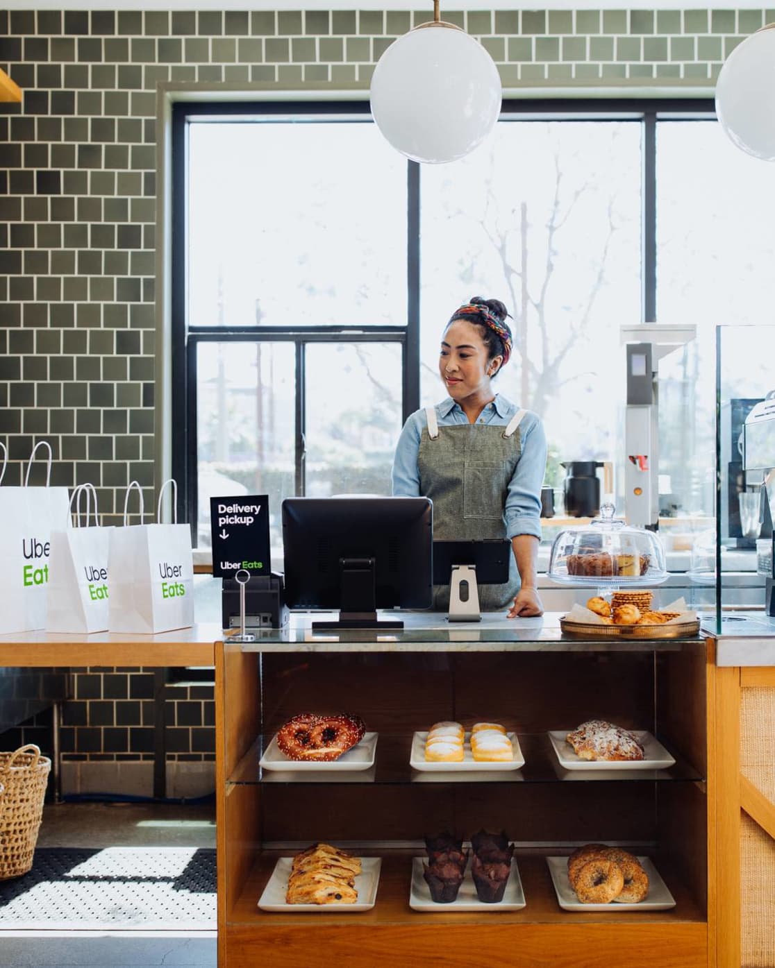

Uber Eats builds loyalty with its new Restaurant Loyalty service; in the future, all users and restaurants with the Uber Eats app will be able to introduce loyalty programmes to reward all the customers who continue to return.
https://restaurants.ubereats.com/gb/en/loyalty-program/
Giulio Vescovi, Strategic Designer at CBA
Space is the final frontier according to Captain James Tiberius Kirk. It’s also where countless artists have boldly gone where no artist had dared go before.
Take Edward Hopper. The American’s paintings took spatial awareness to stark, new heights. Some evoke feelings of loneliness and longing that could break the hardest of hearts.
Musicians have long made use of pauses that hang in the air like soaring butterflies. These silent spaces are there to incite a sense of anticipation giving us a moment or two to gather our thoughts and emotions.
Listen to Barber’s Adagio for one of the most crushing, perfectly placed silences in the history of classical music. (Start at 5’30 to quickly take in its beauty).
Designers continue to seize this artistic technique that leaves time for consideration and emphasis. Read on to find out how less can indeed be more.

Imagine brimming with so many ideas that they won’t fit the space of a brief. The temptation is to cut out a few, make a tight fit and be good to go: the fewer grand plans ending up on the cutting room floor, the better for everyone.
That’s one way to see it, but spare a thought for the consumers looking at your creation for the first time. You spent hours crafting your design. They might only have a split second to digest it.
There’s a strong argument for being brave enough to abandon valuable communication real estate by knowing what and how much to leave out. It can be the tipping point that turns a good designer into a great one.

White space, also referred to as negative space, is essentially any area of design that is not taken up by content. This could be anything from vast expanses between different elements to the tiniest bits of space between some letters.
Despite the hint in its name, white space is not restricted to being white or any other color for that matter. It could be a textured surface or even a photo.
Used effectively you can establish a hierarchy in your composition, set a mood and improve readability. With care, you can achieve a harmonious balance that could take a consumer on a visual journey or draw their attention towards a specific element.
It might feel counterintuitive, but harnessing a whole lot of nothing is not wasting space. It can make or break your creation. It’s a fundamental design principle that will either keep the viewer on your page or leave them looking elsewhere, possibly with eye strain.
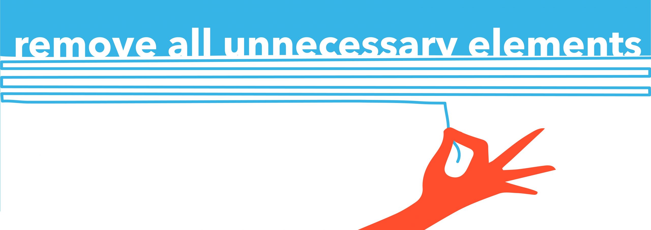
Negatives tend to be balanced with positives. Positive space refers to your subject matter, meaning all the elements that aren’t in the background.
For example, every letter in a block of text is a positive space. To avoid a messy jumble, we call on negative space to bring us much-needed breathing room and to restore balance. Get it right and you’ve achieved a bit of yin and yang.
Just to make things a tad confusing, white space can also be used in an active way to draw attention to a specific element. This could be something like a logo or headline. Taken to a new extreme when used in this way, it began an advertising revolution about 60 years ago.
So, fasten your seatbelts! Let’s take a trip back in time to revisit a piece of design work that put white space firmly on the map and changed the future of advertising and design forever.
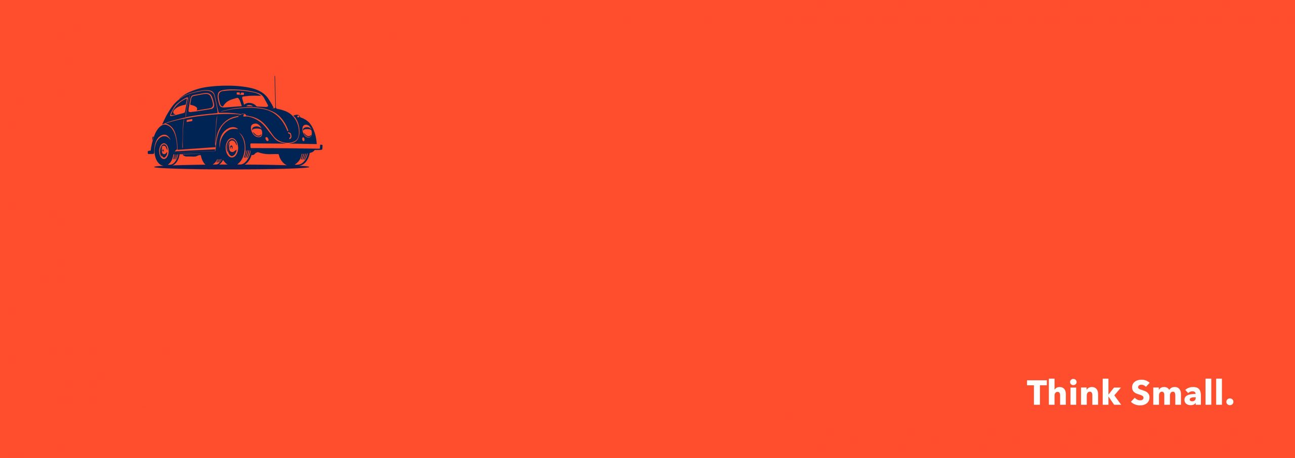
Set your flux capacitors to 1959 because that is when Bill Bernbach of DDB presented Volkswagen with his Think Small campaign idea. It’s regarded as one of the most effective and successful uses of space in design.
He bravely, some might have said foolishly, embraced space to such a degree that he used an ocean of it to surround a minuscule photo of a VW Beetle. This challenged the status quo at the time, ushering in a minimalist design revolution.
The ads caught the coolness of the product so well that people tore them from magazines and stuck them on their walls. It was the start of a new design movement that’s still going on today.
There have been countless negative space success stories ever since.
Take the FedEx logo with its clever arrow between the ‘E’ and ‘x.’ The negative space between these last two letters tricks the eye in a flash. The result is that we are drawn to a symbol conveying the company’s message that it’s super-speedy.
Over the years, IKEA’s ‘less is more’ approach to home furnishings has seen bright colors leap out from the page when set against sparse, Scandi-style wooden flooring. And, Apple’s use of clean, white space on its packaging reinforces a logo now synonymous with luxury, coveted tech.
Vive la révolution!
Staying with the revolutionary ‘50s theme, I was reminded of a controversial three-movement piece composed in 1952 by the American experimental musician, John Cage.
Written for any instrument or combination of instruments, the score, called 4’33”, instructs performers not to play during the entire piece. The work is then made up of the sounds from the environment that listeners hear while it’s performed.
A useful example of what parts of mindfulness are all about, it also reminds us that there will always be a smattering of sound to sprinkle on the aural equivalent of white space.
Apply the same concept to a minimally filled blank page and the light that shines on it. Deciphering its meaning can often lie in the eyes of the beholder. For a designer, the knack is to know what stays in and what stays out to provoke the desired reaction.
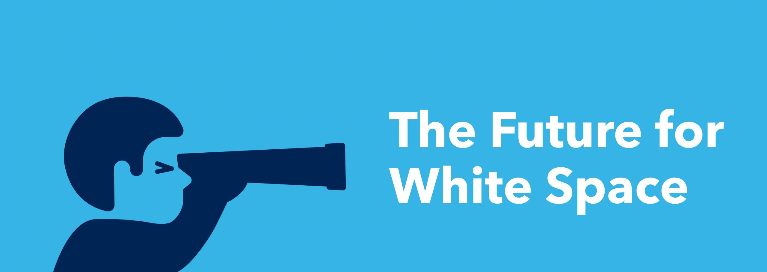
Why design trends come and go does, to an extent, depend on how we choose to make use of white space. White space will always be there and so will ever be a fundamental part of any design.
How far we choose to push its boundaries will play a part in keeping us looking fresh and shiny. So, what can we expect to see this year and beyond?
Minimalism continues to dominate, bridging the gap between art expression and lifestyle choices. It cuts through the noise and provides much-needed breathing space so that we don’t drown from an information overload.
Watch out for colorless and muted color designs, optical illusions and the use of geometric shapes trending everywhere. They all showcase the versatility and power of space that is called white.

This article was written by Arturas Janusas, Design Director, New York.
I’m excited to announce that the next Design Series article will be written and illustrated by CBA Senior Designer, Donny Marjalis, on the topic of shadows!