France
Paris
Switch to your local agency
Back to menu
Welcome to
CBA announced two strategic appointments to its Paris office: Ricardo Oliveira has been named Executive Creative Director, and Gabriel Collins joins as Strategy Director.
These hires mark a pivotal moment in the development of CBA Paris, as we create a new global branding network –the antidote to the traditional monolithic approaches- born from the strategic union of CBA and Coley Porter Bell.
Gabriel and Ricardo will help us to fulfil our ambition to be strategic in our creative and creative in our strategy, and to unearth the unordinary ideas that make brands sticky and memorable and fuel brand growth.

We are thrilled to welcome Ricardo and Gabriel. Their complementary talents will enrich our offering and enable us to even better support our clients in creating iconic, enduring, and future-oriented brands, as well as in delivering creative strategy and strategic creative.

With Cécile Ayed’s appointment as Group President last January, CBA positions itself as a new model, combining “Big agency capability” –with access to global data, cutting-edge technologies, AI expertise via WPP Open AI, and the strength of 9 international studios including Coley Porter Bell– and a “Small agency feel” –an entrepreneurial spirit, agile teams, close collaboration, and a tailor-made approach. This agility, particularly stemming from the network’s experience in constantly evolving markets like Latin America and Asia, allows CBA to offer global branding solutions with strong local relevance and resonance, supporting both global brands and “local jewels”.
The arrival of Ricardo and Gabriel in Paris is a critical part of strengthening our unique offer: a vibrant collective of 9 studios, entrepreneurial at heart, and backed by WPP’s global reach. We bring globally recognized branding expertise as well as a unique positioning – delivering the power of a large network with the agility and proximity that comes with a smaller agency. This is the antidote to traditional monolithic agencies, and it’s what enables us to unleash Unordinary Ideas for our clients.

With over 20 years of international branding experience, Ricardo Oliveira has shaped iconic brands for clients such as Nestlé, Unilever, and Pernod Ricard. Having previously served as Creative Director at CBA for nearly 8 years, he brings an in-depth knowledge of the group’s ecosystem.
His career, marked by experiences in Europe, Latin America, Asia, and the United States, provides him with unique “cultural fluency”. At CBA Paris, he will lead the creative vision to elevate standards of excellence and develop memorable brand experiences that transcend conventions and are deeply rooted in cultures.
I am delighted to rejoin CBA in this new role in Paris. I am excited about creating unordinary ideas that resonate, differentiate and endure. I am eager to collaborate with the teams in Paris and beyond to push the boundaries of creativity and work differently to serve our clients.

A recognized expert in brand strategy, innovation, and consumer insights, Gabriel Collins has held key positions, notably as Head of Innovation at Boundless Brand Design and Strategy Director at Bulletproof. His expertise focuses on understanding the motivations that drive individuals. His appointment strengthens CBA’s ability to develop brand strategies rooted in human behaviour and culture. Gabriel will be deeply involved in the application of CBA’s proprietary AI-Ethnography, combining the expertise of its ethnography strategists with the power of artificial intelligence for unparalleled insights.
The success of brands today depends on their ability to understand and authentically engage with their audiences. CBA’s curiosity about people, culture and what truly motivates them, reinforced by innovative tools like AI-Ethnography and the power of the new network, offers a tremendous opportunity to build strategies that generate genuine connections. I am excited about bringing my expertise in innovation and insights to this new network.

If you’re ready to bring your brand vision to life, get in touch with us.
We’d love to spark Unordinary Ideas together.
This year’s awards celebrate two standout projects: the Caramelo Hotels, developed by CBA Spain for Globales Hotels, and the pro bono rebranding of the French non-profit charity Moteur!, led by CBA Paris. Together, they exemplify the agency’s ability to blend strategic thinking, cultural insight, and creative craftsmanship to build brands and experiences that connect deeply with audiences.
Recognized as one of the world’s most prestigious design competitions, the Red Dot Award: Brands & Communication Design honors exceptional work across 18 categories. In 2025, entries from 58 countries were evaluated by an independent jury of 30 international experts, who assessed each submission for its innovation, design quality, and cultural relevance.
Through deep cultural exploration and an understanding of what inspires young people today, CBA Paris crafted a visual and verbal identity that breaks conventions and creates meaningful connections. The Red Dot jury praised the project for its cultural resonance, emotional depth, and purposeful creativity.
These achievements further establish CBA as a global leader in branding and communication design, building on its consistent track record of delivering innovative, relevant, and high-quality creative solutions for clients worldwide.


It reflects not only the talent of our teams but also our shared belief that branding, when rooted in strategy and creativity, has the power to transform brands and create meaningful impact.
If you’re ready to bring your brand vision to life, get in touch with us.
We’d love to spark Unordinary Ideas together.
With a history of transforming some of the world’s most iconic consumer-loved brands and building upon strategic foundations that marry performance, visual language, and storytelling, CBA Design (WPP Group) has decided to offer a more specific service dedicated to fast-growing start-ups in the US market, that need strategic direction.
With solid experience and established credibility in the startup’s ecosystem, we’ve observed one key insight: Startups tend to focus on perfecting their product and its technical aspects, but in doing so, they can miss a crucial element: their brand. Realizing this significant oversight, we have accompanied start-ups for quite some time, crafting their brand strategies hand in hand.
Below the Brand is dedicated to developing foundational brand and product strategies for start-ups with ambitious goals. It focus solely on achieving growth objectives by:
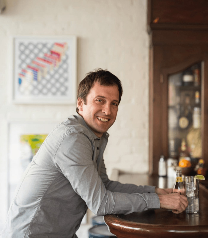
Below the Brand was just what we needed! They’re talented, strategic and move fast – exactly what a start up needs. We did a “Sprint Mode” with them and it turned out great.
The whole process was super collaborative, and by starting with really well thought-out ideas and then working through a number of rapid iterations, they added a ton of strategic and creative value fast and effectively.And best of all – they’re fun to work with!
— Jordan Silbert, founder of Agro
Working with the Below the Brand team was my secret weapon while building a marketing function from scratch.
From value proposition design to brand strategy to architecture and naming, they helped our team create foundational assets that set Brightseed up for success. Without collaborating remotely in Sprint Mode® I would not have been able to scale marketing in such an efficient and inspiring way
— Emma Cooper Mullin, Senior Director of Marketing, Brightseed

We felt they were a very good fit.
More importantly, their team gave us confidence that they would care for our brand with the same level of commitment as we would ourselves.
— Ajay Prakash, founder & CEO, Rinse
Outstanding perceptions of quality, general health and no fishy aftertaste, which is a direct reflection of the unique packaging and allows us to stand out at shelf.
— Susmita Vellanki, Vice President of Marketing, Epion Brands


Outstanding perceptions of quality, general health and no fishy aftertaste, which is a direct reflection of the unique packaging and allows us to stand out at shelf.
— Susmita Vellanki, Vice President of Marketing, Epion Brands
CBA Design wishes to support you in a personalized and human manner, extending beyond a mere professional relationship.
We believe that every important moment deserves to be celebrated and shared with loved ones! This year, we decided to spread happiness to the world, and to put a smile on evryone’s faces!
To achieve this, we offer a simple concept: coloring postcards on wich you can express your thoughts and feelings.
Our creative designers have created coloring postcards to accompany you throughout this promising year and be by your side everyday!
This annual tradition is not only an opportunity for us to express our well-wishes but also to demonstrate our expertise, creativity, and commitment to nurturing our enduring relationships.
As we step into 2024, we are filled with anticipation and excitement as we gaze into the future.
What are our dreams? Our values? What really makes us HAPPY and FULFILLED?

For the fourth edition of 12X6, we immersed ourselves in the world of Serena Gianoli. Her deep fascination in Japanese culture, inspired by her readings, has given life to 12 artworks representing characters, customs, and legends from Japanese popular culture.
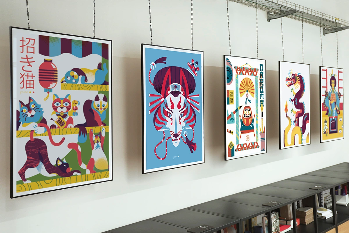
The Japonisme exhibition, which we inaugurated on October 19th in the company of friends, colleagues, and design enthusiasts, takes its name from a term coined at the end of the 19th century by the critic Philippe Burty.
“Japonisme,” prevalent mainly in the 19th century, represents the influence of Japanese art, culture, and aesthetics on Western culture. This artistic movement originated in Europe, especially in France, and influenced numerous artists and designers of the time. Japanese artists like Hokusai and Hiroshige became famous in the West through prints and artworks imported from Japan, depicting cherry blossoms, everyday life scenes, costumes, and more.
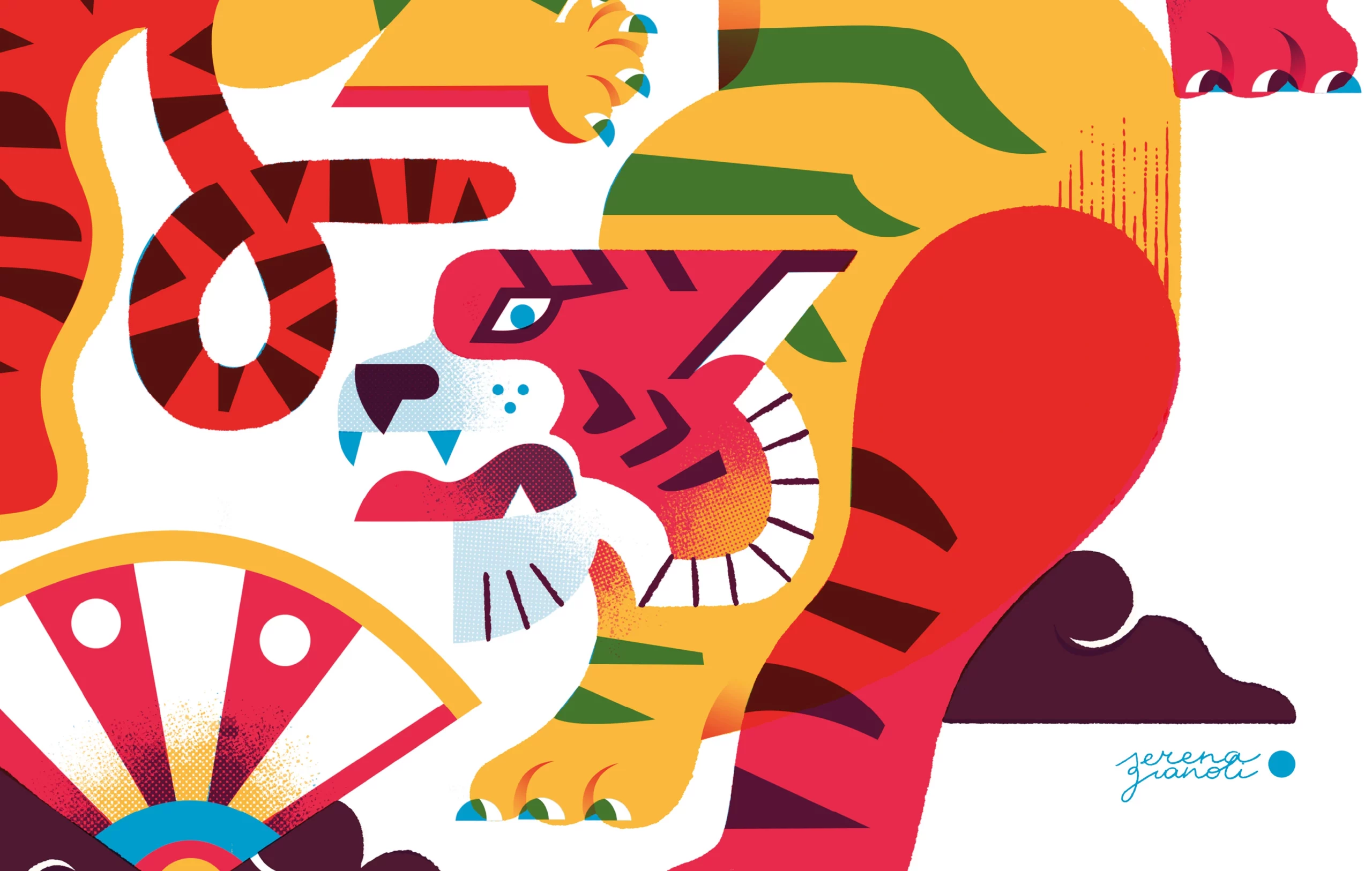

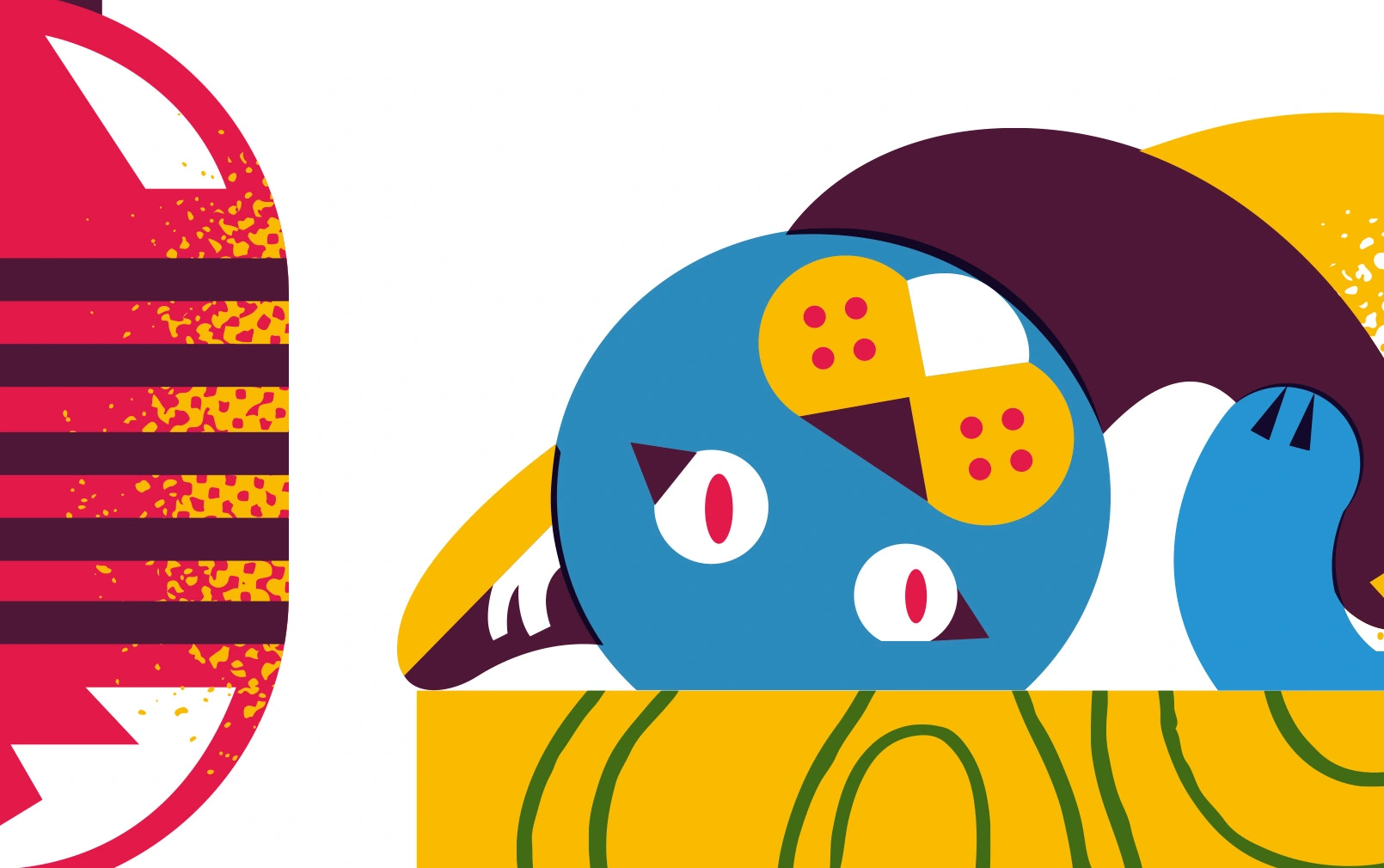
"A couple of years ago, during research for a mythology-related project, I came across the legend of Namazu, a massive catfish capable of causing earthquakes and kept in check by the god Kashima, the thunder deity. Captivated by paintings depicting this legend, I wanted to interpret, in my own way, some of these mythological images and the fluidity, as well as the strength, of Japanese artistic representations.”
Serena Gianoli
Among the highlights of the exhibition, you will find depictions of herons and cherry blossoms, timeless symbols in Japanese art and culture. Herons symbolize grace and longevity. There is also Kintsugi, an ancient Japanese art known as the ‘golden repair,’ which uses lacquer and gold powder to mend broken objects. You will also discover artworks inspired by samurai, the tea ceremony, dragons and tigers, Namazu, and Taiko, the traditional drums that embody power and rhythm in Japanese culture.
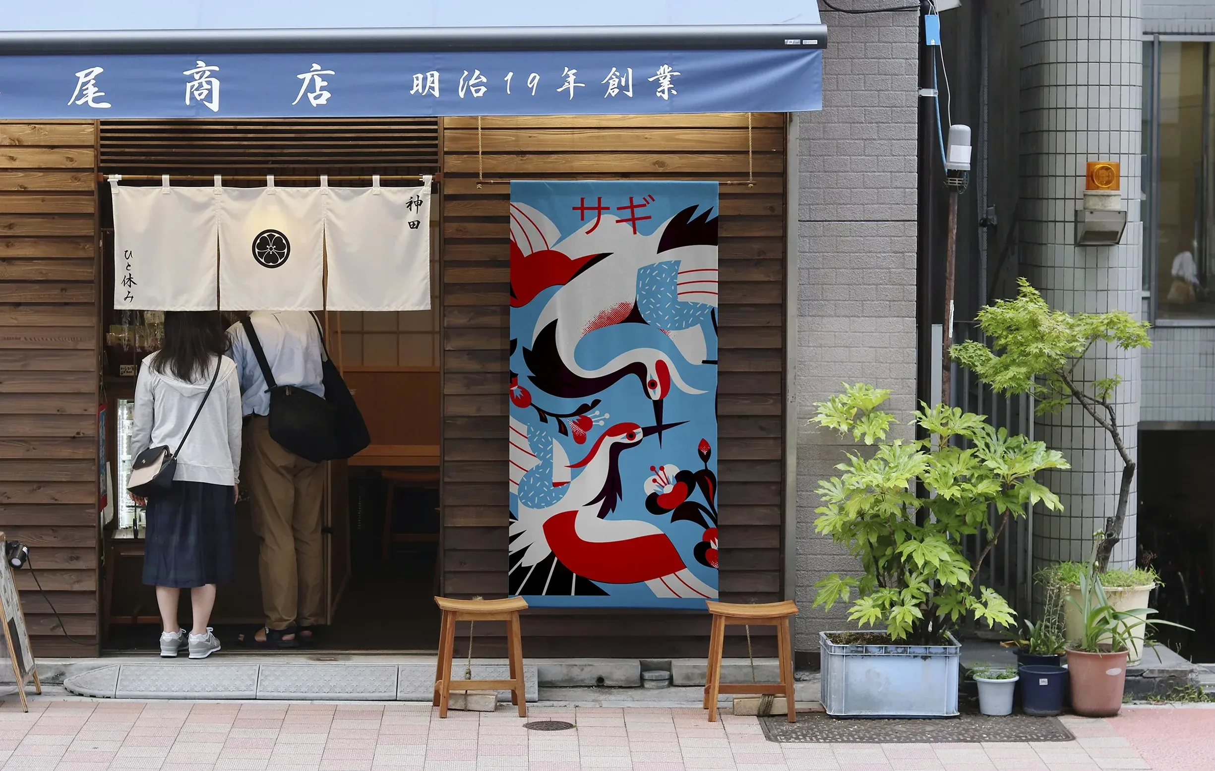
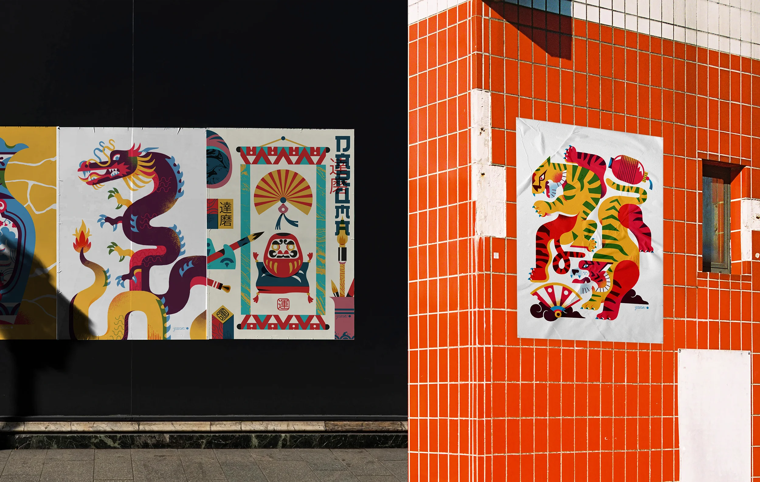
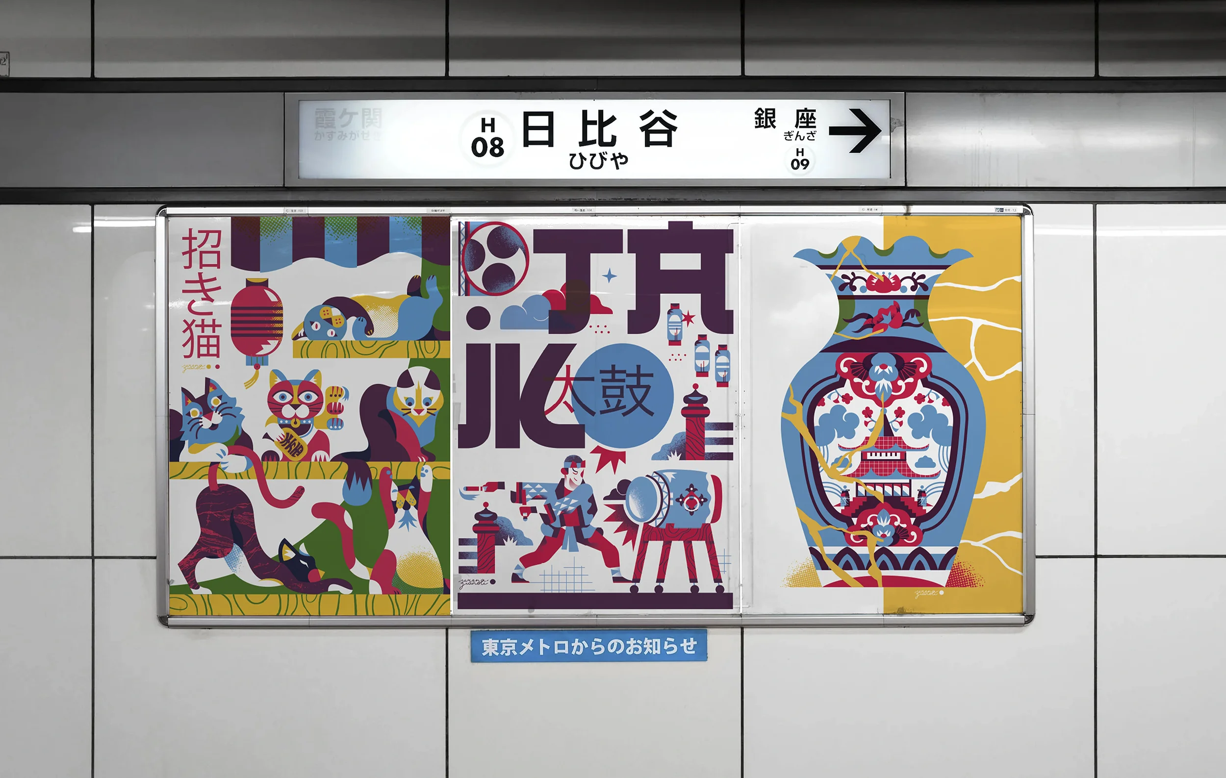
12X6 is a project born to provide space, both metaphorically and literally, for young professionals in the world of visual arts. Every six months, a comprehensive journey of twelve artworks is hosted in our offices, which become a permanent gallery for creative talents.
During the opening night, Serena performed live painting, creating the Pet-Daruma, charming Japanese-style representations of our four-legged friends.
Instagram: @pet_daruma
Daruma dolls, also known as Dharma dolls, are Japanese votive figurines without legs or arms, representing Bodhidharma, the founder and first patriarch of Zen.
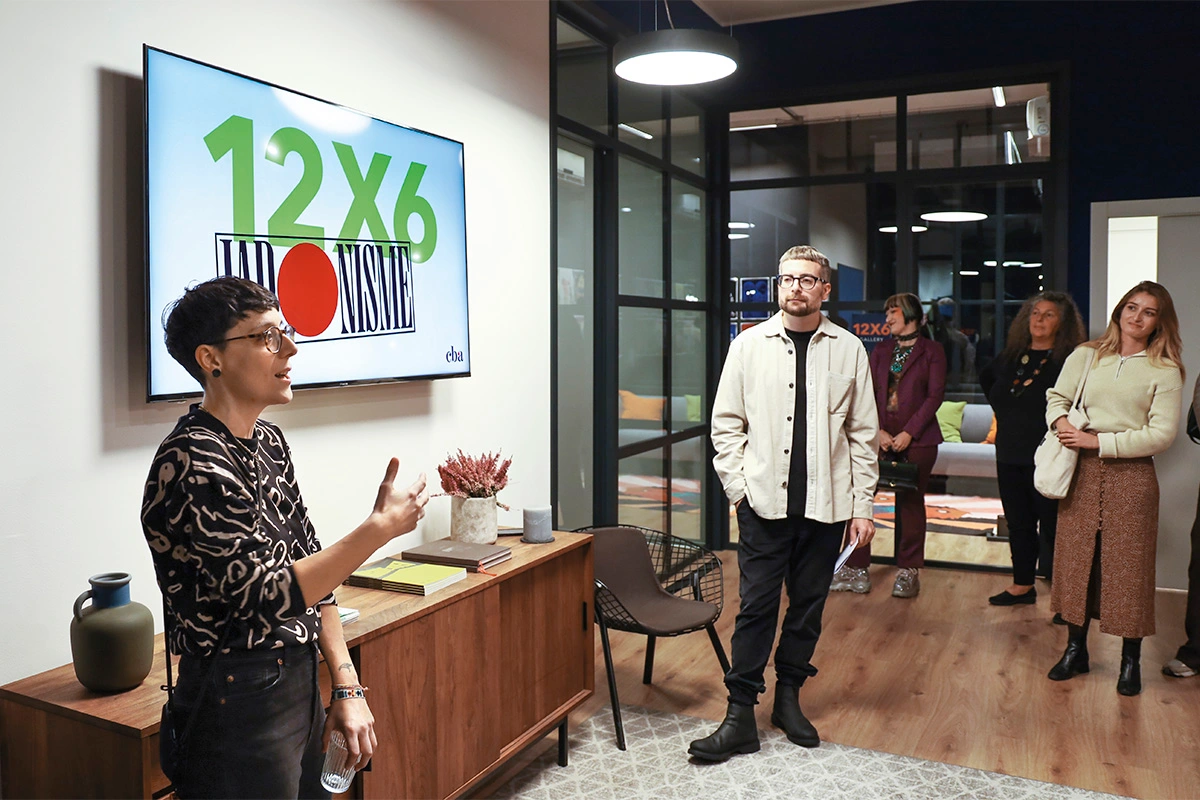
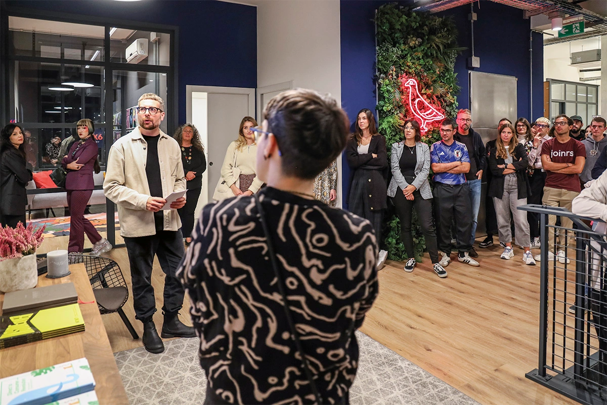
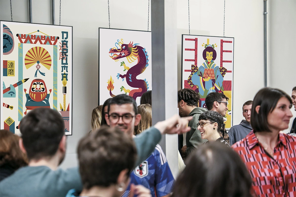
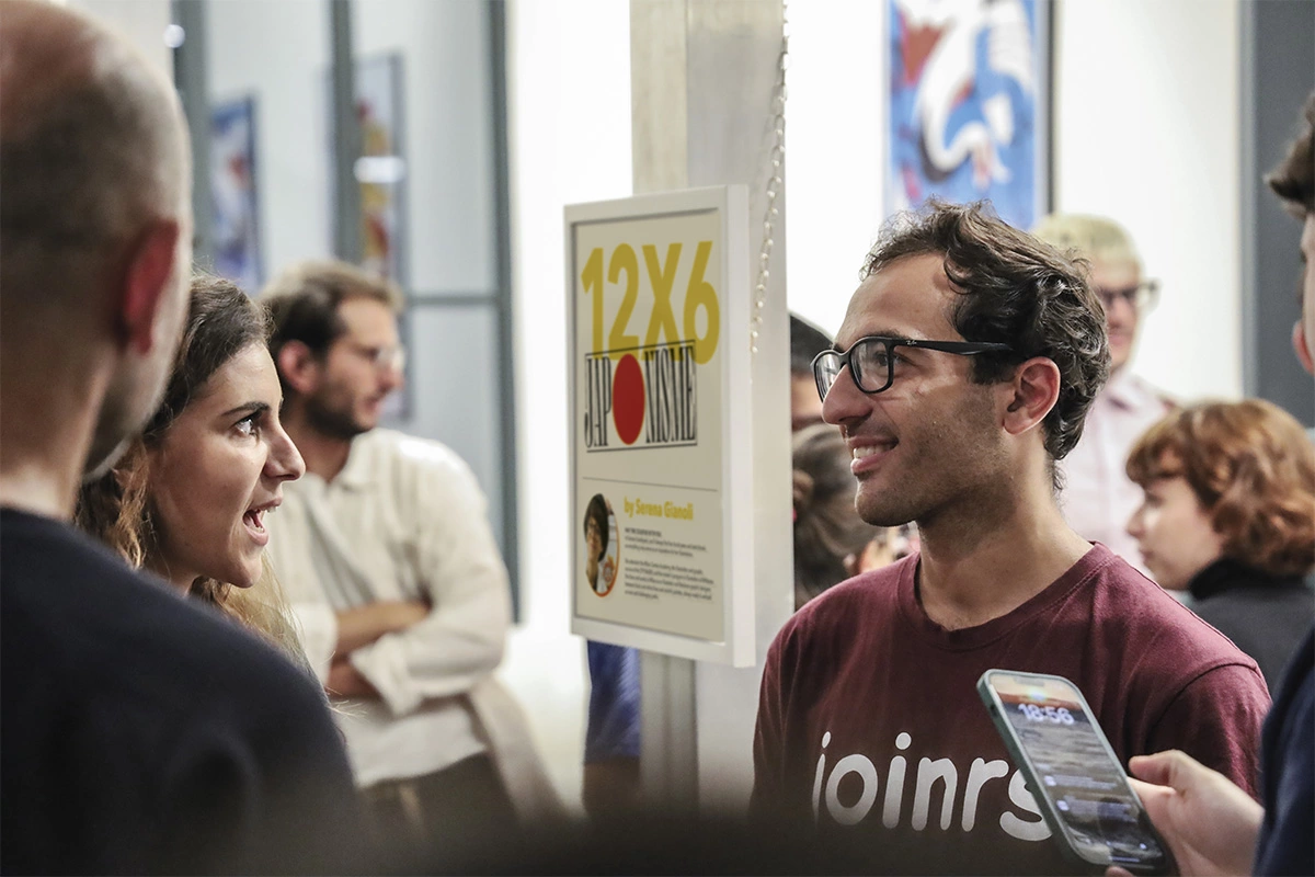
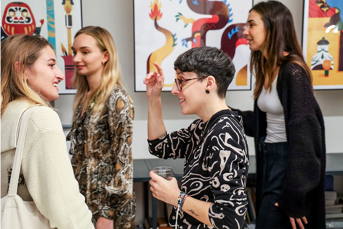
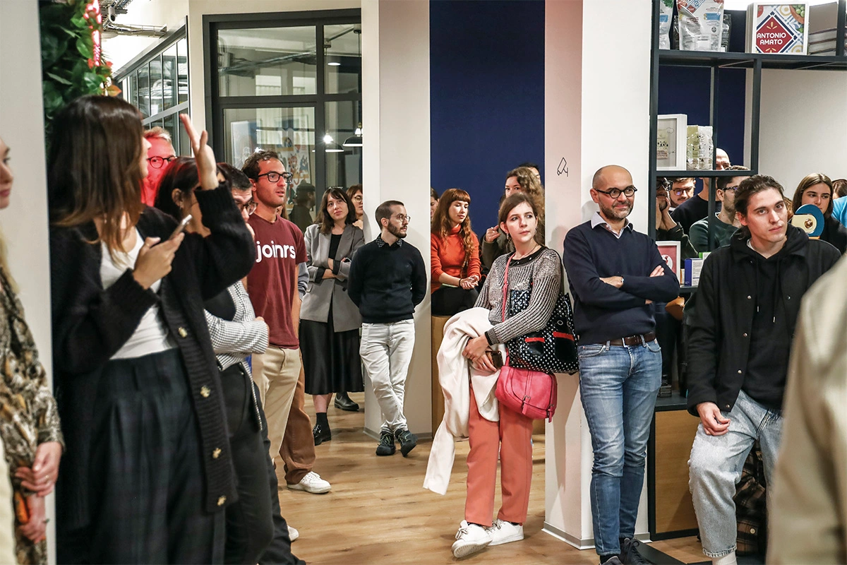
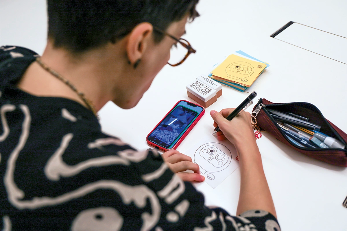
In thanking all the people who participated in the opening night, we would like to remind everyone that for the next six months, ‘Japonisme’ can be ‘visited’ at the CBA headquarters, located at Via San Francesco d’Assisi 15, Milan. We would also like to extend our thanks to Alessandro Doro, Raffaele Sabella, and Claudia Alexandrino, who were the protagonists of previous editions.
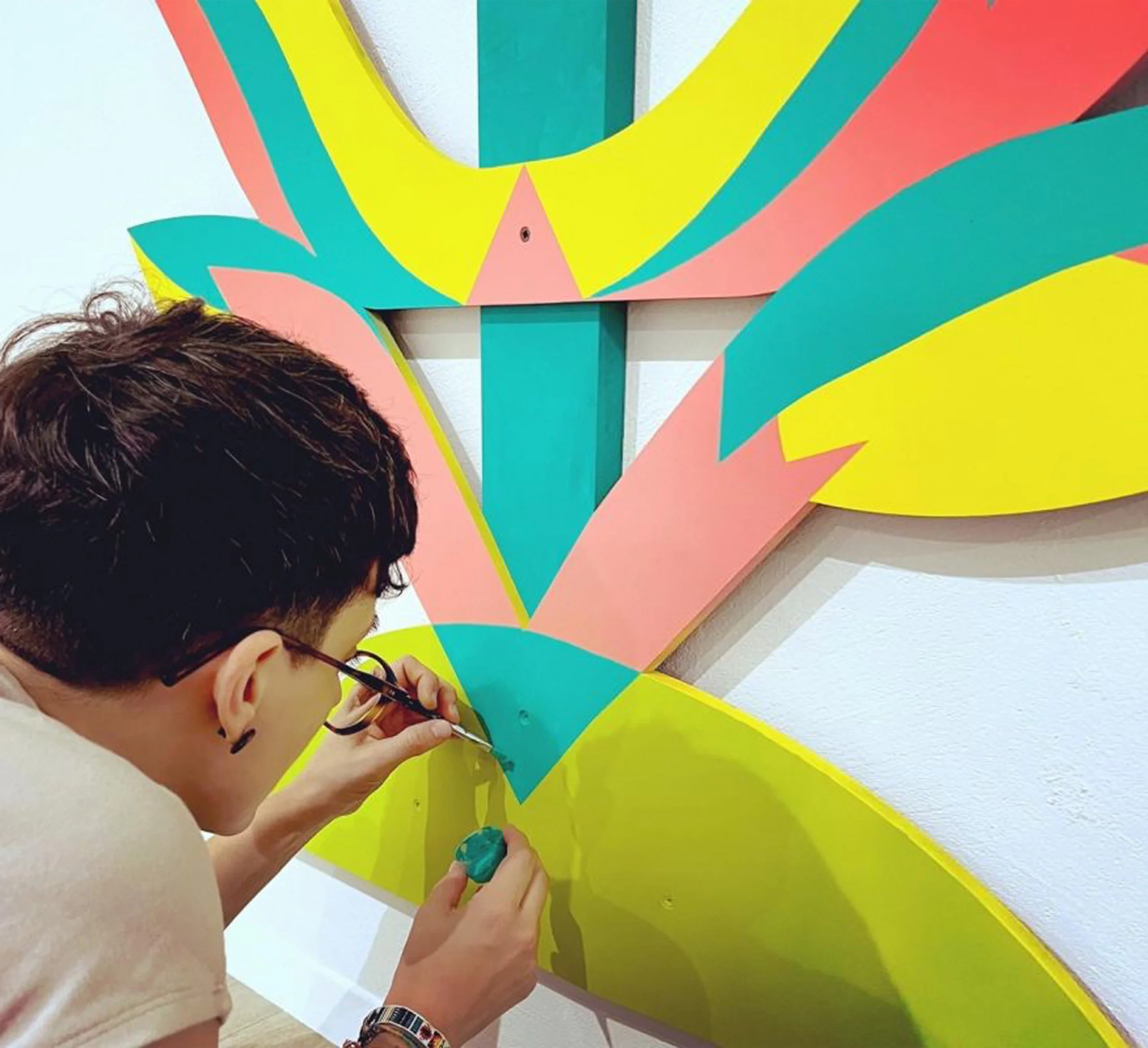

Serena Gianoli is an Illustrator and Visual Designer who lives and works in Milan, amidst black and white lines, colorful palettes, and a backpack full of markers, along with her ever-present sketchbook.
To delve deeper into her work and discover how her style will evolve, you can visit her Instagram profile @serenagianoli or her website www.serenagianoli.com.
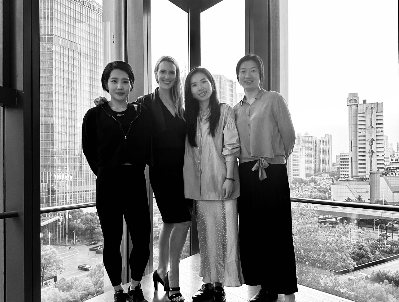
It’s 3 years after the opening of the studio in Singapore and the recent opening of the studio in Ho Chi Minh that CBA Design continues its implantation in Asia.
CBA is opening its third studio in the region and with its growing presence in Asia, the three offices merge and become a single entity: CBA Asia.
A studio opening led once again by Marion Micoud, Managing Director and supported by the recruitment of Ada Xu, Client Director, Olivia Qian, Graphic Designer et Bian Wu, Strategic Director. The studio is already well established with major clients such as Savencia, Unilever and Nestlé.
Great things in perspective!
After two years since the opening of the studio in Singapore and a great success confirmed by a constant growth since then, with clients such as Unilever, Nestlé, Clarins among others, in key markets like China, Japan, India, Korea, Philippines and Australia, CBA expand its international presence by opening a new studio in Ho Chi Minh City!
The success of our team in Singapore is highlighted by two prestigious awards received last year and since the beginning of 2023 during the Transform Awards Asia and the World Brand Society Awards, for its work on the brand visual identity of Unilever brand, Lux.
CBA aims to be useful to brands and society and our team in Asia, a close-knit, enthusiastic and multicultural team, reflects that.


Marion Micoud
/ Managing Director Asia
Ricardo Oliveira
/ Creative Director, CBA Asia (Singapore)
Dammy Chowdhury
/ Client Services Director, CBA Asia (Singapore)
Nguyet Lam
/ Senior Client Manager, CBA Asia (Ho Chi Minh)
Jessica Lucas
/ Associate Client Manager, CBA Asia (Ho Chi Minh)
January has just begun and CBA Design is in the starting blocks to make this year a year of opportunities, exchanges and collaborations, which will mark on people’s consciences, just like the year 2022 that we are closing.
We are transforming the brands of tomorrow and bringing meaning to their journey. We are proud of these achievement, which have been made possible thanks to our amazing and dedicated teams around the world.
2022 was the year we celebrate our 40th anniversary, a major turning point in the life of an agency. 2022 was also for CBA a year of several recognitions with multiple awards received, passionate collaborations and achievements all around the world.
Our creative designers have created a calendar to accompany you throughout this promising year and be by your side everyday!
2022 is a very special year for CBA, as its story began in 1982. This year, we are celebrating the agency 40th anniversary, but also so much more: 40 years of brands, of creations, of successes, of meetings, of stories…. And the list goes on. As an international design agency, we had to celebrate it in a way which fully express our creativity. Which is why we started The Blimp Experience.
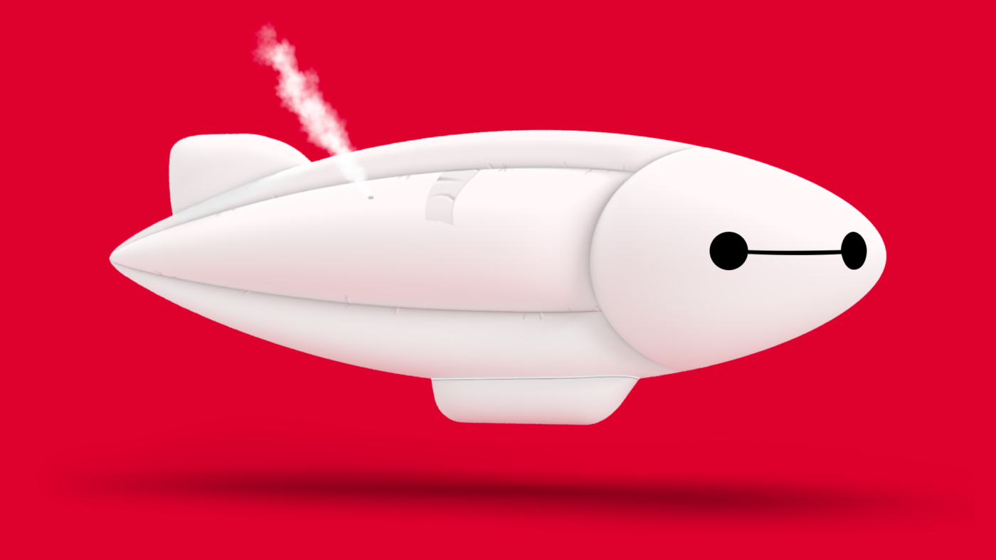
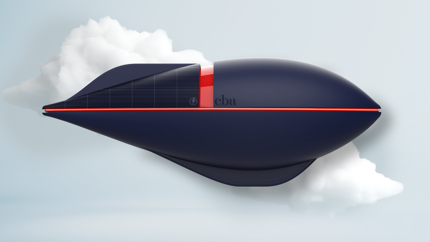
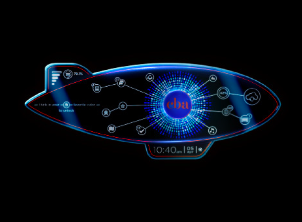
The Blimp has always been an iconic element of CBA’s graphic charter. It was only natural for our creative talents, from all around the word, to redesign it in the spirit of all these decades that the agency has lived through.
The Blimp Experience is a journey throught the last five decades on board of a blimp. Ready to take off ?


