France
Paris
Switch to your local agency
Back to menu
Welcome to
Following the user-centric approach that has always distinguished us, we have taken up some of the topics covered in our Food-Z research. The article frames 5 restaurant trends associated with as many moments of consumption, focusing on a world in constant evolution in which brand identity plays an increasingly crucial role.
1. CHOOSING THE RESTAURANT
Accessible cool: eating experiences that are cool, yet accessible.
There are three main drivers that lead 2021 consumers to choose a particular restaurant: perceived quality, the restaurant’s image, and affinity with the consumer’s identity.
The union of the first two drivers leads us to identify the first trend: Accessible cool. This is a type of format that is accessible to the majority of people but is seen by users as a fairly luxurious experience, thanks to significant attention to image and perceived quality. Accessible cool is the link between a classic restaurant and fast food, characterised by informal service and quick delivery.


Hekfanchai, Milanese bing-shi, showcases original Hong-Kong street food in Milan, accompanied by the new dishes created by the Hong-Kong-born chef Kin Cheung, one of the most internationally popular names in Hong-Kong cuisine, and is offering something new: a cocktail list that is characterised by a fusion of East and West, studied by the bartender Francesco Menozzi. Everything is at truly reasonable prices.
https://www.hekfanchai.it/
2. ARRIVAL
Pick Up Point: a new strategy to pick up clients “on the go”
Over recent months and bolstered by the pandemic and the consequential need to focus on open-air eating, venues have literally populated the city’s streets, squares and pavements of Italy like never before.
With this passage of the restaurant experience from indoors to outdoors, one trend that we believe will become ever more important is that of the “Pick Up Point”; a strategic use of external spaces to intercept passing customers through the use of stations or by literally “opening up” the restaurant to the outside.
The result is coffee and drinking stations, literal satellite points outside the establishment that offer take-away experiences, avoiding the long queues that today’s consumers, impatient and conscious of social distancing, may find stressful. Opening up one’s restaurant to the outside, allowing consumers to explore the venue’s offerings in a direct and interactive manner, translates into a more inclusive attitude towards customers.

The Terrazza Aperol recently inaugurated in Venice seems to have immediately followed the trend: just outside the bar it is possible to find a drinking station ready to serve take-away and strolling drinks, useful for intercepting “on the go” consumers.
https://www.aperol.com/it/terrazza-aperol
3. CHOICE OF FOOD
All-in-one: Fast, quality and healthy dishes
On our journey exploring trends in the restaurant sector, we now finally come to the inside of the venue, and in particular to the moment of choosing the food.
As we also saw in FOODZ, people are ever increasingly attentive to what they eat, and exaggerating with food is seen as an exception. This is why the “All-in-One” formula is gaining in popularity; single dishes accompanied at most by a starter and a side dish, with balanced and clear calorie content and often international in style. This allows everyone to enjoy a quick, quality and healthy meal.

For example, Poke House, after having gone beyond national borders – 30 venues in Italy, Portugal and Spain – decided to return home with its tenth opening in Milan, in the Porta Venezia district. Customisable low-calorie Poke bowls that are quick to make and contain top-quality ingredients.
https://poke-house.com/it-it/
4. EXPERIENCE
Eatertainment: restaurants as venues for entertainment, for an experience that goes beyond food.
Nowadays, people don’t go out just to eat. Our research effectively demonstrates the social importance of food, which is even higher than that of its gastronomic qualities, in response to social pressure to “go out and do something in the evening”. Food is good “material”, which is why, in a venue, the brand, its history and its values can be a subject of conversation; a central aspect when seeing restaurants as brands.
For this very reason, restaurants that follow the trend of “Eatertainment”, offering entertainment services, will capture the attention and the curiosity of consumers. It is therefore fundamental for restaurateurs to identify their target market, in order to be able to design experiences that are in line with that market’s needs and desires. We have discussed this matter in further detail in our FoodZ research, which can be seen here.

In this light, one promising proposal is the format “The 3rd Spot”, which is due to open in the next few months. “Our aim is to encapsulate the positive energy that characterises dining and open-air experiences, which have made a significant contribution to this year’s positive memories. The idea is extremely simple; following an entire life spent working and two years spent at home, we all need a third place where we can feel good and where we can get away from it all” – stated Josh Rossmeisl, founder of The 3rd Spot.
https://the3rdspot.com/
5. DIGITAL LOYALTY
Digital programmes and services aimed at building customer loyalty
We have come to the final chapter in our restaurant experience. The subject here is “Digital Loyalty”, a fundamental concept in the restaurant sector (that of loyalty), revisited in a modern key thanks to new technology and new services present in the world of gastronomy. In the future, restaurants will be able to introduce loyalty programmes to reward returning customers; these will, in fact, be given the opportunity to become “virtual regulars”, consequently accessing a series of advantages and awards provided by the restaurants themselves.
It is a trend in line with the aim of small- and medium-sized restaurant businesses to strengthen the bond with their customers over distance. Restaurateurs will be able to create their own personal loyalty programmes (in line with their brand and the expectations of their target) and set out the main characteristics. Physical cards, proprietary applications, delivery platforms… there are countless methods, and they can be valorised through the creativity of the restaurateurs.
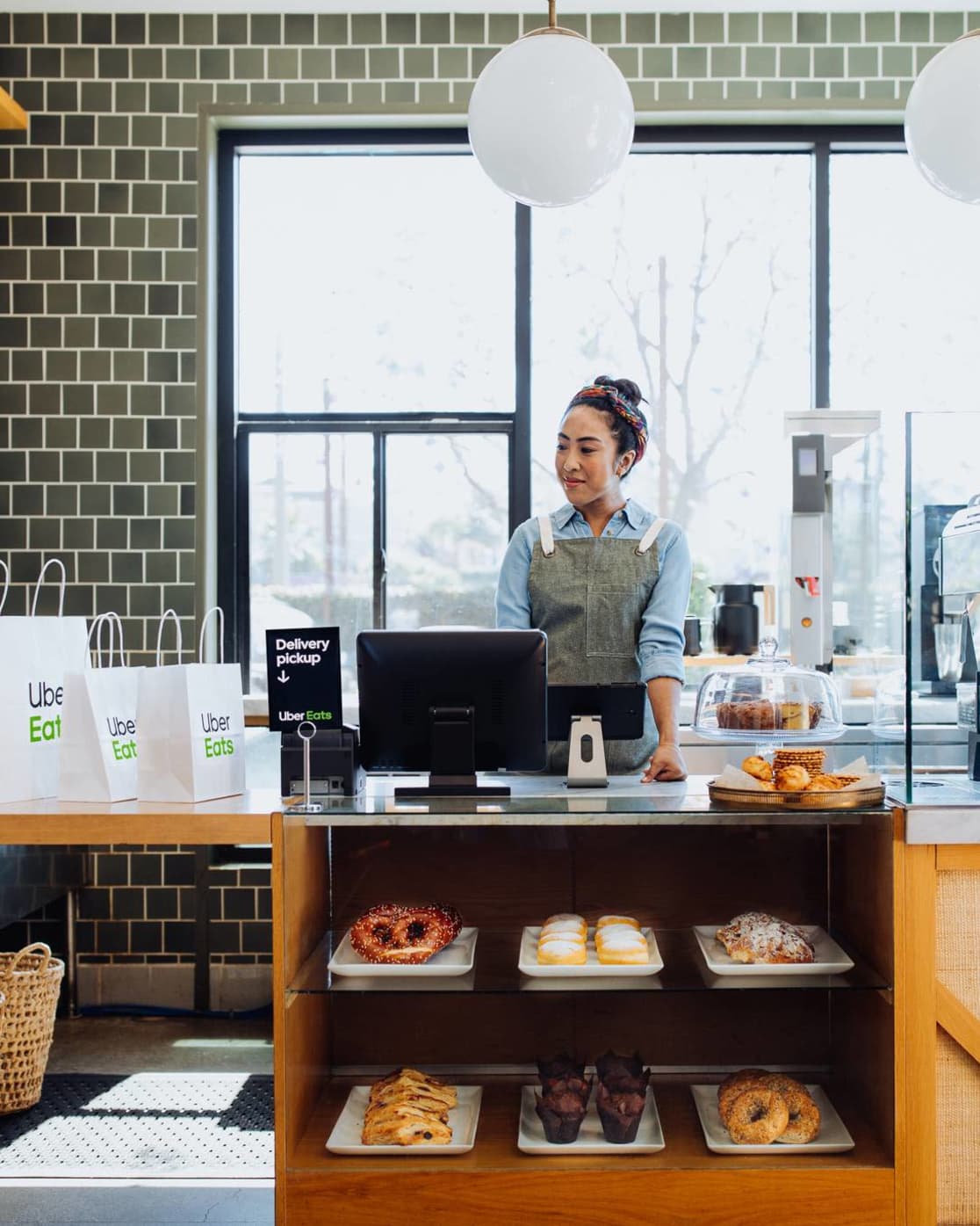

Uber Eats builds loyalty with its new Restaurant Loyalty service; in the future, all users and restaurants with the Uber Eats app will be able to introduce loyalty programmes to reward all the customers who continue to return.
https://restaurants.ubereats.com/gb/en/loyalty-program/
Giulio Vescovi, Strategic Designer at CBA
Since its creation, CBA has been working with brands on design problematic by placing Human being at the very core of its approach. For the agency, it is together, by associating various talents and expertise but also by listening to consumers, that it detects and brings to light the meaning and purpose of brands, through design. For CBA, design is a tool for positive transformation; it shapes differences and allows brands and consumers to leave a lasting positive impact on society, on environment; and on the world.
However, nowadays, having and claiming a purpose is no longer enough. Now, it requires tangible evidence to embody our message with honesty and authenticity.
With a “raison d’être” already detected, the agency decided to undertake this exercise by its own, in order to be able to manage the best possible collaboration with brands.
That is why, in 2021, CBA has decided to reassert its positioning, its missions and its values through the redefinition of its brand platform, its graphic territories and its consumers’ experience on digital.
The results? A new brand speech and a new digital ecosystem, merging meaning with performance, in order to live up to its convictions.
With the aim of focusing on what makes the design agency unique, international workshops were set up to redefine the CBA brand platform. This collaboration has allowed the association of various talents in the world. The main idea was to create a flexible design identity ecosystem to allow each agency around the world to customize it according to its cultural and local influences.
This collaborative work has enabled the agency to create an agile brand platform that reflects CBA’s international standing, and that is consistent with a common and meaningful message.
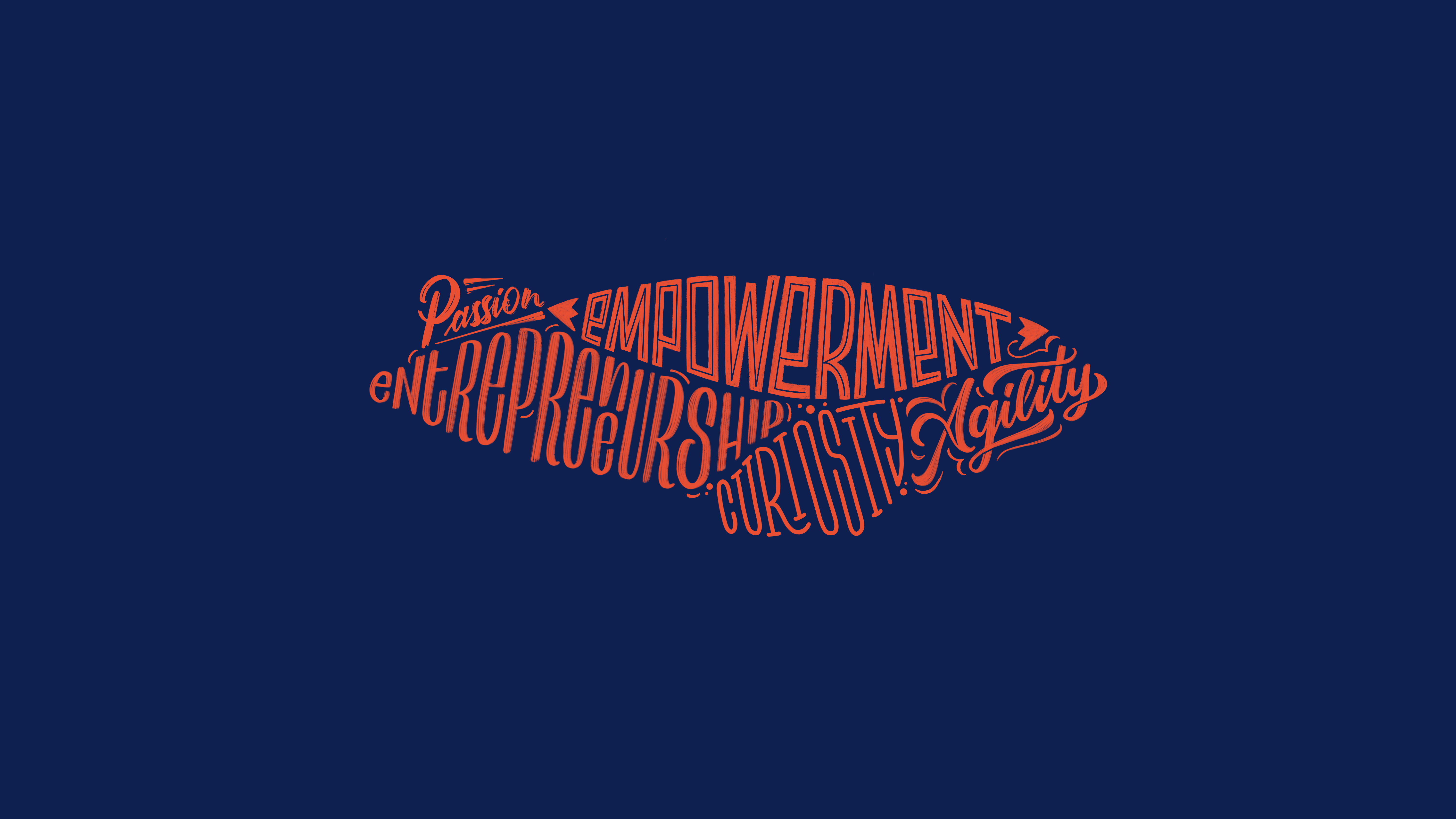
This web design project has been initiated by CBA’s digital teams in Paris.
A major challenge with a double goal:
From the beginning of this project, we’ve put the user at the core of our thinking to make it easier for them to understand the new positioning of CBA as they navigate
Digital Artistic Director
Although the precedent version was a true showcase of its “savoir-faire”, the agency wanted to give a more human and design dimension to its digital ecosystem; hence making its websites a mirror of its expertise and personality.
The goal was to create a true brand experience, with flexible design to allow its various international offices to encounter their own cultural singularity, specific to each country and each team.
The agency needed to give more meaning to its websites, through its speech regarding its new positioning, for its design with the idea of reflecting the core of its business and finally, from technical point of view, to be suitable with its international development and with the best web practices in 2021.
Thus, thanks to a collaborative and international work, CBA proves the successful association of its talents throughout the world.
Today, the agency got a relift and is equipped with new websites that match with its creativity. It offers a brand experience that highlights the meaning hidden behind the design, the purpose embodiment of the agency and its savoir-faire.
One thing is certain, this year, marked by a global health crisis, followed by an economic crisis, will remain etched in our memories! And yet, as Albert Einstein said so well, “in the midst of every crisis lies a great opportunity”.
And yes, 2020 will not have stopped the world from turning, reinventing and innovating! Innovate for what? Simply to survive, to improve, to give more meaning to our actions. Governments, citizens, consumers and businesses have understood this well. Without change, there will be no after.
At CBA, our teams around the world have also been able to seize the opportunities that 2020 has brought:
In short, the creatives of CBA knew how to use design as an element of positive transformation – for the environment, for society, for brands and for the company as for employees.
The result ? A multitude of small positive actions summarized in a few figures!
2020 has also brought us all back down to earth to anchor ourselves in reality, to open our eyes to what really matters: people. Because without Human, there will be no after.
That’s why at the end of the year, CBA wanted to say THANK YOU.
Thank you to our customers who have continued to place their trust in us.
Thank you to our employees who continued to keep the machine running, innovating and challenging themselves a little more every day.
Simply thank you for not giving up so that we can finally say goodbye to such a chaotic year!
So on behalf of our 300 collaborators, thank you.
We are ready to make 2021 an exceptional year with you!
At CBA, we believe that the successful brands of tomorrow are those that will place People at the heart of their approach, embody a cause and have meaning to leave a memorable mark beyond what they sell. To do this, we are convinced that understanding cultures and consumers is key.
By opening an office in Singapore, CBA is establishing itself on a whole new continent in order to be as close as possible to local cultures. This new agency is coordinated, in collaboration with London and Paris, by Marion Micoud.
With 15 years of experience, Marion brings a new perspective on Asian markets as well as effective expertise in understanding local needs and cultural nuances in order to develop, refresh or create new brands, products and services ( Identity, Digital, Retail, Packaging, Activation).
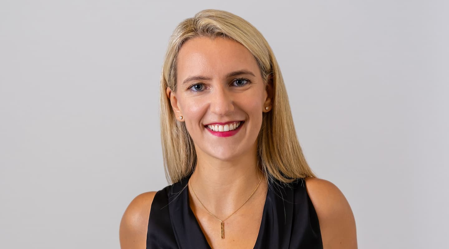
…
Marion Micoud
I am very happy to join the talented team of CBA and coordinate its development in Asia. As we launch our first office in Singapore, the World Economic Forum will hold its annual meeting there in 2021 and are announcing 6% growth for this region (Euromonitor data).
In 2021, one thing is certain: brands and companies must continue to adapt their offers and their working methods while remaining attentive to the desires of consumers and creatives are essential rules.
To support this, at CBA, we have developed a “Critical Imprint” offer. Indeed, we are convinced that the successful brands of tomorrow will be those that combine purpose and utility. If creativity has always been at the heart of our business, our goal is to reconcile the meaning and the raison d’être of the brand through design. Thanks to our collective intelligence and our network of 13 offices, we have a team of experts allowing us to exploit all categories and all markets through brand identity, packaging, retail as well as to digital.
Marion Micoud
General Manager & Head of Business, CBA Singapore
This new establishment allows CBA to strengthen its international presence and thus cover almost all world markets. This network will allow CBA teams to continue to develop synergies between its 13 offices, thereby promoting its ability to challenge itself and innovate on a daily basis.
New York has a string of iconic references to its name. It’s known as ‘the city that never sleeps and for being ‘so good they named it twice,’ for a start.
It’s a city that’s inspired the imaginations of many, never more so than as the fictional metropolis where Batman’s adventures were set. Gotham City is a ‘fantasy transposition’ of Manhattan, despite nobody ever saying so explicitly, often taking on the identity of the city’s noirish side.

Bill Finger, a co-creator of Batman, wrote many of the superhero’s adventures. He’d been drawn to an entry in the phone book for Gotham Jewelers. The name Gotham, he felt, was a fit for his fantasy city. Little did we know that it actually dates back to medieval England when it meant ‘goat’s town.’
Typeface designer Tobias Frere-Jones, a partner with Hoefler & Co at the time, chose Gotham as the name for the sans serif font he created in 2000.
It was GQ who had actually commissioned this new font. The magazine was looking for a linear typeface with a geometric structure. Something ’masculine, new and fresh’ was the order of the day. This, it believed, would bring authority and credibility to its published articles.
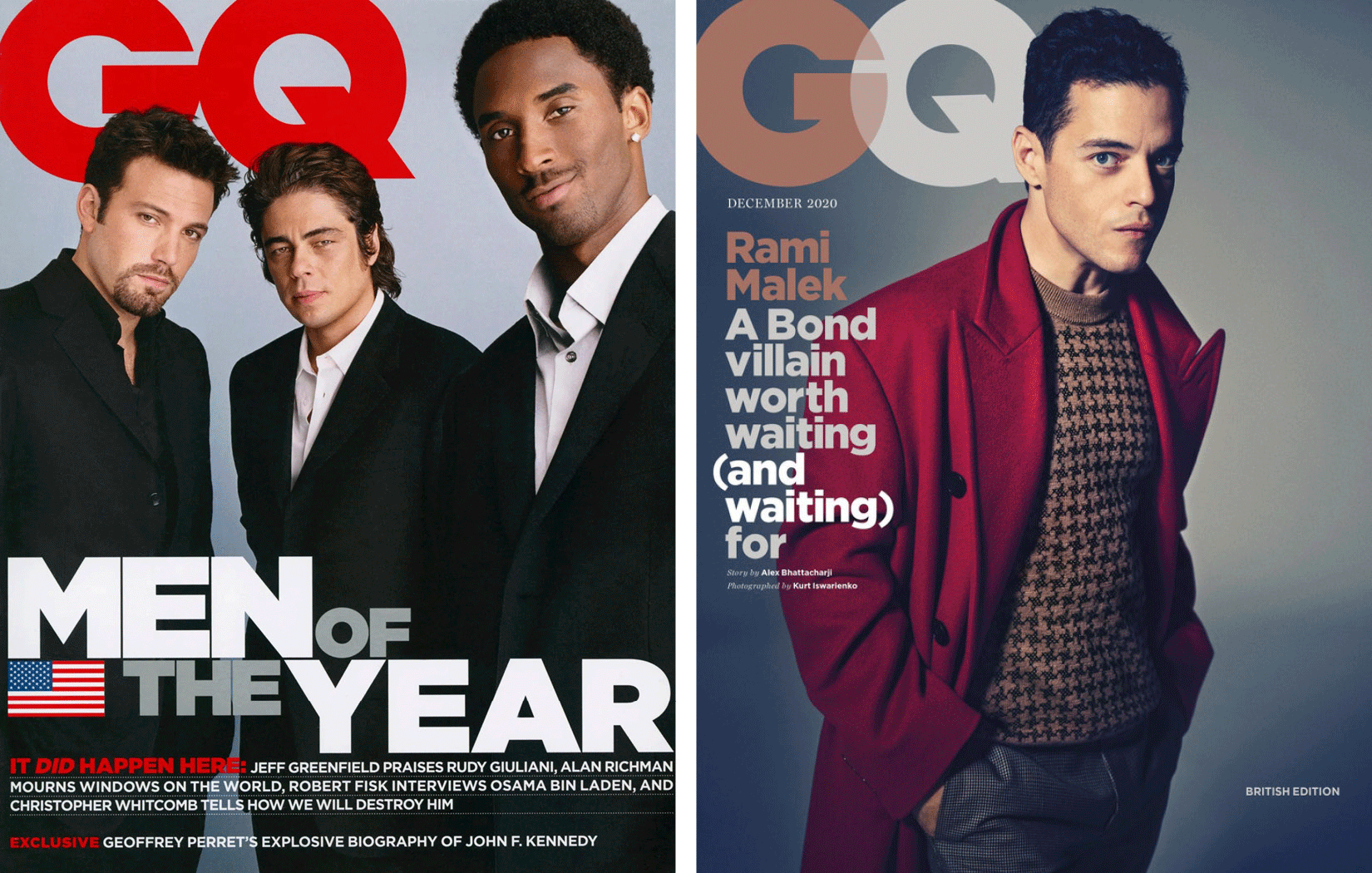
To capture the essence of Manhattan, Tobias had spent hours taking thousands of photos around the city. He focused on signs from the mid-20th century. He wanted to capture the freethinking spirit found in architecture and urban planning during those years.
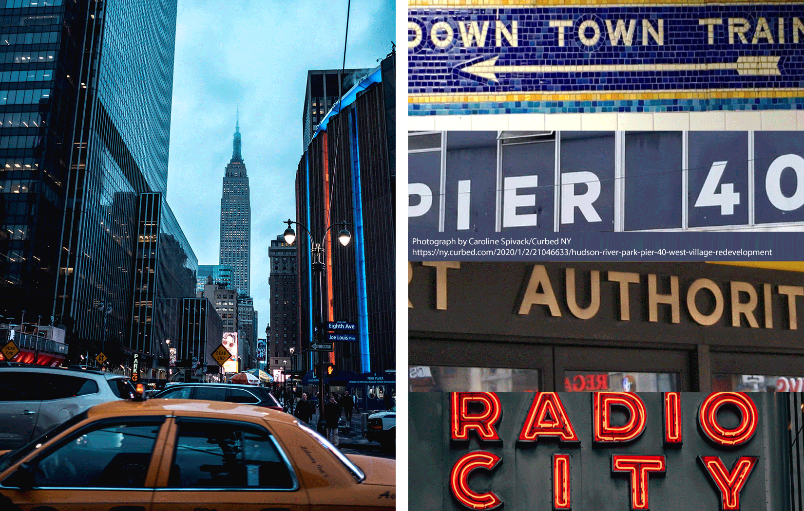
It was signage on the Eighth Avenue façade of the Port Authority Bus Terminal that caught his eye and captured his imagination. He summed up its simplicity when he said, ‘They are letters that only an engineer could have come up with. The fact that they were born outside a typography environment gives them a very distinctive flavor.’
The Gotham characters encapsulate the minimalist philosophy which inspired them. Initially there were 44 weight variants. Now there are 66. No room here for anything silly or nonsensical, Gotham is solid, concrete and functional. At the same time it’s an accessible typeface.
The description on the Hoefler & Co website is quite clear about all this. ‘From the letters that inspired it,’ it says, ‘Gotham has inherited an honest tone that is assertive but never imposing, friendly but never crazy, confident but never aloof.’
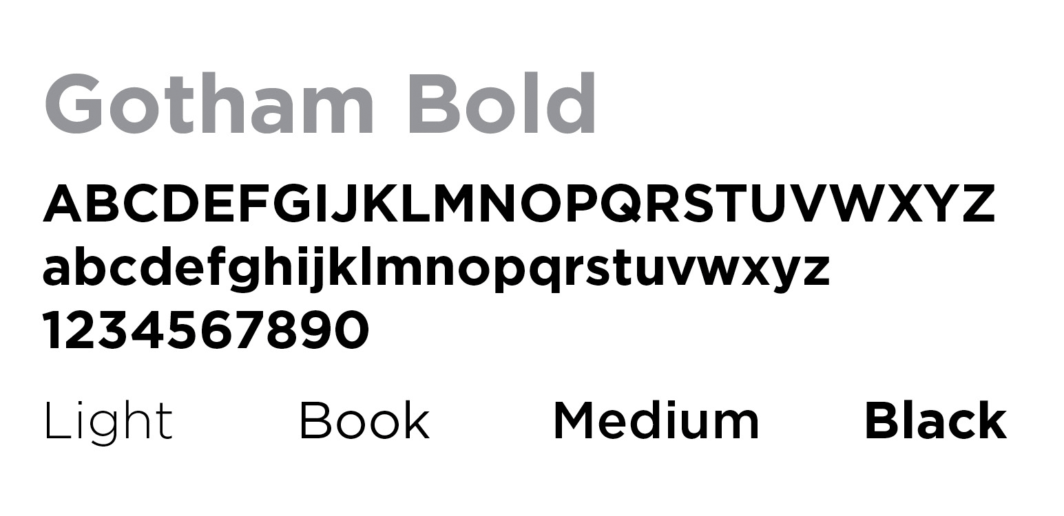
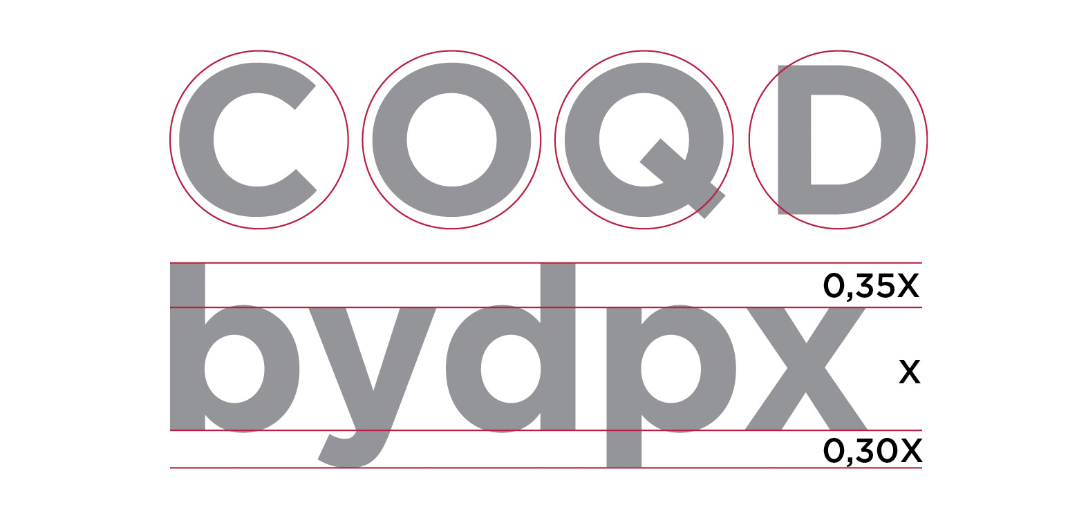
Among its most striking features are the circular shape of many of the letters and the very limited ascender and descender heights.
A few years after its birth and once the exclusive rights reserved by GQ had expired, more and more people began using Gotham. The Freedom Tower, the World Trade Center, and the National September 11 Memorial & Museum all chose it as their main character.

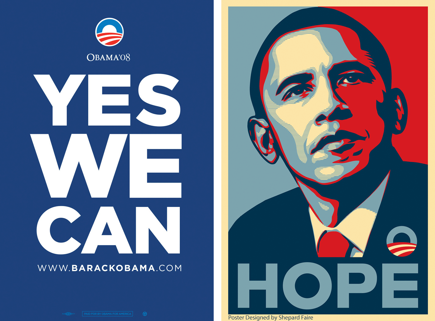
However, it was in 2008 that Gotham found true fame. The then American presidential candidate, Barack Obama, selected it as the official character for his candidacy.
Gotham, with its simple and incisive look, was a natural match for the clear and direct messages he wanted to get across. These included, ’YES WE CAN’, ‘CHANGE’ and ‘HOPE.’ Graphic designer Brian Collins described Gotham as the ‘linchpin’ to the former President’s entire campaign imagery.
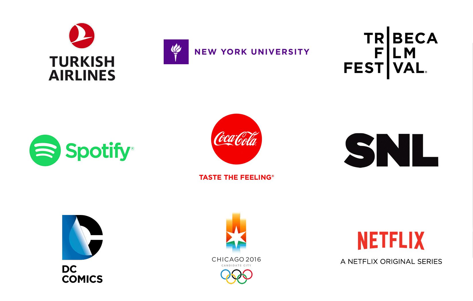
The ’Obama character’ has become popular not only in the United States but throughout the world. It’s used by Coca Cola, Netflix, Saturday Live Night, Turkish Airlines, DC Comics and the Tribeca Film Festival, to name but a few.
It’s even popular in the world of cinema, proudly standing out on the posters of countless blockbusters.
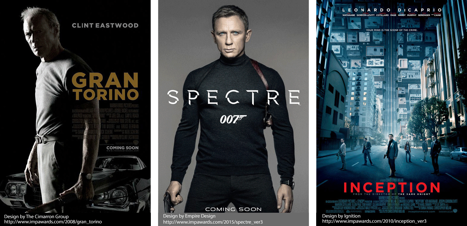
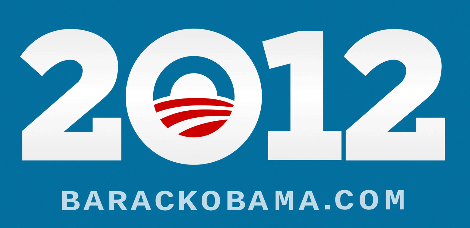
Four years after the first campaign, Barack Obama decided to use Gotham again for the 2012 midterm elections. This time serifs were added to ‘improve’ the typeface. When asked about how all this came about, Frere-Jones and Hoefler delighted by responding in words used in the Obama campaign,
I want to thank Giuseppe Mascia who’s based in Milan with CBA, Italy for writing this article. I hope you enjoyed discovering more about the Gotham typeface. Thank you for reading and I look forward to sharing a new and inspiring topic with you all next month!
Rutger, Executive Creative Director
Locaweb Magazine, on its 102 issue, published an article about the new trends and demands of packaging used as a selling tool, and Luis Bartolomei – our CEO and Head of Creation – was one of the interviewees. He highlighted the importance of designing new packaging having the virtual shelves in mind, that is, thinking about how the products are displayed on websites. Read the full article – and to learn more about the performance of packaging in the online sales environment, check this article where we present our e-pack methodology.

Founded in Paris in 1982 by current Chairman, Louis Collinet, CBA is a global design and branding agency with a human touch. For more than 35 years, CBA has created brand experiences and identities based on a combination of strategic analysis, creativity and a human-centric approach.
The key is listening to and understanding both cultures and consumers. Despite 2020’s unprecedented global crisis, CBA is opening new international locations so it can be as close to local cultures as possible, including Lima and Mexico under the agency’s São Paulo arm, CBA B+G.
Ever since the B+G Agency was fully integrated into CBA Design in 2014, creating CBA B+G, the focus has been on consolidating our Brazilian presence through expertise in four key areas: Branding, Design, Research and Innovation. In 2015, the 80-person agency expanded its presence throughout Latin America and the Caribbean, becoming one of the continent’s major branding agency. Peru and Mexico have become two key strategic platforms for the establishment of an agency that is deeply rooted in Latin America, due to their very unique consumption patterns, creative proprietary cultures, strong growth of local historic brands and the resultant need to know their consumers more closely.
These two satellite offices are flexible structures that will serve as creative and strategic relay points for the parent agency in São Paulo. Their main objectives are to help teams identify local consumer traits and major national trends, as well as to strengthen relationships and partnerships with clients supporting us in this move towards greater regional development, including Colgate-Palmolive, Nestlé, Purina, Pernod-Ricard and Kimberly-Clark.
———– Ludovic DAPOIGNY, Managing Partner & Head of Business Latin America.
Today, CBA is:
Along with these new locations, 2020 is a year of celebrations: the 10th anniversary of CBA USA; the 15th anniversary of CBA Turkey; the 25th anniversary of CBA B+G (Latin America) and the first anniversary of CBA North Europe, whose continued growth includes expanding its teams at the end of the year.
Thanks to this well-established network covering all markets, CBA can develop greater collaborations and synergies between its teams, and thereby constantly challenge and innovate on a global scale.
We believe that virtuous brands are those that know how to combine purpose and utility.
2018 was rich in changes at CBA. We challenged ourselves to adapt our structure to a world that moves at high speed.
To be committed and coherent for our clients as well as for ourselves: this will be our mission this year.
We wish you a wonderful 2019 filled with purpose and utility!