Brand Beyond Packaging
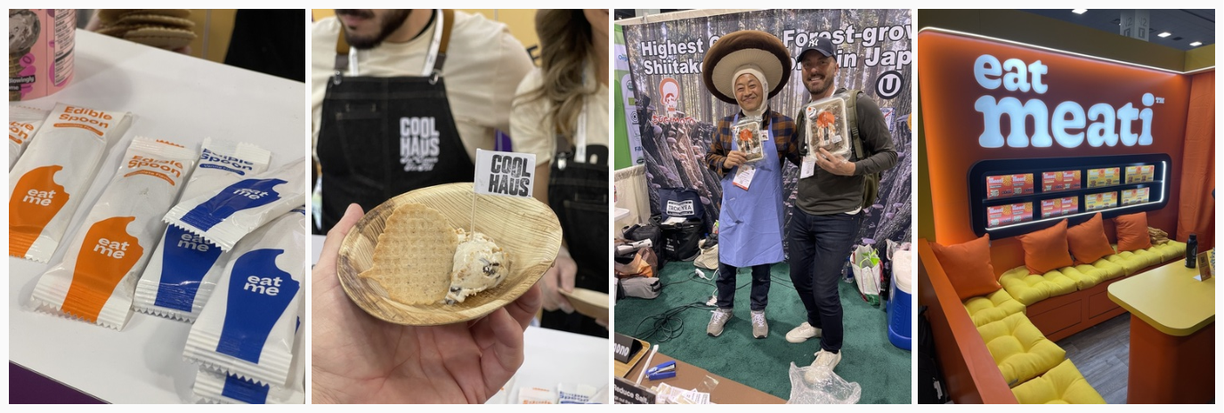
Full brand worlds were presented, not just the product and its packaging. The most successful booths attracted crowds that were seduced by appealing identity design, consistent blocks of color, strong branding extended to materials such as stickers, pos, leaflets and yes of course, packaging. FMCG corporate design is a real thing, and the best performers at the expo confirmed the importance of investing in this.
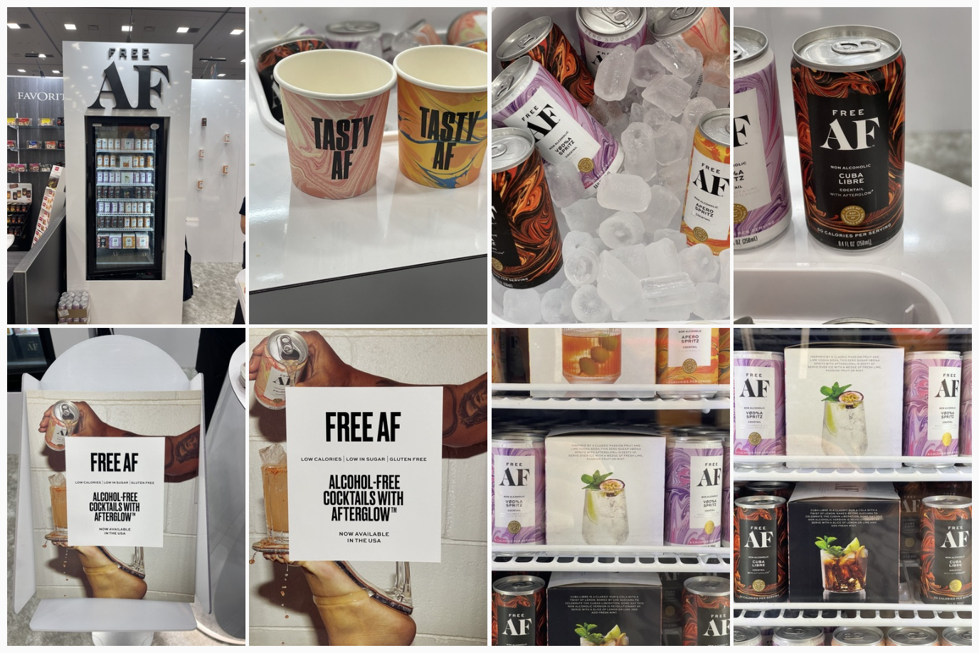
Tasting Theater
A memorable experience here was of course product tasting. This was set up, in some cases, as successful ‘theater,’ where the brand world was seamlessly translated to a ‘set’ where food was prepared. Then there were games, rock stages, and chill areas. There were many examples where the brand was effortlessly extended thanks to a strong visual and strategic foundation.
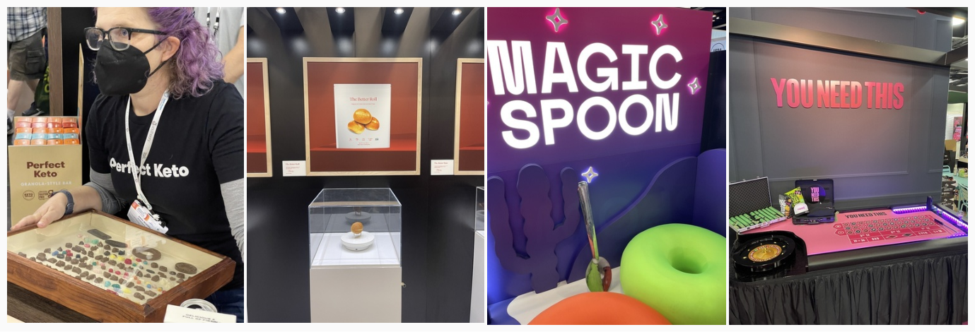
The Era of Bright
It came as no surprise, after multiple Gen Z reports about the preferences of our younger consumers, that brands are simple and bright. Packaging is designed to attract attention on shelf and on the small screen. Flat bright colors dominated the innovation section of the Expo. There was no holding back here, and every color of the rainbow was covered, including a notable presence of pink.

Minimal Design
It was great to see that some brands choose to disrupt by being minimal. This is the design theory I was taught in school: just show what is necessary. A calm oasis amid the sensory overload that surrounds us in this chaotic world (and its supermarkets and digital space!)
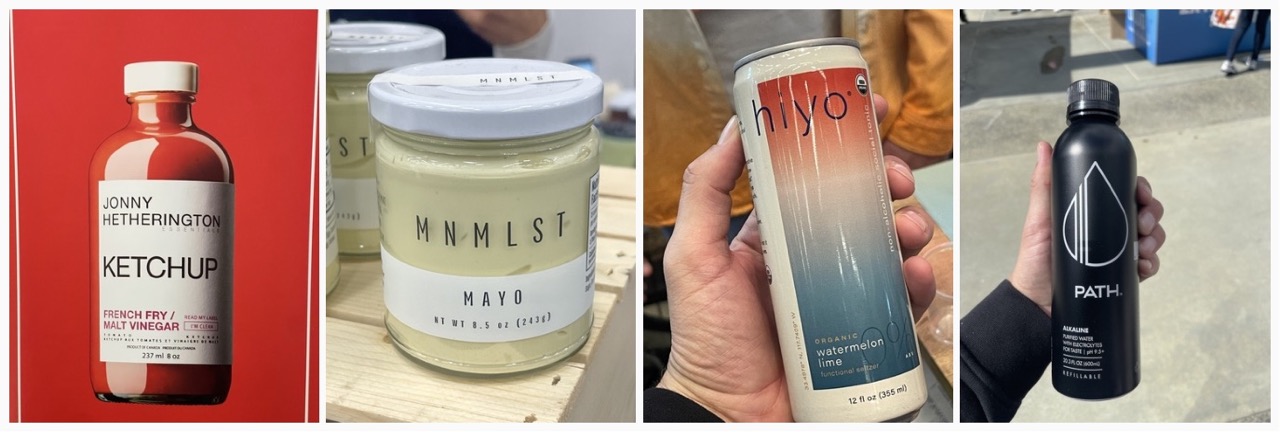
Descriptive Brand Names
With simpler and cleaner packaging, what is on the pack now needs to work extra hard. Brand names often indicate what the product or positioning is. No more ambiguous names that need further investigating to understand what it actually means, but playful versions of real words creating an ownable brand name.

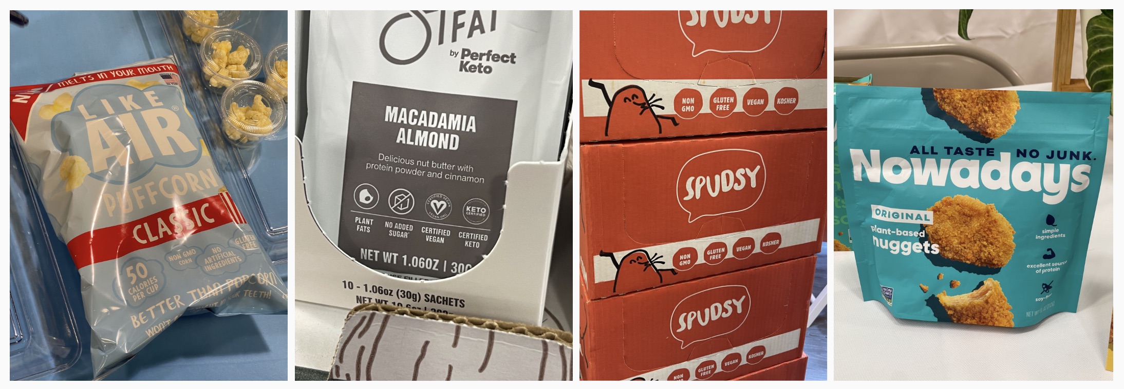
Inform Up Front
Many products now proudly present the important product info on the front of the packaging, such as ingredients (or lack thereof), how it’s made, where it’s from. All designed in an engaging way not just there to inform but also to make you feel good and in some cases, entertain. We also saw a ton of icons adorning all sides of the packaging and displays, further clarifying what each new innovation could mean for you.
Conversational Tone
Designs were not there to just tell us a story but were designed to invite you in and engage. Messaging appeared human, crafted and/or unique. We all know the typography clichés and ‘go-to’ styles that often mark a specific category. Many designs are now inspired by a lifestyle and Instagram-ability (is this a word yet?)

Sustainable Everything
This should not be an ‘ah-ha’ anymore; however, we loved to see how sustainability is here to stay. Everything from plant-based serving platters to edible spoons (which I ate before my ice cream was finished, my bad). And then the biggest thing we saw this year: mushrooms! Mushrooms as protective packaging, mushrooms as chicken, truly incredible and delicious.
Now of course this is only a summary of three days of pure joy and inspiration. Impossible to pen it all down. As always, it’s good to share, and I hope this will pass on some of the energy I took away from the Expo. I love exchanging ideas and keeping the conversation going, so if you feel I left anything major out or if you want my opinion on something here and what this could mean for you as a designer or brand, let me know! Happy to talk.
By Rutger Thiellier, ECD.
