Angelina, the elegant Parisian redefines itself
Since its creation in 1903, Angelina has become the unmissable gourmet and refined meeting place for Parisian aristocracy. In its lounges, Proust, Coco Chanel and the finest French couturiers have crossed paths… Today, Parisians, tourists, and celebrities all crowd in to enjoy the famous “Mont-Blanc” and the unforgettable hot chocolate known as “L’Africain”.
Angelina has turned its legendary address into an international flagship with more than 10 worldwide addresses- from the Middle-East to New York.
In order to modernize and (re)emphasize Angelina’s packaging and giftings, CBA has reworked the brand’s priority codes and packaging system.
The agency had two aims:
- Distinguish the daily consumables from the gifting
- Redefine the brand codes
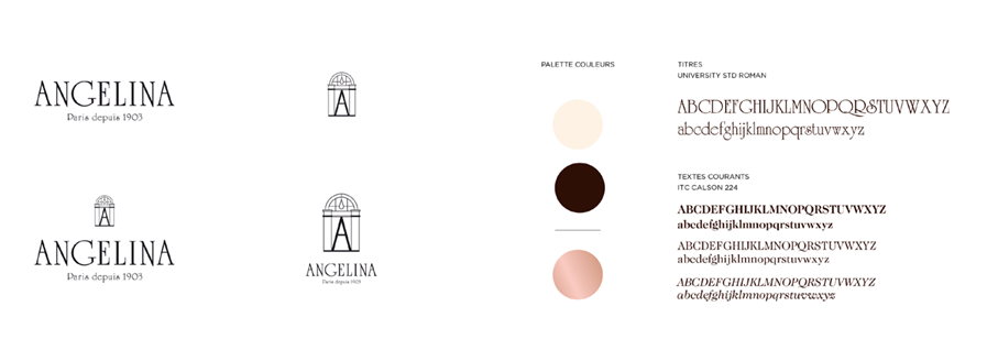
CBA’s teams offered to put back the unique arch, emblematic symbol of the house, at the heart of the packaging design while enhancing the color palette at the same time.
Indeed, the international agency wished to keep the main colours of the brand, while introducing an additional shade: a richer shade of pink- in the spirit of the mythical Mont-Blanc- and chocolate on certain details.

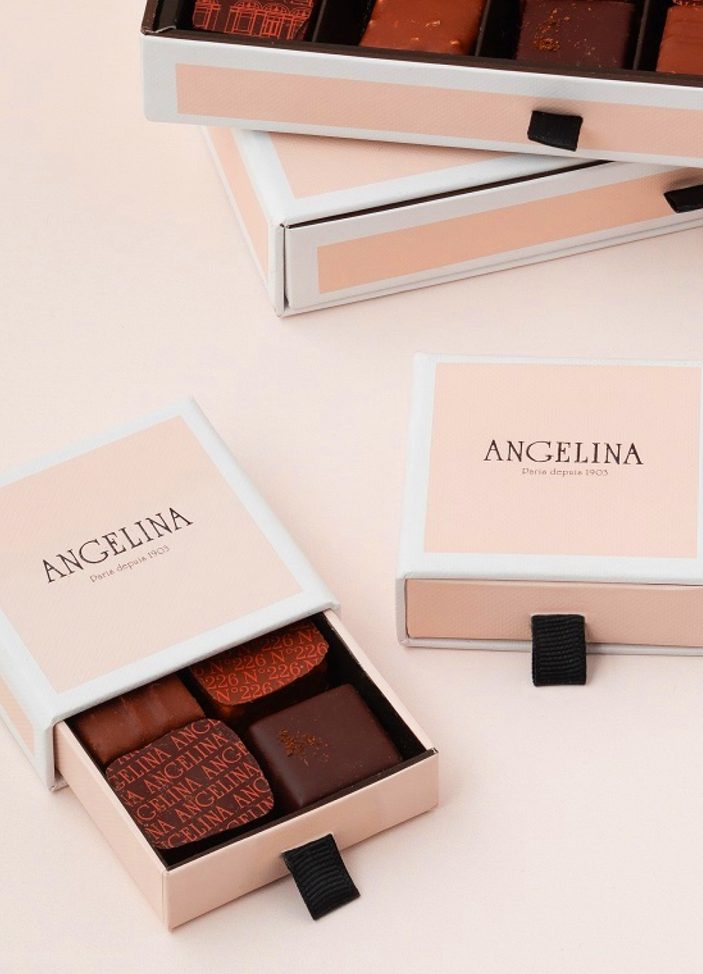
At Angelina, each tasting is an opportunity for a renewed celebration. To magnify this experience, the packaging of the containers has been redesigned. Reflecting the richness of the brand and its complexity, the exterior retains all the signs of delicacy, while the inside, more intense, represents the intensity of taste.
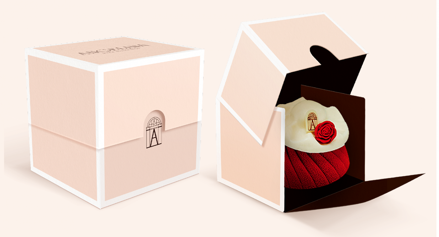
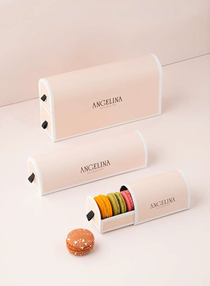
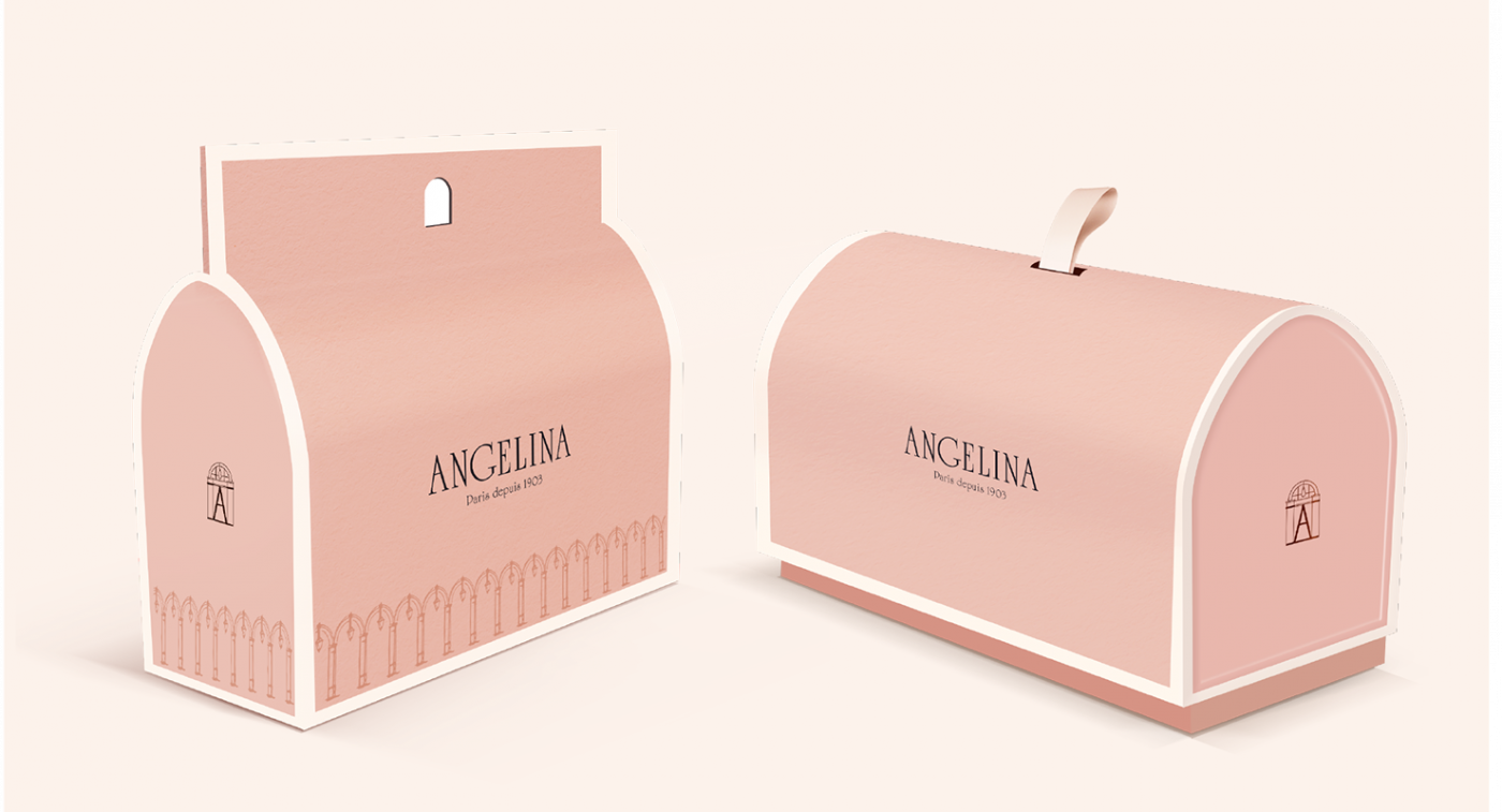
The Tuileries arch is emblematic, it is the icon of the logo. Therefore, CBA had the will to make this arch a unit of volume, which defines the profil of the containers; whether it’s the daily consumables or the gift containers- it will appear from all perspectives, no matter the angle of the packaging.
But that is not all. Indeed, the iconic French macaroon containers has been reworked to take on the shape of an arch. In one-tier or two-tier format, there will be plenty for all tastes.
