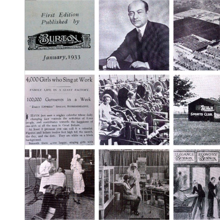
Burton of London, the most English of French brands, is a fashion brand for men and women.
With the aim of reaching new targets by revamping its image, its know-how and its unique style, the brand called on the design agency CBA. Moreover, as Burton of London is often perceived as a purely masculine brand, it was also necessary for the brand to highlight its feminine lines.
The main challenges for CBA were to redefine the brand’s strategic fundamentals and to deploy an identity ecosystem in phase with the times. To carry out this project, our teams initiated a workshop with the brand’s directors: a collaborative process reflecting the brand’s family history.
The objective? To audit the brand in order to understand its origins and redefine its positioning, its values… its essence.
The results? The agency detected a very strong heritage and DNA concerning the brand’s commitment to :
- The accessibility of its products. The vision of founder Sir Montague, a tailor by trade, has always been to make bespoke suits accessible to all by offering “smart suits”.
- To the right message and vision of the company that the founder had.
Based on this analysis, CBA wanted to focus on :
- The DNA that makes the brand unique.
- Burton of London’s Anglo-Saxon origins, which symbolise the duality between its traditional image and its more punk and rock side; a contrast that makes the brand rich and unique.
- The brand’s smart bias, making it a chic and trendy brand accessible to all.
This led to the creative concept of "Sir with a twist".
Impertinent British style
The agency therefore decided to put these three elements at the heart of the brand’s positioning and graphic territory. The objective? To bring Burton of London to life through its history and the impertinence of its British style.
CBA has developed a visual identity inspired by classic English fashion and the quirky style of contemporary England. A graphic territory that expresses the meeting of these two opposing universes by mixing traditional and pure colours with more peppy and fun shades.
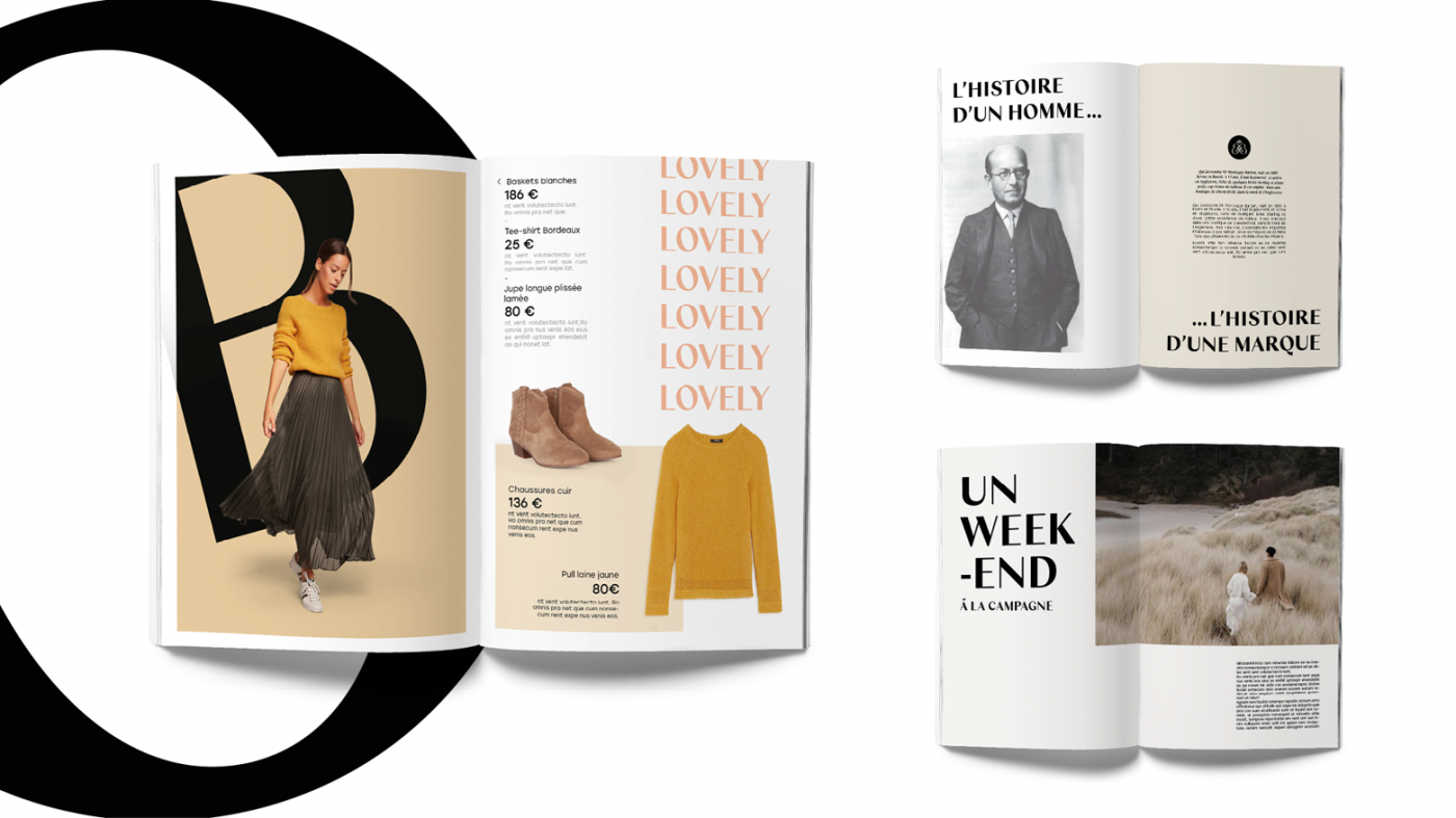
To embody the brand’s strong and committed message, the agency chose to use an imposing typography in keeping with the brand’s message.
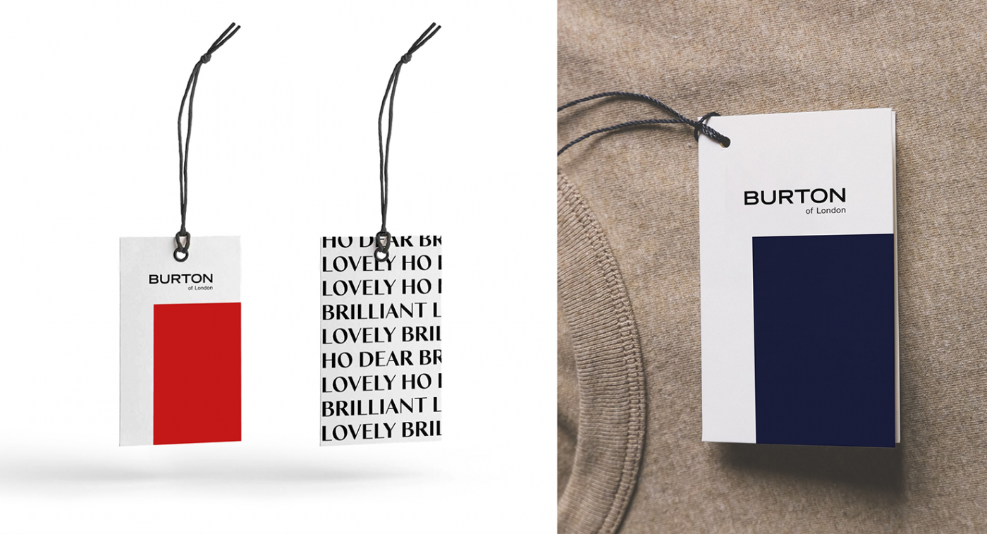
In order to highlight the brand’s contrasting values, our teams created an offbeat and playful tone of voice by taking popular and historical English quotes and twisting them in the Burton of London style.
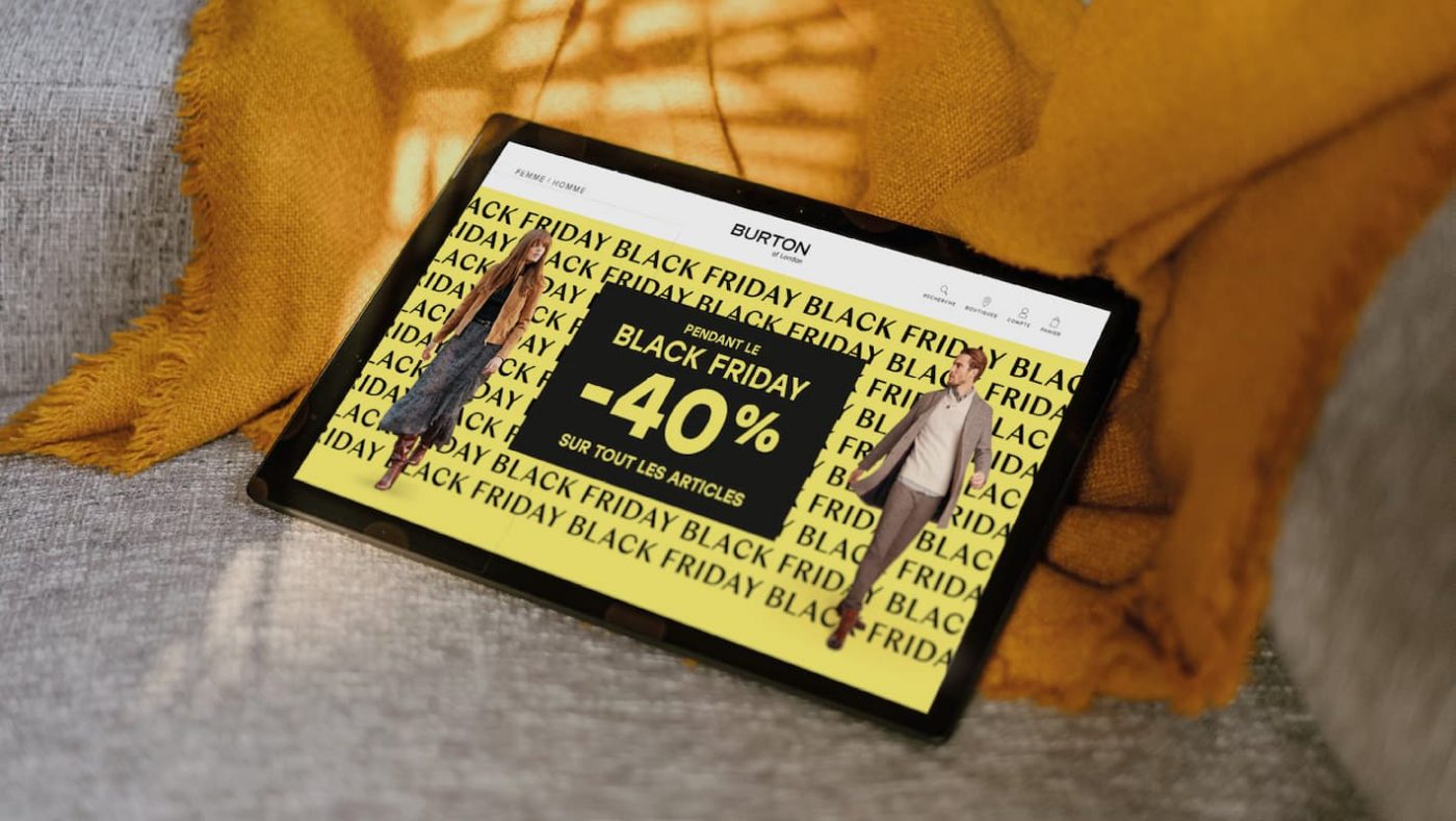
Following the creation of this design ecosystem, the visual identity and iconography were applied to various communication media: from labels to DLV and PLV through the graphic and editorial line of the catalogues. CBA was thus able to make the brand’s history and original message resonate through the creation of a unique and proprietary universe.
This strong DNA also inspired the photo brief designed by the agency. A photo brief developed to guide Burton of London in the artistic direction of its visuals and its various collections. The creative idea? To recognise the brand’s aesthetic at a glance. To do this, CBA defined the archetypal Burton of London models: the androgynous and enigmatic man, inspired by the iconic David Bowie, as well as its female reference, the ingenuous and uninhibited modern woman.
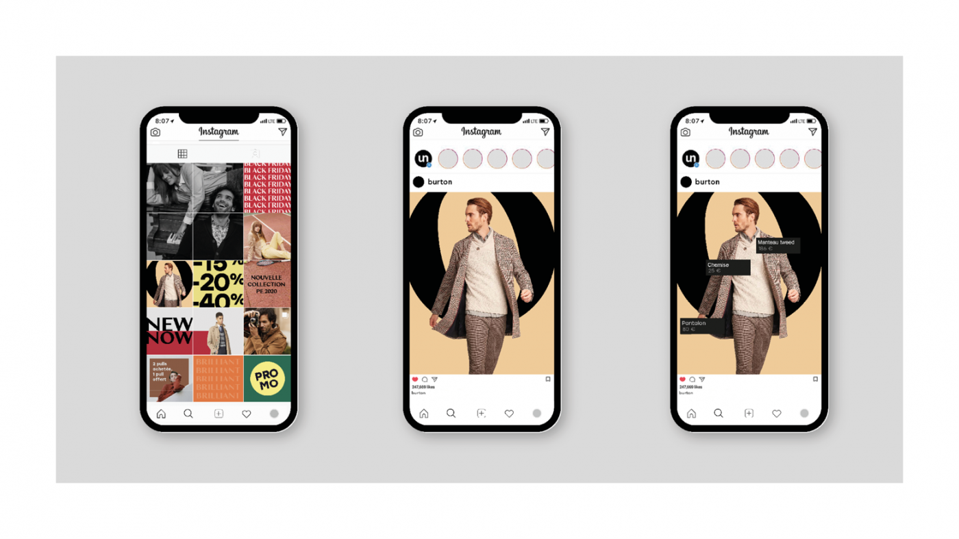
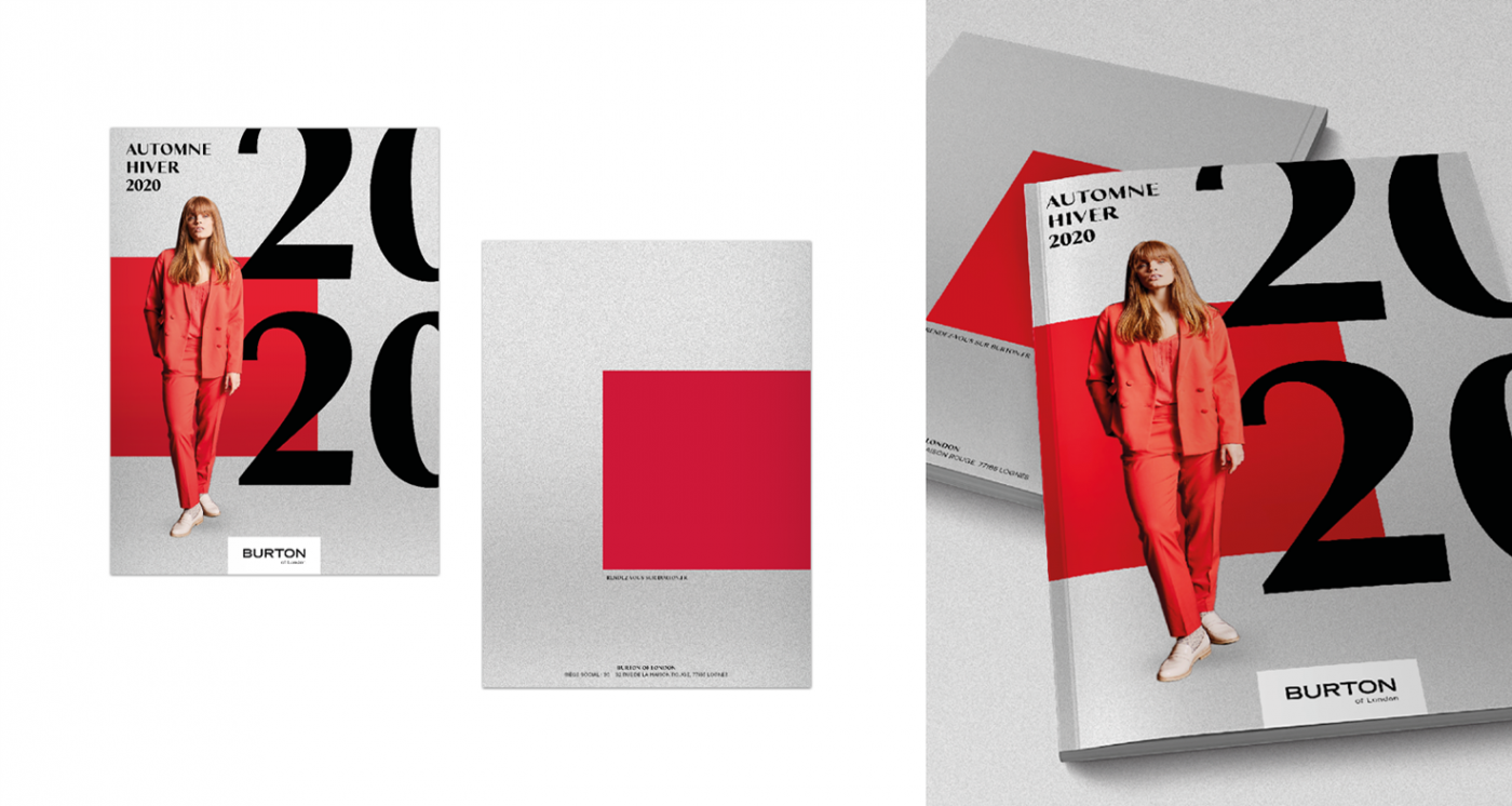
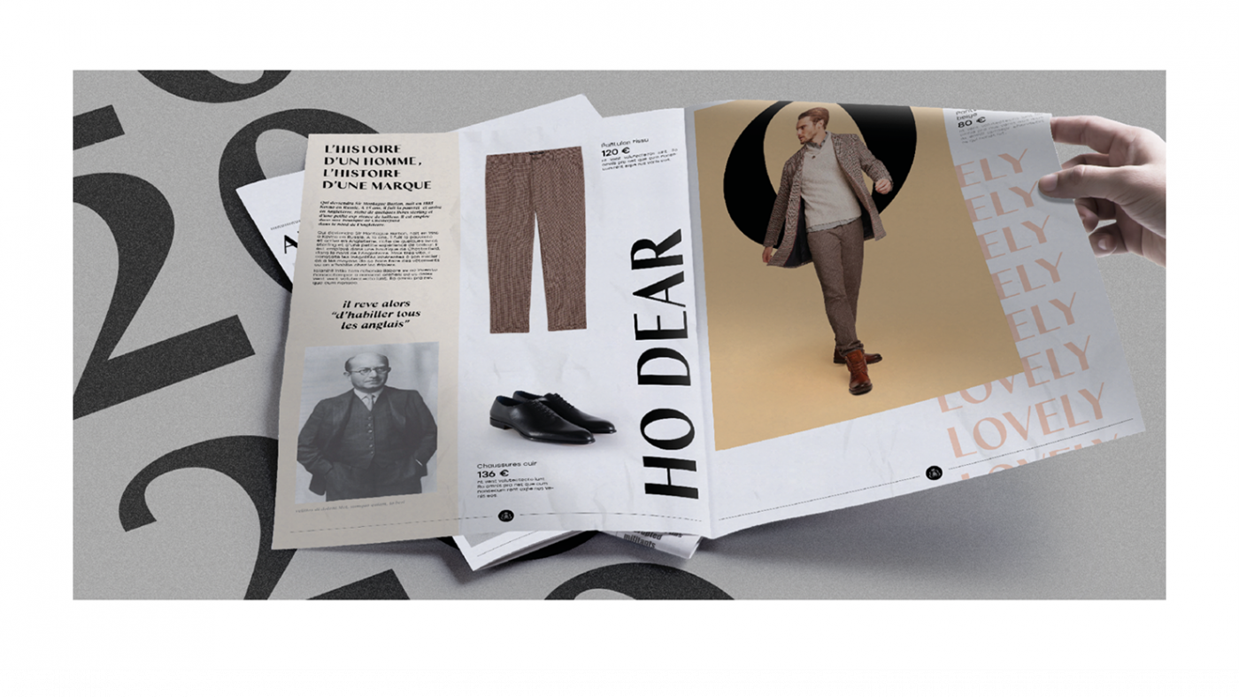
Burton of london : the twist in store
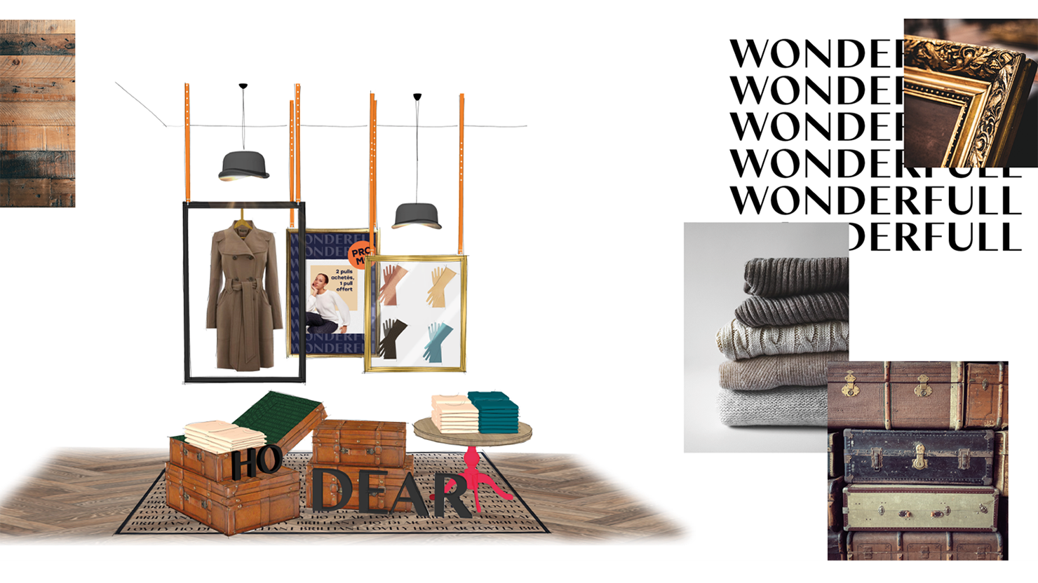
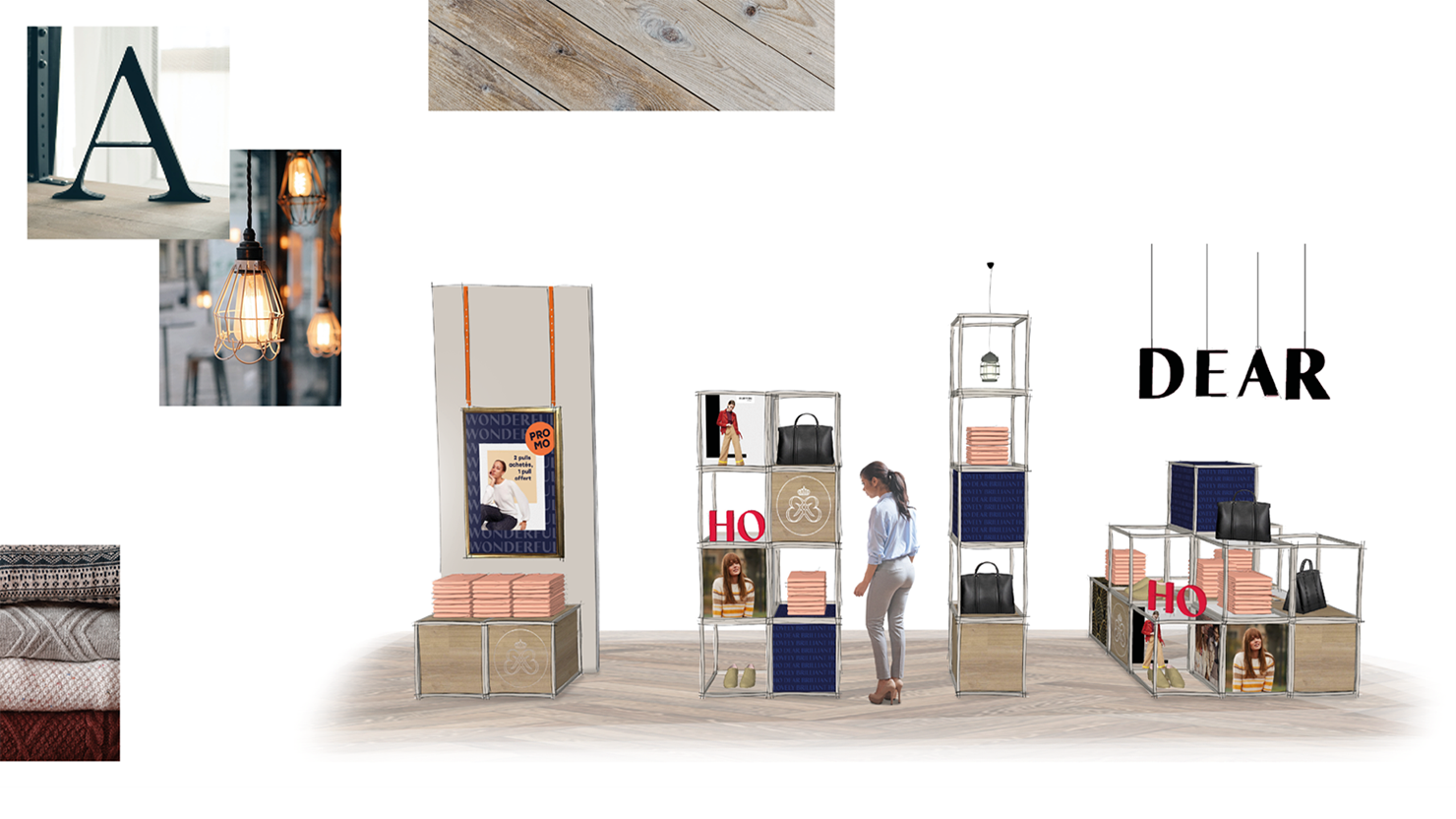
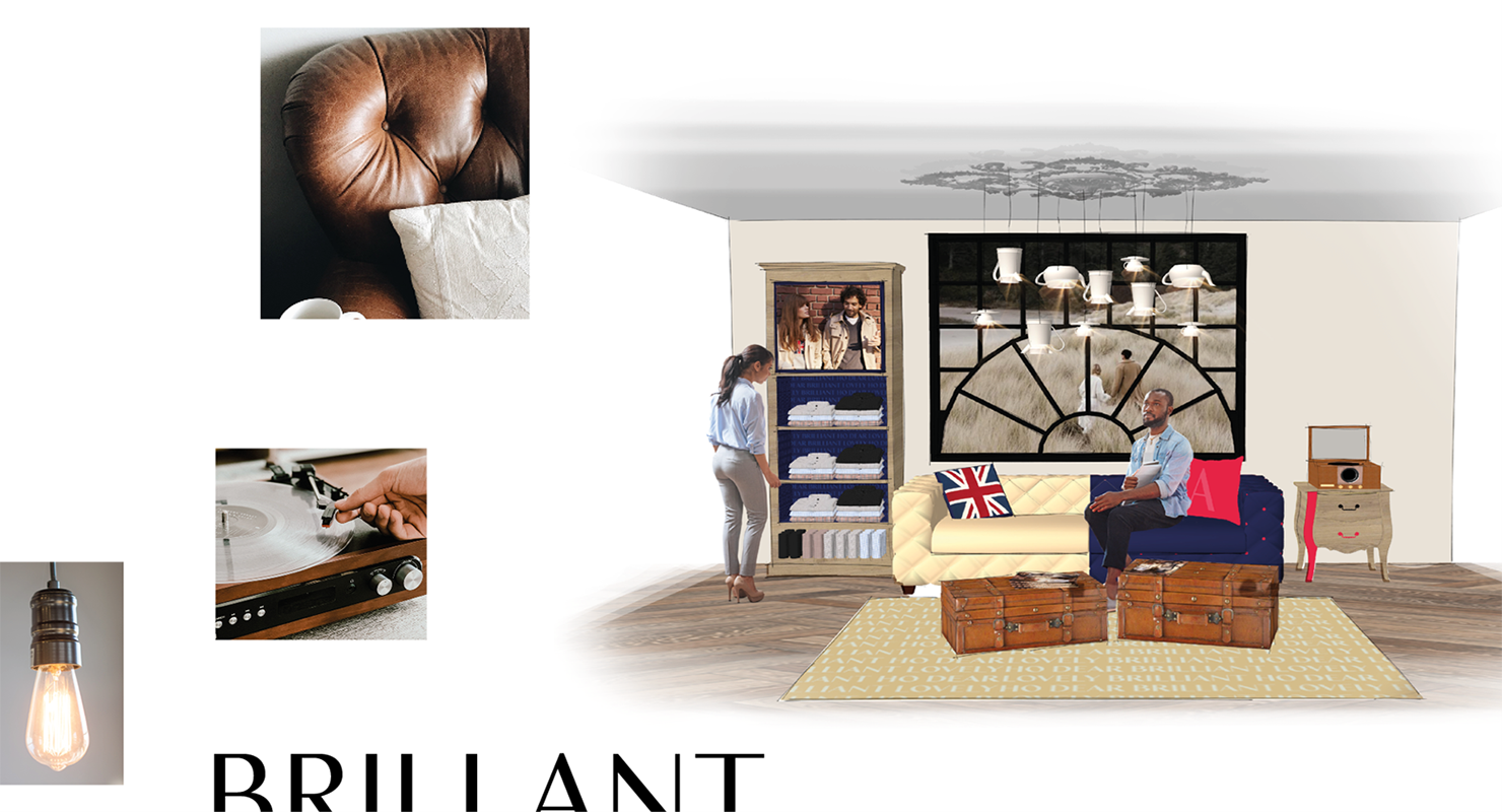
Finally, our teams also redesigned Burton of London’s retail concept to be consistent with the new brand platform developed. At the same time, CBA revalued the women’s wardrobe in the points of sale, a collection often forgotten in the collective consciousness. The theatrical nature of the spaces and the principles of decoration have been rethought to bring the “English Twist” to life in the points of sale: fresh colours, imposing patterns and capsule spaces that vary according to the seasons and the collections.
The shop windows have also been given a makeover. The result of a collaboration with Glö Studio, they have been dramatised to highlight the highlights of the year, while accompanying consumers through the changes of season.
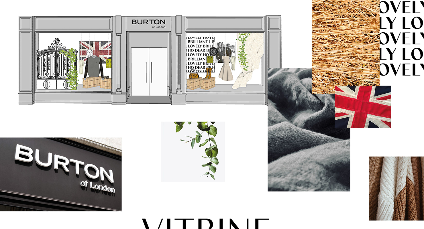
Thus, thanks to a great collaborative effort between the Burton of London and CBA teams, the brand is ready to seduce new consumers!
