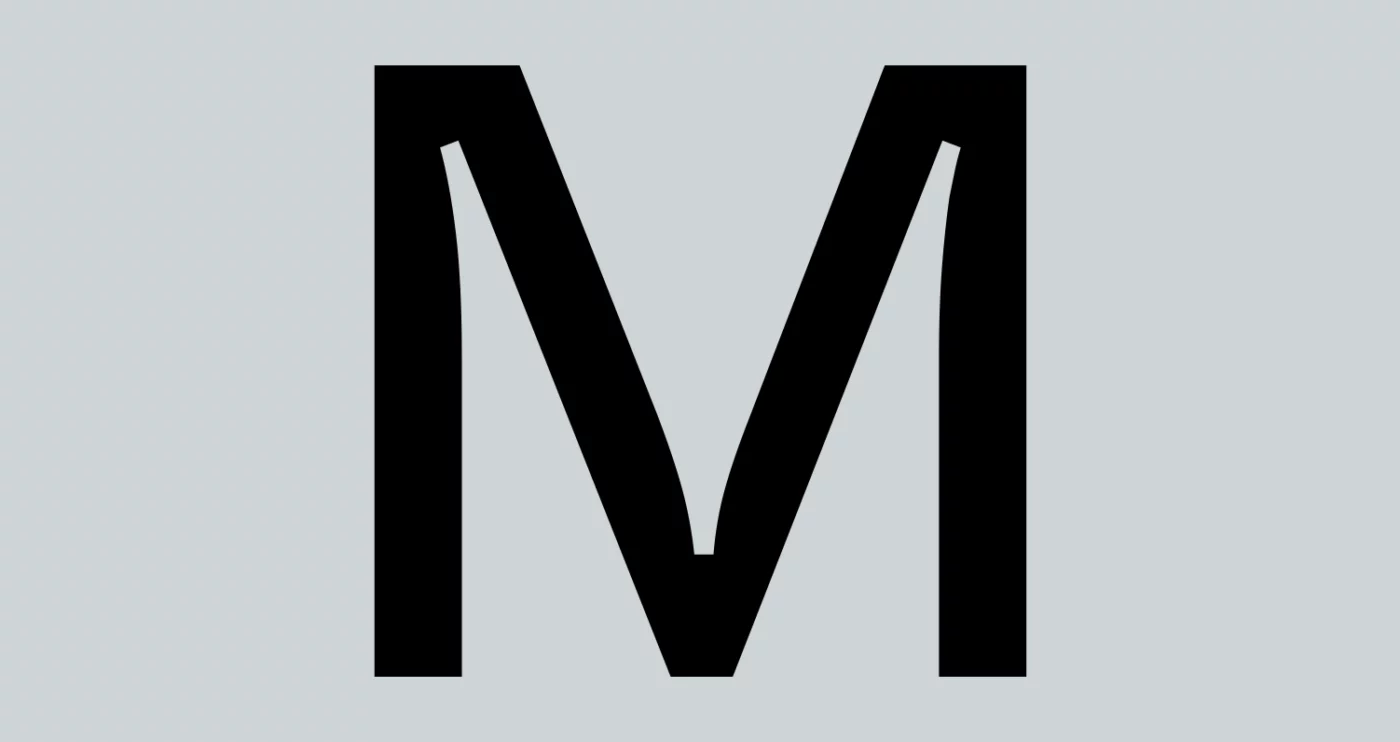
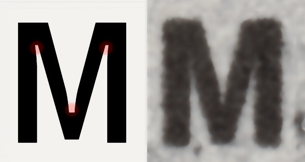
“What a strange ‘M’… it looks broken.” Who hasn’t stumbled upon letters with these strange notches and thought they were mistakes? But no, these notches in the letters are intentional and are not errors at all. They are called ink traps and are one of the most practical examples of the utility of type design.
Their technical function is to improve the printing performance of letters under suboptimal conditions, such as high-speed production or printing on low-quality paper. Ink traps are applied in the acute corners of letters (like this “M”, for instance, at the angular junctions of its strokes), precisely where the ink tends to concentrate and accumulate, deforming the letter.
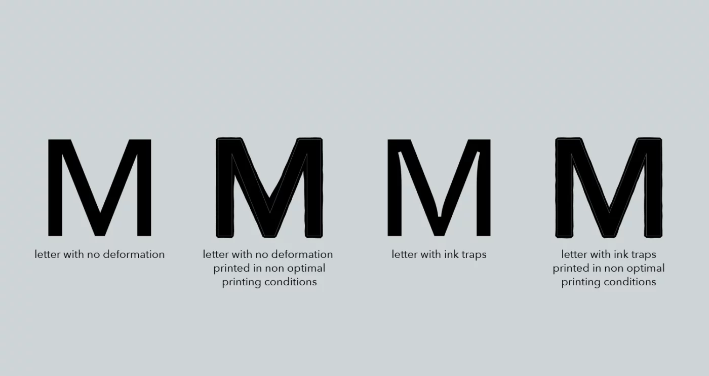
Ink traps serve to compensate for this phenomenon by creating a notch in the letter that allows the ink to flow into it (trapping it, hence the name) and producing a letter more similar to the intended print.
But when did this practice start? Who came up with it? It’s difficult to answer with absolute certainty. The best way to understand this method is to examine some cases, starting with the most famous examples, through to today’s more experimental practices.
One of the most well-known cases is Bell Centennial, designed by Matthew Carter in 1976 on commission from AT&T. The request was to design a new font based on their legendary Bell Gothic. The aim was to solve the problems this older font caused in the printing of telephone directories. Bell Gothic worked quite well, as long as the directories were printed in letterpress with Linotype machines. But when the composition of the pages switched to phototypesetting technology, everything changed. This new method, with subsequent faster and therefore less precise printing, highlighted that Bell Gothic was not designed for this technology. For a while, Carter adapted Bell Gothic by correcting some details and modifying the printing process. But this made it clear that a font designed for this new, faster, and less precise technology was needed. Thus, Bell Centennial was born, which, as per the request, took the design of Bell Gothic, modified the strokes and openings of the letters, but most importantly, incorporated ink traps.
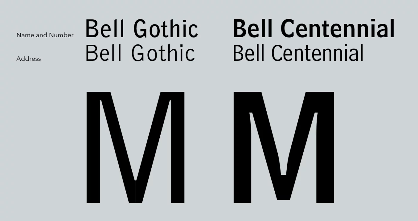
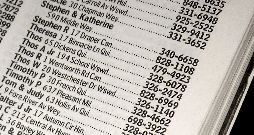
Despite Bell Centennial being one of the most famous examples, it is not considered the first font developed using this technique. Previously, other type designers had encountered similar issues and studied solutions to resolve them. One such person is Francesco Simoncini who in the late ’50s studied the issues caused by phototypesetting, leading him to create an officially patented method in 1963: the Simoncini Method.
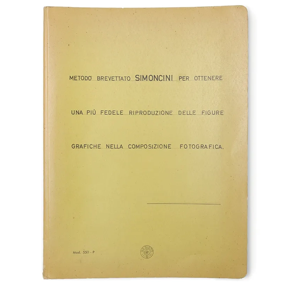
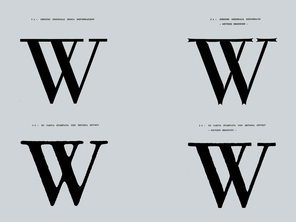
Using this method, Simoncini also ventured into the design of a typeface for the printing of telephone directories and in the ’60s designed Delia for SEAT Yellow Pages, a rather experimental font for the time that widely used the concept of ink traps and stencil features.
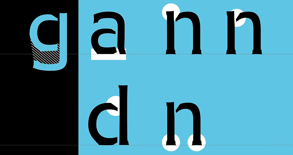
Staying within the realm of telephone directories, in the late ’90s SEAT Yellow Pages commissioned Piero De Macchi to create a new, more modern and efficient typeface capable of saving vertical space in print while maintaining high readability at small sizes. Thus Nomina was born, a gigantic effort that took several years and led to the production of 36 complete series of individual weights. Here too, the use of ink traps is very evident.
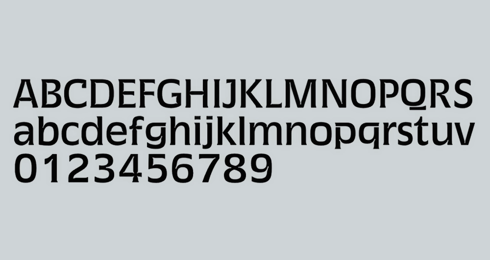
But this technology has not only been relevant to the printing world. The reproduction of letters on old television screens also produced similar issues. In this case, the traps are not for ink but light. Hence, they are called light traps. The basic idea is the same since these screens blur the image due to the luminous shading effect, which tends to enlarge the white strokes, and distortions of the scan lines, which tend to emphasize the horizontal strokes. The first solution to this problem comes from the American television network CBS, which until then had used News Gothic for on-screen communication. To improve it, designer Rudi Baas, at CBS’s Department of Graphic Arts, created a variant featuring light traps—round notches at the corners of letters. This project was named CBS News 36.
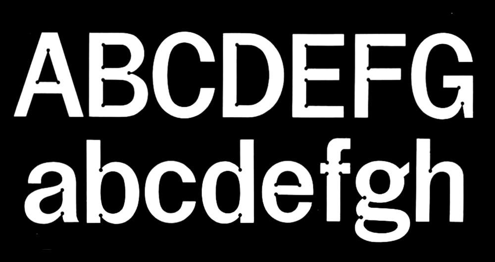
Recently, designer Nick Sherman created a revival of this typeface, naming it Rudi, in honor of the designer who first came up with this smart solution.
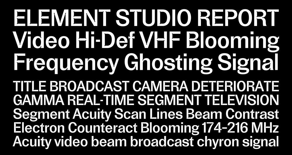
This context of optimizing the shapes of letters through notches has led to very experimental projects such as Minuscule by Thomas Huot-Marchand, designed in the early 2000s. His creation is inspired by the theories of ophthalmologist Emile Javal and his “theory of compact prints”.
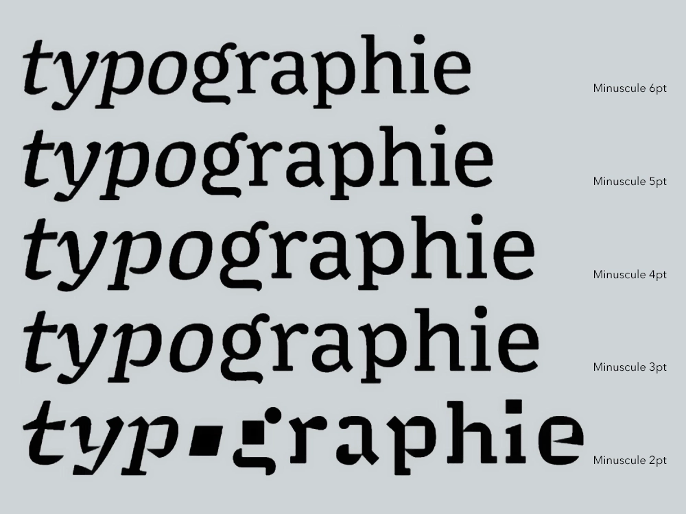
The typeface is available in five versions, all optimized for sizes of 6, 5, 4, 3, and 2 points. The design evolves progressively as the sizes decrease: the line spacing and the height of the lowercase increase, the contrast decreases, ink traps appear, and the design gets simplified. The version for the 2-point print is the most peculiar: at this size, according to Javal, we pay more attention to the difference in the shapes of the letters. Consequently, the uniqueness of each sign is exaggerated, and secondary details are eliminated. The counterforms of the lowercase become squared, up to the ‘o’, which becomes a square of pure counterform.
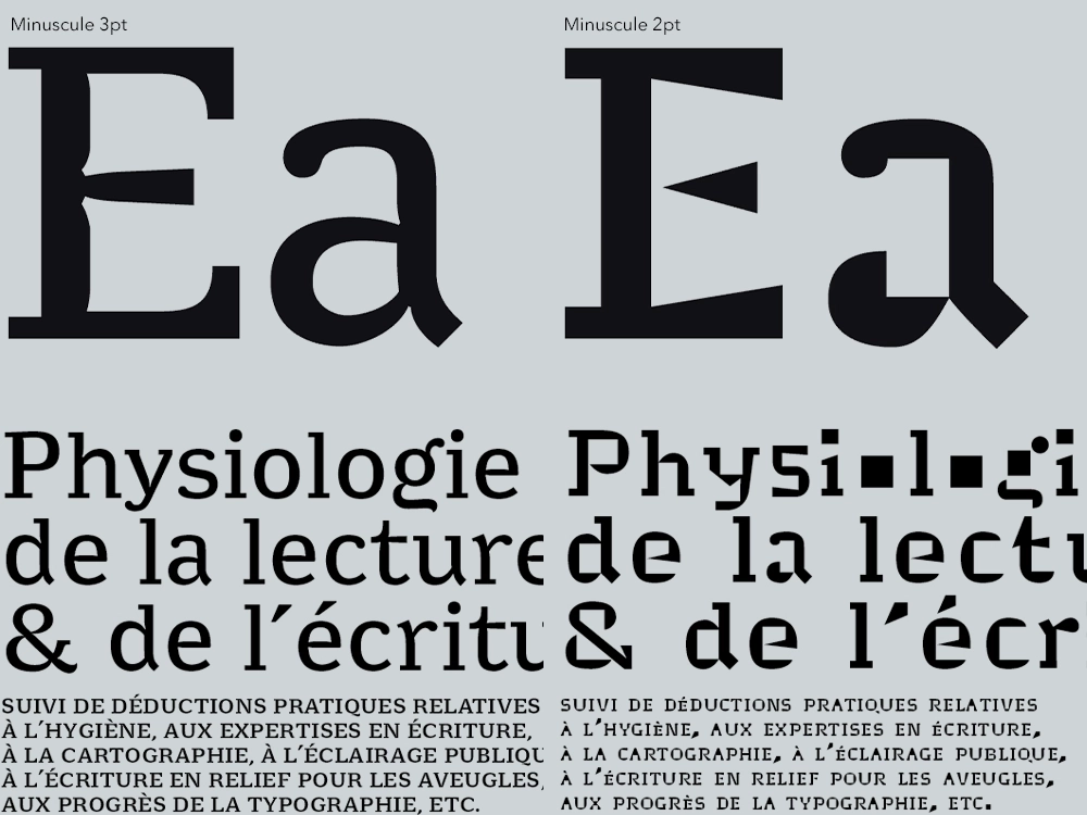
The charm of ink traps remains intact even today, although printing is now almost always in high definition and screens have excellent visual quality, making them technically unnecessary. But the personality they give to the letters is undeniable: many designers choose to design fonts with highly visible and uniquely shaped ink traps. They are even used more often for display cuts, thus for use at large sizes, where they would be technically even more unnecessary, but where they can be more evident and visible.
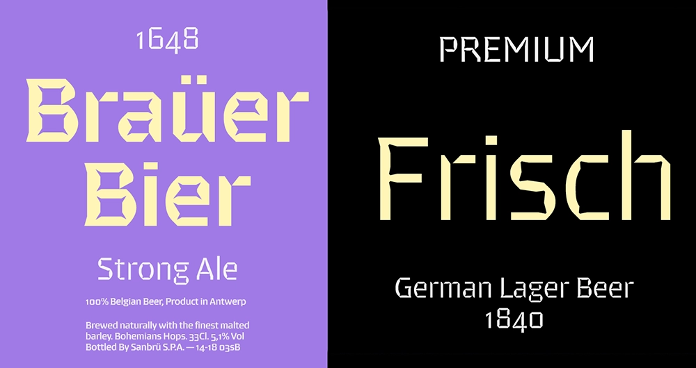
In this context, several examples can be cited, such as Brevier by Riccardo Olocco for CAST. Brevier is the name given by printers to fonts for 8-point print. It features a seemingly geometric design but hides Renaissance characteristics.
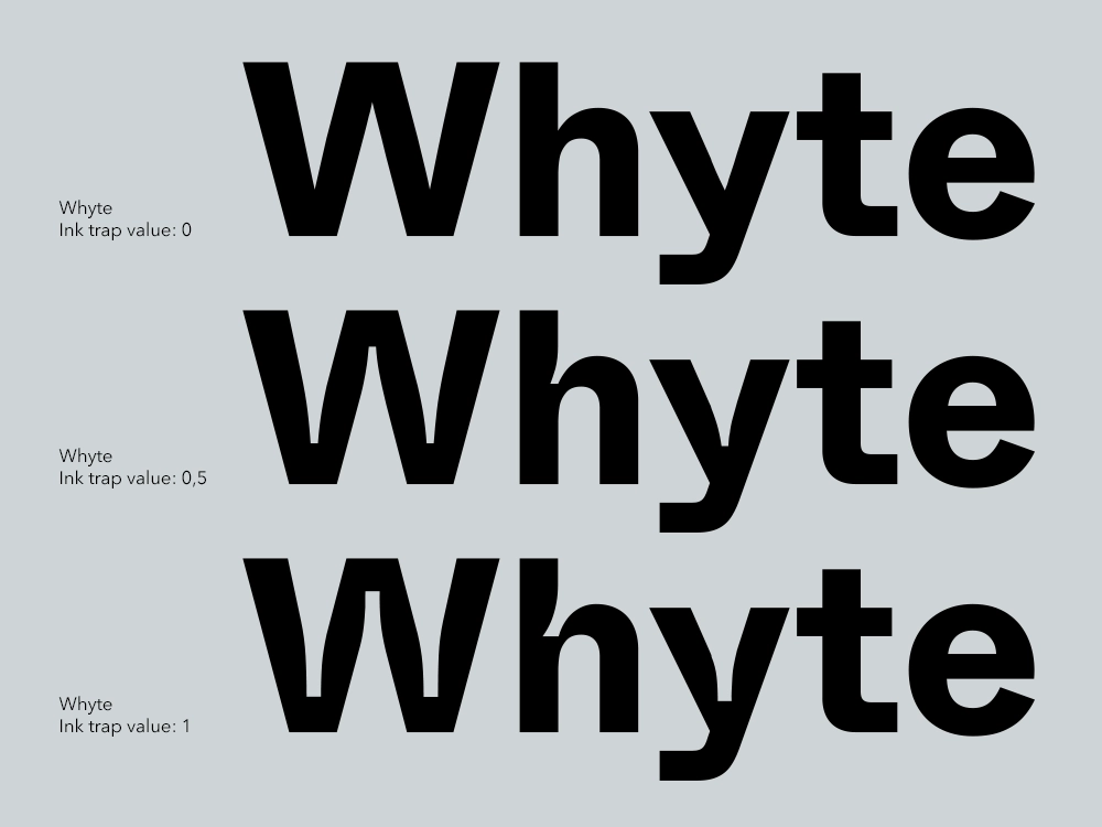
Whyte Inktrap, designed by Fabian Harb for Dinamo, is the ink trap version of the famous Whyte, one of the flagship grotesques of the type foundry. A variable version of the same typeface has also been developed, where ink traps become an adjustable parameter from 0 (absent) to 1 (very pronounced).
The bold personality of the typeface has also been adopted by Cba for the development of the visual identity of Lynfa, the new Corporate Academy of the Sella Group.
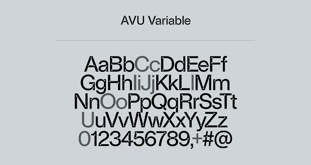
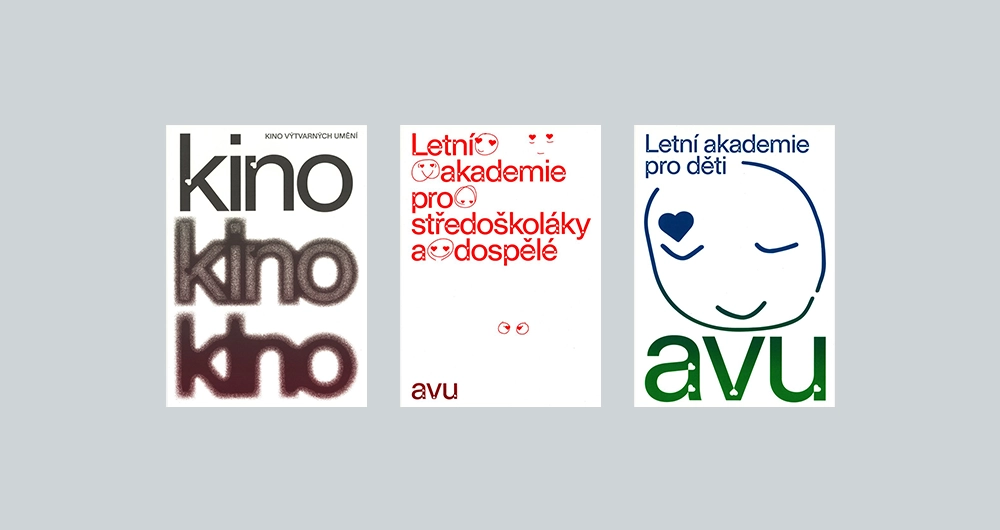
Another interesting use of ink traps can be appreciated in the AVU Custom typeface, designed by Heavyweight Type for the Academy of Fine Arts in Prague. The new identity required the design of a typeface that showed the shape of the heart, already present in the previous logo, and incorporated it into the new communication, starting from the logo.
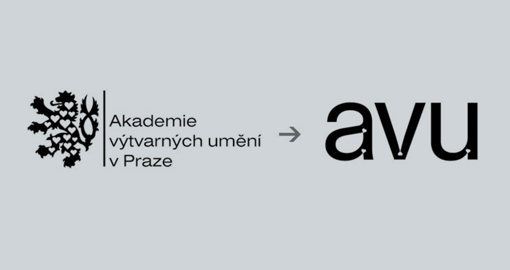
The solution was to include the shape of the heart as an ink trap within the letters, so as not to excessively alter the neutrality of the basic character (a variant of Helvetica).
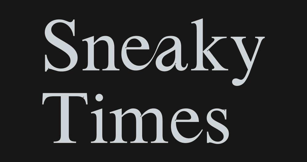
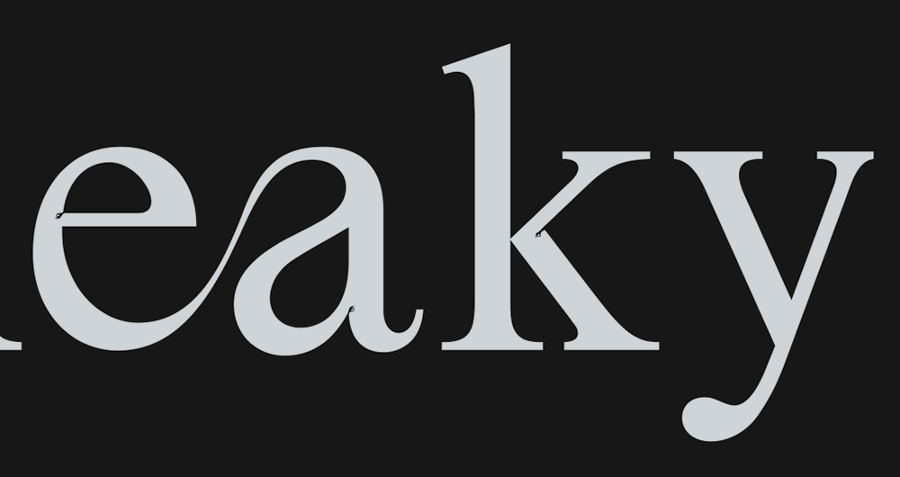
Today, more than ever, ink traps represent a challenging territory for designers, who, thanks to this technique, can let their creativity run wild and find new solutions, more or less experimental, and, why not, also have fun, hiding some Easter eggs, as demonstrated by Collletttivo with Sneaky Times.

Davide Molinari, Senior Visual Designer

