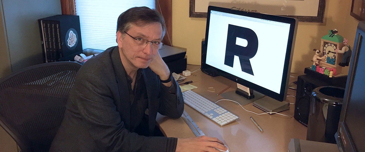
Between the late 1990s and the first decade of the new millennium, the introduction of CSS (Cascading Styles Sheets) in information technology marked the start of a new age for typefaces. In fact, the CSS language made it possible to design the appearance of web pages with great freedom: designers were no longer restricted to the use of just the so-called “web-safe fonts”, but were free to choose personalised fonts as they desired. One of the typefaces that benefited most for its great versatility both online and offline was without doubt Proxima Nova, which many have defined as the Helvetica of the web.
However the path leading to consecration in the temple of the best-loved contemporary typefaces was long and tough. It was long ago, in 1981, that Mark Simonson, the father of Proxima Nova, began thinking about a new, geometric and elemental typeface, sketching it on a piece of paper (and provisionally naming it Zanzibar), never imagining that that sketch would take another 9 long years to reach fruition.
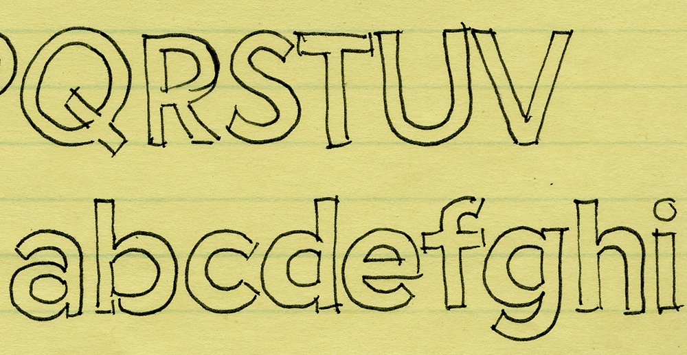
In fact it was only from 1990 to 1993 that Simonson, who was then Art Director of the magazine Business Ethics,created “Visigothic”, basing it on the 1981 sketch with the objective of creating a simpler and more geometric alternative to the typeface Gills Sans, which he was using at that time for the magazine’s page design. He thus devised a hybrid that combined Helvetica’s modern and regular characteristics with the more technical and geometric appearance of Futura and Franklin Gothic.
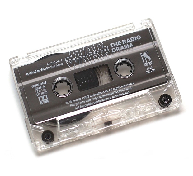
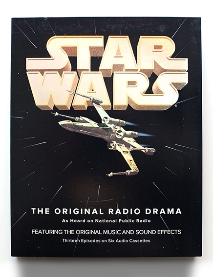
The first public appearance of Visigothic dates back to late 1993, printed on the Star Wars – The Original Radio Dramacassette designed by Simonson himself. In 1994its name changed and it was released as Proxima Sans. Initially Simonson had great plans for this project, but due to the accumulation of other work commitments, he decided not to dedicate any more time to it and unfortunately developed just a few font weights.
But in the early 2000s, things started to change for Proxima Sans. In 2002, Matthew Ball decided to use it for the redesign of the magazine Rolling Stone. In the same year, on commission from GQ magazine, Tobias Frere-Jones published a geometric typeface inspired by New York City and named Gotham. Gotham rapidly became popular, causing an exponential increase in the demand for simple, linear geometric typefaces.Seizing the opportunity, in 2005 Simonson republished Proxima Sans, renaming it Proxima Nova. This typeface was improved with many more weights and styles capable of combining a geometric appearance with modern proportions. The six original fonts in the Proxima Sans family (with three italic weights) thus became 48 complete OpenType fonts.
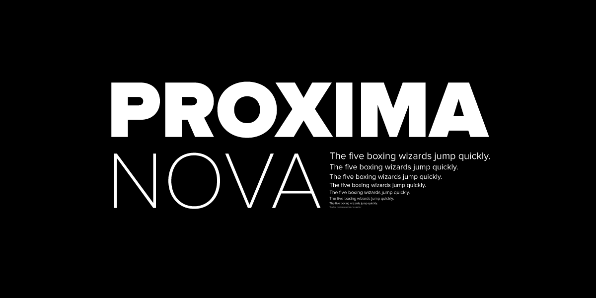
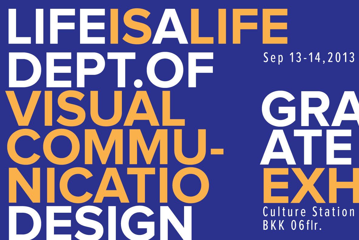
In 2009the Typekit font hosting service was launched, and from the start, Proxima Nova was one of the first typefaces available. In 2013, Proxima Nova became extremely popular, inundating the digital world as a result of its incredible versatility both for print applications and for digital interfaces.

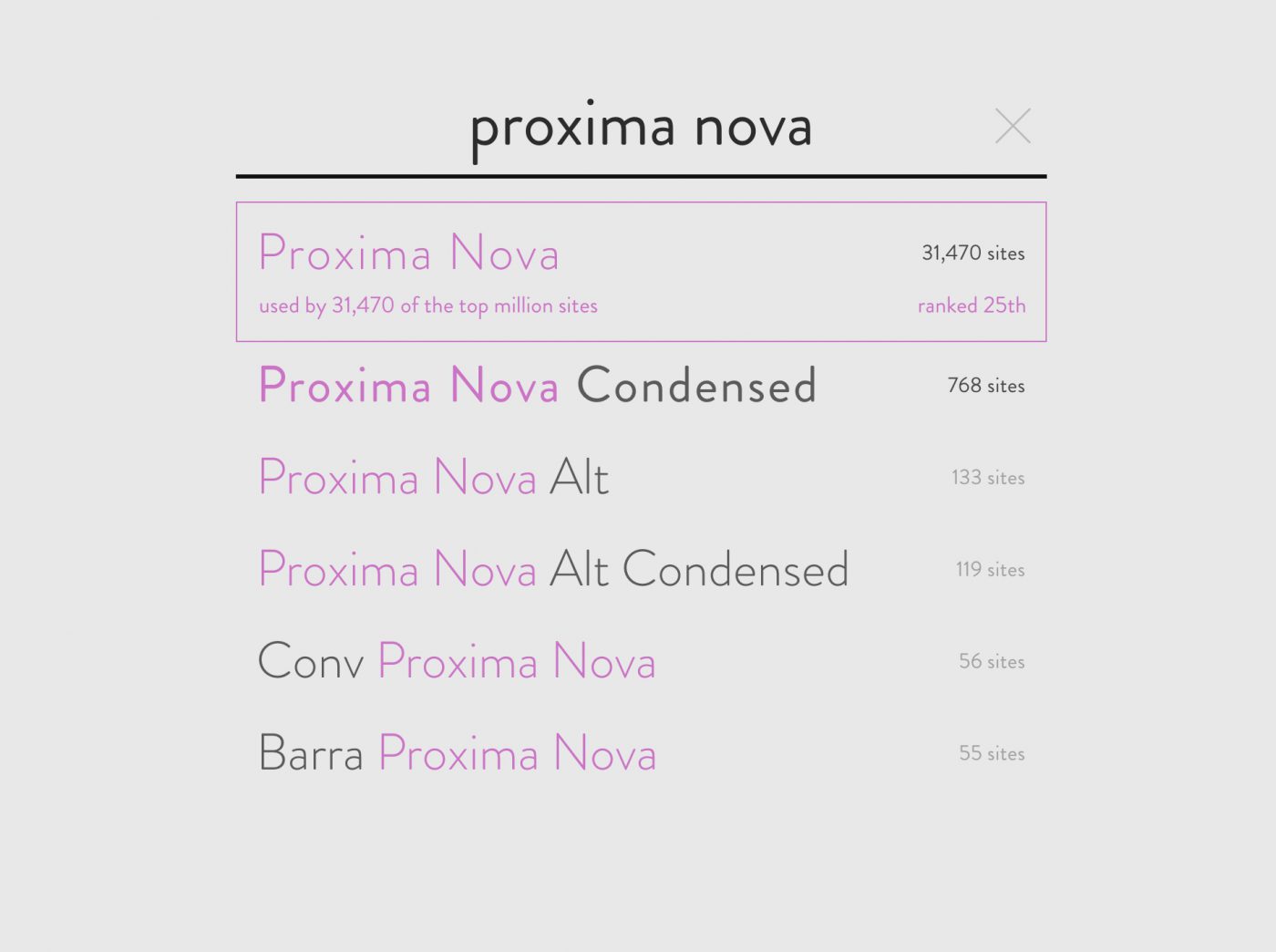
Today, it is the major typeface for some of the most popular digital media companies such as BuzzFeed, Flickr, Mashable, NBC News, Wired etc. It is used in the logo of the third best airline in the world, Turkish Airlines, and by many other companies
However, as is the case for all great typefaces, the long process of refinement has not ended yet. New weights are arriving for the rounded version Proxima Nova Soft, an additional language support tool has recently been implemented, including Vietnamese, Cyrillic and Greek, and apparently, a possible Proxima Nova Wide is in the development stage.
Stay proximal for the next release!
