The relationship between the female world and the labour market has always been complex. Commonplaces and stereotypes have conditioned and still condition the access of women to numerous professions, especially in certain sectors considered the prerogative of men. Obstacles are often rooted in the culture and habits of many sections of the population. However, there are companies that strive every day to overcome them, trying to reduce the gender gap with concrete actions. This is done, in particular, by Gi Group, which we have joined in a collaboration that has included branding and communication, design and development.
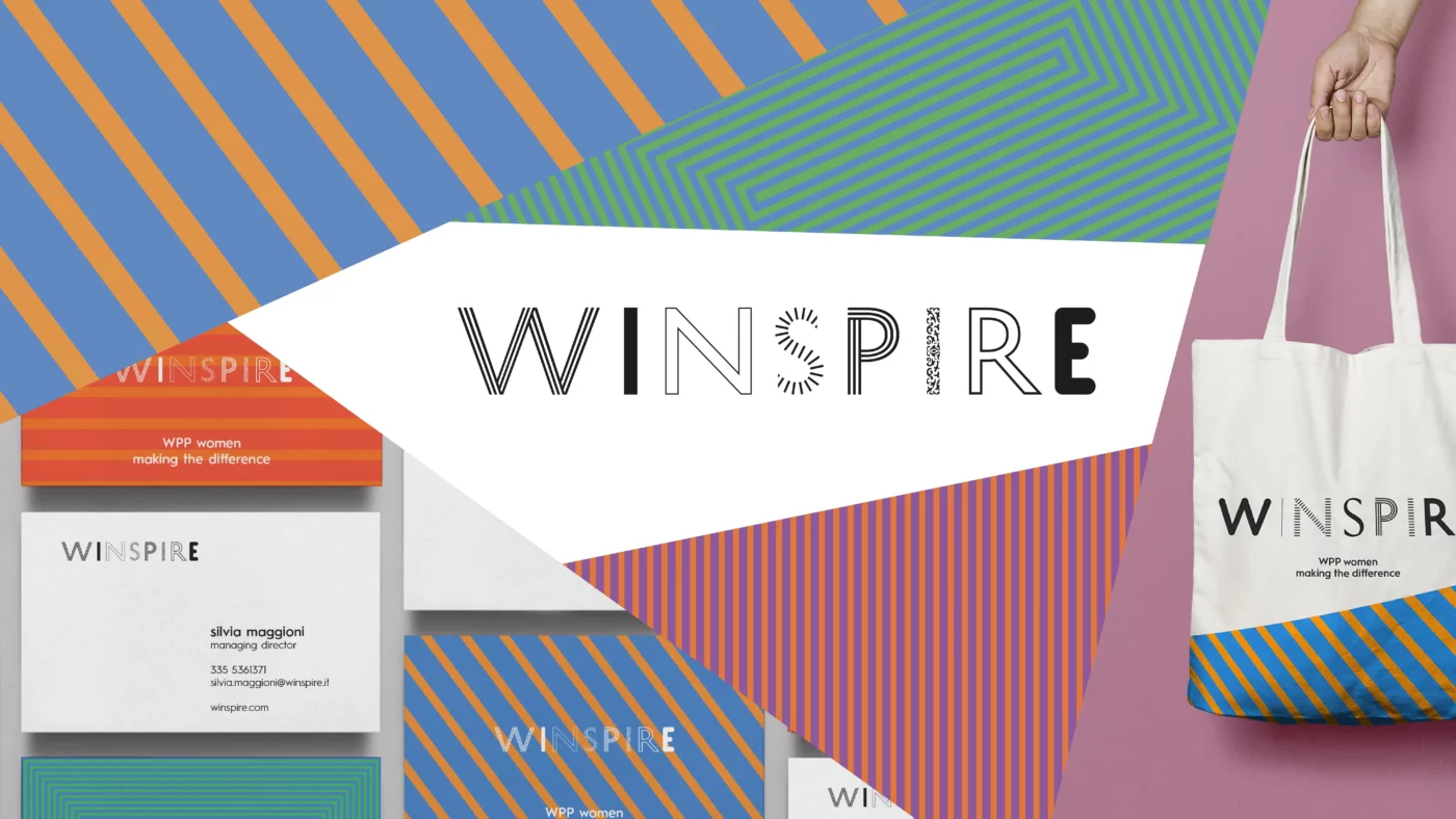
At CBA we had already dealt with this issue with Winspire, creating the brand of an internal WPP project aimed at enhancing the talent and uniqueness of all its employees.
With Women4 we took a step forward, helping the first Italian multinational labor company to promote women’s employability in sectors such as logistics, transport, mechanics and ICT, while strengthening its positioning around the concept of Sustainable Work.
To be truly effective, Women4 needed to address, on the one hand, the target of candidates (the main beneficiaries of Gi Group’s commitment), and on the other hand, the most important public and private stakeholders (who play a decisive role in the evolution of the labour market).
We worked side by side with the Group, starting with the definition of the statement and the values of the project.

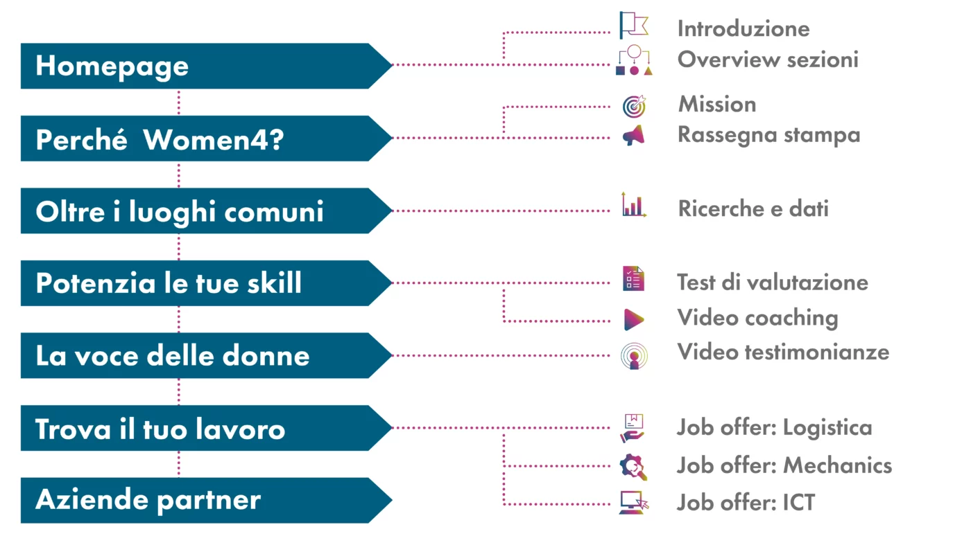
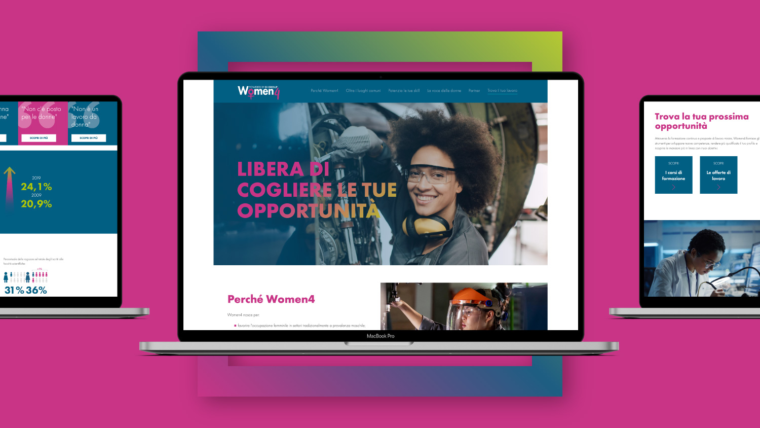
With a view to customer centricity, we then moved on to identifying the needs of female workers and professionals. Thanks to the research and data owned by Gi Group we defined concrete objectives, reflected in the structure and content of the website.
Authenticity and inclusiveness have guided every lexical and visual choice, balancing the Gi Group identity with a universally accessible language.
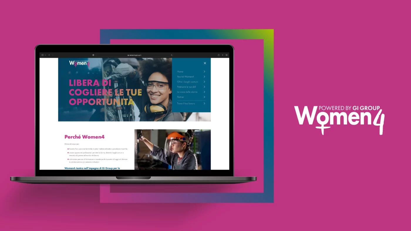
The symbol itself of Women4 represents this balance.
The empty square, used as a contour, serves to leave room for people, as Gi Group is positioned as a container that frames the life of the workers, who are the real protagonists of the project. To emphasize the will to meet the women’s needs, spontaneous brushes have been applied within the brand – including the famous symbol of Venus.
Going beyond clichés, we combined blue and yellow with fuchsia and white, applying this color palette to all communication touchpoints.
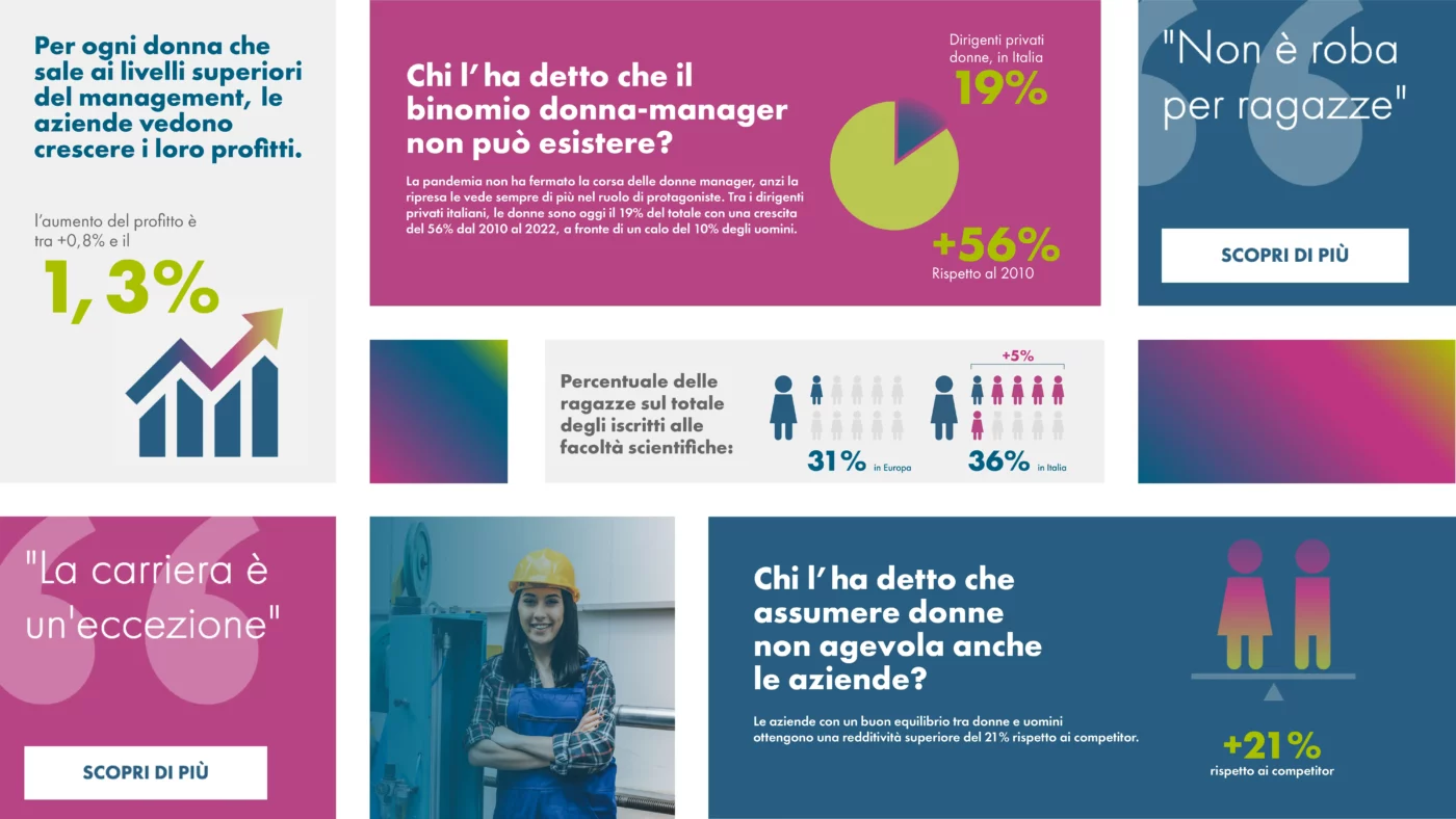
Beyond common places is also the name of a very important area of the website. Through data, infographics and statistics, false myths and stereotypes about the relationship between women and work are dispelled, providing useful information to candidates, companies and institutions.
The message conveyed is that the added value of a person does not depend on gender, but on personal skills and competences. And that, as a result, every woman can find the job that best suits her needs.
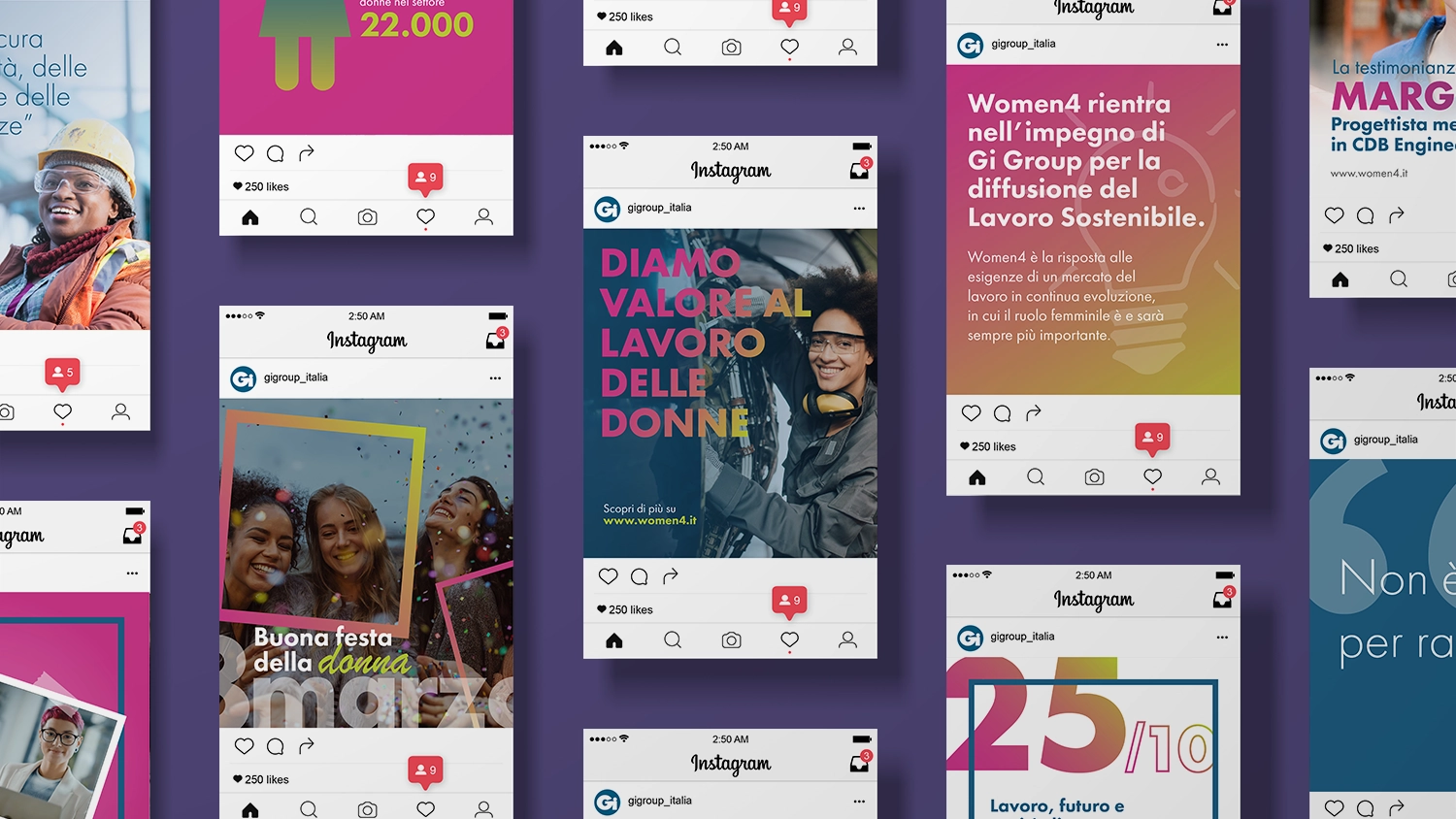
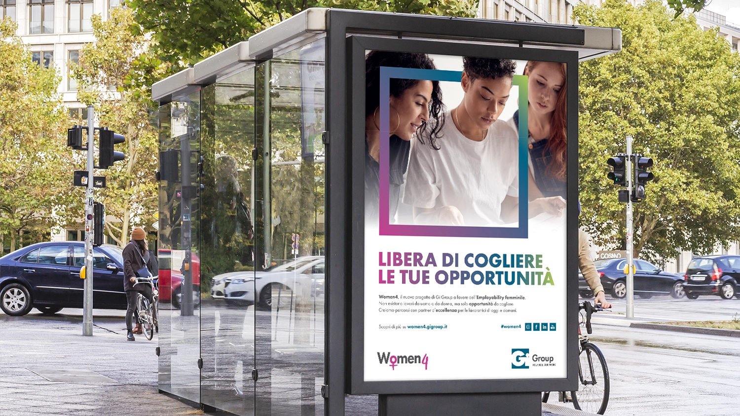
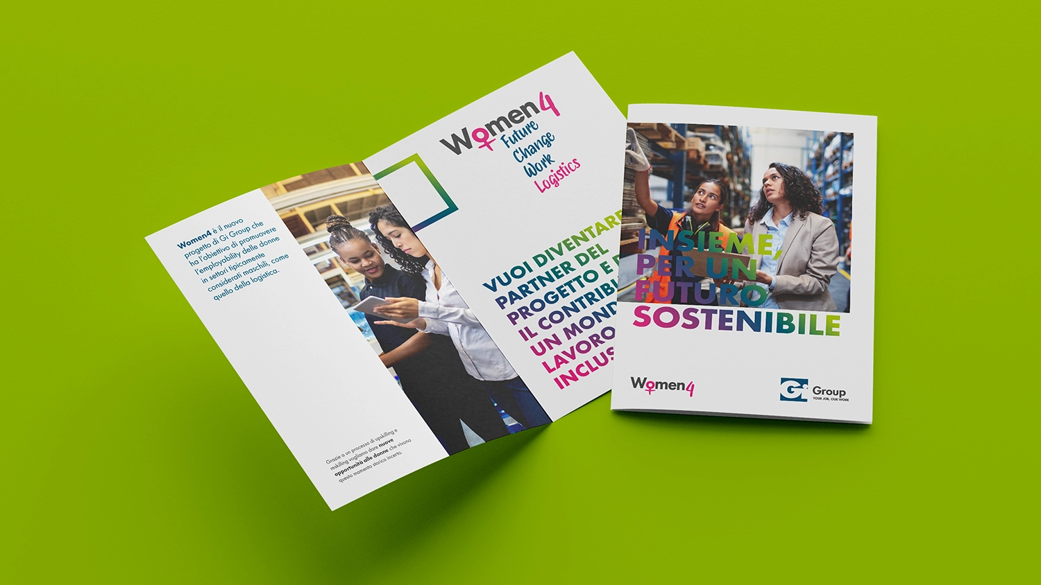
To make the knowledge of Women4 even stronger and more widespread, implemented the contents and values of the project on various on-line and off-line platforms, through a series of formats for social media, brochures, advertising, etc.
Visit the website of Women4

