Sevengenerations of history make the Casa Vinicola Zonin one of the most importantItalian wine enterprises and one of the first to operate internationally.Thanks to an expert professional team, which is constantly improving itsproducts, the company is a standard bearer for the area and its excellentproduce. And it has a clear mission: to earn international recognition for itsestates, both in the trade and by consumers – ‘each region has its owntradition; each region has its own wine’.
With an overall surface area of 152 hectares of vineyard, Casa Zonin includes theTenuta il Bosco estate, the second largest wine producer in the Oltrepò Pavese,an area that is traditionally known for its heterogeneous, noble productionssuch as Spumante and popular wines such as Bonarda. However, this extraordinarydiversity in microclimates has created a problem in terms of brand positioningand architecture.
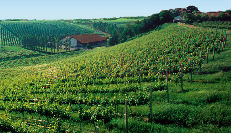
Structure has always been the defining point of the Bonarda and boasts an extremely strong perceived image for this type of product. But the Tenuta il Bosco variety has an equally strong propensity to be sparkling, which the company is keen to make people aware of and appreciate, offering products of excellent quality with unique organoleptic characteristics.
It is not an easy challenge given the vast differences between the two vine varieties, but it is nevertheless stimulating as the challenge was born of a brave decision: to use this produce to spread the riches of little-known territory, the Oltrepò.

Tenuta il Bosco must become a Brand that can express both the simplicity of itseveryday wines and the complexity of its Pinot Nero. Therefore the first stepwas to improve focus on the Brand’s assets, redesigning the offer segmentationand packaging system in order to reinforce them for both the main products. TheBrand decided to keep the squirrel mascot in order to maintain imagecontinuity, but it has increased in size thanks to the more synthetic design.All the labels, which differ according to family, share the same shape, whichrecalls the letter ‘O’ for Oltrepò.
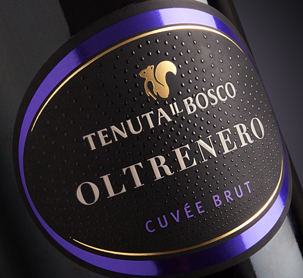
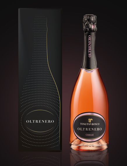
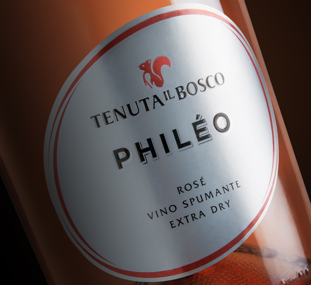
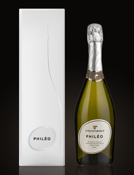
Oltrenero and Philéo, two wines that share the same roots, those of Pinot Noir. Weredesigned both packs, seeking to characterise them as much as possible throughthe use of colours, shapes and materials that emphasize the different vocationsand different method of production, Classical Method for Oltrenero and Charmatfor Philéo.
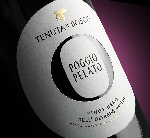
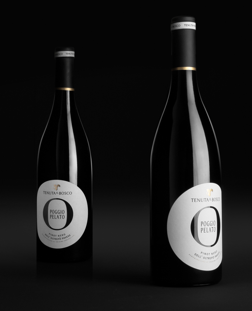
Of all the red berry vine varieties, Pinot Nero is considered one of the most noble and yet one of the most difficult tointerpret. From this starting point, we worked to define the identity of thisproduct and transform it into the flagship of the estate, with the mainintention of raising the perception of the winery in the eyes of sectorexperts. For Poggio Pelato, we used a unique and defining treatment compared tothe other Tenuta il Bosco wines, which recalls the codes of the mostprestigious wines available.
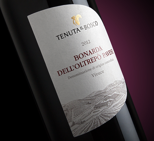
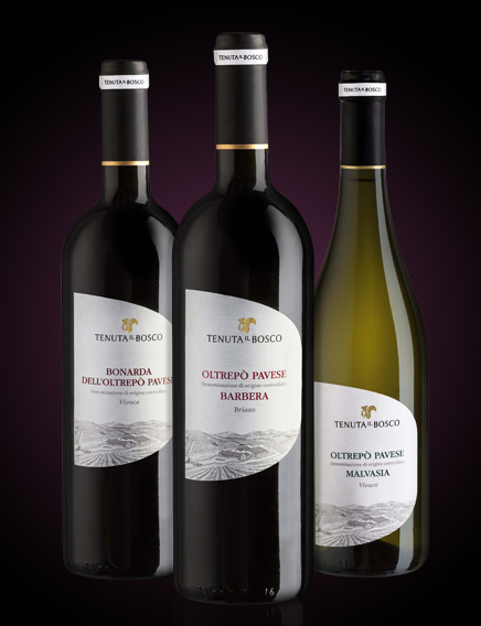
Barbera, Bonarda and Malvasia. Three icons of Lombard traditional enology, defined by a very classical language and also slightly stereotyped as wines of poor quality. CBA’s job was to overturn that stereotype, firstly by valorising the territory of origin of the grapes, the Oltrepò Pavese, and by using a light, contemporary style on the labels to express the differences and peculiarities of each wine.

