For a long time, Fruttolo has been the undisputed leader of its category, actually inventing a new appetising and nourishing proposal for children’s snacks, in the form of fruit-flavoured fresh cheese. In recent years, store shelves have become full of innumerable alternatives, sweet and savoury, practical and fun, making selection by consumers more complex and the competition more aggressive.
. . .
Fruttolo’s packaging for the 2010s
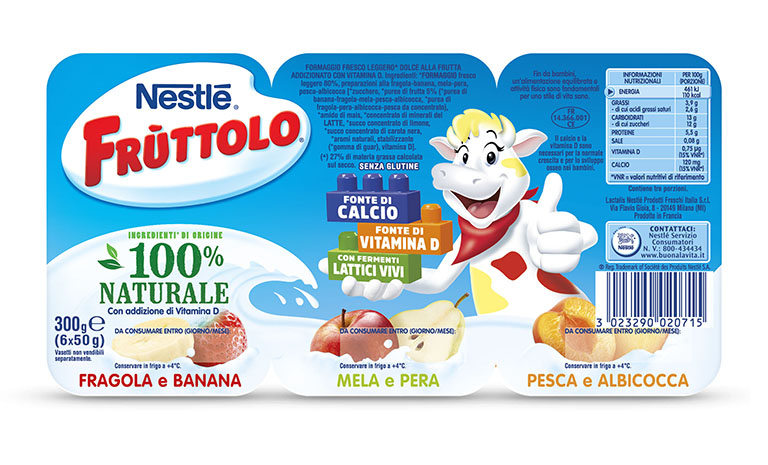
In this scenario, Fruttolo has perceived the need to reformulate its identity in order to respond to a dual need: on one hand, transmit the product’s natural features with spontaneity and clearly explain the nutritional benefits linked to its content of calcium and vitamin D, and on the other hand, stimulate children’s emotional involvement. An analysis of the reference audience, namely children, shows that today the best-loved personalities have a marked character, lively and a bit “tearaway”.
. . .
Today, the personalities best loved by children have a lively, distinctive character
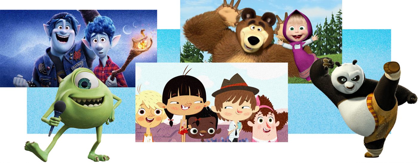
This observation has led to a development in the brand character, which has changed from being a wise and caring point of reference, a sort of mother-cow, to someone with whom to share fun and games, someone with whom children can identify.
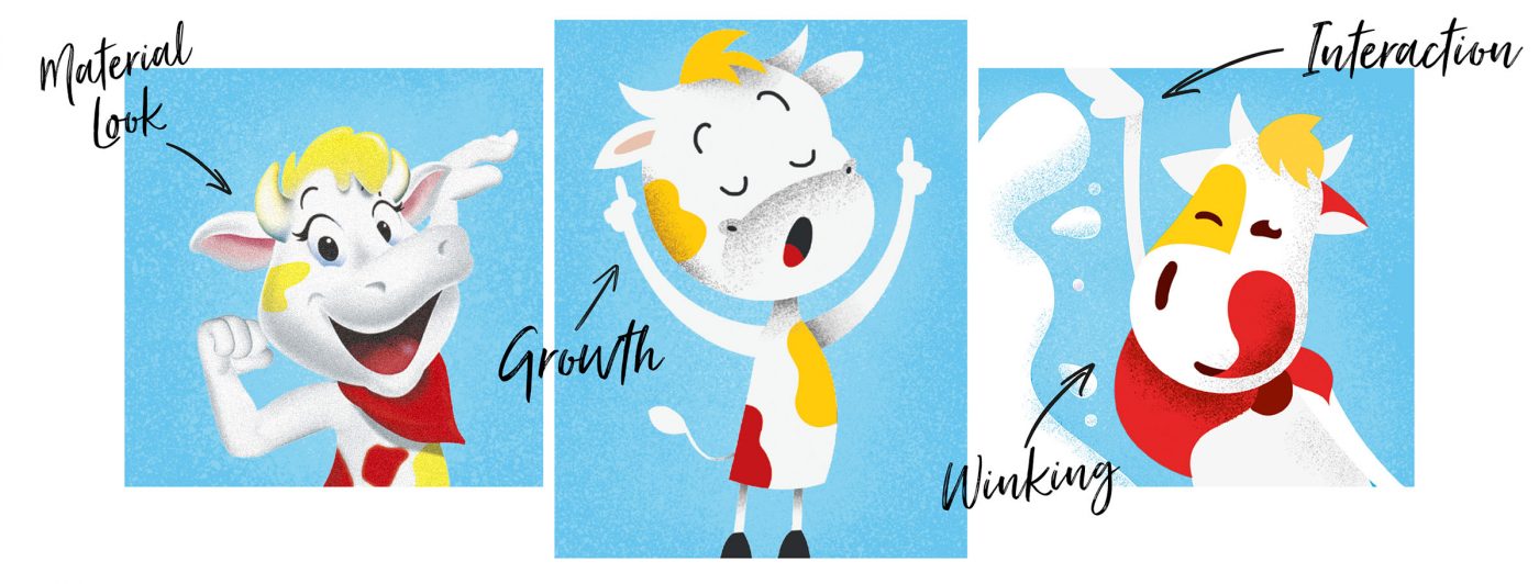
Therefore we explored different directions to devise a more companionable and amusing expression for the cow, together with a more material look, that recalls the natural world.
. . .
Some of the exploratory work on the cow
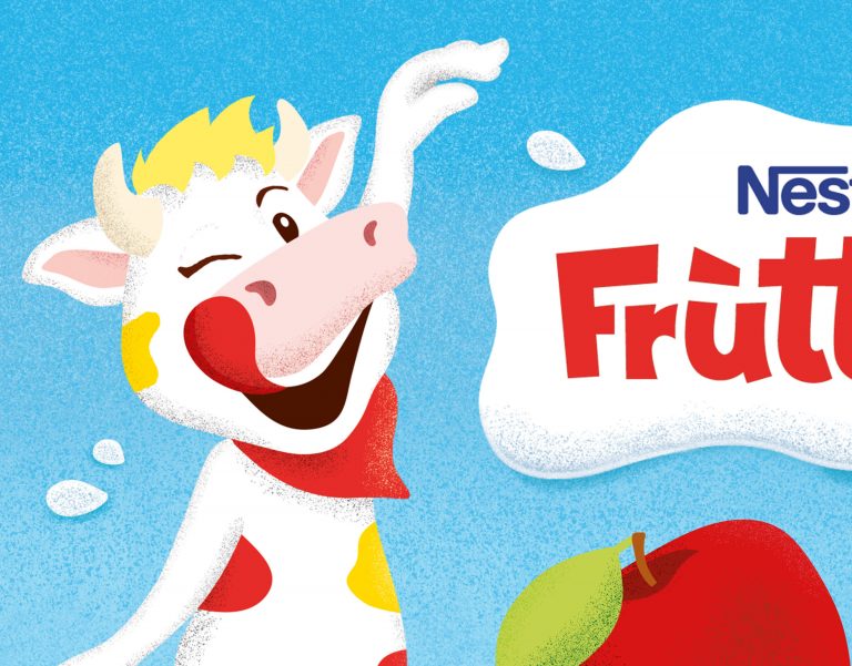
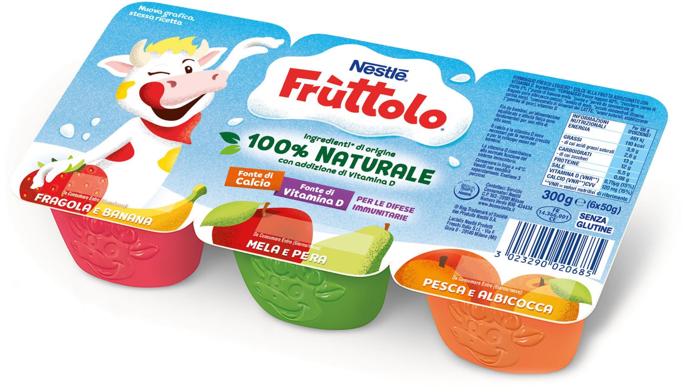
The final character becomes the expression of this change, while also guaranteeing recognisability on the shop shelf. Within the composition, the new cow plays a more important role, offering a visual depiction of the benefit of healthy growth associated with the product. The interaction with the logo also creates a stronger link and identity between the brand’s two principal assets.
. . .
Final illustration of the brand character
The sensation of natural genuinity goes further than just a textual indication of the claim “100% natural” and becomes the distinctive feature of the overall language. More delicate colours, material textures and a very spontaneous, contemporary style, also used in the depictions of fruit, give the overall composition increased authenticity.
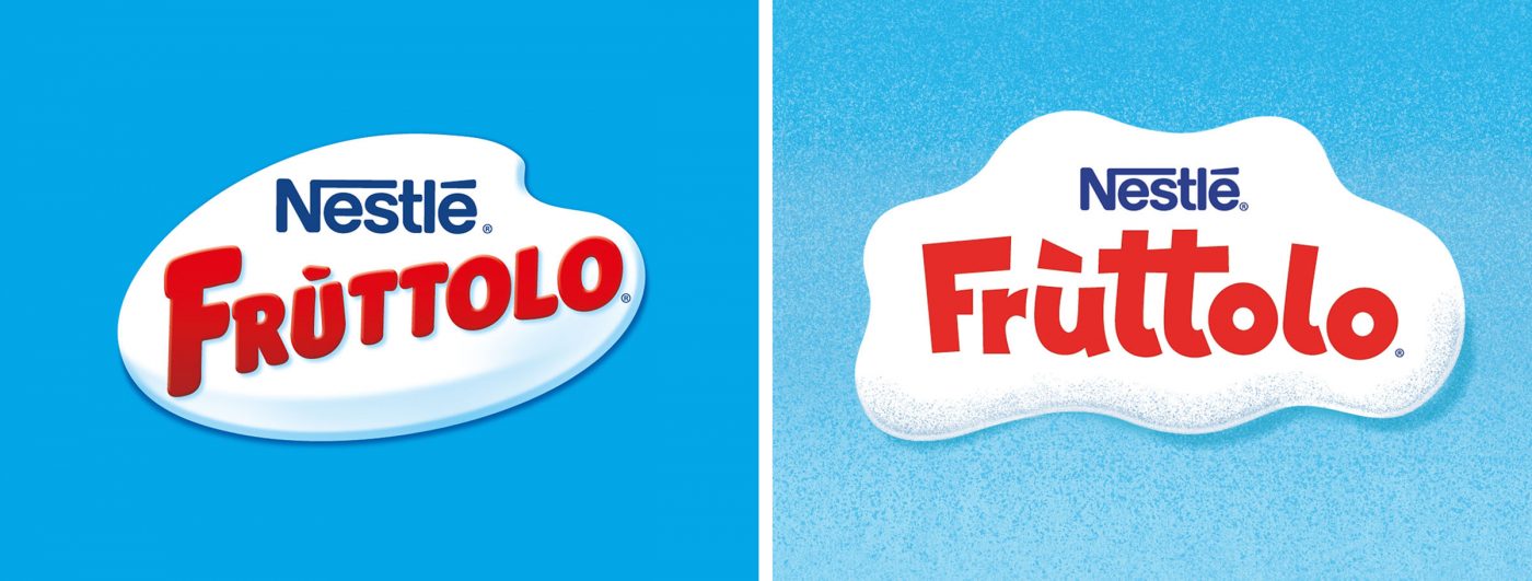
The logo returns to a central position in the composition, with the space necessary to suggest the appropriate degree of authority. The typeface is made more accessible by the lower-case lettering and the spontaneous lines while the holding device becomes a clearer expression of the product’s appetising creaminess.
. . .
Logo before and after
Reassurance for mothers is naturally also provided by the claims presenting the product’s nutritional qualities and benefits, which remain central and are visually simplified to give them a more logical and effective presence.
. . .
The packaging before and after
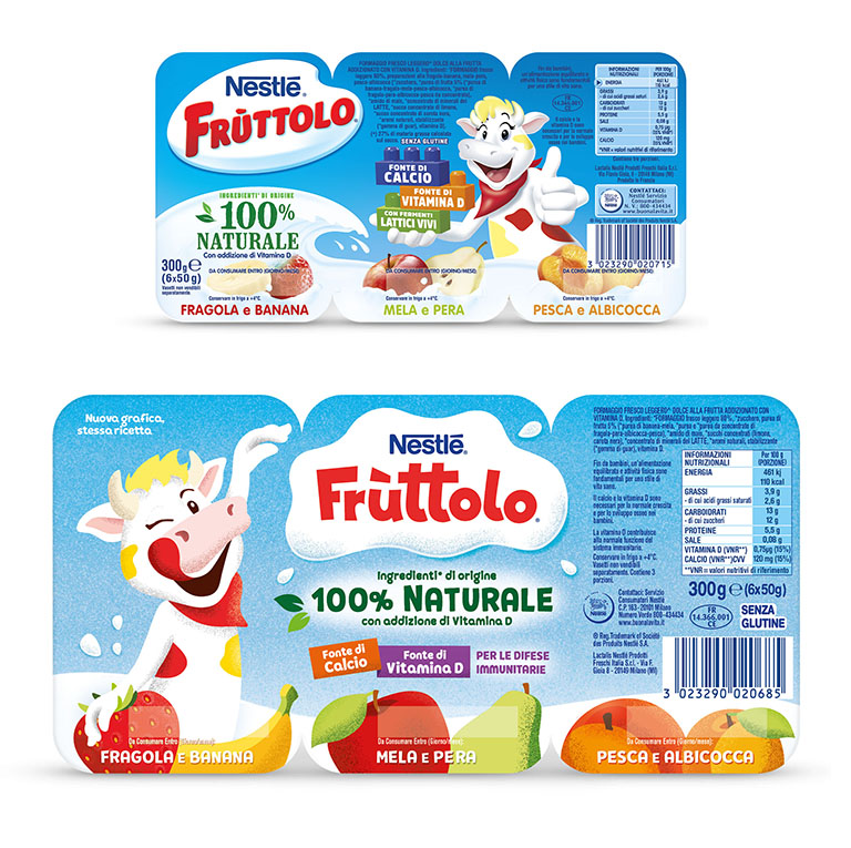
Starting from Italy, the new packaging system was subsequently implemented first in the UK and then across the entire international platform, for which we were involved in different ways according to the respective country.
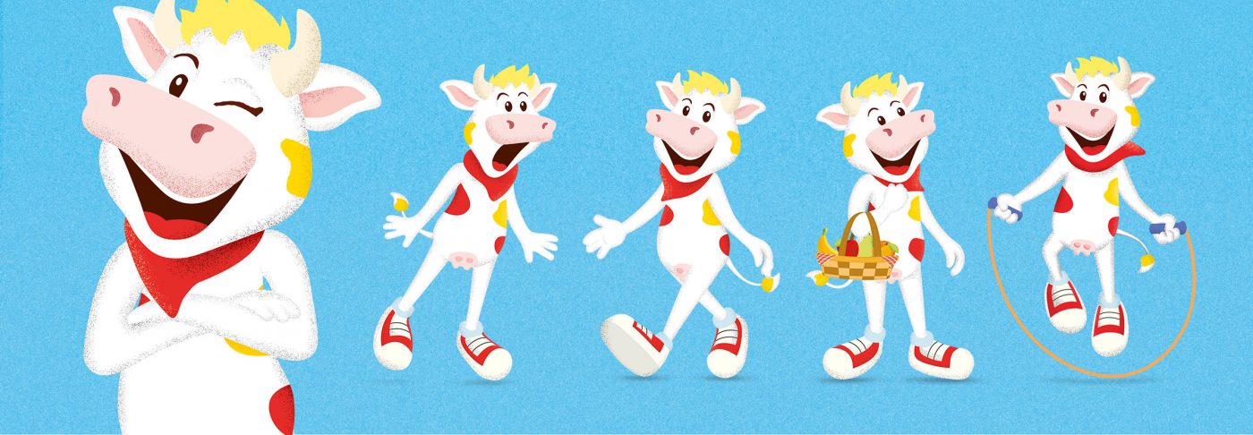
In order to bring the new brand character “to life”, we also developed a complete set of illustrations, which depict it with different expressions, engaged in various activities and contexts, for use through all the brand’s communicational touch points.
Part of the LNPF Group (Nestlè-Lactalis), Fruttolo is a brand that has been present on the Italian market since 1984, specialising in the production of fresh cheese for children.

