














Present in 92% of Brazilian households, Perdigão celebrated nine decades of existence in 2024. To mark this milestone, alongside AlmapBBDO, responsible for Perdigão’s brand repositioning, and Plau, we at CBA B+G embarked on the mission to redesign not just its packaging, but the very essence of the brand.
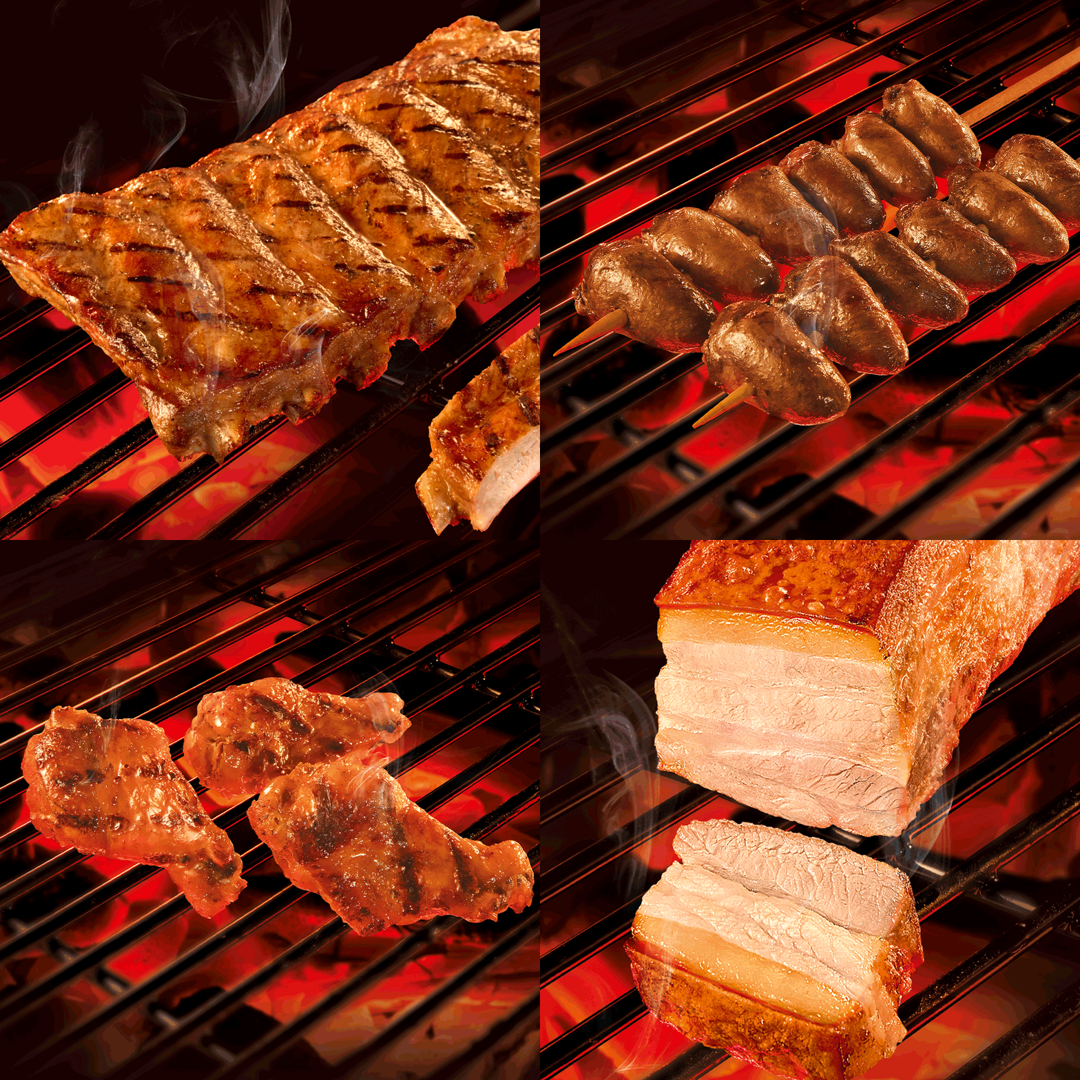
To reflect the new positioning, we worked on redesigning the entire Perdigão portfolio, encompassing hundreds of SKUs. An ambitious project that included redesigning sub-brands such as Na Brasa, Meu Menu, Ouro, Chester, and Montana.
“We chose to simplify our logo, moving from a 3D to 2D design, aligning with the market trend toward clarity and functionality in design. This strategic change adapts the Perdigão brand to various touchpoints, especially on packaging, where consumer interaction is much higher. Our reformulation was carefully thought out to provide an even more engaging and relevant brand experience. The new packaging integrates physical and digital elements, accompanying the consumer journey and offering suitable solutions for various consumption occasions,” explained Marina Secaf, Executive Marketing Manager at Perdigão.
We developed a new design system to give a consistent look to the complete product line. This system balances tradition and modernity, maintaining iconic elements such as the partridges and the red color, now reinterpreted in a contemporary way.
The central challenge was to create a cohesive visual identity for the entire brand while ensuring clear differentiation between each product line. To achieve this, we implemented a color system that categorizes products, transforming the shopping experience into an intuitive journey and facilitating identification at the point of sale. This maintains the consistency of the Perdigão brand as a whole while highlighting the unique characteristics of each product category.
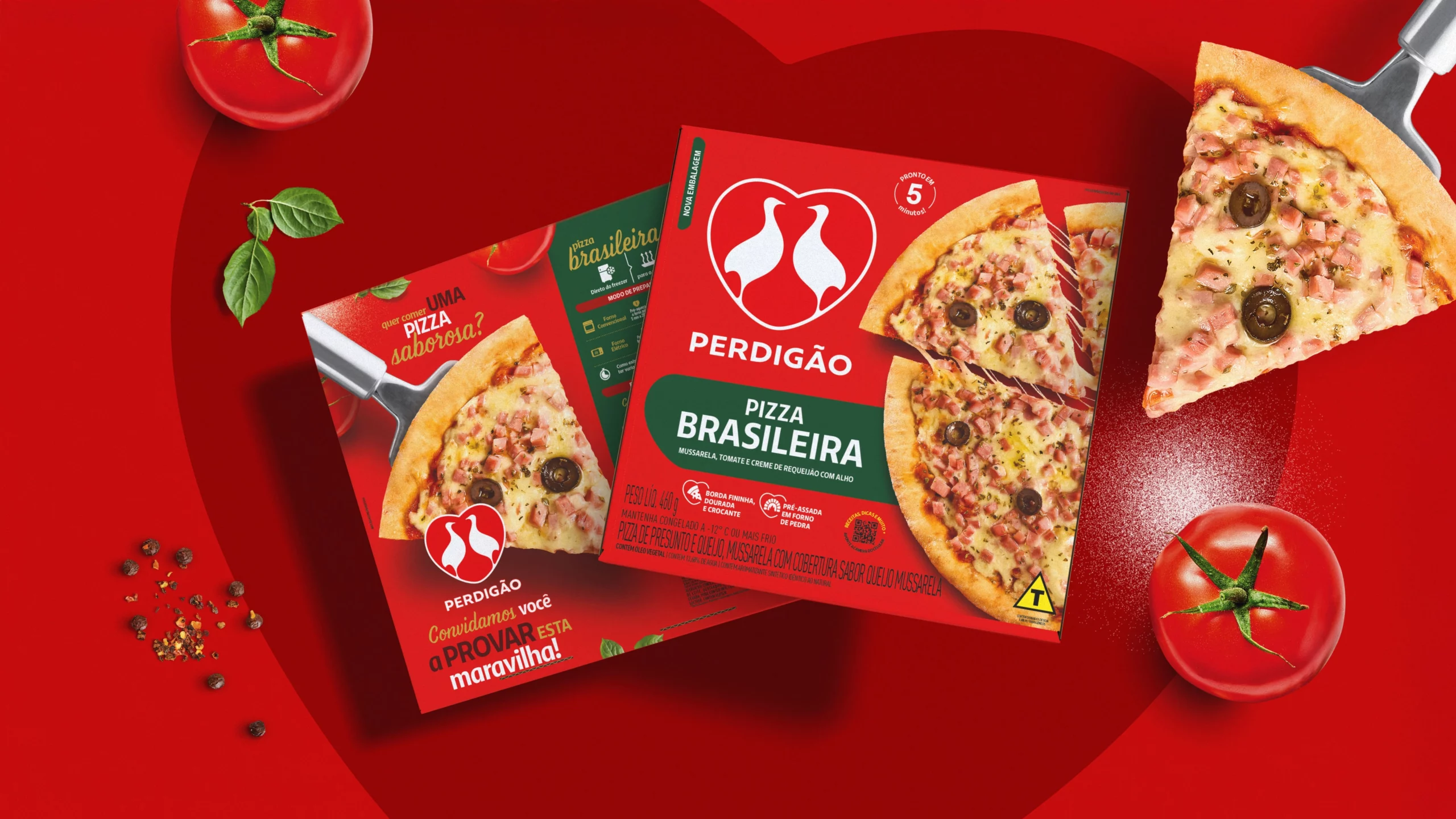
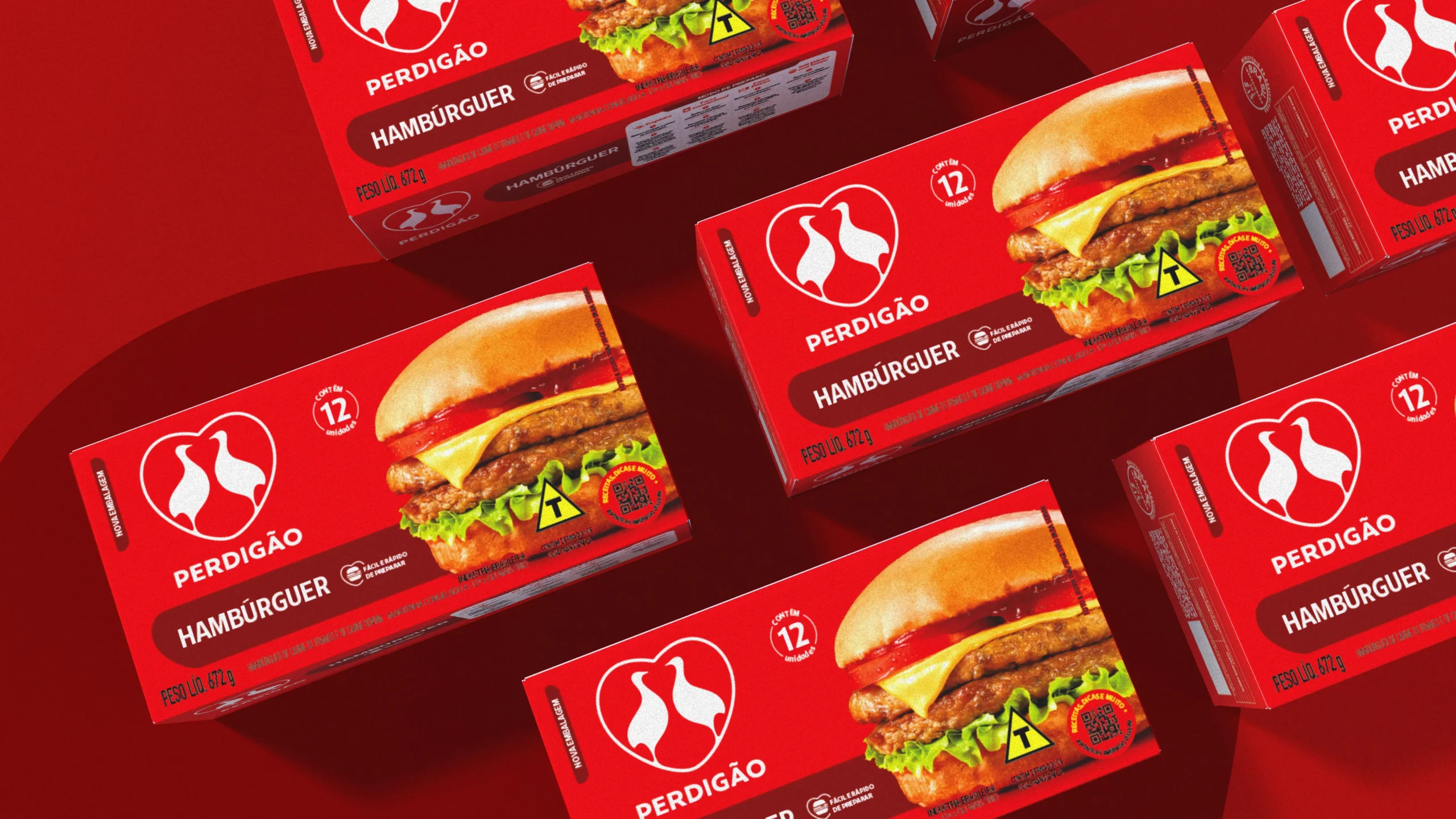
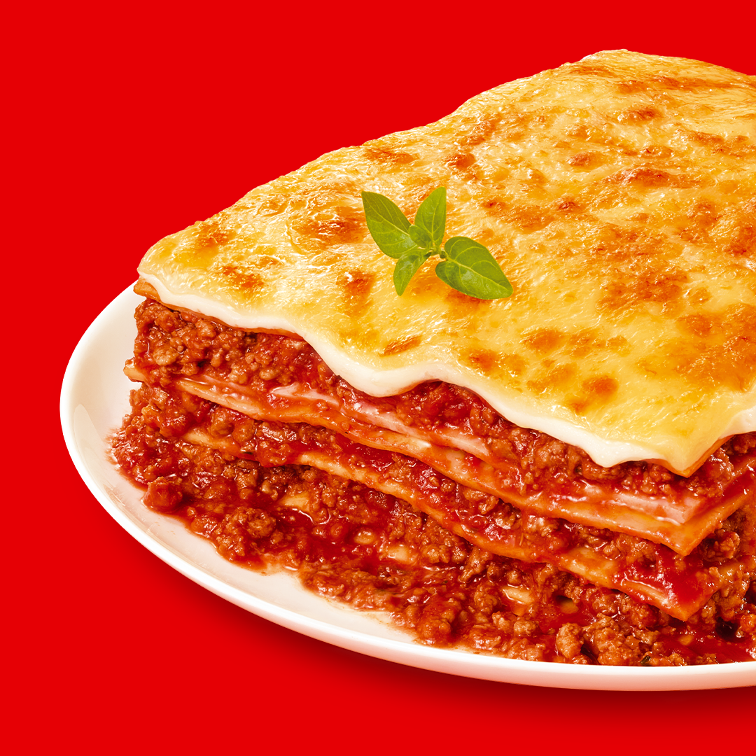
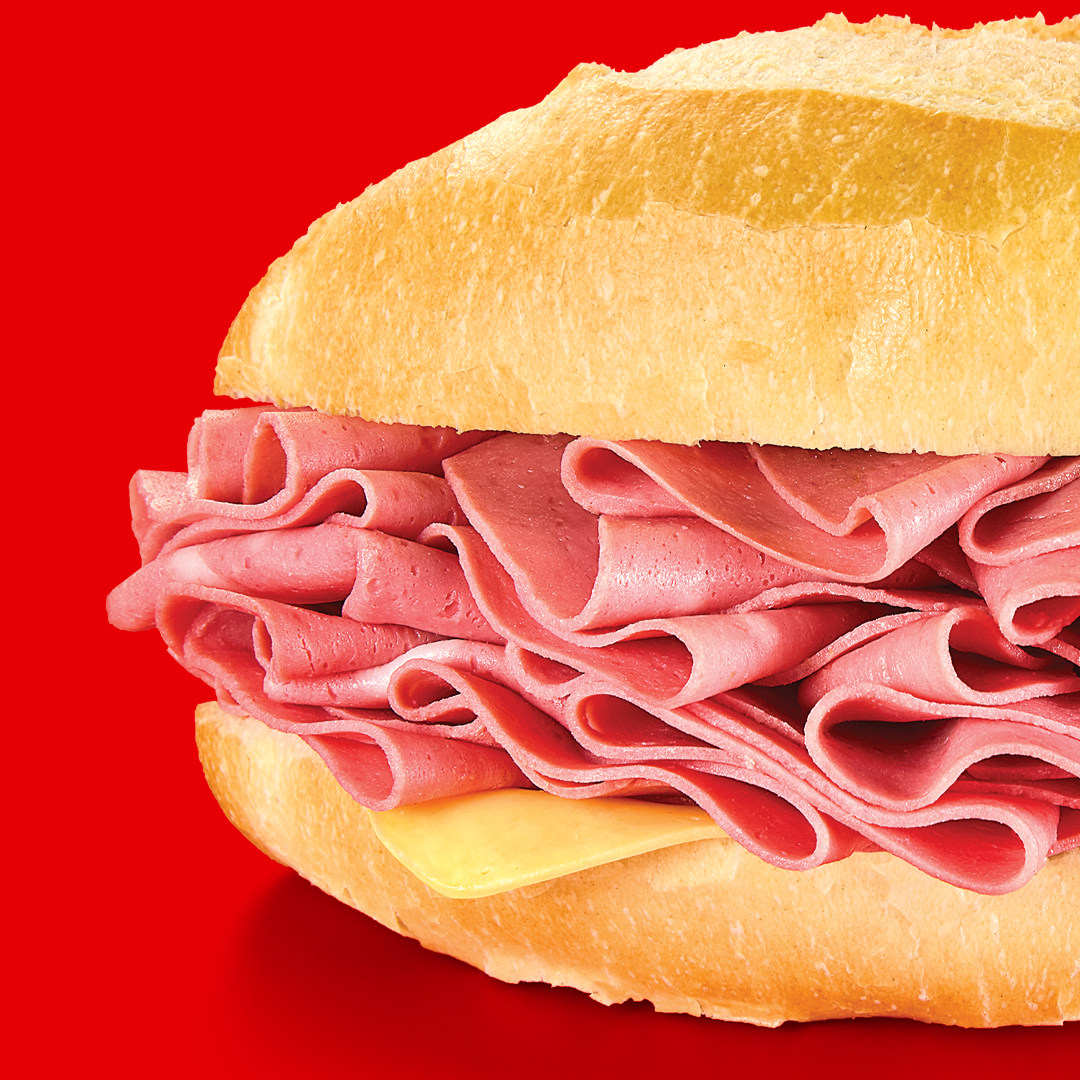
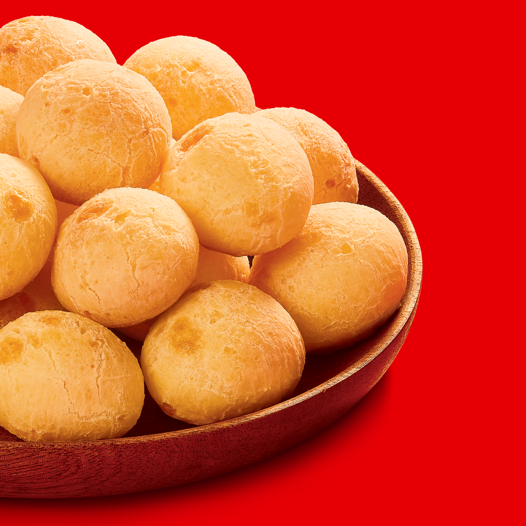
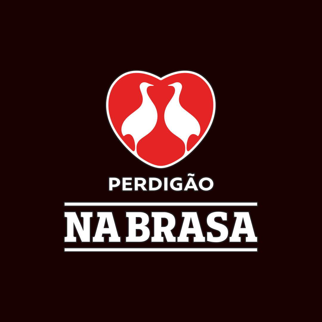
The new slogan “Perdigão. The flavor of eating together” reinforces the brand’s positioning as an essential part of Brazilians’ moments of unity and celebration at the table. This message is reflected across all packaging, from the most traditional products to the latest innovations, unifying Perdigão’s proposition of flavor and togetherness.
A Long-standing Partnership
Partnering since 2017, CBA B+G and BRF have collaborated on projects to innovate in the Brazilian food market. This collaboration has been shaping brands and redefining how consumers interact with different products, covering crucial fields such as innovation, branding, and performance.
Together in this endeavor, we worked on several fronts that solidified this partnership:
- Business Performance
Qualy Portfolio Architecture – The project redefined the brand’s purpose, identity, and expansion, aiming to strengthen its market perception. - Brand Identity
For Qualy, we reformulated the mother brand’s visual identity, bringing a cleaner and more contemporary visual language. We also developed its new tone of voice, seeking a more welcoming and optimistic expression.
- Brand Strategy
We conducted a Brand Audit of BRF brands, an ambitious project that went beyond looking at numbers to listen to consumer voices through comprehensive market research, competitor analysis, and attentive consideration of BRF brand consumers’ feedback. The resulting recommendations led to a strategic map to elevate BRF’s communication to new heights.
“Our partnership with CBA B+G has been fundamental in various strategic projects, from Qualy’s brand architecture to BRF brand’s Brand Audit. Now, seeing Perdigão’s renewal, preserving its centenary essence while adapting to the modern consumer, reaffirms the value of this collaboration across different fronts of our portfolio.”
Aline Alexandrino, Global Insights Executive Manager at MBRF
Each of these projects is part of building a solid partnership, making CBA B+G a strategic ally that anticipates needs and proposes solutions that go beyond the conventional.