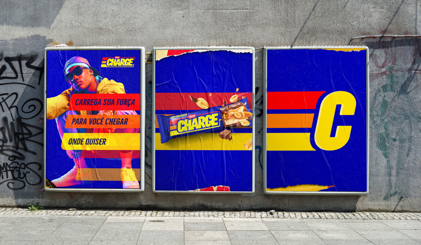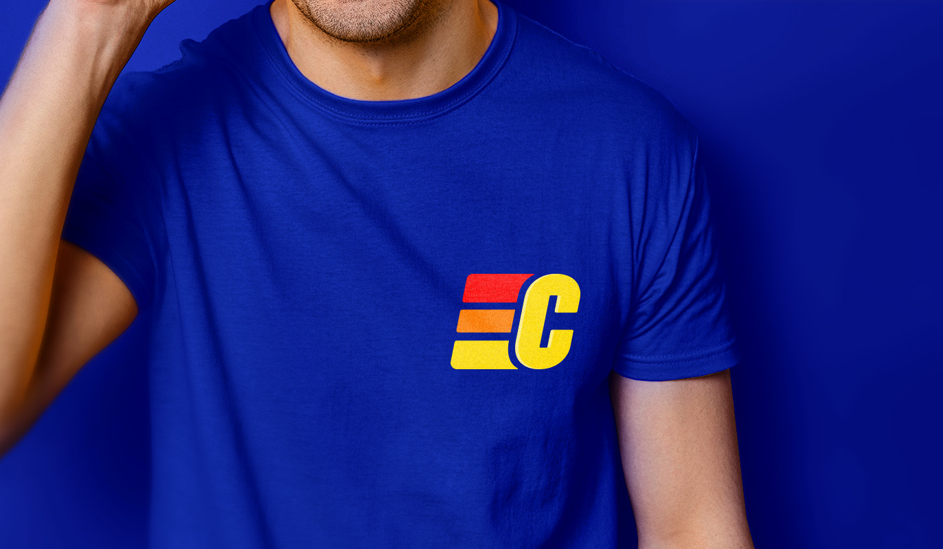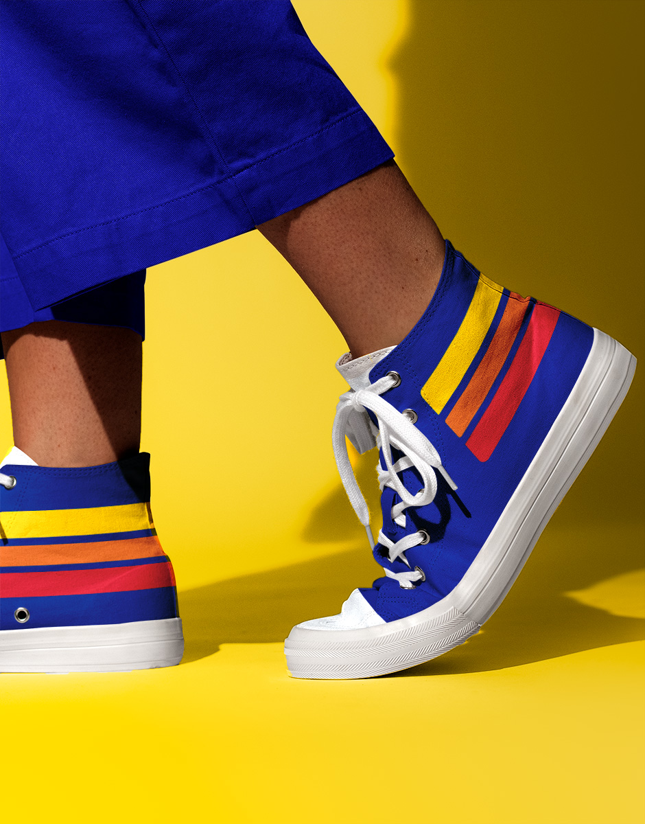

CHARGE is a successful and traditionally recognized brand since the 1980s, adored by young Brazilians. Recently the brand was repositioned for a fresher look and a closer bond with its audience, and we were invited to create its new visual identity.
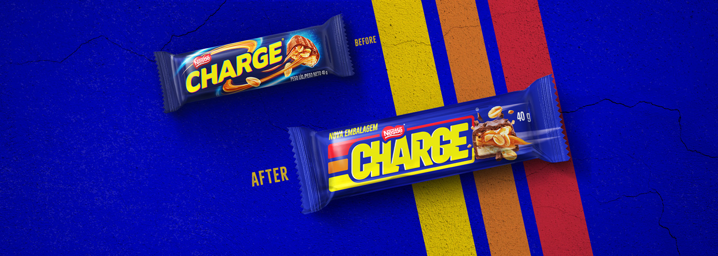
The challenge of translating the new positioning in a way that would communicate the rebranding was as delicious as the chocolate itself. Through the Brand Senses, a methodology that explores the brand’s five senses and helps establish the principles that will guide its entire identity, we developed the new visual assets of the brand, in a co-creation work with the Nestlé marketing team.
When hunger strikes: CHARGE
The new look re-signifies the previous existing strips representing the layers of CHARGE: chocolate, peanuts and caramel, with strong colors that make the product stand out at the point of sale. The daring typography of the new lettering, in capital letters, occupies a greater space to transmit strength – a reference to the product, which is dense and bursting with energy. The impactful and compact logo, combined with the image of the product, conveys the feeling of motion, translating the essence of the brand: CHARGE provides a boost to help urban youths handle the everyday hustle and bustle.
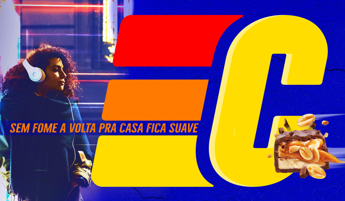
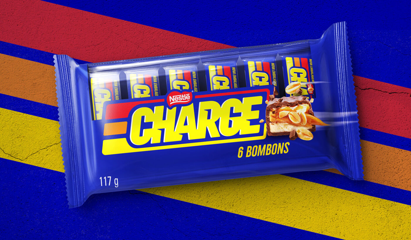
The new visual identity, applied across the brand’s platform – from packaging to digital communication – has become much more vibrant, conveying the fast-paced lifestyle of its consumers. A chocolate bar that recharges the batteries and gives a boost of energy when hunger strikes.
