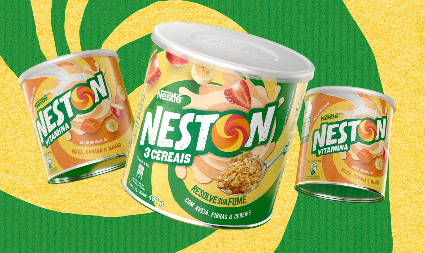
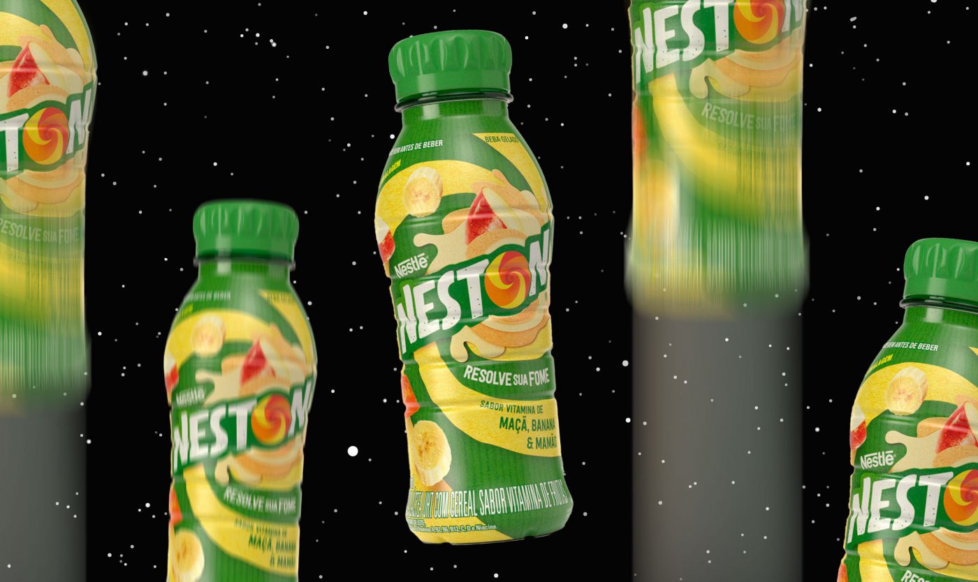
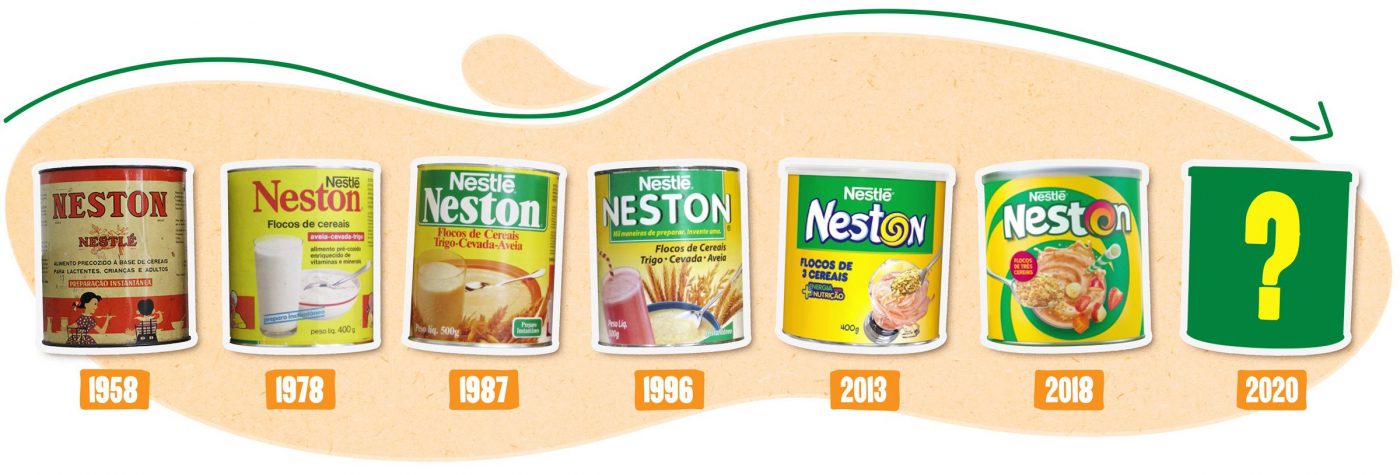
How to keep updated at the age of 60? This is Neston’s challenge, a brand that was born decades ago with the aim of contributing for a healthier and more balanced nutrition, and which is still faithful to its purpose until today. However, the world and the people have evolved a great deal since 1958, and to realign the brand communication we, from CBA B+G, were asked to reposition the brand.
Online multimedia tool
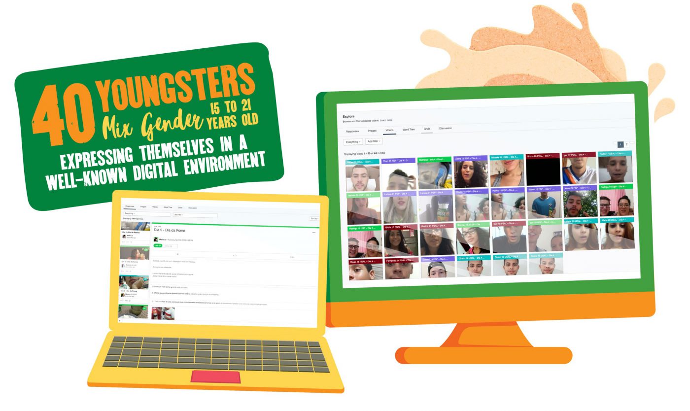
Although the company was aware of its target audience – generation Z people (born between 1995-2010), also known as centennials – Neston decided to broaden its knowledge of these youths and get to know their habits better so to connect to their needs.
To develop the new brand positioning we deeply immersed in the food routine of dozens of youths from generation Z, to understand Neston’s function.
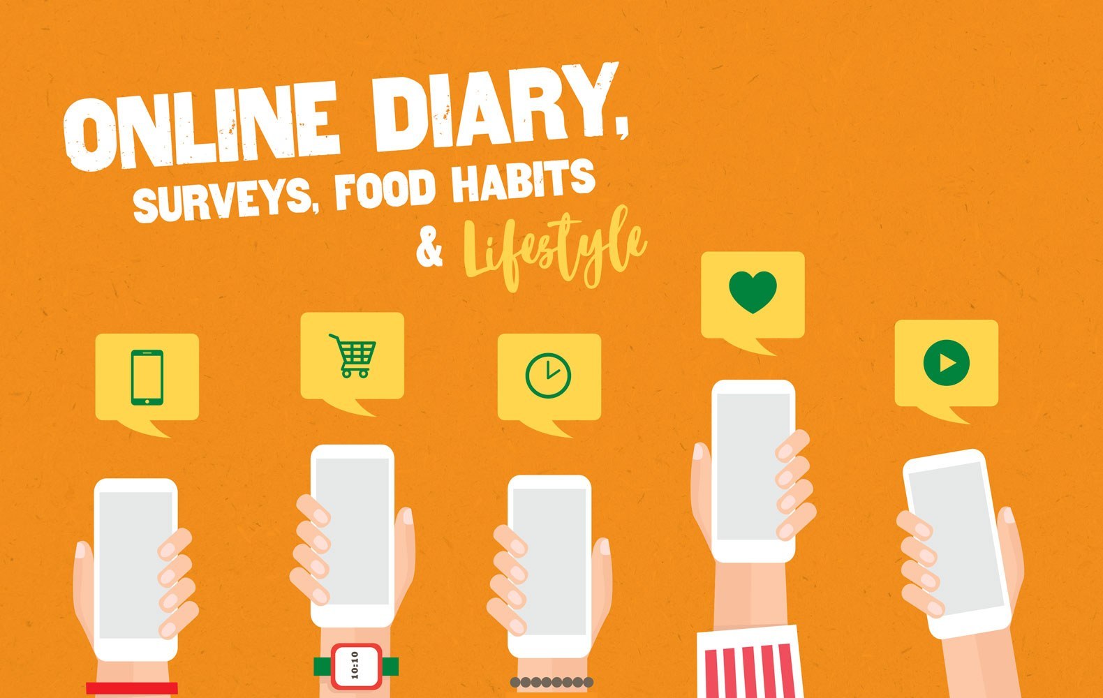
We started this in-depth study carrying out a qualitative research with a significant sample of young consumers and potential consumers of the cereal. We used an online multimedia tool which allowed for a deep analysis – during 5 days in a row, the youths filled out an online diary with interactive activities, which enabled the identification of consumer drivers and needs of the target audience. The great differential of this tool was the possibility of obtaining more spontaneous insights, since the language used is closer to the codes used by young people to express themselves, such as apps and social media.
Based on this survey we were able to map territories where Neston could operate for an ideal brand expression.
Pure energy
Once the brand territory was defined, the next step was to rethink the visual identity. For that purpose we used our Brand Senses methodology, that analyses the brand through the 5 senses on an approach that aims to enhance the basic features and properties of the product: satisfy hunger combining different textures – dry or wet, crispy or creamy, yet always healthy. And always in movement, constantly energetic and vibrant.
The visual identity is nearing completion and will be the outcome of this deep analysis of the target audience. Stay tuned, cause soon Neston will get a new look – connected to the youths and their needs for movement and nutrition.
We’re lucky to have Neston
The new visual identity developed translates the deep analysis conducted with the target consumer – urban youth that move and recreate their surrounding world; people who speak up, talk, recognize their flaws and continually reinvent themselves. The visual codes were inspired on their language, in a collage of styles. The movement emerging from the letter ‘O’ sweeping and twirling all around; the imperfect-textured font; the intensity and freedom represented by the natural colors. As the target audience would say: fuel up, set off and enjoy the ride. It’s excitement and nutrition. It’s Neston.

