This project won the Nielsen Design Impact Awards 2019, a global award that highlights cases of packaging redesign, assessing them as marketing tools. Prestígio’s packaging redesign stood out for increasing the brand’s sales by 46% after the new packaging reached the POS. In 2018, it was also awarded for ABRE Brazilian Packaging Award and Grandes Cases de Embalagem.
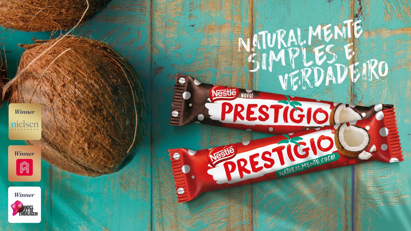
Prestígio is natural coconut, Prestígio is Brazil.
Created in 1961, and up to now a synonym for homemade recipes with coconut and chocolate, Prestígio is a genuine Brazilian chocolate deservedly recognized as one of Brazil’s symbolic brands.
Attentive to consumers’ tendencies and desire for more and more natural products, the Swiss multinational, as a leader in products which join nutrition, health and wellness, decided to renew the Prestígio brand. The preservation of its ‘natural coconut origin’ essence was established as the main goal, and CBA B+G was invited to the challenge of reconnecting the brand with its Brazilian chocolovers.
Coconut lovers
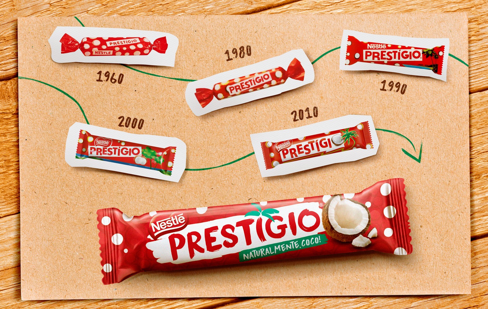
Despite being a traditional brand, preserving its memory is important.
So we started off from the brand’s archeology, in a way to rescue its codes and original shapes and visuals, the fundamental elements for settling down Prestígio’s essence and positioning. In order to grasp the real meaning behind the visual codes and reconnect them with its target audience, we carried out dense exploratory researches, both quantitative and qualitative, always checking the brand’s preliminary concepts and triggers. The research oriented a creative process that gathered strategy, research and design staff.
Hundreds of consumers from several Brazilian states were considered in a deep semiotic study with lots of learnings. We also carried out the Brand Senses methodology, which explores the brand’s five senses and orients the guiding principles that would shape the creative path to reconnecting with its identity: fresh air, nature sounds, the perfect combination of natural coconut and chocolate flavors.
Understanding the consumer is worthwhile
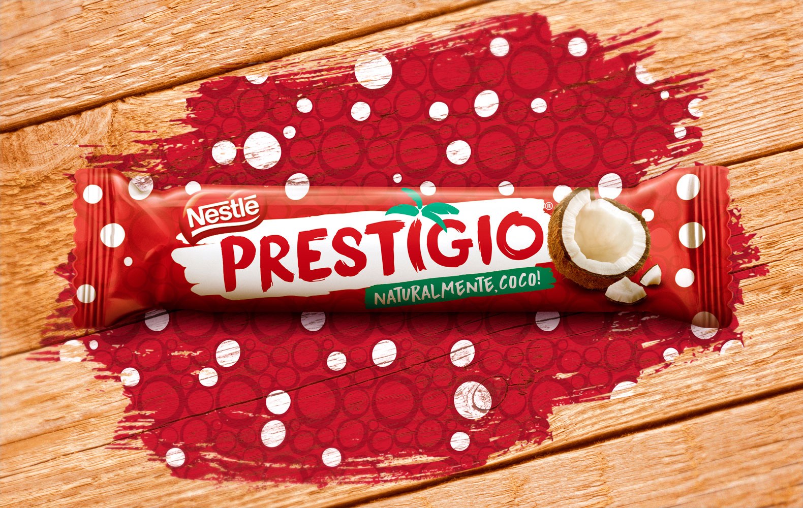
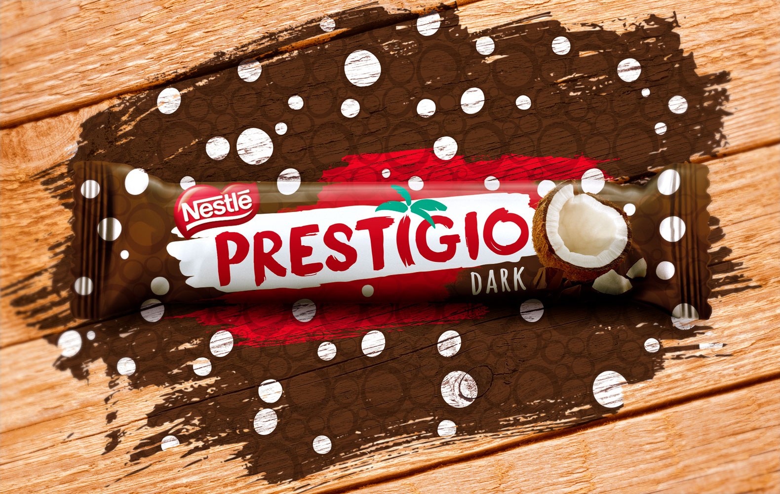
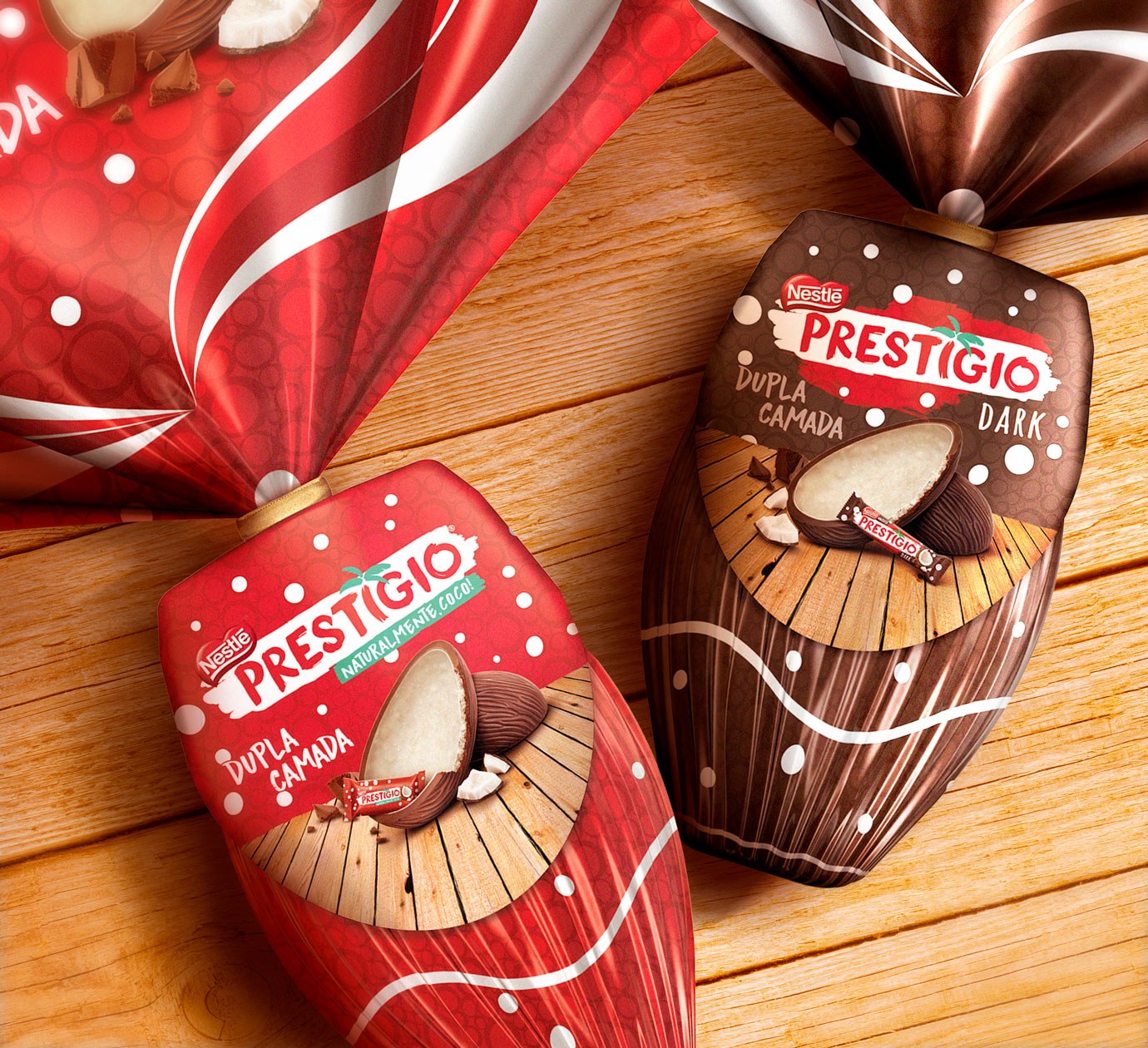
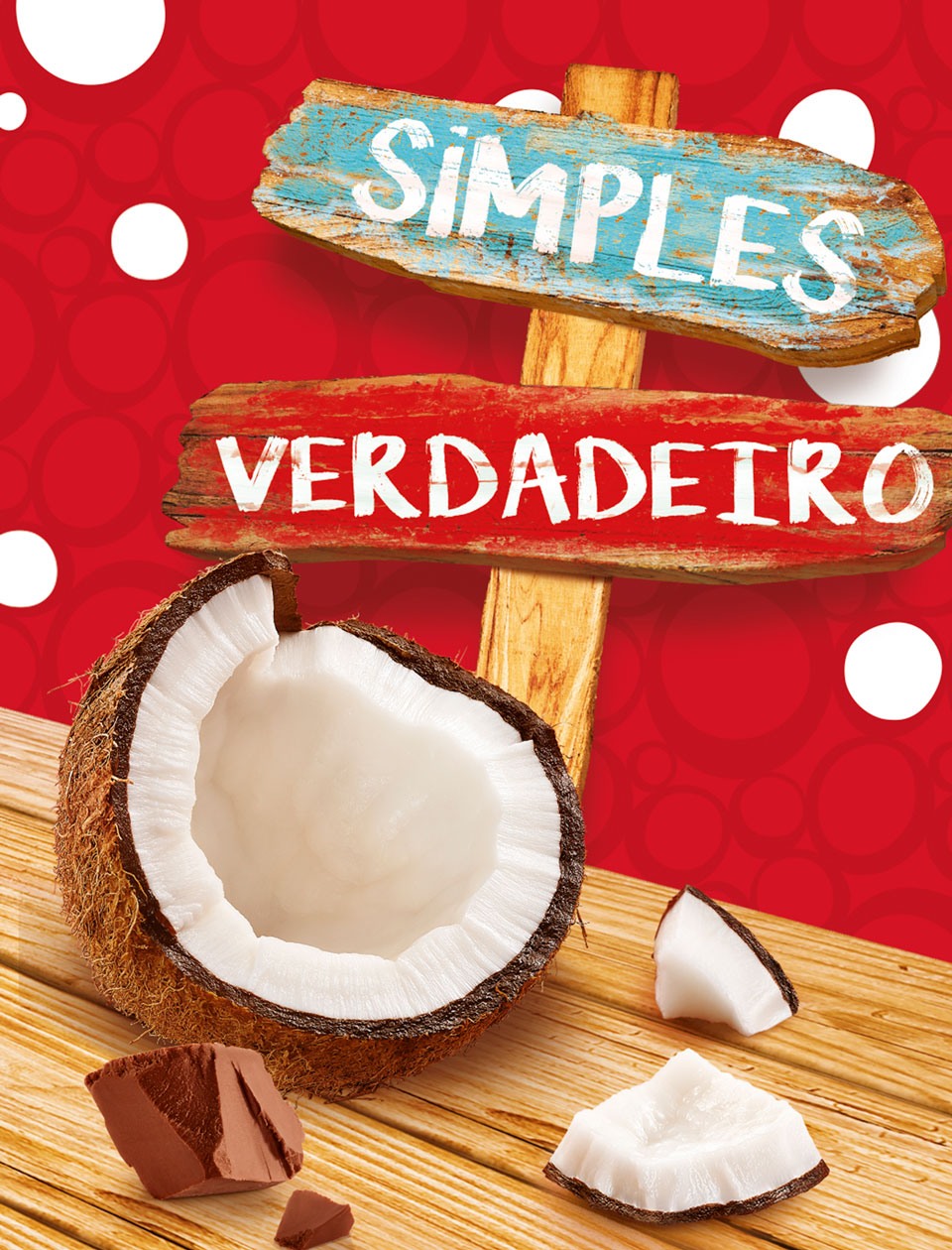
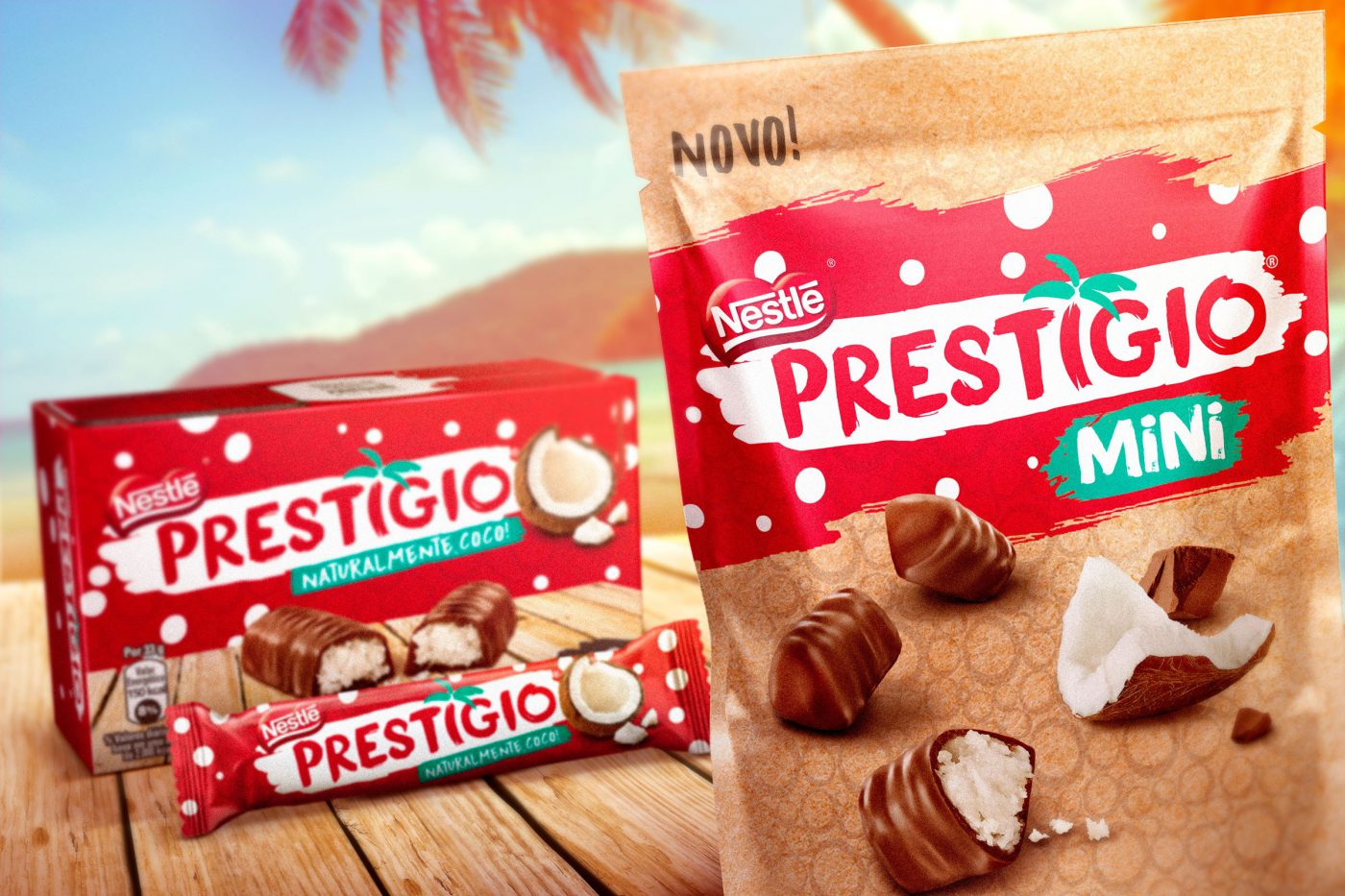
The outcome from the strategy and design works was the translation of all we heard from Prestígio consumers. Its iconic elements – the red color, the textures and the coconut were kept on, although represented in a more natural and authentic way. The sign typography, also recalling a more natural and truthful feeling. On the packaging, wooden boards, slivered ingredients, details in green – nature showing off closer to reality. The boxes were finished with embossment and textures to reinforce the brand’s sensorial aspect. An authentic simplicity to the exact Prestígio extent.

