

Imagine the responsibility of working with a product that is present in Peruvians’ lives since 1927. Sublime counts on a huge penetration in Peru and lots of meanings to its consumers: the chocolate for relaxing from everyday pressure, childhood’s taste, affection at any time.
Relevant to all those who consume it and to Nestlé Peru (the country’s second most important brand), the brand needed to revitalize its story, renew its identity and, through its iconic and proprietary features, settle its importance in the context of national market.
As a long-time partner, CBA accepted the challenge of reworking Sublime brand through an extensive branding perspective: brand architecture, visual identity, packaging, and finally a global vision integrated with all of the brand’s touch points.


Brand territory and its senses
As of Sublime’s essence, “Recarga el buen ánimo”, we proposed to build an extremely structured design system to work its strong identity in a way to contemplate all touch points and reinforce the portfolio strategy.
Along with Nestlé Peru’s marketing, research and innovation teams, CBA B+G carried out an extensive workshop on Brand Senses, a methodology for exploring the brand’s five senses and helping the establishment of the guiding principles of the whole brand identity. The contrast and joy on the colors (vision), the rhythm, the smile, the laughing inspired by the brand (sound), the product’s crunchiness with those little pieces mixed to the chocolate (palate).
Working on the brand’s senses was critical to the next step: exploring different insights to the same message of the brand’s optimism, respecting its essence and its expression territory.

Smile
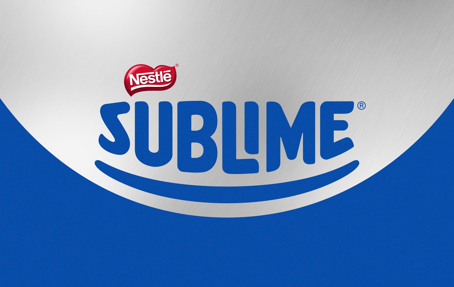
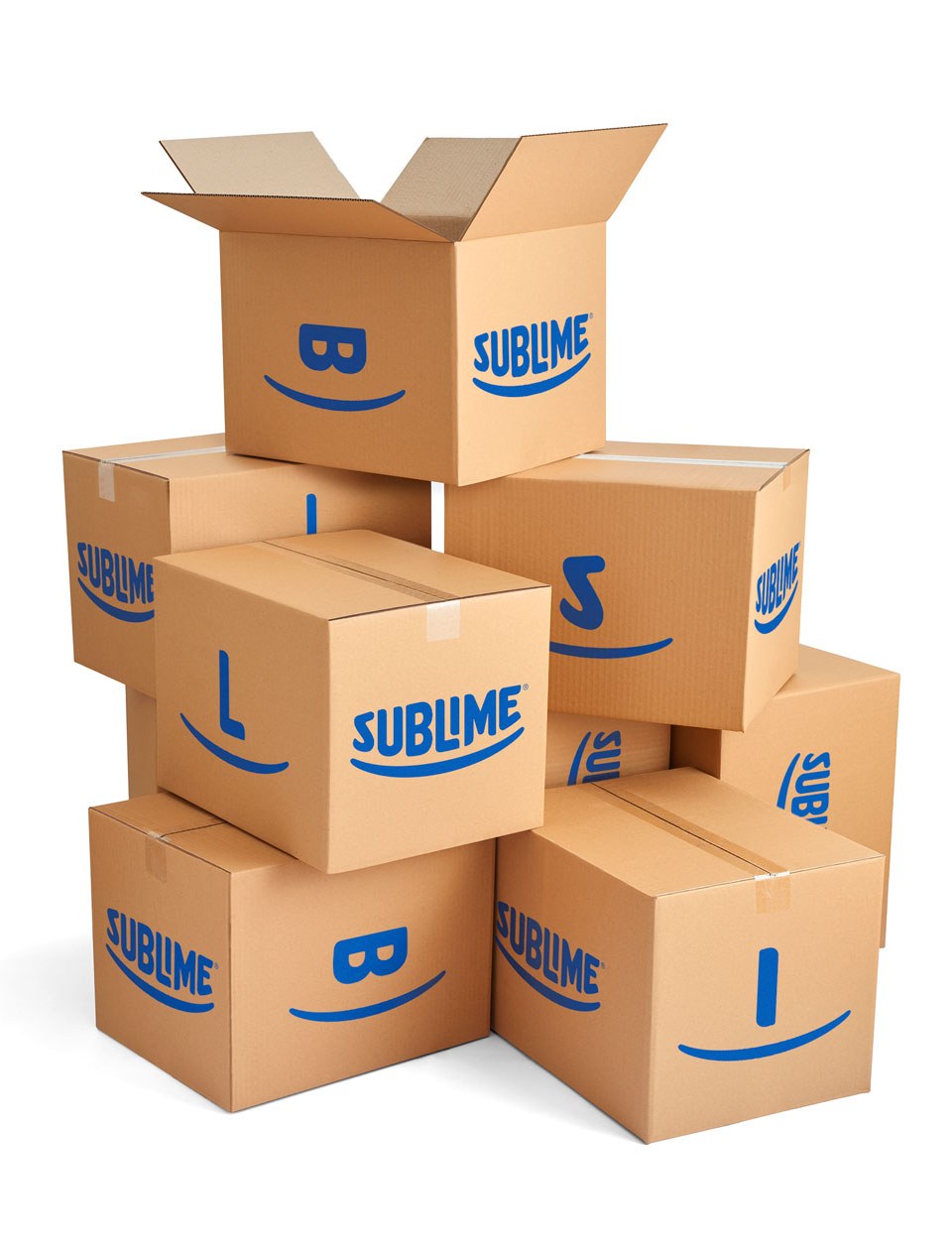
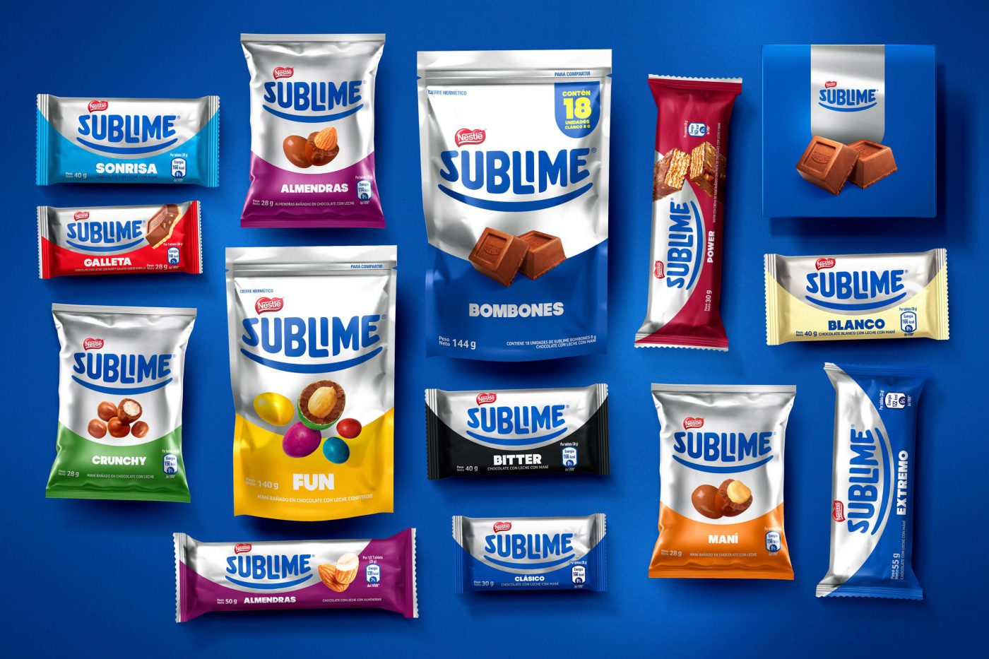
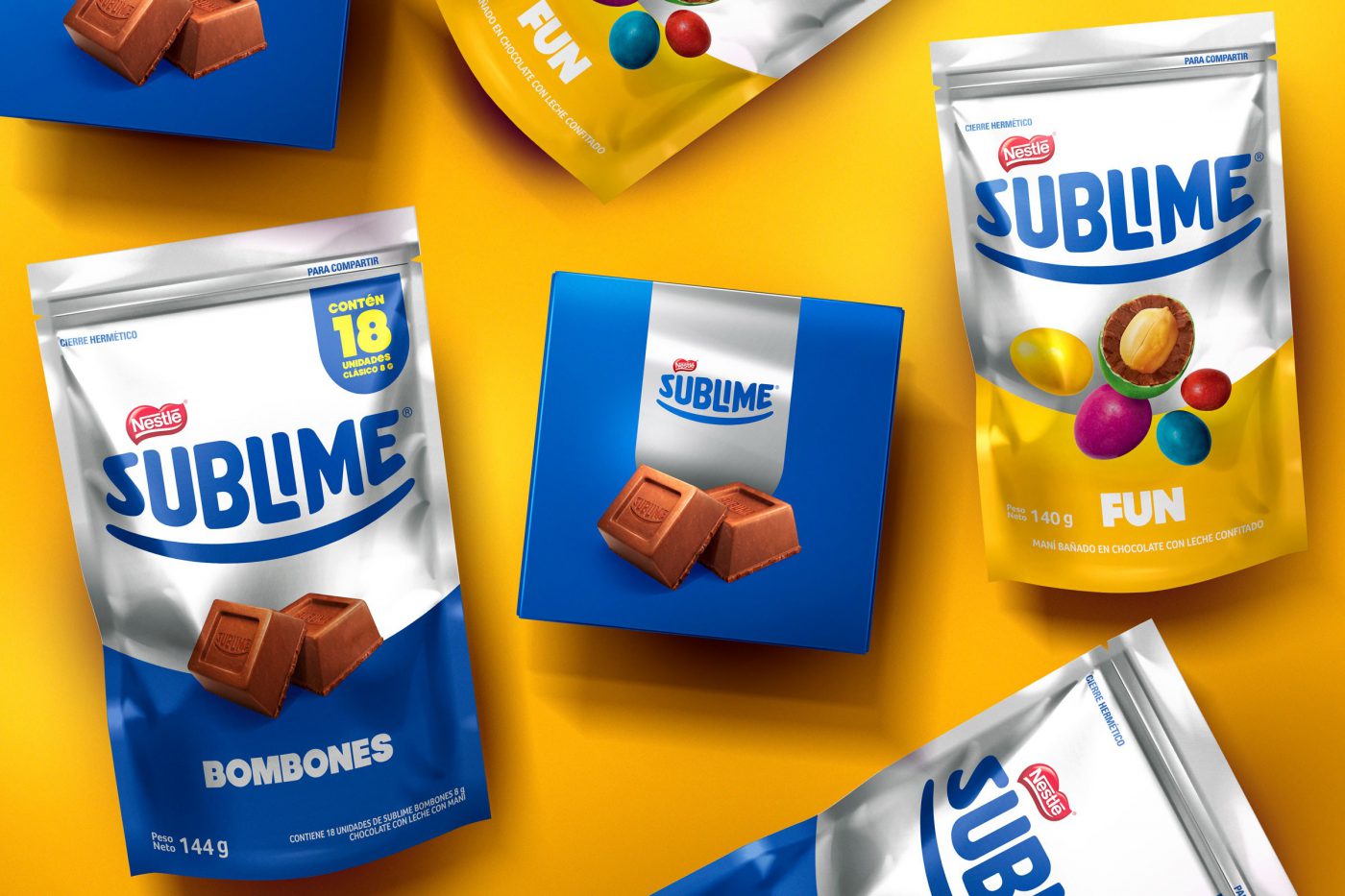
The new identity kept the brand’s proprietary elements, although they were evolved: the trace became a smile and its color system was totally redefined in a way to get closer to Sublime’s inherent senses:
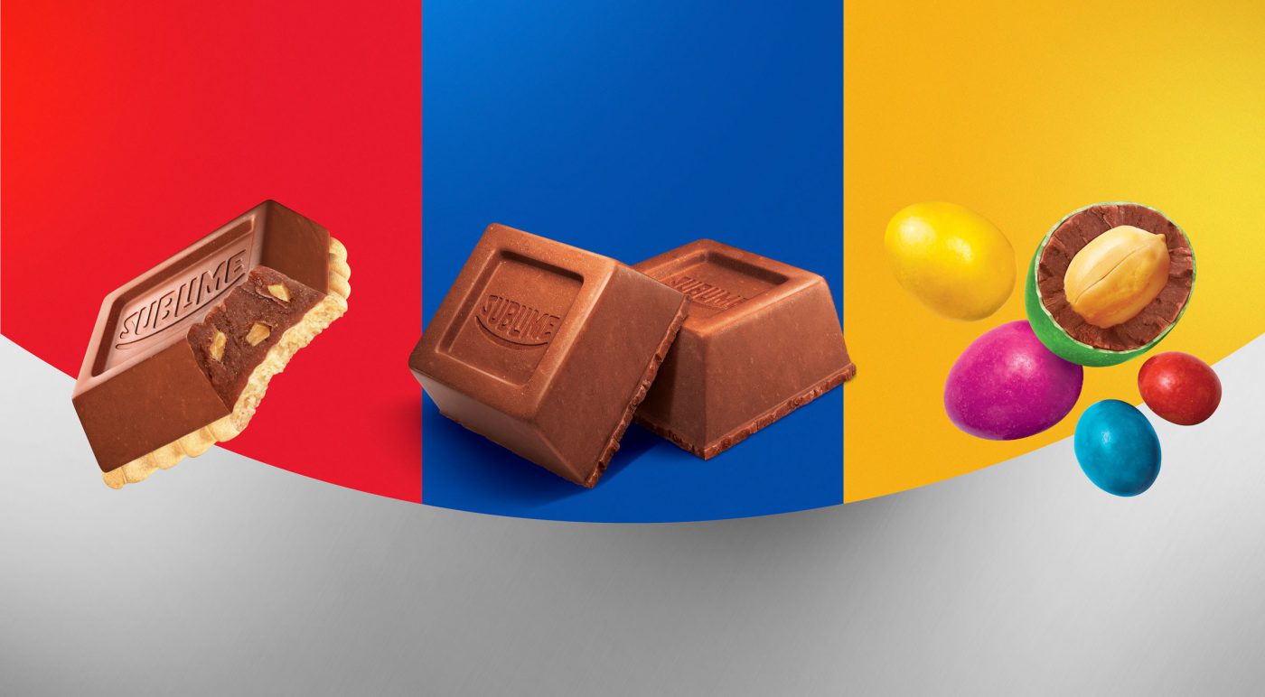
A balance between the iconic blue and silver but added to a color palette full of energy.
We carried out countless material tests and colors to get to the desired contrast. We studied the application of the substrates in different materials, paperboard, laminated – and how it would react when in display racks; we highlighted the contrasts between matte, brightness and color.
Besides recreating all design system and developing a guide on the brand’s use and application (‘brand look’), the most incredible outcome was its cross impact: total integration with the brand communication. As of a consistent and collective work of renewing the identity, JWT, the agency responsible for the brand’s communication adopted a new positioning, the internal staff restructured its product portfolio, the event agency applied the brand’s new concepts as well.
A great case of commitment and integration, which is worth a relevant brand such as Sublime.
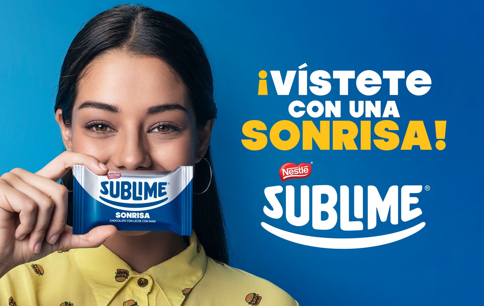
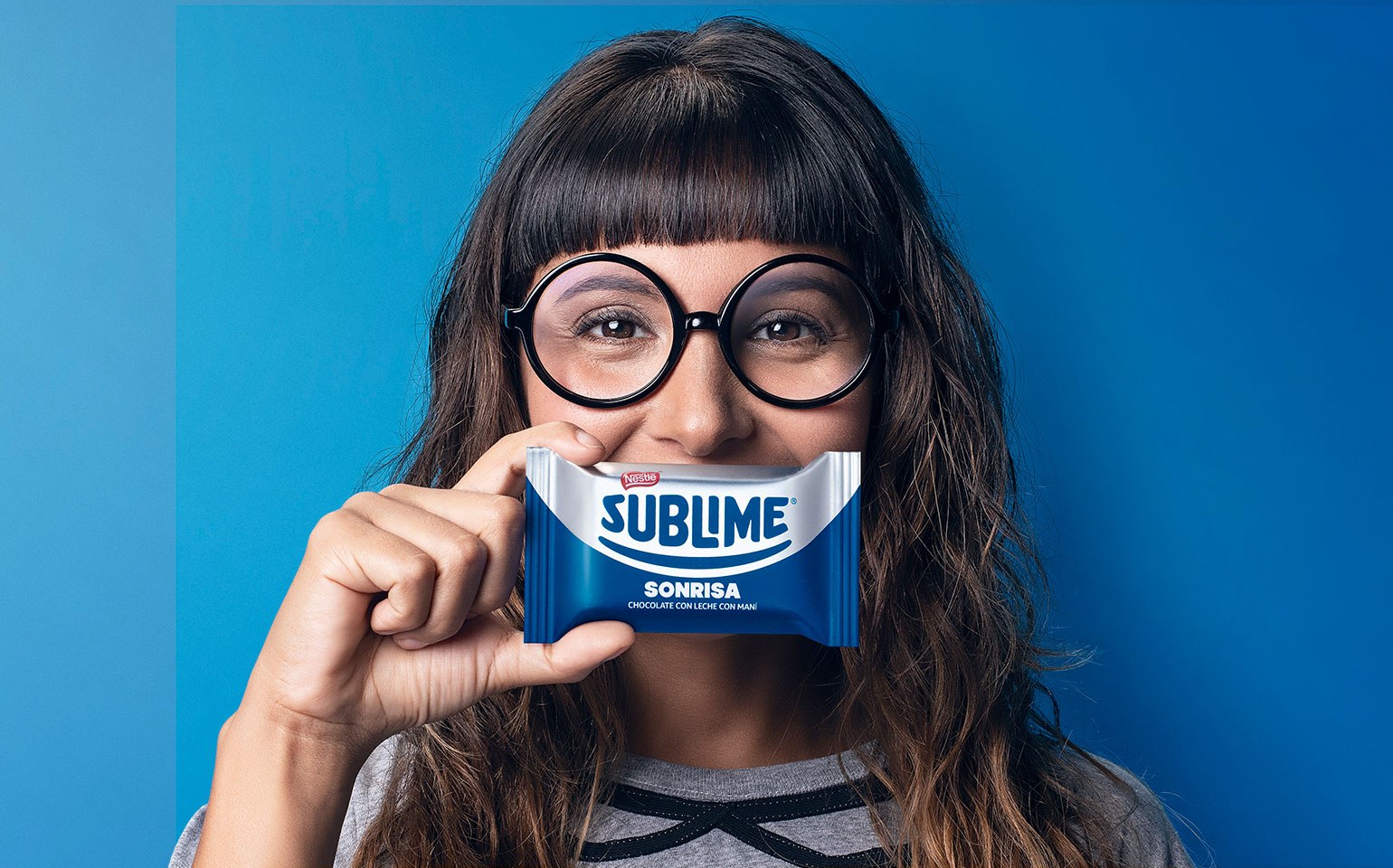
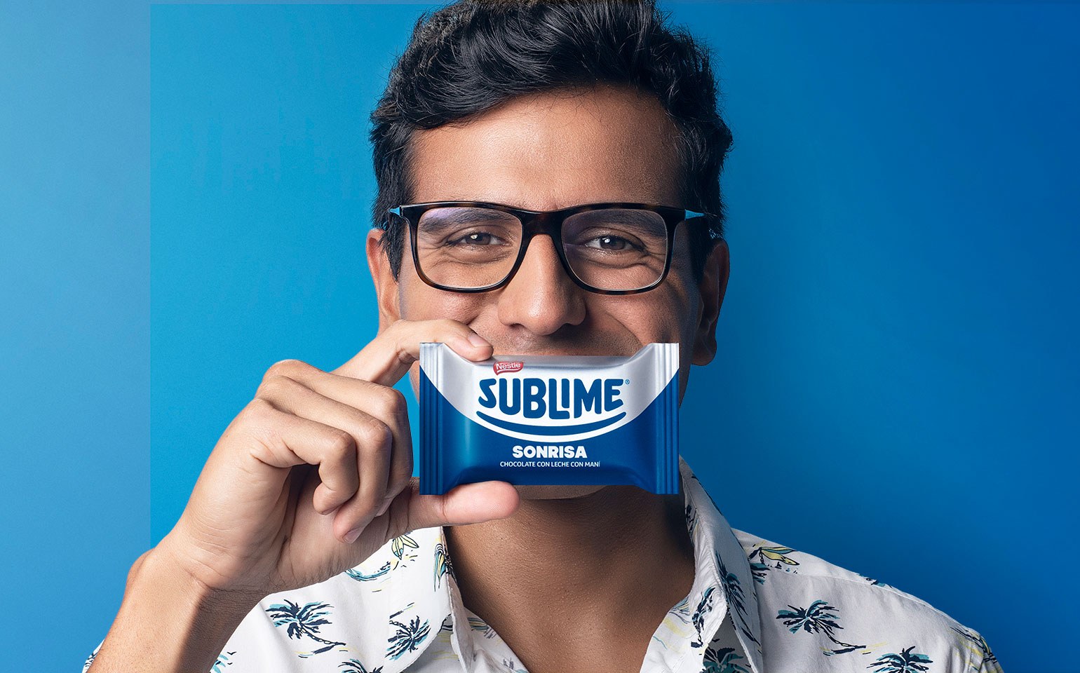
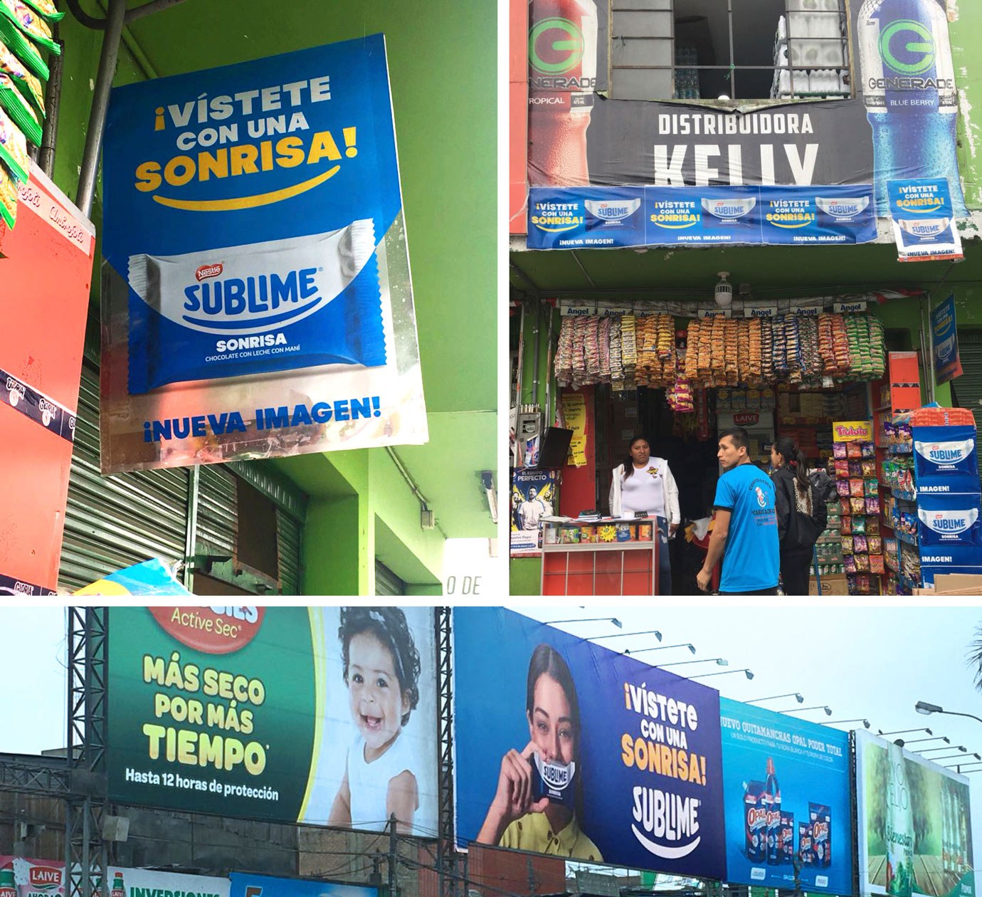
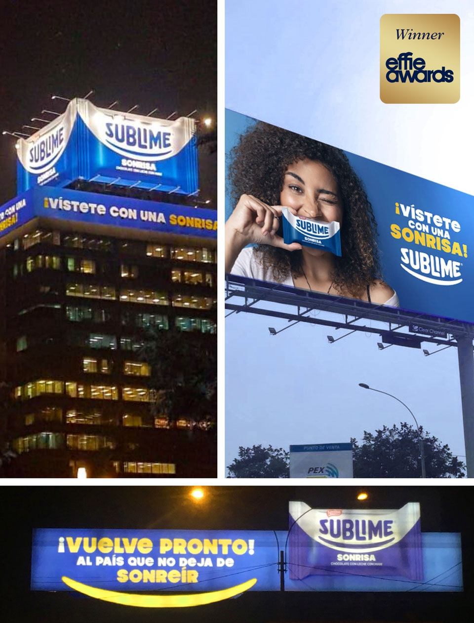
This project won one of the four awards we have earned in the Effie Awards 2019 (Peru), an internationally renowned and respected award in the marketing and communication industry. Sublime received a prize for the advertising campaign “Vístete con una Sonrisa”.

