A new Ayesa. Stronger, more relevant, more human.
Since its foundation in 1966, Ayesa has become a global leader in technological and engineering services. After its merger with Ibermática, the brand needed to evolve and enhance its potential as a unique company in the sector.
To this end, Ayesa entrusted CBA and Ogilvy with the redesign of its visual identity to welcome this new reality of two historic companies with a common project. An act of respect towards two great organisations that share values and that, together, give rise to the new Ayesa.

This is not the usual Ayesa, this is the Ayesa that has evolved.
A new visual identity created from the brand’s strategic platform, transferring it to an iconicity that establishes a meaningful relationship between Ayesa, its customers, suppliers and employees.
This is not the usual Ayesa, this is the Ayesa that has evolved.
A new visual identity created from the brand’s strategic platform, transferring it to an iconicity that establishes a meaningful relationship between Ayesa, its customers, suppliers and employees.
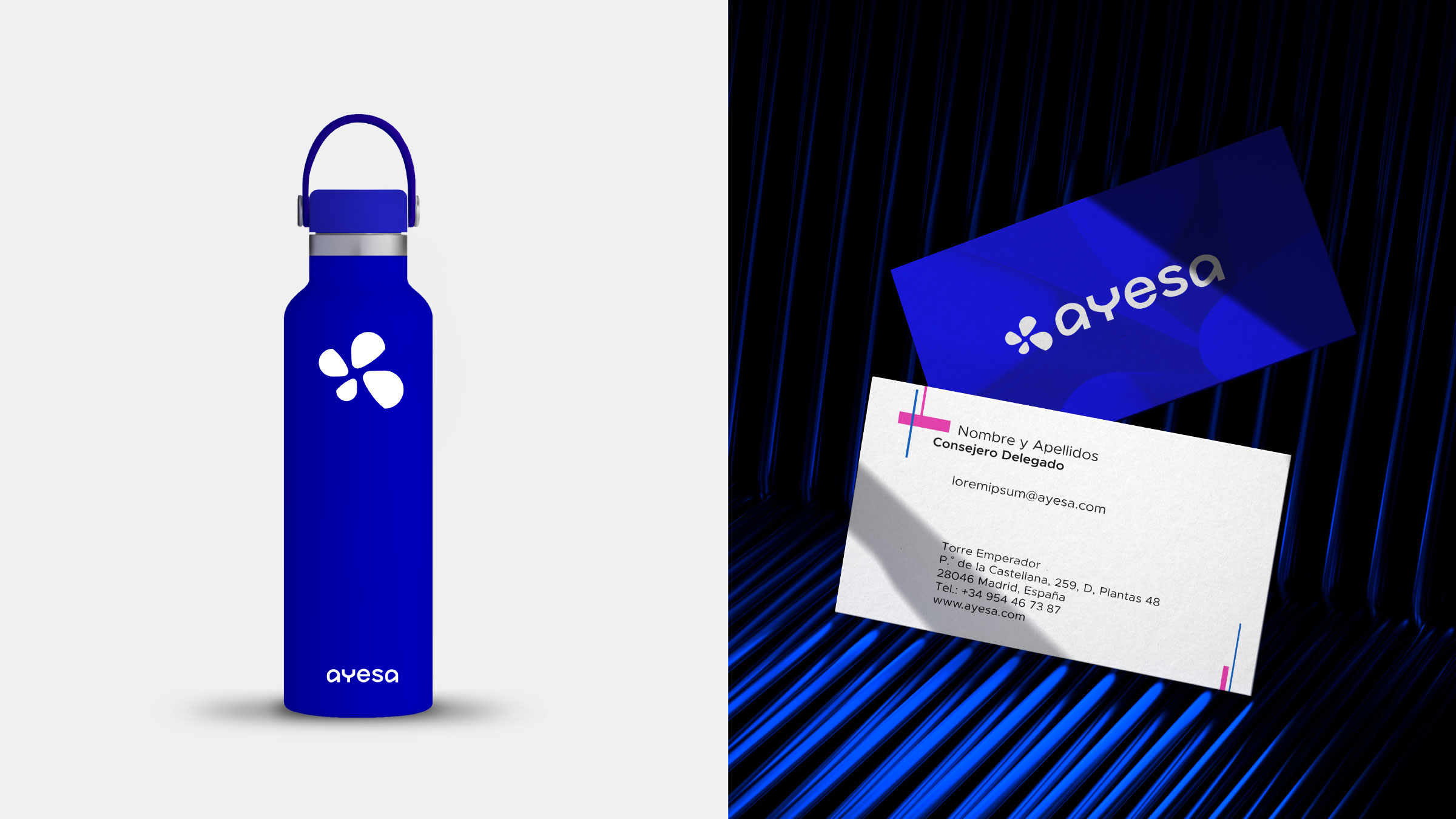
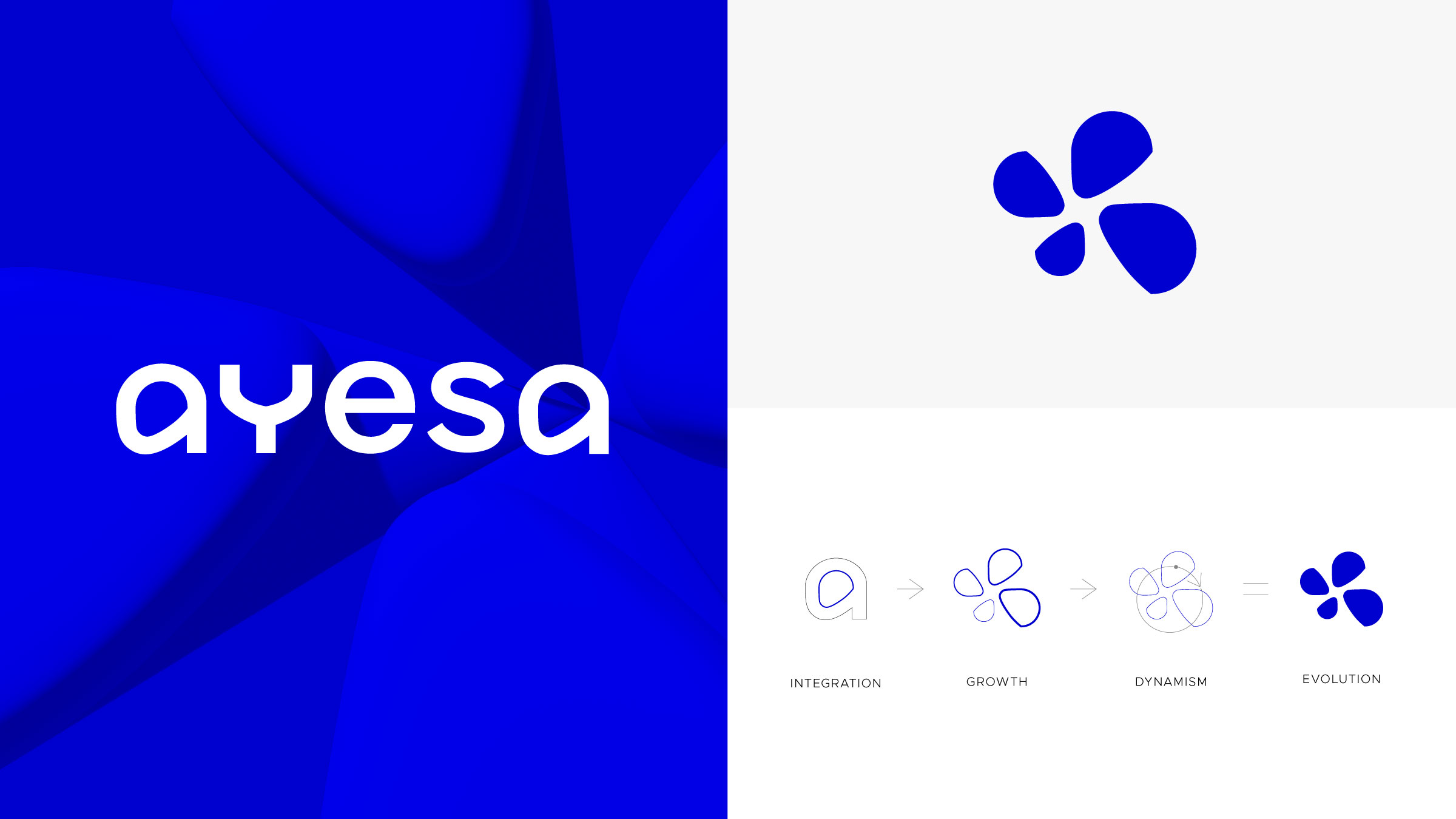
The first step has been to update the logo, which is now more stylised, digital and contemporary. This is accompanied by a new dynamic icon with organic shapes, built from the counterforms of the “a”, giving rise to a symbol of growth, integration and commitment.
The first step has been to update the logo, which is now more stylised, digital and contemporary. This is accompanied by a new dynamic icon with organic shapes, built from the counterforms of the “a”, giving rise to a symbol of growth, integration and commitment.
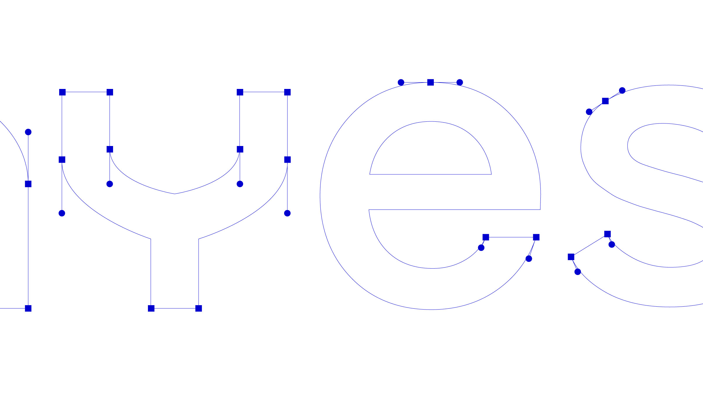

This way, we represent the progress, adaptability and leadership of Ayesa in a sector that is constantly changing. From the redesign of the logo, we began to build a flexible and dynamic visual identity system that shows a fresher, more professional and renewed Ayesa.
A human-centred brand that speaks with professionalism and trust.
A human-centred brand that speaks with professionalism and trust.
We created a system with organic shapes and lines that reflect this continuous movement, flexibility and transformation from a digital dimension.
The new colour palette, more vibrant, technological and luminous, establishes an open dialogue between innovation and all the people who make it possible.
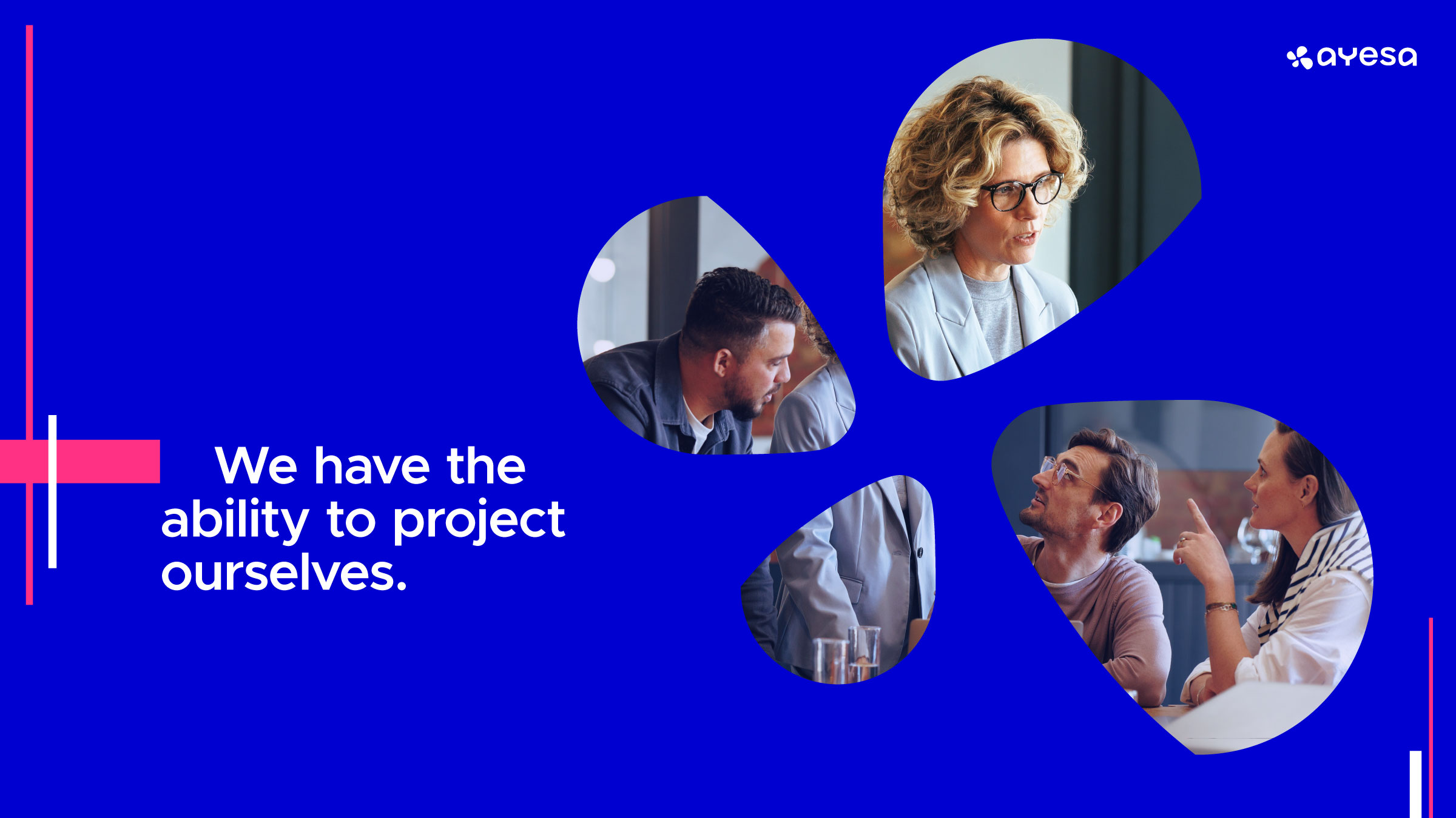
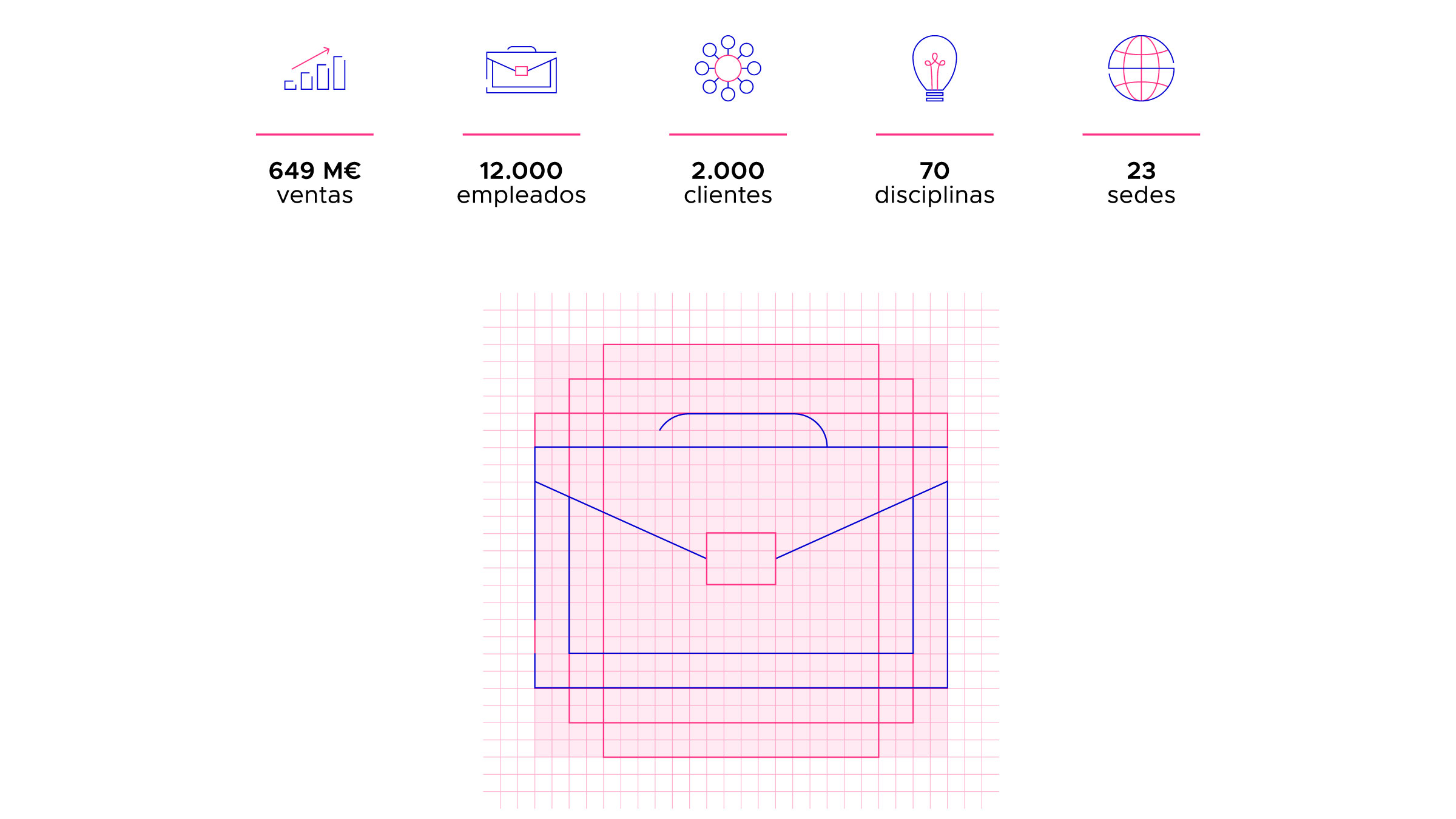

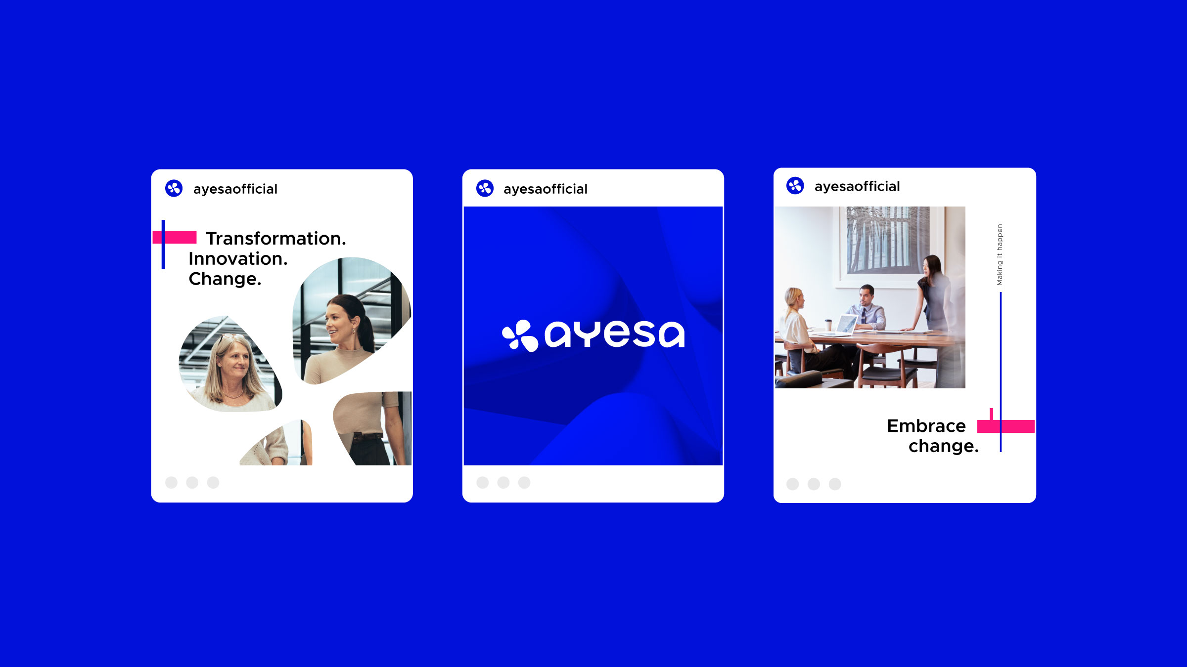
We put people and professionals at the centre of the new image. The photographic style reflects the human side of the company, which is part of its DNA, and a fundamental factor in generating value in a sector dominated by cold and technological elements.
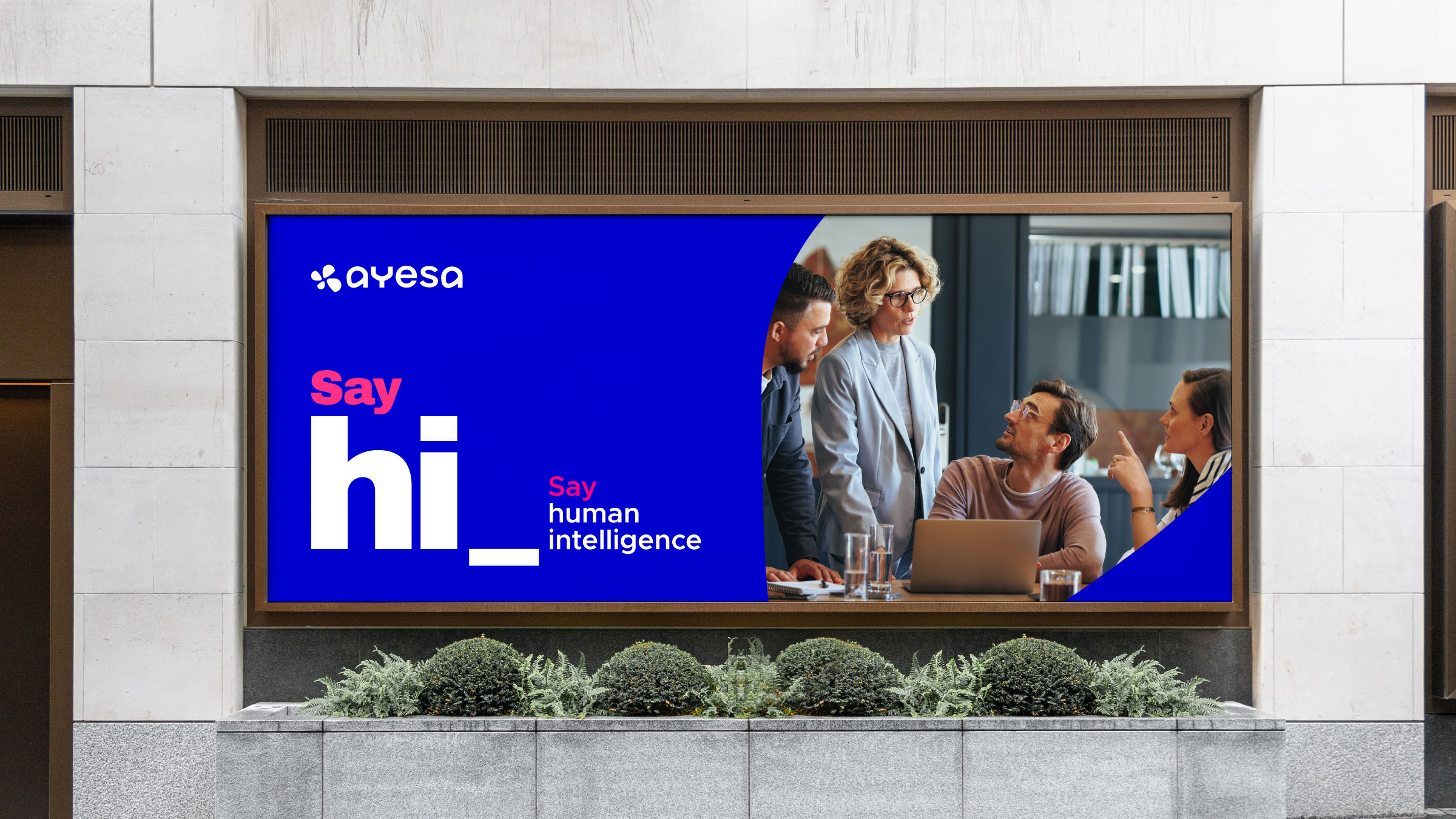
A new visual identity for Ayesa that highlights the integration of the two organisations, which together rise towards a new territory. A story of leadership, experience and innovation that highlights advanced technology and the team behind it.
A new visual identity for Ayesa that highlights the integration of the two organisations, which together rise towards a new territory. A story of leadership, experience and innovation that highlights advanced technology and the team behind it.
