Doğuş Group is an international powerhouse with experience more than 44 years. Doğuş Group has more than 15 brands under it’s hospitality portfolio.
Doğuş Group is involved in many industries; which includes hospitaly & retail.
Doğuş Group’s hospitality and management industry; D’Hotelier required a brand identity which will truly reflect the Doğuş Group hospitality services’ quality and the trust it provides from the many years of experience.
The brands under Doğuş group’s portfolio are diverse in ways more than one. From the service provided to the brand identity, there are many variables that differentiate the brands.
CBA partnered with Doğuş Group previously to renew the Group’s corporate identity.


Doğuş hospitality & retail wanted to leverage their strong industry experience and expertise by founding a management company. The vast portfolio of hospitality and retail Doğuş Group contains brands with different brand and visual identities. To ensure that the identity created at the end of the process would be in-line with Doğuş Group’s identity, CBA conducted interviews and analysis to get a better sense of Doğuş Group and have a deep dive into Doğuş portfolio for Hospitality & Retail. Naming process of the brand was the first step and followed by the logo design and color coding. CBA wanted to emphasis the importance of being modern, as well as being a timeless brand. During the creation of the process, providing a management service that will improve the efficiency and performance of the customers via innovation was the key highlight for the brand.
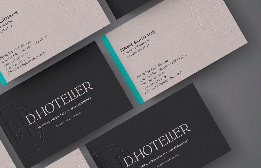
Creating the brand identity for Doğuş Group’s hospitality management brand; the first step was the name selection. Focusing on the existing sub-brands and the umbrella brand; the letter “D” was preferred, to provide verbal similarity and a visual resemblance. The design structure of the sub-brands did not follow a single strategy, so CBA focused on the bigger picture; which was following the simple structure of “symbols and lettering”. For the color palette; colors which would provide a sense of premiumization were chosen. Supported with the benchmark analysis of the brands present in the market, a premium visual identity and D-Hotelier brand story was conveyed.
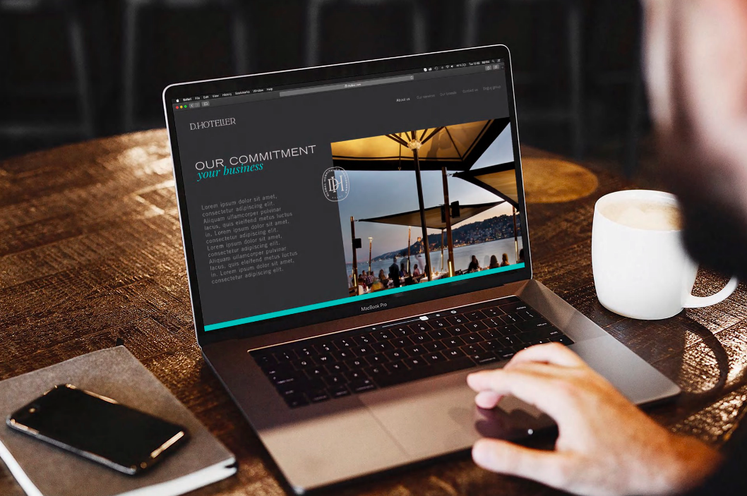
The elements of D.Hotelier’s new identity highlight its experience and excellence in global hospitality management. The visual concept merges tradition with a touch of contemporaneity, in a measure that is just right!


