Dog Chow is Nestlé Purina’s leading brand in Latin America, and despite its high-perceived brand value and growing market share, it aims to become the indisputable leader of the premium segment.
As a result of the traditional and recurrent market and consumer analysis conducted by Purina, the conclusion was that a brand differentiation opportunity would include a repositioning and portfolio improvement, covering message, product and packaging, to build a consistent communication with the target and increase engagement.
On account of our regional field of operation and long business partnership with Nestlé Purina, the CBA B+G team was invited to join the project, adding critical and creative thinking skills to this major work of strategic repositioning of the Dog Chow brand.
Shine: a well-cared & welll-fed dog has a shiny coat
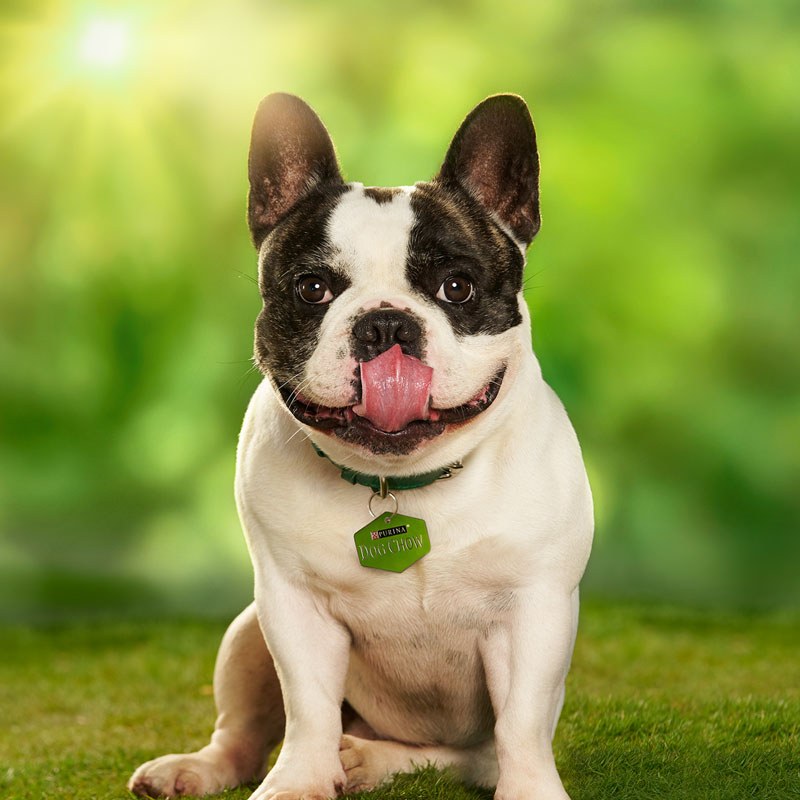
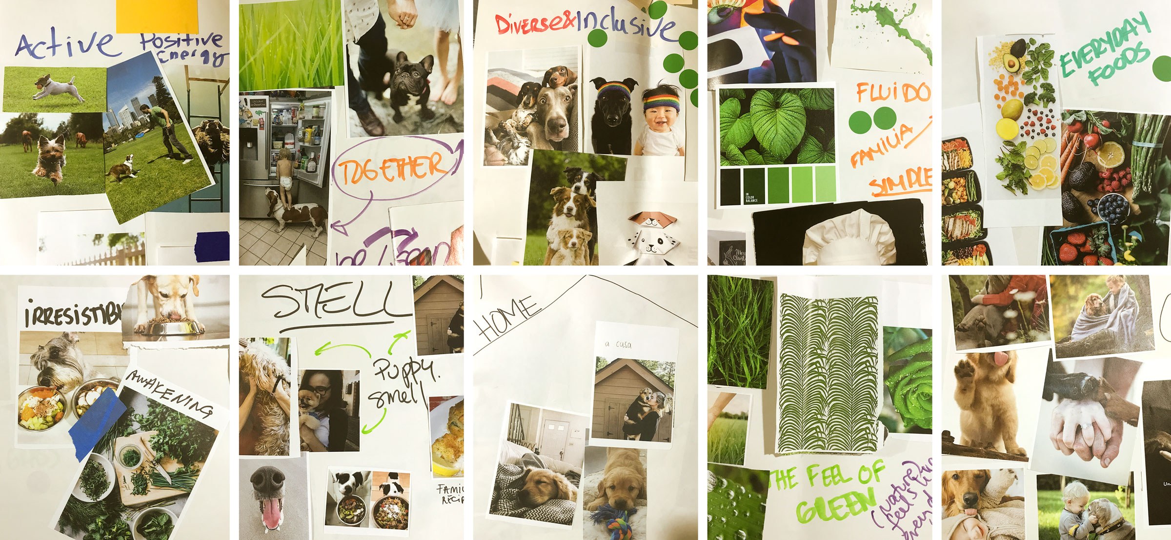
We started our work in Saint Louis, Purina ’s Headquarter. We led an extensive workshop on Brand Senses, a methodology that explores the brand future and the five senses, helping to establish the principles that will guide the brand identity. During this time, we discussed the portfolio architecture with a multidisciplinary team consisted of all Purina’s Latin America market leaders, concluding that the core brand territory should be the quality of life – nutrition totally linked to the dog’s quality of life. Many ideas to express the brand territory were tested and assessed, and the winning concept was the ‘shine’: a well-cared and well-fed dog, has a shiny coat.
Together life is better
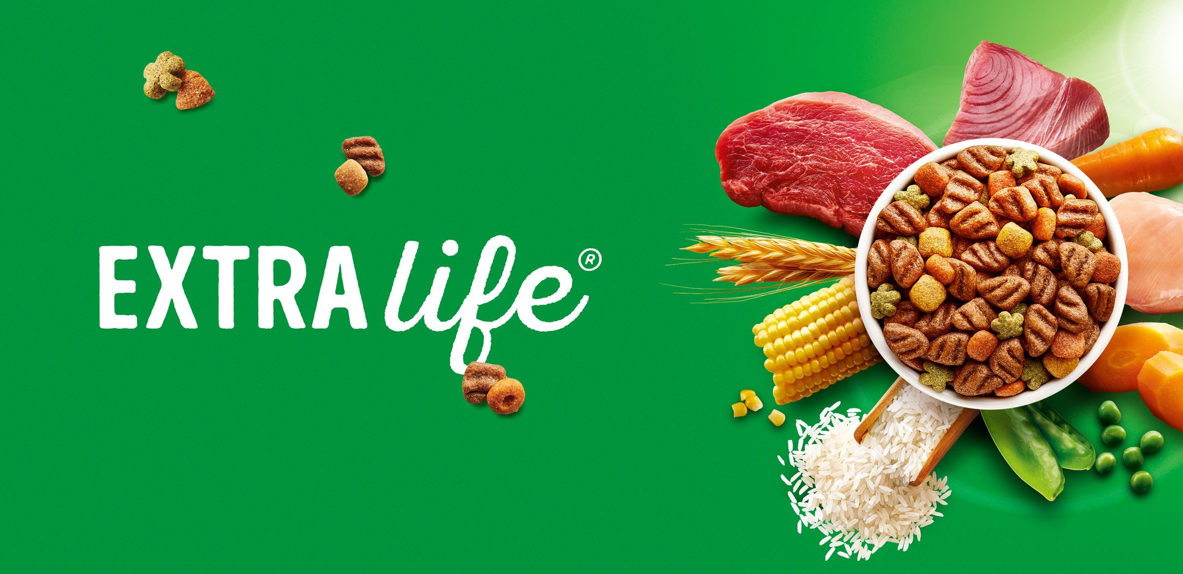
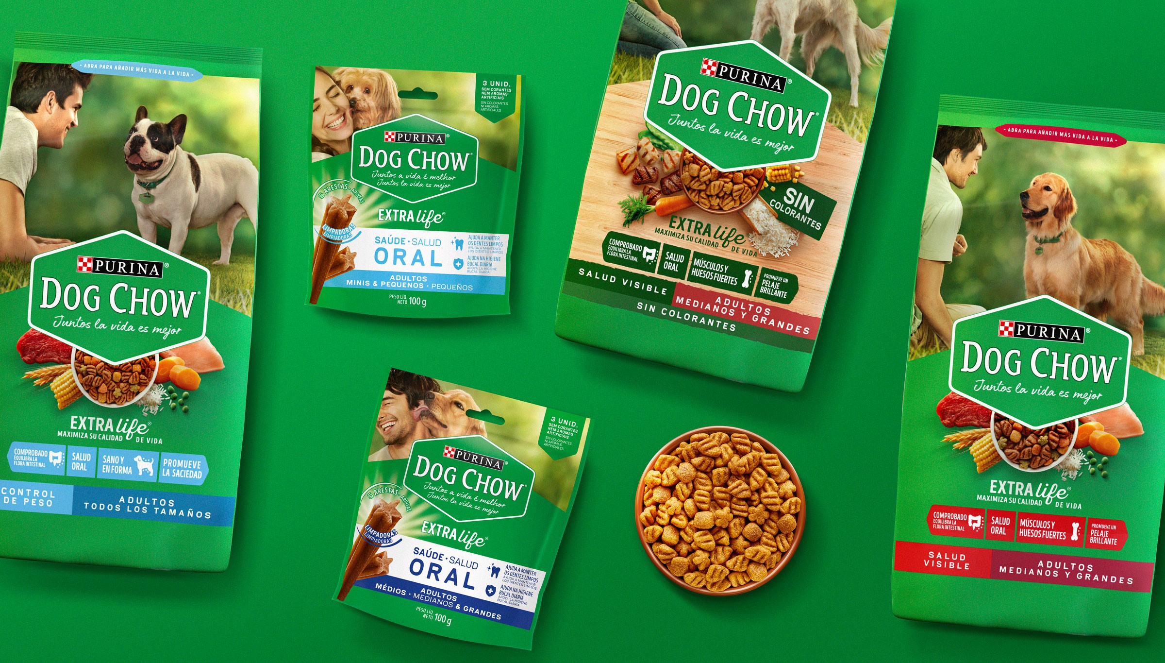
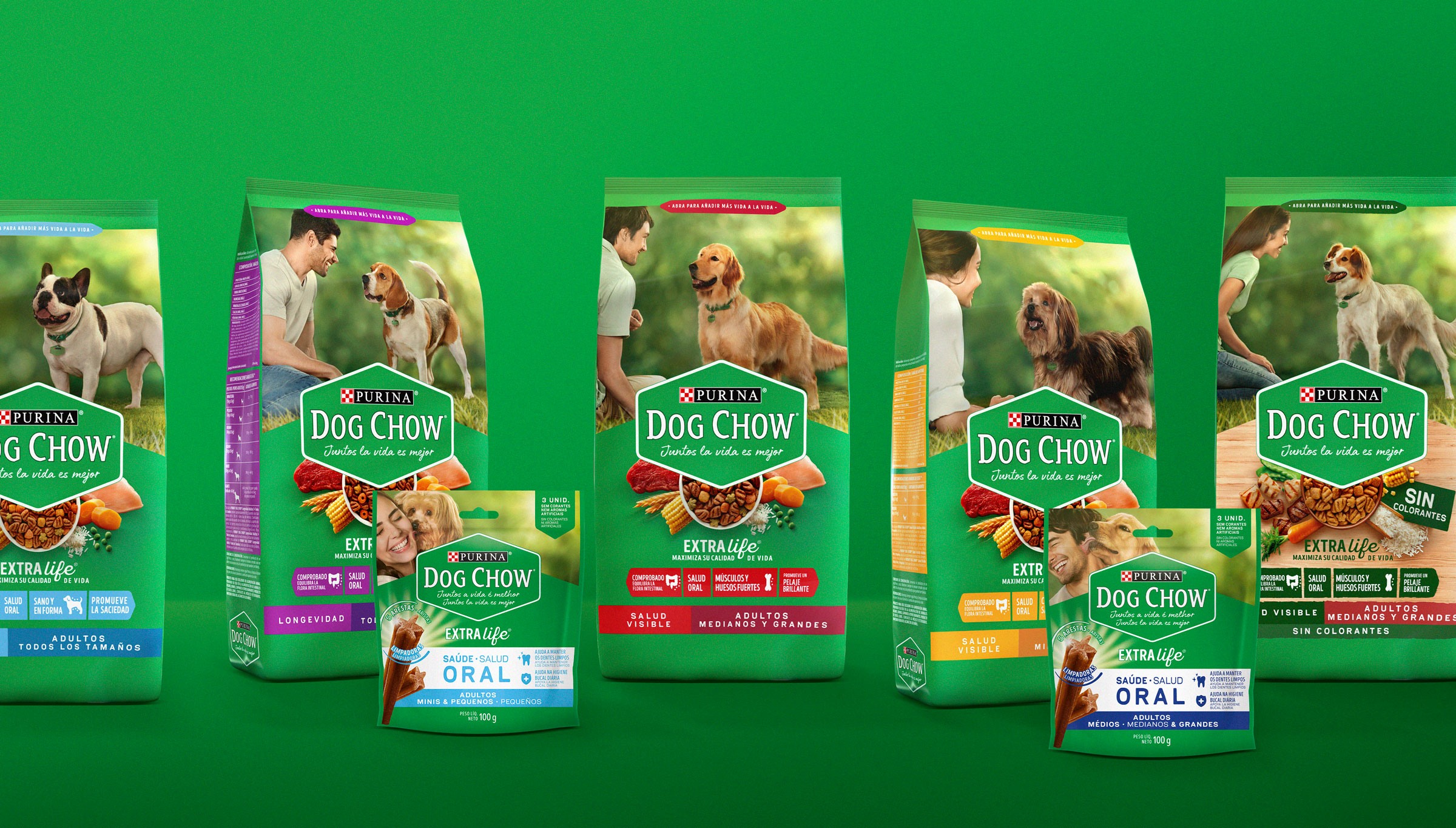
To build the new identity, all the elements – nutrition, care and shine – were considered and developed as strong brand characteristics. This way, being consistently communicated, they provide a real experience in all the touchpoints. To highlight the nutritious advantages, we enhanced the maximizing nutritional component Extralife®, present in the product’s composition, that has the property to delay aging and help the dog keep fit.
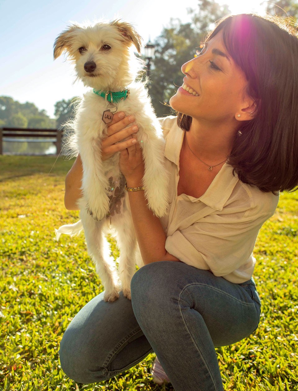
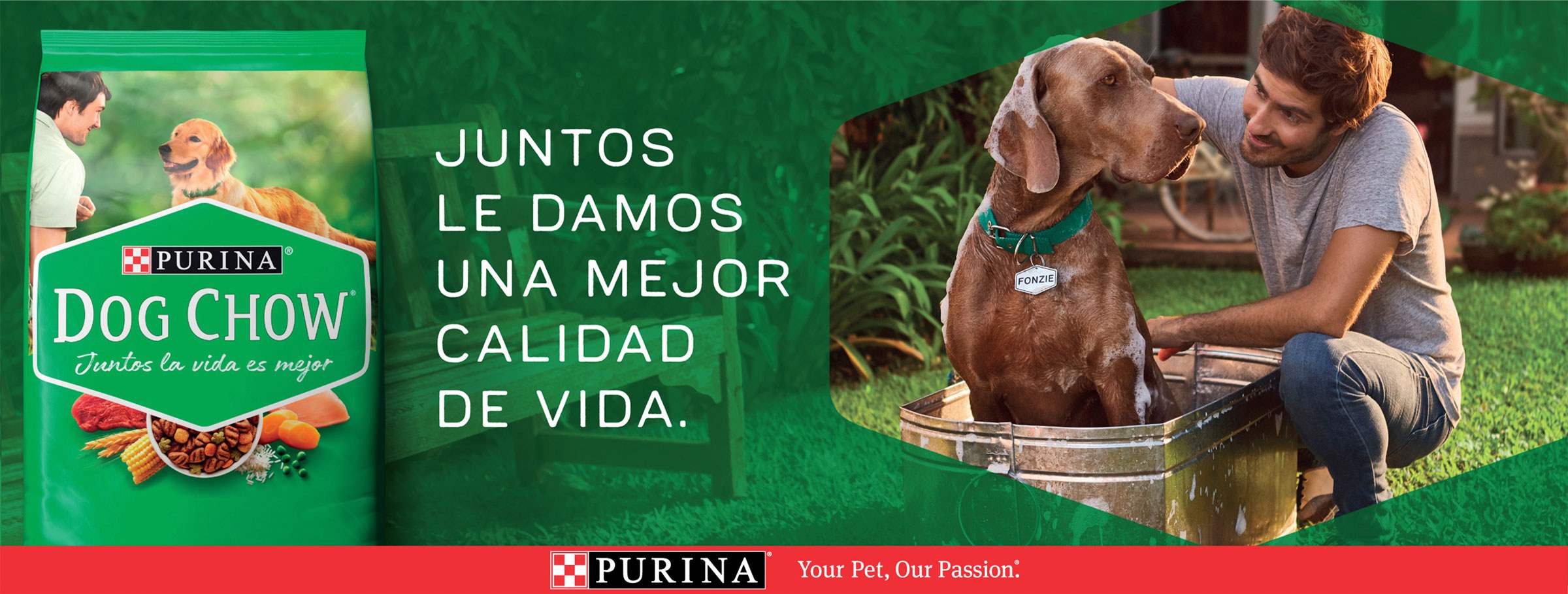
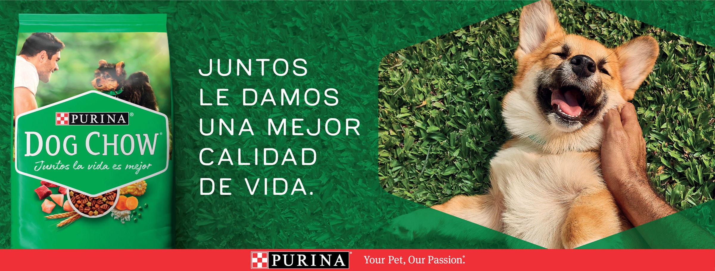
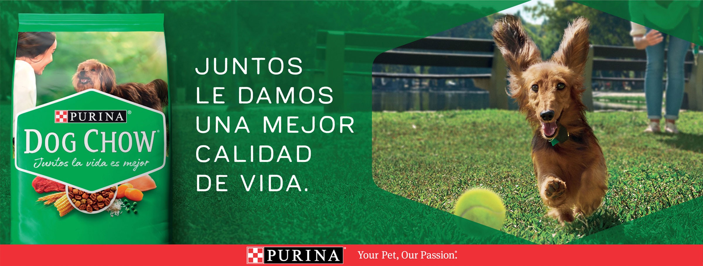
Pictures convey the careful relation between owner and dog, showing their interaction and emotional closeness, reinforced by the new tagline adopted – Together, life is better.
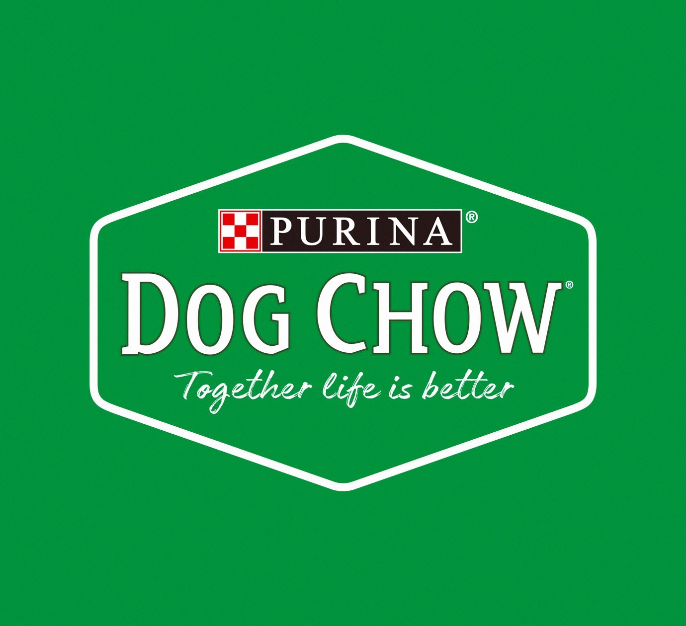
The green color, outdoor life, natural ingredients, all the elements that suggest the caring relation that makes a dog shine, are covered. A new logo was also conceived: in the shape of a hexagon, referring to the pet’s identification tag.
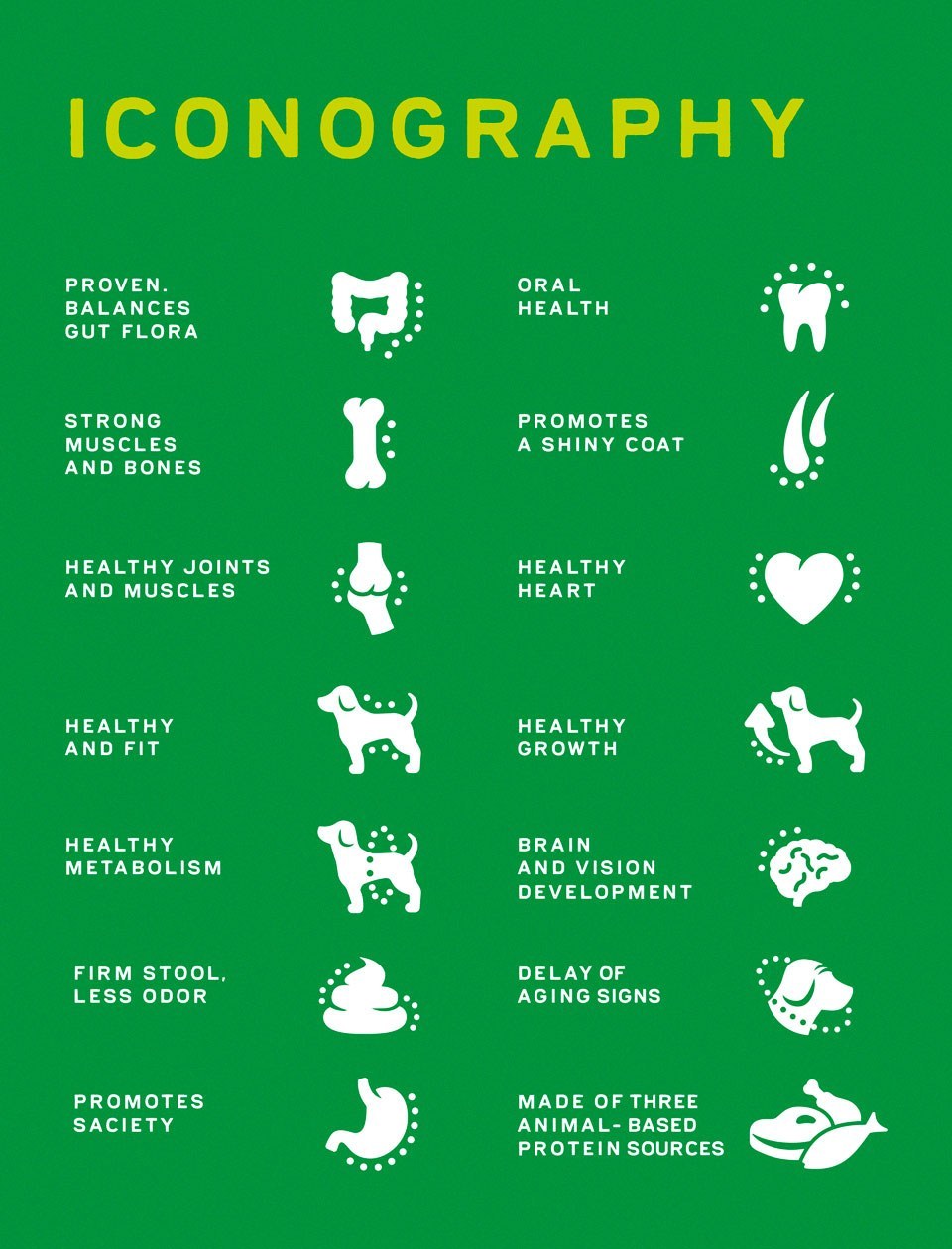
Moreover, as part of a regional project encompassing several Latin American markets, we developed the Brand book with all the brand’s strategic guidelines, including Dog Chow’s portfolio architecture, guidelines for packaging applications, printing material and all the brand’s touchpoints.
