Forno Bonomi is the world’s largest producer of savoiardi biscuits: their journey began in the mid-1800s with a small family-owned village bakery set in the Veronese mountains. Today, they still produce their wide range of products for the Italian and international markets surrounded by the same luscious beauty of the Lessini mountains.
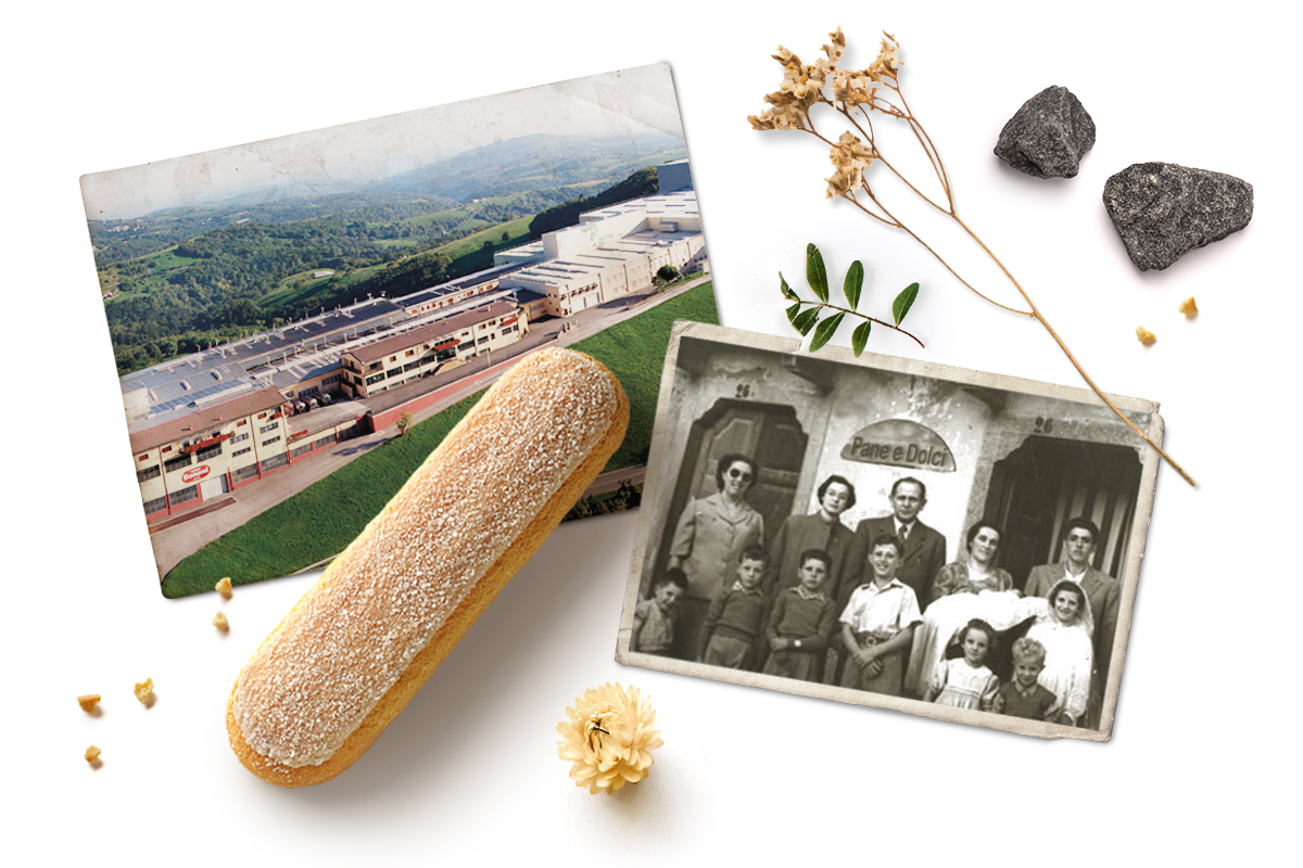
Succeeding and growing in the current industrial confectionery world requires a solid brand image as a producer, becoming a consumer’s favourite. For this reason, Forno Bonomi needed to redesign its identity, highlighting a distinctively different production offer with its matching language and style.
We immersed ourselves in the world they inhabit daily through long conversations with the Bonomi family and exploring their bakery. Breathing in the scent of freshly-made biscuits, we admired the spectacular landscape the family cherishes so much day after day.
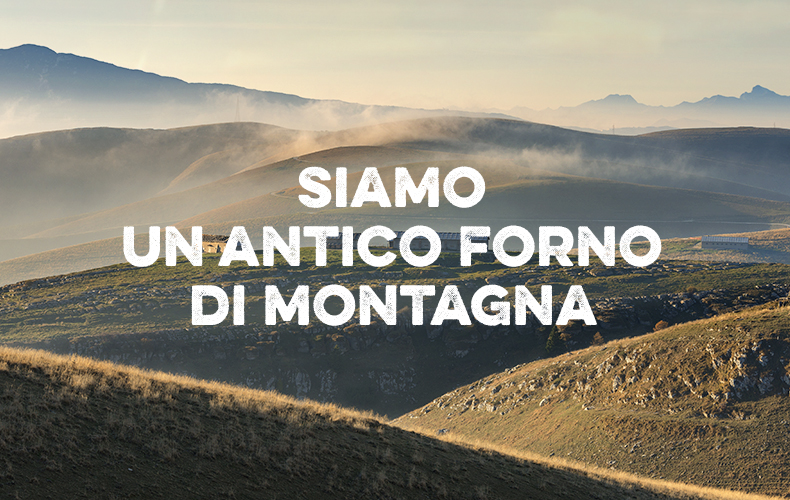
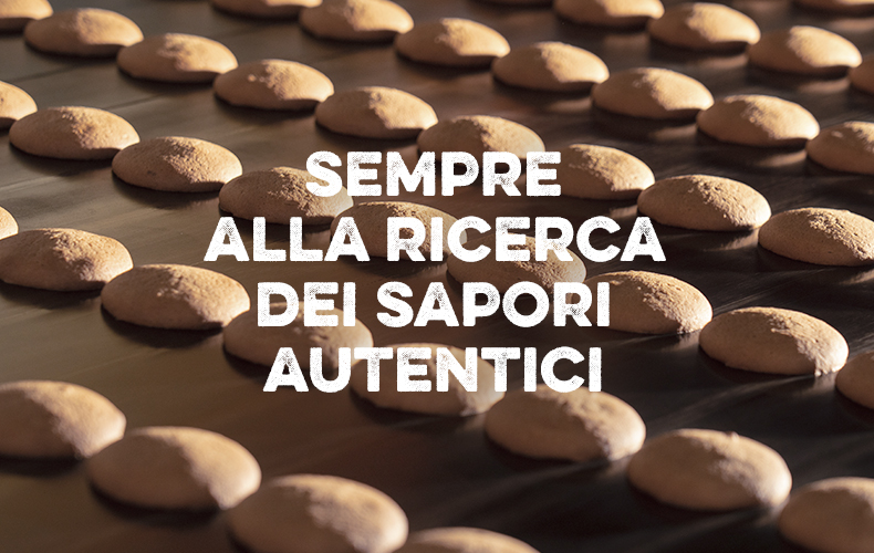
This way, we fully grasped their spirit of perseverance and their desire to always give it their best. We experienced first-hand their taste for genuine goodness and their deep-rooted love for their home. All these qualities have always set Forno Bonomi apart from the very beginning.
By analysing the market scenario and, above all, listening to current and potential consumers, we identified the area that inspired the concept: mountains of goodness.
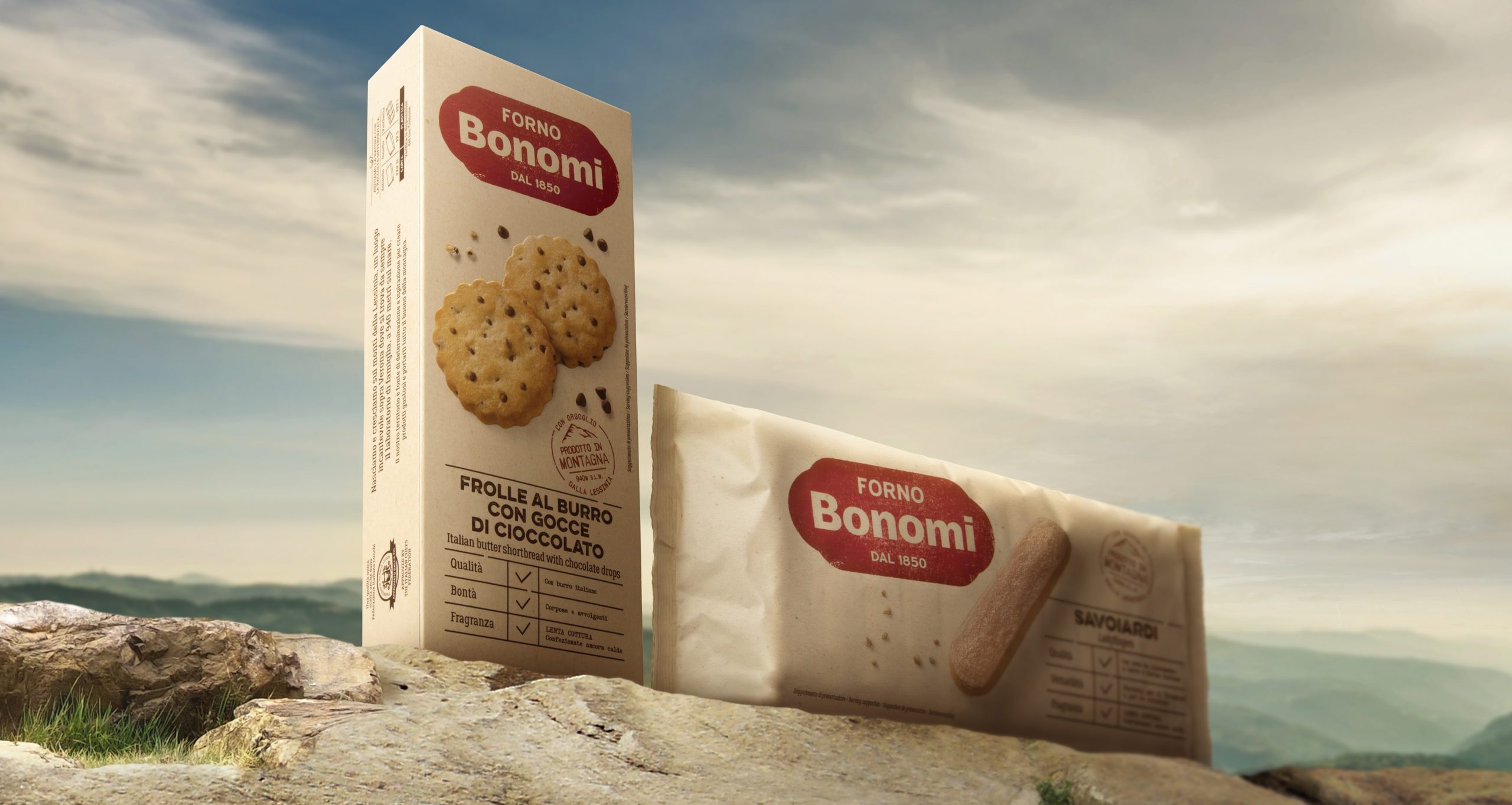
The new brand identity offers a renewed representation of the mountain bakery, set 900 metres above the sea and immersed in uncontaminated nature. It’s here the expert bakers research the best mixes of ingredients and recipes through constant testing. The goal? Achieving a product that fuses fragrance, genuineness and authentic flavour at their finest.

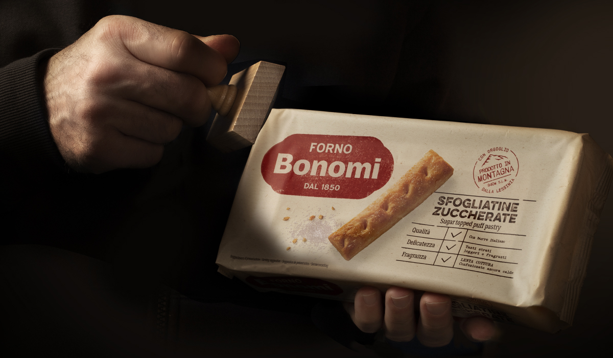
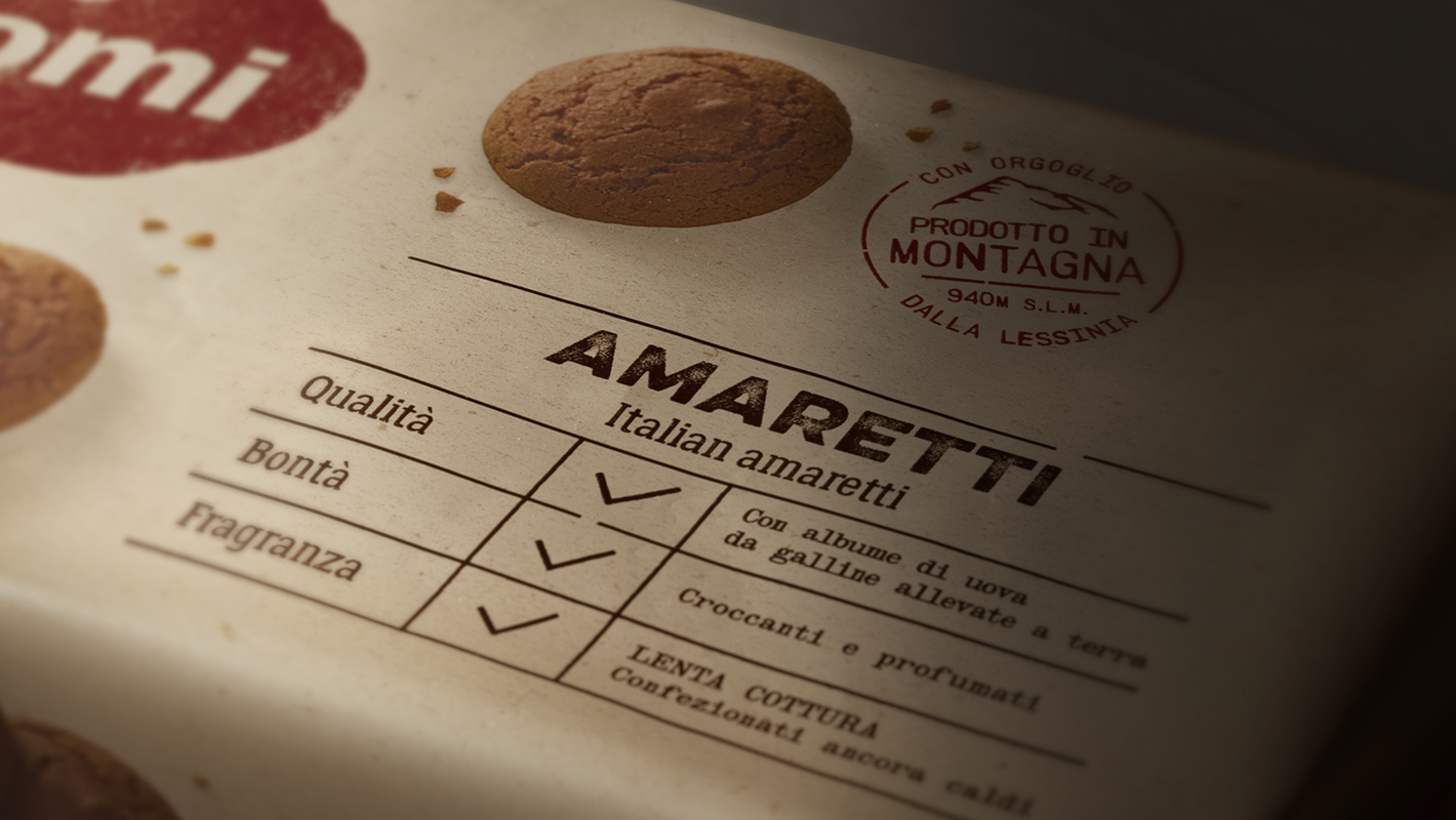
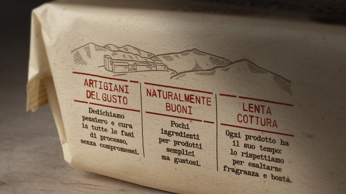
Only the finest products are selected, branded and wrapped in brown paper packaging, resembling traditional packs of handmade baked goods, freshly out of the oven.
The place of origin, ingredients and preparation are impressed with dedicated stamps and handwritten on each packet.
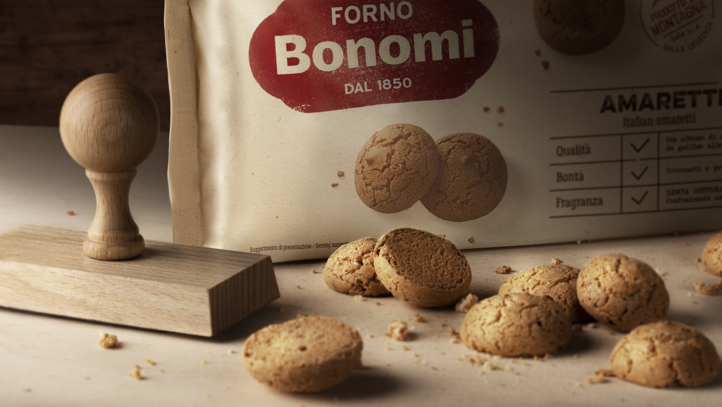
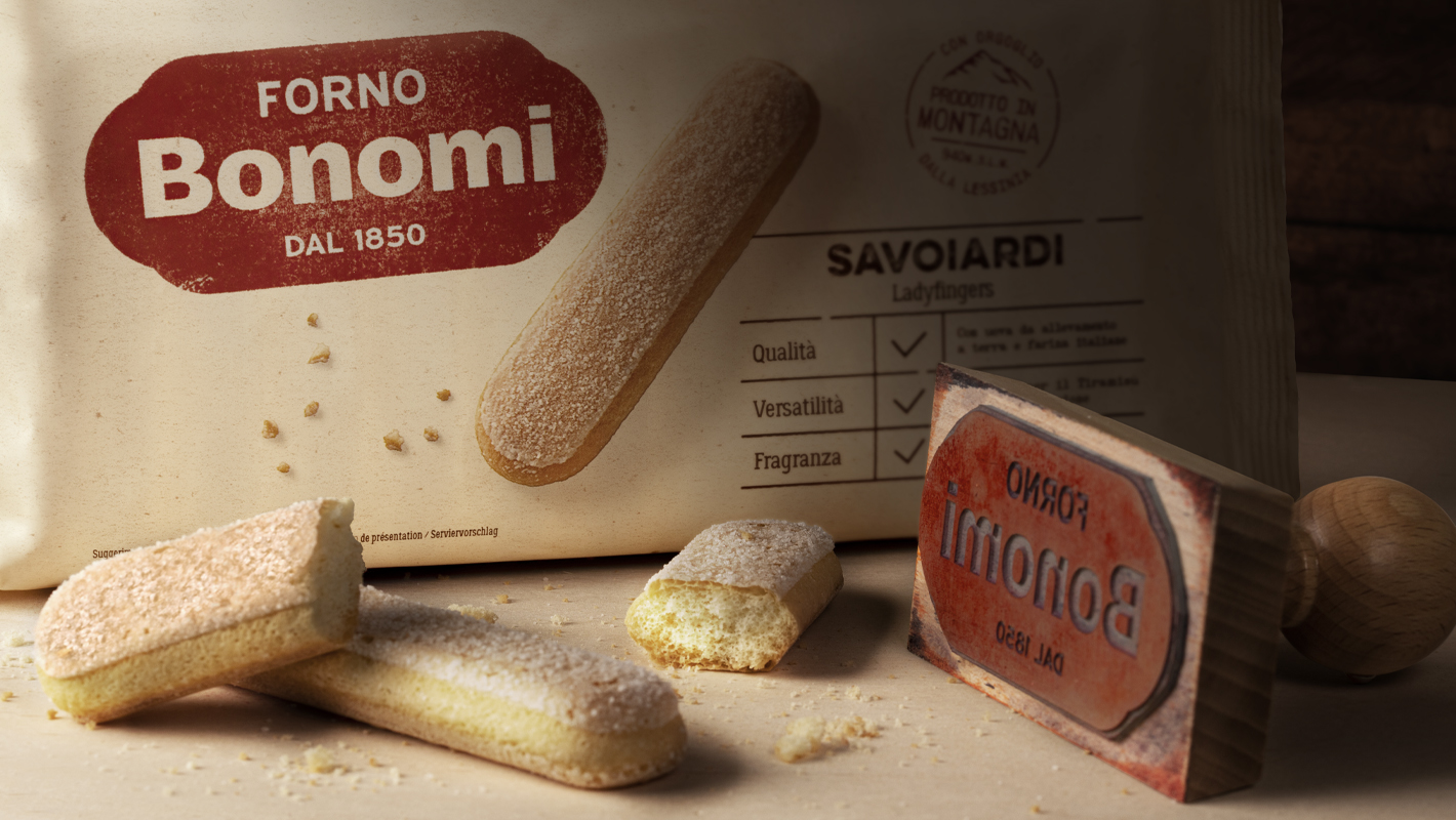
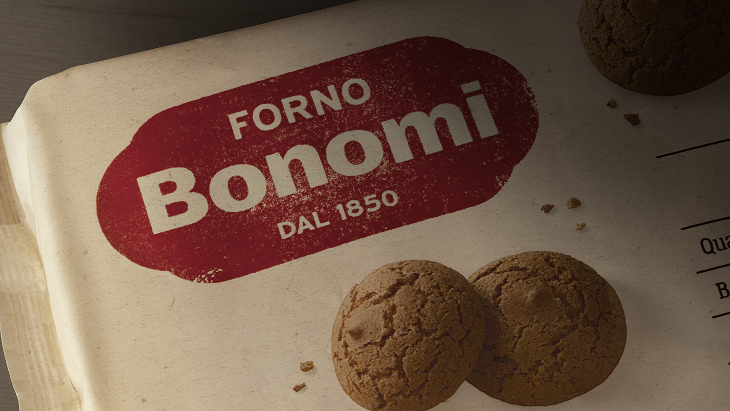
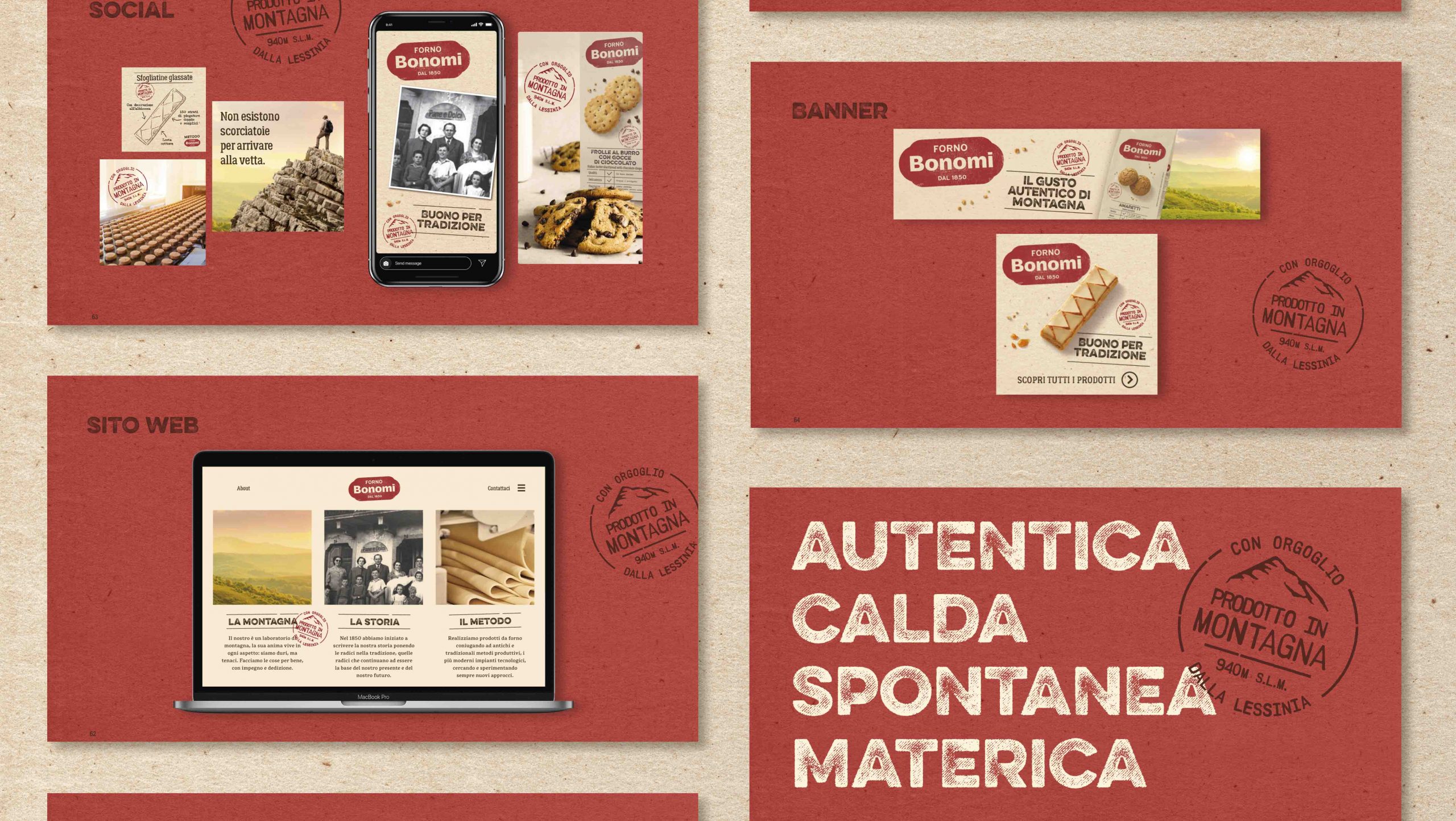
The logo has a rubber stamp effect, representing the brand’s traditional approach to baking, authenticity and history.
We chose typefaces recalling the knowledge of traditional bakeries from the old days with their handmade products while also representing the honest and straightforward approach that defines the Bonomi family and its collaborators.
The product photography enhances and captures all their inviting, unpolished goodness; the atmospheric and soft shadows are similar to those seen on the mountains in the first morning light.
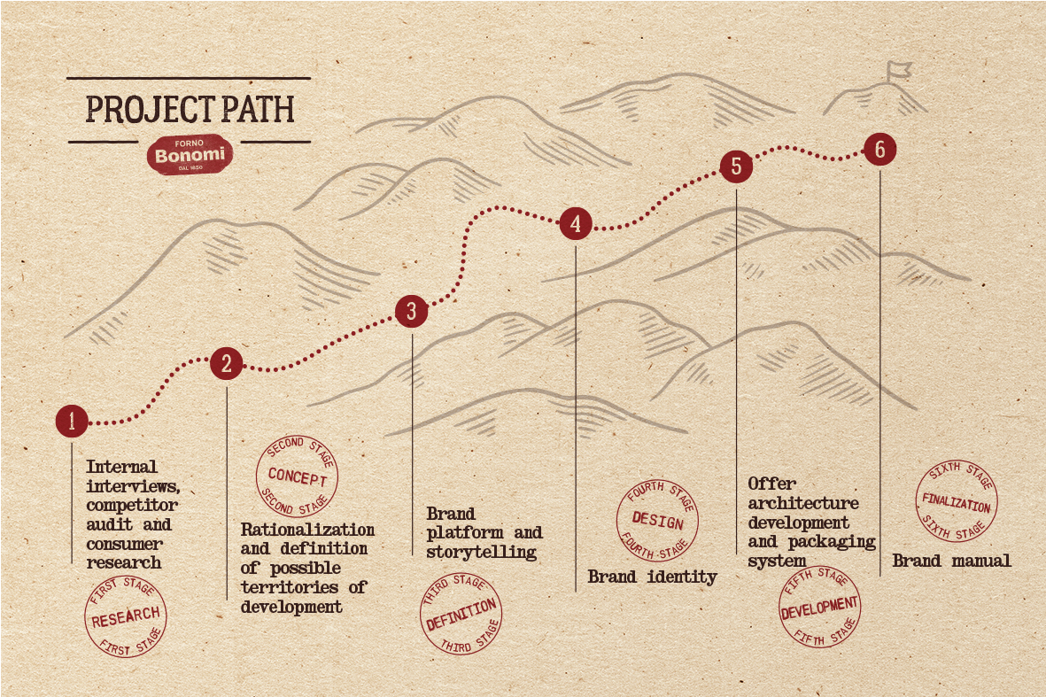
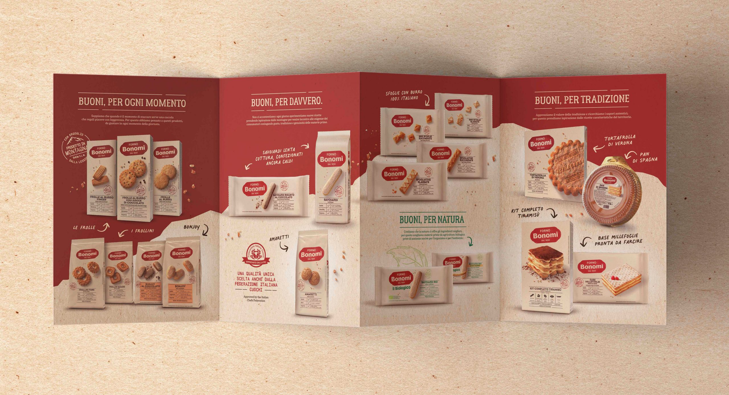
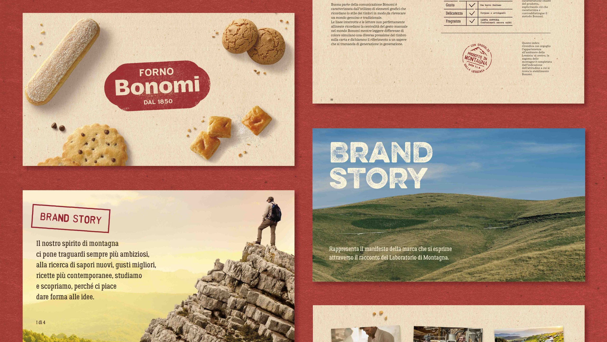
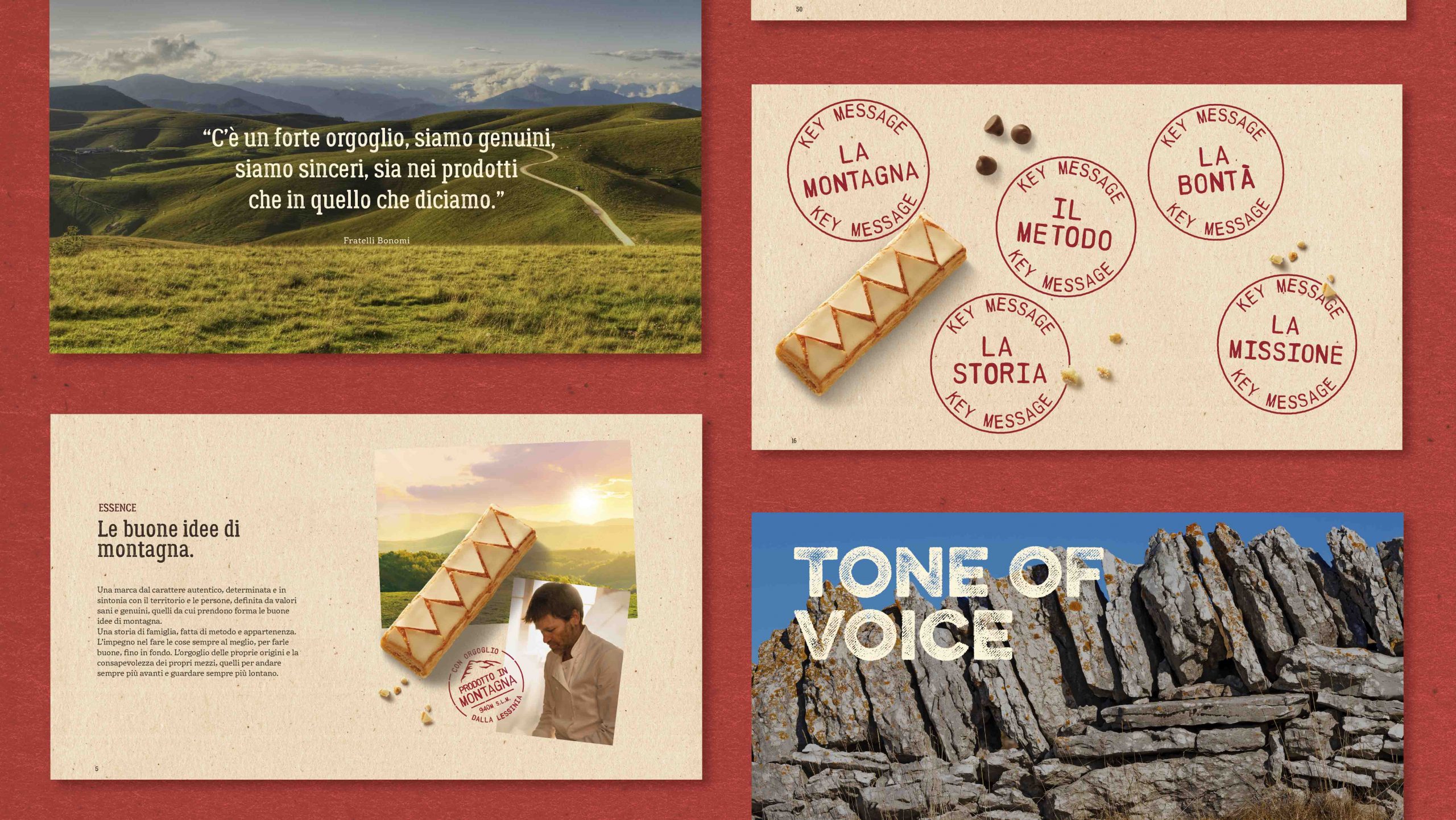
For the last stage of the project, we created a brand book presenting all the main brand themes, including the tone of voice and the viewpoint behind the storytelling, the visual language and the message. We laid the foundations for all future brand developments by offering a visual and content roadmap; we provided the design guidelines for all future output, the physical and digital touchpoints.
Forno Bonomi specialises in industrial confectionery for the Italian and international markets. A world leader in the production of savoiardi biscuits, the bakery is located in Roverè Veronese, 940 metres above the sea on the edge of the Lessinia Natural Park (Verona) and close to the Little Dolomites.
